|
| Group |
Round |
C/R |
Comment |
Date |
Image |
| 83 |
Aug 19 |
Comment |
Jane
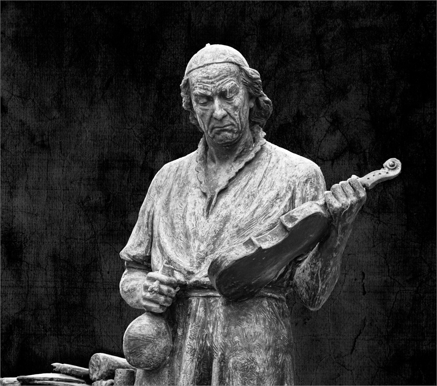
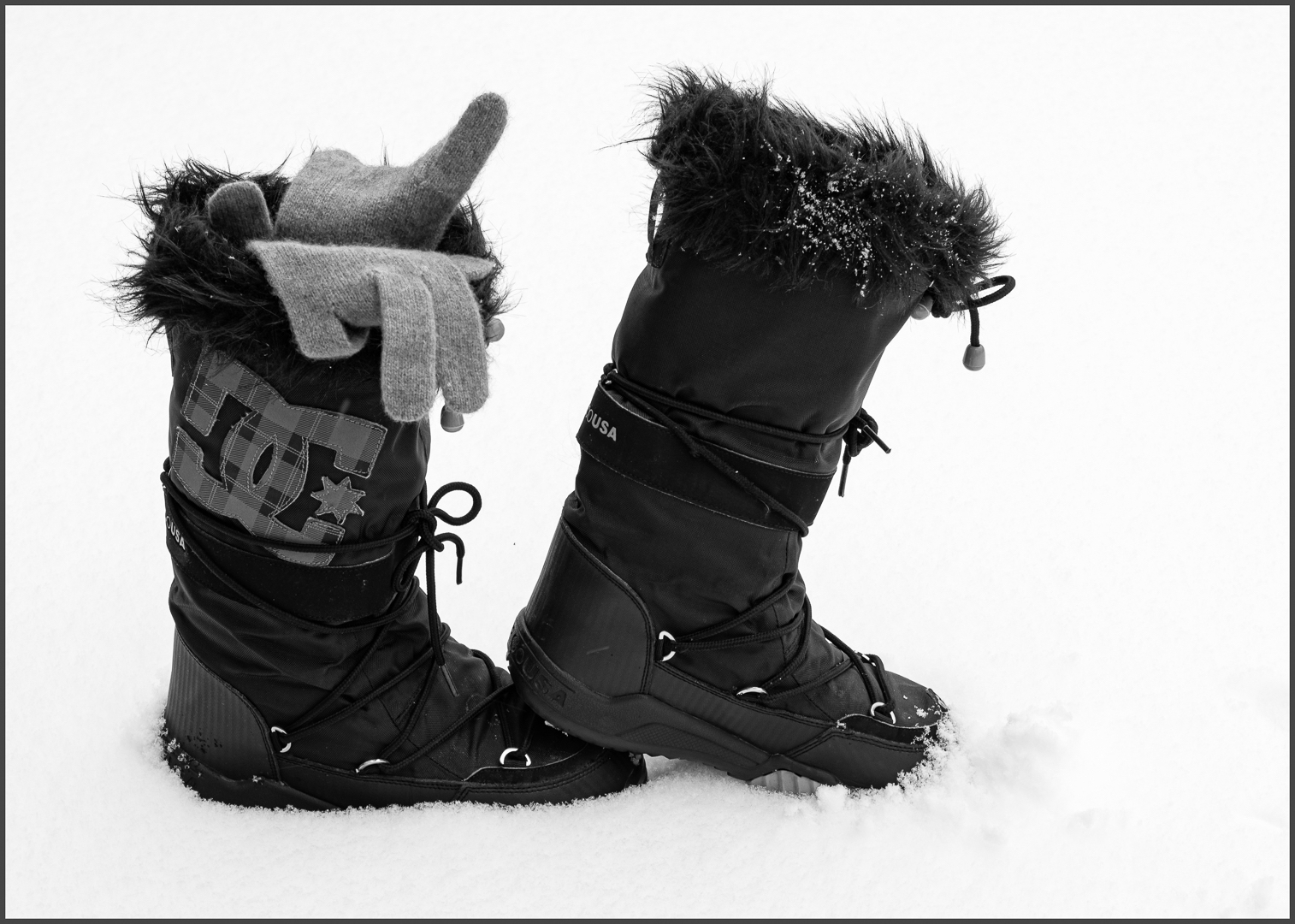
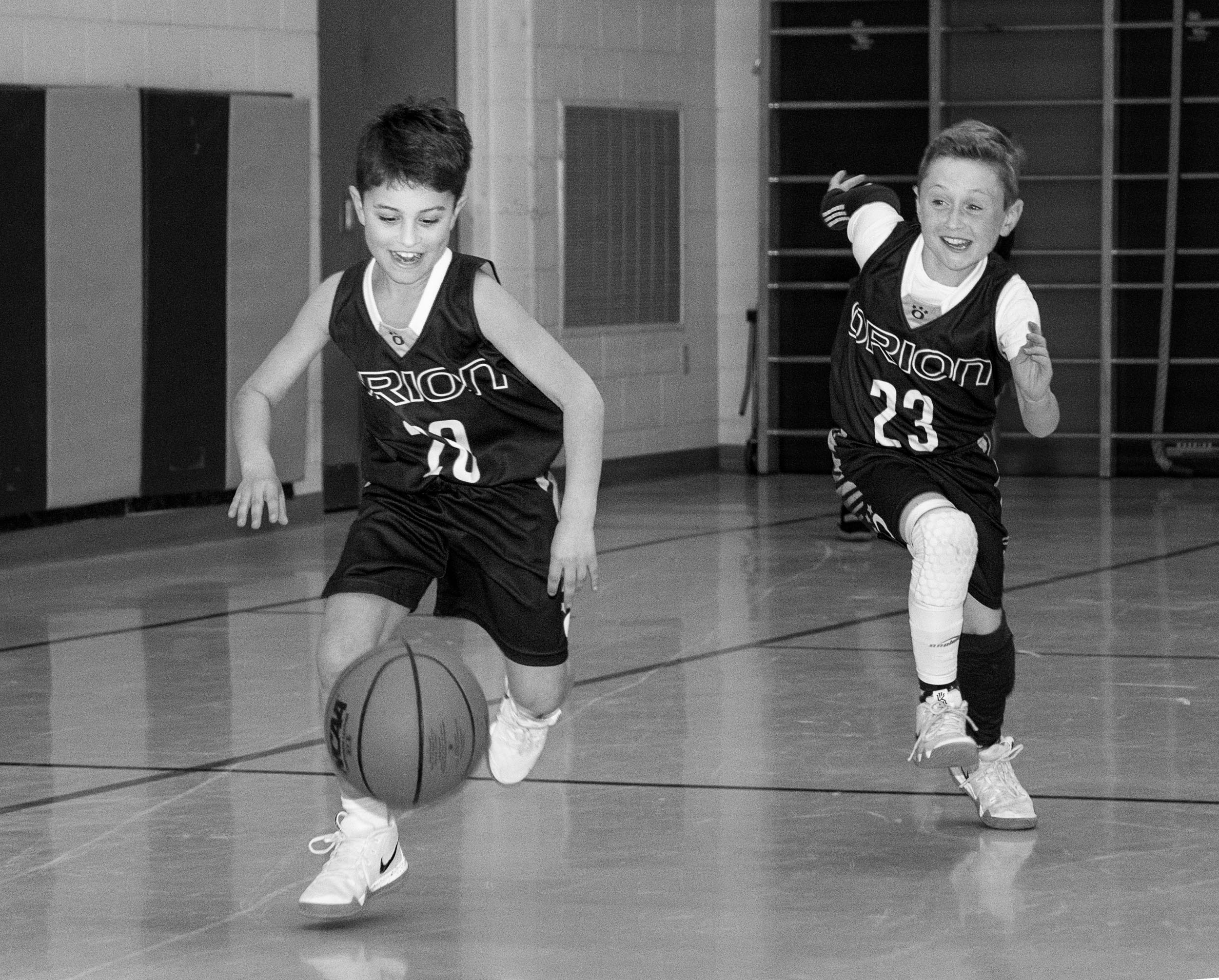
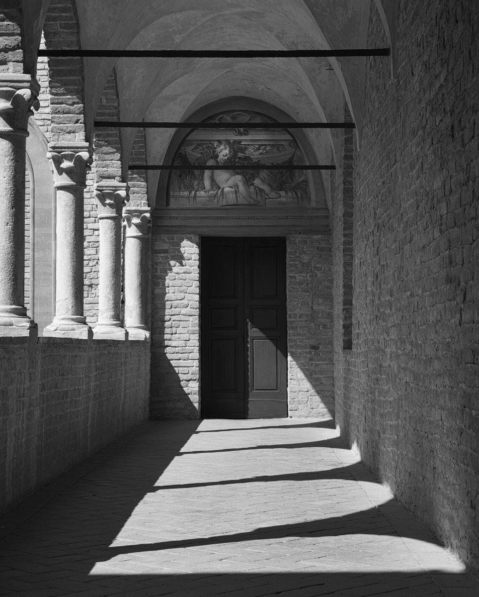
Objects like the buttons naturally have strong highlights. I applied a luminosity mask and was able to reduce the highlights to bring back detail. Ditto for the white belt.
I found that it is critical for posing a person in a door frame to look at how the light hits the persons face and it is dependent on the angle of the sun relative to the face. In another image, where the man has his head turned toward me, there is no highlight. However, I chose this image because for me it was more dramatic and proved that in a portrait, a person does not have to always look into the camera. The important thing is to capture the mood, to have catch lights in the eyes (Jose taught me this), and to have a strong pose.
For one month in June, I practiced photographing my husband in natural light, experimenting with settings, backgrounds, poses and diffuse light.
I enjoy photographing people I do not know, watching them, and sending them their image. Because I do not know them, I have no preconceived ideas. It is just the moment.
Perhaps this is comes from my experience of sailing where people are like ships passing through the night, or walking the Camino of Santiago, where one meets a strangers on the path, shares time together, and then the person is gone forever. The image is the short sweet memory where we shared time together and in an unguarded moment connected with each other.
JPS
|
Aug 31st |
| 83 |
Aug 19 |
Reply |
Jose
I found your comment about stop the car, get out etc. interesting. Someone commented on an image I did that it looked like I had just taken an image of something that was in front of me. The images was of a baby alpaca feeding on her mother. For me, it was a tender moment, not a snapshot.
After that, I started asking the question - how can I take the image so it does not look like I just took something in front of me. The framing in this image is good, but as you said, I suspected it was a stop, take the picture image because your images are so well composed. That bucket in the foreground was a clue.
JPS
|
Aug 26th |
| 83 |
Aug 19 |
Reply |
Jose
I like the color image better. The blue and green are analogous colors and the blue and green convey mood (calm and relaxed), form, and function (story of the water and fishing) and invite me into and through the shop.
The tones in the blue chairs are similar to the water balancing each other. For me, the effect of light and shadow on the green leaves is better in the color version and convey the sense of shade and protection. The yellow hanging on the camera right wall adds a good complementary color tone that is totally missing in the color version.
|
Aug 26th |
| 83 |
Aug 19 |
Reply |
Lance
I did look at the work of Cameron and the contention that surrounded her soft focused portraiture. Then, I compared her work to Nadar's and Lange. The different approaches are fascinating. These people influenced my interest in portraiture.
What encouraged me was that she picked up photography later in life, was spirited, learned how to cajole the people around her model, and ignored the criticsm about her work as sloppy technique. Let history and the viewer decide her place in the annals of photography. |
Aug 21st |
| 83 |
Aug 19 |
Reply |
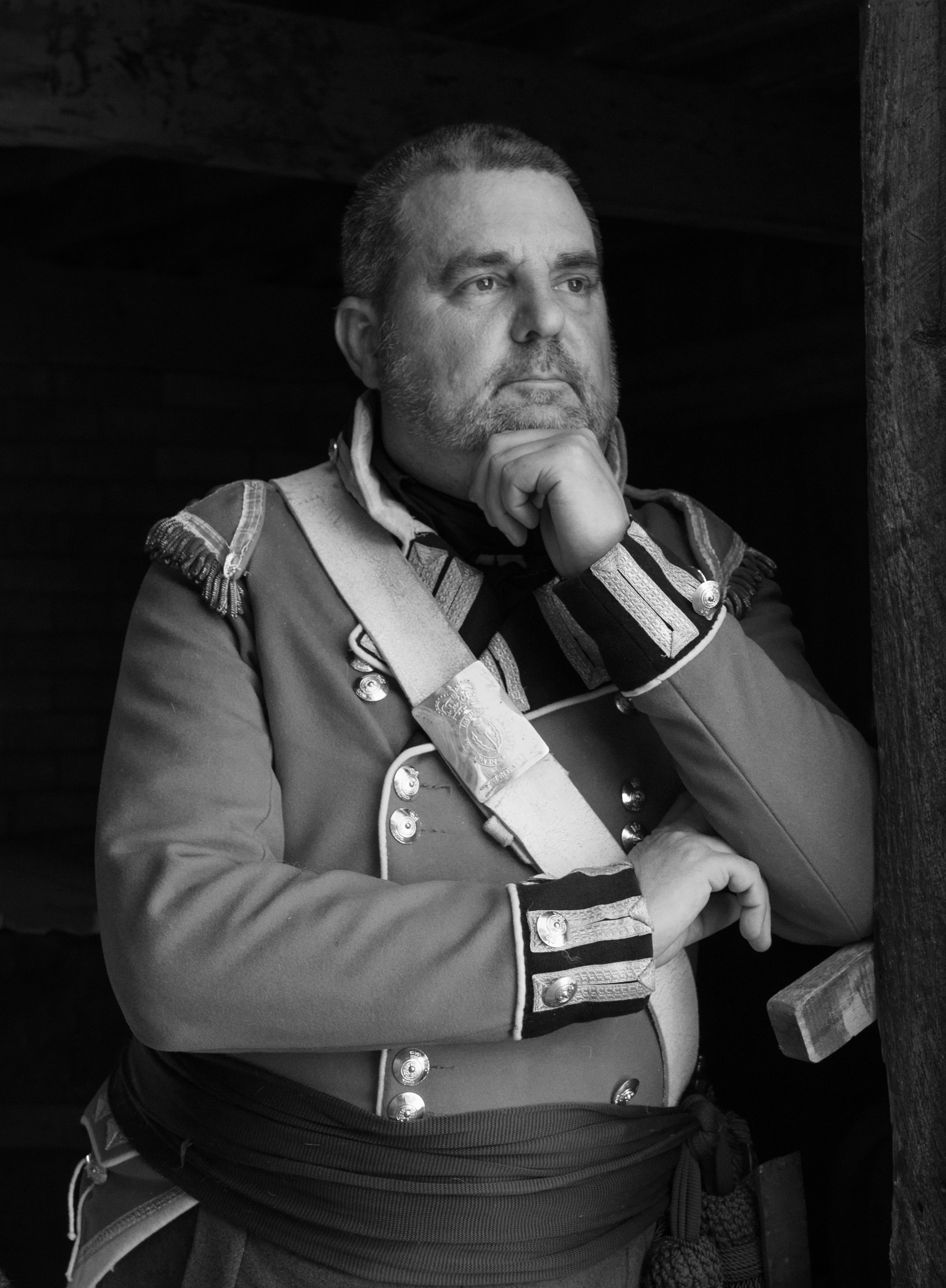
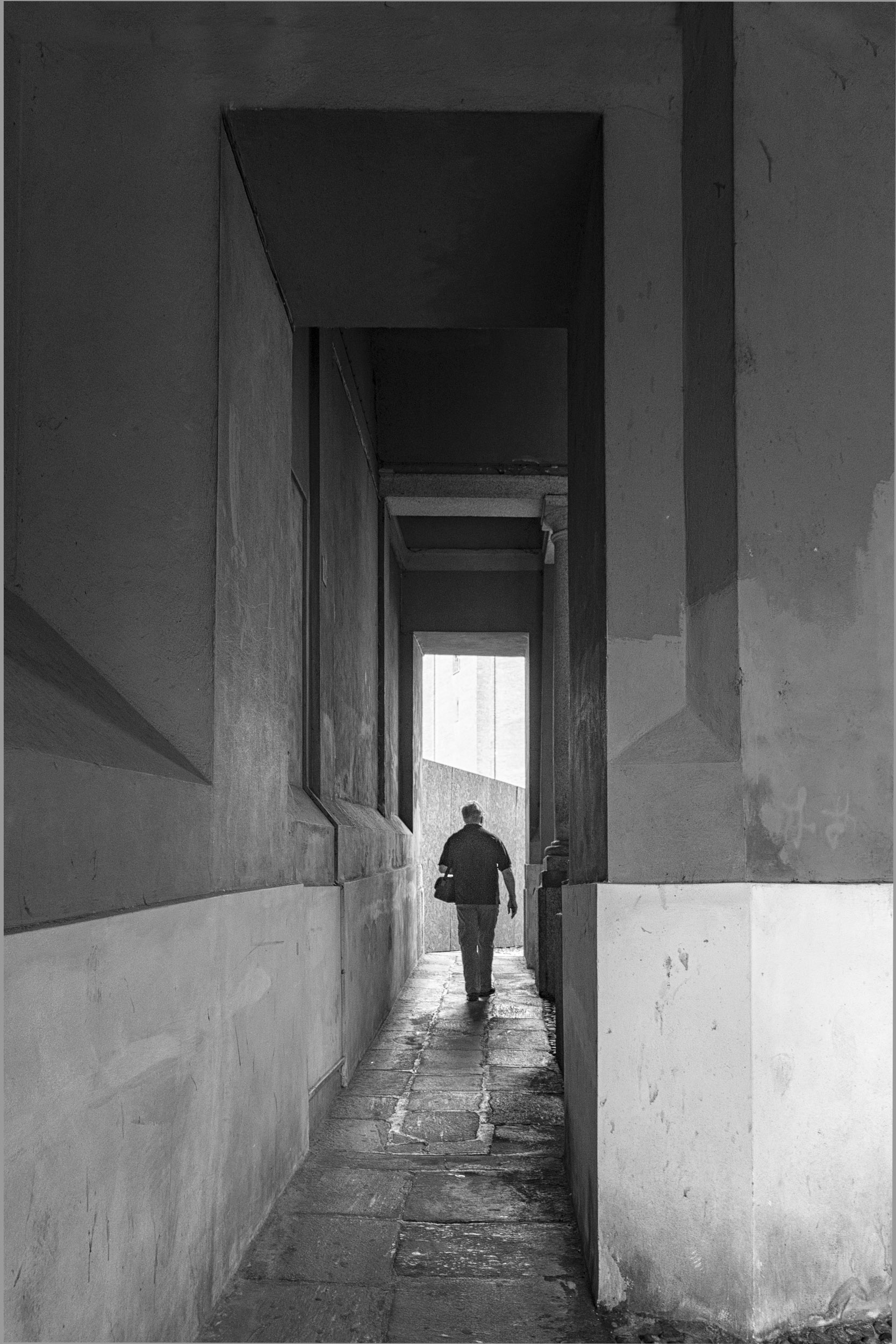
Charles
This man belongs to the King's Company of Historical Reenactors. He had studied photography at college and knew how to pose. When I asked him if he would pose by the door, he went into a series of poses for me. When I said, I wished I had brought a stool to photograph from a higher position, he went down on one knee and kneeled for me. That was impressive. The whole interaction with him was about 2 to 3 minutes.
|
Aug 20th |
| 83 |
Aug 19 |
Comment |
Lance
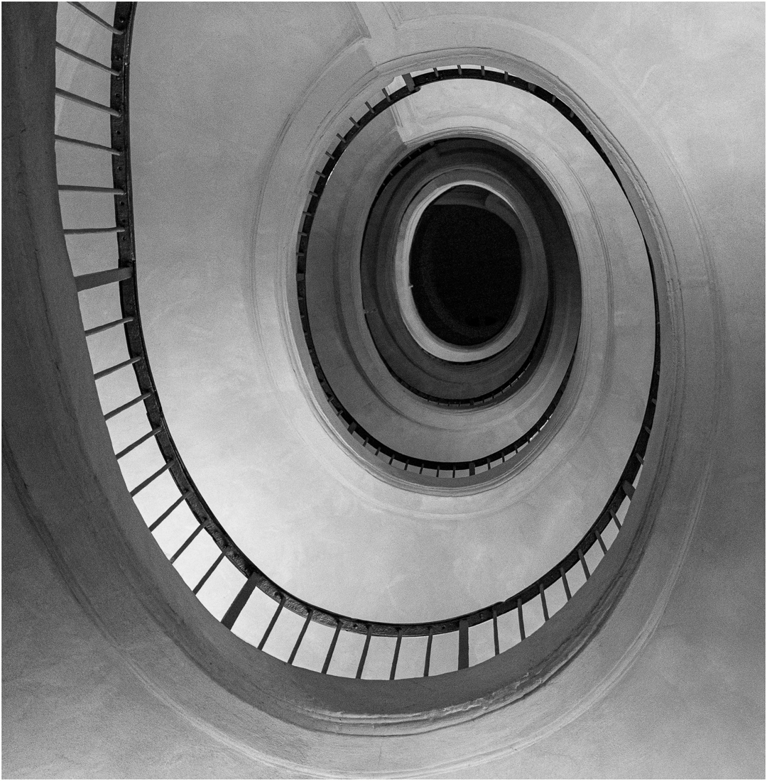
This is an intriguing portrait with interesting composition, use of DoF, light, shadow, and focus to draw attention to the central point. I like the light subtle feeling the image portrays. It feels like I am peeking inside it.
Indeed you have brought your creative vision to this fine art portrait.
JPS
JPS |
Aug 19th |
| 83 |
Aug 19 |
Comment |
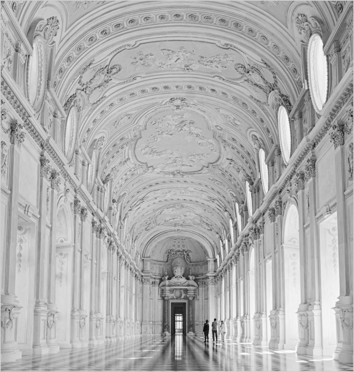
Jane
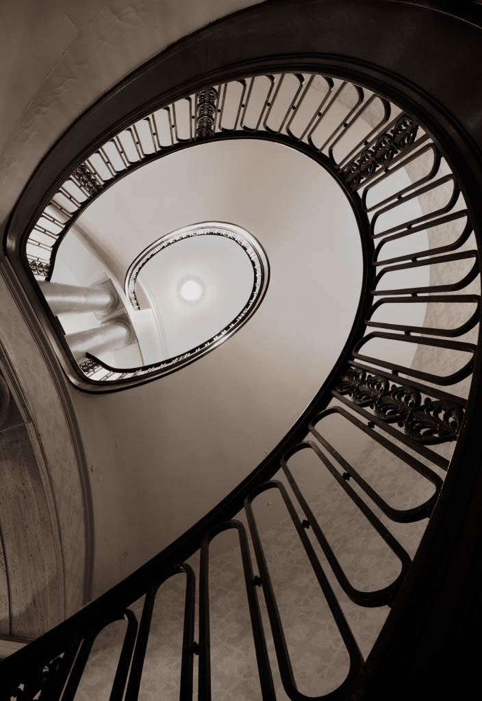
This is an intriguing image and I like your use of sepia to age the image.
It was a good image to test out luminosity masking.
I applied Lumenzia masks to tone down the central light, remove some splotchy light shadows in the ceiling, bumped up the contrast to bring out more detail in the wall, spot removed tiny details in the ceiling, cloned on color in the ceiling to even out the tones, and then increased the overall exposure. |
Aug 19th |
 |
| 83 |
Aug 19 |
Comment |
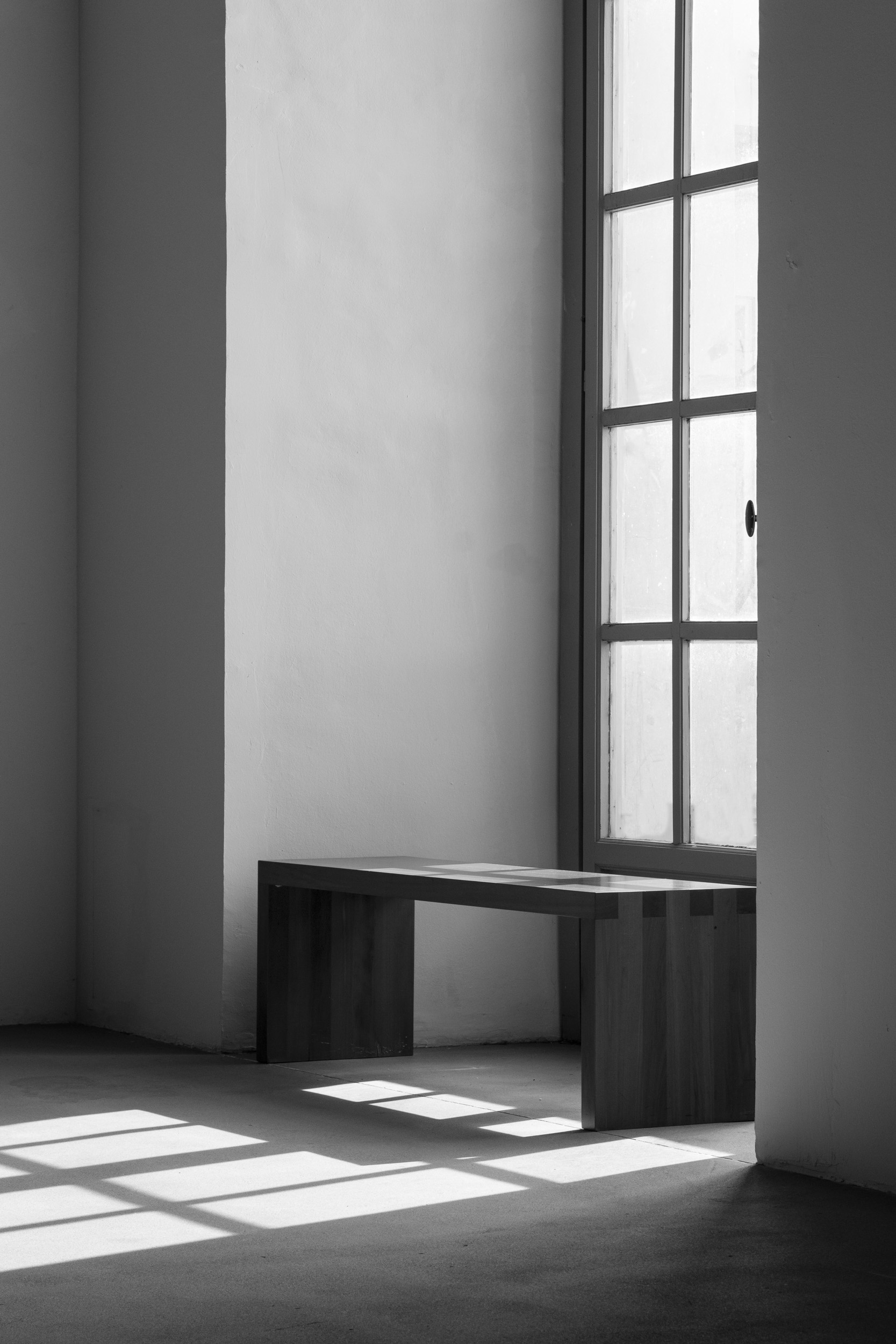
Charles
I love this image. The positioning of the people is so perfect. What grey street photography. What is that little rectangular block in the lower right third? |
Aug 19th |
| 83 |
Aug 19 |
Reply |
Lance
Please see my comment to Dr. Nair.
JPS |
Aug 19th |
| 83 |
Aug 19 |
Reply |
Dr. Nair
I went back to the series of poses I did in the door frame.
Using the technique of putting a person in the door, one has to be so careful about how far in or out the person is and whether the sun suddenly peeks or comes out from behind a cloud. The slightest turn of the head makes a difference on how light falls on the face and alters the background.
Using a tripod, at least for me, is not practical. Photographing this man was like a dance, flowing, and responding to the slightest nuance or movement of light, expression and pose. Greg Benz made a similar comment in his video on portrait reediting using Lumenzia. Sometimes, using a tripod, takes the spontaneity out of the situation.
In other poses I did, with a different facial orientation the highlight is minimal.
I edited this image using a variety of luminosity masks to avoid blown out highlights in the shiny buttons, belt, and face etc.
I have attached an image with a reedited PS face layer. In my earlier version, I was overzealous with the clone tool. I do not think it is a case of noise.
|
Aug 19th |
| 83 |
Aug 19 |
Reply |
I do not know whose comment to reply on.
In my luminosity masking course, I can e-mail the instructor so I asked Greg Benz about whether he would recommend using bracketing. He suggested I expose to the right, and then blend two exposures from the same raw file. He sent me a video on how to edit portraits that I will look at.
I have been editing a set of images, mainly people, taken at a barbecue last night using the wacom tablet. It is amazing how using pressure sensitivity with any of the pressure sensitivity PS tools improves retouching skin.
I will reedit this image using Greg Benz's approach and reattach it on someone's comment later. |
Aug 18th |
| 83 |
Aug 19 |
Comment |
Lance
I read your biography to understand your background with photography and fine/visual arts. Please read mine. We are polar opposites in knowledge and experience with photography. One thing we have in common. We both share the passion for fine art photography and looking at the masters. I just completed the PSA History of Photography course the end of May. I followed this up with a one month study of portraiture in natural light and looked at the work of Karsh, Penn, Avedon, and Eisenstadt. This month's image is as far as I reached in understanding how to take a portrait in natural light. It is far different than from photographing in a studio or photographing things that are static. The concept of bracketing for portraiture did not occur to me.
I interpreted your comment as directed at me not the group since our group members are so skilled with photography and Thank you for clarifying your approach to critiquing as a method of educating all group members.
For clarification, I understand how to meter, bracket, use exposure compensation and merge images using LR, PS, and Photomatix. When I first learned to use a digital camera, I photographed in our local cathedral and practiced these techniques along with using a tripod. I also know how to set up my camera for bracketing. Last Saturday, I experimented with adjusting the exposure on an image with all other elements constant and then blending using Lumenzia.
I am now learning Lumenzia and am working my way through Greg Benz's course on exposure blending. He has good videos on how to determine correct exposures and blending. He also advised to learn how to get a good exposure and not always to rely on bracketing. Therefore, I opted for assessing my exposure, and taking one exposure only during the different poses. I have also followed David Morrow and watched his videos on determining exposure, hyper focal distance etc., DoF, tripods etc. and setting the lowest ISO.
A week ago, I started watching videos on portrait retouching and high frequency separation. Yesterday, I bought a wacom tablet and experimented with how cloning using the wacom pen produces such a different result from the sledge hammer approach of using just a mouse.
There is so much I have had to learn within a couple of months, test, and evaluate. With portraiture, the challenge is not just technical, but interpersonal skills, keen observation and instinct how to position oneself and when to press the button. Karsh said anyone can be taught how to press the button. What one has to learn is how to photograph with heart and mind. That is what I focused on heart and capturing essence.
So back to technical skills and bracketing, I shall try out your suggestion and see if in a more candid situation, it provides me with a better starting point for editing. Indeed, will much editing even be required????
I will be interested in Jose's comments on bracketing with portraiture.
Thank you for taking the time to critique my image.
|
Aug 16th |
| 83 |
Aug 19 |
Reply |
Cory
For me, you are suggesting a routine which I would consider if I were photographing architecture or landscape, not strangers in a dynamic situation.
My settings were deliberate: manual aperture and speed with auto ISO to deal with any situation I encountered photographing at Pioneer Village, a historical museum. I wanted an aperture that would not exceed 5.6 because I wanted to black out the interior and a shutter speed sufficient to reduce impact of shake.
In this setting, a tripod was not an option since people were moving in and out of the entrance of the structure. This man was a complete stranger and I asked him if I could take his picture. Using a tripod, may have resulted in "no, I do not want my picture taken". I followed common sense and courtesy and had 2 minutes to take 5 different poses. I was fortunate. He had studied photography and new how to pose and quickly followed my direction.
I photographed a variety of willing strangers in different structures. As I photographed, I did check my camera histogram and depending on the situation, determined if I had to move people forward or back in the doorway or use exposure compensation to get a good exposure.
|
Aug 15th |
| 83 |
Aug 19 |
Comment |
Jose
I looked at this image again. I like the way you use light, how the structure of the shop frames the image, your wide range of tones, highlights and shadow, and how the man sitting on the right side leads me to stop and look.
However, the bright sparkling water draws my attention and I want to walk right through the shop, ignore the fish and man, and head for the water.
Do you have the color version of this image. |
Aug 13th |
| 83 |
Aug 19 |
Reply |
Georgianne
A thought. Would you consider blue rather than sepia toning the image. Sepia tone does age the image. However, in the case of your image, with its cool tones in the original color, blue toning may create an interesting look. I watched a Greg Benz video on his monochrome workflow. He mentioned he often used blue or sepia for toning.
With respect to wanting to straighten the perspective in your image, I realized that it came from my sailing imagery. I would have to climb the ladder/steps from our sailboat's interior cabin to the deck. If the ladder was on a slant, we were heeling because of a strong wind. I would have to hold on tight to avoid falling as I exited the cabin toward the light. It is amazing how your image dug into my memory and made me wish the ladder was perpendicular.
JPS |
Aug 13th |
| 83 |
Aug 19 |
Comment |
Jose
When I first saw this image, I wished I were there buying a fish or putting my foot in the water. I was intrigued by the man on the right.
However, as I look closer at the image, the image is confusing because of the bright highlights and so many things to look at.
Do you have any other image of this location?
|
Aug 12th |
| 83 |
Aug 19 |
Comment |
Georgianne
I sense your claustrophobia.
When I look at the image, I keep wanting to straighten the ladder or change its orientation, so I can envisage how someone can climb up or down the ladder.
Would you consider reducing the detail extraction to simplify the image.
I prefer the color image because the blue color provides form and function. i.e. blue is calming, and suggests a separation with the submarine hatch. In the monochrome image I do not understand the meaning of the top part of the image.
|
Aug 12th |
| 83 |
Aug 19 |
Comment |
Dirk
I like the complexity of this image and the range of tones used from darker and heavier on the bottom of the image to lighter on top. You have done a wonderful job achieving separation of the smoke coming out the stacks against the white cloudy background.
I also like the steel grey tones you used.
JPS |
Aug 12th |
9 comments - 9 replies for Group 83
|
9 comments - 9 replies Total
|