|
| Group |
Round |
C/R |
Comment |
Date |
Image |
| 83 |
Apr 19 |
Comment |
Peter
I tried out your first method of creating a layer with alt +new layer, etc. It works beautifully.
Then I tried your second suggestion. When I tried doing a selection on a merged monochrome layer without the multiply blend mode, it was impossible to get a selection. The multiply worked like a charm. What I did was copy the layer, changed the blend mode to multipy, created a selection, then added the mask which automatically contains the selection. I think the result is the same as you are suggesting. I then varied the opacity of the layer.
I think if I had tried this method on my image for the boy's arm, it would have been more successful.
Before trying the method with just creating a new layer and then painting with the brush (black/white, and setting the opacity), I was using a curves adjustment layer, using the white eye dropper to identify areas of potential blownout highlights, and then adjusting the curve for that specific area to reduce the highlight.
Thanks for all these tips.
JPS |
Apr 26th |
| 83 |
Apr 19 |
Comment |
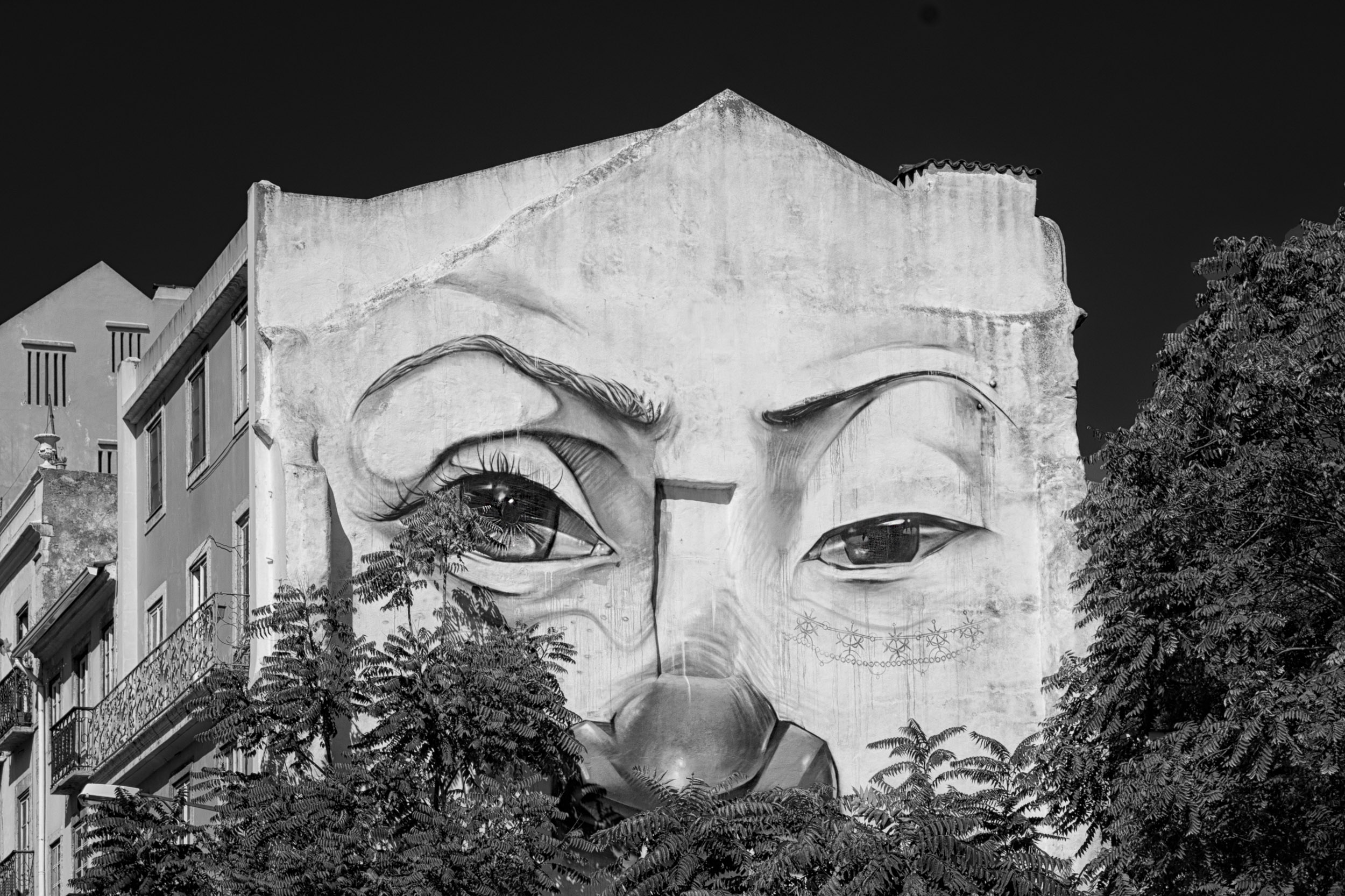
It is so interesting how people perceive fading away. I want to still be seen as I fade away.
JPS |
Apr 26th |
| 83 |
Apr 19 |
Reply |
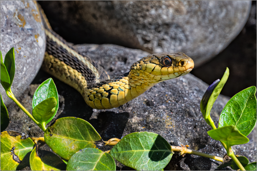
Dirk
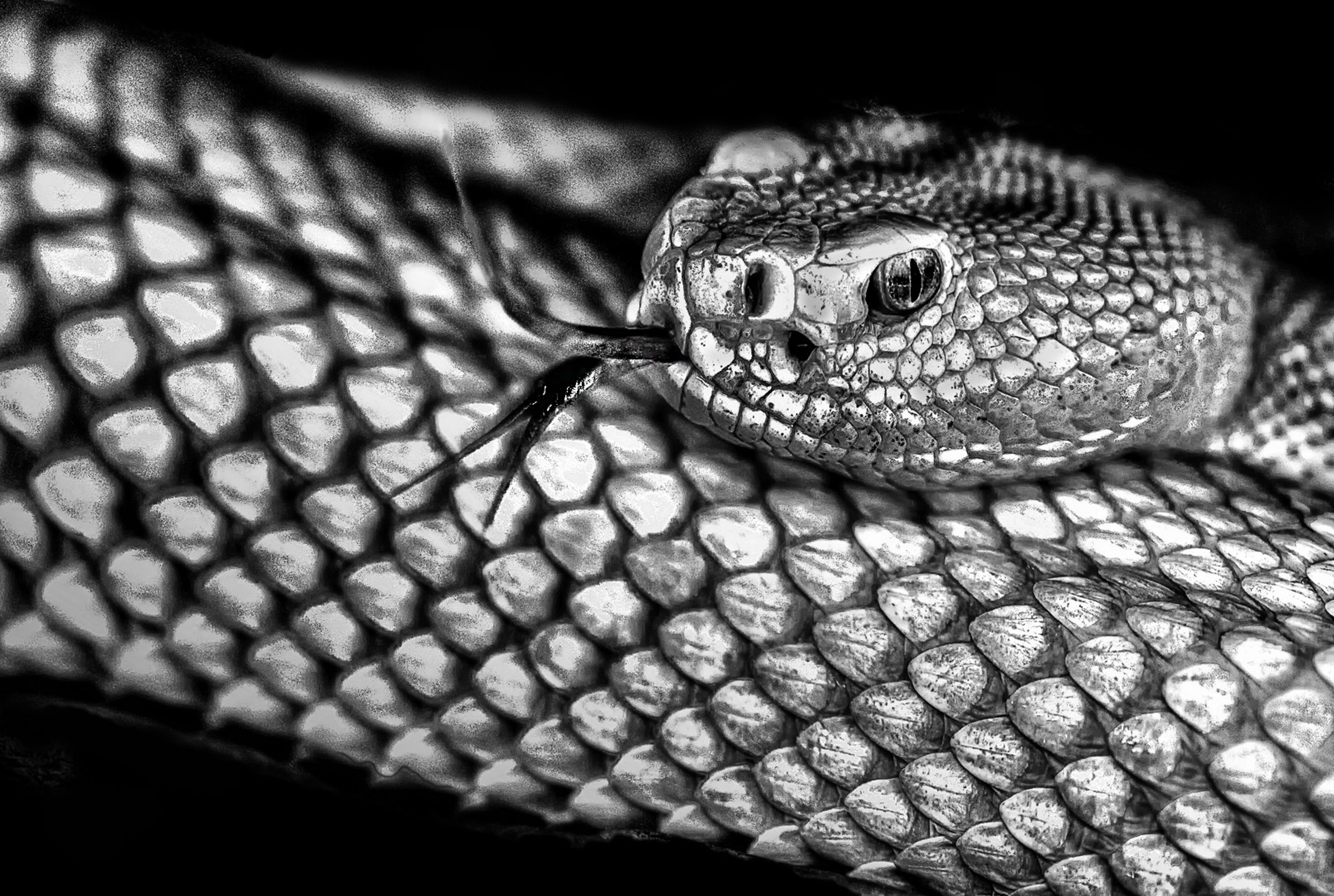
I agree with the comments about leaving some pebbles in the foreground so the snake has a position in space.
JPS |
Apr 26th |
| 83 |
Apr 19 |
Reply |
Peter
Thanks for the suggestion.
I saved your suggestion on a document and will test it out.
JPS |
Apr 26th |
| 83 |
Apr 19 |
Reply |
Tracy
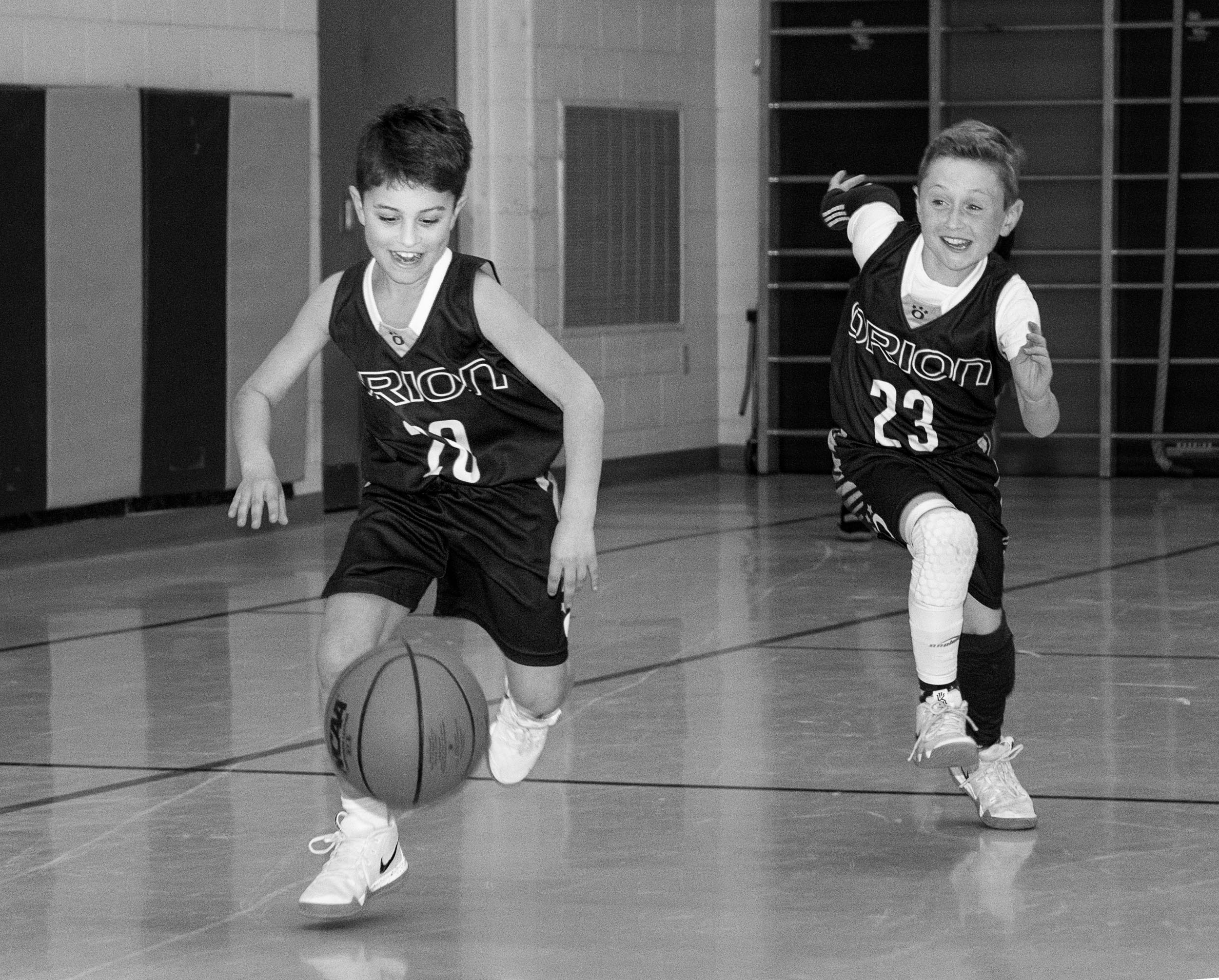
I did try to look at how to handle the DoF issue. On Tuesday, I photographed a basketball practice of 13 year olds. I used manual, f3.2 (to reduce DoF), 1/400 sec. to stop the action, 50 mm (my 50 mm lens is a 1.8 while my 18-300 is a 3.5-6.3), and auto ISO. I did not use a speedlite as in the image of the two boys.
See attached. The 1/400 stops the action. At f 3.2 the coaches in the background are blurred. However, the ISO crept up to 4,000. Jose commented on the noise in my image of the two boys.
If I were to photograph sports photography seriously, I might need a different lens.
On Tuesday, I was also testing out the theory, could photographers of old (1920s) with their view cameras and tripods, capture instant vision. I wish I could meet one of the photographers from the early 20th century and ask them how they managed.
JPS
|
Apr 26th |
| 83 |
Apr 19 |
Reply |
Jose
Please look at my comment under Jane's response. I did look at the DoF issue. It is work in progress.
JPS |
Apr 26th |
| 83 |
Apr 19 |
Comment |
Jane
Good observation about the switch behind the ear. I did not notice it.
I am uncertain in this kind of image which is documentary, what I am allowed to remove. With straight photography (i.e. documentary and photojournalism), one is not suppose to tamper with the image.
On Tuesday, I photographed a basketball practice of 13 years olds. I used a 50 mm lens,1/400 sec, 3.2 and auto ISO. I was surprised that 1/400 sec. stopped the action with no blur, and the DoF was still sharp. However, the ISO crept up to 2,800 to 5,600 because of the light in the room.
Next time I will experiment with reducing my aperture even further to see if I can blur out the background, reduce the noise, but still have sufficient DoF.
|
Apr 26th |
| 83 |
Apr 19 |
Comment |
Jose
When I saw Tracy's comment, I specifically asked about the rim lighting. I have tried that technique once at a friend's and was amazed at what a beautiful effect rim lighting creates. |
Apr 18th |
| 83 |
Apr 19 |
Reply |
Jose
It is amazing what one sees when using an image for competition and making a print. I used the image I submitted this month for competition. I first printed a 4x6 test print and the exposure etc seemed alright. When I had it printed 12 x 18, I saw the darker exposure on the figures of the boy on camera left and the left arm of the boy on camera right was underexposed. I had created this problem through my editing when I used a masked exposure adjustment layer. So far, no one has noticed/commented this on my image.
I find skin touch up for highlights so difficult and use a variety of techniques: clone, spot healing, patch, and dodge and burn. |
Apr 18th |
| 83 |
Apr 19 |
Reply |
Peter
Is there an alternative in PS for what you do in Topaz? |
Apr 15th |
| 83 |
Apr 19 |
Reply |
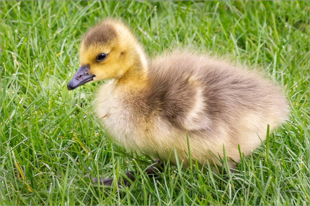
Peter and Tracy
Look very carefully at the foreground and then tell me what you think. I originally felt the foreground should be cropped a bit. When I started to do it, I noticed the birds legs would be cropped off so I left it in. That meant I painted on black on the legs to show them up more. In Jane's version, the legs were deceiving and looked like grass.
JPS |
Apr 15th |
| 83 |
Apr 19 |
Comment |
Jose
Were those white lines rim lighting?
JPS |
Apr 13th |
| 83 |
Apr 19 |
Comment |
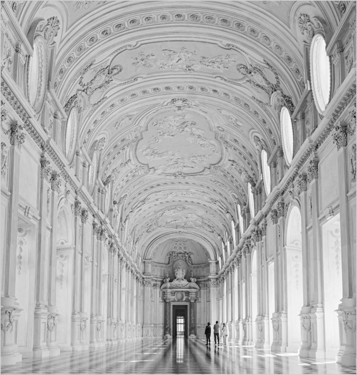
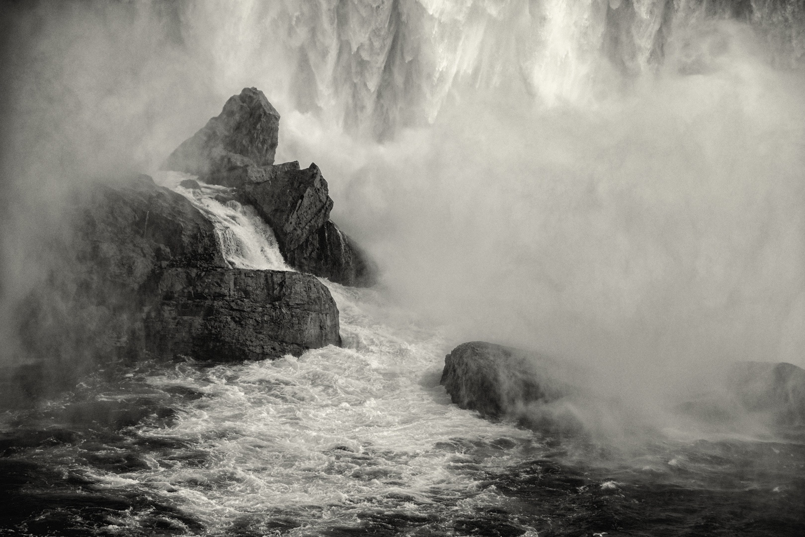
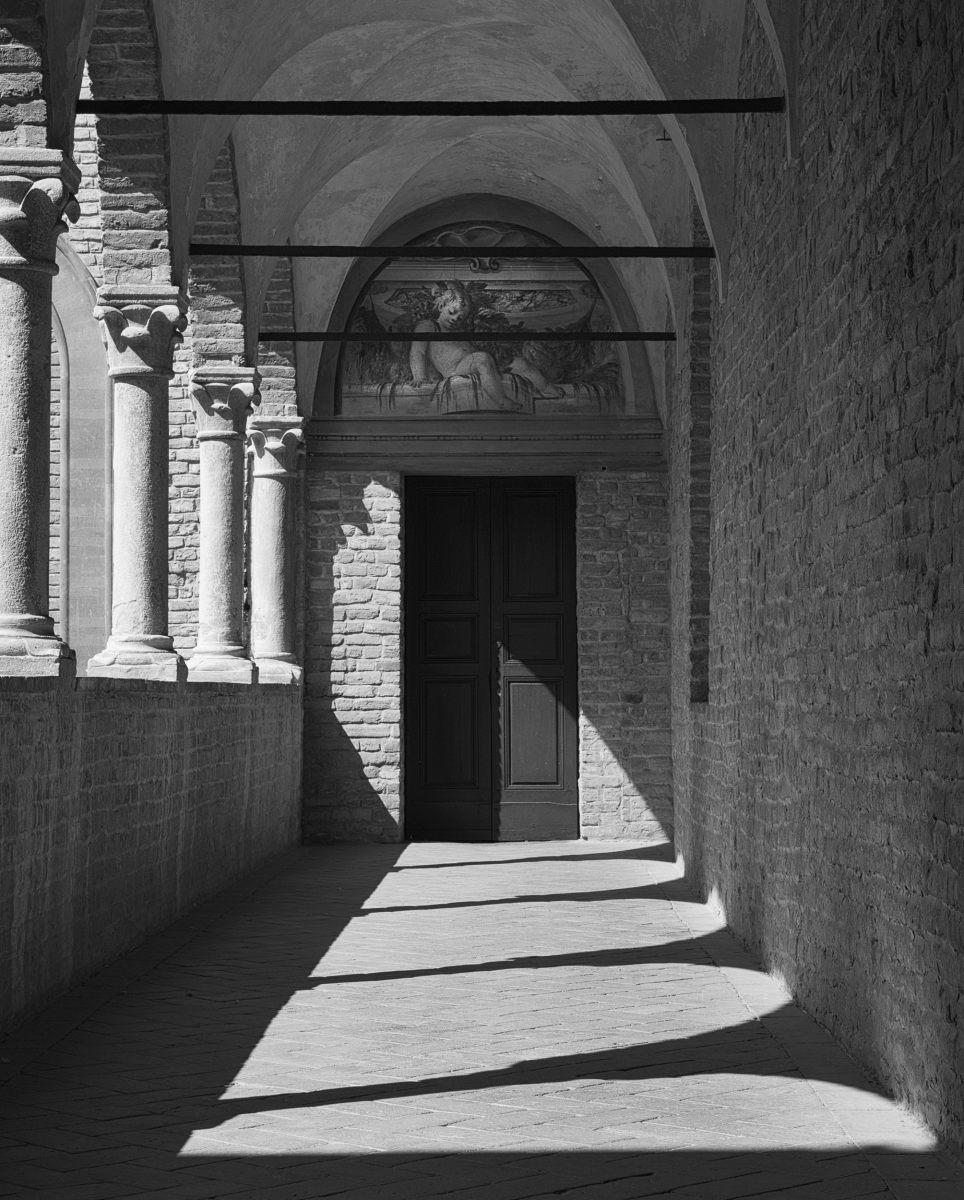
Peter
This image is amazing. I love the panorama and your technique and how the white lines delineate the subject.
Could you explain your technique or is that a secret.
At first I thought the image was replicating a negative and then printed to reverse the image so that the whites are white and blacks black.
Could you provide us with a copy of the original version. I could not copy your image from dropbox because it said there was file protection.
JPS
|
Apr 10th |
| 83 |
Apr 19 |
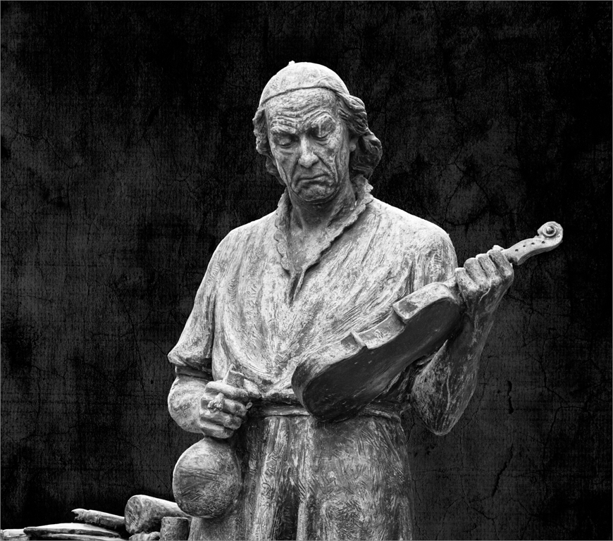
Comment |
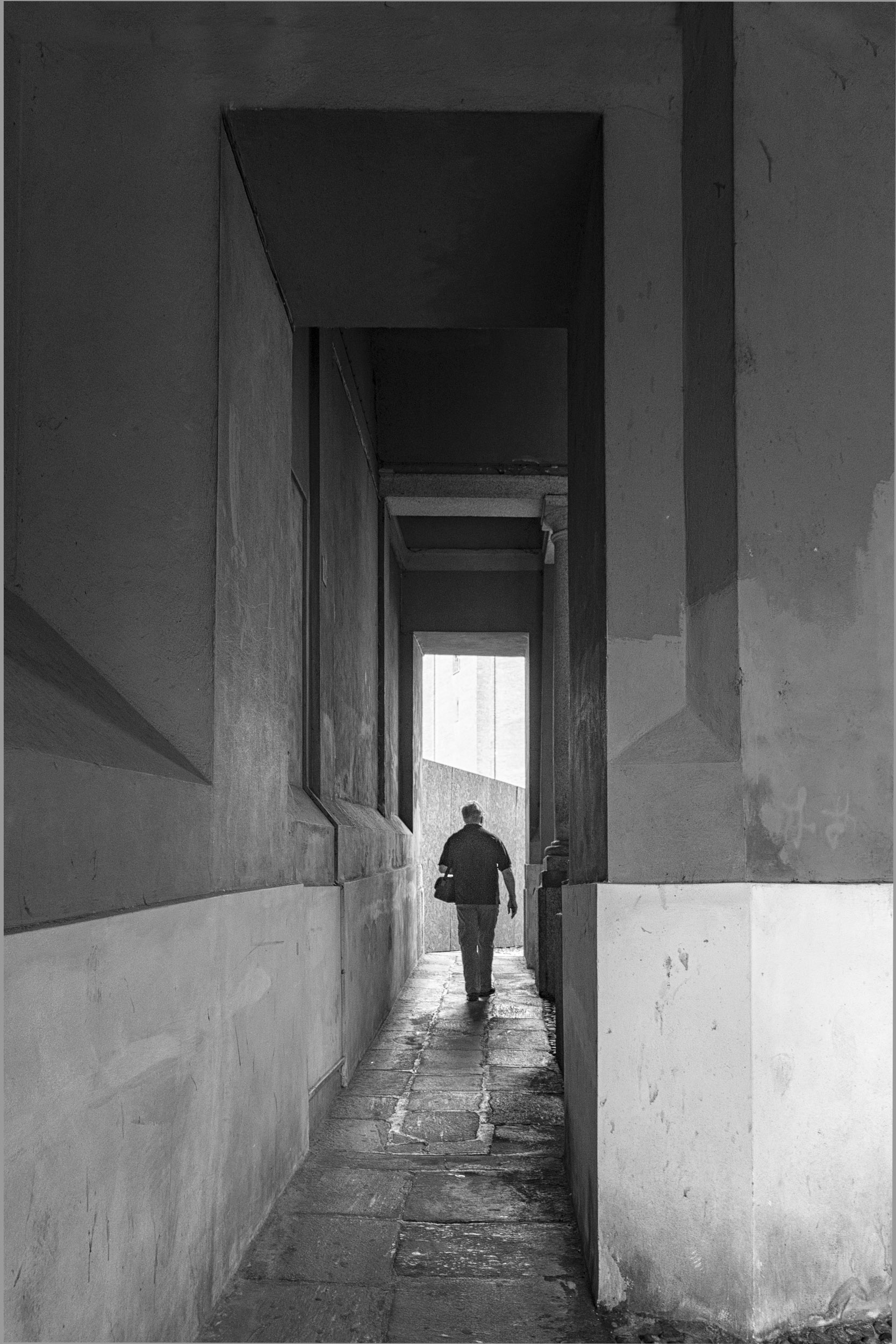
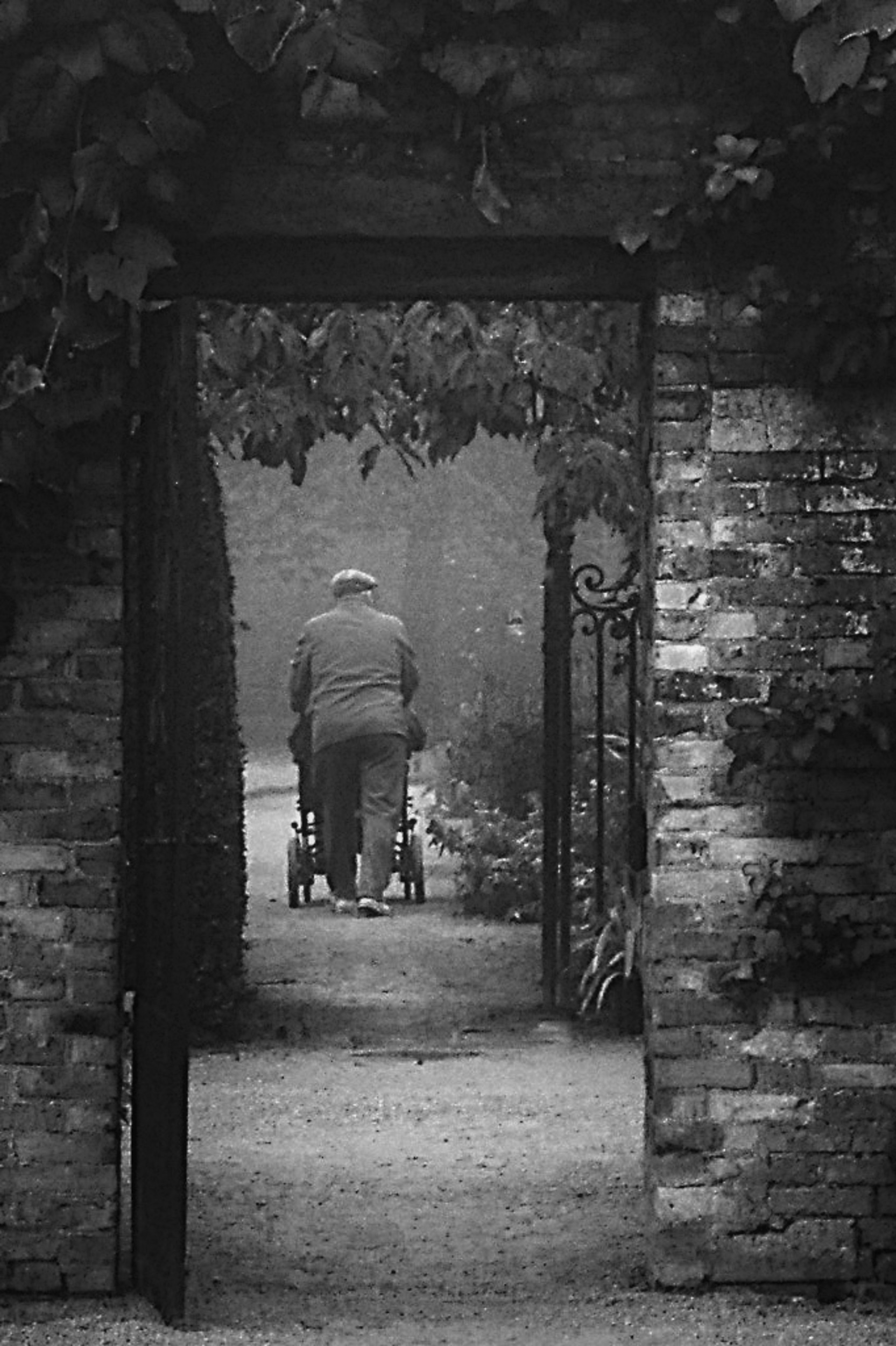
Charles
This is a very touching compassionate image.
I applied a couple of curves with linear contrast to increase the contrast in the image and painted out some leaves that drew attention. Then, I sharpened the image in PS with a vivid light bend mode and for me, it made the image pop. However, you may prefer the softer tonalities.
Using the paint brush, I dodged the path leading up to the man so the eye moves in that direction. You might want to tone down the lighter areas on the wall on the right if you find it distracting.
Take what you like from these suggestions.
JPS
|
Apr 10th |
 |
| 83 |
Apr 19 |
Reply |
Tracy
Thanks for the suggestion. I have one more chance to take the team picture for a boy's basketball league. The coaches have been kind and let me take some action shots.
|
Apr 9th |
| 83 |
Apr 19 |
Reply |
Tracy
What a wonderful idea using the reflector. I will try it sometime.
It was interesting looking at your image to see how different contrast levels change the mood of the image.
|
Apr 8th |
| 83 |
Apr 19 |
Comment |
Dirk
You were brave too wait for so long but it paid off to take this image.
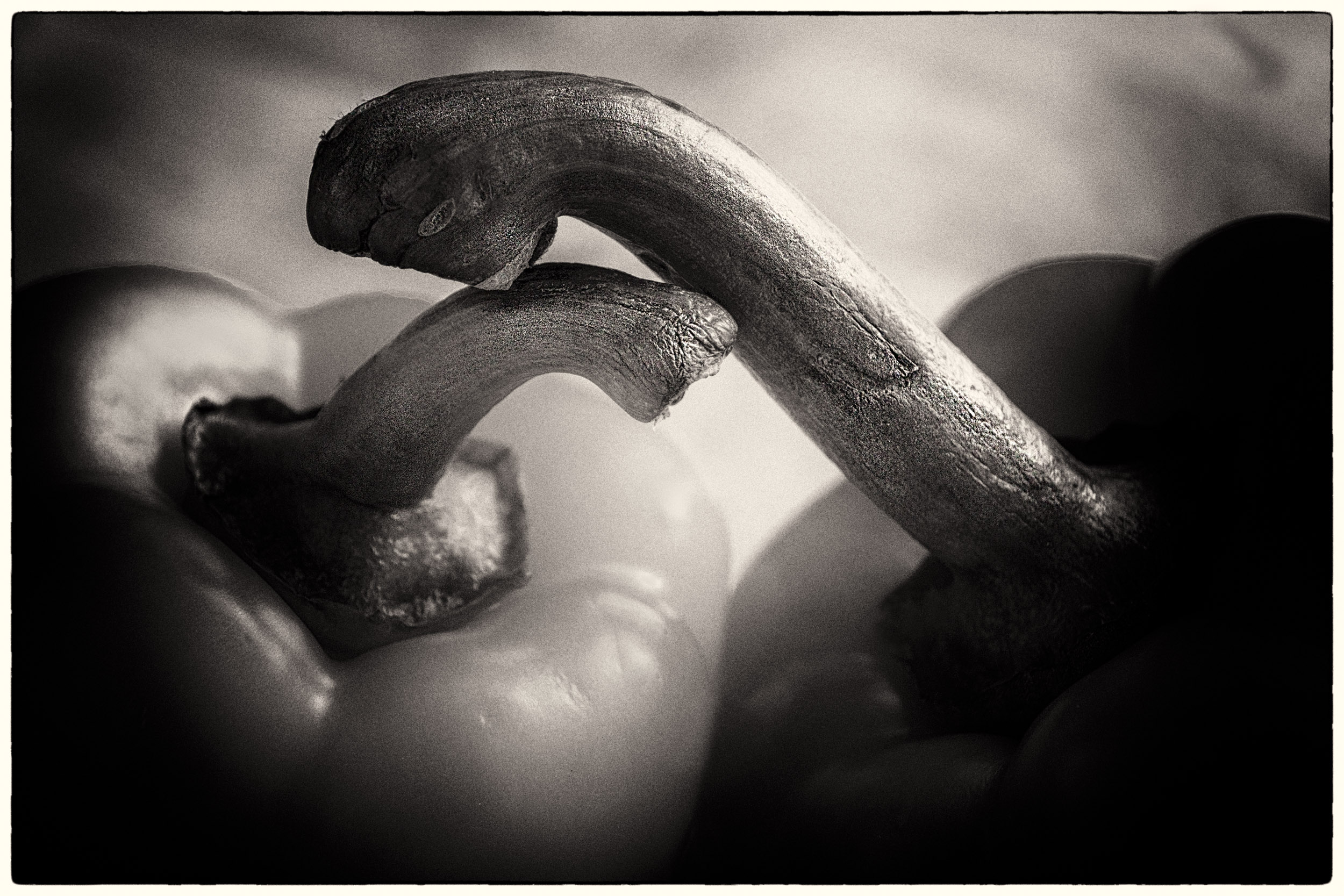
I made some changes you may wish to consider. I found the snakes setting a little distracting because of the pattern in the snake and background. Therefore, I selected the snake, created a masked exposure adjustment layer and darkened the background. Then I selectively burned areas with the brush around the snake to blend the background and snake. There seemed to be a harsh line around the top of snake close to the head and I was not sure if that was shadow. I was not sure whether that was an eye on the left side of the snake's head. To make the fangs more prominent, I burned them slightly. When I took the image back into LR, I noticed that the blinkies on the highlight warning indicator and they appeared around the head area. Therefore I brushed on reduced highlights to remove them.
I am interested in what others think about changing the background to completely black to amplify the contrast and simplify the image. |
Apr 6th |
 |
| 83 |
Apr 19 |
Comment |
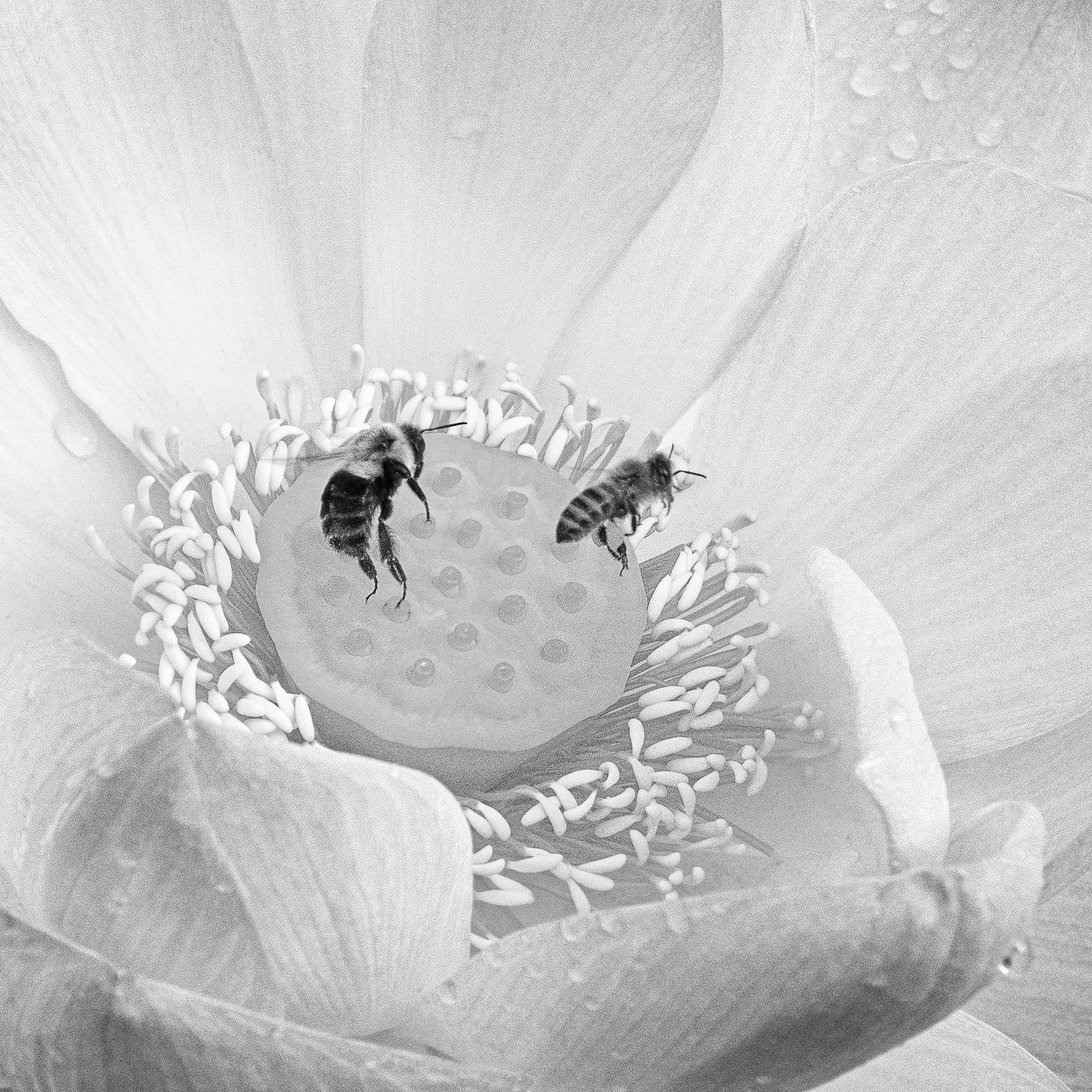
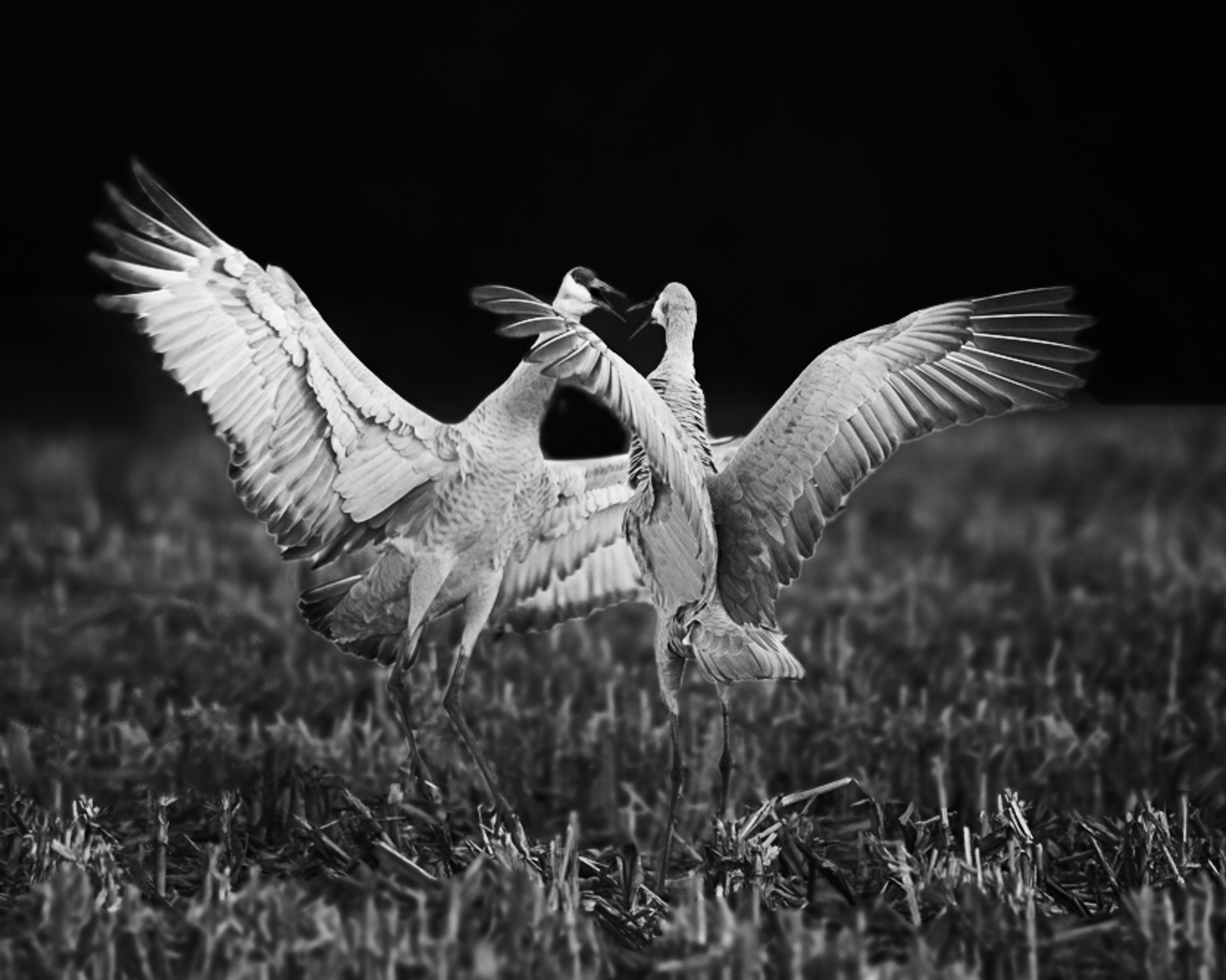
Jane
You captured a wonderful image of birds doing a love dance, a reminder of spring.
Here are some suggestions. Increase the overall exposure. This will automatically show the birds heads off against the background. Then in PS, apply an exposure adjustment layer with a mask and reduce the exposure on the sky. This increses the contrast between the birds heads, beaks and background. I then burned the grass with the paint brush tool at reduced opacity and applied a curves adjustment. I cropped tighter to bring focus on the birds. To me, the grass in the foreground seemed slightly distracting and there were some light spots sticking out, so I burned them with the brush. I next applied a curve layer. I found I had to burn out the centre part between the two birds. Also, I noticed that there legs were not showing. So I burned the legs to bring them out, then dodged the area around the legs so the legs stood out. After that I applied a light centre dark exterior color efex filter placing it between the beaks of the two birds. Then I sharpened with high pass, hard light blend mode, but masked out the sharpening from the grassed area. This again increased the constrast in the birds feathers.
Take what you like from these suggestions and experiment. Vin Singh, a monochrome photographer, presented at our club this week. He showed us how he uses the paint brush (black or white with reduced opacity) to dodge and burn selectively on a plain layer. It is like painting but certainly is an effective tool for enhancing an image. Your image was wonderful to practice using this technique.
|
Apr 6th |
 |
| 83 |
Apr 19 |
Comment |
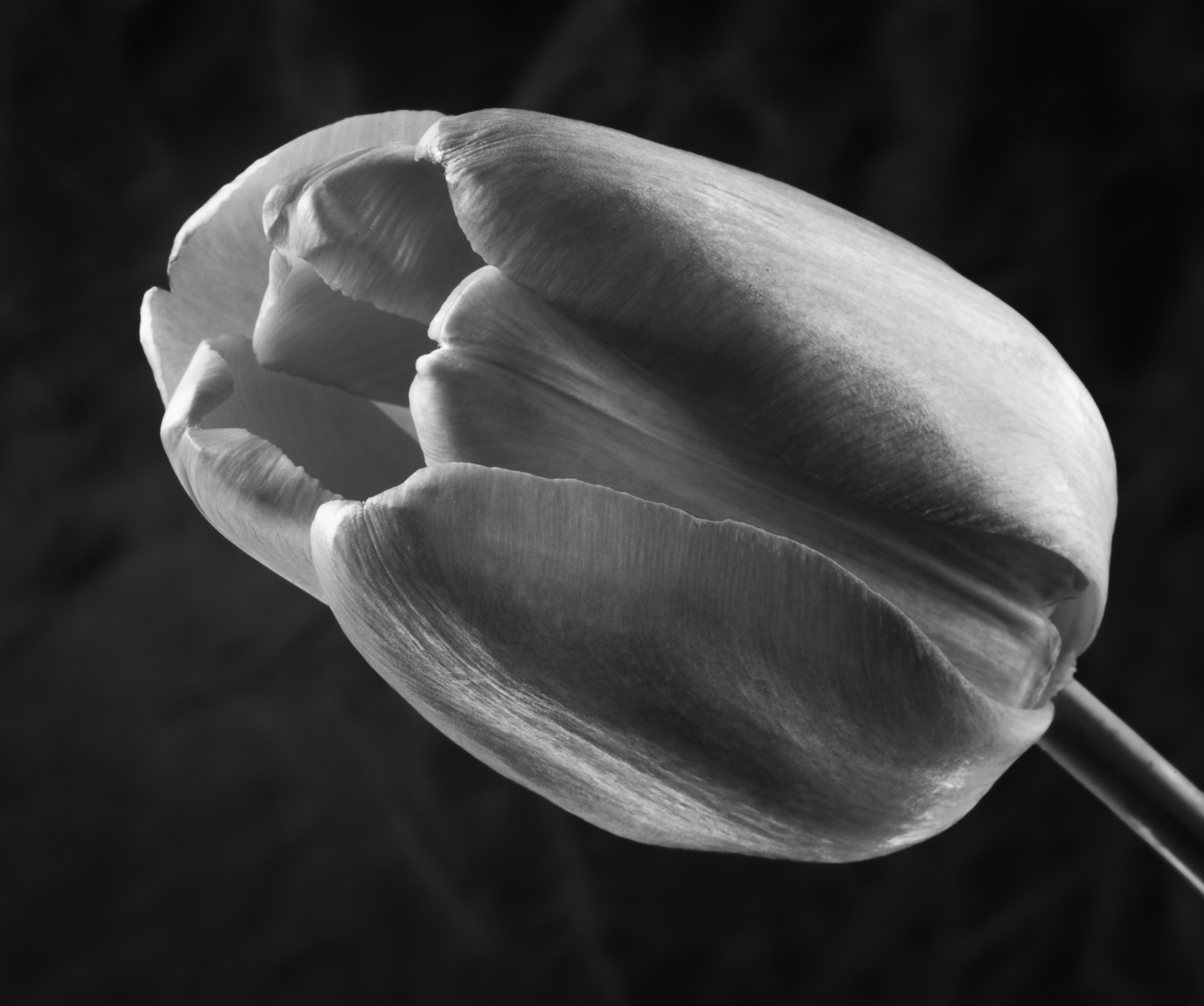
Tracy
This is such a beautiful delicate image of spring with beautiful lighting.
I looked at another option creating greater contrast between the tulip and background. This still retains the feel of the grass but reduces the delicate mood of your image.
In PS, I selected the tulip, applied a mask, and reduced exposure in the grass to create greater contrast. I also applied a curve with linear contrast but painted out the delicatly lighted area on the back top of the tulip as well as the rim of the tulip. To bring the eye slightly more into the centre of the tulip, I painted white reduced opacity close to the flower entrance. Then I used a Color Efex light centre dark exterior, putting the centre point close to the edge of the front tulip.
I started experimenting using the paint brush on a separate layer and selectively dodge (white) or burn (black) with reduced opacity to subtely tweak parts of an image.
|
Apr 6th |
 |
| 83 |
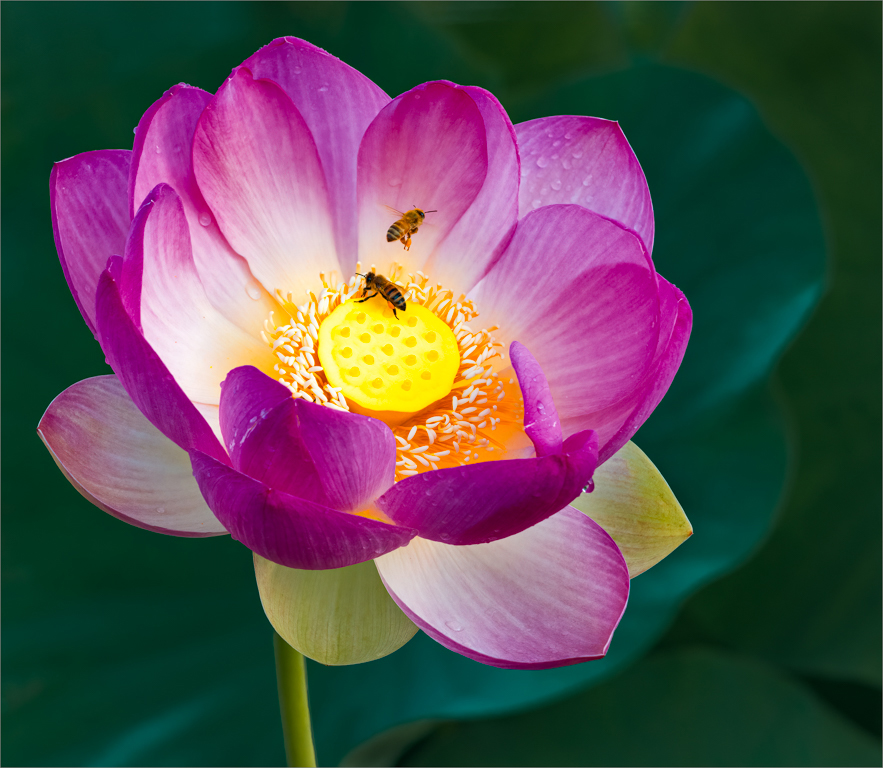
Apr 19 |
Comment |
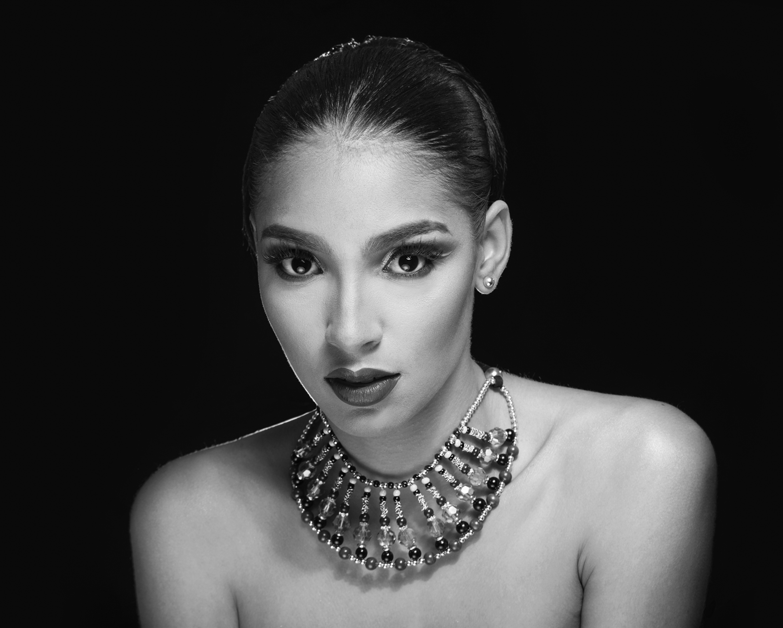
Jose
This lady certainly is a beauty and your lighting enhances her image, especially the rim lighting.
My suggestions are minute details. You may wish to consider a different crop if you are not constrained by a traditional crop.
There is a difference in how you have treated the lines under the eyes. On camera right, the lines under the eyes are slightly more pronounced. I used the clone tool, at reduced opacity and applied it to the lines under the right eye.
On the nose -middle bottom tip, the highlight is slightly noticeable but not blown out. I used the paint brush, white, opacity?, to just slightly tone down the white.
On the camera right chin, just below the lips, I can see a lighter patch where you may have cloned to reduce a highlight. I tried to clone with reduced opacity the skin to more carefully match the area around it but did a poor job. Perhaps with a raw file you will be more successful.
Portrait touch up is so tricky. Sometimes it just takes another set of eyes to see miniscule things.
|
Apr 6th |
 |
11 comments - 9 replies for Group 83
|
11 comments - 9 replies Total
|