|
| Group |
Round |
C/R |
Comment |
Date |
Image |
| 83 |
Mar 19 |
Reply |
Dirk
See my general comment to everyone. |
Mar 16th |
| 83 |
Mar 19 |
Reply |
Tracy
See my general comment to everyone. |
Mar 16th |
| 83 |
Mar 19 |
Reply |
Jose, Peter, Dirk and Tracy
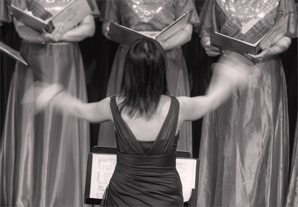
Thanks everyone for your comments. I will stay with the darker version and darken the area that my husband is walking toward. That darker version was the one I did two months ago when I was learning how to use the color efex detail enhance and tonal contrast filters, and also selectively apply curved masked layers.
For the lighter version, I experimented with using a hue/saturation adjustment layer, to bring up the colors (you can see that from the color image), and then I just used a PS monochrome adjustment layer.
This exercise, taught me that I really have to look at intent and the mood I am trying to create when choosing an editing approach. This lesson was also very clear when we looked at Tracy's image. In that case, when I edited her image, applying perhaps too much detail enhancement to the building, I changed the mood of her image. However, it worked for the sky.
|
Mar 16th |
| 83 |
Mar 19 |
Reply |
Graham
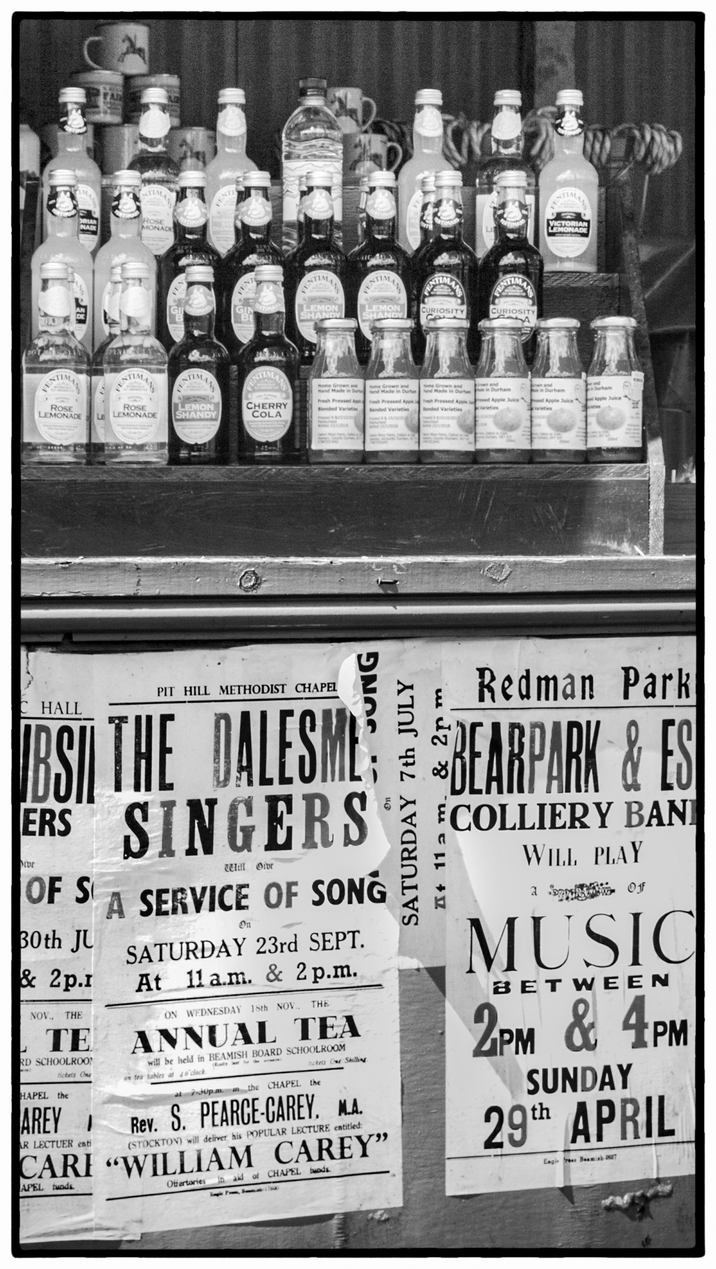
Your subject lends itself well to monochrome, with good shapes, light and shadow. After Tracy's comments, I looked at your image again wondering why I kept looking at the bottom of the image rather than the whole image when the subject was the bottles. I believe it is because of the lighting. The lighting draws my attention to the lower part of the image and I focus on reading the signs and not looking at the bottles. Therefore, I suggested a crop that would draw attention to the bottles.
Would you consider adding more exposure to the top part of the image to balance the lighting? In LR, used a graduated filter increasing exposure on the top part of the bottles without creating blown out highlights. Then in PS, I applied a curves linear contrast adjustment to the whole image. Finally, I added a border from Silver Efex to create an old world look.
|
Mar 14th |
 |
| 83 |
Mar 19 |
Reply |
Graham
Your subject lends itself well to monochrome, with good shapes, light and shadow. After Tracy's comments, I looked at your image again wondering why I kept looking at the bottom of the image rather than the whole image when the subject was the bottles. I believe it is because of the lighting. The lighting draws my attention to the lower part of the image and I focus on reading the signs and not looking at the bottles. Therefore, I suggested a crop that would draw attention to the bottles.
Would you consider adding more exposure to the top part of the image to balance the lighting? In LR, used a graduated filter increasing exposure on the top part of the bottles without creating blown out highlights. Then in PS, I applied a curves linear contrast adjustment to the whole image. Finally, I added a border from Silver Efex to create an old world look.
|
Mar 14th |
 |
| 83 |
Mar 19 |
Reply |
Peter
Do you prefer using aurora for HDR situations?
|
Mar 13th |
| 83 |
Mar 19 |
Comment |
Charles
I find that the bottom part of your image distracts my attention from the subject bottles. Therefore, another option is to focus just on the bottles.
As a suggestion, I cropped the lower part of the image, and using Nik Silver Efex, reduced the highlights (brightness), added burned edges to suit, and applied an old style frame. I am not sure if you have Nik Silver Efex. These modifications still keep the historical look you are after.
JPS
|
Mar 11th |
 |
| 83 |
Mar 19 |
Comment |
Jane
In this version, I did not use the CEP tonal contrast filter and brightened only the building (masked brightness +2/contrast adjustment layer). |
Mar 11th |
 |
| 83 |
Mar 19 |
Comment |
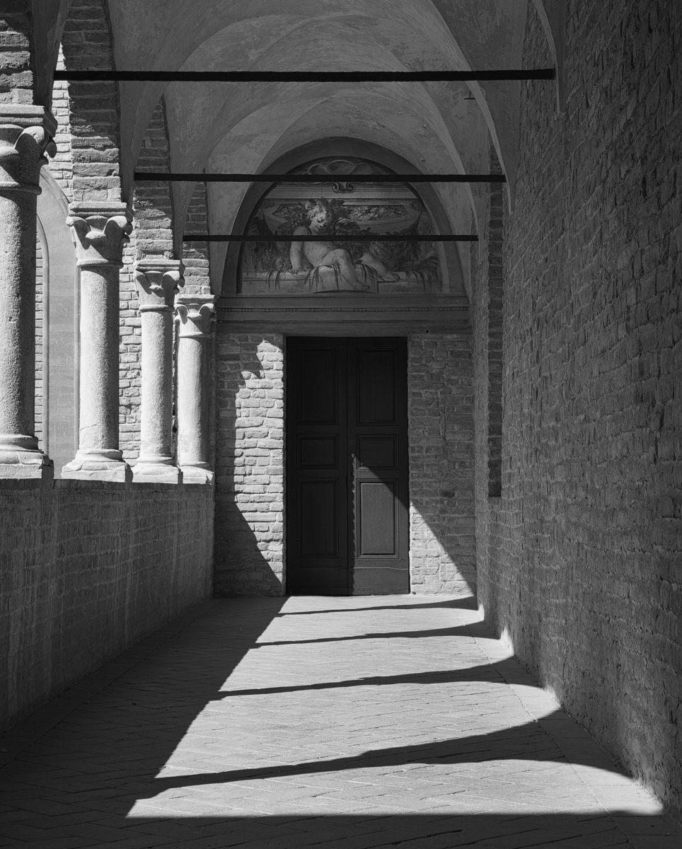
Jane
I have given you two options to consider. I was not sure if your intention was to have the church tilt and have the image underexposed for mood. First, I increased the exposure in LR and did other global edits including reducing contrast. Then I straightened it in PS under edit>transform>perspective (20 degrees both top and bottom), and cropped residual. Then I brightened the image (+2), then created two masked curves adjustment layers, one for the sky, the other the building and used a custom contrast on the building and darker contrast on the sky. Then I merged, created a smart filter, took the image into Color Effex and used the light centre/dark exterior filter placing the point on the door. In one version, I added the tonal contrast filter. When I took the image back into PS, I burned out some white masses in the sky because the sky was blotchy looking. The second edit, I did not apply the CEP contrast filter to show the softer look. I also, dodged the people in the doorway to make them look more prominent. In both images I sharpened (2.0) with high pass. This brings out more detail in the sky and building.
See if this is the type of look you are after. I will attach each file separately.
|
Mar 11th |
 |
| 83 |
Mar 19 |
Comment |
Tracy
As usual you write so beautifully and give us the important message. We as artist photographers in the end decide what and how we wish to communicate and must be thoughtful. Our group comments have a ripple and spin off effect where we can all benefit.
I found this week, in looking at how to use new tools such as the color efex detail enhance filter, it is easy to swing too far in one direction and change the meaning and interpretation of an image. However, that is part of the learning process and how we grow.
This week I photographed an old dog with cataracts who had just come from the groomer and was wearing a beautiful ribbon around his neck. His owner, whom I do not know, supported himself on a walker while I took the image. He was was so proud of his "best friend". For my first edit, I applied too much detail enhancement and the old dog just ended up looking that...old, not beautiful. I backed off with the detail enhancement filter and the result was an image of a beautiful faithful companion.
Peter's comment about how editing style changes mood was very helpful in making me realize why I was not happy with my original edit of the dog image. |
Mar 9th |
| 83 |
Mar 19 |
Comment |
Peter
I am still having difficulty understanding when is not enough and when is too much contrast/detail. When I redid my image this month, I reduced the texture etc.
I find it useful when members rework an image, to see options and get feedback. |
Mar 7th |
| 83 |
Mar 19 |
Comment |
Tracy
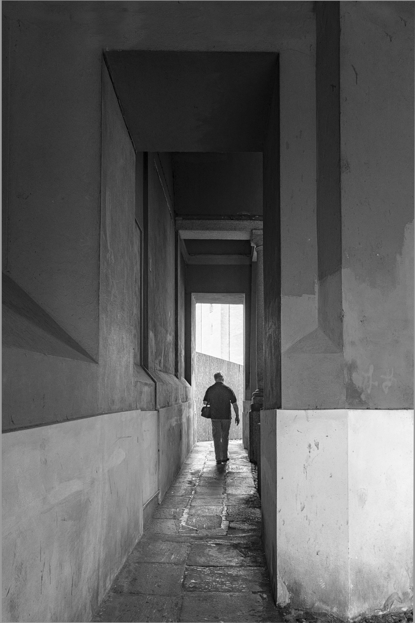
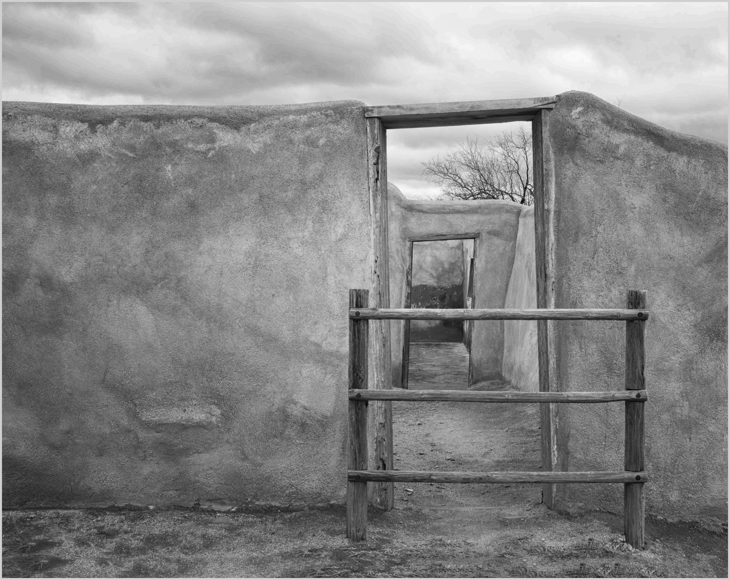
I find doors are intriguing, and especially this one with two doors to walk through.
I looked at the comments and did some edits for you to consider focusing on walking through the doors and drawing ones eye to the back of the second door.
Like Peter, I used PS content aware crop and added space at the bottom of the image, kept the same crop ratio, so the result was removing some sky. Then, I did a selection on the sky, created a masked brightness contrast adjustment layer, and reduced the contrast in the sky. This increased the details of the sky. (That was Peter's gem from our Feb. group for increasing detail in the sky). After that, I took the image into Color Effex Pro, and used detail enhance to create more texture in the sky and building. I used control points on the grass so they would not get more detail. Then I used the Color Effex Pro, light centre/dark exterior to place the bright spot on the doors so that your eye goes toward the doors and the wall exterior and sky become darker. I also applied a curves layer to the whole image, and a second one just to the far wall at the end of the second door. After that, in PS, I used the dodge tool (, and gently added a trail from the door entrance to the back so that one's eye keeps moving through the doors.
You may find these edits move away from your original intention.
You can probably create a similar effect using some LR tools. The exception is content aware crop.
|
Mar 4th |
 |
| 83 |
Mar 19 |
Comment |
Tracy and Dirk
Another option I used for the cathedral when the window area was small, is to create a masked exposure adjustment layer, and then alter the exposure in the window only. |
Mar 4th |
| 83 |
Mar 19 |
Comment |
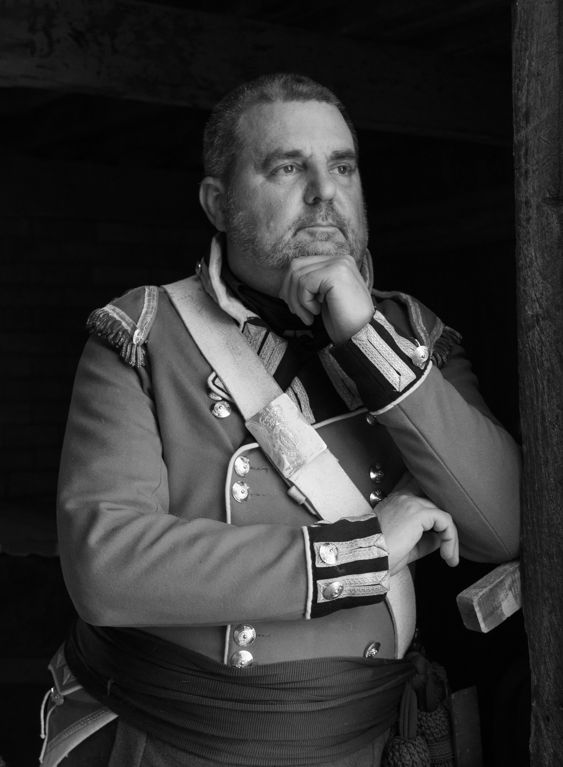
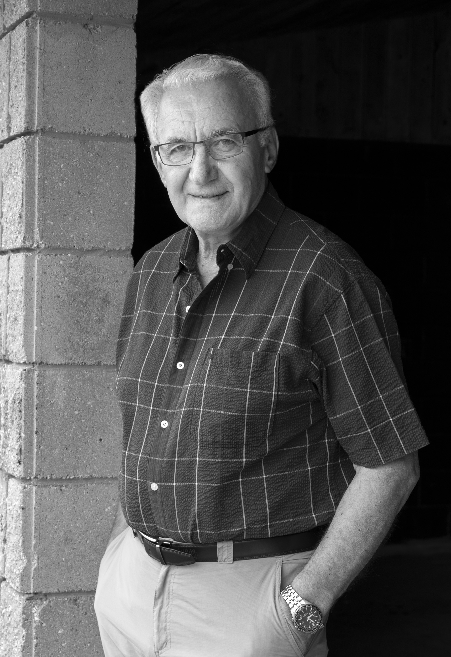
Jose
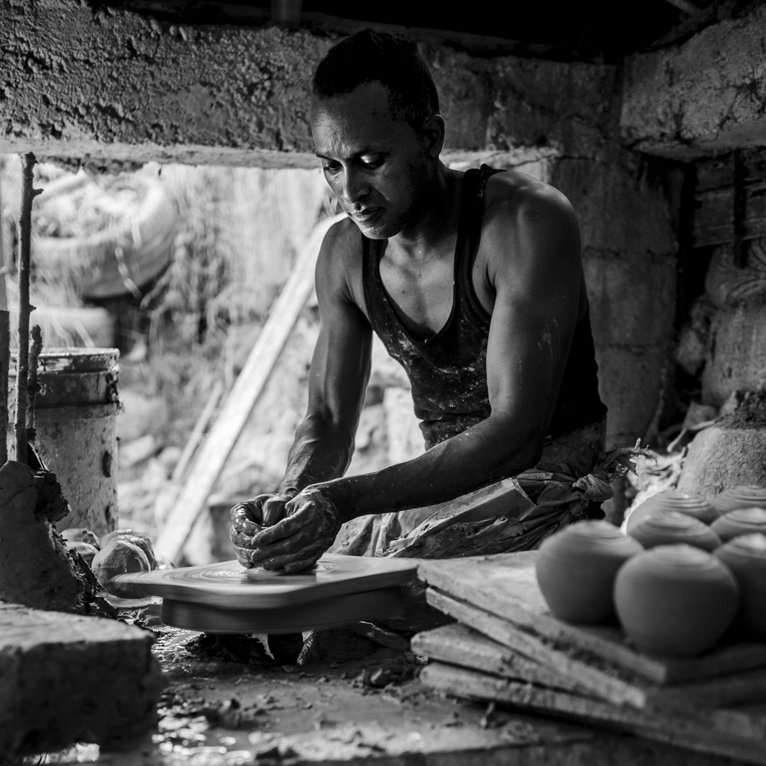
I do not know what happened to my comment from Saturday. Attached is the crop I did Saturday.
My comment was: I found this a beautiful environmental portrait. The light coming from the back beautiful highlights the man's body, arms and brings one's attention to his hands, the focal point of the story. My attention stopped there. At first I did not understand the middle part, then I saw the man's feet. This added another dimension making it an environmental photo.
I also, increased the exposure on the man's face and removed a small highlight just behind the top part of the head. I also though dampening the highlight/tone on the slanting white object behind the man, being careful that it would not blend into the background might be worth considering. Are we moving from the realm of photography to artists and painters?
My suggested crop, moves the image from an environmental to more a portrait. I think either could work, depending on how you wished to tell the story.
|
Mar 4th |
 |
| 83 |
Mar 19 |
Comment |
Dirk
I like the way that you took out the reflection from the window on the wall. It removes the distraction and does not distort reality because it is just a reflection.
I noticed that you kept your darker version. On the version I inserted with my comment, I actually increased the exposure .33 EVs but found this reduced the entire tonal range. Peter in his comment, changed the contrast which slightly lightened the image, but still retained the beautiful highlights in the chair.
Is this worth trying to give the message of entering a place of light ....(I am too poetic)?
You said the church is only open at a certain time. Perhaps you could ask them if you could go in and redo the picture at an earlier time when you do not have the sun shining in and offer to give them a copy of the picture for their website. I have done this for our St. Peter's Cathedral in London and even taken in members of our camera club to photograph. It is amazing how offering to provide images opens the doors especially when they see such a beautiful image. |
Mar 4th |
| 83 |
Mar 19 |
Comment |
Peter
I appreciate that you are detailed in your description of the edit you did. It helps me to replicate the look and learn something new. I looked at your instructions and will replicate it. |
Mar 4th |
| 83 |
Mar 19 |
Comment |
Peter
For me, this is a good example of where color or monochrome both work. With the monochrome, I do not focus on the sky but the whole scene. With the color, my attention goes to the sky. |
Mar 2nd |
| 83 |
Mar 19 |
Comment |
Peter
When you say white portion, are you referring to the part over my husband's head, the part at his feet (sidewalk) or all of that area? |
Mar 2nd |
| 83 |
Mar 19 |
Reply |
Peter
I think your first image is much better in color and the water is realistic. This is a point which is important for us to ask with each image.
With your second image, the story is the skyline and the clouds. I think, I would just give it a little bit more water on the bottom, even if you use content-aware crop fill to show the water front.
I like the composition with the verticals and the skyscraper predominating and the white cloud line crossing at an angle.
Since just Jose and I have commented on your other image, and it is just the start of the month can you ask Jane to post this for your March image? Also, would you provide the color image for this. Alternatively, the group could comment on both.
|
Mar 2nd |
| 83 |
Mar 19 |
Comment |
Dirk
This is a magnificent candle holder and I like the perspective.
Would you consider cropping a little tighter on the left to remove the line, and on the right to remove the stained glass window. I also found the highlights on the wall slightly distracting. At first I thought it was a window and then realized it was light cast from a window probably on the opposite side.
I learned the hard way when photographing in the cathedral in London to choose an overcast days and late in the afternoon so that I did not have to deal with highlights on arches created from light coming through the window. If this church is close to you, you may consider photographing the same scene when the sun is not bright outside. However, you might not get that same beautiful light on the candle holder or the chairs.
|
Mar 2nd |
 |
| 83 |
Mar 19 |
Comment |
Peter
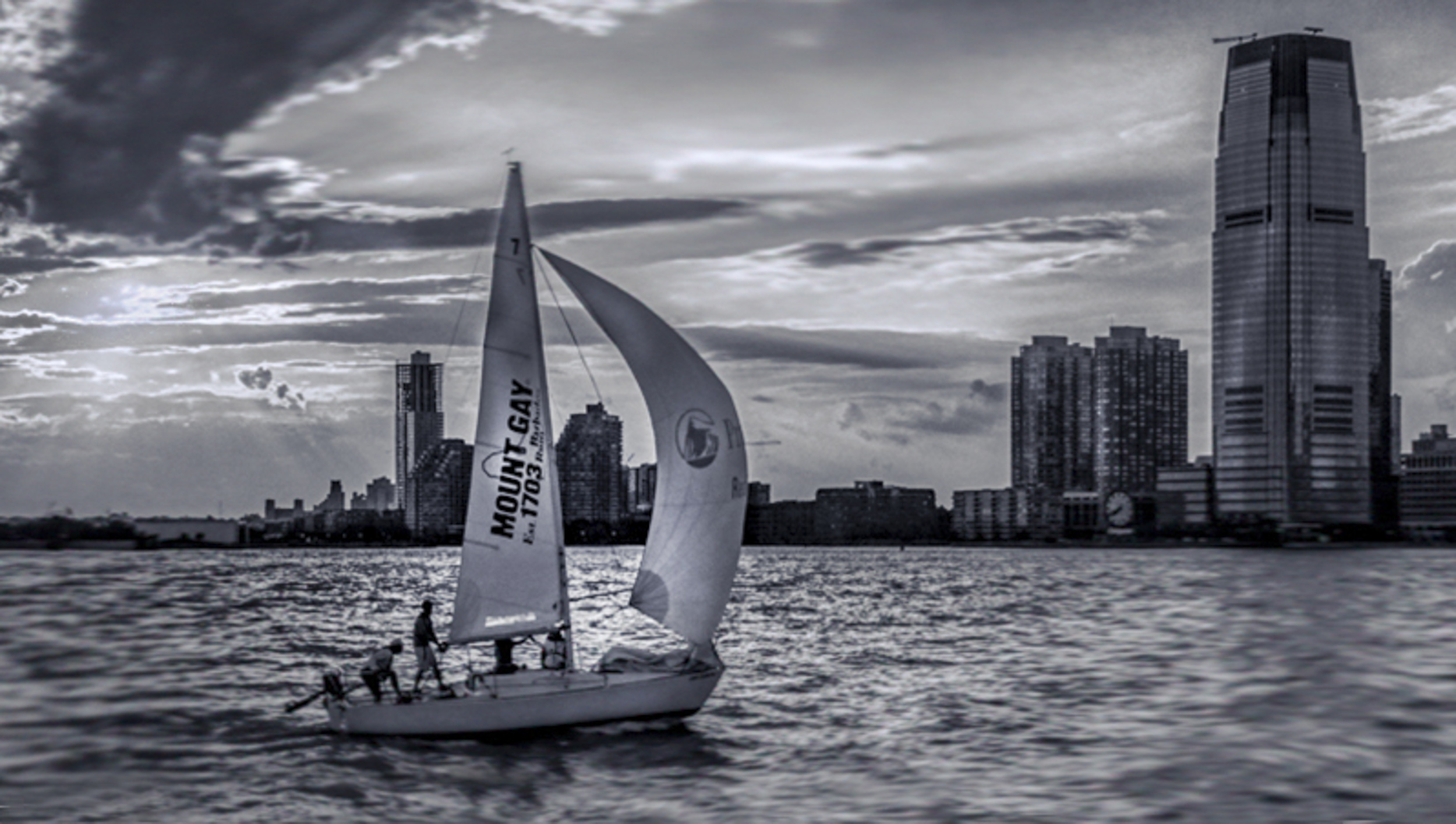
I am looking at this image as a sailor.
For me, my attention is drawn to the skyscraper, not the boat. I feel this image could be simplified.
As a sailor, I look at the water, and do not understand why the wave pattern is sharp around the boat, but blurred behind the boat and completed blurred in front of the boat. Did you blur it?
I can tell that there is a nice wind with the jenny full and would expect to see the water slightly separating as the bow breaks through the water and then a slight wake off the stern, not the blur fore and aft of the boat.
I have provided an alternative crop that gives the boat space to move into, and shows where it has come from. I also added more water to the bottom of the frame. Then I put a radial filter on the sail, to draw attention to the boat and the wind pushing the boat forward. After that, I reduced the highlights in the clouds from the sun. By highlighting the sail, rather than the sky, I felt enhanced the sunlight cruise story.
|
Mar 2nd |
 |
14 comments - 7 replies for Group 83
|
14 comments - 7 replies Total
|