|
| Group |
Round |
C/R |
Comment |
Date |
Image |
| 83 |
Feb 19 |
Reply |
Peter
Based on your method of dealing with skies, I created a mask for the sky, reduced its contrast, using the HSL blue channel, darkened the sky, then I just did one BW layer instead of masking. I also reduced the sky. Then I took it into Col Efex Pro, added the tonal contrast, a bit of detail, and light centre dark exterior. That addressed Charles concern about adding a vignette.
I cannot believe how there are so many ways to process one image. |
Feb 20th |
 |
| 83 |
Feb 19 |
Reply |
Peter
I understand that but what type of layer was it? |
Feb 20th |
| 83 |
Feb 19 |
Reply |
Peter
Can you explain again what you meant by "the detail in the forest...I added a layer". I understand about changing blend modes and opacity on layers. But, I was not sure what type of layer is it you added? |
Feb 20th |
| 83 |
Feb 19 |
Reply |
Charles and Peter
I purposely asked the question about is this image better in color or monochrome to stimulate the conversation. To me, it is a worthwhile question we should all ask for our images.
Until I see the color version, it is difficult to tell.
|
Feb 20th |
| 83 |
Feb 19 |
Reply |
Peter
I also have the Adobe LR/PS $10 per month subscription and have taken full advantage of phoning for help. I do have the free Nik version as well.
I just tried your suggestion to Jane on how to bring out detail in cloud. It does seem counter intuitive but it works beautifully.
|
Feb 20th |
| 83 |
Feb 19 |
Reply |
Jane
I can add keywords to the original file at anytime in LR. One solution is put in the keyword(s), find the image number, then select it. Then you have the file number. Then go to the library, find, put in the file number and all the files with the same number appear i.e. 8116, 8116edit.tiff etc. Select the one you want.
The important thing is to develop keywords that are meaningful, and provide a quick way to sort. |
Feb 18th |
| 83 |
Feb 19 |
Reply |
Jane
My local library has access to Lynda.com for free. This site has videos on how to use the Nik collection. Ben Long on Foundations of Photography Black and White has a section on how to use Nik vs PS. Tim Grey explains the different Nik components i.e. Silver Effex.
In LR, perhaps you might want to consider keywording images and referencing by keyword, or keyword string to select an image to reduce the number of collections. Tim Grey has videos on Lynda.com on how to clean up your mess in LR. I also find Nick Orwig's explanations simple.
I have heard an opposite viewpoint about whether to use LR or PS. Someone advised me to do my basic edits in LR because LR is non-destructive and to use PS for the things LR cannot do. If one does take an image from LR into PS, then one should take it in as a smart object i.e. LR>edit in PS as a smart object. I also read that once the image goes back from PS into LR as a TIFF file, that making modifications on the TIFF file are not as effective as if they were done in PS. Therefore, once I edit in PS, in general, I stop tweeking in LR after sending the file back into LR unless it is an adjustment for printing an image.
The other important thing I learned was that the dodge, burn, saturation tool in PS is much better than the exposure/highlight brush in LR because it provides more options i.e. burn (highlights, shadows, or midtones).
For monochrome, I prefer using the PS dodge,burn tool because I can do it on a separate layer and do not have to backtrack in the LR history to figure out where I did things.
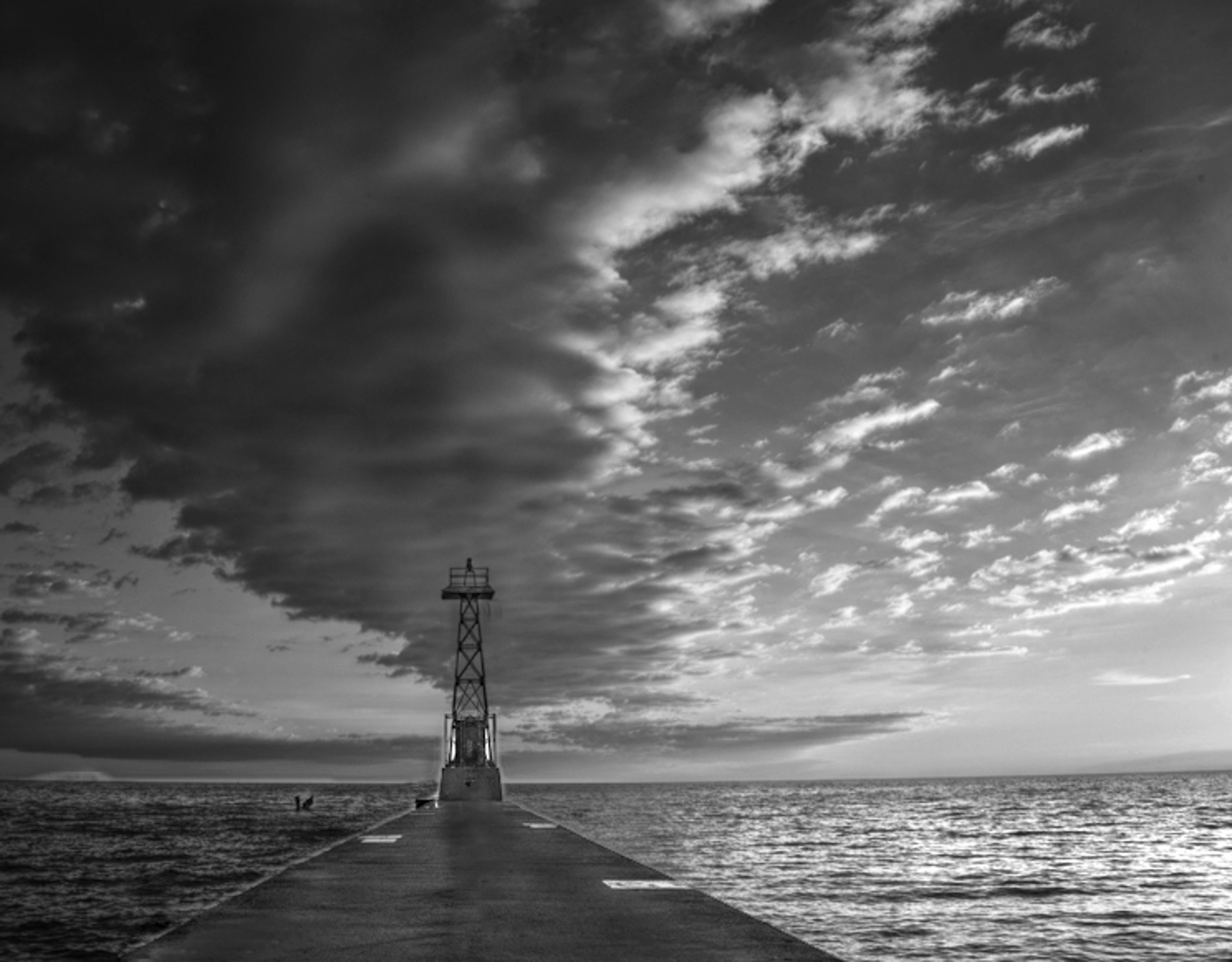
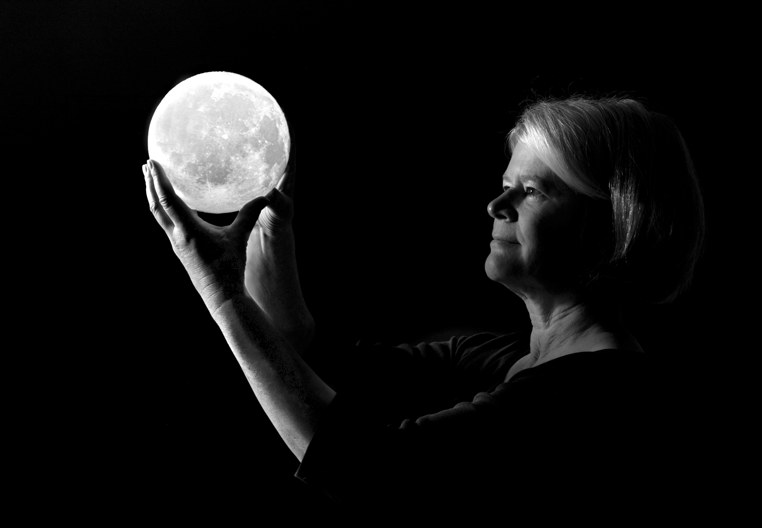
With your light, you are guiding the boaters home. It would flash on and off.
|
Feb 18th |
| 83 |
Feb 19 |
Reply |
Peter
I believe you use Color Efex. If yes, have you used the detail filter? One part of the filter has a saturation slider 20%. Do you use the saturation slider for your monochrome?
|
Feb 18th |
| 83 |
Feb 19 |
Reply |
Jane
I have had to consider what is the best workflow. I start in LR and just do the basic global adjustments i.e. set white and black point, shadows, highlights, and exposure. I do not touch contrast or saturation. Sometimes I move dehaze if I think there will be a major problem with the sky.
To assess whether an image might convert well to monochrome, I use the monochrome option but use edit undo to go back to the color version. I do not use LR's BW color sliders. A camera club member told me that when I use Nik, I can take the image directly from LR to Nik without making any adjustments because I can make the adjustments in Nik. I also read somewhere that it was better to use the PS BW adjustment layer. Given that for this image, I wanted to try using multiple BW adjustment layers with masks, PS was the route of choice.
For my Nik version, I did not use presets. Instead I worked, through the brightness, contrast, structure, sections, then chose a main overall filter, and then worked with the individual color sliders. I did experiment with the film type and noted that this automatically applies a curves adjustment and moves the color sliders. I can go back and readjust them to override. I like with Nik, how I can set control points or choose a frame/style for more character.
My understanding is that the global adjustments in LR or the same as CR. Since I use LR as a library organizational tool, I do global edits in LR. However, it is easy for me to send the image from LR to PS editing as a smart object. Then I can edit in CR, using CR as a filter.
I prefer your symmetrical crop because it creates a more sweeping line. I also like the middle cloud darkened underneath because that is how the cloud appears before the storm.
You added the flashing light on top of the observation tower. Was it there before?
|
Feb 18th |
| 83 |
Feb 19 |
Comment |
Charles
Do you have a color version of your image that includes more of the boat?
Your image really has made me think. It made me realize that I have such tunnel vision when it came to looking at this image. This boat is a wonderful relic and that was your intention with this image.
Realizing this, my question was, "Would this image look better in color than monochrome?"
|
Feb 16th |
| 83 |
Feb 19 |
Comment |
Peter
I really like how the group, and you are discussing not just the technique for the monochrome conversion, but also the artistic thought that went behind the image, how that drove the method of taking the image, and then how that led to your editing style. Our group is really doing well with such mixed talent.
|
Feb 16th |
| 83 |
Feb 19 |
Comment |
Graham
I look at boats differently having owned four sail boats, ranging from 27 to 36 foot and from lake boats to ocean going boats. That also means, providing photos when the boats are for sale (sail). Usually, what people want to see is the majesty of the boat. They image themselves behind the helm braving the water or relaxing on the front taking in the sun.
I think part of the visual distress is wanting to see what the boat really looks like. Usually that means a sweeping side view (horizontal view), a look from behind the cabin facing forward toward the bow, or a look of the helm (steering mechanism).
People also like to look at rigging i.e. masts, lines, stays. In this case the vertical works. However, you have truncated them. Another option, might have been focusing on specific details, i.e. pully and line, or changing to a landscape orientation.
Please do not push me into the water. I doubt this boat has life saving equipment.
|
Feb 15th |
| 83 |
Feb 19 |
Reply |
Stephen
You are correct. The ends should have been whipped. That is the first clue that an amateur did this. Also, the end of the bowline knot is too short. It could easily be dislodged with pulling creating a disaster.
Other non-photography comments, you do not leave an anchor on a deck like that. It hangs off the bow. Thus, I wanted to look at the bow of the boat to see whether it was in equally bad condition, all banged up. Only Graham can tell us the story.
|
Feb 15th |
| 83 |
Feb 19 |
Comment |
Thanks for showing me the original with the lighting.
As I look at images, I am now starting to focus on lighting and how it is used to enhance and create impact.
The reason I asked is that the couple of mushroom images I photographed were taken on a hiking trail with opaque overcast light. To achieve a lighting effect I used a graduated filter. It is wonderful how you were able to rely on nature itself to produce the beautiful lighting.
|
Feb 14th |
| 83 |
Feb 19 |
Reply |
Tracy
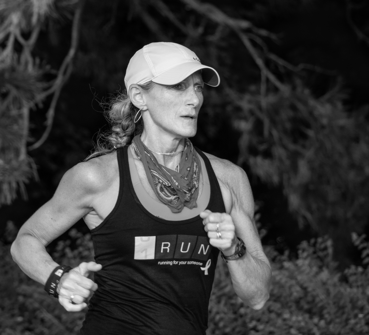
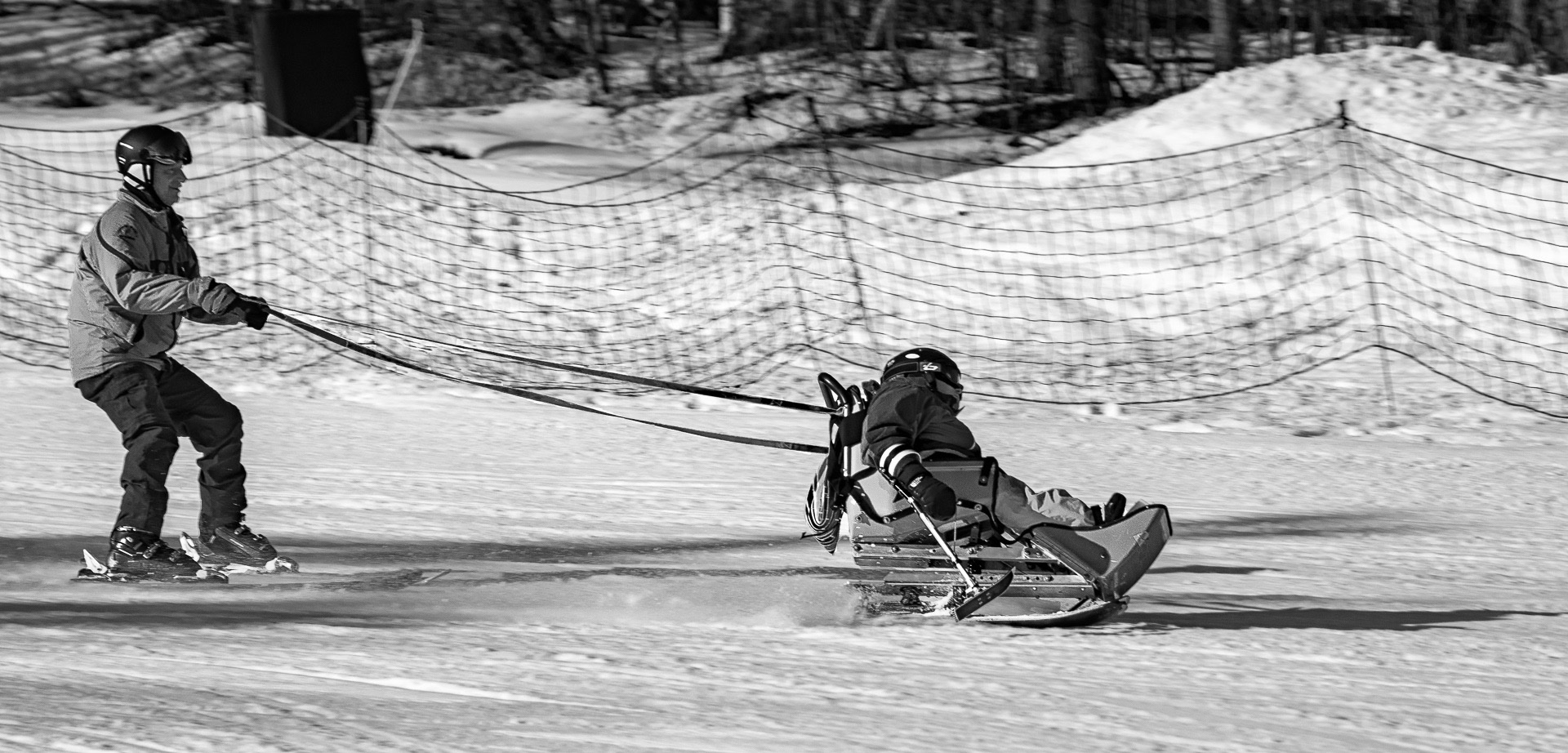
I am glad you will reshoot it since now you know the problem with the arm. Perhaps you need to experiment with the angle of your two hands and how the light falls on your hand and flash. I wondered if it would work if you raised your back arm more to create a separation between your two arms. Also, a top that did not completely blend in with the dark background might help. When I tried to dodge exposure onto your back sleeve, there was absolutely no detail to bring out.
It is such a beautiful image. I am tempted to try doing it and see if I can come up with a solution.
|
Feb 14th |
| 83 |
Feb 19 |
Reply |
Jane
I forgot to attach my version.
In my version, I pretended I was standing on the dock looking out so I removed the post. |
Feb 13th |
 |
| 83 |
Feb 19 |
Reply |
Jane
Your comment on the mushroom being out of focus really made me look at this image again. Someone explained to me that mushroom images can be deceptive. Sometime they look out of focus but are not.
To me, the foreground, first and second mushroom are nicely in focus and you can see texture on the first mushroom. There is also good tonal separation and detail in the foreground.
Jose, as mentioned with the open aperture, has made the background out of focus, which further draws attention on the mushroom. He has also beautifully used light to focus attention on the lower two mushrooms.
What is interesting is his composition with an imaginary diagonal line from the tall to the small mushroom mushroom and both being on a crash point (rule of thirds point) with Tracy's suggested crop.
Jose,
Did you purposely use external lighting on the mushroom on the right side to move our eye toward it or did you create the lighting effect through editing. It appears to be the latter?
|
Feb 13th |
| 83 |
Feb 19 |
Reply |
Would someone please comment on Jane's suggestion of using a solid background. I noticed in our camera club's Dec. competition, the two prints that scored first, used this technique.
I do not understand why color images should have detail in the highlights, yet monochrome images can have parts completely black. Can someone explain the aesthetic behind this? |
Feb 13th |
| 83 |
Feb 19 |
Reply |
Tracy
When I tried edit your image to increase the exposure on your arm, I found the same thing. The arm was in an odd position and looked distorted. Therefore, I think you made a good choice with your reedits.
|
Feb 13th |
| 83 |
Feb 19 |
Reply |
Peter
You would make a good sailor. We watch for motion and movement, and color in clouds to predict weather patterns. Also, we look at movement of ripples on the water, direction, and wave height to determine wind velocity. I completely ignored these concepts when I was doing this landscape. Shame on me. |
Feb 13th |
| 83 |
Feb 19 |
Reply |
Peter
Thank you for taking the time to make the changes and suggesting the reference book. This week, I just started to learn about using the PS color adjustment layer and the image, adjustment, color change and experimented with it. I will see if I can imitate your process. What is the "smudge" you mentioned. Is it a tool, filter or layer in PS. |
Feb 13th |
| 83 |
Feb 19 |
Comment |
Jane
You gave us a challenging image to look at. There are so many ways to interpret and edit it.
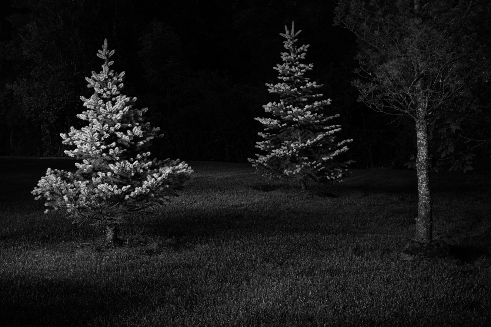
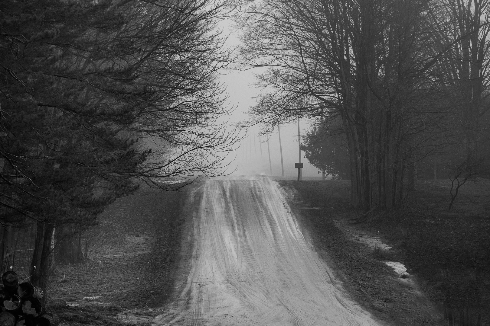
For this landscape and your story of the impending storm, I wondered if a different crop, rather than symmetrical might work. The crop I tried, puts the stand on a 1/3 crash point. However, I think I prefer your symmetrical crop with the lines converging.
I also wanted to see more detail on the dock and separation between the dock on the left and water. (I did not want to fall into the water. This is the sailor in me.) When, I increased the exposure on this area, the post and the moorage designation were attention grabbers. However, the landscape in the background became more apparent. Immediately I saw something in the water on the left side and wondered what it was. I have had too many days watching for obstacles to avoid in the water.
I liked the contrast between the sky on the left and the right which shows the storm moving in.
Therefore, I tried a few changes on your image. See if any of it works for you. I removed the middle pole and the left bottom moorage marker so the tower could be seen, put more exposure on the tower, centred a Color Efex point light centre on the tower to brighten it. This also darkened the exterior of the image. I then with patch and clone and in the combing on the lower left side of the dock. I added Color Efex detail filter (just a little bit) to bring out the textures. The result is there is more detail in the clouds and the shimmer on the water on the right is increased.
With this kind of sky, I would be anchored or tied to the dock. Where was this image taken? |
Feb 12th |
| 83 |
Feb 19 |
Reply |
Peter
I wonder how he would feel if he knew you were now making flowers monochrome after all those lessons in the dark room on color accuracy. I can image you telling him with a twinkle in your eye, you took it to the next level and showed the wonderful tonal gradations in flowers. You might also tell him that if he looked carefully flowers dance, twirl, and have hard or soft edges depending on how we see them.
Thanks for your detailed explanation of your process and artistic interpretation.
|
Feb 12th |
| 83 |
Feb 19 |
Comment |
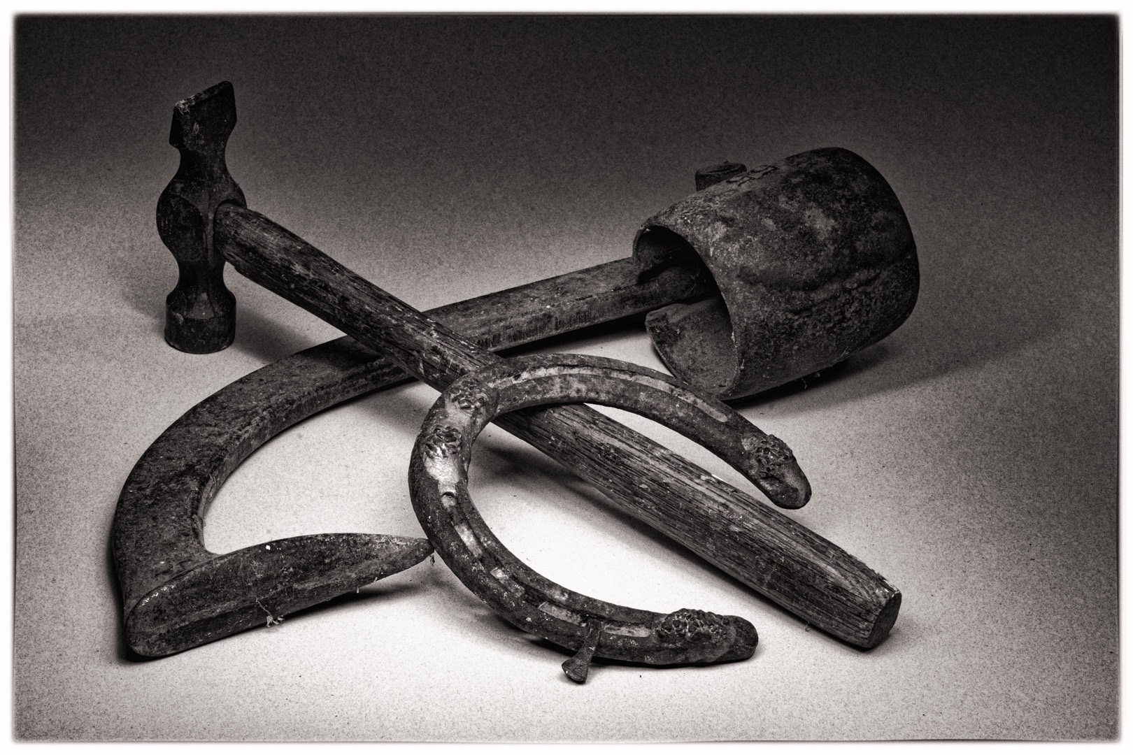
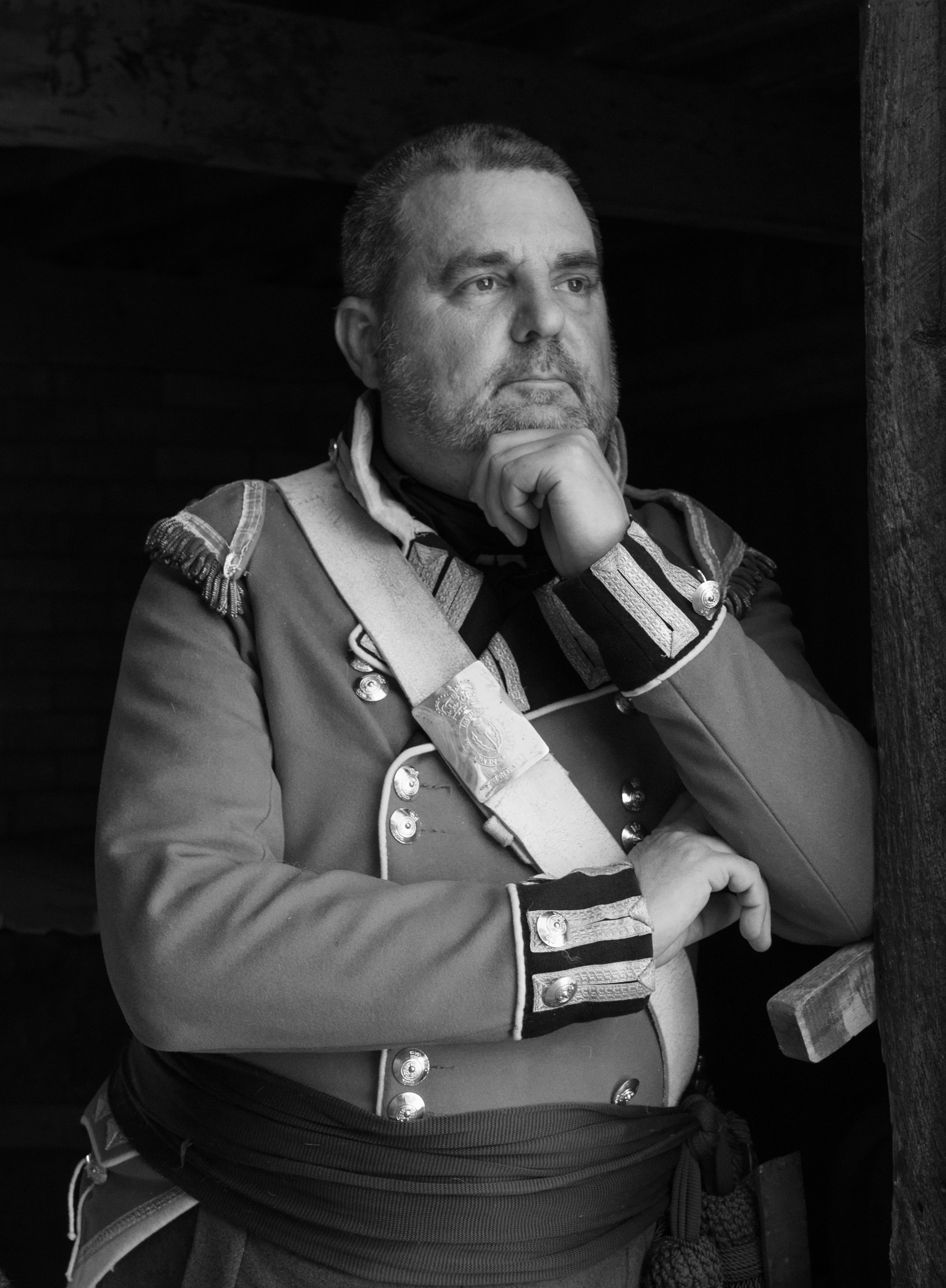
Charles
Could you provide us information on your camera settings along with the color image.
I am looking at this image not just as a photographer but a boater. I owned four different sail boats from lake to ocean capable vessels and have had to maintain them. I have also proctored on safe boating. I would not want to go out on this vessel.
I feel that one can see or sense the age of the boat just from the use of wood, rope lines, hardware, construction, peeling paint and anchor. Wooden boats are a horror to maintain.
I feel in some white/bright areas there is lack of detail, i.e. top of the cabin hatch, the object above the boom pole, fore area of the spinnaker poles (if that is what they are).
I am assuming that the boat is against a dock and it is low tide. However, the fore and mid mast seem to blend into the dock. Perhaps this needs some tonal separation.
I do not understand why there is such a tonal differentiation between the two lines on the left and front of the fore pole. I can only assume a line broke, and someone rigged up some new line (right side) and did a poor job with the bowline. I was not sure if it was the editing.
There seems to be such an incongruity in this image between the hardware, construction, and sloppy maintenance and the well painted sign. Was that your photo editing that made the name clear? Or is this a show boat.
It would be interesting to have a more complete view of complete boat bow to see the boat construction.
|
Feb 12th |
| 83 |
Feb 19 |
Comment |
Jane
Thank you for your comment. I am quickly realizing that monochrome images are challenging to produce. It is not simply a matter of taking a color image and converting it into BW.
I feel that I am still at step one, trying to determine what type of image is suitable for monochrome conversion, and then realizing that when I strip the image of color, I have to really look at it to see if it creates visual impact. From this month's comments, I have learned light, shadow, shape, line, texture, contrast and tone are not sufficient.
I have also learned that if the image does not have great tonal range, I can use editing to create it i.e. color adjustments, layers, selections and masks.
Experimenting with tonal range (the different versions for this image), I am quickly learning that the use of tone and contrast is a personal, artistic and interpretive judgement.
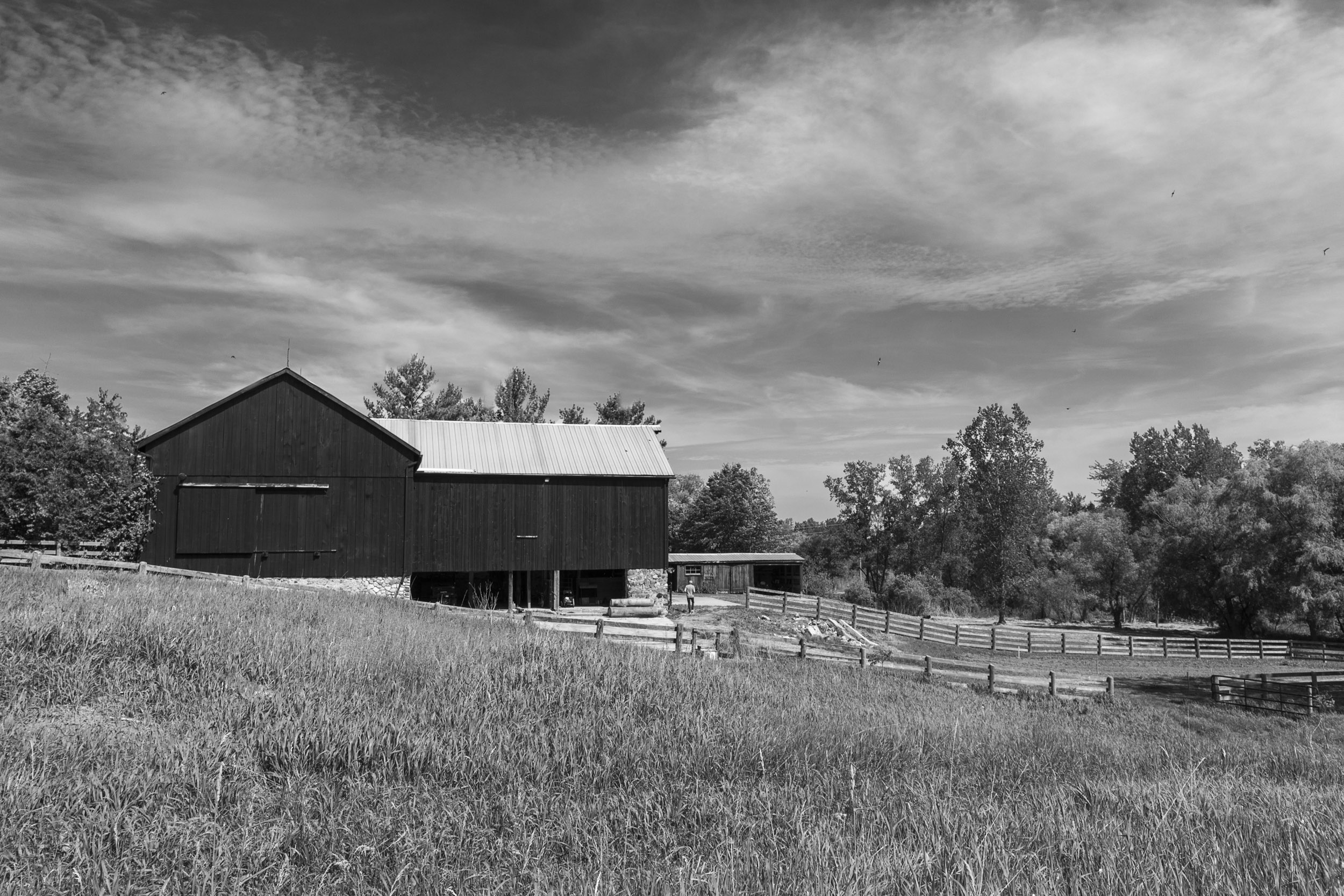
Your comment about more detail on the grass is interesting. I chose the light grass because that is how I saw it i.e. bright yellow, light and shimmering. See the barn image above. I enhanced the detail in the image by using the detail extraction filter in Color Efex (just slight enhancement). Then I used a control point to selectively reduce the detail in parts of the image i.e. lower grass. I also put a Color Efex light centre/dark exterior filter with the point on the couple. I wanted the attention to be on the couple and did not want the grass to overpower them.
|
Feb 12th |
| 83 |
Feb 19 |
Reply |
Jose
Thanks for the explanation.
I noticed in your image last and this month, that you set your subject (i.e. horse or mushrooms) against a very dark background. Is this your preferred style?
I am responding to your comment on my image here. Your comment on the tonal range in my image, prompted me to further investigate and learn options for achieving better tonal range. I learned how to change colors in PS using a selection with the hue adjustment layer, the image-adjustment-color change technique, painting selectively with the brush set to white or black and altering the opacity of the layer, or just the dodge/burn/saturation tool selectively applied.
So thank you for asking the question.
|
Feb 9th |
| 83 |
Feb 19 |
Comment |
Tracy's crop focuses more attention on the mushrooms. On my screen I see halo around the top of the tall and middle mushroom.
What island is this?
|
Feb 5th |
| 83 |
Feb 19 |
Comment |
I like Tracy's crop. It focuses more attention on the mushrooms. On m screen I see haloing around the top of the tall and middle mushroom.
What island is this?
|
Feb 5th |
| 83 |
Feb 19 |
Comment |
Tracy
In LR, I applied a gradient filter angled from left to right increasing the exposure to bring more light to your face. I also added some increased exposure on the arm. I think this balances your face and the moon out so there is less tendency to look at the arm.
|
Feb 5th |
 |
| 83 |
Feb 19 |
Comment |
Here is the field dark grass version. |
Feb 3rd |
 |
| 83 |
Feb 19 |
Comment |
Tracy
This is such a beautiful creative image. I find that the back arm from the wrist to the elbow disappears as expected because it is in shadow. However, brushing on slight increased exposure on the arm in this area, might enhance the image and still maintain the mysterious feeling. |
Feb 3rd |
| 83 |
Feb 19 |
Comment |
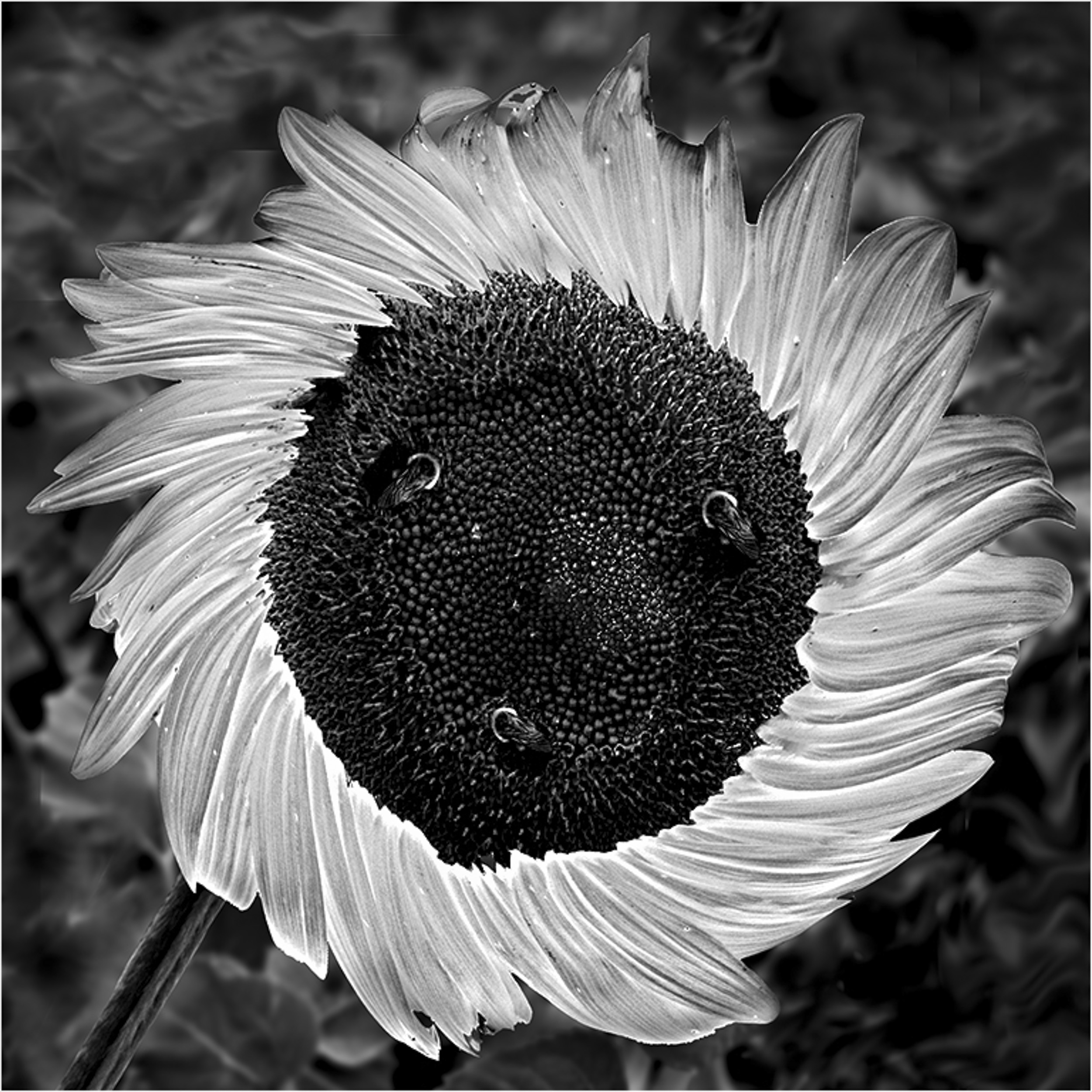
Peter
This is a beautiful and creative image. I will try your approach of changing color next time to see if I can achieve a better tonal range in my images.
What are the three spots in the centre of the sunflower?
My only suggestion is there are some bright spots in the leaf foliage top left that could be darkened. |
Feb 2nd |
 |
| 83 |
Feb 19 |
Comment |
Dirk
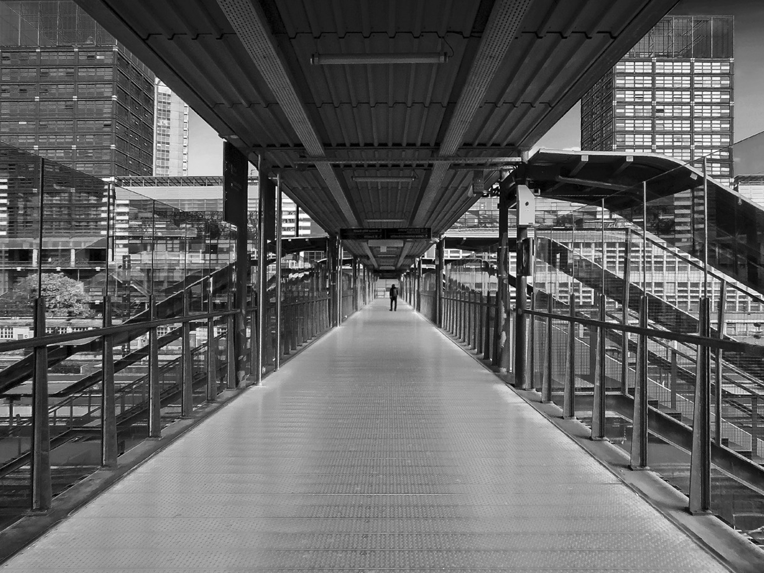
This image has good tonal range and makes such wonderful uses of lines.
The building 1/3 down on the right has some blown out highlights.
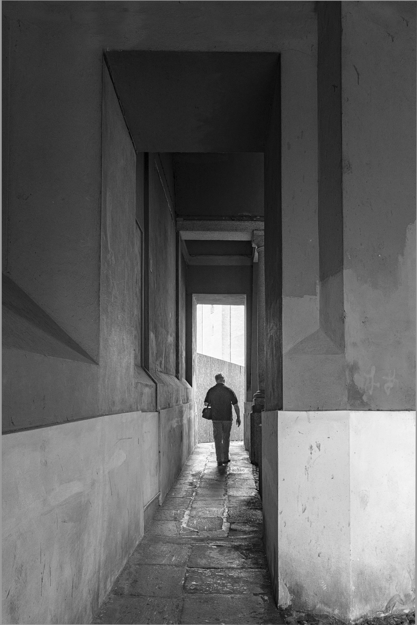
It is a challenge taking bridge images to create equal symmetry on both sides and I note you handled this by including more on the right side. In this image, my attention gravitates to the vanishing point and the middle and left side of the image. Did you consider cropping closer on the right side to emphasize just the vanishing point and balanced symmetry.
It changes the composition, and the focus becomes the bridge and the man.
|
Feb 2nd |
 |
| 83 |
Feb 19 |
Comment |
Dirk
This image has good tonal range and makes such wonderful uses of lines.
The building 1/3 down on the right has some blown out highlights.
It is a challenge taking bridge images to create equal symmetry on both sides and I note you handled this by including more on the right side. In this image, my attention gravitates to the vanishing point and the middle and left side of the image. Did you consider cropping closer on the right side to emphasize just the vanishing point and balanced symmetry.
It changes the composition, and the focus becomes the bridge and the man.
|
Feb 2nd |
 |
| 83 |
Feb 19 |
Comment |
Jose
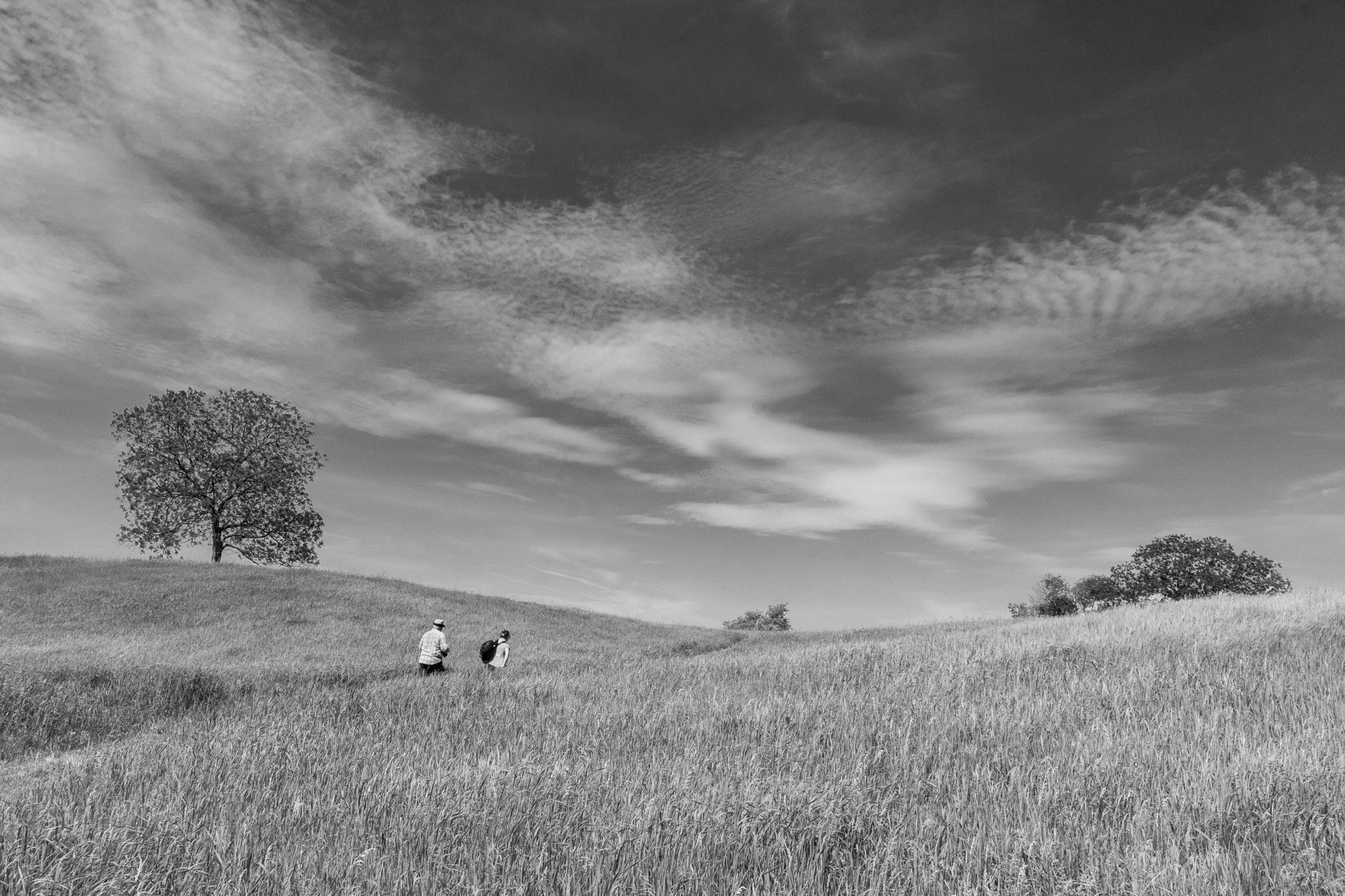
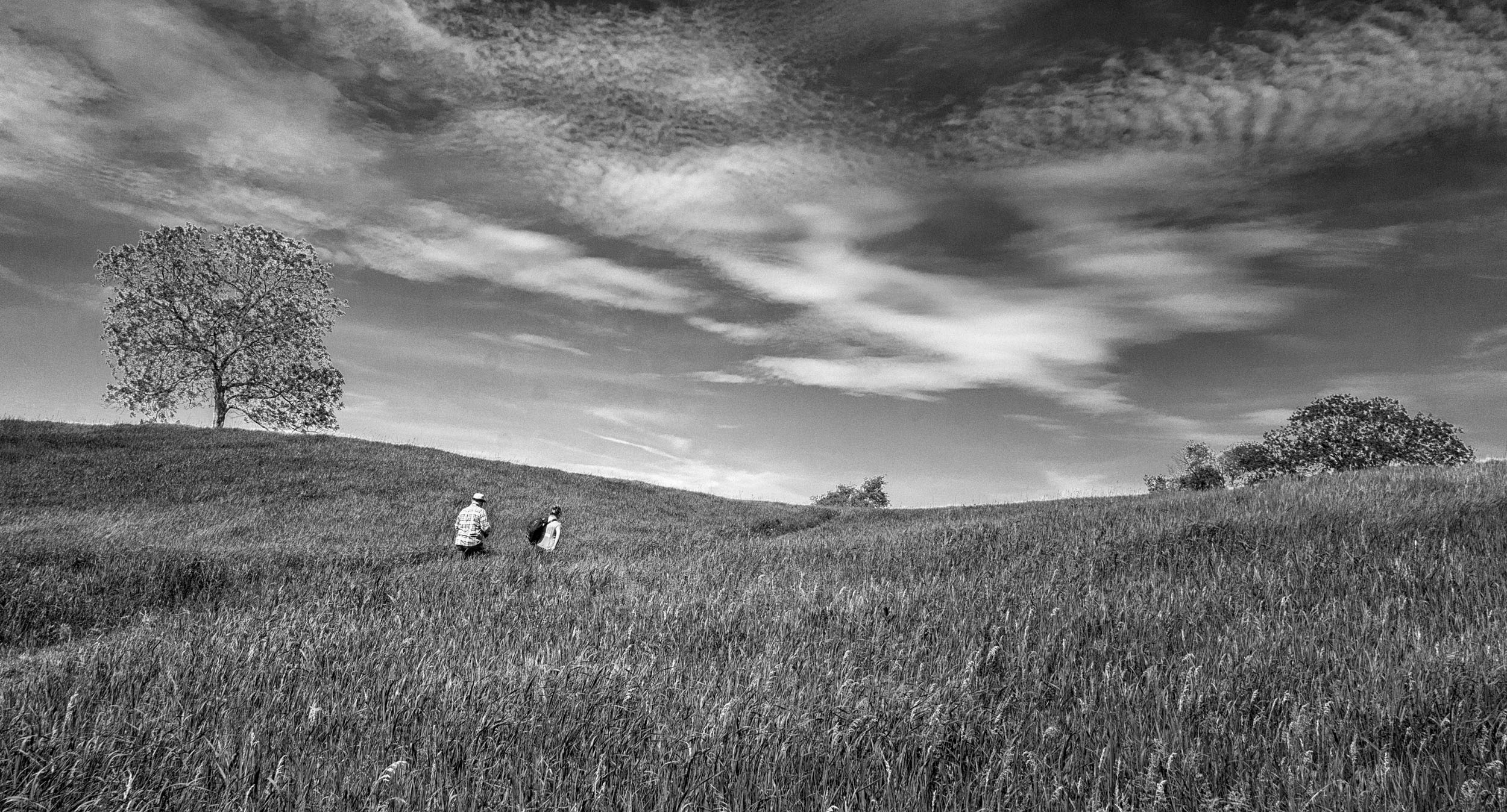
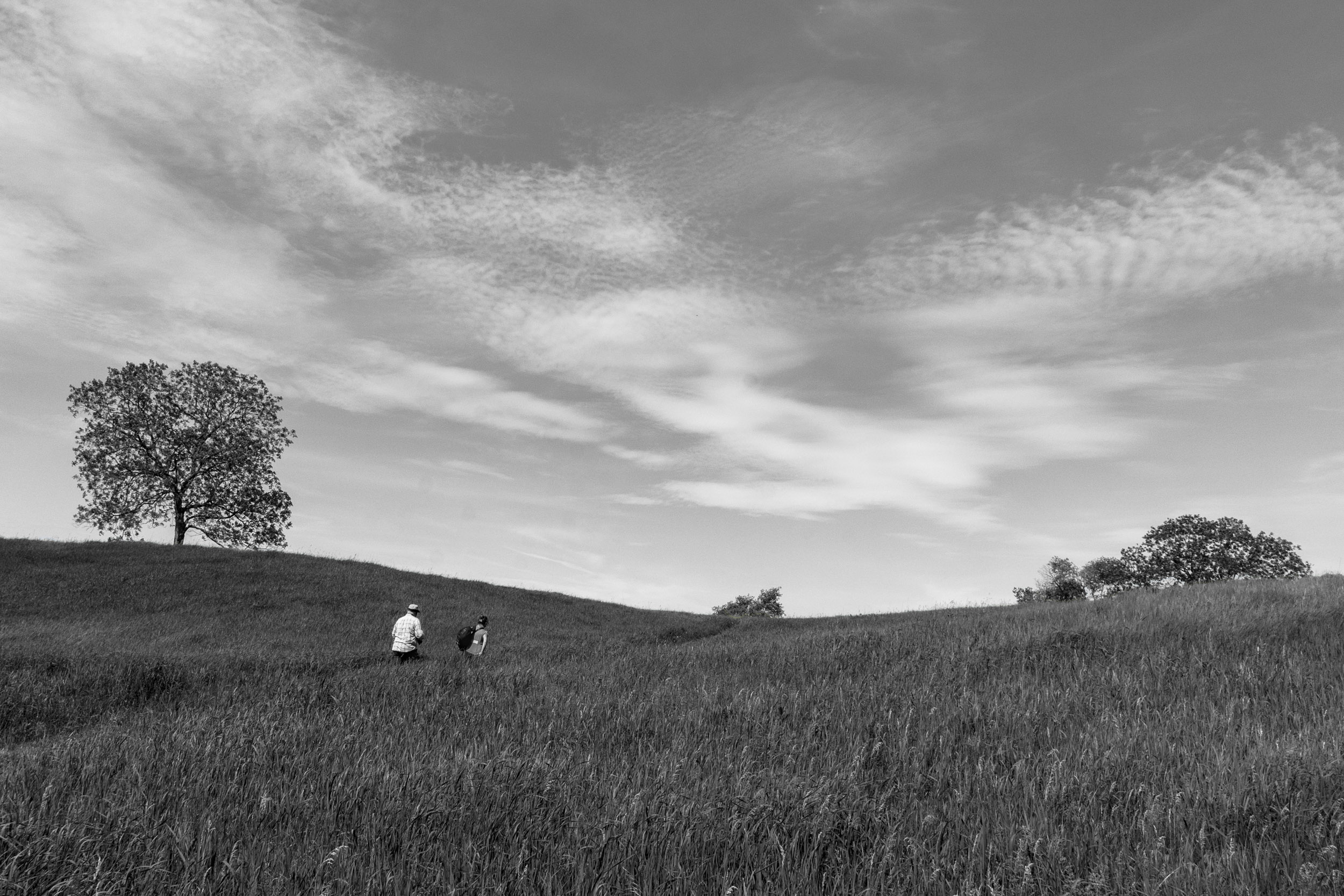
1. For a landscape, my starting point is aperture priority, ISO 100, f11, and in this case 18mm focal length. This was a camera club outing. The man in the white shirt in the image who teaches landscape photography, told me to increase my shutter speed to at least 1/800 sec to 1/1000 because it was windy. The higher shutter speed would avoid blurred grass. I was fortunate that it was a sunny day so I could achieve f11 and 1/800 sec at an ISO of 400.
2. Color Toning: Your question about tone is very good.
I created two masks: one for the grass and the other the sky. Then I played with every combination to try to achieve tonal separation between the sky and grass.(7 versions). The version with the dark sky and dark grass in my opinion seemed ominous i.e. a 5:00 p.m. image. I have attached the version with the dark grass and the ladies shirt made darker by moving the red slider.
To me, the problem with this image is that there is not enough color contrast between the blue sky and the green grass.
I tried two more images taken at this location to assess how to deal with the lack of tonal contrast. The barn image is better, because the barn adds some black and there is better light. With the path and field, I darkened the sky, kept the field bright, and brushed on exposure on path to try to create more tonal contrast. |
Feb 2nd |
 |
16 comments - 19 replies for Group 83
|
16 comments - 19 replies Total
|