|
| Group |
Round |
C/R |
Comment |
Date |
Image |
| 31 |
Jan 19 |
Reply |
Peter
Thanks again for posting your detailed workflow. I have been using it to reedit color images. It is magic.
Judy Ponti-Sgargi |
Jan 10th |
0 comments - 1 reply for Group 31
|
| 83 |
Jan 19 |
Reply |
Jose
I too am fascinated by all the comments. My original intention was too spark a discussion on which was better color or monochrome.
|
Jan 25th |
| 83 |
Jan 19 |
Comment |
Jose
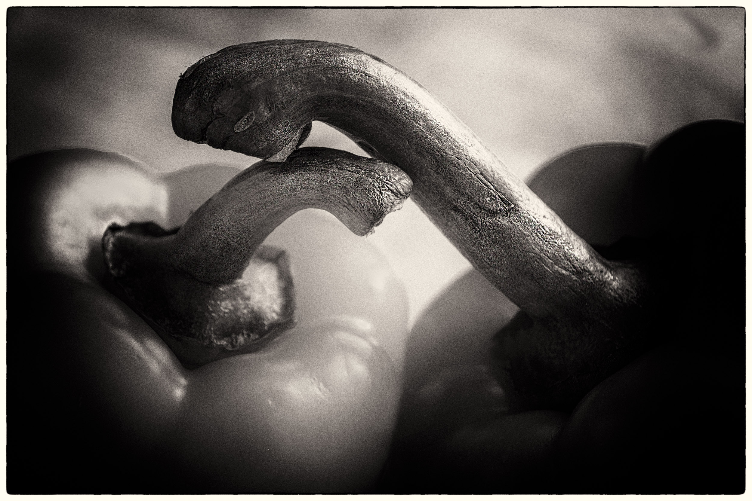
This is an interesting image. The two horses look as if they are joined as one creating an unusual view with seven legs.
I find that the left and right side are quite dark and heavy. Perhaps you might consider cropping in on both sides and also lightening the leaf over the right horse. |
Jan 24th |
| 83 |
Jan 19 |
Comment |
Jose
This is an interesting image. The two horses look as if they are joined as one creating an unusual view with seven legs.
I find that the left and right side are quite dark and heavy. Perhaps you might consider cropping in on both sides and also lightening the leaf over the right horse. |
Jan 24th |
| 83 |
Jan 19 |
Comment |
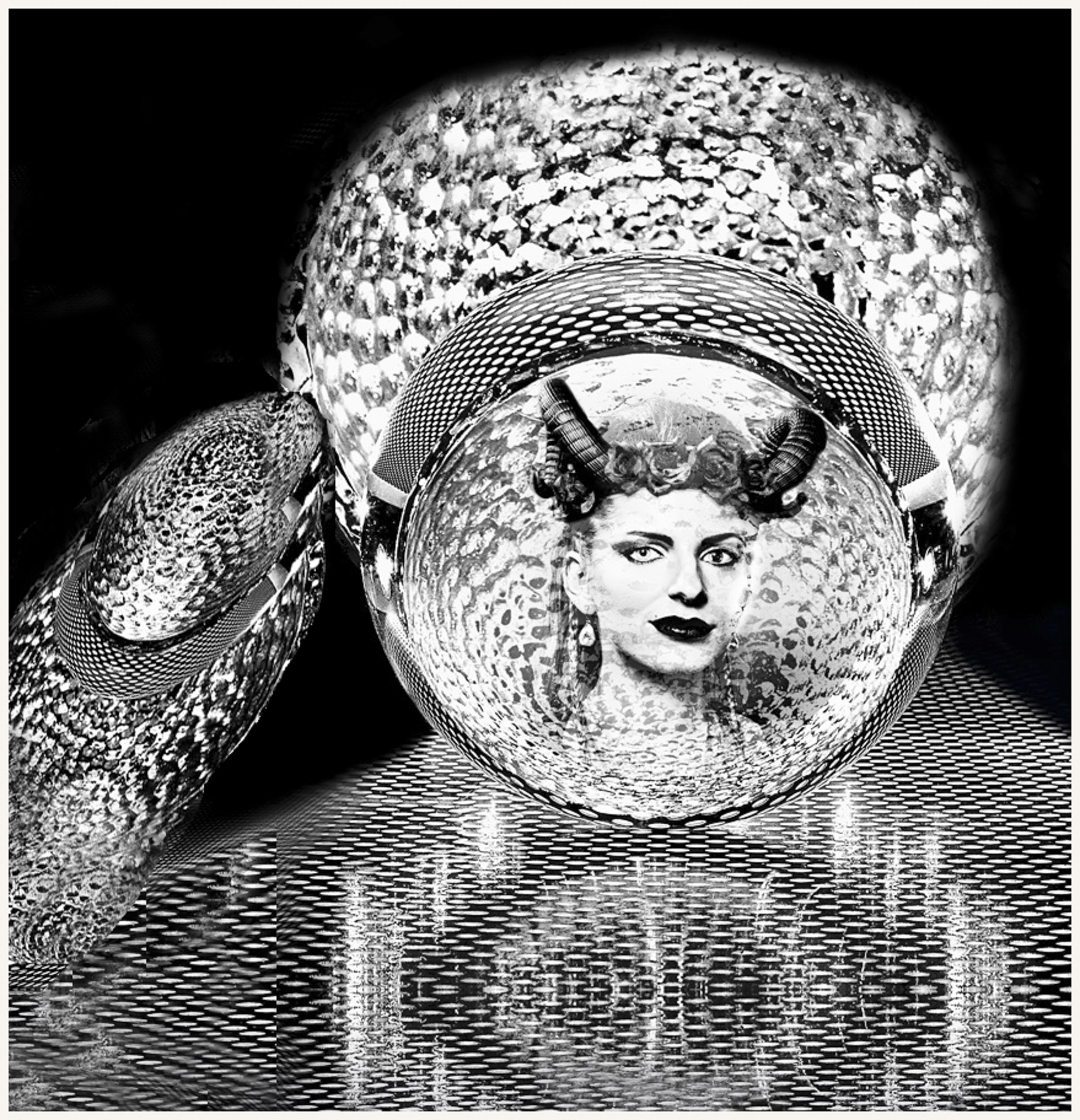
Dirk
I like the way you have sifted through our comments.I feel your revised image is much stronger including the reflection of both the bowl and the vase (finger). If there are competitions on the subject "reflections" this image may be a good candidate. I see two reflections: the reflection of the objects in the lower half of the image, and the reflection of the surreal character (i.e. the finger pointing to the head thinking).
You have introduced me to the world of creativity and you and Peter have encouraged me to improve my photo editing skills. |
Jan 21st |
| 83 |
Jan 19 |
Comment |
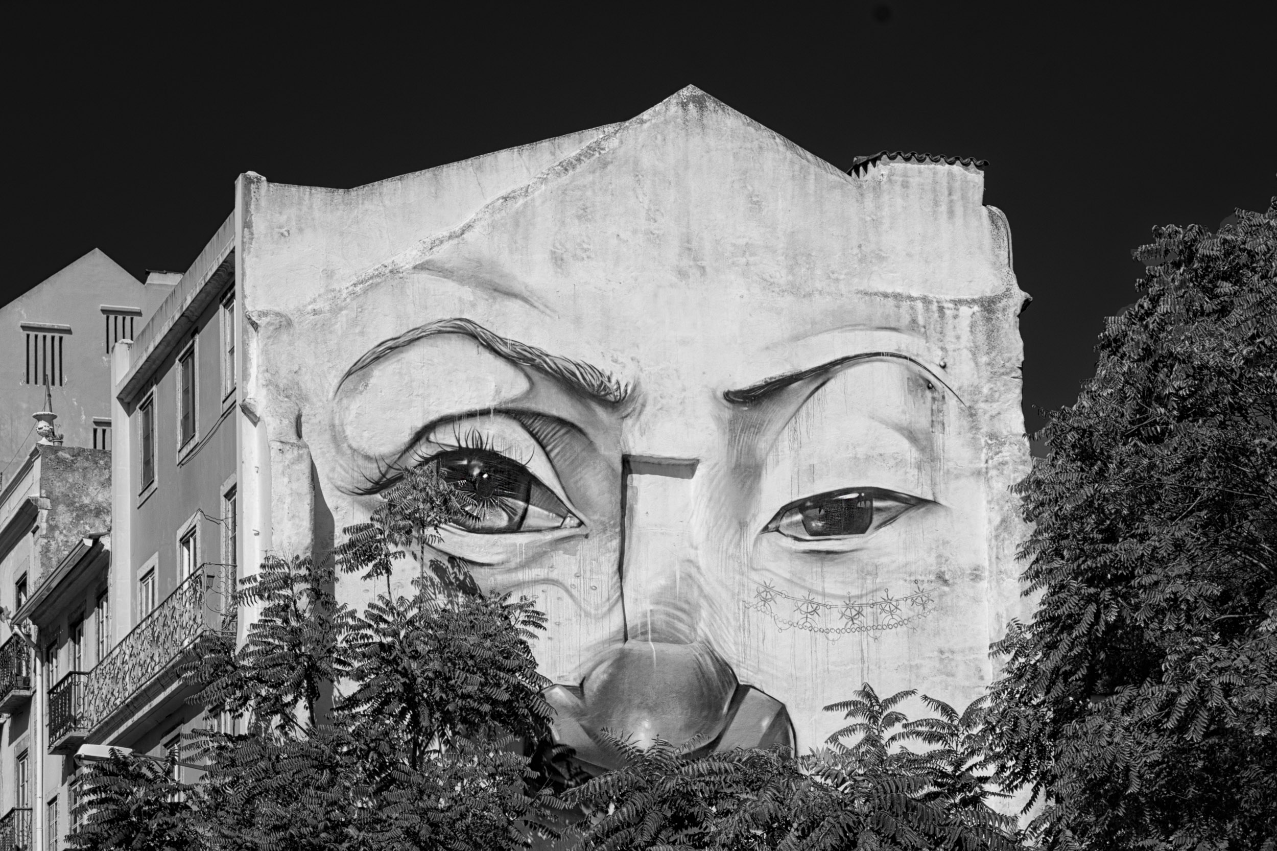
Tracy
That is a very interesting comment.
It is a single image, not superimposed. I looked at the second building, one third down, or the right side (the one Dirk flipped), it has the same weathered look.
One explanation may be that the building was recently painted but the owners did not want to remove the wall mural.
|
Jan 12th |
| 83 |
Jan 19 |
Comment |
Thanks Dirk
The eye shows up wonderfully and I like the flip. |
Jan 10th |
| 83 |
Jan 19 |
Comment |
Dirk
I looked at your image again and wondered if I tighter crop would work and cropped tighter on the left. However, this (attached) removes some of the beautiful detail and positioning of objects on your original image with the two women and the vertical object in between.
Looking closer at this image, I noticed that the heads of the two women point out of the frame in opposite directions and that the face of the lady on the left is very detailed and on the right not as detailed. This may be why my attention is pulled both ways and out of the frame. I look to the left to see what the lady is looking at and then to the right to make out details on her face.
|
Jan 8th |
 |
| 83 |
Jan 19 |
Comment |
|
Jan 8th |
| 83 |
Jan 19 |
Comment |
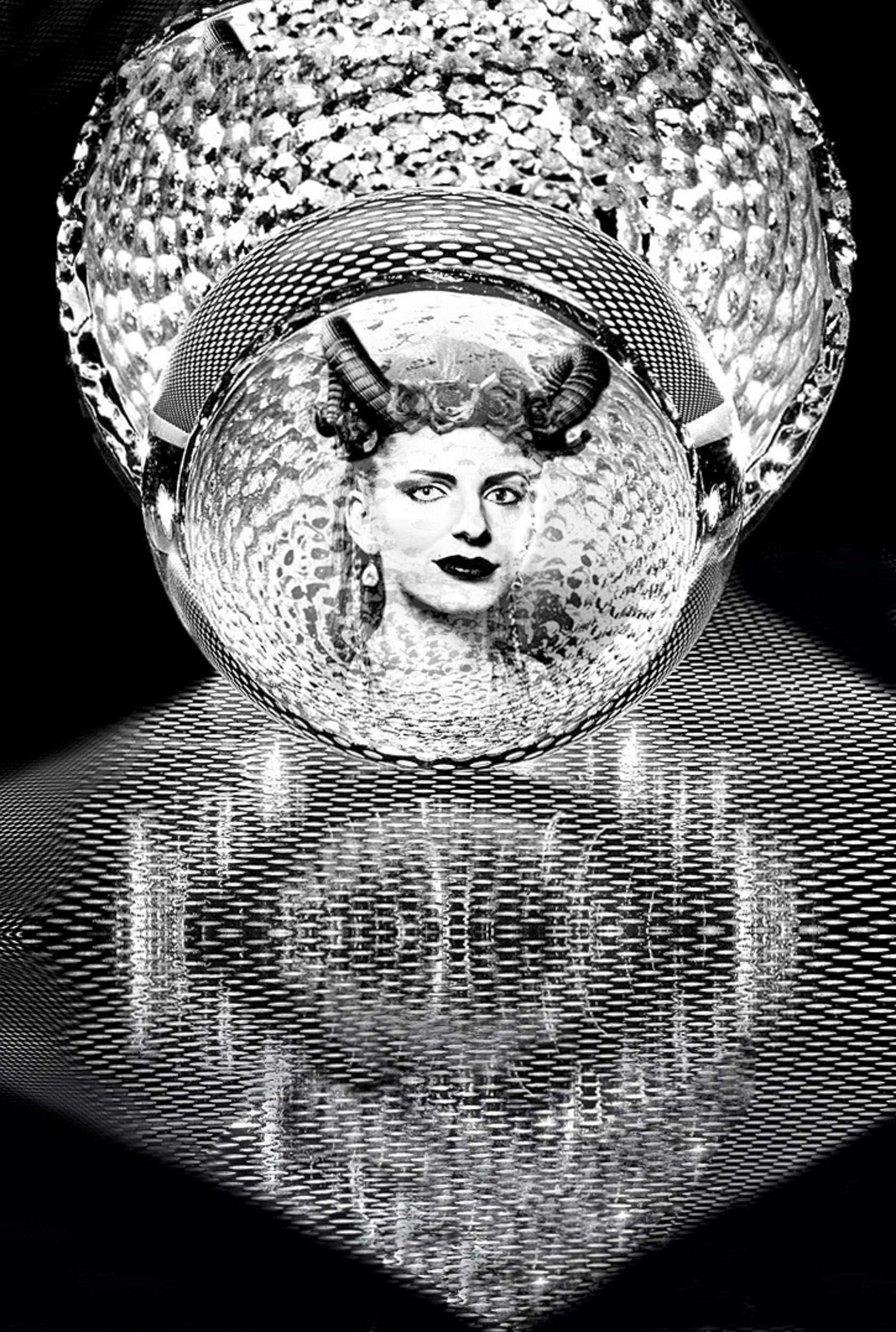
Dirk
I praise you for your creativity, imagination and photo-editing skills.
For me, this image is complex in its structure, texture, contrast and lighting. Would you consider simplifying the image? One thought, was to pretend the bowl was a head, and the finger pointed to the head. Inside the head was a very beautiful lady and we are drawn to look at her. I have attached a draft version of the concept
To create this version, I removed one finger. The other, I did a content aware move and scaled the finger to point it toward the bowl as if the bowl were a person's head and the finger was supporting the bowl. With content aware crop, I added content at the top to contain the bowl within the image and cloned around the bowl. I also used a CEP tonal filter to bring out the contrast, put a CEP light centre dark exterior filter with the point on the ladies face to draw attention to the face, and sharpened the image.
You certainly have introduced me into a total different world of creativity and encouraged me to develop new PS skills.
|
Jan 8th |
 |
| 83 |
Jan 19 |
Comment |
This is the color file. |
Jan 7th |
 |
| 83 |
Jan 19 |
Comment |
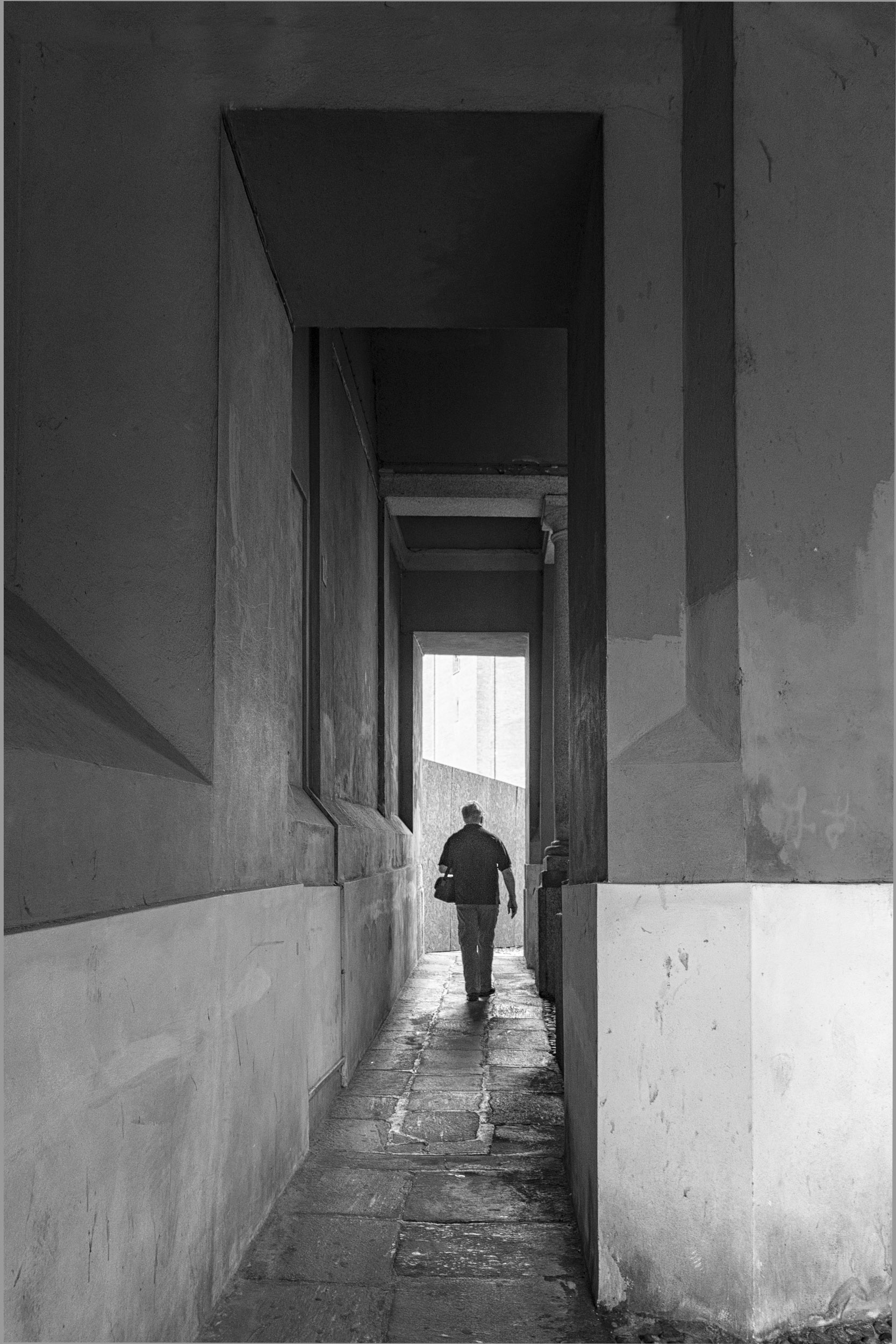
Graham
I like the way you have captured the two men engaged in conversation, the setting and the timeless feel of this image.
To me, it looks as if the image on the right side is crooked.
You might consider, straightening the image, cropping tighter, brushing on increased exposure on the clothing to bring out detail, and increasing the contrast.
I noticed you are using elements and blurred the background. You might consider blurring it slightly more. |
Jan 7th |
 |
| 83 |
Jan 19 |
Comment |
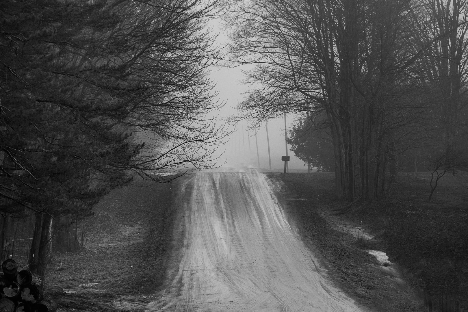
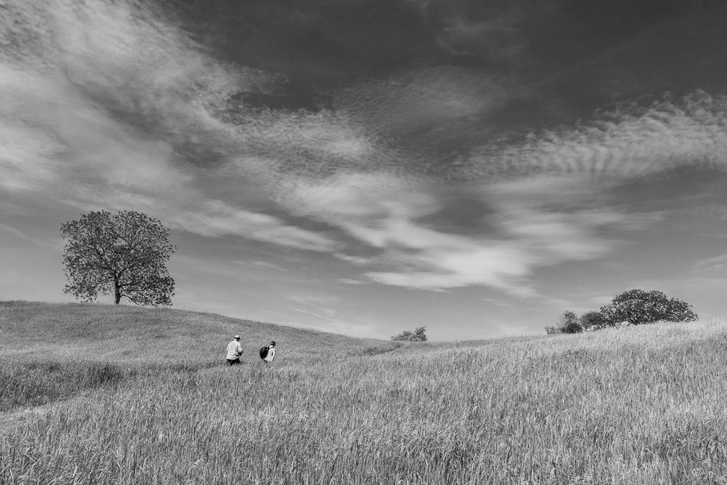
Tracy
I think your choice of perspective, composition, and cropping, enhances the mood of this story.
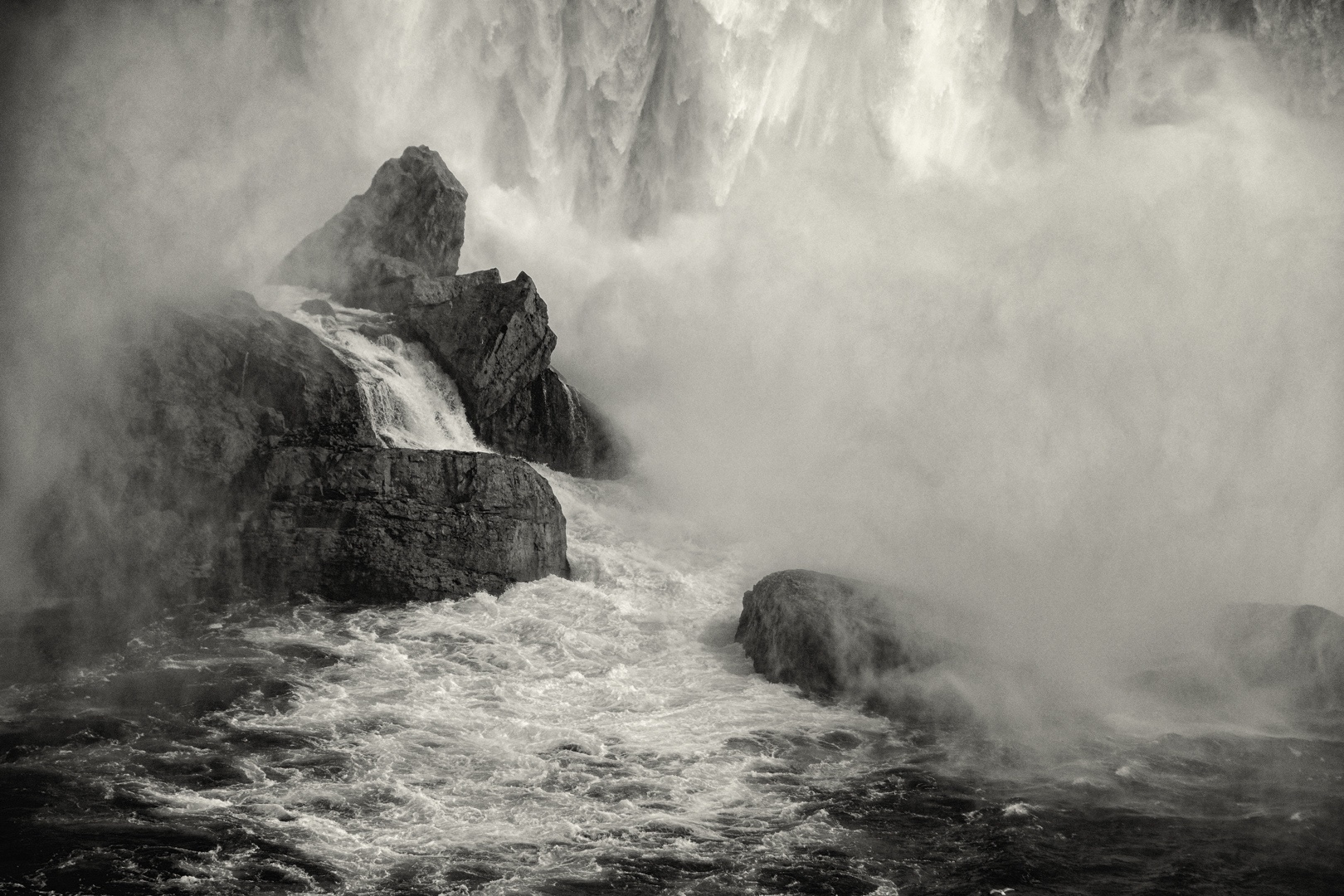
You may consider increasing the contrast slightly to bring out more tones but still preserve the foggy feeling you are after. |
Jan 7th |
| 83 |
Jan 19 |
Comment |
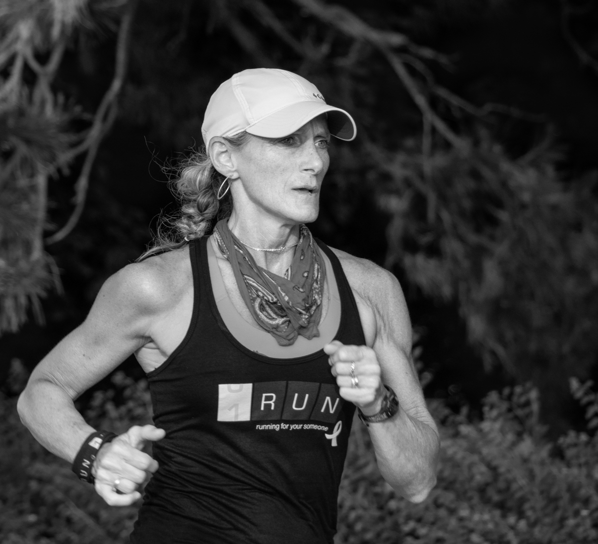
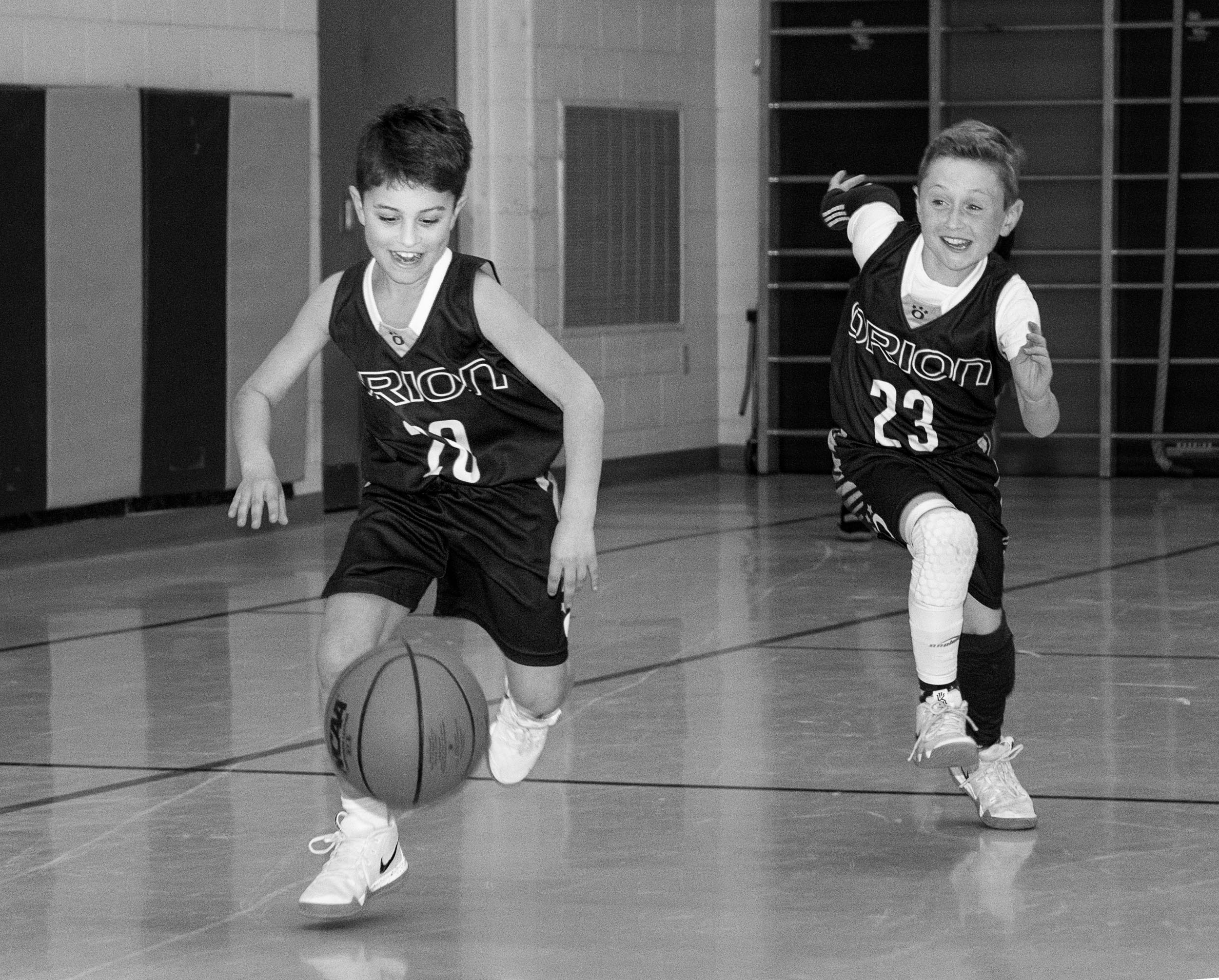
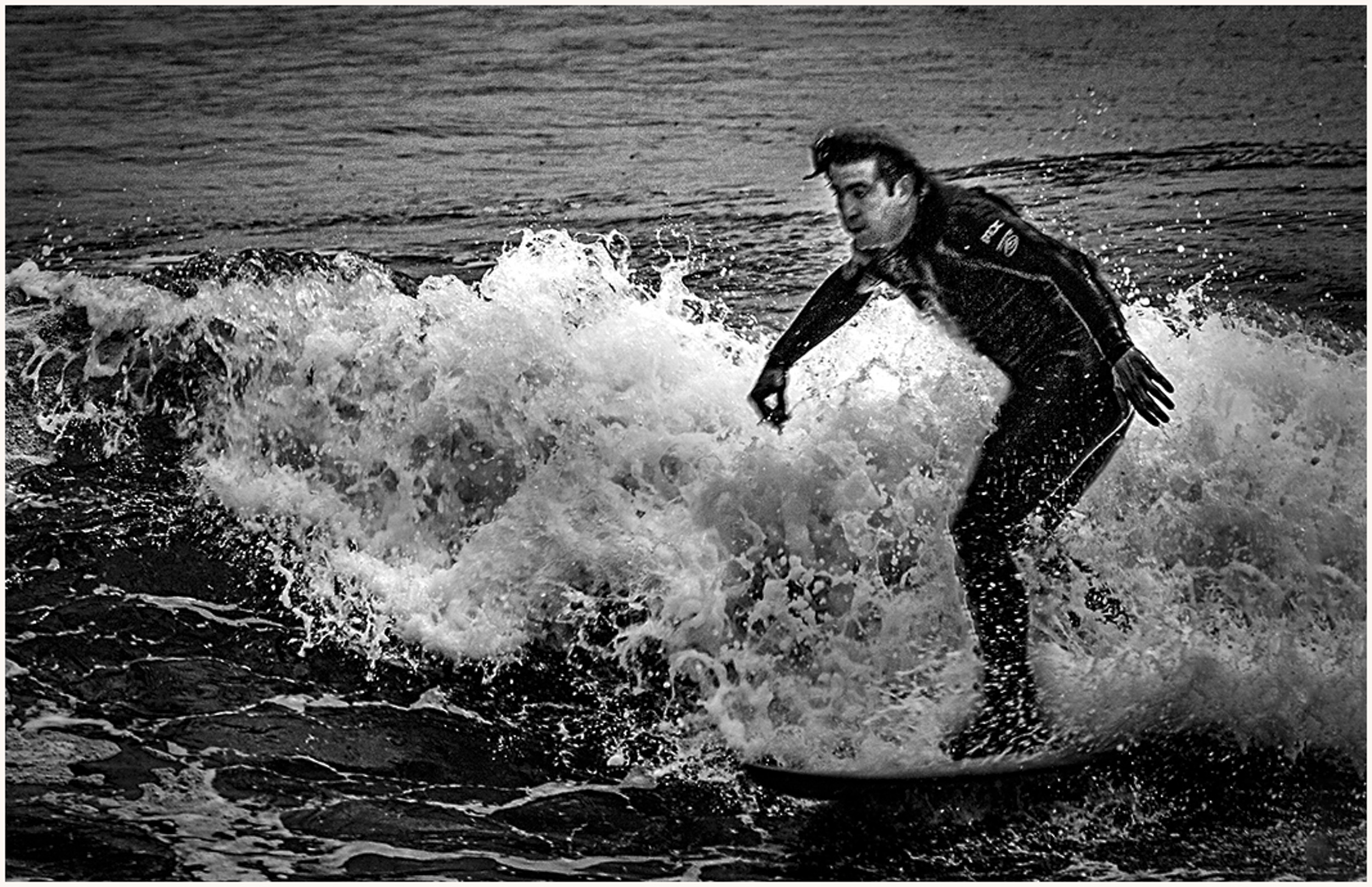
Peter
I like how you have captured the action of the man and wave and your crop.
You might consider reducing the exposure on the waves to provide more detail in the highlights. Also, you might consider providing more detail in his face and body by brushing on increased shadow and exposure. This would reveal the water splashing off him. To put more emphasis on the man, you might consider using a CEP filter and applying it to his face. |
Jan 7th |
 |
12 comments - 1 reply for Group 83
|
12 comments - 2 replies Total
|