|
| Group |
Round |
C/R |
Comment |
Date |
Image |
| 31 |
Dec 18 |
Comment |
Peter
Thanks for detailing the process and posting your comments on our site.
JPS |
Dec 8th |
| 31 |
Dec 18 |
Reply |
Peter
Thank you for responding in detail to my question.
Now I understand the acronyms, I checked and I have CEP4 and SEP2.
I go from LR global adjustments into PS for refinements and to use CEP4, SEP2, and Photomatix, save and export from LR.
For my portfolio course, I tried the CEP detail extractor and looked at the tonal constrast for a rock image. That was one time. With your suggestions I will study further these as well as the full capacity of curves.
When you use your file for color, you mentioned that you remove the sharpening and vignetting layers. Do you mean you just turn that layer off, or do you delete it or does it matter?
Thanks for clarifying the workflow between sharpening, merge visible at the top of the layer stack, then applying CEP4. Do you prefer two layers to do this? Originally I would merge visible, smart filter, then sharpen with high pass high(3 pixels) with blend mode overlay and adjusting opacity as required on a separate layer. I would repeat this i.e. blend visible, smart filter, CEP4 for the light centre/dark filter. Now I switched to putting both filters high pass and CEP on the same merge visible layers. Does this matter?
I will also check out Nik Sharpener Pro.
Could you clarify just one more time, you use Nik Sharpener Pro for prints but high pass for digital jpgs. I am in the process of finalizing prints for competition. I e-mail a jpg file to Costco. Should I sharpen the jpg file with Nik Sharpener Pro?
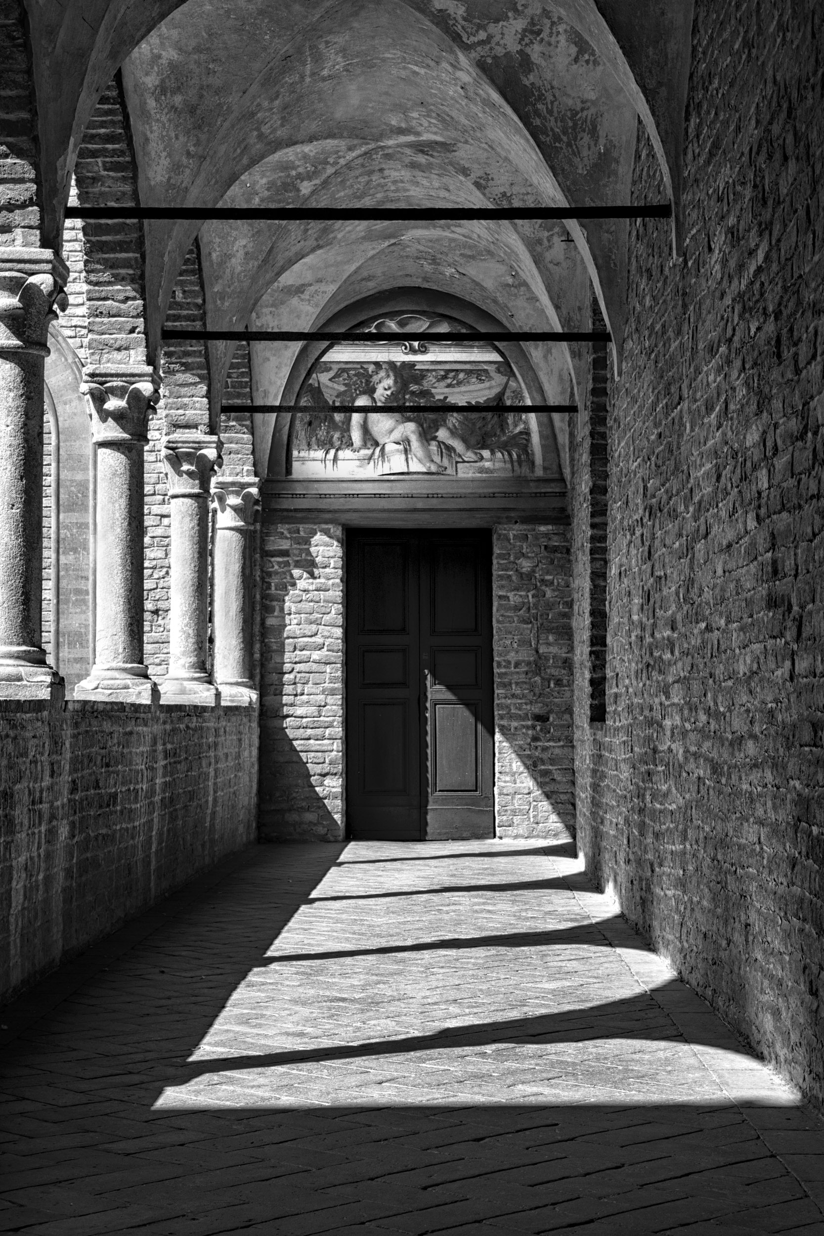
Regarding your comments that BW is so different, last night I tested out various images: my house (shadow, light, texture, shape), a portrait of a colored man selling news papers in the piazza in Bologna, a fountain at the Forks of the Thames (cascading shimmering water), high school students running on a track for a One Run fund raiser (people, timeless), a bridge support (texture, line, plane sky), and a goose on a rock against a water background (texture/no tonal contrast).
I will edit these images again. I already reedited the castle (Dec DGG83) using PS for our club competition but will redo this using your workflow.
Would you be willing to look at my reedits of the above based on your work flow. My e-mail is pontisju45@gmail.com.
Your response is so valuable and I am sure the rest of our group new to BW would benefit from it.
I have done a print screen of your answer to me and would like to share it with our group. One option is to send it to my co-ordinator and ask her to attach it to the e-mail she sends us to ask for image submissions.
Do you object? Is there another option?
Judy Ponti-Sgargi
|
Dec 8th |
| 31 |
Dec 18 |
Comment |
Hi Peter
You certainly captured the stormy day and rugged land.
I just joined DDG83 with a Dec. launch. For my first images I did one version with PS and the other with Nik.
You mentioned that you used several PS curves layers. Do you prefer the curves to levels for selective adjustments? What is CEP 2 and 4? Is that Color Efex?
Given your darkroom and digital experience, what approach would you advise for someone just starting out with BW.
My normal work flow is LR for global adjustments, then PS and applying filters i.e. Color Effex, Nik as a PS smart filter.
Judy Ponti-Sgargi |
Dec 7th |
2 comments - 1 reply for Group 31
|
| 83 |
Dec 18 |
Comment |
Dirk
With your January image, could you provide the camera settings, a colored version, and your editing workflow method.
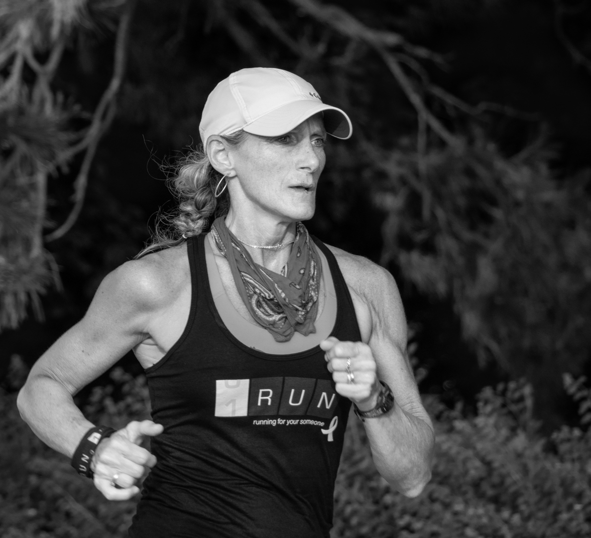
I am trying to learn BW editing so I asked a member from another monochrome group Peter Clark to post his method under my Dec. image. I found the workflow effective and used it for my January image. I am curious what method our group members are using? |
Dec 20th |
| 83 |
Dec 18 |
Comment |
Jane
I will not know until the second week in January.
Here are the two images BW images I submitted to the competition. I redid Fontanelato based on our DDG 83 comments and Peter's workflow. His workflow was magic.
The other image is "Puppy Love".
|
Dec 19th |
 |
| 83 |
Dec 18 |
Comment |
Jane
I will not know until the second week in January.
Here are the two images BW images I submitted to the competition. I redid Fontanelato based on our DDG 83 comments and Peter's workflow. His workflow was magic.
The other image is "Puppy Love".
|
Dec 18th |
 |
| 83 |
Dec 18 |
Comment |
Angela
Bravo. The head stands out much clearer and everything looks sharper.
Thanks for bringing your insite to our group.
|
Dec 15th |
| 83 |
Dec 18 |
Reply |
Peter
I looked at your image again. In the color, the pelican's head clearly stands out against the background but not in the BW version. |
Dec 7th |
| 83 |
Dec 18 |
Reply |
Dave
Please try it out. It is my go to. It is so subtle that one does not even know there eye is being drawn to the subject. |
Dec 7th |
| 83 |
Dec 18 |
Reply |
Dirk
Thank you for considering my comments.
At a London Camera Club meeting a couple of weeks ago, a member commented on an image in our critique night. He said that it was not necessary to have an angled line exit an image in the corner. That was an old concept. When I saw your cropping, that was what prompted my suggestion to open up the sky and provide space on the right.
For my own images, I am so aware that intent drives editing. The intent in my suggestions were man vs nature.
Being new to BW, I read an article on what makes good BW. There were five key criteria: contrast, tone, shadow, shape/line/form, and texture. Your image covered most of this.
Thank you for not considering I was redoing your image. Please tell us how it does.
I am submitting my castle to our club's Dec. competition. I redid it bumping up contrast and using some of those techniques I mentioned, i.e. dodging, levels etc.
JPS
|
Dec 7th |
| 83 |
Dec 18 |
Comment |
|
Dec 6th |
| 83 |
Dec 18 |
Comment |
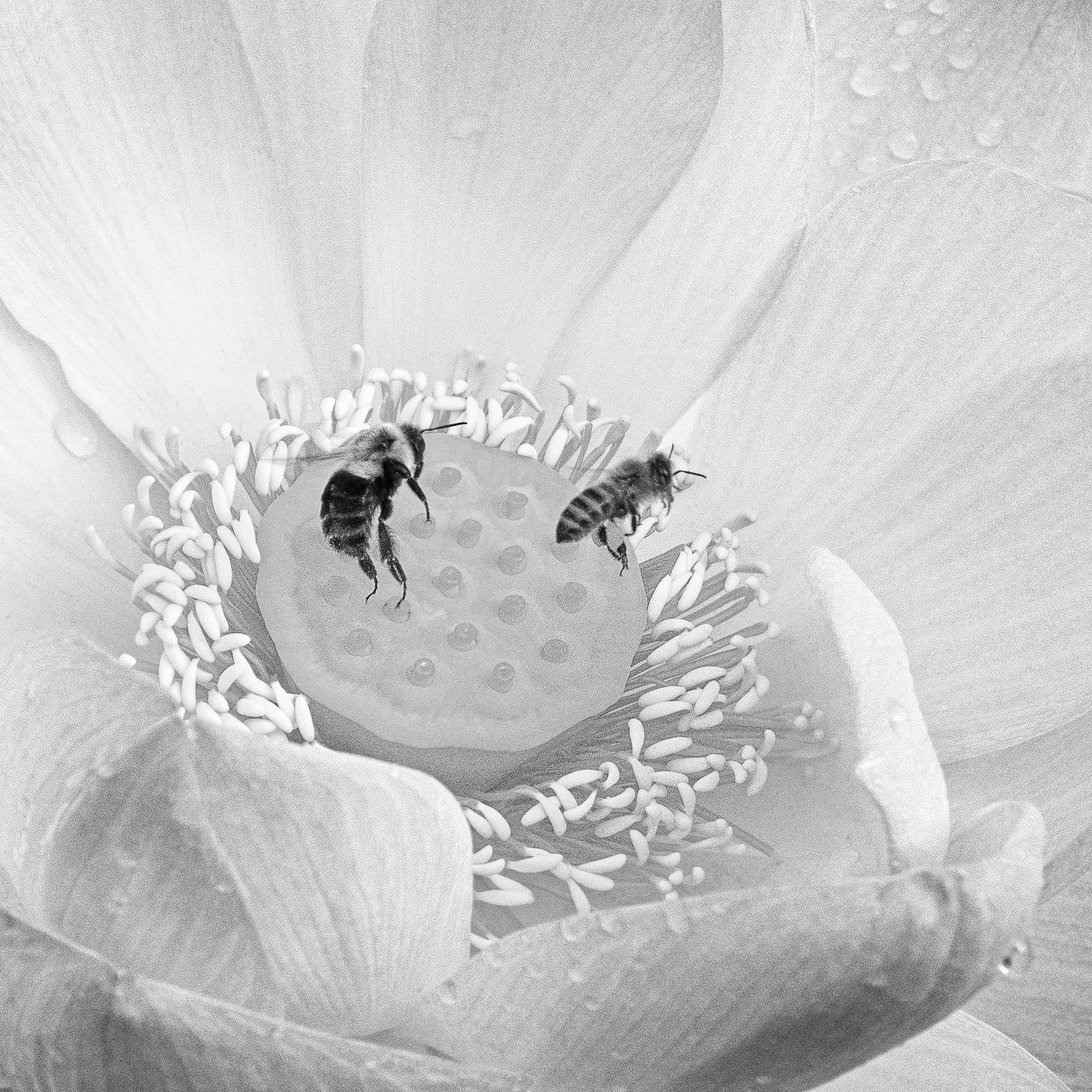
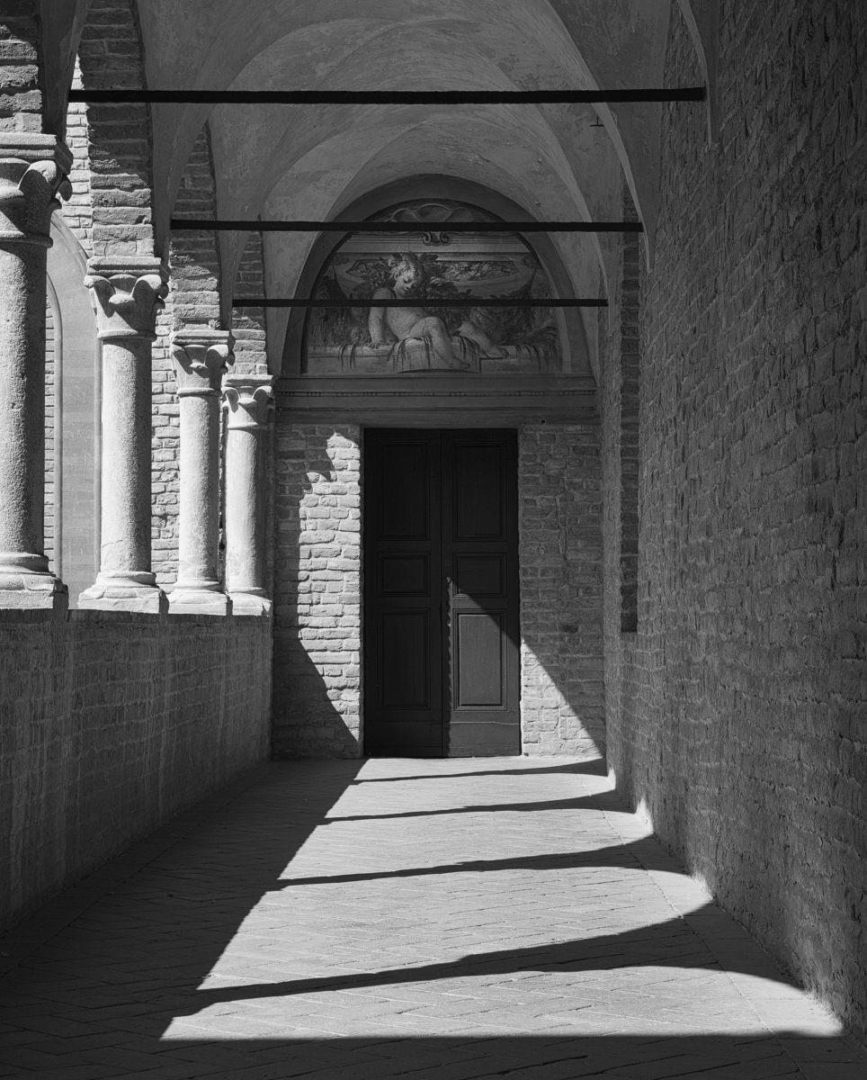
Peter
Congratulations on capturing the pelican as he landed. You caught his spirit.
To me the image is blurred, both wings and face. The reason most likely reason is your settings 1/250 sec, 400 mm and f11. I am not sure whether you purposely chose your settings or whether the bird happened to land when you were photographing something else.
I think 1/250 sec is just too slow a shutter speed to get a sharp image of a bird landing unless he is dead stopped in the water. This is further compounded by your focal length 400 mm.
Following Charles suggestion of vignetting, do you have Nik Color Effex. You might want to try the light centre/dark exterior filter placing the centre on the birds face.
Your crop very nicely removes distractions leading us to focus on the bird. |
Dec 6th |
| 83 |
Dec 18 |
Reply |
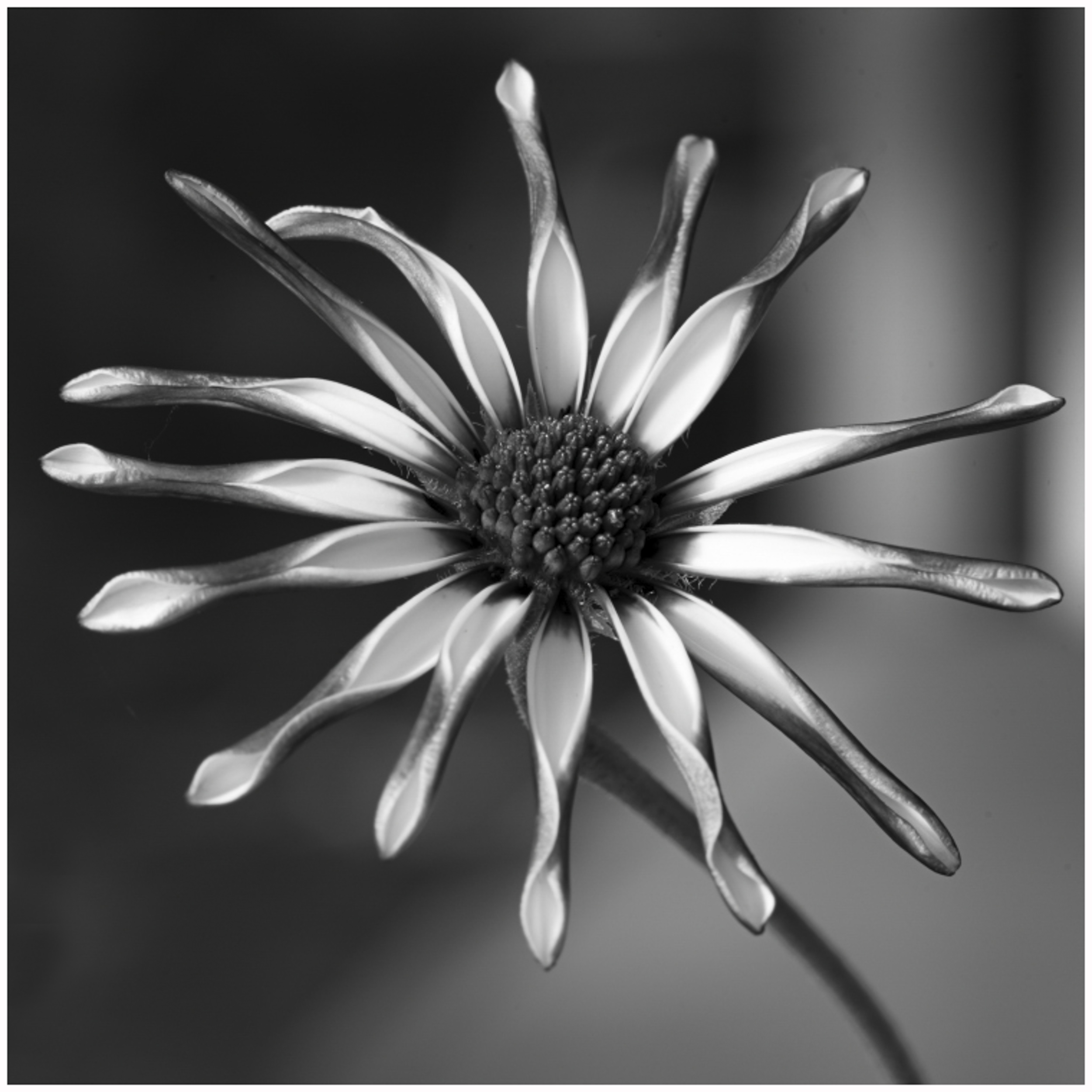
Tracy
I like Peter's revised crop and agree that the light spots on the left detracted from the beautiful flower.
There is a distraction on the petal at 45 degrees and I cloned it out. I also cloned out some of the remaining highlights on the left side. Alternatively, you could consider the suggestion of a simple dark background. This would remove the distraction of the vertical lines from the window. |
Dec 6th |
 |
| 83 |
Dec 18 |
Reply |
Tracy
I like Peter's revised crop and agree that the light spots on the left detracted from the beautiful flower.
A couple of additional minor things you might want to try are removing the distraction on the petal at 45 degrees, and cloning out just a little more some of the highlight on the left hand side. See insert.
I am not sure if you have every used Nik Color Efex. It has a wonderful filter called light centre dark exterior. I applied it to this image to draw the eye to the flower and darken the background. |
Dec 6th |
 |
| 83 |
Dec 18 |
Comment |
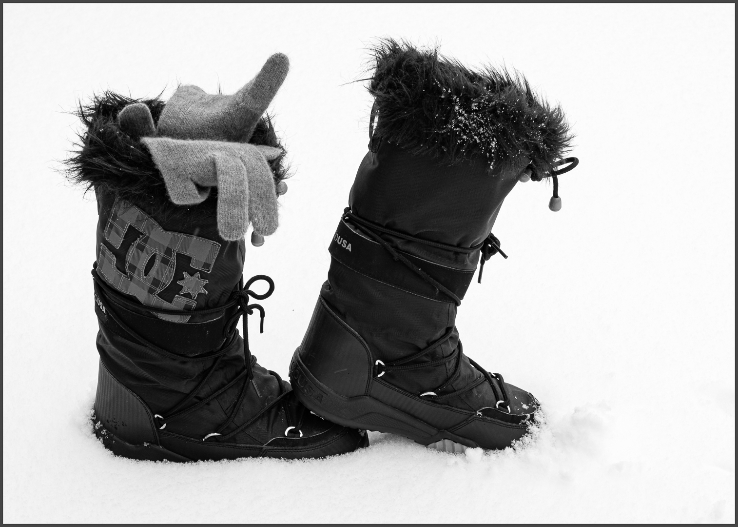
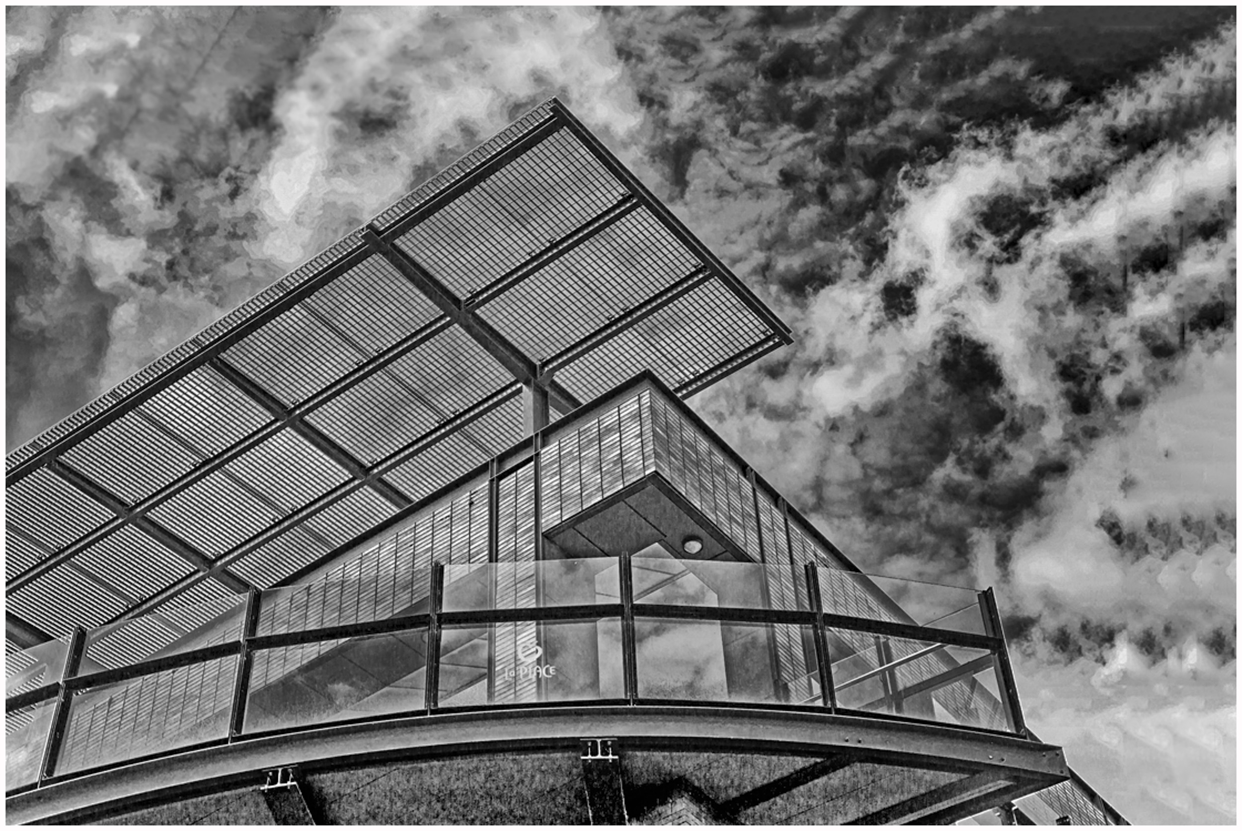
Graham
What strikes me about this image is your feet and the shadow cast by your body falling to the left.
I considered Peter's comment about the static logo in the centre, Dirk's about the feet, and your goal to focus on the patterns rather than reflections and suggest the following crop for your consideration. It moves the logo up, simplifies the image, keeps the lines, but puts more focus on your feet thus creating intrigue.
I applied a curves layer to bump up the contrast even more, increased the exposure, and sharpened the sign with the sharpen tool in PS.
This is just another interpretation. |
Dec 6th |
 |
| 83 |
Dec 18 |
Comment |
|
Dec 6th |
| 83 |
Dec 18 |
Reply |
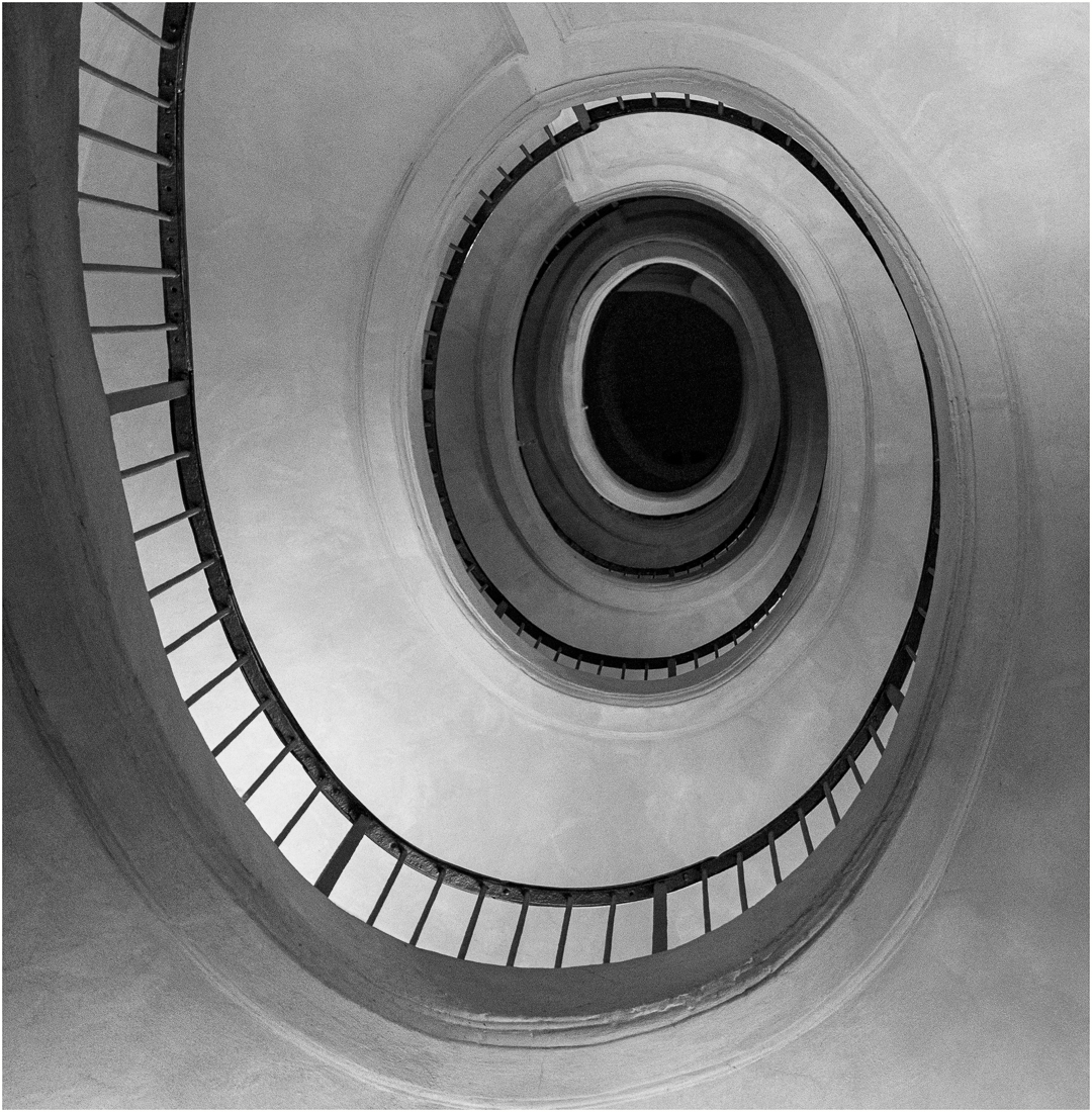
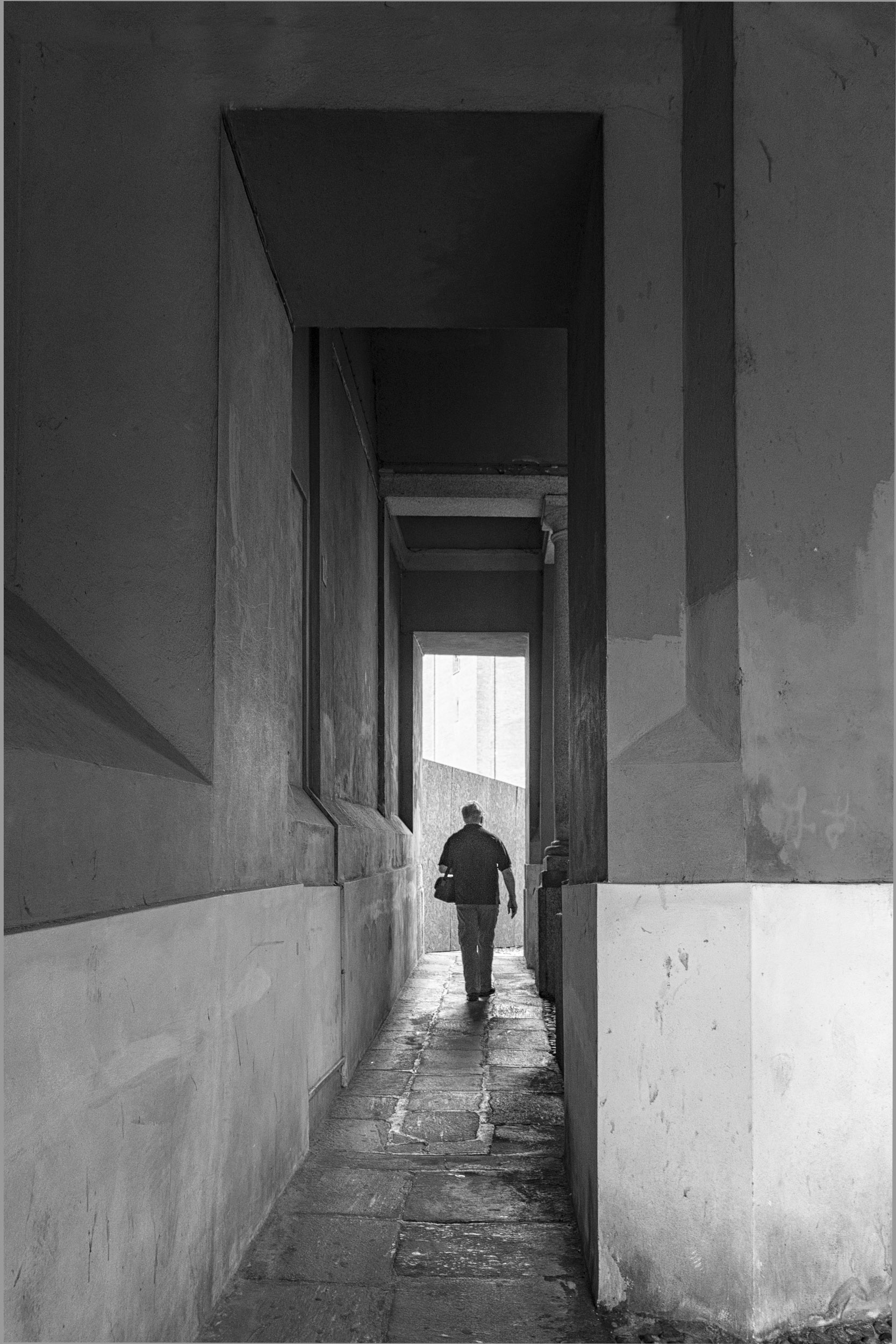
Dirk
This is an interesting image of a man made structure competing with nature. I like the graphic contrast of the man made structure vs nature's fluffy clouds.
Your choice of perspective gives a strong message of man vs nature.
I prefer your original version. To me, the darker tones have a stronger visual pull and help balance the image.
I can see that you have carefully cropped the image. For me, I would like to see more negative space. See image attached. I applied content aware crop to increase the sky.
This is another interpretation of your image.
To create more contrast, I applied a curves layer in PS. To create more tone and shadow under the balcony, I applied a levels layer, inverted, and selectively masked in a darker tone. In LR, I also bumped up the contrast, dehazed and increased the clarity.
|
Dec 6th |
 |
| 83 |
Dec 18 |
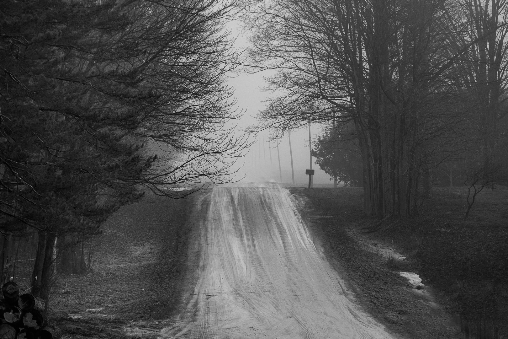
Comment |
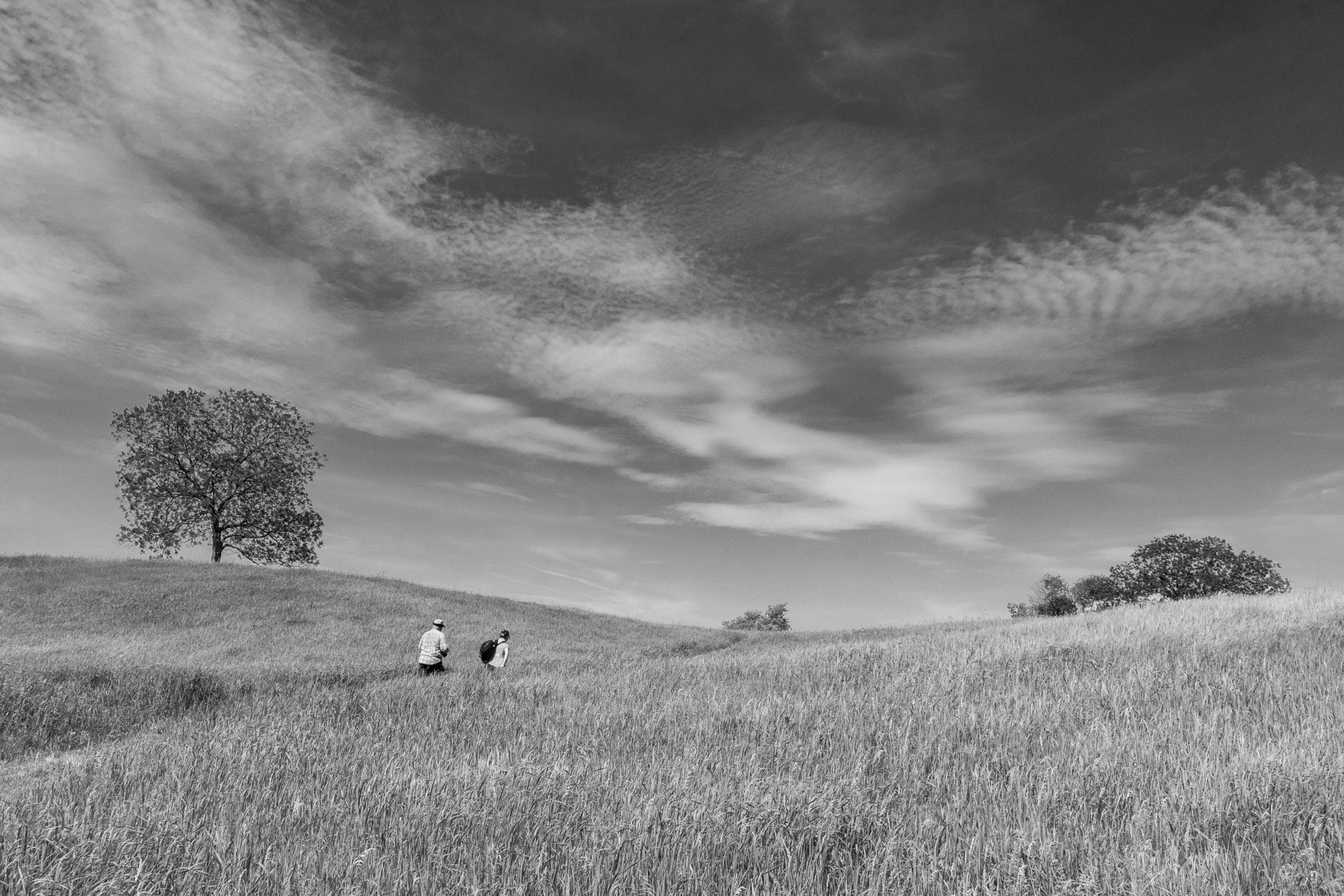
Hi Jane
This is a beautiful moody landscape. Cropping on the left to me strengths the composition putting the vertical tree more on the rule of third line. I like the softness in the sky and lines of the sky converging toward the tree. I feel that the white streaked highlight above the trees is a bit distracting. In PS, can you apply a levels adjustment and tone down the highlight. |
Dec 6th |
9 comments - 6 replies for Group 83
|
11 comments - 7 replies Total
|