|
| Group |
Round |
C/R |
Comment |
Date |
Image |
| 83 |
Dec 19 |
Comment |
Hi dear all, I have learnt so much from the group. I would like to say thank you! Wish you all a very happy holiday season. Merry Christmas and Happy New Year! |
Dec 19th |
| 83 |
Dec 19 |
Comment |
Hi Jose, happy holidays! This is a very lovely and beautiful image. I love every bit of it. Beautiful setup with the falling snow and you have caught the perfect moment. Agree with Lance and Judy, removing the steps would make the image cleaner. Also, today I revisited the image and noticed the lower right corner has a man-make object too. I think it might look nicer if replace it with the snow white ground as the left side is. |
Dec 19th |
| 83 |
Dec 19 |
Comment |
Hi Lance, beautiful image! Love your composition, nice contrast, and good detail texture on the tree trunk. Everything seems to put together perfectly. Wonder if the light color of the leaves is from the snow or Fall colors. :) If there is anything I must pick on, I'm thinking about to clean up the leaves at the left /top of the border. |
Dec 19th |
| 83 |
Dec 19 |
Comment |
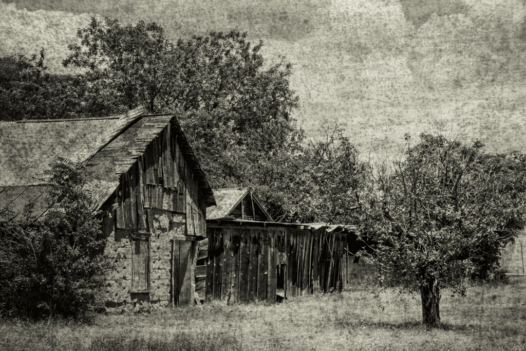
Hi Georgianne, nice capture of the interesting falling apart old house. It's definitely a winning image after converting it to b/w. I like your creative way of making this image the ancient look and feel. I feel it's a little bit depressed as the light is kind of dim. I use the curve to make a small adjustment to bright up the highlights. Not sure if that's what you want or not. I like Lance's b/w modification of the original color image too. It seems both approach deliver totally different emotion to audience and they are good.
Judy, I enjoy reading you and Lance's conversation about presets. I think it's very common now to use presets for special effects. It's always nice to know how to create your own ones. Lance, even though using presets looks like cheated, nowadays to photographers it's so popular. |
Dec 19th |
 |
| 83 |
Dec 19 |
Comment |
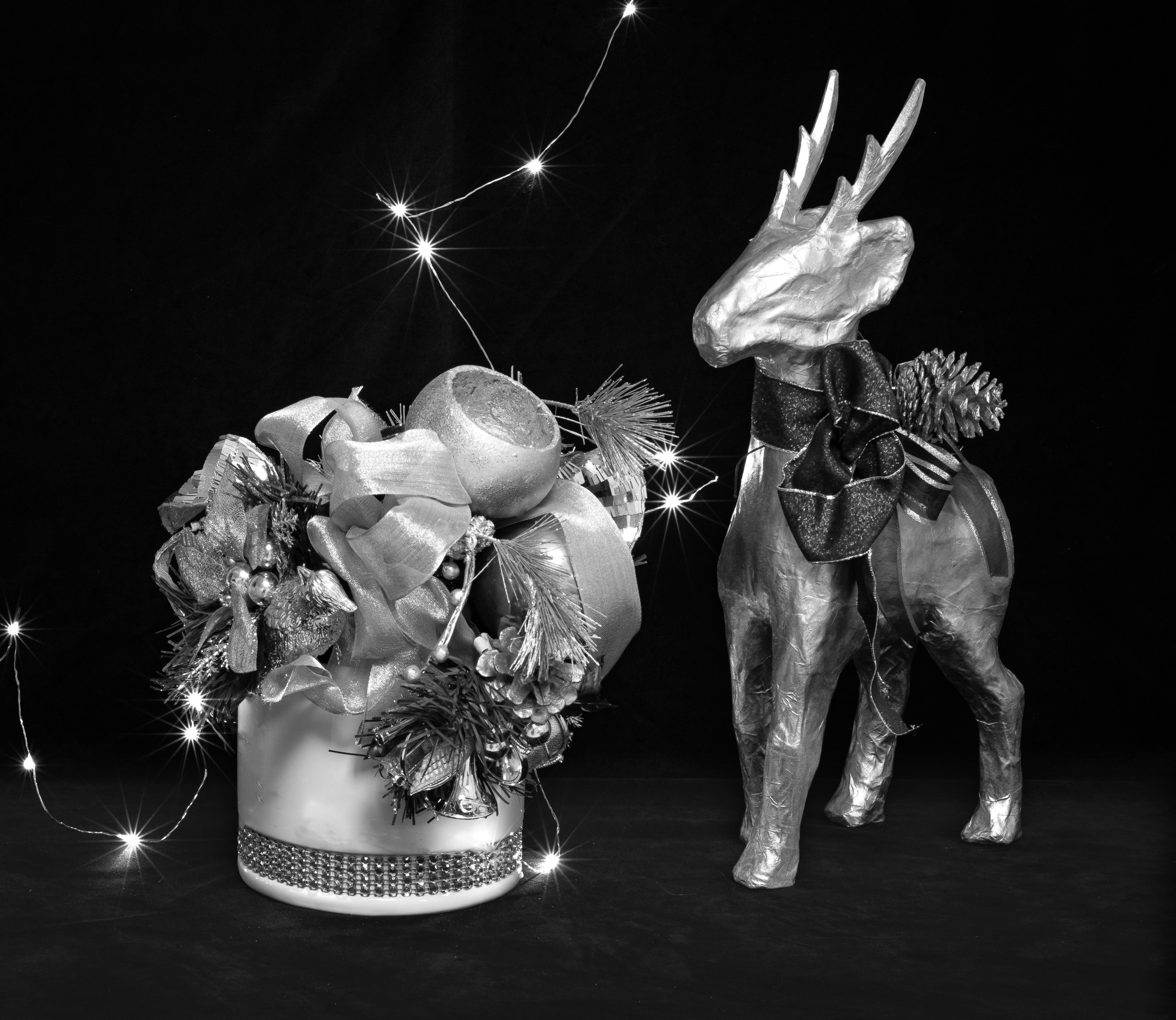
Hi Judy and Lance, agree, the black background does bring out the sparkling lights. Making background lighter won't look that good. I'm thinking another way to add some depth to the image. I think a few things we could try. I'm uploading one that I lighten up your table stand to add some depth. Or maybe add/drop a pine cone at front of the table. It's very thoughtful that you covered up the stand, otherwise it won't look so nice after I add more brightness to it. |
Dec 19th |
 |
| 83 |
Dec 19 |
Comment |
Hi Judy, beautiful still life shot! Did you use any focus stacking? The objects look very sharp and crispy to me. The lighting is perfect and I could see the texture and details of the ribbon and the reindeer. I really like the sparkling LEDs too. I wish there are more. lol It is a very nice elegant image. Well done Judy! If there is anything I could add, I might try to replace the black background to something that could give a little bit depth of the surroundings. Maybe it's just me, I feel the black background makes the image a little bit too flat.
|
Dec 18th |
| 83 |
Dec 19 |
Comment |
Hi Dirk, I was hoping you might be ahead of me to come out the dark, guess not yet, wish you good luck in your publication. :)
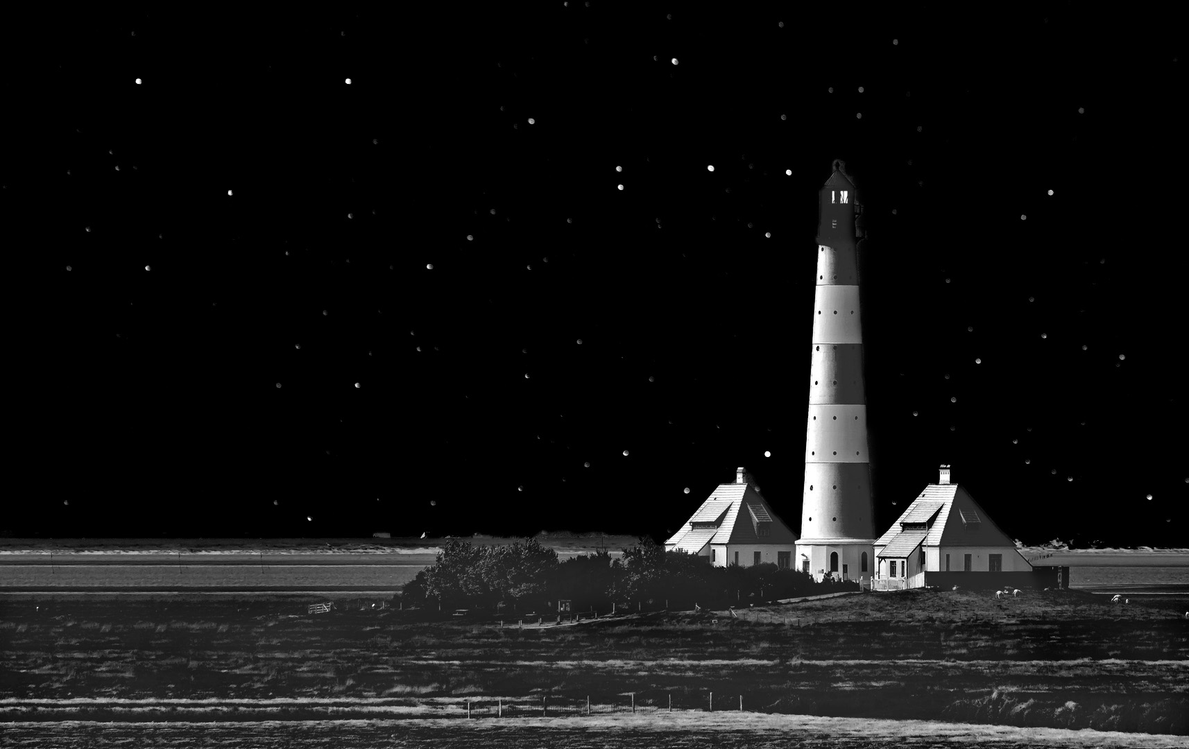
This image, indeed very interesting. I have never seen such a pretty lighthouse painted like a Santa lighthouse.:) I like your idea of putting a night sky behind as twinkle twinkle little stars all around. Strong composition. It does look like a miniatures in a Christmas Village, as Lance mentioned. :) Good creative work. :) However, I think the sky is a little bit too busy and took away some of the attention from the lighthouse. I made a small contrast adjustment to the sky, used TK to bring up the lighthouse and the surrounding. This way I feel more like real, but it might have broken your intend to make the sky looked like snow, as what Judy saw. :) (Sorry, the separation of sky and the lighthouse at the top part isn't that good as I am just making a draft.) |
Dec 18th |
 |
| 83 |
Dec 19 |
Reply |
Hi Georginanne, thanks for re-editing the image. I like what you did to darken the background. I agree with Lance though, after bringing up the table, this b/w looked more like the color one. :) When I reedit the image, I'll give a try as you suggested.
Lance, I like your interpretation of the emotion connection between the music and the image. :) thanks again. |
Dec 18th |
| 83 |
Dec 19 |
Reply |
Hi Judy, what a good catch! Thanks! I'll give a try to remove the uncompleted harts. Talking about focus, I agree, I think it could be better if I have used focus stacking. |
Dec 18th |
| 83 |
Dec 19 |
Reply |
Hi Lance, you are so encouraging! Honestly, after I finished my b/w conversion, I thought this was a failed one compared with the color version. Glad I did it.
About the background, I like your idea to smooth the border of the table and blend in. Thanks! I'll give a try later. Talking about greeting card, what a good idea! But I guess I'll need to use the color one. :) Thanks again. |
Dec 18th |
| 83 |
Dec 19 |
Reply |
Hi Jose, thanks! You are right about the bokeh. Also you can tell my terrible craftsmen skills. lol |
Dec 18th |
| 83 |
Dec 19 |
Comment |
Hi everyone, it's really nice to read all your posts after my final. Thank you! :) I'll reply to each of the comments. :)
|
Dec 17th |
8 comments - 4 replies for Group 83
|
8 comments - 4 replies Total
|