|
| Group |
Round |
C/R |
Comment |
Date |
Image |
| 83 |
Aug 19 |
Comment |
Judy, I save this the last as you know I have a lot to learn. :) I like your portrait. I like the pose, the exposure, and the effect of the natural lighting. I'm amazed that you could come up such a great shot only within 2~3 min. To me it'll be hours. That's why I don't do portrait as I don't know how to do it. lol Talking about the highlighting spots, as you mentioned, I did notice the buttons having some washing out, but I don't think that matters that much. As the details of the forehead, I'm not that certain if it's from the highlighting or opening up of the shuttle. I feel your image is a little bit like Julia's photos, which belongs to the soft focus type. I learnt her style from Lance's posting. :) Please correct me if I'm wrong. |
Aug 31st |
| 83 |
Aug 19 |
Comment |
Graham, what a great street shot you've made! Love it. I like the motion contrast you used in the image, still and moving. Very good capture. I think making this image b/w is a very good idea as it draws more attention to the subjects than the distraction created by different color schemes. I like your title. You tried a very challenge composition with two passengers passed by. To me I might be able to only handle one passenger. lol Thanks for the sharing Graham, glad that you are back. :) |
Aug 31st |
| 83 |
Aug 19 |
Comment |
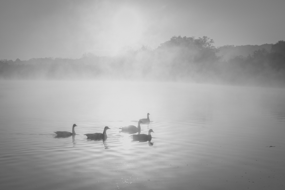
Welcome to the team Georgianne. It's very interesting that the different feeling that this sepia monochromatic image brought in compared with the color one. From this image it does make me feel scared. :) Looking at the monochromatic image, it's a little bit like HDR as the details of brightness and shadow almost even, maybe the process made the clarity too good that lack of the spatial feeling. In reality, subjects closed to us usually clearer than those far away, which adding spatial distance to the image. Maybe that's why the color image looks better as the far away latter tip is less clear and the blue color cooling down the anxiety and let one feels distant. Thank you very much for sharing this image. |
Aug 31st |
| 83 |
Aug 19 |
Comment |
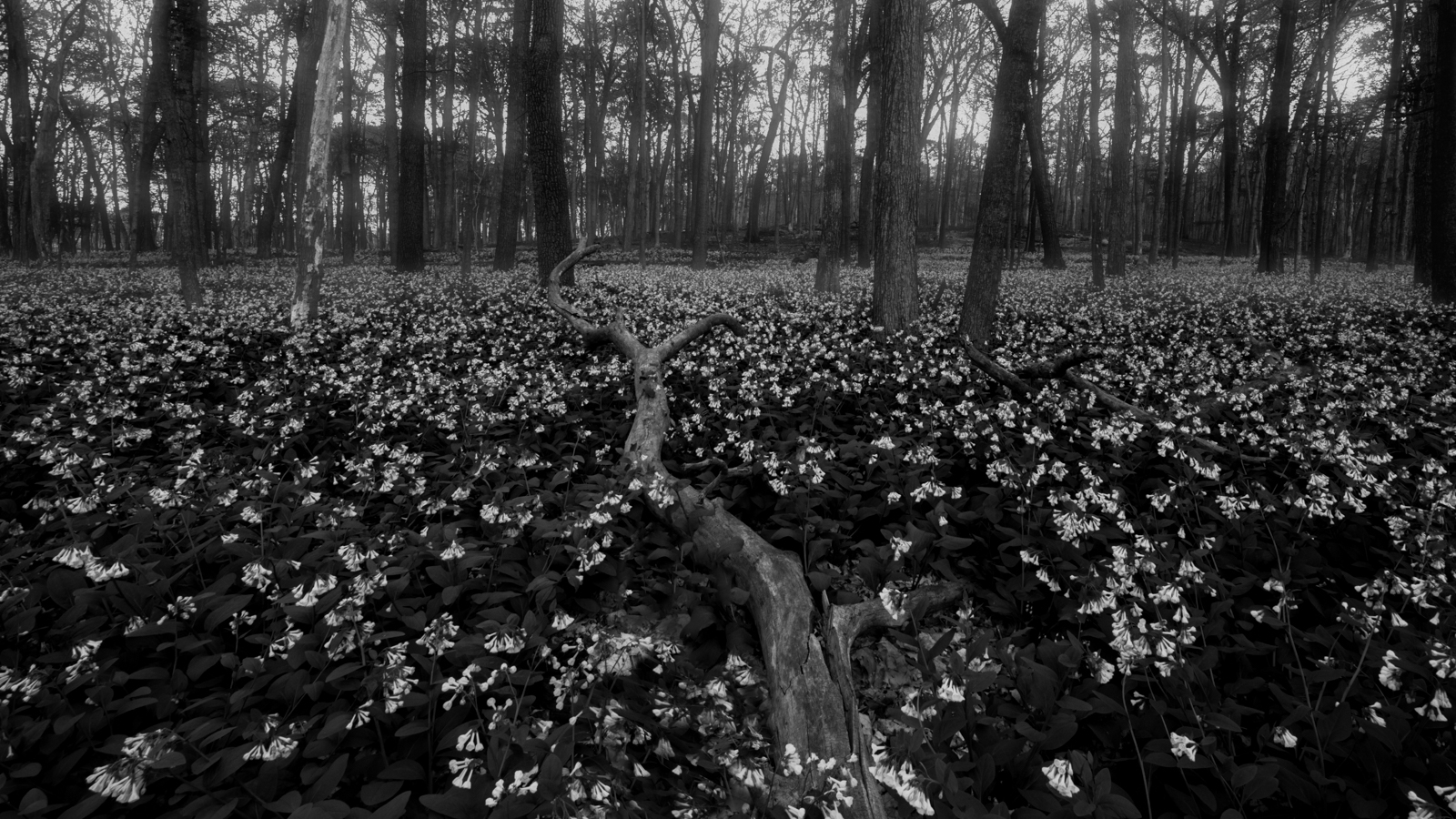
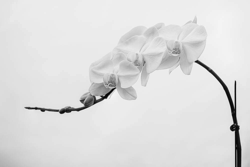
Hi Lance, welcome to the team. This is a very interesting image, just as Jose experienced, at first I thought this is from some canyon, it took me a long while to realize it's a flower. :) I like the lighting from the back and the softness with your open F. With most of your toning at the middle tone, it adds more softness and uncertainty to the image also. That's a good use of it. The waving edge of the flower definitely brings more dynamic to the image. If I must pick something to say about, I might try to add some separation between the tip and the shadow of the middle. I know it's hard for the nature flower to grow so perfect. :) But anyway, this is a beautiful b/w art work and thank you for sharing. Btw, I checked on Julia, Nadar, and Lange's portraits too, thank you and Judy to bring up these excellent masters' work to our attention. I think Julia's photos are very unique that is good at certain type of portraits. |
Aug 31st |
| 83 |
Aug 19 |
Comment |
Jose, I love this shot! So authentic! This image let me feel like to rush into the water to have a good swim. :) I like your framing, the fish and scale feel like decoration. The connection between the ocean and the audience is so strong that makes me think maybe the title of the image could be altered to present that. :) Thanks for the sharing. Is it a high tide or everyday is as this? Where is the place? |
Aug 31st |
| 83 |
Aug 19 |
Comment |
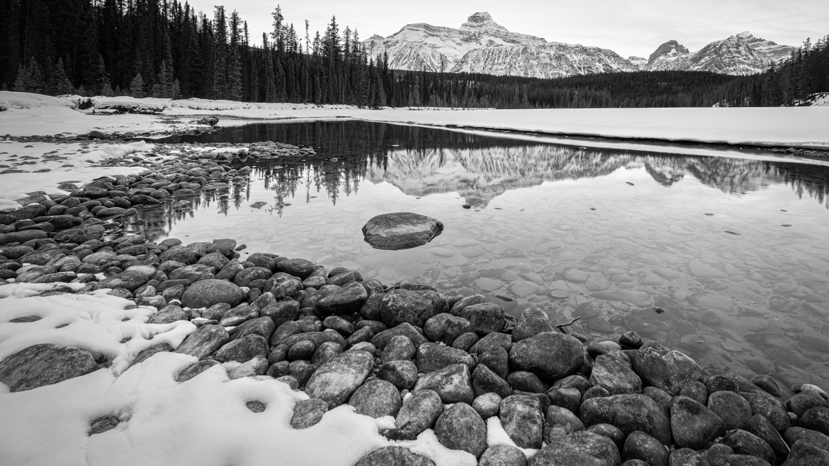
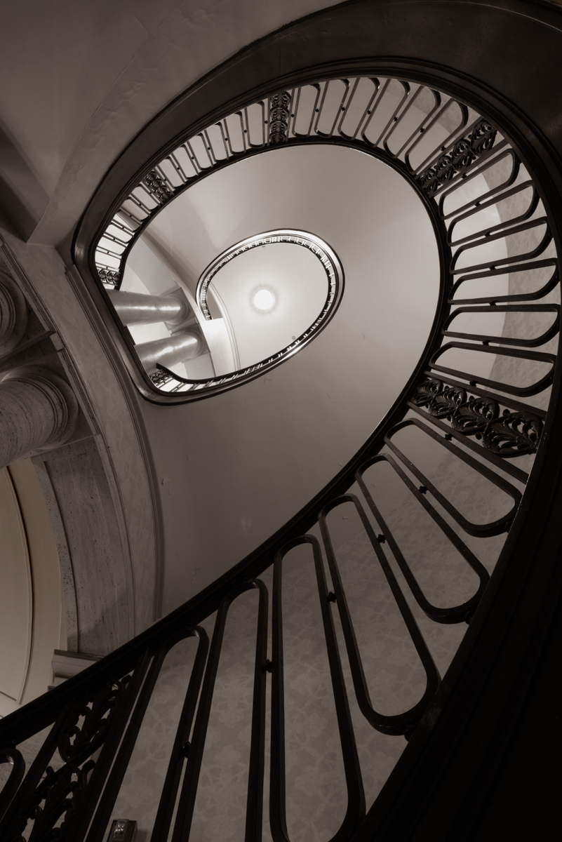
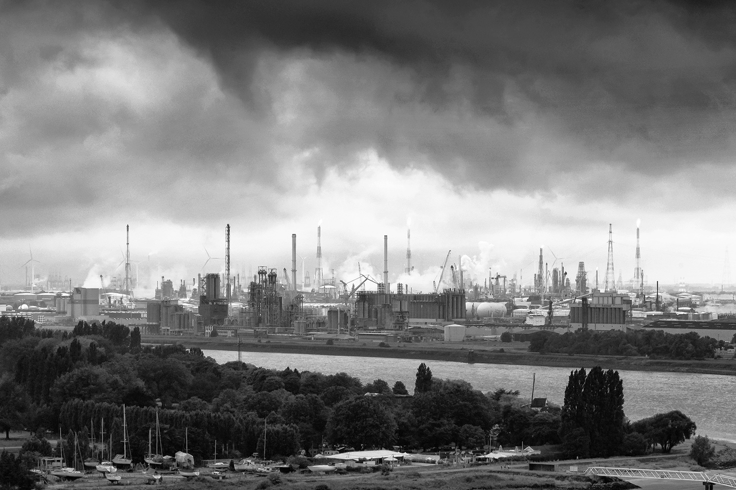
Dirk, what an interesting and rich content image. I like the way that you framed the industry campus, between the dark cloud and the ground. It gave me a sense of watching a historical documentary movie.:) If I must say something, I might say the foreground seems to have too much of detail that distract people focus to the industry park. I cropped the image a little bit. But it seems I like the original more. |
Aug 30th |
 |
| 83 |
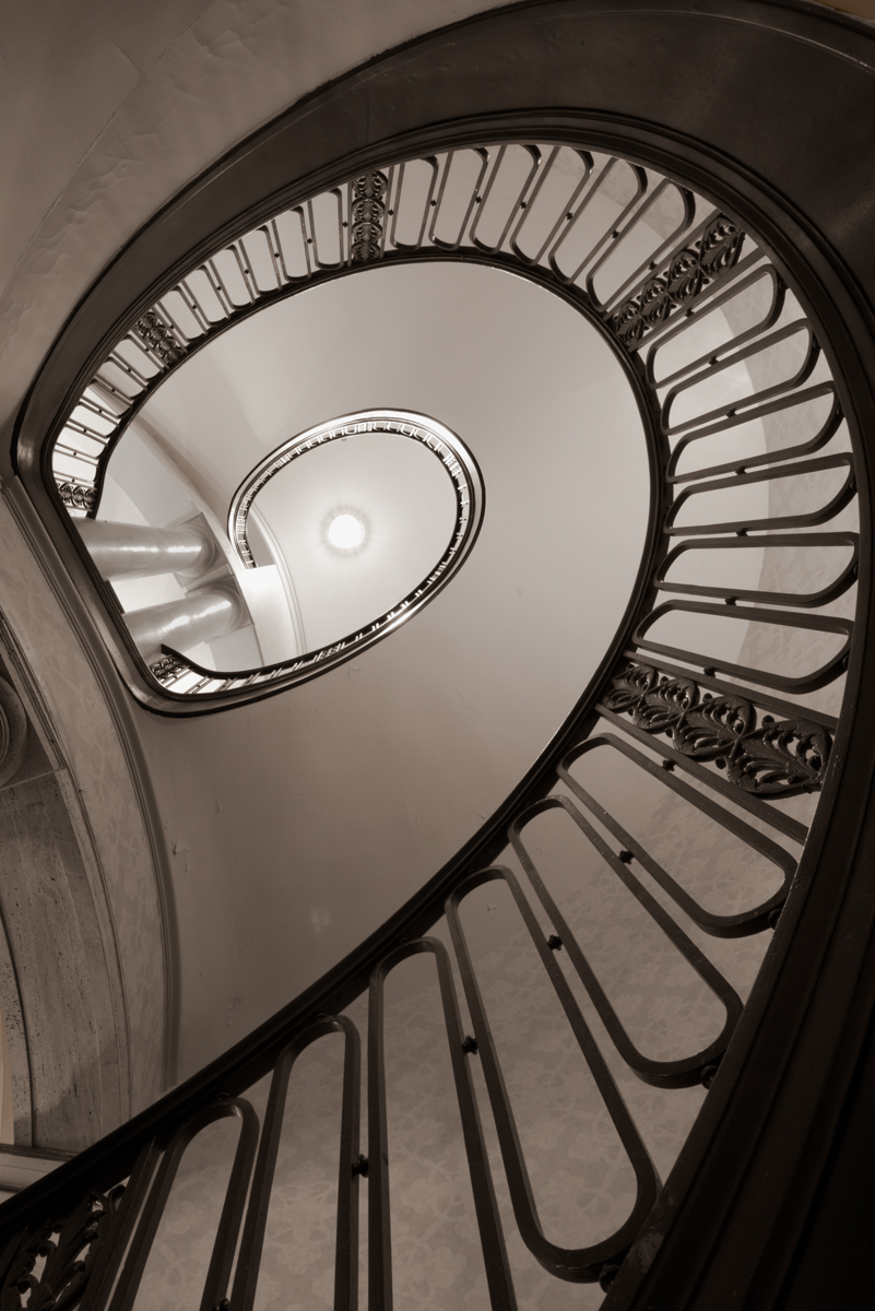
Aug 19 |
Comment |
After cropping, the perspective of the stairs don't look the same. :( |
Aug 30th |
| 83 |
Aug 19 |
Comment |
Not sure why my reload of the images look so dark on the browser. |
Aug 30th |
 |
| 83 |
Aug 19 |
Comment |
|
Aug 30th |
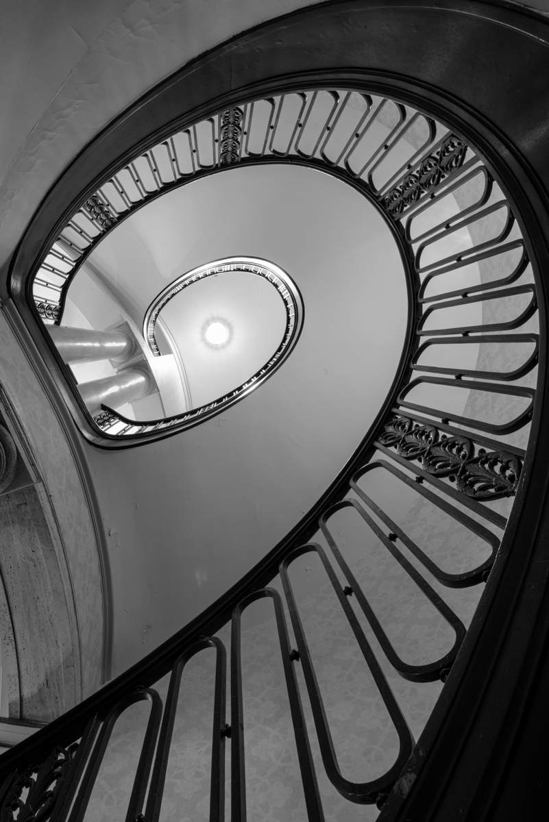 |
| 83 |
Aug 19 |
Comment |
Thanks Barbara, Lance, Jose, Judy, Charles, and Georgianne! It's very nice and encouraging reading all your suggestion and comments. "Fiobinacci stairs", what a great name for this stairs. :) Thanks Jose, I'll definite use it. Judy, I like your cropping. Georgianne, you are right, I feel the same too, and I like how you removing the details even though I don't know how you did it. :) These two types of composition that help to eliminate the distraction from the supporting posts seem to affect to the visual effect of the image. I'm still debating which one is better. Barbara, thanks for a positive note about the center bright spot. Lance, your fine touch of the reflection made the image very interesting and it does help to balance out the center brightness. Charles, thanks for your such positive comments about the image. :) I have tried to blend in all your ideas and make some modification to the image, here are two versions, both used Judy's cropping. One with the real b/w instead of Sepia. Please feel free to let me know what you think. Thanks! :) |
Aug 30th |
10 comments - 0 replies for Group 83
|
10 comments - 0 replies Total
|