|
| Group |
Round |
C/R |
Comment |
Date |
Image |
| 83 |
Jun 19 |
Comment |
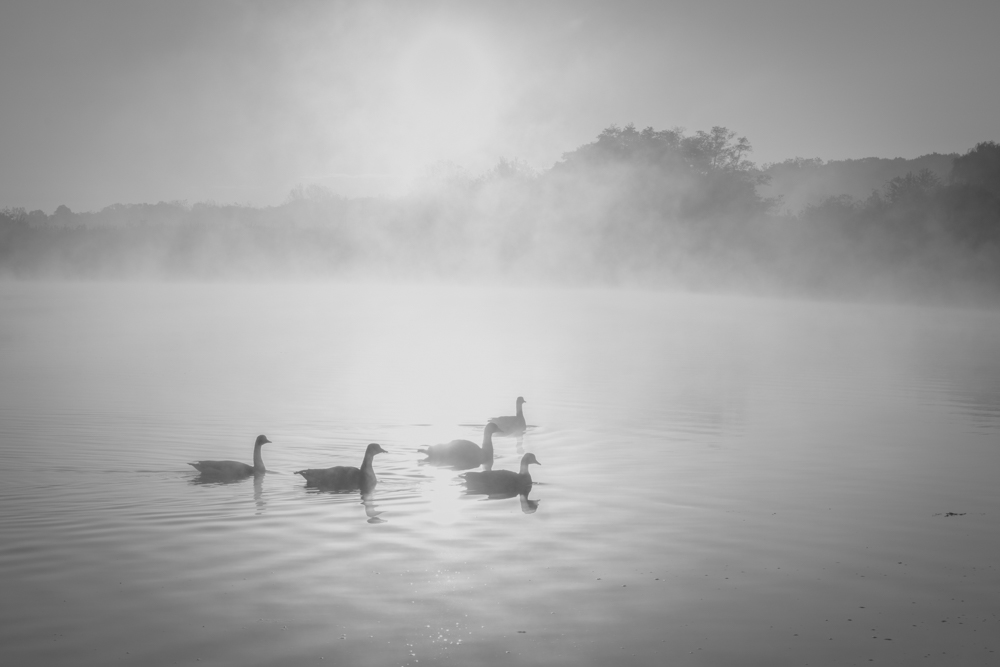
Hi Jose, what a beautiful landscape image! I like the quiet moment that the image brings in. As Dirk said, the small white fishing boat is a perfect anchor for the image. Wish it faces to the left side. I know it's hard to be so perfect. Judy made a good comments about the cloud. I noticed there is a small white spot at the left lower corner of the water stream. If you could tune down the reflection of the sky/cloud, it will help to bring more attention to the boat. |
Jun 30th |
| 83 |
Jun 19 |
Comment |
Hi Graham, agree with Jose, your image transfers us back to the old days, or somewhere only be seen in movies now. I like the texture that the bricks look like. The exposure at the front of the image is good. Agree with Dirk and Judy, the hallway under the sun is a little bit over exposure that washed out the details. Not sure if you could bring it down by using luminosity mask. Jose made a good point that under such a strong contrast env, you might need to use exposure stacking to get a good image. |
Jun 30th |
| 83 |
Jun 19 |
Comment |
Hi Judy, I think you did great job to convert the color into b/w. This makes the lady much more lovely without the distraction of her colored hair. Yeah the lighting is a little bit harsh. But it seems you handled it well except some small shady spots. It's interesting that you captured the couple in totally different kinds of eye focus, the lady is in well focus but her eyes are looking away, the husband was looking at your direction, and his face is out off focus. What a interesting moment! :) |
Jun 29th |
| 83 |
Jun 19 |
Comment |
Very interesting image Dirk. Very nice shapes and strong composition. I like the leaves that are white which well matching to the white color of the walls. The lines of the dark roofs are striking too. I agree with both Jose and Judy's observation about the plane and roof. Also, I feel the middle part of the image, with the round shape, a little bit too bright. The shadows from the light added some interesting texture to the image, but with this image, I feel they are a little bit distract. I wonder how the image looks like if w/o them. |
Jun 29th |
| 83 |
Jun 19 |
Comment |
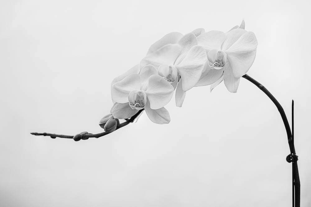
Thanks Jose, Dirk, and Judy! Good idea Jose to clean up the background. Dirk, I agree with you, this image doesn't bring in the type of feeling that high key images give. Maybe a wedding bouquet works out better. Not sure if it's due to the shape of the orchid or the lack of complexity of the texture. Good observation Judy. I had cut short the support, but it still looks awkward. I think I need to try something else. |
Jun 29th |
5 comments - 0 replies for Group 83
|
5 comments - 0 replies Total
|