|
| Group |
Round |
C/R |
Comment |
Date |
Image |
| 83 |
Apr 19 |
Reply |
Judy, agree. When you are too far from the object using a standard lens or a wide angle lens, especially this type of event, it seems very unlikely that you can blur the background. I noticed using a zoom lens could help. As the documentary part, it is an interesting question that I'm afraid I won't know the answer. I'm curious about it too. |
Apr 29th |
| 83 |
Apr 19 |
Comment |
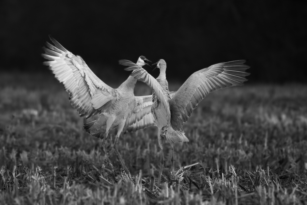
Hi all, thank you so much for all your comments. I really appreciate that. After reading your inputs and seeing the outputs from Judy and Jose, I have a warm feeling about this B&W approach. You all bring in very good thoughts and good implementation plans to me. Both Peter and Judy introduced some new way of masking burning/dodging that I've never done before, thanks and I'll practice them to see which works for me better. :) Graham brought in an uncommon thought to create a sort of rim light around the red head. It's interesting as halo is always bothers me when I tried to separate objects from sky as multiple exposure stacking used in landscape shots. Dirk, Tracy and Jose you make very good points about the separation of sharpness between grass and birds. Agree that toning down the grass helps to bring up the birds too. Again, thanks all and it's really good to have your input here. |
Apr 29th |
| 83 |
Apr 19 |
Comment |
Hi Dirk, I'm sorry that I have almost left out your image unintentionally due to my busy weekend schedule. :) Glad I still get one more day to add my input to it. Judy is always so helpful with creating a new image that let us be able to visual the changes that you suggested. I think the modification you made to the background helps the snake more prompt to the audiences. I agree with Tracy and Jose too, 100% removing the background lost some interesting parts of the image. I might try to tone down the background but still leave some texture there. Another part I would like to suggest is to separate the brightness between the head and the body. The focus of the head is interesting and the lack of focus of the body became destructing. |
Apr 29th |
| 83 |
Apr 19 |
Comment |
Hi Judy, what a great action shot you captured! Both movements and the facial expression are perfect! I think you did a great job to lower the tone of the bright orange doors. Nice work on this b/w conversion. Agree with Tracy and Jose, if this is your only photo, then you could try the PS Gaussian Blur to blur your background with a mask. Now I can see the color variation on both boys hands. :) My only suggestion would be remove the reflection light switch under the ear of the boy that looking down to the ball. :) |
Apr 26th |
| 83 |
Apr 19 |
Comment |
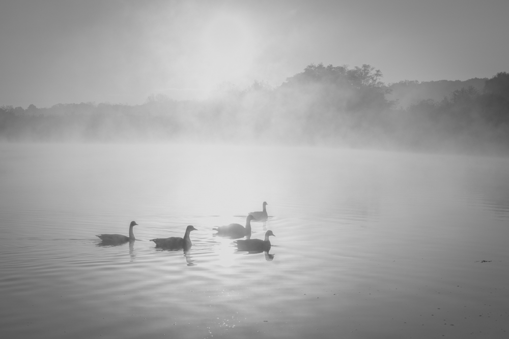
Hi Graham, thanks for bringing us such a touching image, I like the mood very much. Our team is amazing as every entry is so helpful that let me learn something from it. I don't feel I have too much to say except to suggest to add some contrast between the front frame and the fading away couple as Tracy and Dirk mentioned. I might take the approach in between, make the front a little bit clear, but not too much and add some fogs to the back but not too much either to increase the distance feeling in the image. |
Apr 25th |
| 83 |
Apr 19 |
Comment |
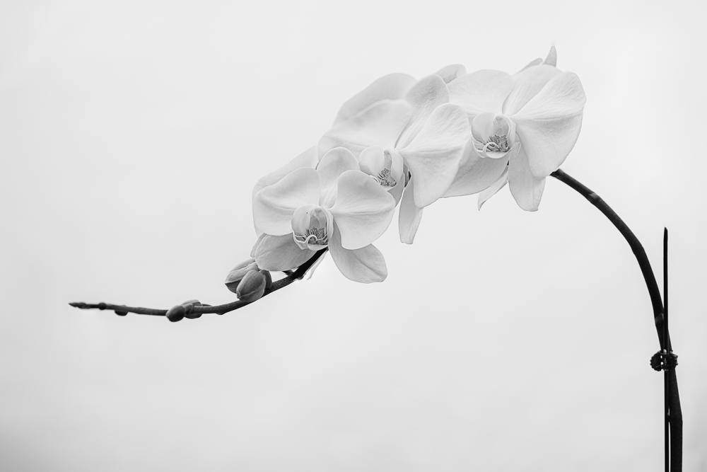
Hi Tracy, beautiful flowers. It makes me want to go out this weekend to shoot some too, finally our tulips are blooming after a long winter. :) It's very interesting to compare your original with Judy's dark background tulip. I like both. :) Indeed they feel so different. Yours is at the mid-tone with low contrast, it brought in softness, let me feel a little bit sleepy too. :D Judy's is low key with high contrast, which brought me strong and hard feeling that I feel like that's not a tulip in the Spring anymore. I think your gals' hands are magical. So I guess it's really depends on the mood that you would like to direct your audiences to. Maybe try a high key tulip with low contrast, it might bring in raining and foggy feeling to the table. Wish I know how to make it. lol OK, back to the image, Tracy, I might suggest to lower the highlight of the image a little bit as I feel there are a few spots at the tip of the heart of the Tulip are over exposed, unless that's your intention. Thanks for sharing the idea of using a reflector as the background. I will order a 7-in-1 from amazon now. |
Apr 25th |
| 83 |
Apr 19 |
Comment |
Hi Peter, thanks for sharing an interesting image. I could never imagine one could make such a low key edge lighting up image from a normal picture. :) I'm actually thinking to acquire some lights and bring to a garden to make some back lighting shots like this for a few days lately. Now I know there is another (might be easier:) way to do so. lol But anyway, agree with Jose, I think minimizing some small lighting edges might create stronger impact on the bigger objects. Thanks for sharing this interesting new way of creating effects. |
Apr 25th |
| 83 |
Apr 19 |
Comment |
Hi Jose, what a beautiful picture and beautiful lady your client is. Must be very pleasant to make a pictures like this. :) Glad that you all are commenting on the lighting as I am curious too. Were you using a loop lighting on the client? I know a lot of beauty shots using the butterfly lighting. But this one did not seem to be a butterfly one. I like the rim light on her. Judy brought up a good point about the white spot above the lips. I noticed a few other places too, such as the ear and the white dark hair that is at the front top. I think some reason those spots are distracting the attention on the face. But overall, it's a very good shot. Thanks for sharing with us. |
Apr 25th |
7 comments - 1 reply for Group 83
|
7 comments - 1 reply Total
|
