|
| Group |
Round |
C/R |
Comment |
Date |
Image |
| 83 |
Mar 19 |
Comment |
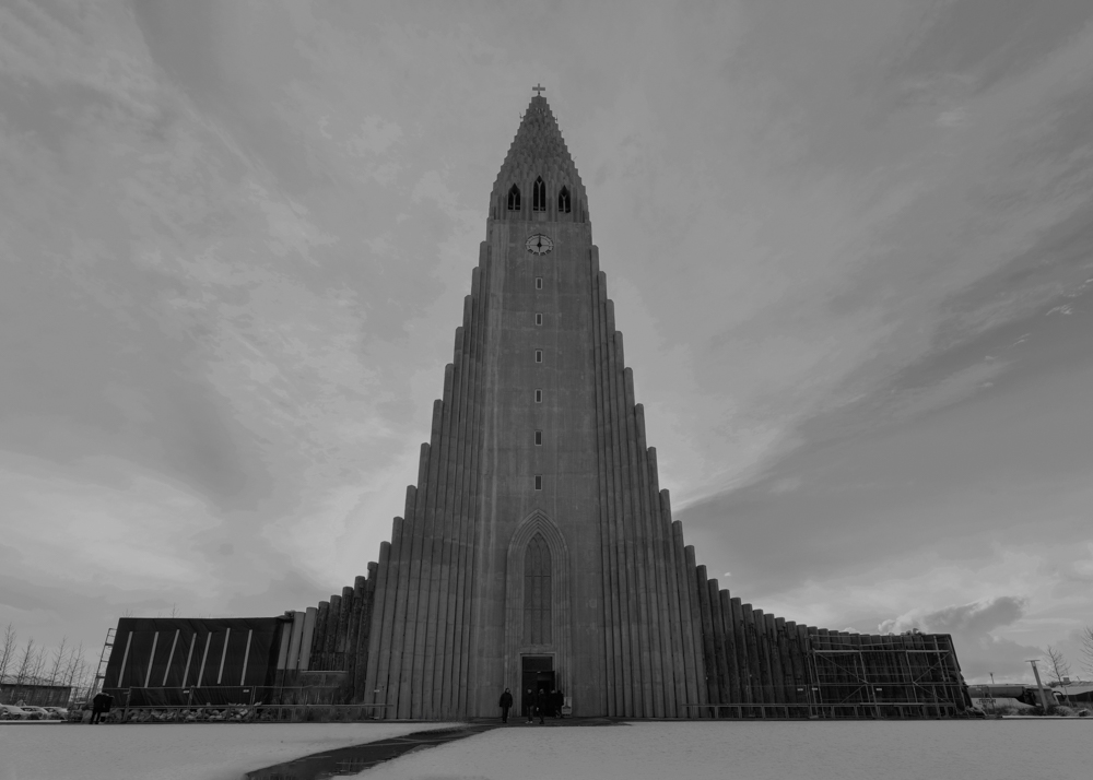
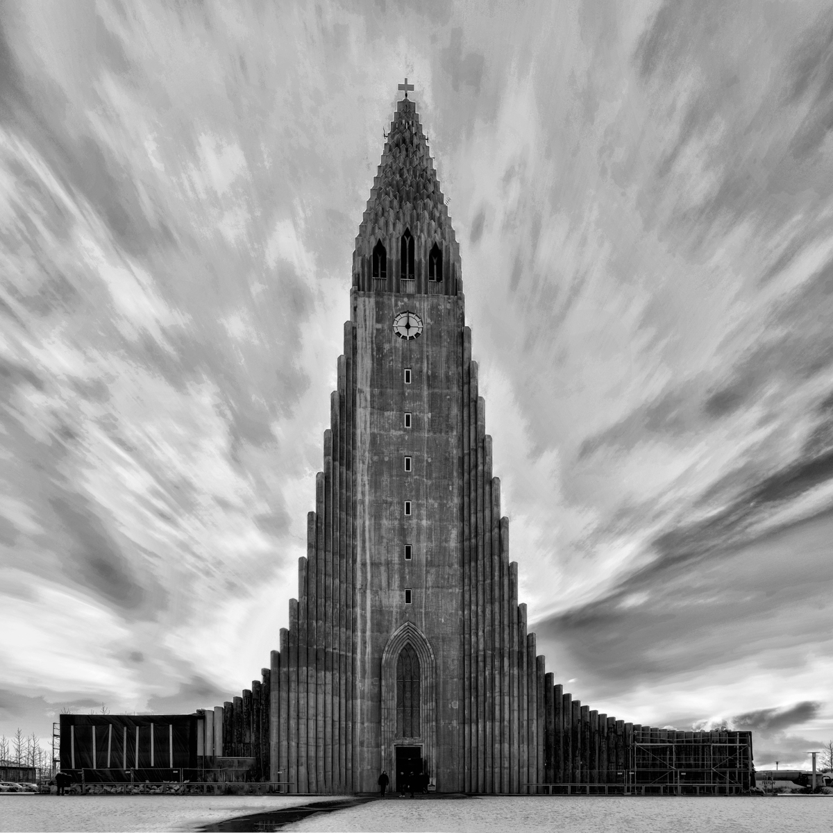
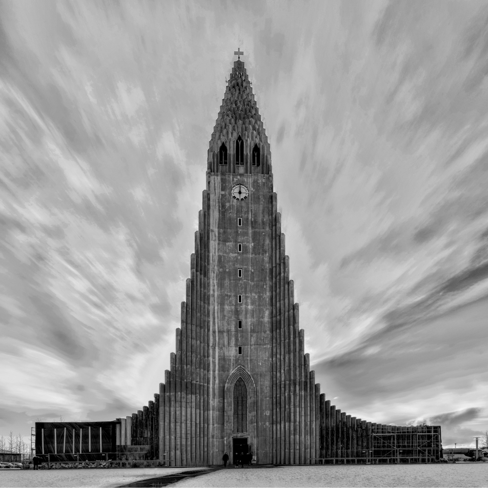
My one more update of the post processing image. Not sure if it's better or worst. :) I'm not sure why the pixels on the cloud look so bad. I used Nik's tonal filter to stretch the cloud definition and contrast.
|
Mar 27th |
 |
| 83 |
Mar 19 |
Comment |
Thank you Charles & Jose, very nice input. :) I found this group is really helpful. Thanks everyone for the great ideas and demos. I finally get something like this. I used the Tonal from Nik which seems to exaggerate the cloud a lot. I still fill the clouds are weak. I might try to darken the cloud and lighten the church a little bit more for my submission in my club. :) What do you think?
|
Mar 25th |
 |
| 83 |
Mar 19 |
Comment |
Hi Jose, this is a very interesting image. There are so much information in it. I like the suggestion from Peter too. I noticed Peter was darken out some of the surroundings to bring attention to the craftsman. I think that's a great idea. I like the framing that Judy suggested. A little bit more surrounding makes the image more comfortable. |
Mar 19th |
| 83 |
Mar 19 |
Comment |
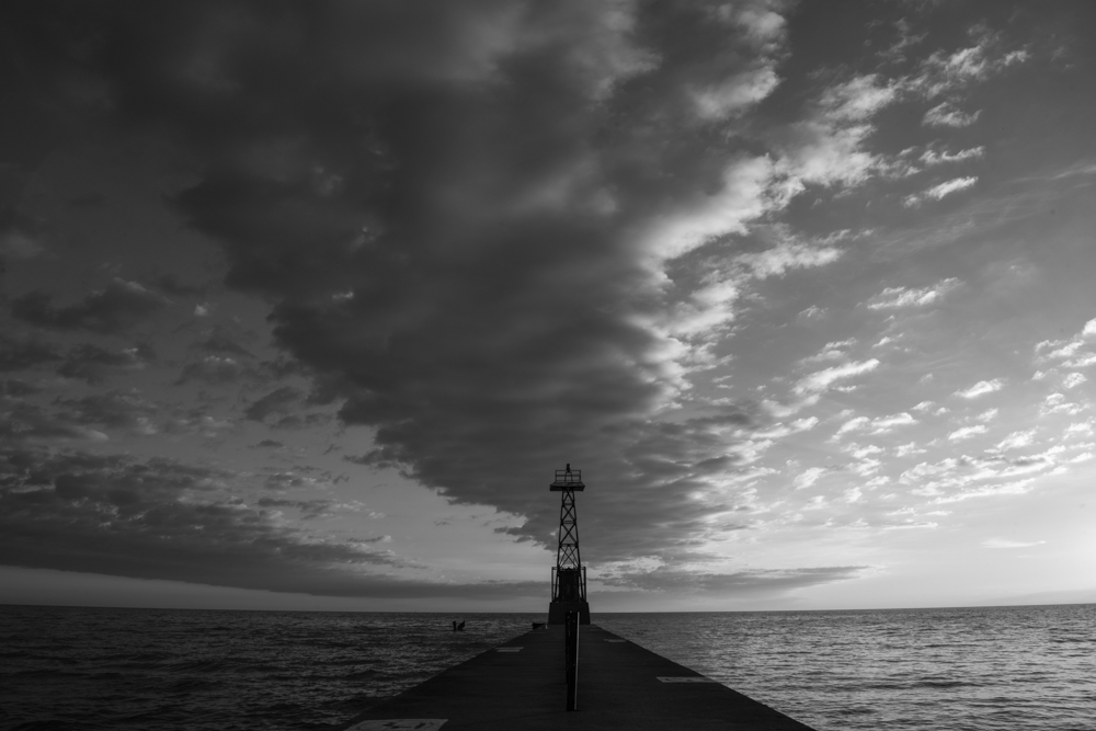
Hi Peter, agree with all the others, the color is better for this image. But if you must have a b/w, I would suggest to break down the image into two parts. I like the cloud and the sail boat just themselves w/o the skyrocket building. I think that'll make a very good picture too. |
Mar 19th |
| 83 |
Mar 19 |
Comment |
Hi Tracy, this is a beautiful architecture with rich history. I like the image as it is that represents more than just doors. :) Jose made a good point. I'm attracted to the texture on the wall and the overall of the building more than the doors while looking at your photo. Agree with Peter to extend the ground a little bit. I like Judy enhanced the texture and tonal on the wall as well. IMO, if you want to draw attention to the doors, a square frame to cut down some of the wall might help. But I like the whole picture as Dirk said. :) |
Mar 19th |
| 83 |
Mar 19 |
Comment |
Hi Graham, a very interesting street photograph. Good observation. If changes of the image is allowed, I would vote for Dirk's reflection. :) |
Mar 19th |
| 83 |
Mar 19 |
Comment |
Agree, I like v2 too. |
Mar 19th |
| 83 |
Mar 19 |
Comment |
Dirk, you got a very interesting image. The metallic reflection on the candle is excellent. Agree that the windows create distraction in the image, but w/o the one on the wall does look too dull. I like the light and shadow pattern on the chair. What about to create soft light beams pass through the candelabra to the chair? I like the idea of bringing out the candelabra from the background. |
Mar 19th |
| 83 |
Mar 19 |
Comment |
Thank you so much Judy, Tracy, Dirk and Peter! You all gave me something very good to think about. I like Judy's straighten out the building, Tracy darken the sky, Peter's dramatic touch on the clouds, and Dirk's enhancement on the surface details of the building. In my mind, I would like to see a strong and firm church standing there with dynamic sky. Tracy, your off center composition is interesting too. I never looked at the picture in that way. Thanks all, I really learnt a lot from your discussion. |
Mar 18th |
9 comments - 0 replies for Group 83
|
9 comments - 0 replies Total
|