|
| Group |
Round |
C/R |
Comment |
Date |
Image |
| 83 |
Feb 19 |
Reply |
Maybe the dark color layer? How did Peter do it I have no idea.
|
Feb 21st |
| 83 |
Feb 19 |
Reply |
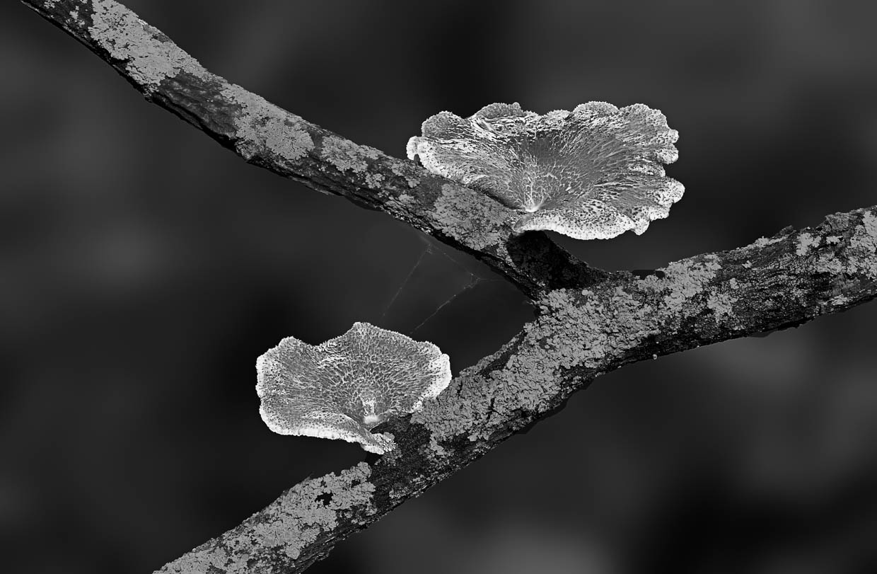
Hi Peter, now I see how you destroyed my love of the muddy soil. I have to put my head back to the mushrooms. LOL. Good cropping, even though I think the left side is a little bit too tire, but at least it makes audience only to think of the mushrooms. :D |
Feb 21st |
| 83 |
Feb 19 |
Reply |
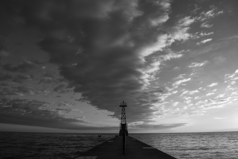
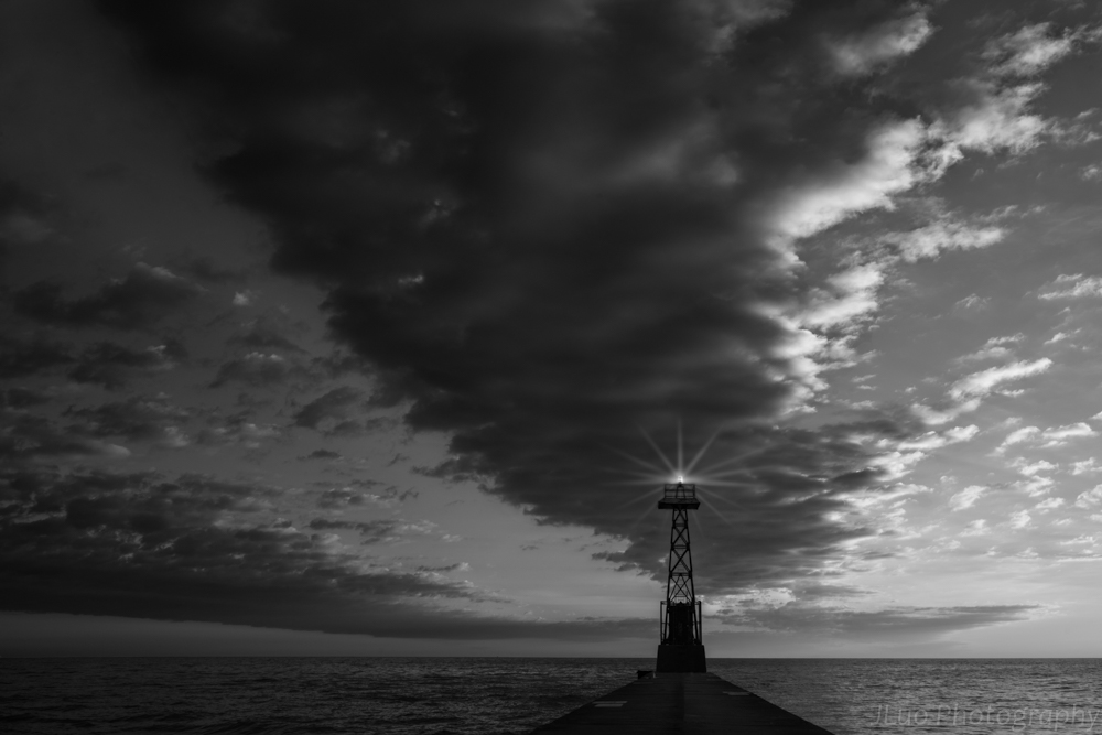
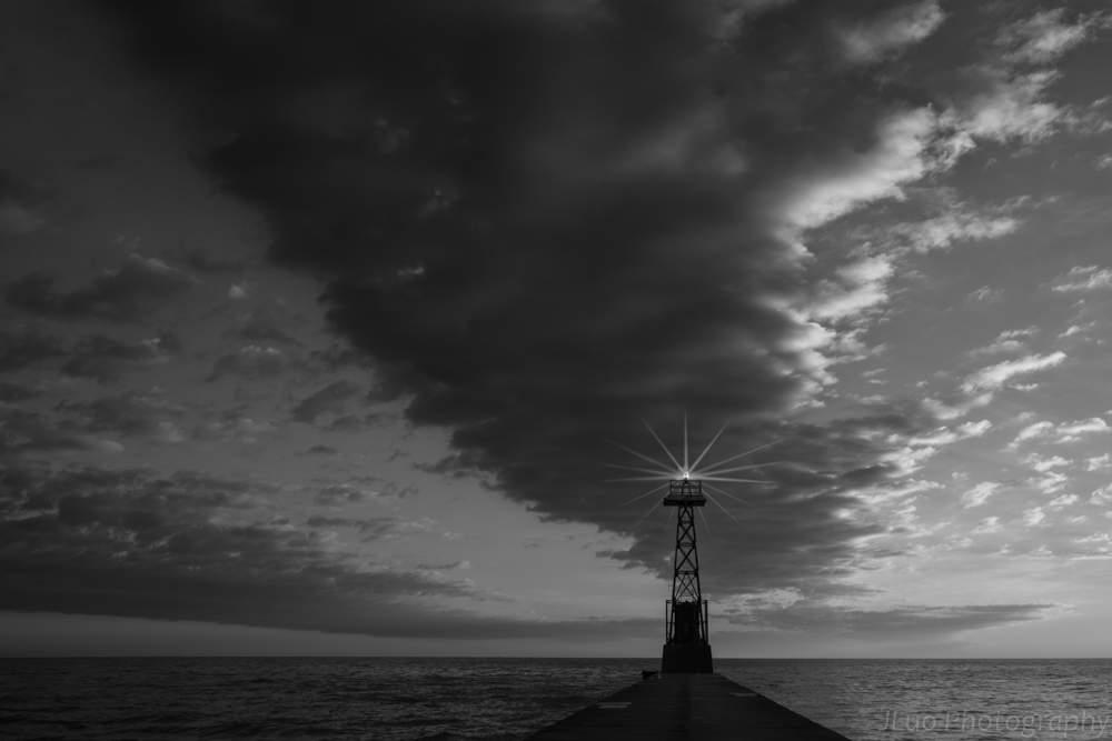
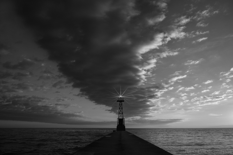
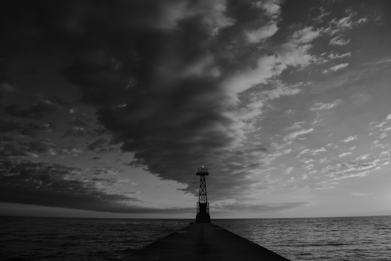
Hi Dirk, nice to know you have had so much fun. Maybe show us some of your real nature stuff in black and white in future? :) Oh, I'm actually thinking to try one next month. I like your latest upgrade of the image. I think it does look more focused to the vanish point and not get distracted. BTW, nice try on the architecture images. |
Feb 21st |
| 83 |
Feb 19 |
Reply |
Thanks Dirk, welcome back!
I guess you like the original nature color. :) I would think the b/w adds more dramatic effect on it. Now I need to consider the mood that Peter brought up about the light beams. Maybe be I could rename the image to something not before storm, or on the other hand, make the whole image sad and heavy. lol |
Feb 21st |
| 83 |
Feb 19 |
Reply |
Haha! Peter, you make me laughing. :) Thanks! |
Feb 21st |
| 83 |
Feb 19 |
Reply |
Thanks Judy! It's nice to know. I'll try it next time. |
Feb 21st |
| 83 |
Feb 19 |
Reply |
Thanks Jose and Peter for the explanation of dark background compared with natural setting of the background. True it's purely based on the subject and how people view it. I agree that Peter's beautiful and well processed image is good for either setting. As Jose mentioned, I think pure dark background is good to emphases on the texture and pattern of the image, especially if one wants to create 2D visual effect.
|
Feb 18th |
| 83 |
Feb 19 |
Reply |
Agree Judy. I found I learn a lot by participating this forum and read everyone's comments. Peter always could bring in some historical view points. I like that. Now I know how Norman Rockwell and Jackson Pollack do their paintings. :) Thanks!
|
Feb 18th |
| 83 |
Feb 19 |
Reply |
Thanks Graham, now I know the trick for all those black backgrounds. I should get myself thing like that next macro shooting. :) |
Feb 18th |
| 83 |
Feb 19 |
Comment |
I sprained my ankle yesterday on the ice and can't go anywhere today which gives me more time to work on this board. lol |
Feb 18th |
| 83 |
Feb 19 |
Reply |
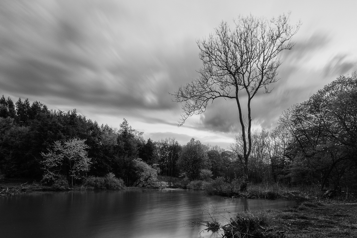
Hi Judy, thanks for the quick response! I'll take a look Grey and Orwig's videos. I need that. :) I found keyword seems can only be used while importing the files LR, not after post processing, maybe I need to review the LR to see how much I don't know. :) Guess I used masks and filters a lot, including Nik and TK's, maybe that's why I rely on PS, but the big file size kills me. I use less and less dodge and burns now as I noticed it brings in noise or lost details. I tend to use TK's masks and make adjustment on using curve control which is more accurate to the region I like to apply control to. But for this b/w image, I feel hard to work with TK, so I used selection tool instead. Anyway, so many tools I make myself dizzy. Maybe you should stay with what you like now to make life easy, don't learn from me. :D
OK, I got my final version and plan to print it out to join my club competition next month.
Thanks all for the great help! :) |
Feb 18th |
 |
| 83 |
Feb 19 |
Comment |
Hi Judy, thanks for the in depth discussion of the workflow. You taught me something new. I never pay attention to NIK can be used in this way as I only used their filters, and actually only certain types of filters. :) I used LR too. As you do, I import/review photos in LR, then find the one that I like. I use some of the LR tools to preview the image, (I used to modify on LR first but now I skip this step), then use LR to PS and bring up the original image on ACR (in PS) to do cleanup, basic modification and b/w conversion. I'm not sure if that's the optimal approach, but somewhere I read that modifying the image in ACR is less damage to the image. Other tools actually would affect to the image including LR, I think.
I'm interesting in the topic of using LR to manage photos too. I have used LR for a long time but I never really establish a good management system. I used it more like an file explorer. I store my images based on shooting date, when I find a good one to process, I saved the post processing file back to the same directory and put the image into a collection. I realize my problems. 1st is that I need to maintain a long list of collections based on the purpose of the collection, also the trouble is I could not find my image sometimes quickly when I need to. 2nd, once I change my original file directories, I'm in trouble to locate the post processing files. I'm not sure how other people do their file management and would like to get some tips.
BTW, the light on the lighthouse is from PS, so does the beams too. |
Feb 18th |
| 83 |
Feb 19 |
Comment |
Thanks Graham. You brought up a topic that bothers me too. Should I keep the lighthouse at center or a golden ratio? I have another cropping I would post it too. It's closed to Peter's crop. Please share all of you view to see which one is better. |
Feb 18th |
 |
| 83 |
Feb 19 |
Reply |
Thanks Judy for the demo. It's much better w/o those poles. I like the texture that you extracted from the cloud above to make the sky more 3D. I need to try that too. |
Feb 18th |
| 83 |
Feb 19 |
Reply |
Hi Peter, I just opened up your image. Wow! So dramatic! I love it. I'm not sure if you got it from my image or created your own based on the concept. lol I could not map any cloud back to the original. Only things I can tell are the lighthouse and the pier. How could you make the cloud and sky so dramatic? :) I like the texture that you added on. Now from your graph, I can see how much can do to this image. Thank you! I definitely should make a version like this for this years Halloween greeting card. lol |
Feb 18th |
| 83 |
Feb 19 |
Comment |
The site seems repeating itself yesterday. I'm reloading the image. |
Feb 18th |
 |
| 83 |
Feb 19 |
Comment |
I redo the masks again and added light beams to it. What do you think? |
Feb 18th |
| 83 |
Feb 19 |
Comment |
I like Issac did to the mushroom. I think now it's sharper and more texture seen from the big mushroom. Judy, I see what you mean about halo created by white/brightness in the image.
As the composition, I like Jose's original better as it gives the feel of distance and room to breath. Maybe just a minor cut on the top to get rid of the lighter layer. |
Feb 17th |
| 83 |
Feb 19 |
Reply |
Hi Peter, I noticed you mentioned decreasing the luminescence of the blue brings more contrast to the sky. I think I got confused. I did the opposite on my lighthouse image. So I guess only when the cloud is white, decrease adding contrast, but if the could is dark, increase makes the contrast. Is that true? |
Feb 17th |
| 83 |
Feb 19 |
Comment |
Thank you very much Judy, Peter, Charles and Jose! It's very helpful! I put all your ideas together and redo the photo. Jose, thanks for bring up the luminosity. I did not know how to use it before. Judy, I remembered you have asked about how people convert to B/W. I think from somewhere I read the best is to start from the ACR(Adobe Camera Raw). Don't use any Nik or LR(LightRoom) or Satuation etc. The reason for that is that ACR keeps most of the details of your image. I changed my workflow to ACR lately, but usually just got a flat image. Thanks Jose to show me the new toy. :) Hmm, I think I still like Jose's demo better. Please let me know how you guys think about this modified image. Does anyone know tricks to make the light beams? :) |
Feb 17th |
 |
| 83 |
Feb 19 |
Reply |
Thanks Judy! I like to read your comments. Thanks for those good tips, I need to think about it and try on. I also thought about another option is to darken the blue sky, light up the white cloud and bring in more texture. Not sure how that'll look like. :) |
Feb 12th |
| 83 |
Feb 19 |
Comment |
Hi Graham, you bring to us another image that needs to "feel" than just visualize it. lol Thanks Judy for the explanation of the knots and bolts on the boat. Honestly, I could barely have the feel of an ancient boat unless they have some character printed as "made in 1929". :) This image I could see a little bit aging from the material that covers the feet of the wooden poles. I think maybe lower the contrast, especially the objects on the boat and put more grey, might be able to create the "aging" mood in the image. |
Feb 12th |
| 83 |
Feb 19 |
Comment |
Hi Jose, I enjoy reading the comments about the image and agree with Tracy's cropping to fit in the "Mushroom" title. But on the other hand, I like your original image more, especially the texture of the muddy soil. I'm not too sure about the mushroom though as I think they are less interesting due to the lack of sharpness. I like the lower view point that you shoot the picture too. I feel to rename the image as "Emerging" or something to describe the mushroom just out of the soil might be closer to what the picture is presenting. |
Feb 12th |
| 83 |
Feb 19 |
Comment |
Hi Peter,
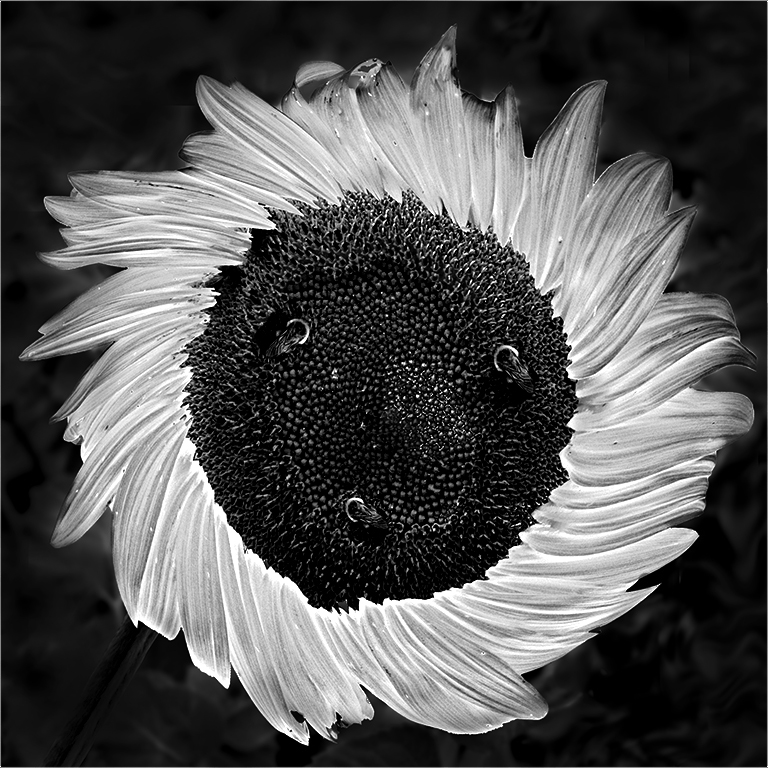
Thanks for bringing in such an interesting image. I have learnt a lot just from reading all of your conversation. I think Judy, Tracy and Jose have made very good points. To me that the focus point of this image is the flower pattern. I might try to eliminate the distraction from the background, maybe use a very low contrast or even a black solid one. Then I might try to bring up the texture of the paddles to create strong visual impact. I made a quick adjustment. :) |
Feb 12th |
 |
| 83 |
Feb 19 |
Comment |
Beautiful and very creative image indeed Tracy! I like the soft lighting on your face. I like both Judy and Jose's comments. :) I think a little bit light to give a contour of the arms (especially the rear one) would help the image too as now they seem to blend in with the background and disappear. |
Feb 11th |
| 83 |
Feb 19 |
Comment |
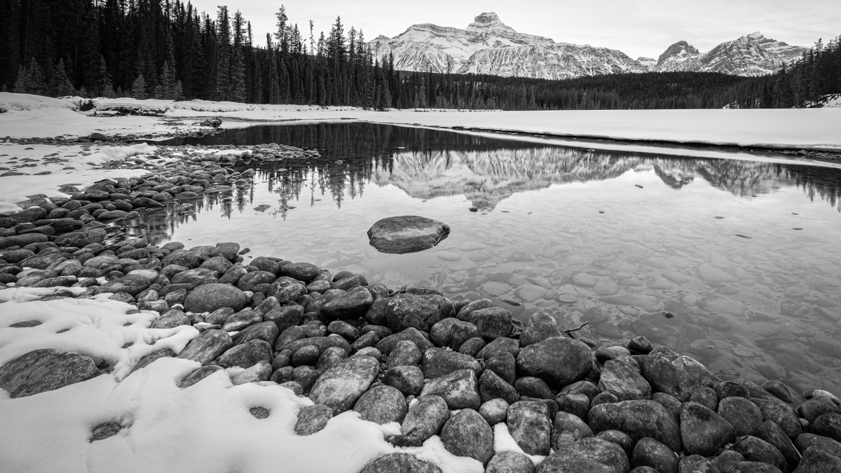
Beautiful capture Judy! I like both the color and the b/w. :) Good try for so many different combinations. I agree with Jose's suggestion about the tonal separation between the blue sky and the green grass. I think his mid-grey range makes the image better than the light grey grass which almost blend in with the sky tone at the top of the hill. Also, I would like to bring up the texture of the grass more while darken the grass. |
Feb 11th |
| 83 |
Feb 19 |
Comment |
Hi Dirk,
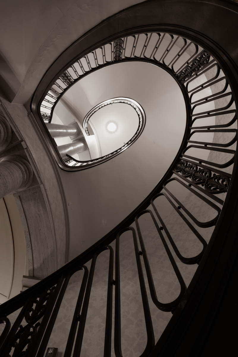
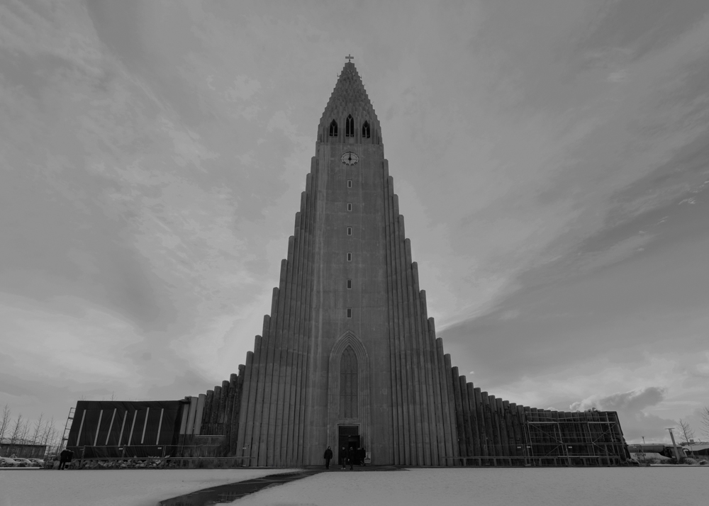
I like your conversion from color to the B/W which makes the image a very strong display. I think you did great job to bring up the details on the ceiling of the hall way as many leading lines that bring audiences' focus to the vanish point. Jose has made an interesting observation about the location of the man. I noticed the man seems well fit in the small image but the big one there is still some room to go. My only suggestion would be lower the contrast of the objects outside the hallway and make them less visible to fight for the attention. |
Feb 11th |
13 comments - 14 replies for Group 83
|
13 comments - 14 replies Total
|