|
| Group |
Round |
C/R |
Comment |
Date |
Image |
| 83 |
Dec 18 |
Comment |
Hi Judy, how was your club competition results coming out? |
Dec 17th |
| 83 |
Dec 18 |
Comment |
Or like this. But over all, I think Peter's version might be more interesting. Otherwise the right up corner seems too empty that makes the image lost some balance. |
Dec 16th |
 |
| 83 |
Dec 18 |
Comment |
I did some simple modification like this to show what I meant. The sky could be too dark though. |
Dec 16th |
 |
| 83 |
Dec 18 |
Reply |
Peter, I like the way you darken the cloud. I wonder how you did that. :) Did you use any tools besides ps? |
Dec 16th |
| 83 |
Dec 18 |
Comment |
Thanks Peter and Judy, you made very good point. Thank you all for your suggestion, I redo the image and see if it's better. BTW, thanks Peter for your resourceful comparison as I checked out the Hudson River School artists collection, those paintings indeed beautiful! |
Dec 16th |
 |
| 83 |
Dec 18 |
Comment |
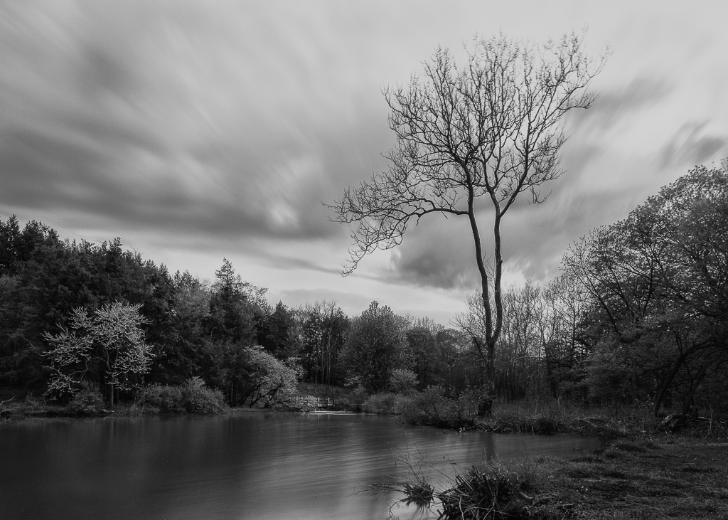
Dirk-Olaf and Peter, it's interesting that both of you thought about putting the sky in the high key white/light grey color. I'm actually thinking the opposite way to deal with the sky, I try to image the sky into dark/dark grey with less definition of the clouds to create a contrast between the building and the sky. Usually light color of any subject in the b/w image would catch attention first, that's another reason I second the white sky in this image. :) But I haven't really try to put the sky into a lower tone, I'm not sure how the outcome will be.
|
Dec 15th |
| 83 |
Dec 18 |
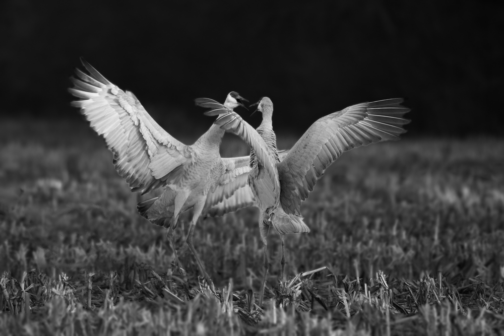
Comment |
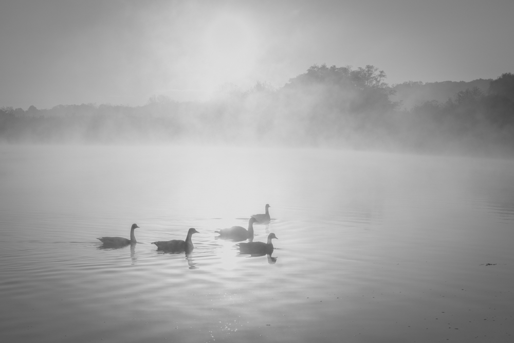
Hi Peter, you caught the pelican at the great moment! Agree with everyone said above, thanks all as I keep learning from you all. I guess the slow bird gets the worm this time. (Lol - Just kidding.) I especially like what Angela did to the head and the wing. Thank you for your visiting Angela, I like your tips about imaging the colors while converting to b/w. Looking at Peter's original, the head and the left wing of the bird do share some yellow tone as the water. |
Dec 15th |
| 83 |
Dec 18 |
Comment |
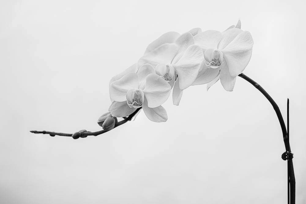
Tracy, what a surprising image that you have produced! I had looked at the image many times to try to figure out what this flower really made of. :) I love the metallic look of the paddles. Agree with the rest of the team, the composition is weakness of this image. Yes, please share your secret about how to make a flower to metallic look when you get a chance. :) |
Dec 15th |
| 83 |
Dec 18 |
Comment |
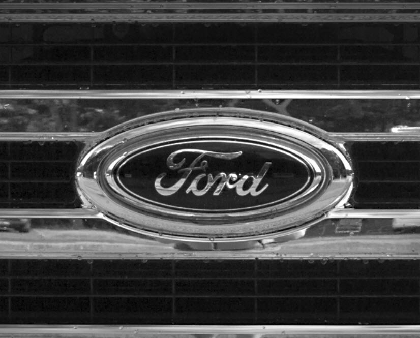
Hi Graham, thanks for sharing this interesting image with us. I think you did well in capturing the chrome and reflection of the metal. Comparing with the original, a black & white does look much better in presenting that. Agree with the rest of the team, if you want audiences to pay more attention to the logo, a tire framing would help. I like Judy's crop out the top bar. I think a square framing might help too. I made a slight adjustment and attach it to this comment. |
Dec 13th |
 |
| 83 |
Dec 18 |
Reply |
Thanks Graham! Good point! Let me try and see how it feels. |
Dec 4th |
| 83 |
Dec 18 |
Comment |
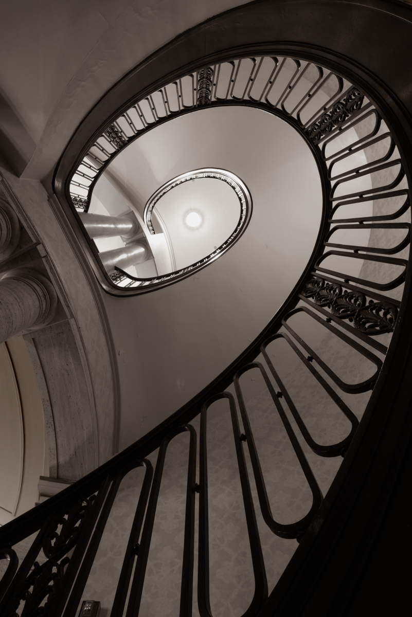
Hi Judy, this is indeed a beautiful picture! I like the grey scale of the building and the texture of the bricks. I think the lighting and the shadow are nice capture in the photo and they make the image very interesting too. I agree with Tracy that more texture to bring up the better. I also feel adding more contrast makes the image less flat. |
Dec 4th |
| 83 |
Dec 18 |
Comment |
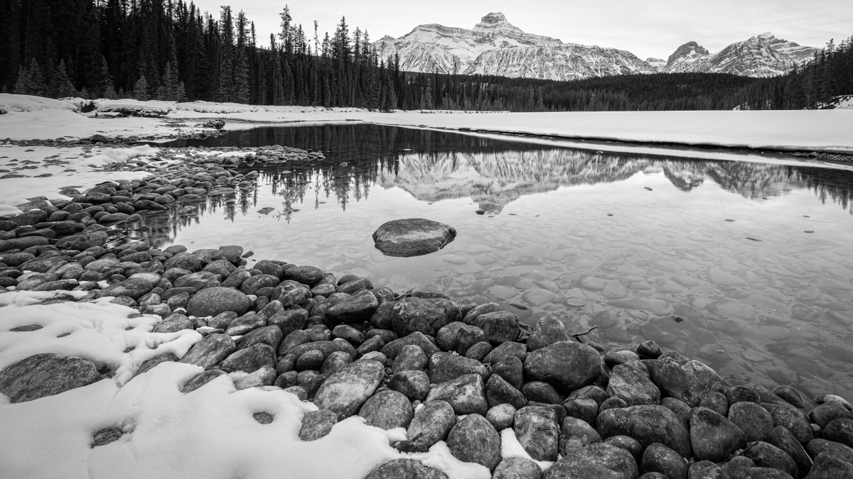
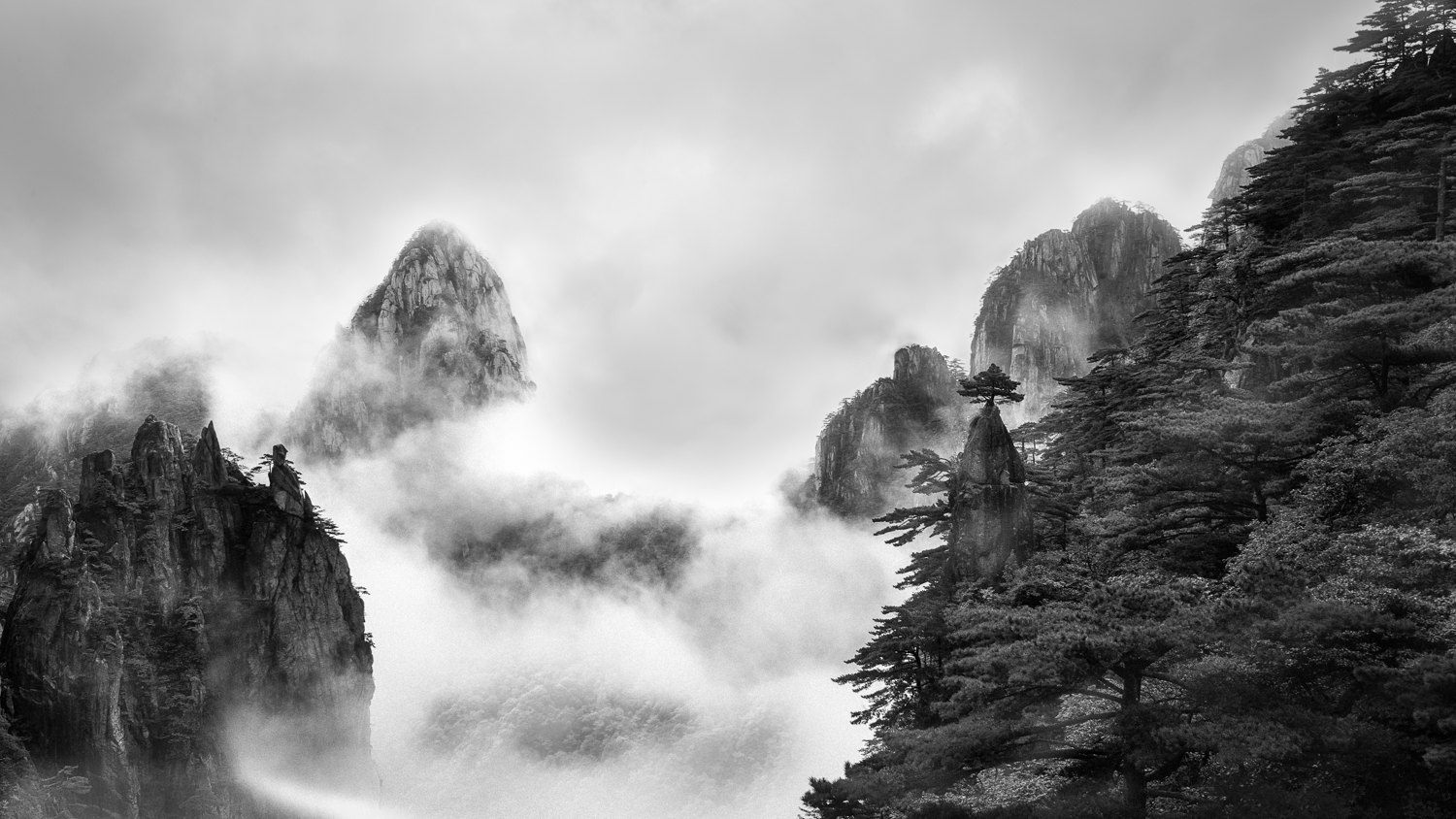
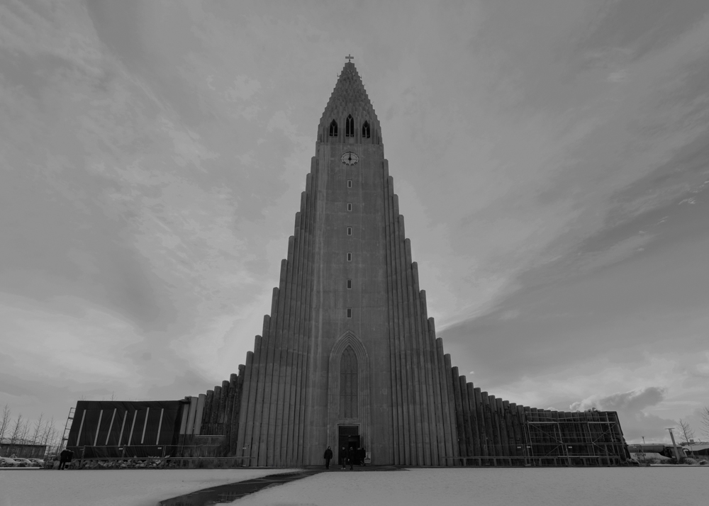
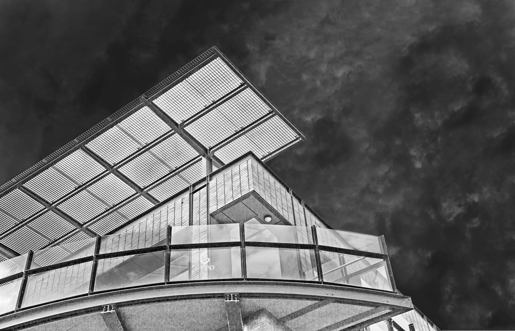
I think you create a beautiful image with the dynamic shape of the architecture. I like the widespread of the grey scale of the building which makes the image very pleasant. I think the details of clouds are very interesting too. I feel the clouds and the building are fighting for attention. I wonder if it will bring more impact if one subject per time. |
Dec 3rd |
| 83 |
Dec 18 |
Comment |
Thank you Tracy and Dirk-Olaf for both of your nice comments. I like Tracy's cropping as it brings up more texture in the photo. Dirk-Olaf, you are right about the NIK. That's why I did the BW by free hand also as I tried to understand how NIK could do so well. But with all I know about the photoshop, I'm not able to bid NIK. |
Dec 3rd |
11 comments - 2 replies for Group 83
|
11 comments - 2 replies Total
|