|
| Group |
Round |
C/R |
Comment |
Date |
Image |
| 39 |
Jun 25 |
Reply |
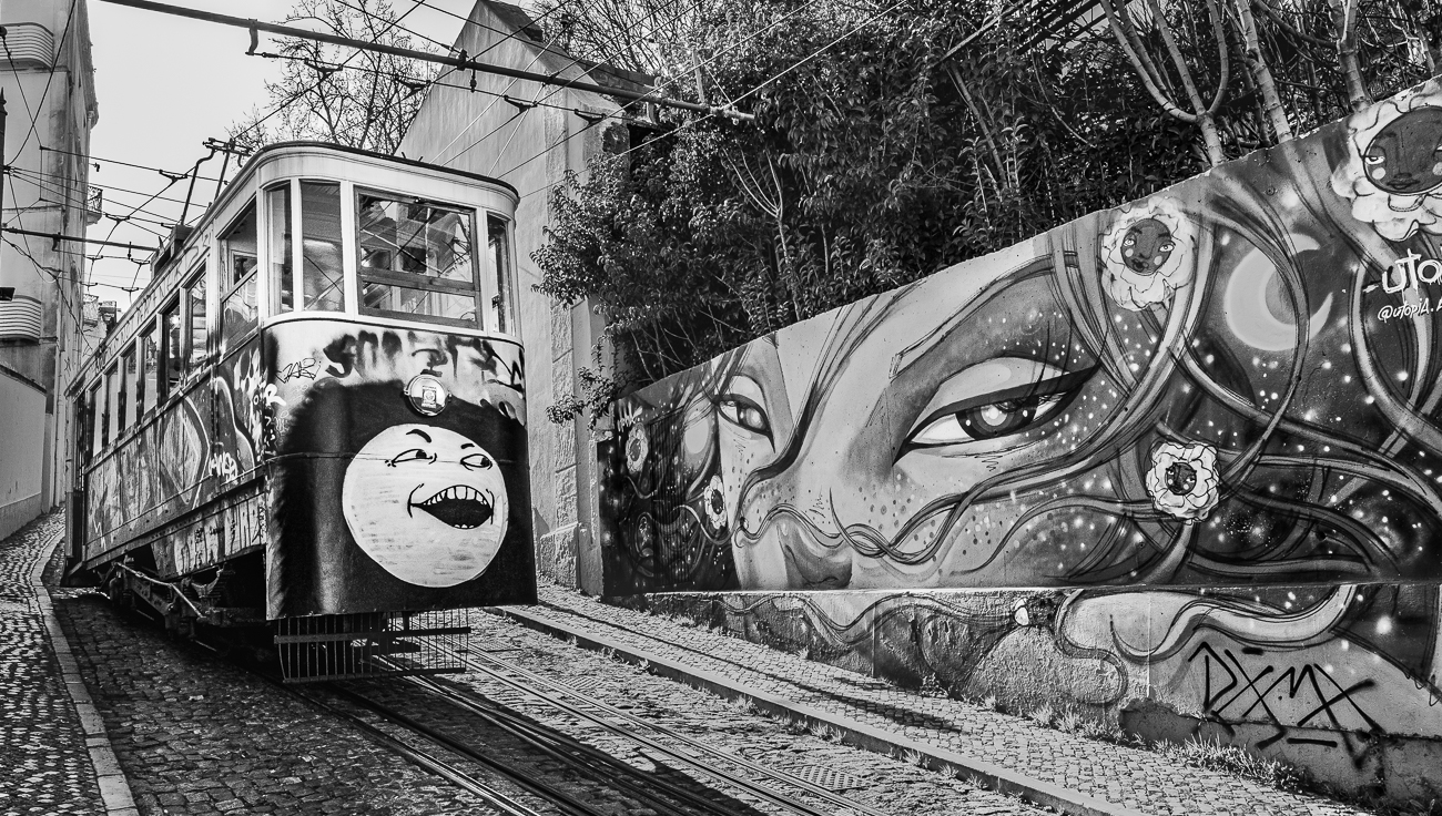
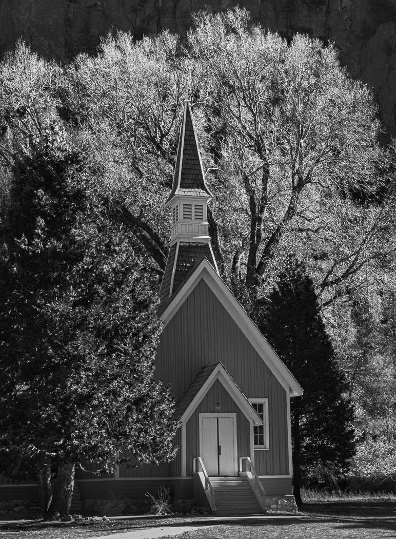
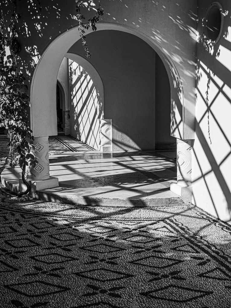
Paul - Thank you for your comments. Yes, the lady's trousers are burnt out - I am not strong enough at Mono to understand the expression "colour spectrum", but I will work on the trousers as a mask to darken them slightly.
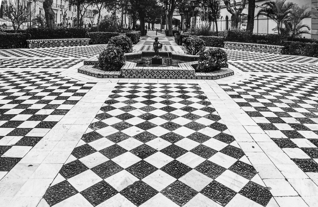
Just for interest, the Portuguese wavy floors are all made from individual basalt/limestone pieces rather than painted. |
Jun 14th |
| 39 |
Jun 25 |
Comment |
Paul - lone trees in the landscape often provide pleasing images and this does. But the tones in yours seem too similar. David appears to have lightened the foreground and that helps.
As Paul H says, we haven't got the Raw version so it is difficult to comment further. I would prefer to see greater tonal range between the tree and sky - have you tried playing with any of the mono filters to see the effect? Can you darken the branches towards black - many seem grey. |
Jun 14th |
| 39 |
Jun 25 |
Comment |
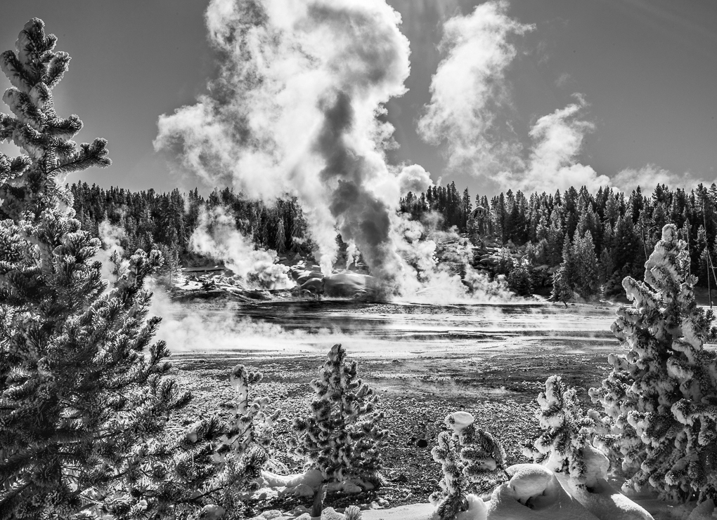
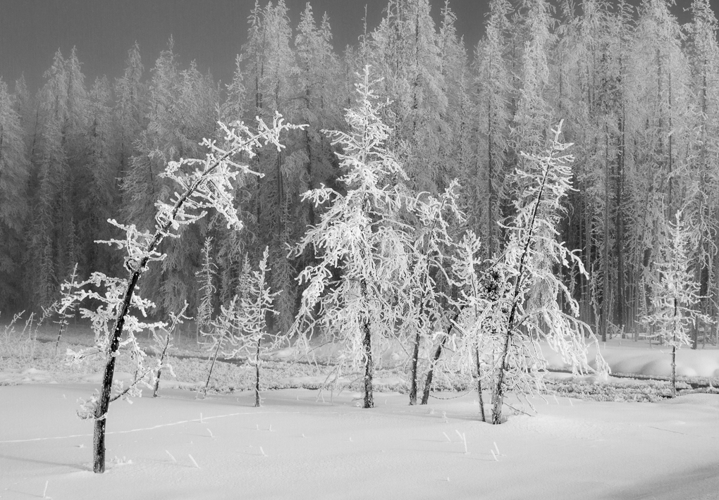
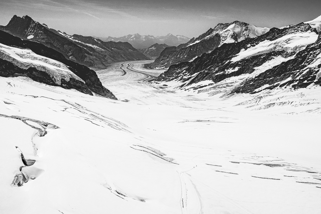
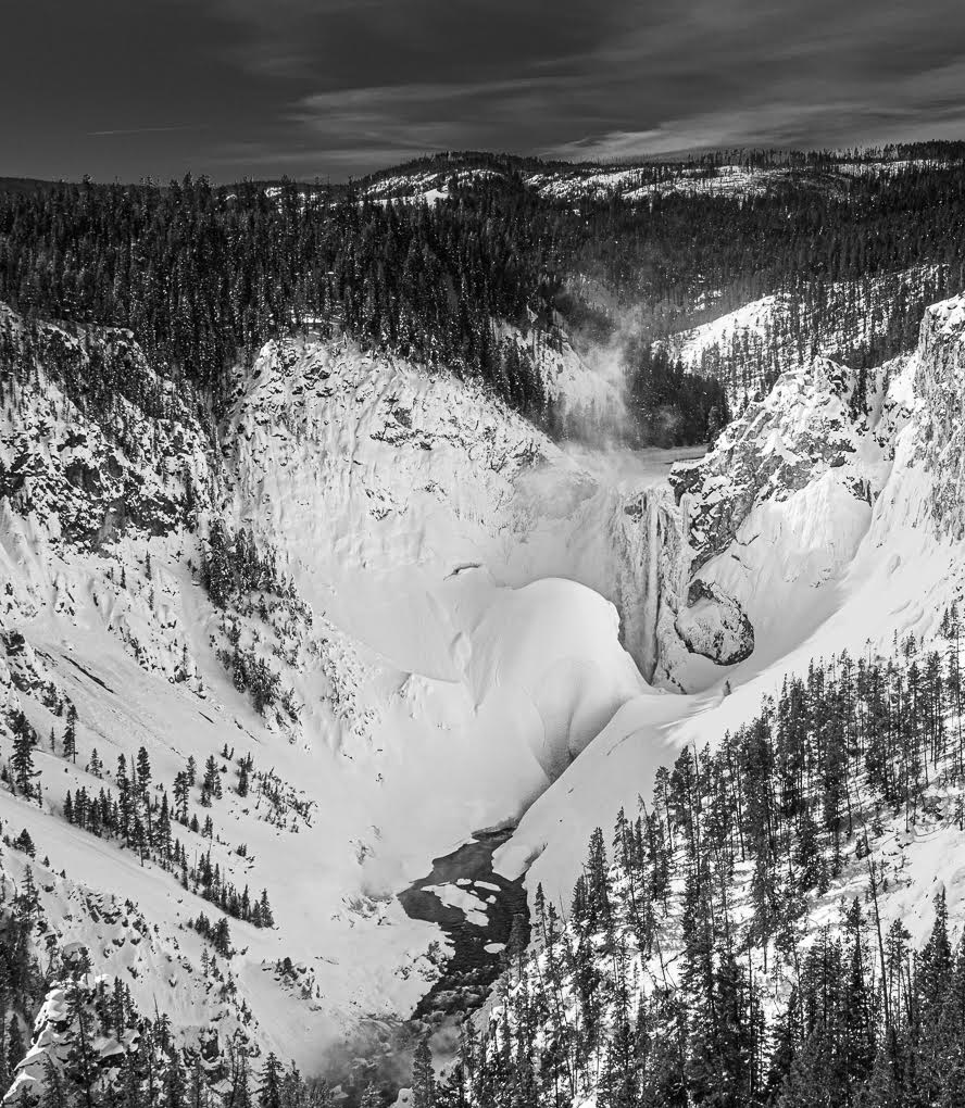
Hi Mary - yes unusual to be there in winter - I rarely see snowy images from this iconic place.
Yes, I believe this picture is a classic one requiring PP to be done by area rather than globally. The snow looks so much whiter and cleaner in David's image. The trees do need their shadows lightened and I would try adding clarity over the misty areas, lifting the shadows if the trees in that mask darken too much.
You may also consider cropping from the bottom, to remove the snowy area there, so the base is mostly the rocks. Sorry to sound negative - you have a nice image here. |
Jun 14th |
| 39 |
Jun 25 |
Comment |
Vincent, I like this. It is simple with a pleasing shape to her, but as said above, the dancer looking towards (if not at) the clothes on the floor brings the image together - if it were not for that, this square option wouldn't work.
I like this version over the colour. Your work on the dancer's costume has brought out its detail well and its tone works well vs the background.
I would suggest you look at her skin and see if a localised dropping of the whites improves her tone - same with the floor item. |
Jun 11th |
| 39 |
Jun 25 |
Comment |
Paul - your mono is a far more pleasing image than the colour. It's not a striking one, but a lovely 'quiet' image that would look good on a wall.
I have much to learn re the art of borders and B&W images, but I do find your border is too wide and detracts from the feeling from your image. |
Jun 11th |
| 39 |
Jun 25 |
Comment |
Fran - to answer your question, your image works very well in mono - our eye is drawn to her face - her dress monopolises the colour image.
Yes you did well to get her sharp with 1/500 speed - this was helped with the excellent IS of your Oly camera (same as I use), but more especially Topaz Ai sharpens very well as well as denoise treatment.
I think David is correct that the whites do seem too intense and I like his version. |
Jun 11th |
| 39 |
Jun 25 |
Comment |
David - this is a lovely "soft" image and far more enjoyable than the colour version. Two observations
- while I like the concept of your border design, I believe the dark border lines, particularly top & bottom draw my eye to there, rather than the image. I thus wonder if a simpler grey border may be better.
- the dark flower to the right is very close to the border.
I still enjoy your image though! |
Jun 11th |
| 39 |
Jun 25 |
Reply |
Thank you Paul and I hope you enjoyed Lisbon - it's a very compact City. |
Jun 10th |
| 39 |
Jun 25 |
Reply |
Thank you David - both re your comments re the image and tips for future uploading (my workflow is probably out of date, in that I haven't changed it for 7 years). |
Jun 10th |
6 comments - 3 replies for Group 39
|
| 72 |
Jun 25 |
Reply |
Thank you Karen! |
Jun 22nd |
| 72 |
Jun 25 |
Reply |
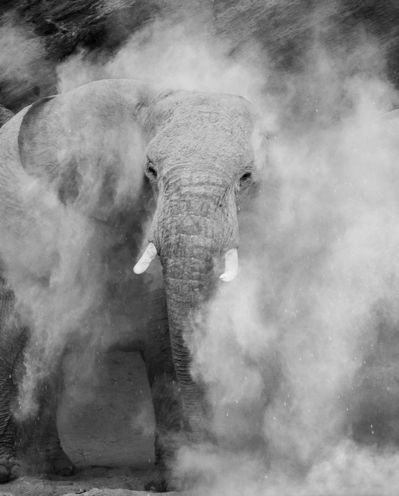
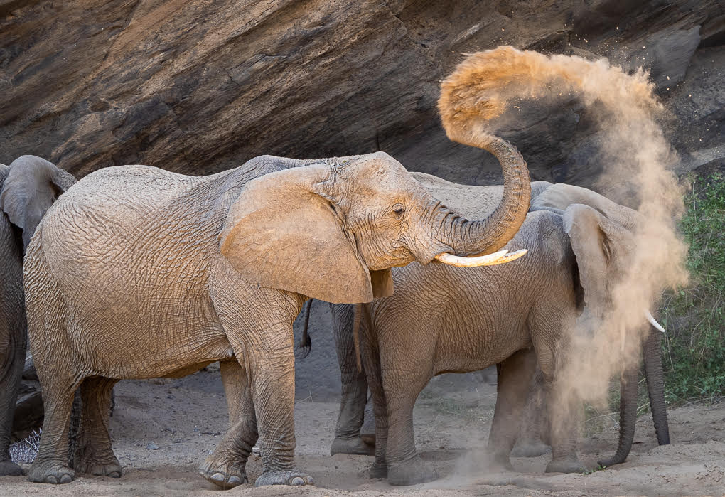
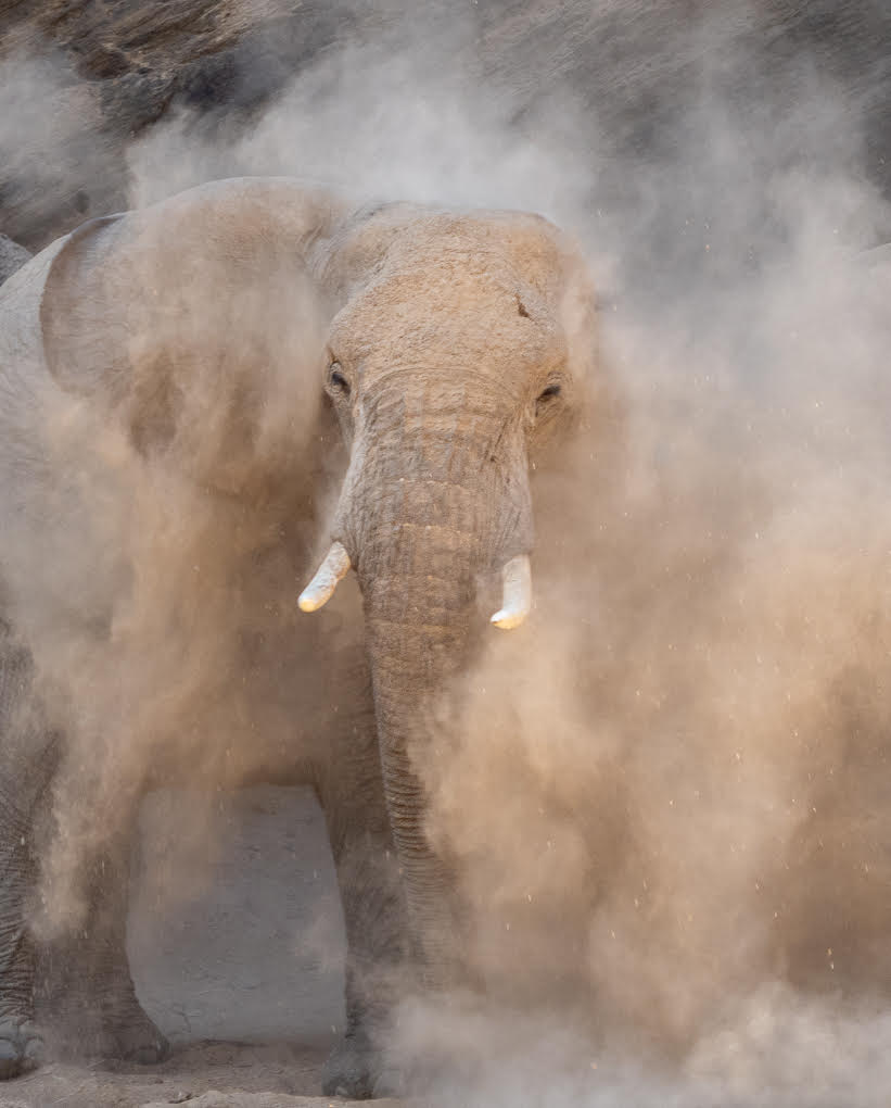
Thanks Maria - as stated above, I prefer the golden colours of the dust in the colour version. |
Jun 22nd |
| 72 |
Jun 25 |
Reply |
Thanks Maria and I prefer the colour version too - but the mono will also find its way to Exhibitions!
|
Jun 22nd |
| 72 |
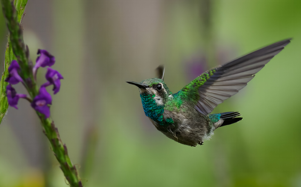
Jun 25 |
Comment |
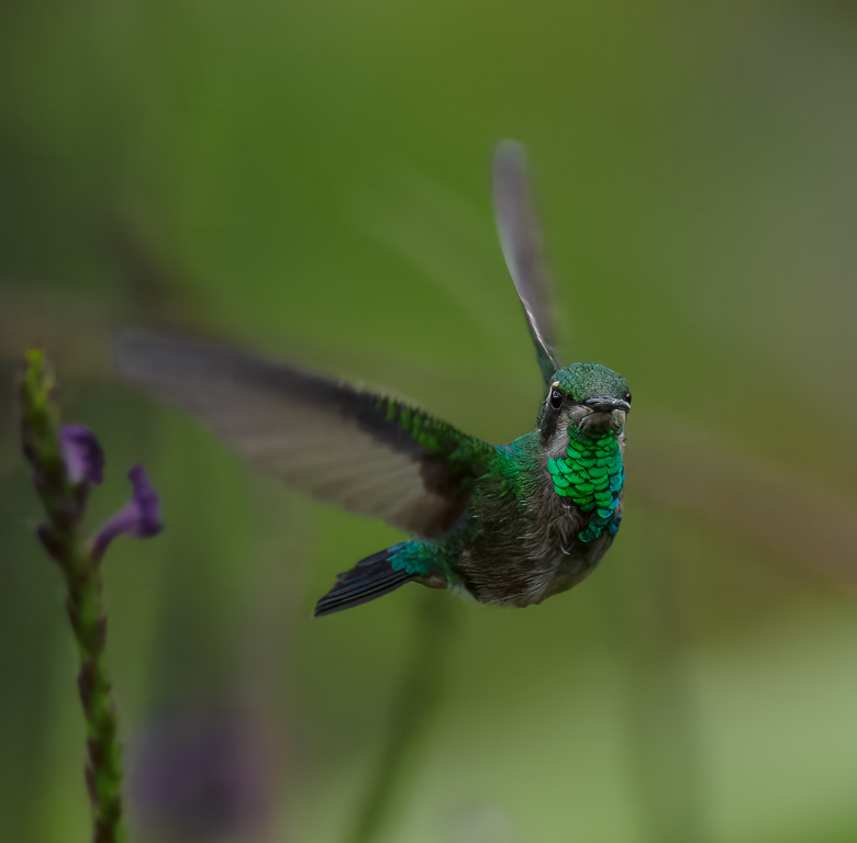
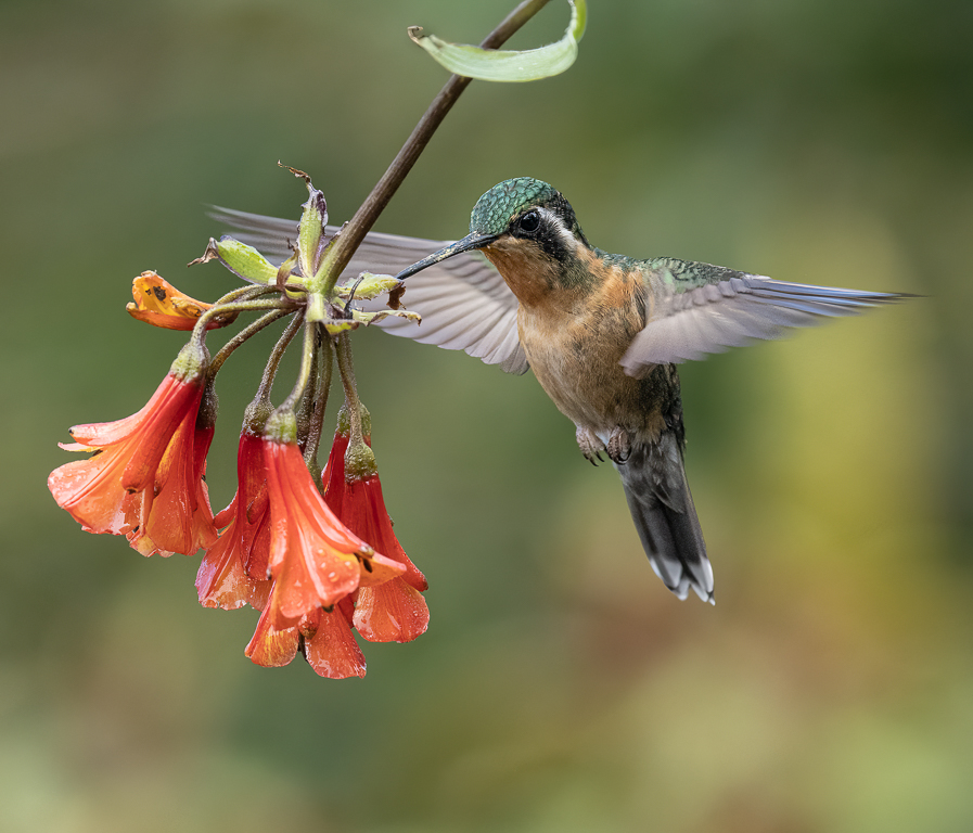
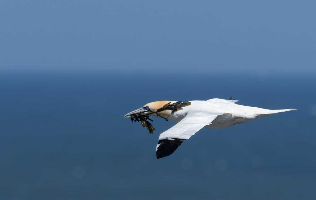
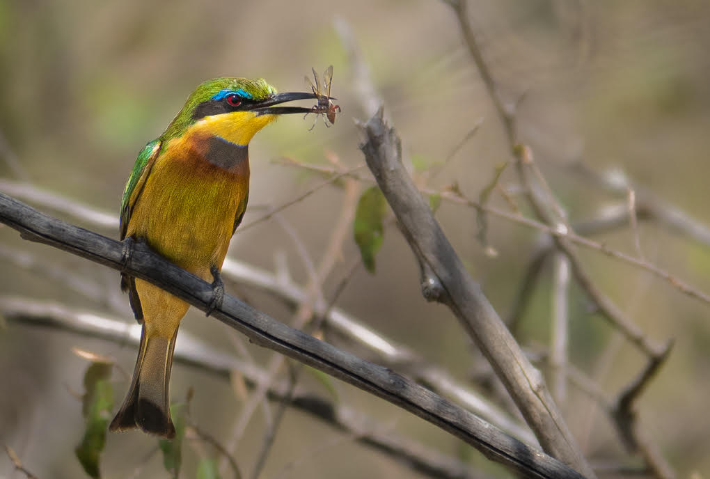
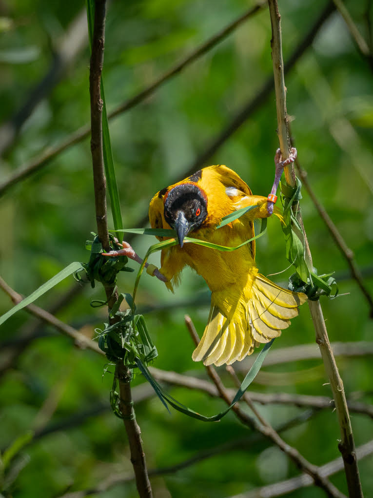
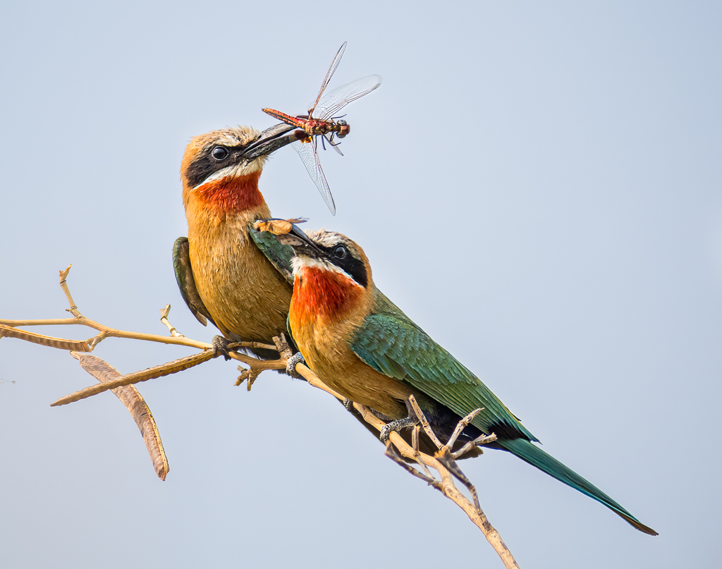
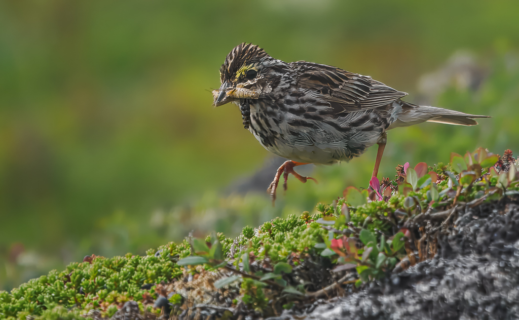
Maria, nice bird and nice picture of it caught with action with a raised fork making the story so much more interesting. I would consider 3 things -
- widen the crop slightly as suggested above - more space will help I think.
- see what you think of flipping it, so it's pointing down to bottom left corner - I'm not sure whether this will help the viewer, but worth experimenting, and
- try lighting the shadows a fraction for the bird only, to further bring out the lovely colours and patterns. These are there, but I feel could be made more of.
Nice picture! |
Jun 22nd |
| 72 |
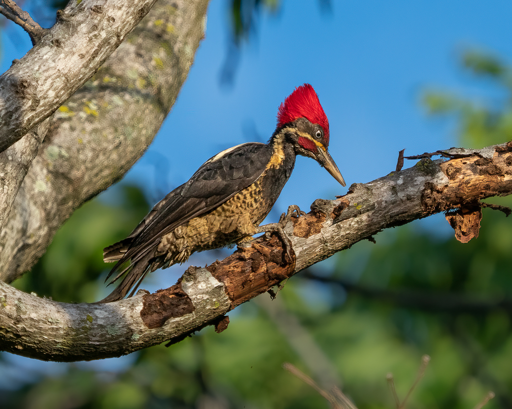
Jun 25 |
Comment |
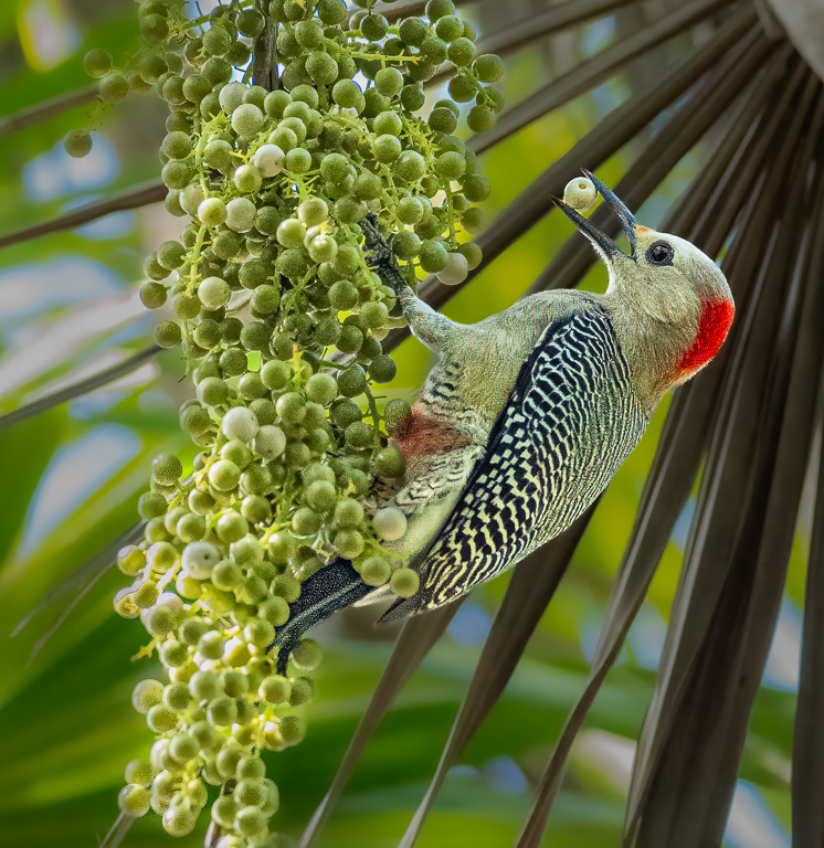
Richard - nice shot, with interest coming from its pre-flight position, full mouth and holes/marks in the tree.
But the bird in my view is too small in the frame. I don't think you need all the width of the tree for the story. I would play with a square crop, deciding how much tree is needed for the story and leaving space to its left to fly into - hence square rather than portrait. If you conclude to include the tree holes above/right of the bird, then removing the two part branches left of those holes would give a cleaner output.
I think you've got the base for a very pleasing image here. |
Jun 22nd |
| 72 |
Jun 25 |
Comment |
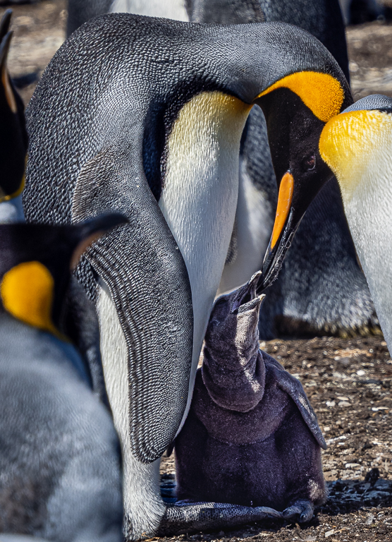
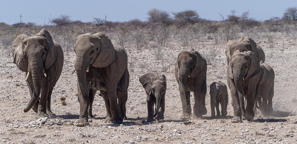
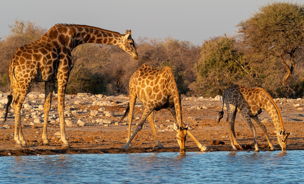
Hello Karen - you kook a fine image here with a narrow depth of field and you've position the giraffe well in the left, looking right into all that burred out space - lovely.
Yes, the work Isaac has done to darken the background and remove the unnecessary top 1/3 creates a lovely final result. Great picture. |
Jun 22nd |
| 72 |
Jun 25 |
Comment |
Maria - well captured. Yes the story would have been just as strong with the been caught on its way to the flower, rather than in it. But you've caught it well, it's sharp etc.
I do like what Richard has managed to do, creating a much cleaner image. |
Jun 22nd |
| 72 |
Jun 25 |
Comment |
Wow, Bruce what a great picture and a fabulous experience for you to hold in your memories too! It's a great image to be sure!
IoY Award is very well deserved and an honour. I was lucky to get a runners up Silver Plaque recently, but not the Top Prize - well done.
I would love to go, but as we've recently been to Cuba, US at the moment isn't an option for us. I intend to research options in Canada. |
Jun 15th |
5 comments - 3 replies for Group 72
|
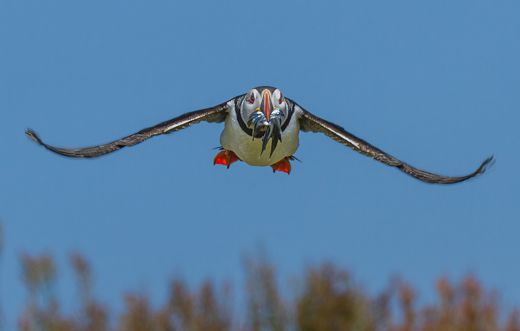
| 91 |
Jun 25 |
Comment |
Well done Jerry - your PP has created (with a great title) a very interesting image with some amusement. Flipping it has really contributed to this. Well done. |
Jun 22nd |
| 91 |
Jun 25 |
Comment |
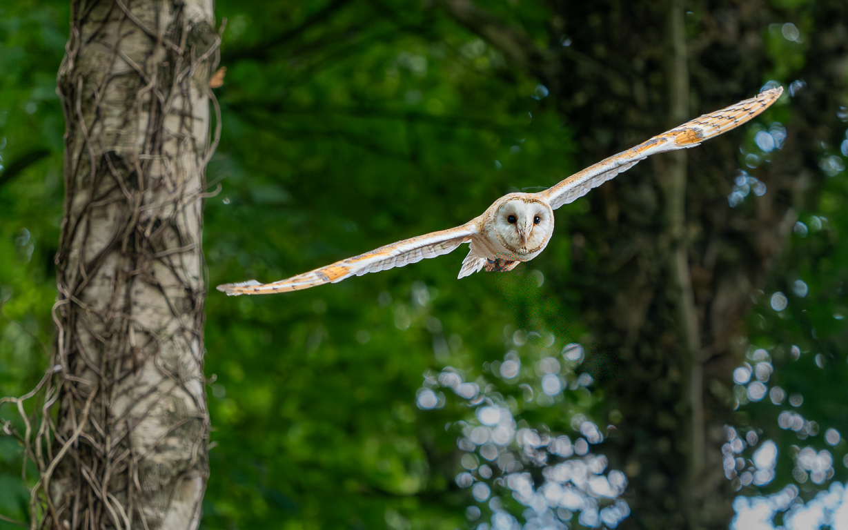
Bruce - this is a very compelling striking image. Well done! Perfectly taken not to require any PP! |
Jun 22nd |
| 91 |
Jun 25 |
Comment |
Sunat, very well captured. Nice story. Yes, I agree your picture is too saturated. You've positioned its legs dead central, with so much of the bird to our left, plus it's looking that way. |
Jun 22nd |
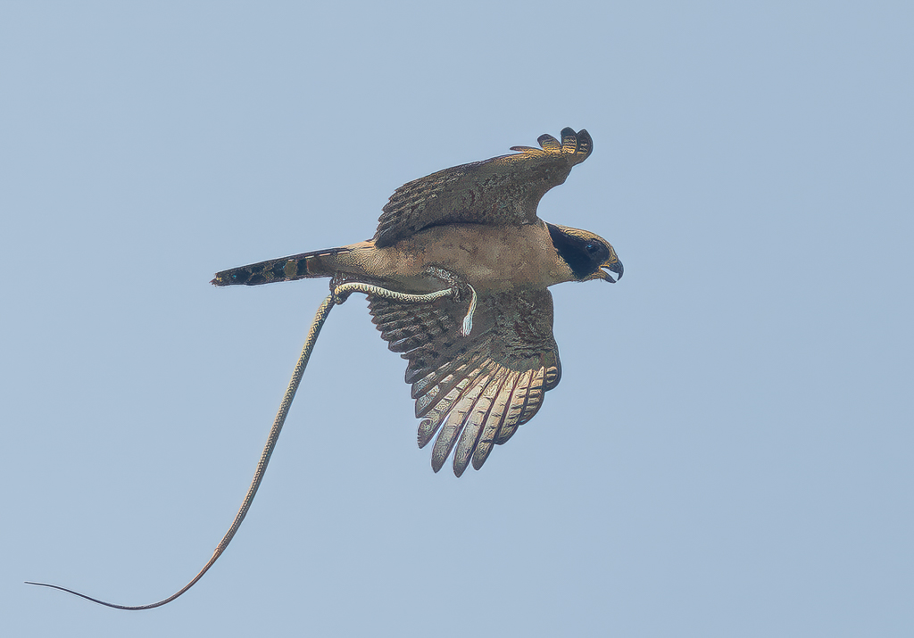
| 91 |
Jun 25 |
Comment |
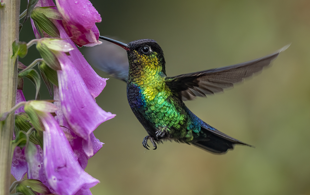
Hi Maria - how luck you are to have a Kite in your garden! We see them flying overhead here (Hampshire, Southern England) but never landing!
Your bird is beautifully captured and presented - it's just a question of what crop you want - always a personal thing. Personally, I rarely like the main subject central (except perhaps when staring straight at the lens), so here I would position him slightly left to look right. I think this simple image would look good as a square. |
Jun 22nd |
| 91 |
Jun 25 |
Comment |
Cindy - this is simply lovely! The background is so perfect for your swallow, which has so much detail - beautifully captured and processed. |
Jun 22nd |
| 91 |
Jun 25 |
Reply |
I've added below a version with no stick. |
Jun 19th |
| 91 |
Jun 25 |
Reply |
Thanks Maria - thanks for your comments and here is the image after removing the stick (and the larger of the yellow blobs) - I agree, this is an improvement! |
Jun 19th |
 |
| 91 |
Jun 25 |
Reply |
Thank you Jerry |
Jun 17th |
| 91 |
Jun 25 |
Reply |
Thank you Cindy |
Jun 17th |
5 comments - 4 replies for Group 91
|
16 comments - 10 replies Total
|