|
| Group |
Round |
C/R |
Comment |
Date |
Image |
| 47 |
Oct 21 |
Comment |
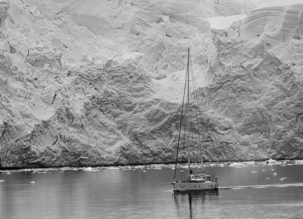
Albert, I agree the mono works better than the colour. The like leads in so well to the landscape - well composed. I do question the boldness of the sky. This is always a personal thing, but I feel that too much contrast tells the viewer "look at me", where the key story here is the lovely landscape. Just a thought.
As you are aware, I have asked you to remove me from this group, which is a shame, but I just have too many commitments now that us Brits will be allowed to travel again to interesting places soon! I will miss your words of wisdom on my images and have learnt much from you. Thank you! |
Oct 24th |
| 47 |
Oct 21 |
Comment |
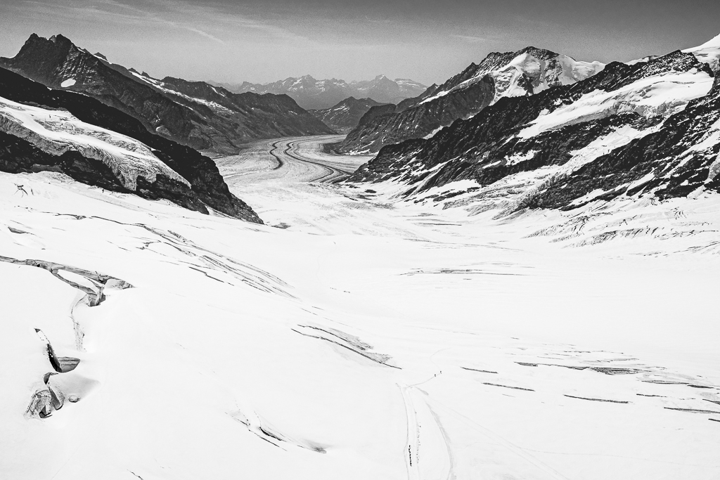
Kirsti, gosh you have some good PP skills! First you have corrected the perspective very well. Then taking out the top 1/3 in the way you have in your extra version above is excellent! I like this version very much!
regrettably, I have asked Albert to remove me from this group, which is a shame, but I just have too many commitments now that us yBrits will be allowed to travel again to interesting places soon! I will miss your words of wisdom on my images and have learnt much from you. Thank you! |
Oct 24th |
| 47 |
Oct 21 |
Comment |
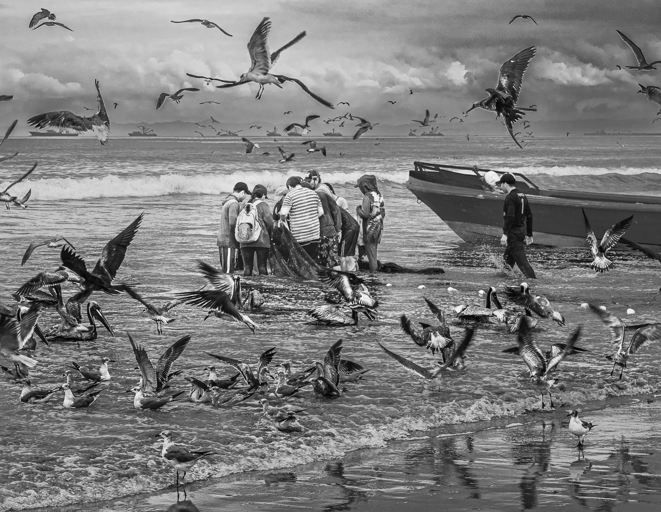
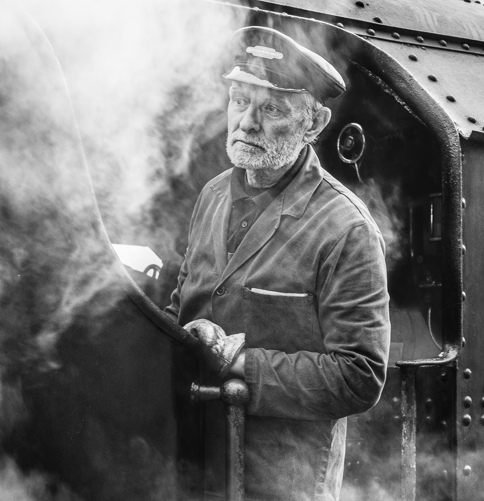
Jen, this works very well in mono, with a good range of shades. I can understand what Albert advises re the crossing sign and how eyes tend to be attracted to text. I do wonder in this instant whether the sign being iconic with American railroads (not the U.K. term railways), that this sign actually helps the viewer to know which continent it's taken. It helps the storey telling.
If you have any space to the front of the train in your Raw file, I suggest you consider using it as the front of the train is very tight to to the border.
regrettably, I have asked Albert to remove me from this group, which is a shame, but I just have too many commitments now that us Brits will be allowed to travel again to interesting places soon! I will miss your words of wisdom on my images and have learnt much from you. Thank you! |
Oct 24th |
| 47 |
Oct 21 |
Comment |
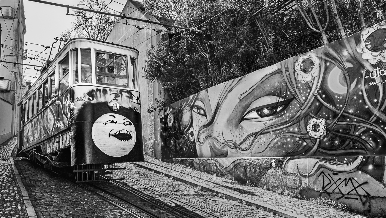
Hello Ed, I am going to echo what has been said by the others. The perspective distortion is so strong it dominates the viewer's thoughts. The brightest part of the image is not the key focus of the shot, which is usually to be avoided. I always admire and like the way you present your images here and this is no exception.
Regrettably, I have asked Albert to remove me from this group, which is a shame, but I just have too many commitments now that is Brits will be allowed to travel again to interesting places soon! I will miss you words of wisdom on my images and have learnt much from you. Thank you! |
Oct 24th |
| 47 |
Oct 21 |
Reply |
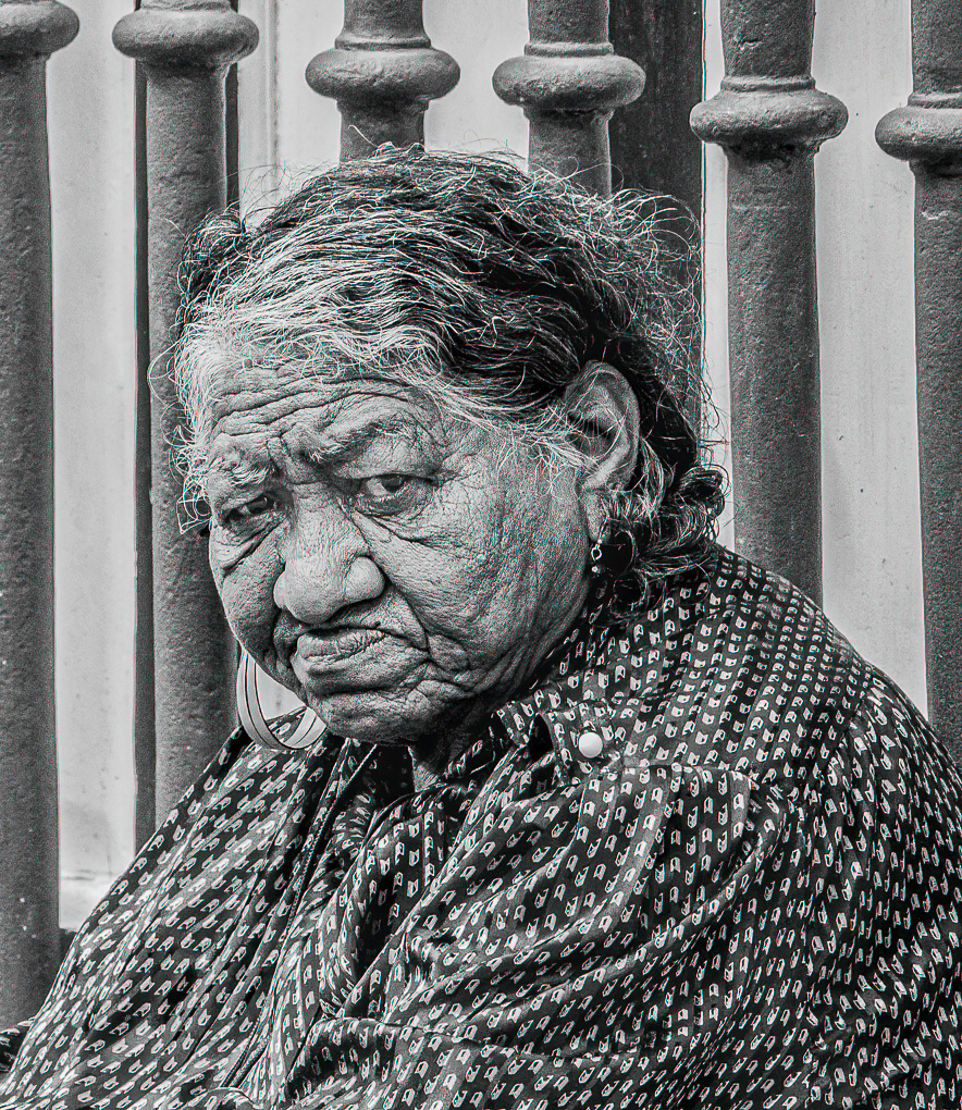
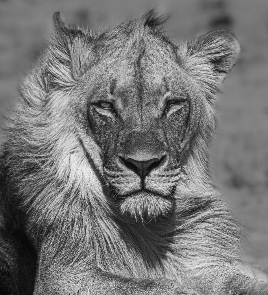
Hi Jen. For some reason, my narrative sent to Albert didn't get uploaded. It was��..
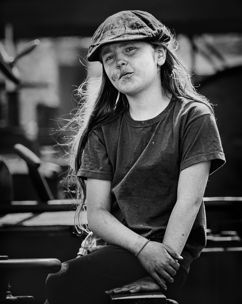
Character from Xian
This was taken in 2017 during a 28 tour of the key cities of China - this one from a city I loved Xian (the old part with a vast old wall round is very interesting).
Settings using Olympus gear - 150mm (so FF 300) 1/1000, f2.8 ISO200.
This seemed an obvious one for mono, so after cropping I worked on emphasising her features, brightening her eyes and dulling down bright parts of the background - all in Lightroom. A final push through Topaz A1 Sharpen. |
Oct 20th |
| 47 |
Oct 21 |
Reply |
Hi Jen. For some reason, my narrative sent to Albert didn't get uploaded. It was��..
Character from Xian
This was taken in 2017 during a 28 tour of the key cities of China - this one from a city I loved Xian (the old part with a vast old wall round is very interesting).
Settings using Olympus gear - 150mm (so FF 300) 1/1000, f2.8 ISO200.
This seemed an obvious one for mono, so after cropping I worked on emphasising her features, brightening her eyes and dulling down bright parts of the background - all in Lightroom. A final push through Topaz A1 Sharpen. |
Oct 19th |
4 comments - 2 replies for Group 47
|
| 72 |
Oct 21 |
Comment |
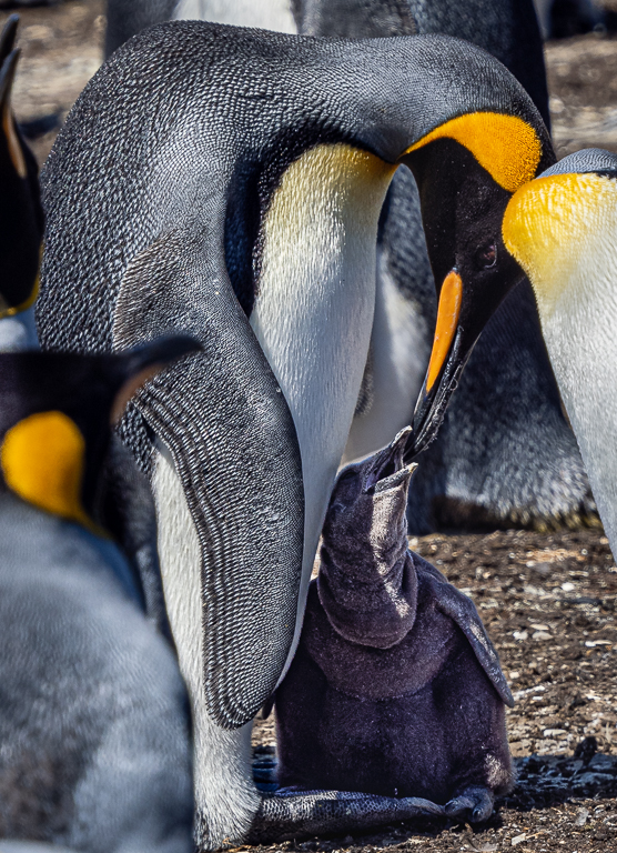
Wow! Great image Isaac, as is the 2nd. You must have hundreds of keepers!
I too am amazed how close you all are and I note the kneeling pages and get wet gear being worn. Thank you for posting all images, very interesting. When is the best time to go there? |
Oct 21st |
| 72 |
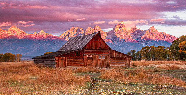
Oct 21 |
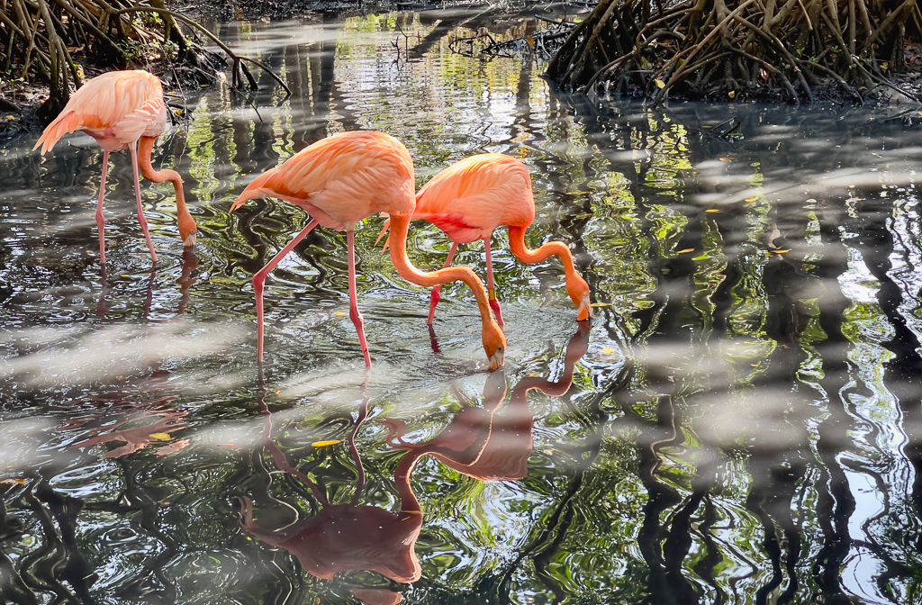
Comment |
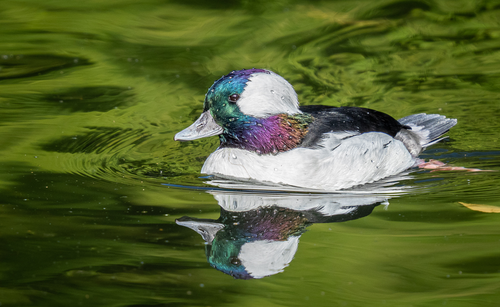
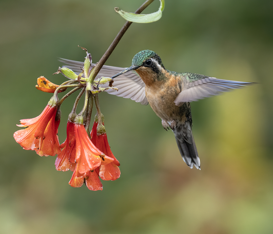
This is so calming Marie, love it! Very well composed with lead in lines left and right, with beautiful colours. I just want to stroll down there and enjoy the last of the evening. Great image! |
Oct 21st |
| 72 |
Oct 21 |
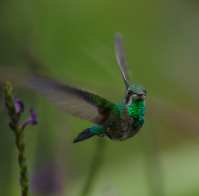
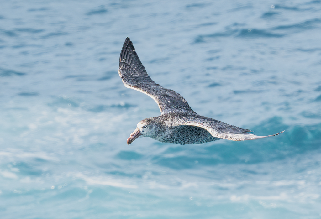
Comment |
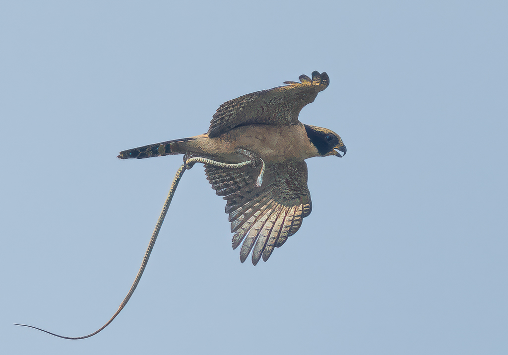
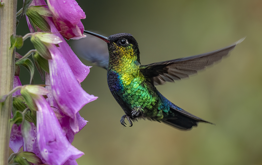
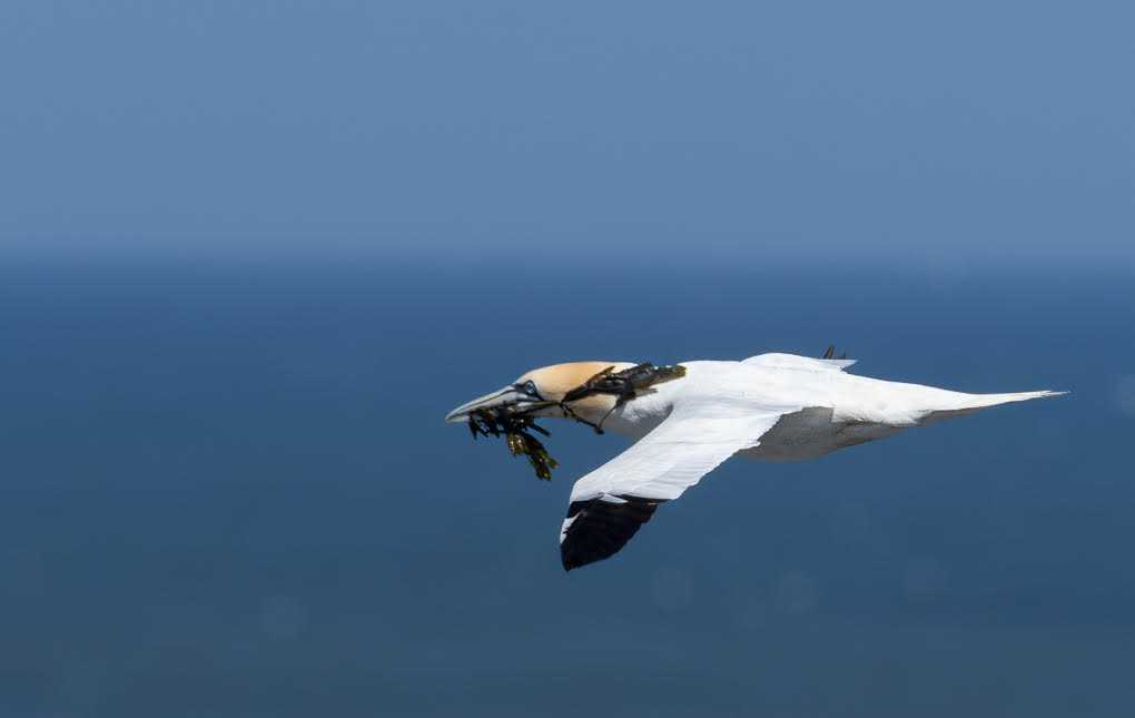
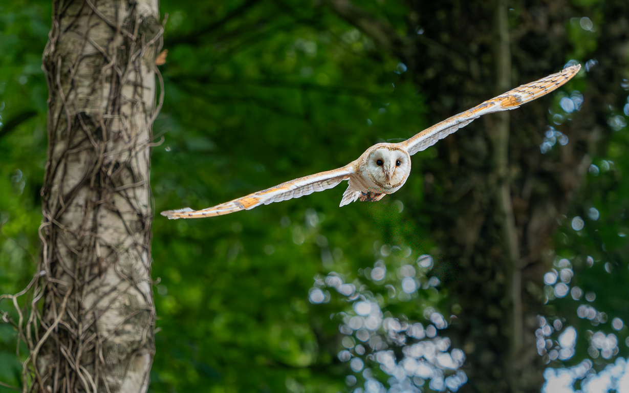
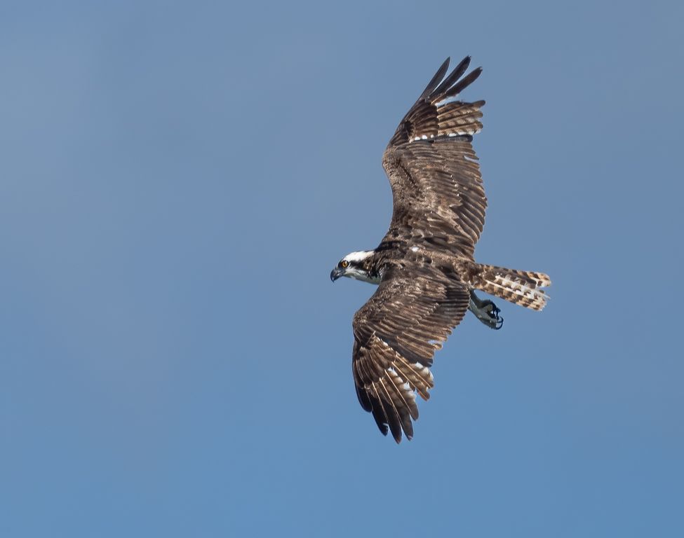
This is a lovely image Bruce! So sharp and clear with perfect background. Isaac I think has a point that more space for your bird to fly into looks more balanced. But lovely. |
Oct 21st |
| 72 |
Oct 21 |
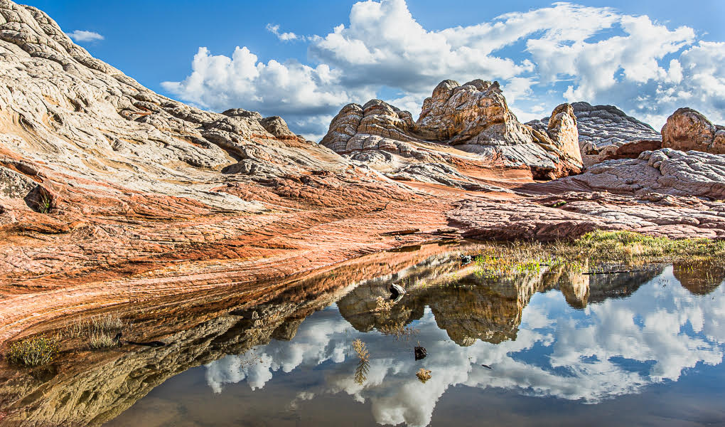
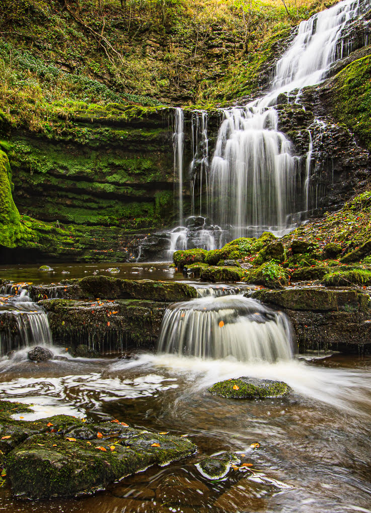
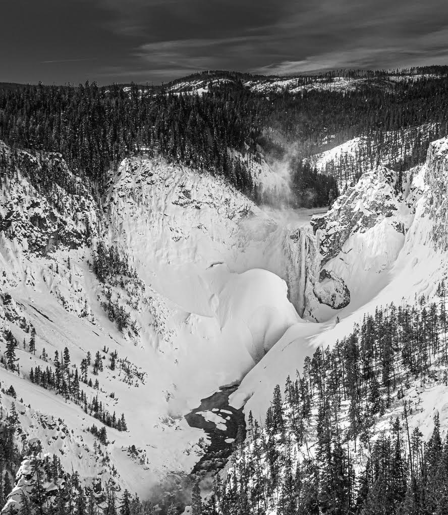
Comment |
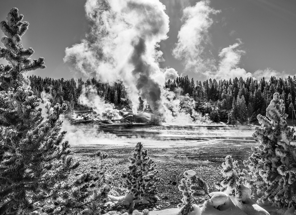
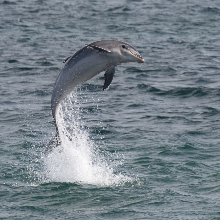
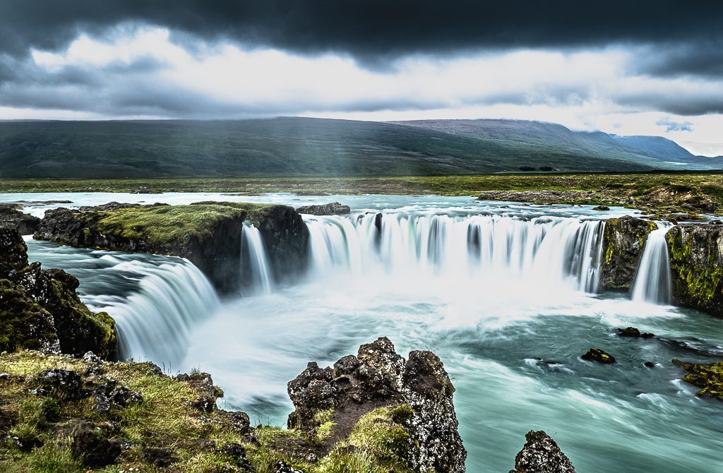
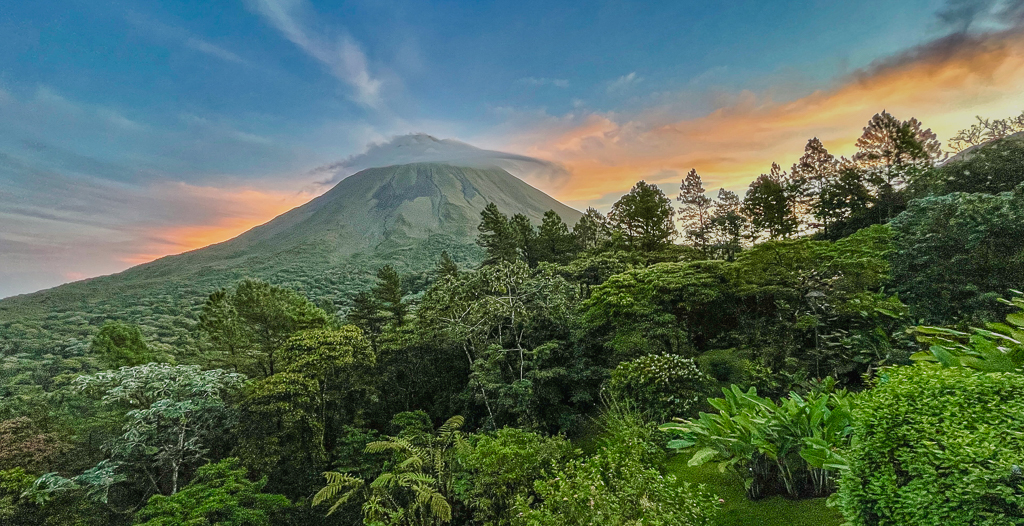
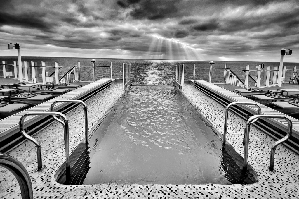
This is a very interesting image Mary! One can really feel the power of the water volume and I'm interested your choice of shutter speed (glad you didn't use a slow one as I don't like the effect).
I think the clouds look fine here because there aren't many! Heavy clouds can compete for attention too much, but not here.
Nice image and thank you for sharing. |
Oct 21st |
| 72 |
Oct 21 |
Comment |
Walt, this is probably my favourite of your images from Brodie. Some how, Less is More!
A very ordinary chair helps the viewer to focus on the hat - it's all about that hat! So much character in it enhanced by your PP work. Lovely! |
Oct 20th |
5 comments - 0 replies for Group 72
|
9 comments - 2 replies Total
|