|
| Group |
Round |
C/R |
Comment |
Date |
Image |
| 47 |
Mar 21 |
Reply |
Many thanks Colin, both for the advice and taking the trouble of doing your edit. Yes on all three counts! I use Lightroom (not PS as well, but Topaz) and I have worked on it and I agree your suggestions improve it. I am a novice in this mono world! |
Mar 26th |
| 47 |
Mar 21 |
Comment |
Kirsty, hi! I like your creativity and willingness to experiment!
Here is a suggested crop, from the left as Albert suggested, but also from the top. You may feel this keeps the mood that you have created, but focussed the viewer to the main areas of interest. What do you think? |
Mar 25th |
 |
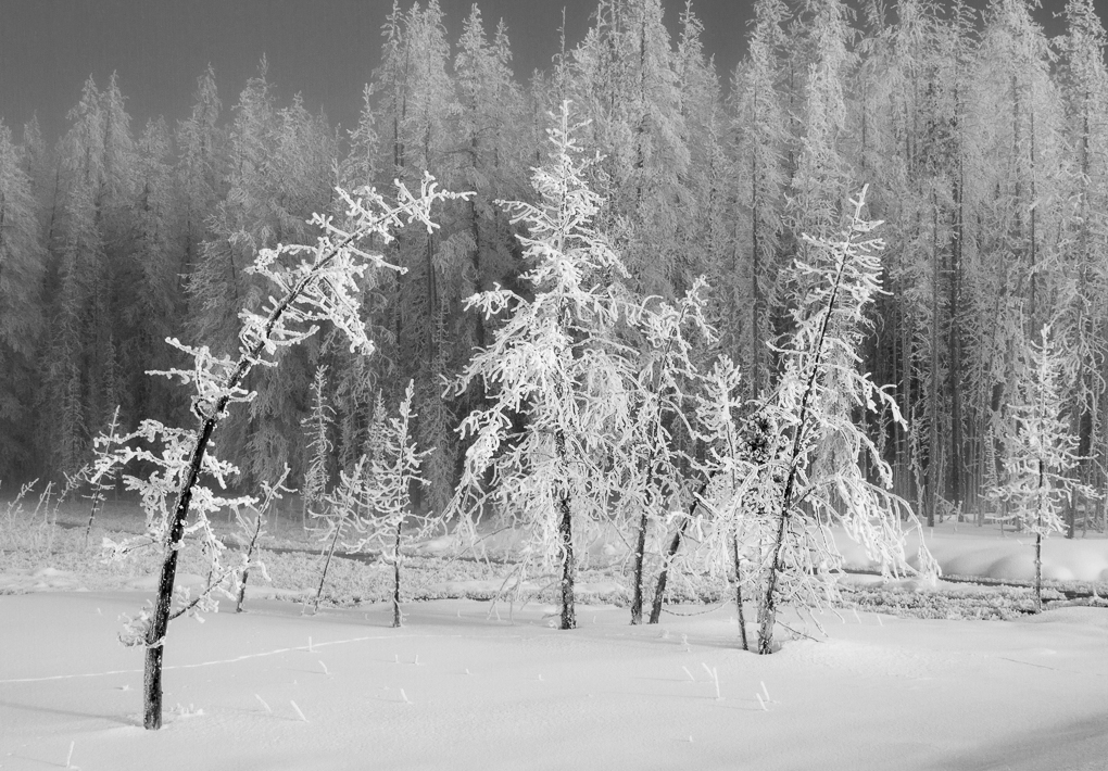
| 47 |
Mar 21 |
Comment |
Jen - yes this has worked!
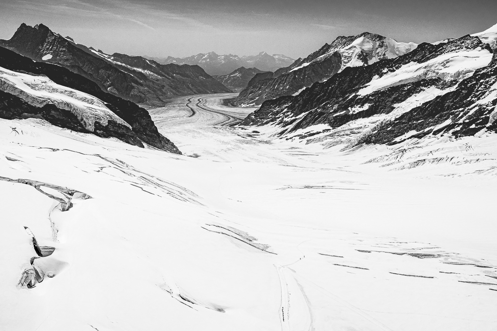
I was taught that snow needs up to 2 stops of positive compensation, subject to not clipping highlights. We had lots of snow when we lived for 20 years in the Yorkshire Dales - less snow now we are south of England near Southampton - we miss it!
If your camera has a live view histogram, this helps a lot.
You have very nice detail in the snow, both the smooth areas and where you have walked. Nice! |
Mar 24th |
| 47 |
Mar 21 |
Comment |
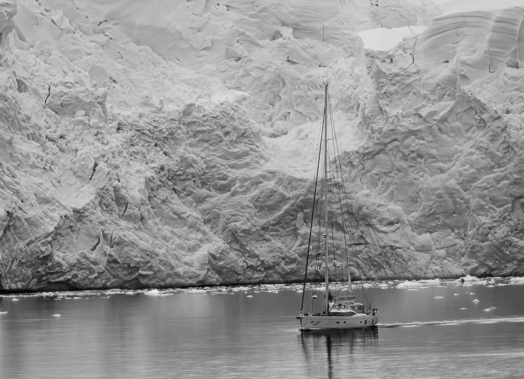
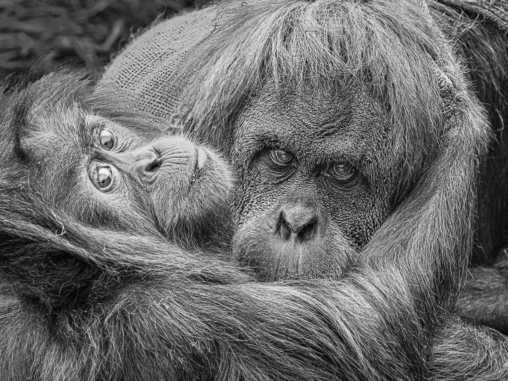
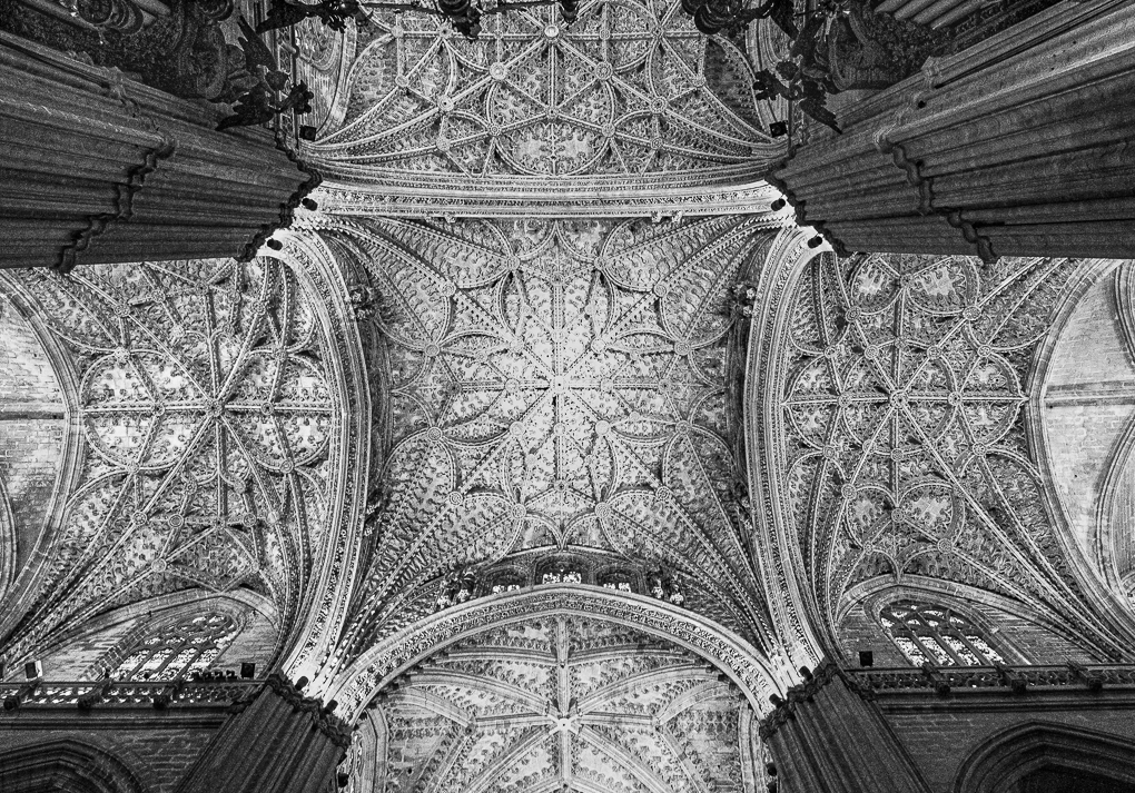
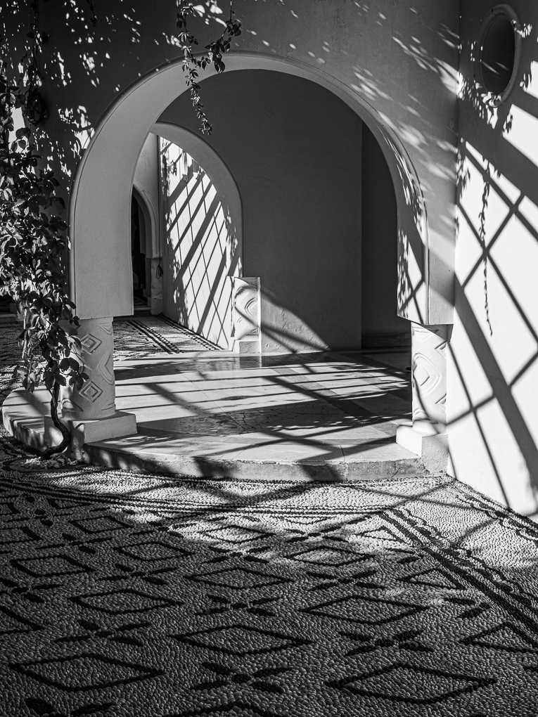
Wow, Albert this is a fabulous mono image. Your PP has significantly added to the image which has now so much depth as well as lovely textures. The shafts of light add somehow, because they are all different shapes and one asks why!
Very impressed! |
Mar 24th |
| 47 |
Mar 21 |
Comment |
Kirsty, hi! I like your creativity and willingness to experiment!
Here is a suggested crop, from the left as Albert suggested, but also from the top. You may feel this keeps the mood that you have created, but focussed the viewer to the main areas of interest. What do you think? |
Mar 24th |
 |
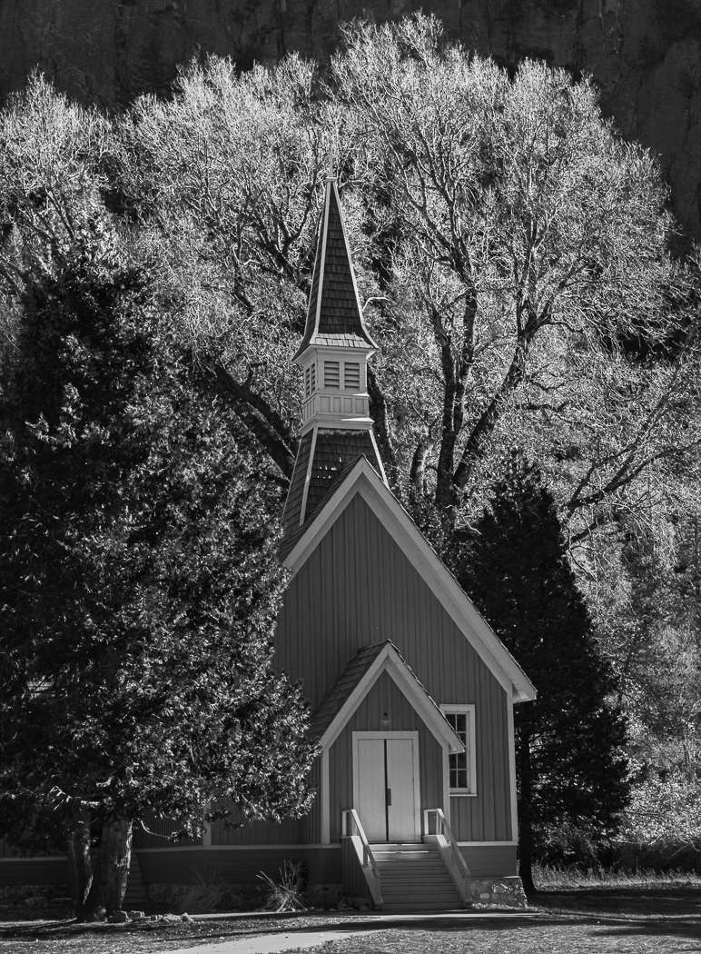
| 47 |
Mar 21 |
Comment |
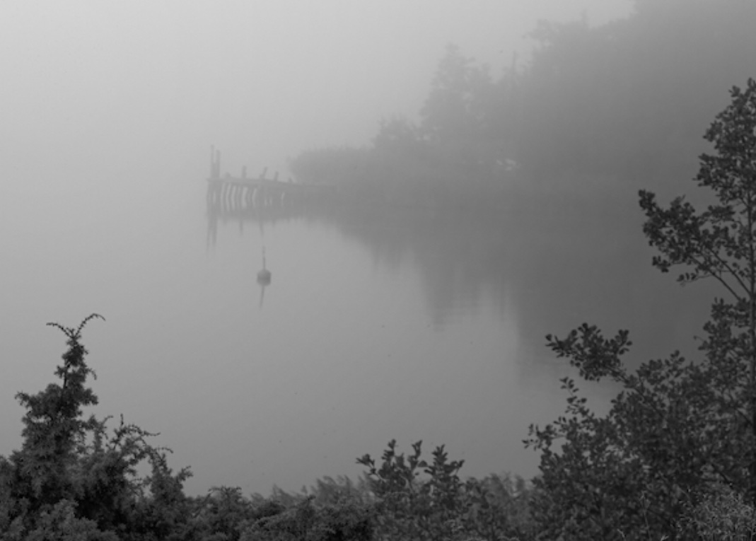
Ed, a very interesting house and I also like the tree to its left. I'm sure you have taken other images without the tree, perhaps closer up to the house, but the tree adds to the story and the remote location feel.
I also suggest you play with adding a tad of contrast: this is greyness feel may have been your intention to go with the scene, but I'm just not sure if it works for me. |
Mar 24th |
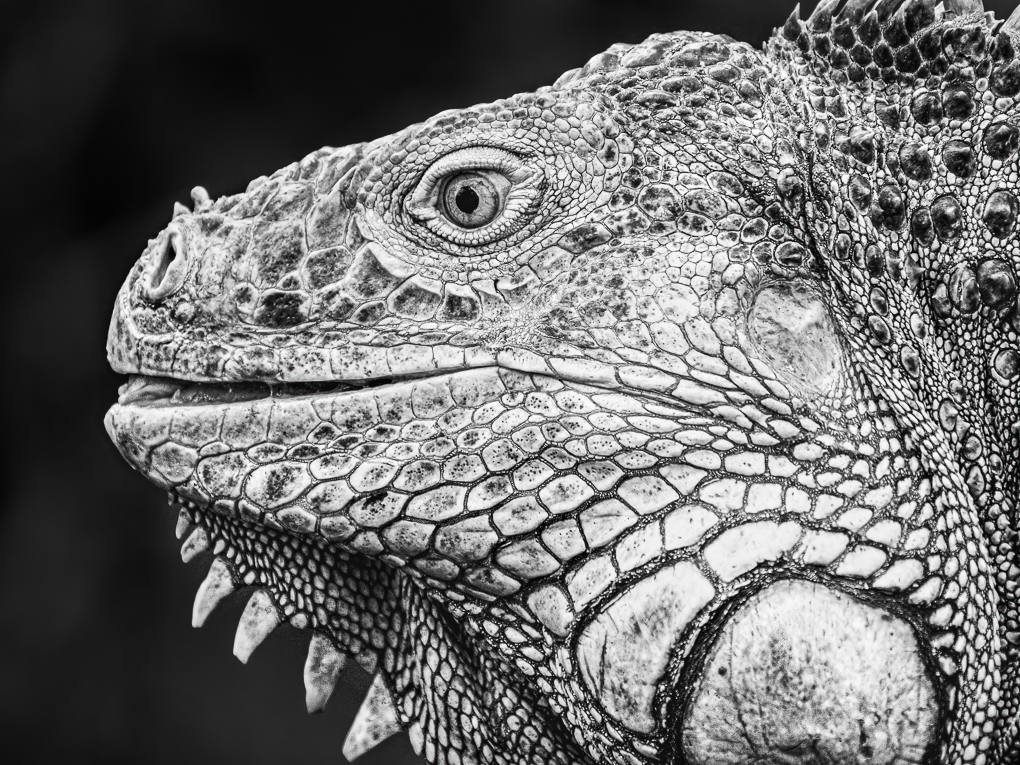
| 47 |
Mar 21 |
Comment |
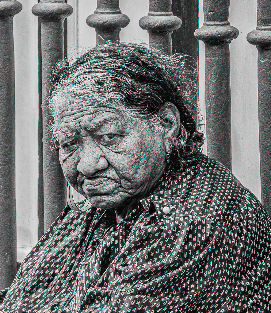
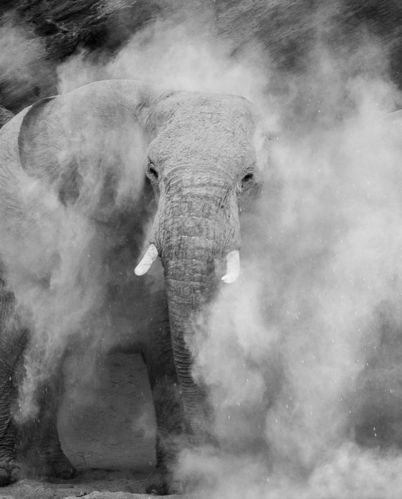
This is a great mono image Colin! As has been said there is so much detail! It would be great to hear how it did in your comp - if it didn't win, you have some serious competition in your club!
The hood really adds to the mood and you chose a garment with good texture.
It looks as though you deliberately didn't wash your face for a week before taking the picture! Great image! |
Mar 24th |
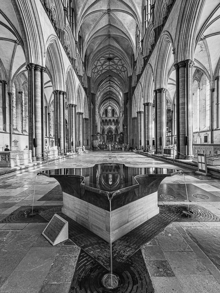
| 47 |
Mar 21 |
Reply |
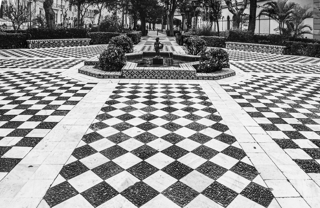
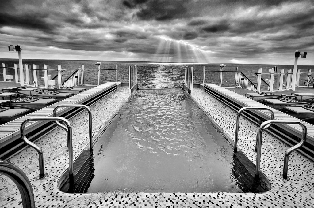
Thanks Jen. The text I gave with this image was.........as below. You were right....Spain!
Symmetry in Cadiz park
This was taken last February while on a cruise from Southampton and back round Spain. Cadiz is a fascinating old city just west of Gibraltar. There is a small park right by the coast which is interesting photographically.
Settings - 12mm on my Olympus gear (so 24mm ff) 1/100 f10 ISO200.
PP - Not a huge about after cropping and straightening verticals. |
Mar 22nd |
6 comments - 2 replies for Group 47
|
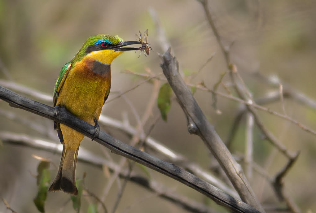
| 72 |
Mar 21 |
Comment |
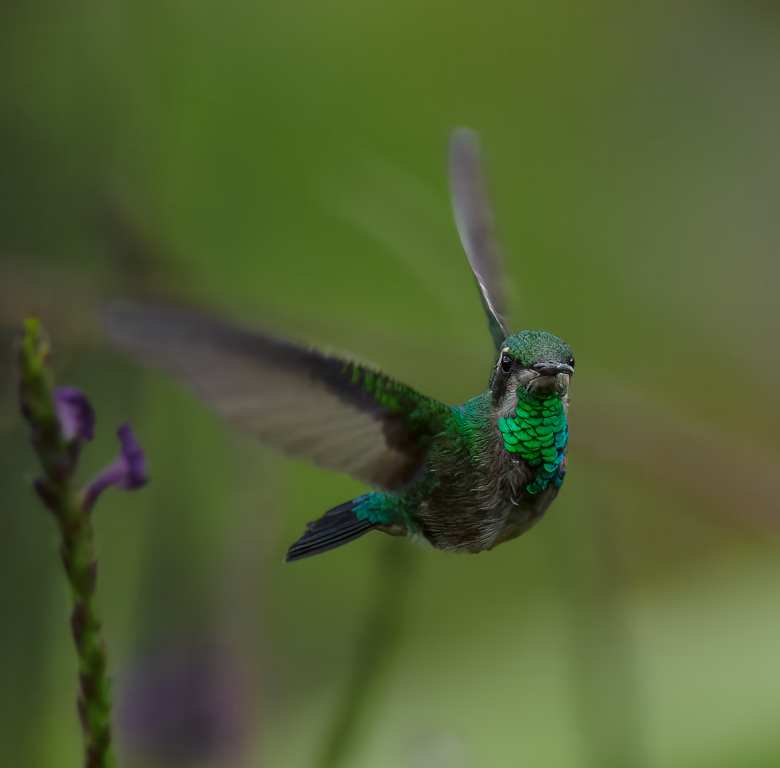
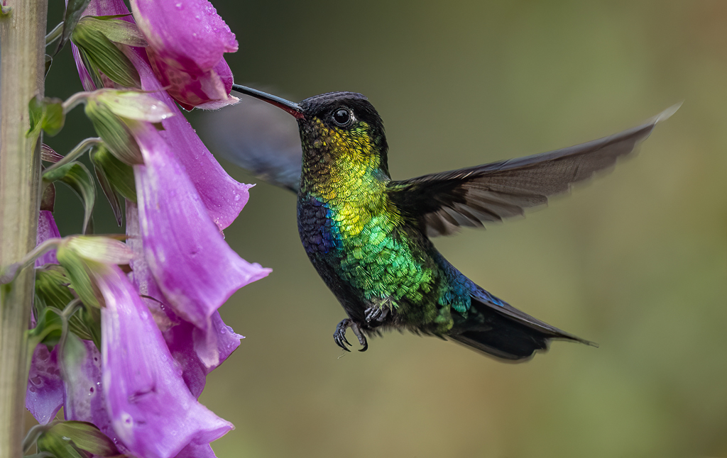
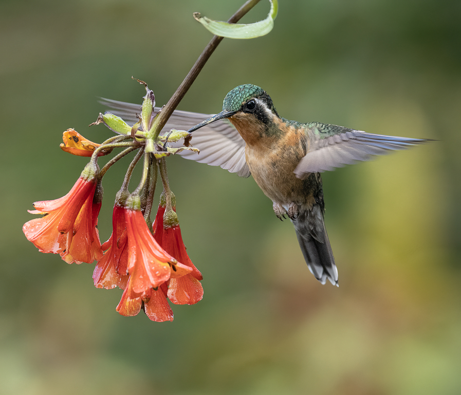
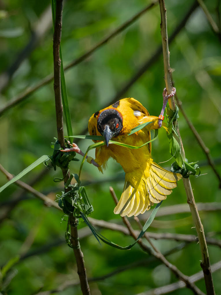
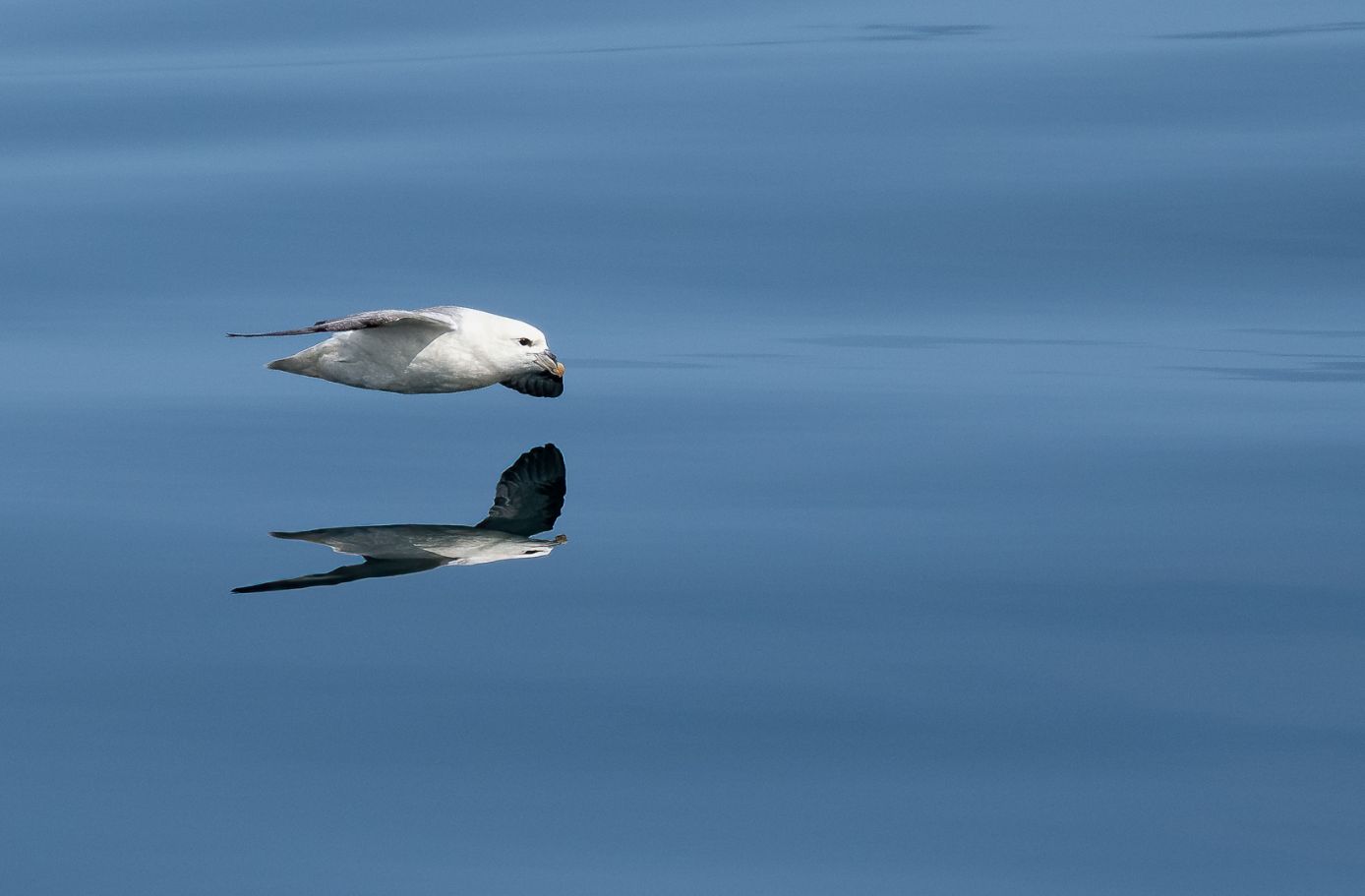
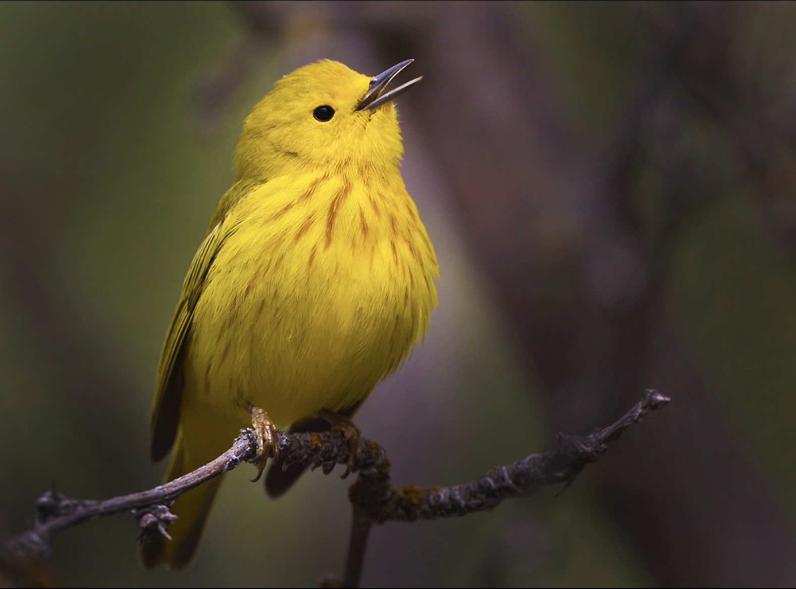
Bruce, this is a lovely shot of a lovely bird. I'm sure you smile every time you look at your wall!
I actually like the space in front of him. I feel he needs space to chirp away into! If you have any more space above him, I would consider using some of this and in which case, you may not need as much width. I like the fact you can see the end of the branch as this is to me part of the story of where he is (but the very end is a fraction bright).
I also wonder whether a flip would work better, with the branch coming out from bottom left corner, but a fraction less width to remove the orange tint area. I have tried to add a file here showing this (without Isaac's eye treatment). |
Mar 24th |
 |
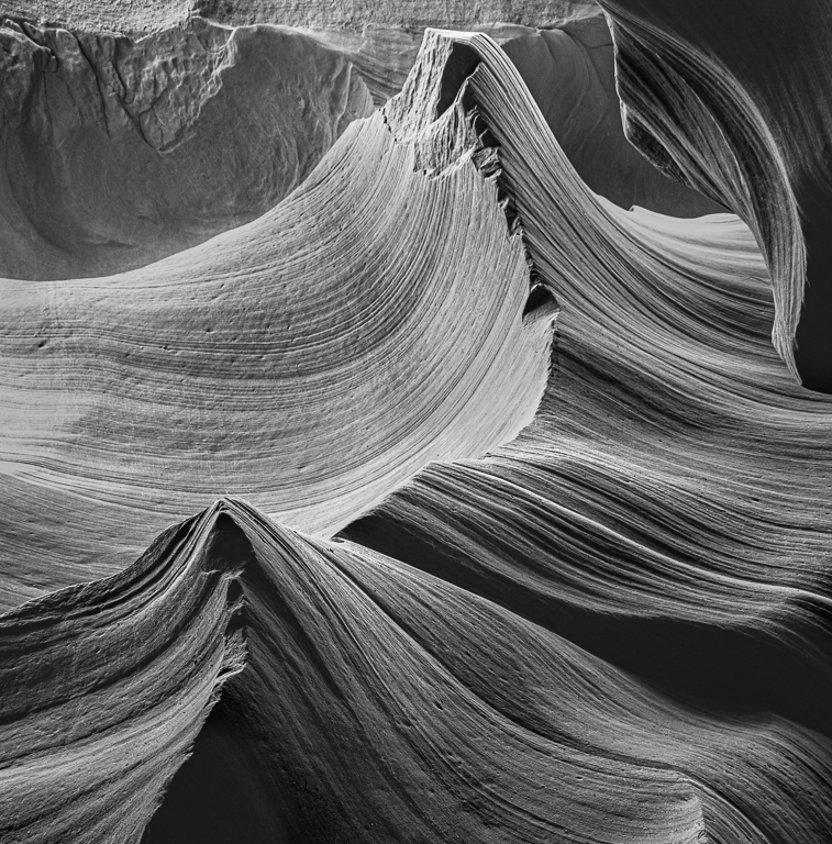
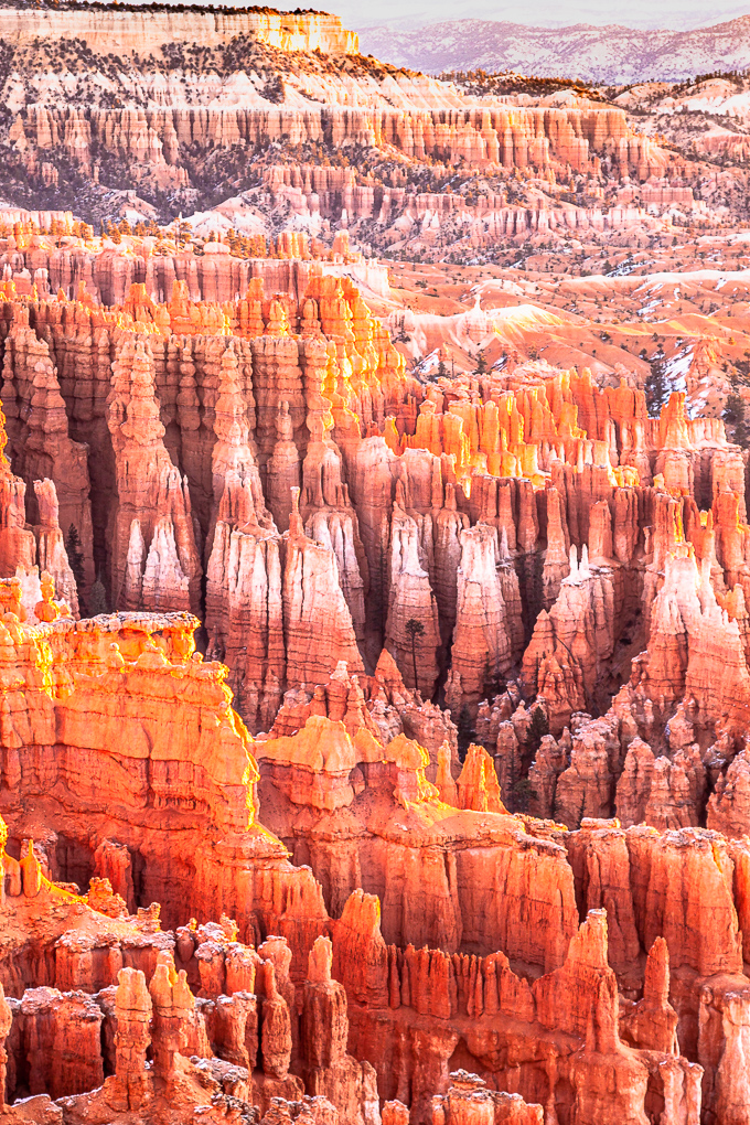
| 72 |
Mar 21 |
Comment |
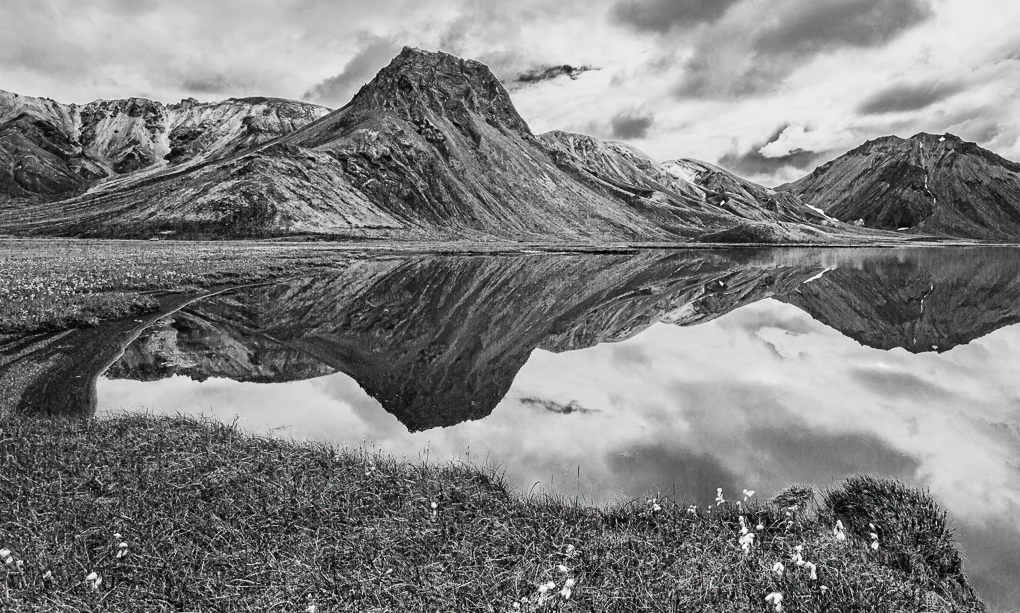
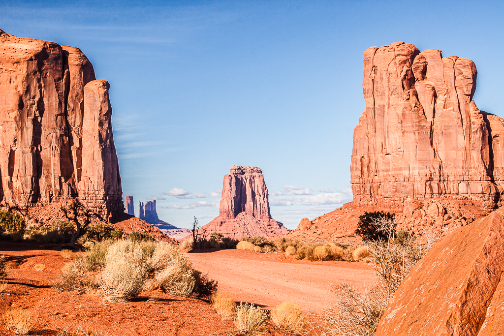
Randy, this is a very unusual image from the lower canyon (I'm lucky enough to have been twice, the first time when I was a novice and the second time on one of your described 'tripods allowed' periods which lasted no time at all). Your image encourages me to spend some time revisiting my old images.
Yes, yours is unusual and very well processed. My only feeling is that the brightest areas are very bright and I do wonder whether they would be less "look at me" if they were toned down a tad - particularly on the right.
Thank you for posting a different image. |
Mar 24th |
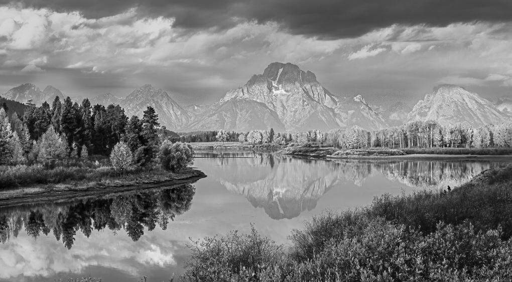
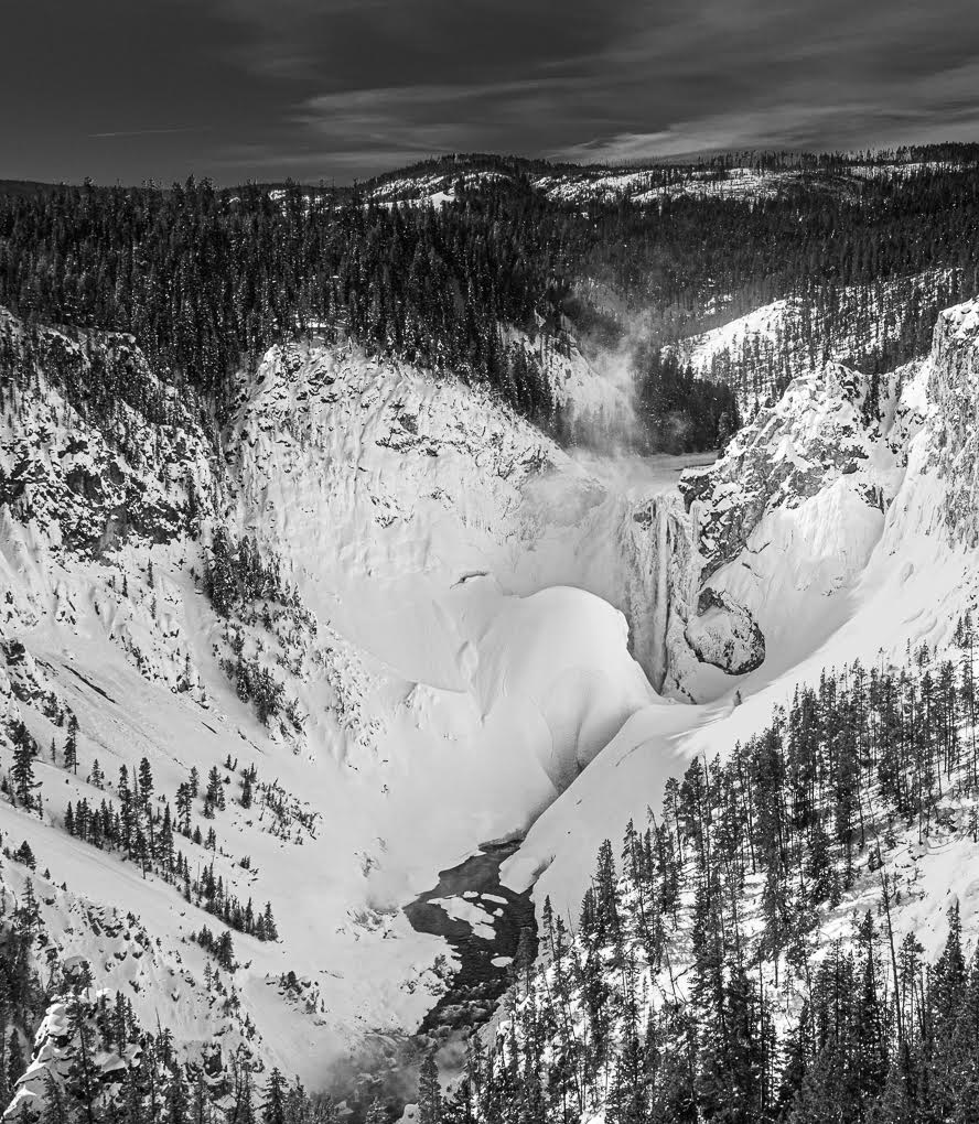
| 72 |
Mar 21 |
Comment |
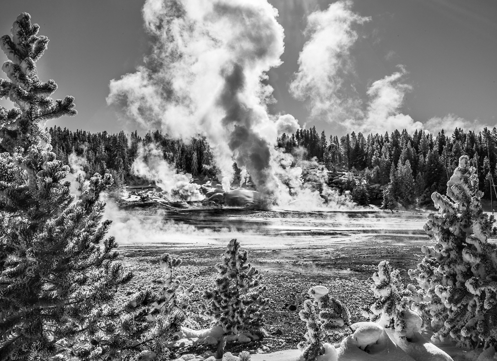
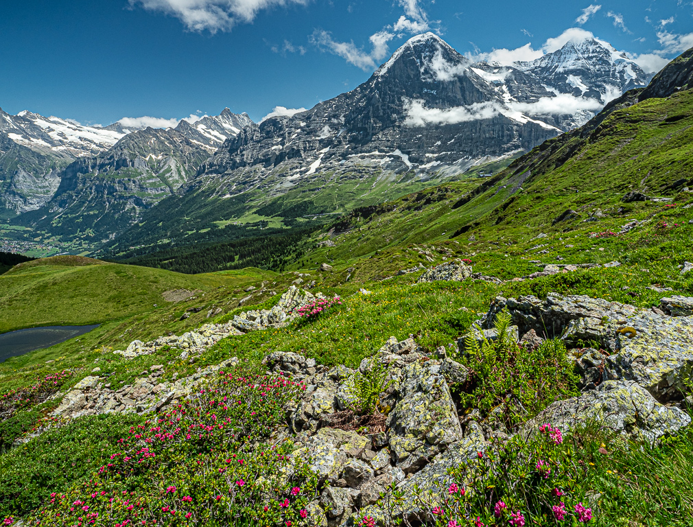
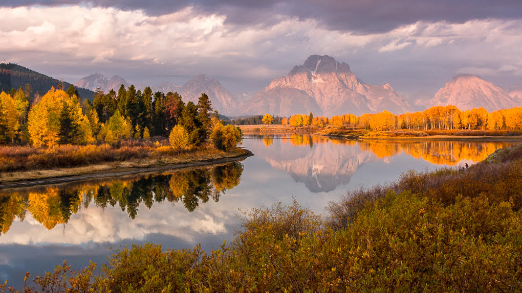
Mary, Yellowstone is an amazing and unique place! The colours in so many of the pools are different and vary from one season to another. The challenge is to end up with an image which shows this off and have the thermal character there, but not taking over. Your position and treatment is in my view perfect as your image shows the pictorial quality of a nice landscape, with all these unique Yellowstone qualities.
Yes, Marie's crop removing some of the sky stops this competing and improves it.
Another image which should be on a wall!
I think we can see evidence of the huge fire they had a year or two before your visit. I was worried when I originally heard that, but I was told this is actually good news as the forest areas come back stronger! |
Mar 24th |
| 72 |
Mar 21 |
Comment |
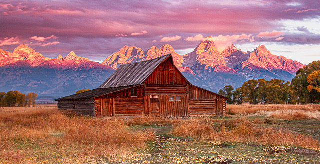
This is lovely Walt! And Isaac's crop makes it perfect! I feel it is made by the sunrise colours coming over the flowers - this makes it unique. I'm sure this will be an image you will cherish - it should be on a wall, ideally printed big!
A B&W solution is completely different (obviously) in that it should emphasise the shapes and textures more. But your version to me is too grey and lacks contrast. I feel the yellow needs to end up brighter and I think the sky would be better with the differing tones still visible to leave the top 1/3 with more interest. At the moment there are no whites in the image and too many shadow tones. Only my thoughts, but my point is that I wouldn't write off the idea of a mono solution. |
Mar 24th |
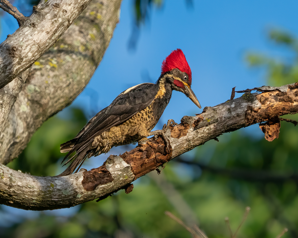
| 72 |
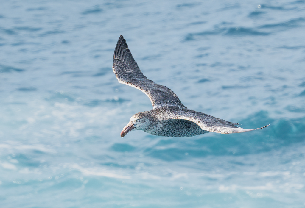
Mar 21 |
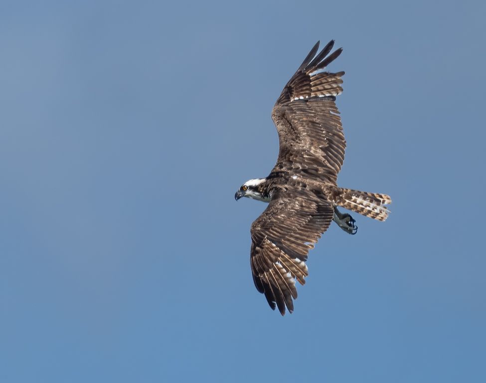
Comment |
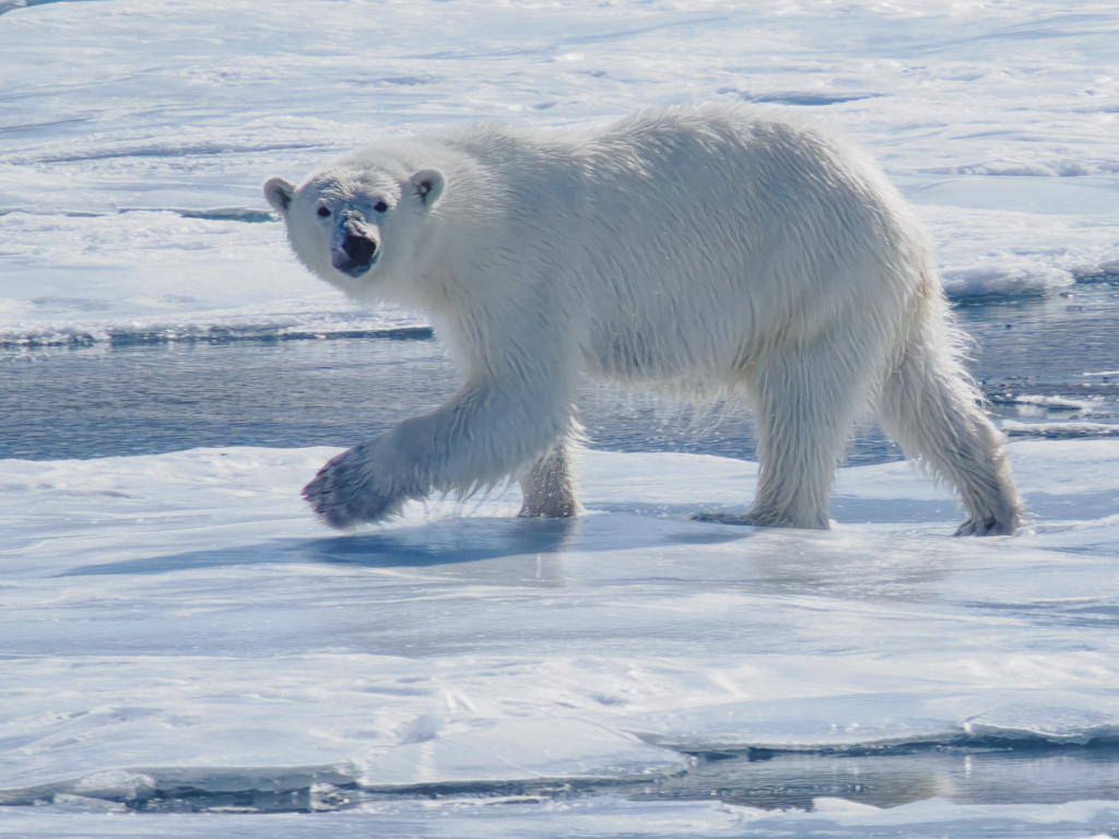
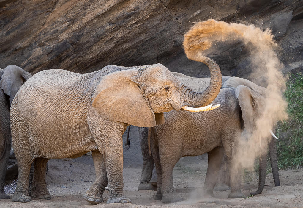
First, the horsepower of your 850 is amazing to be able to crop to this extent - why have a long lens! 300mm is obviously enough!
Yes as has been said, a square crop is nice, but I still like the large negative space you had in your original. The square also has the added advantage of the branch coming from the bottom right corner which helps.
It is a very nice image and well taken and processed: my only negative is that the poor bird looks in a very unnatural position with its head turned so far, although I like the idea Randy suggests in giving it an amusing title!
|
Mar 24th |
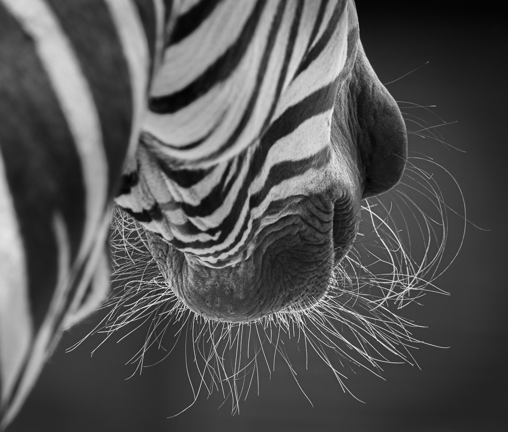
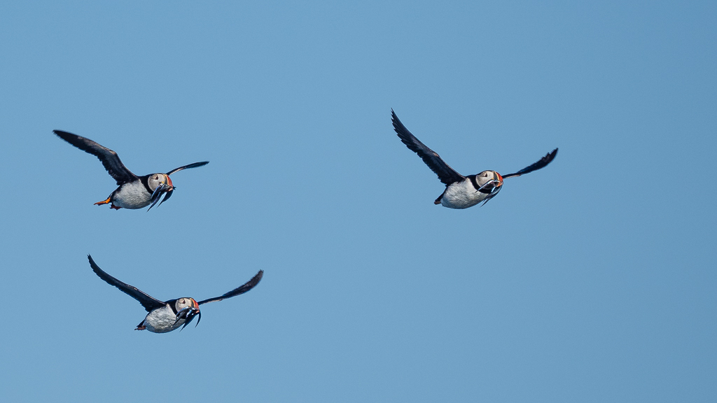
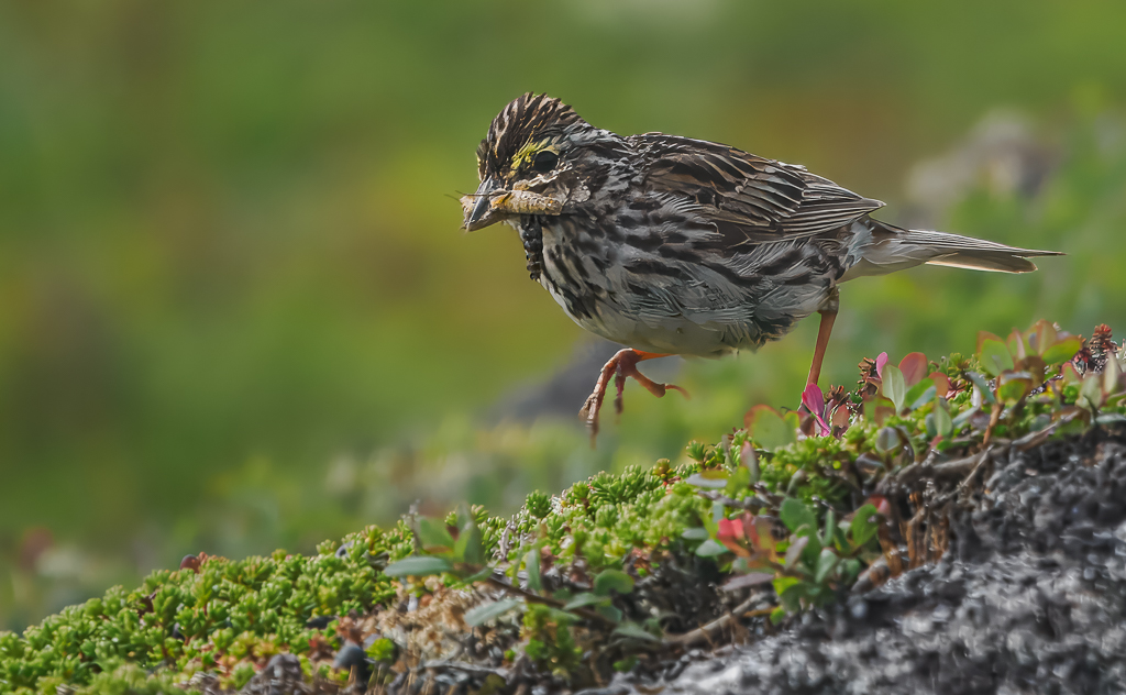
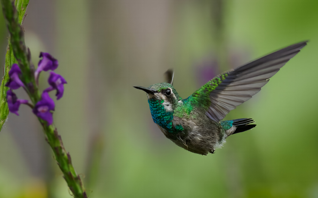
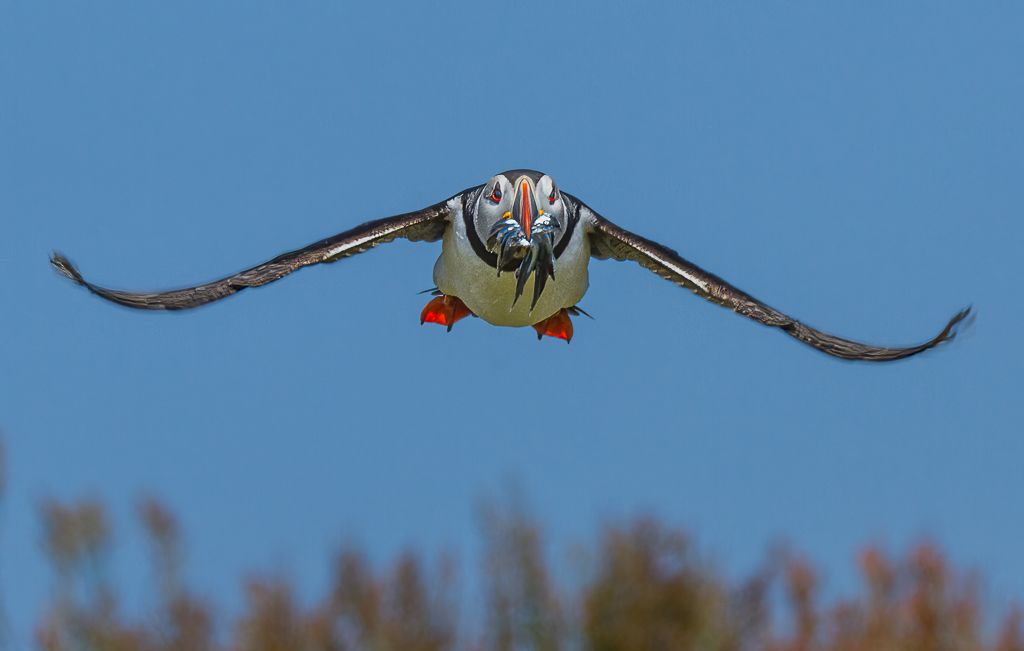
| 72 |
Mar 21 |
Comment |
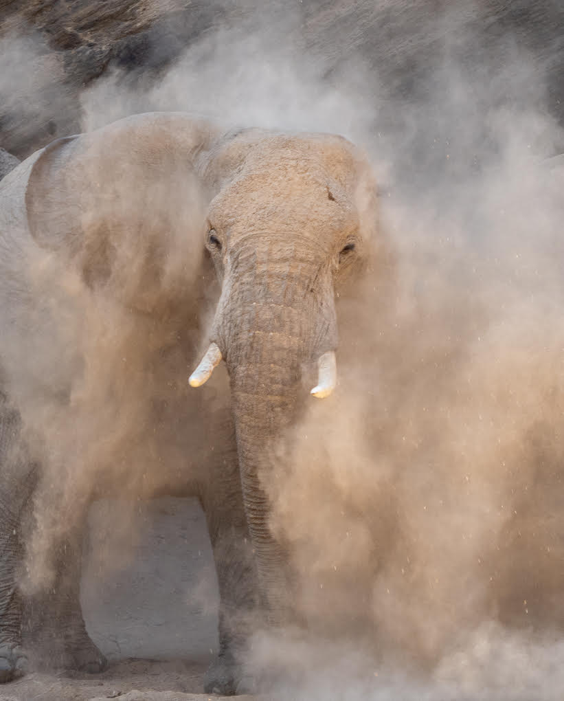
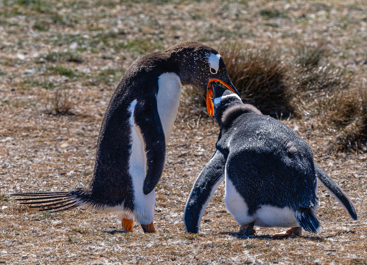
Isaac,
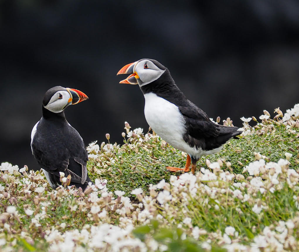
Puffins are a delight to both enjoy watching and photograph. They are a popular subject here in UK and we see a number in club competitions and nationally. I am going to the coast of eastern yorkshire in may and will bound to take some! It will be the fourth time looking at puffins, but first in May's location.
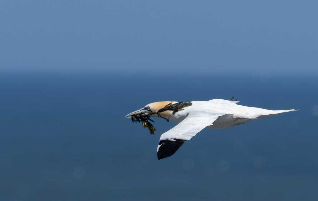
This is a very nice shot and well timed and you were well positioned through being slightly lower than the bird, so we can see the under wing detail. This makes it an unusual shot and is better for that.
There are no parts of the bird where the white is blown out: in my view a shot like this which is showing well the character and detail of the bird should not be altered through cloning. I wouldn't alter anything, although the little white spots mentioned above are not part of the bird and could be removed
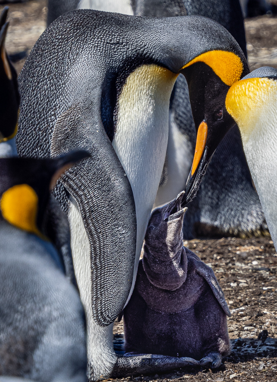
I thought it was interesting that you used exposure compensation positively by 2/3 stop despite the normal position of having to be careful with the white feathers. But in this instance the bird was creating its own shadow and the original image is darker than you wanted as a final result. I conclude you were obviously right in your settings and actually the weather conditions were helpful to you to get such detail on the bird.
|
Mar 24th |
| 72 |
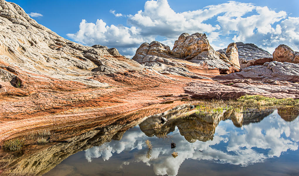
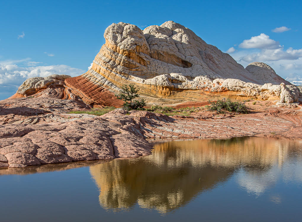
Mar 21 |
Reply |
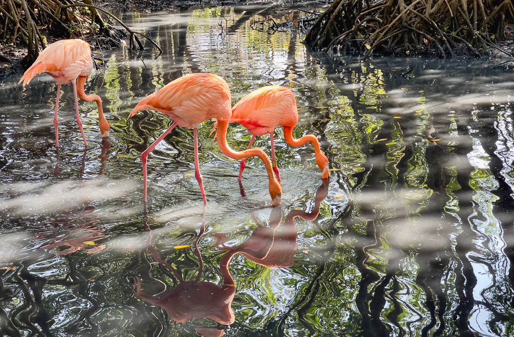
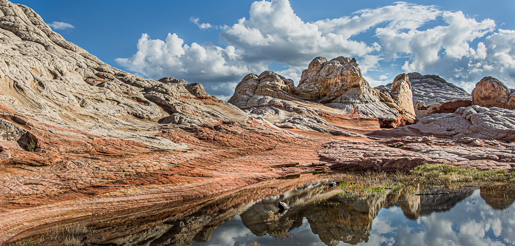
Thanks Isaac - I respect what you say here - it is an image which should not be about the reflections but the main landscape.
I have attached a newer version, having cropped from the bottom to a point which maintains the lead in lines of the rocks from the bottom left. I have also tried to make the whole image less bright and further dimmed the reflection area and reduce the saturation of the grass area in an attempt of reducing the distraction of that area more. |
Mar 4th |
 |
6 comments - 1 reply for Group 72
|
12 comments - 3 replies Total
|