|
| Group |
Round |
C/R |
Comment |
Date |
Image |
| 47 |
Nov 20 |
Comment |
Jen - so many options!
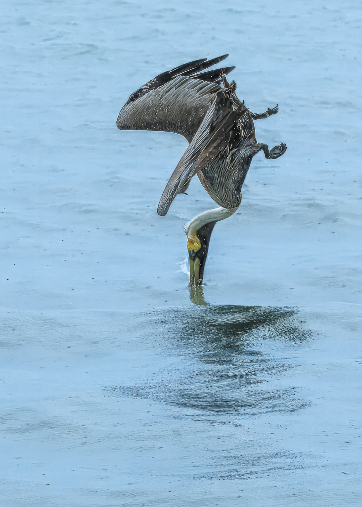
I'm very much in agreement with John. Yes, the is a mono group, but in my view, a mono image of a wildlife situation is better if it tells a story. Cropping the bottom out leaves the story as a flying pelican by trees. This may me a 'cleaner' image, but the story and context is IMHO weak.
So your concept I believe is right, but I don't like the flying pelican being in the centre - hence John's crop is, to me, better. I would also try using the blue slider to see if the water at the bottom becomes darker, helping to emphasise the swimming pelicans better.
Nice image Jen! |
Nov 29th |
| 47 |
Nov 20 |
Comment |
Albert, your image encouraged me to see where Prospect Harbor is: I haven't yet been to that area, but is very much on our list.
I like your IR treatment, but will agree with others that as presented it is too dark and that takes away my enjoyment of it. Ed's adjusted version does improve it, whilst still maintaining the drama you were after. Thank you for posting. |
Nov 29th |
| 47 |
Nov 20 |
Comment |
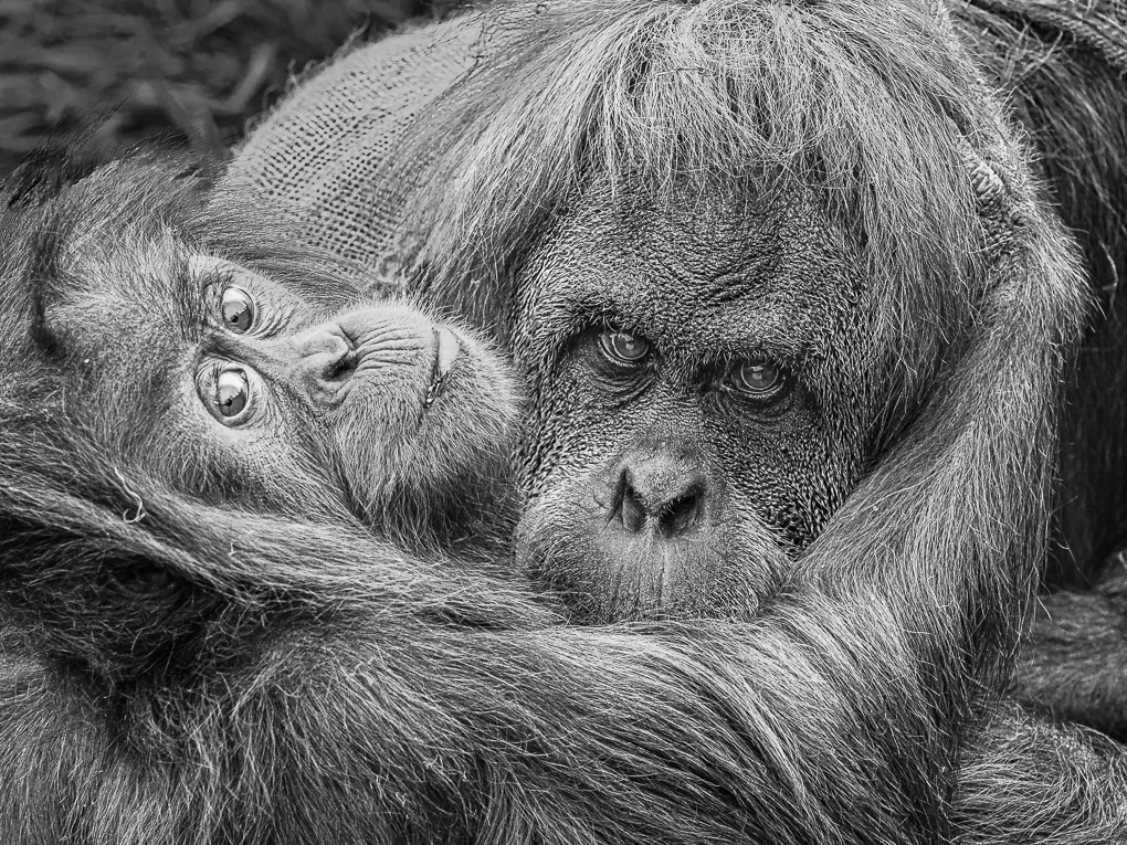
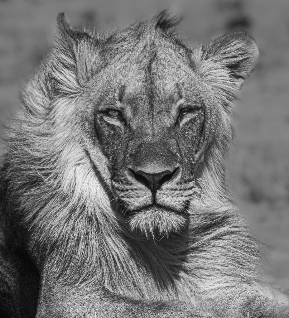
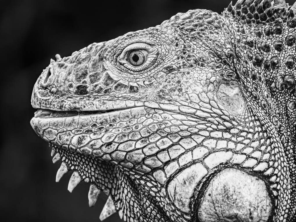
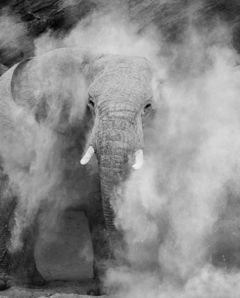
Don, I love mono nature images, although, I've only just started tinkering with them. One of our v good camera club members recently presented an evening's entertainment with a huge number of his African images, all in mono, Thought provoking!
I very much like many aspects of this. Your capture and processing has really brought out her intensity in focussing on something over to your right and this is lovely. I do wonder if the foreground rock has been over processed. I find it takes the eye away from the lion somewhat and asks me questions as I look at it: particularly the top area. I tend (rightly or wrongly) develop my nature images in a way which directs the eye to the main animal and less to its surroundings.
I agree with others that the shy adds interest. But you have taken a portrait where the core focus is the lion. I thus find the wispy clouds a little distracting and would tone them down somewhat.
Reading my comments here sound negative. I don't mean to be! It's a lovely portrait Don. |
Nov 28th |
| 47 |
Nov 20 |
Comment |
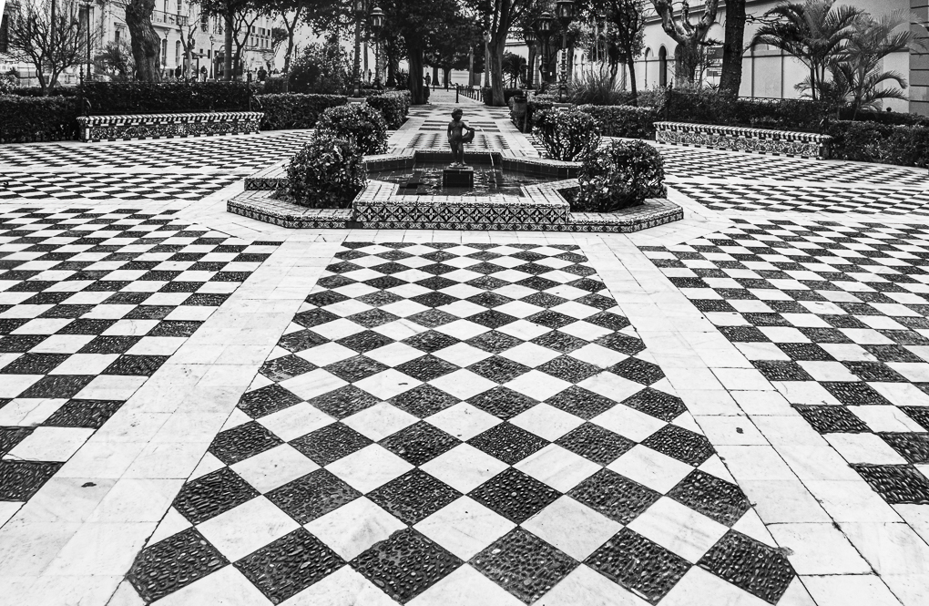
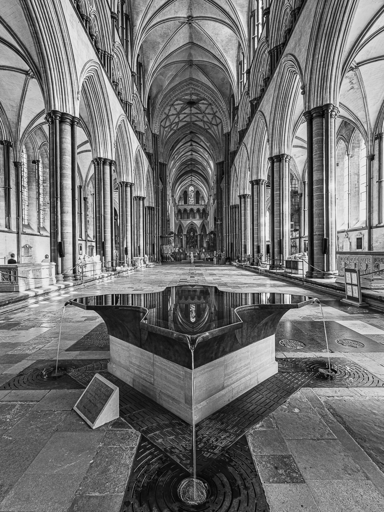
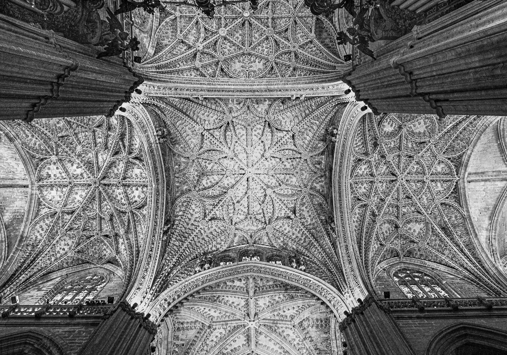
What a lovely image and so interesting that one can show it so differently. I prefer your darker mono version to the others, although I can see why you have the colour one on you wall.
As a colour wall image, the viewer will see different things each time it's viewed. There are more to look at in terms of the lighting skill on the columns and surrounding area.
In mono, the darker version correctly (in my view) focuses the attention on the main event - the cathedral. One sees the other people, but in a way which adds scale rather than anything else. The columns are there, but their interest comes from their shape and texture rather than lighting colour.
I love the evenness of the lighting - it makes it very restful to look at and enjoy. |
Nov 28th |
| 47 |
Nov 20 |
Comment |
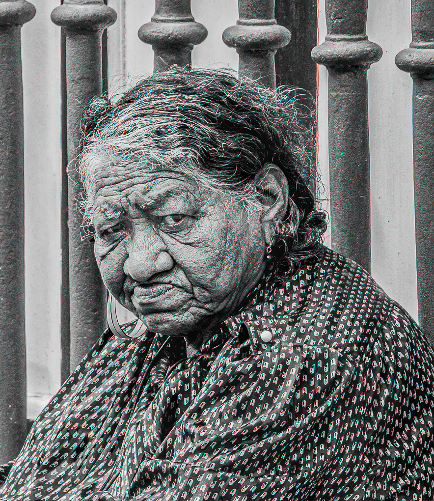
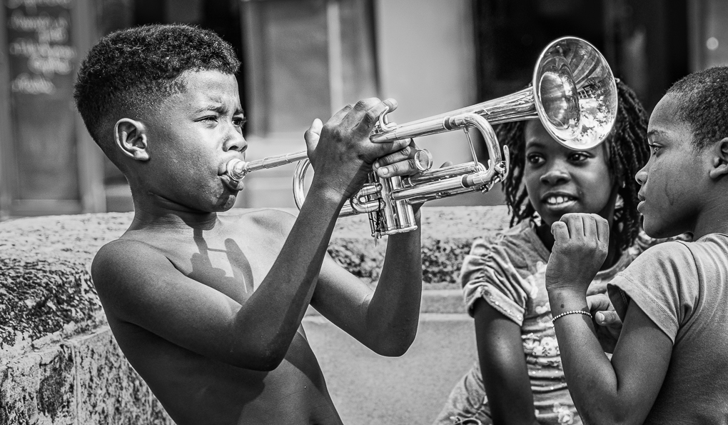
Hi John - I saw your subject as male.....until reading the prior comments....and still think he it.....but actually it doesn't matter!
This is definitely one for mono treatment, rather than colour....the question is how to develop and 5 people will probably have at least that many views!
I find your initial version has lost the sharpness or clarity of the colour and to me, this just begs the question (assuming one hasn't seen the colour) whether it was captured poorly.
I rather prefer the granularity of the colour detail and would vote for creating a mono version which kept this - as well as working more on the 'headdress' as this is too bright and I believe would benefit from more texture added, so it adds to the interest. I also feel the nose rings should still be clearly visible as part of the story and intrigue.
Thank you for posting a really interesting image, where there is definitely more than one way of presenting! |
Nov 28th |
| 47 |
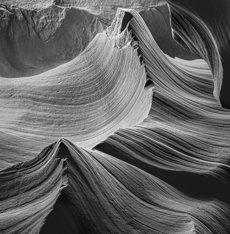
Nov 20 |
Comment |
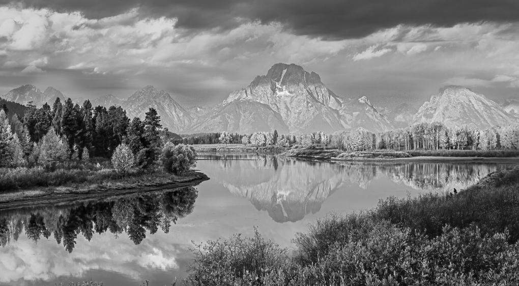
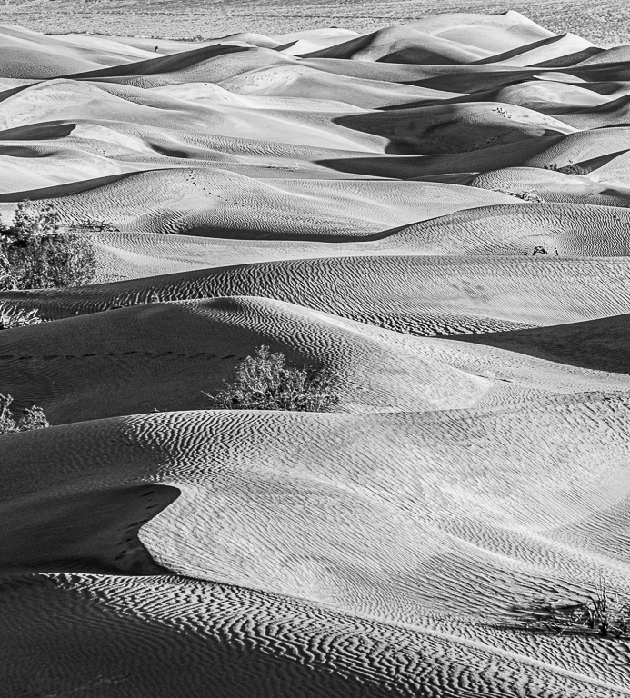
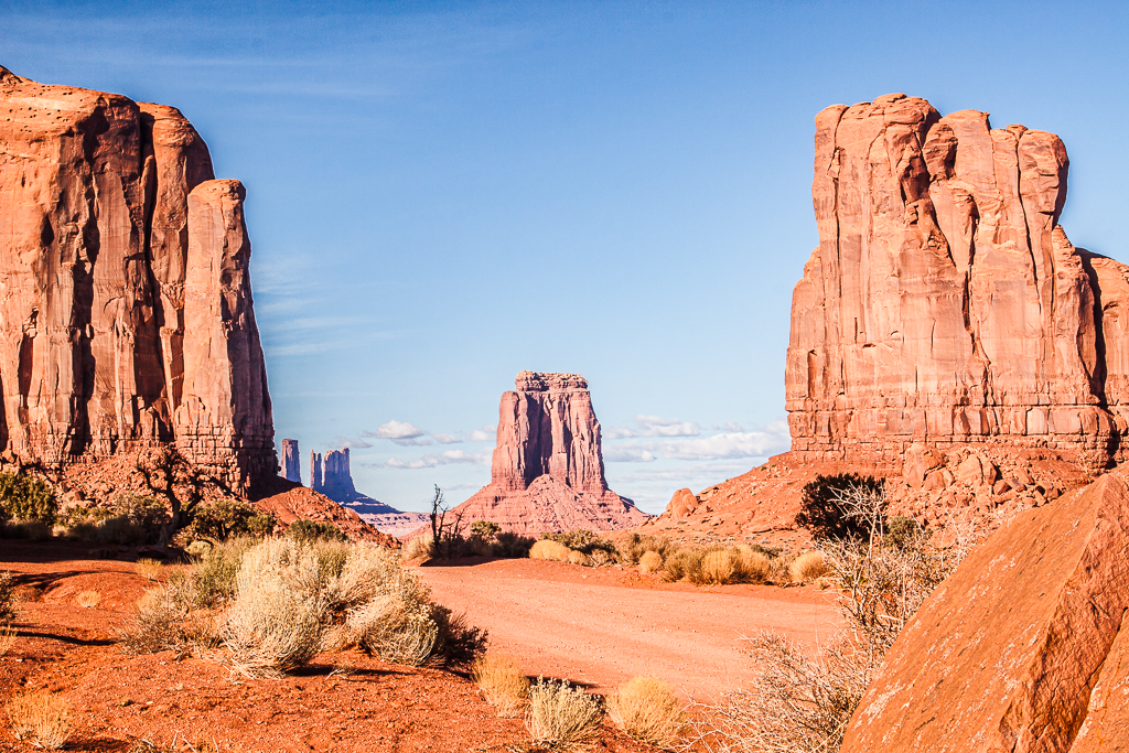
Jack - lucky being able to revisit Death Valley: even when very hot!
The curve you have primarily concentrated on is fabulous and the ripples and detail is great. But as said, the very bright centre area grabs the attention with no or little detail visible. Probably a case where HDR at time of capture is needed as the extremes from bright to dark is quite extreme.
I also like Ed's colour version, a case of having two images for the price of one! |
Nov 28th |
| 47 |
Nov 20 |
Reply |
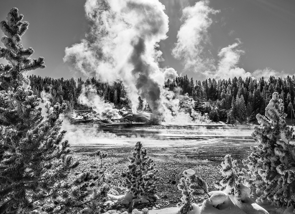
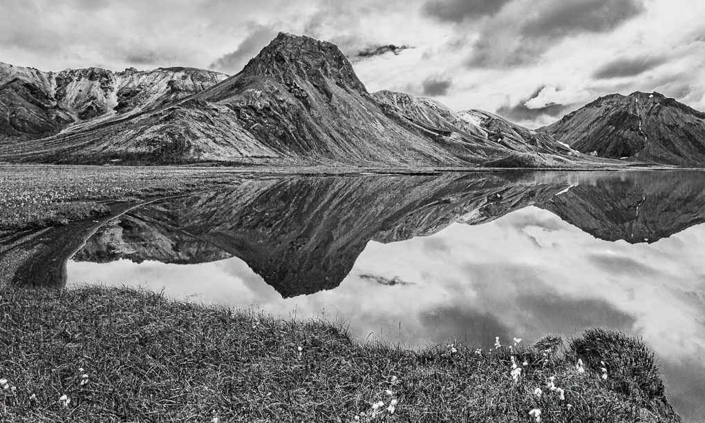
I appreciate your comments Jack: thank you. Here is an adjusted version with more work done on the mountains and sky, plus a small bit on their reflections to try to keep them in step. |
Nov 8th |
 |
6 comments - 1 reply for Group 47
|
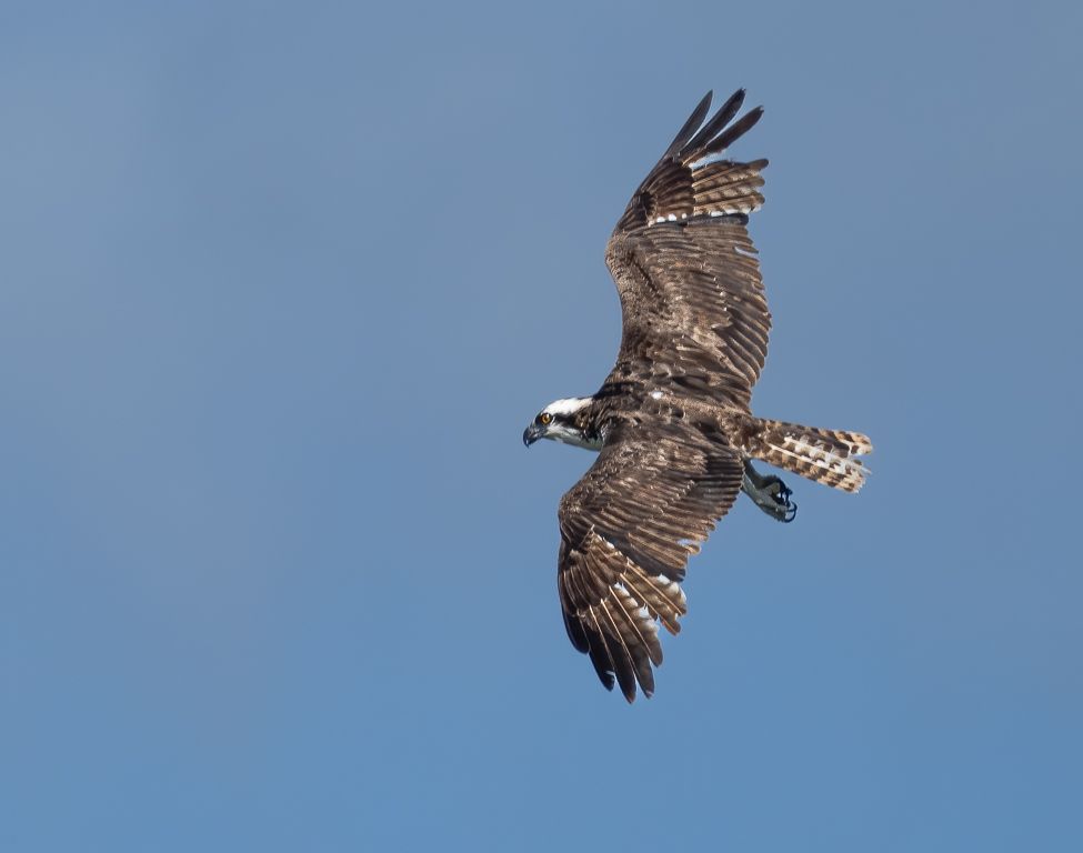
| 72 |
Nov 20 |
Comment |
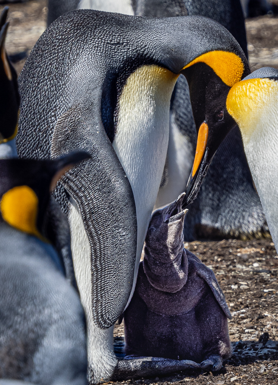
Fabulous image Isaac! Having looked at your Group 4 dawn light version, I actually prefer this - I feel the dawn light doesn't help to show off the lovely detail of the eagle.
I very much like the intensity of the bird, clearly focussing on something over your right shoulder. I was wondering why you've positioned it in the right half bearing in mind where it's looking, but it works! The branch to our left and (?) Spanish moss adds interest. |
Nov 28th |
| 72 |
Nov 20 |
Comment |
Wow, a fabulous end result Marie! Incredible crop, but your camera had the horsepower for it. I chose to go to micro 4/3 which is the other extreme of quality cameras, but the sacrifice is lack of cropping ability.
Your pp delivers a powerful colour image .......very successfully. For any pure Nature comp or similar, this degree of vignette is frowned on (needs to be there without noticeable). I'm sure you know this though. |
Nov 28th |
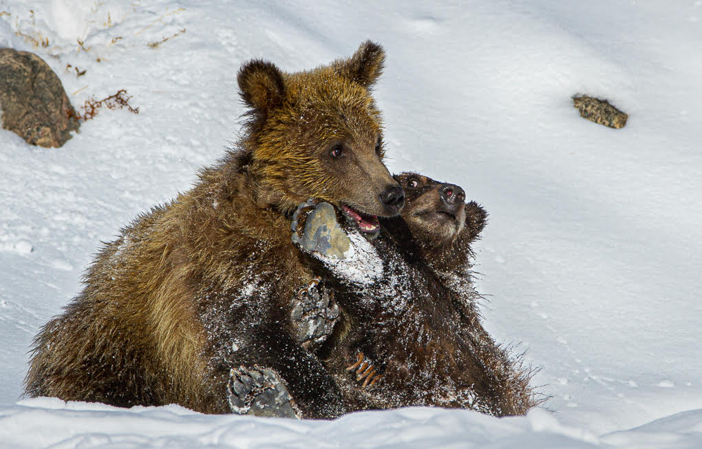
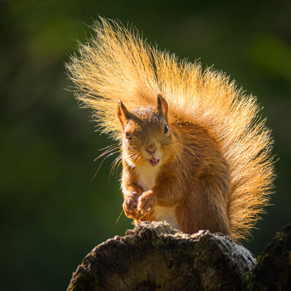
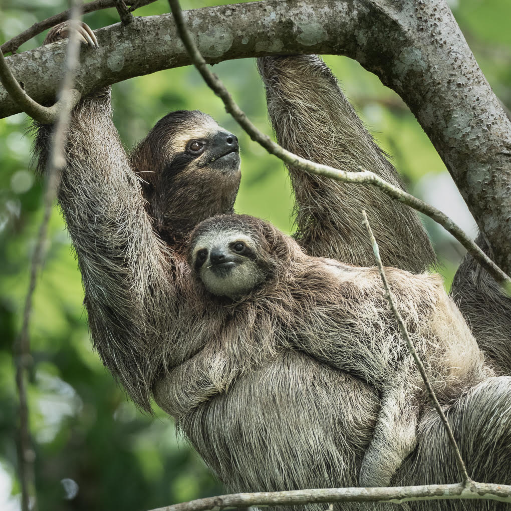
| 72 |
Nov 20 |
Comment |
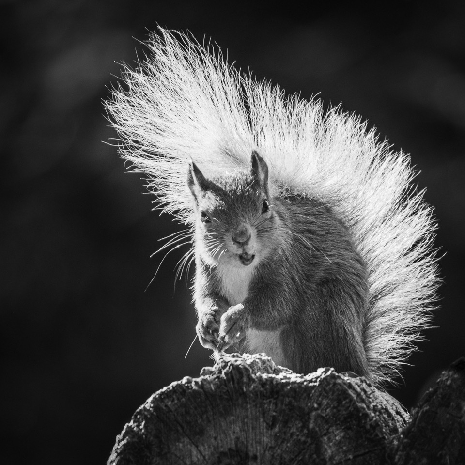
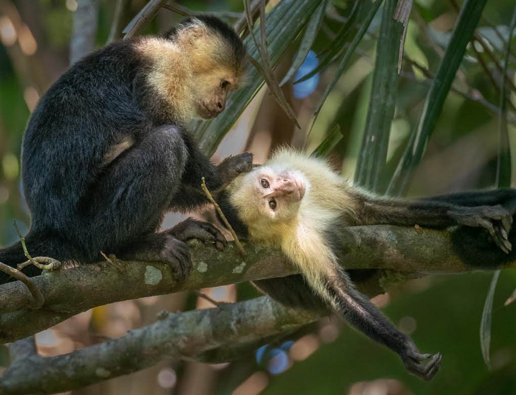
I love the character you have captured here - great timing Mary! You have also brought out fabulous detail in its fur - love its tail. For me, it's the thin branches which are distracting, especially on the right. Good luck with removing these, especially on the left where one is visible through the fur! Well beyond me! |
Nov 21st |
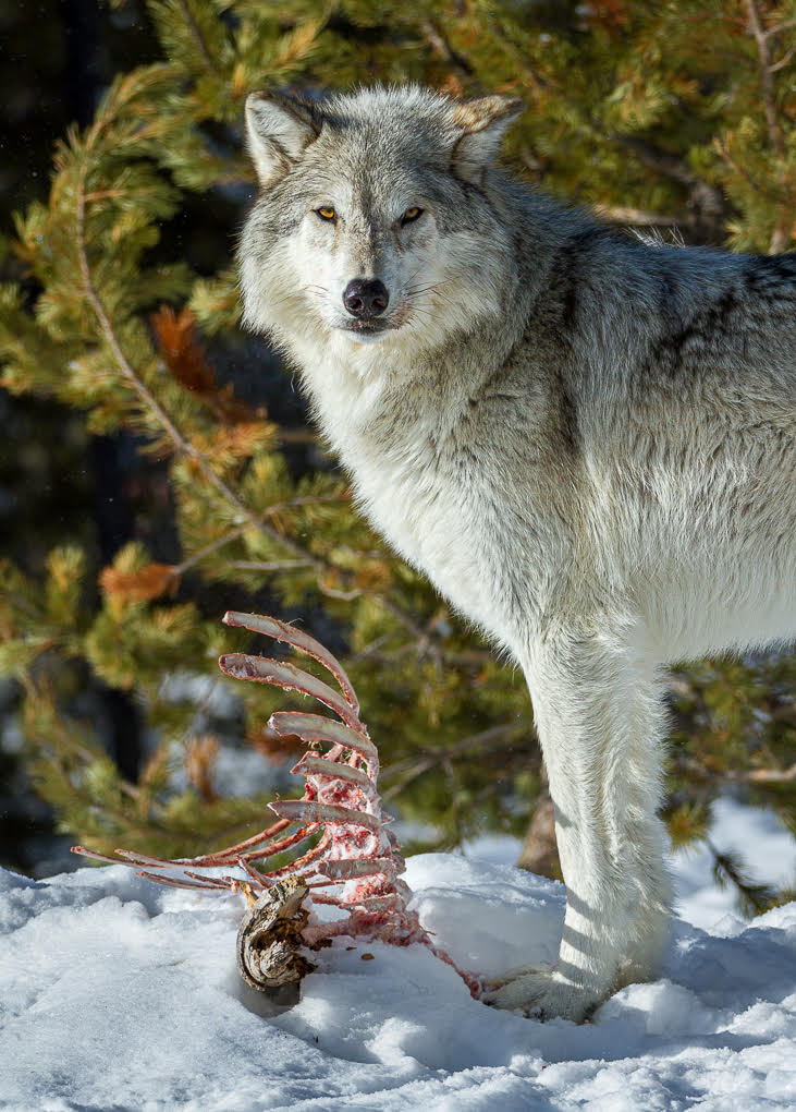
| 72 |
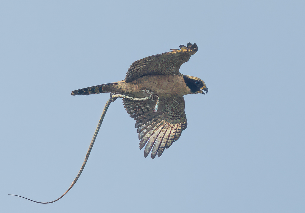
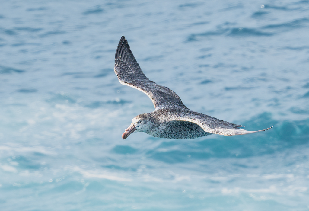
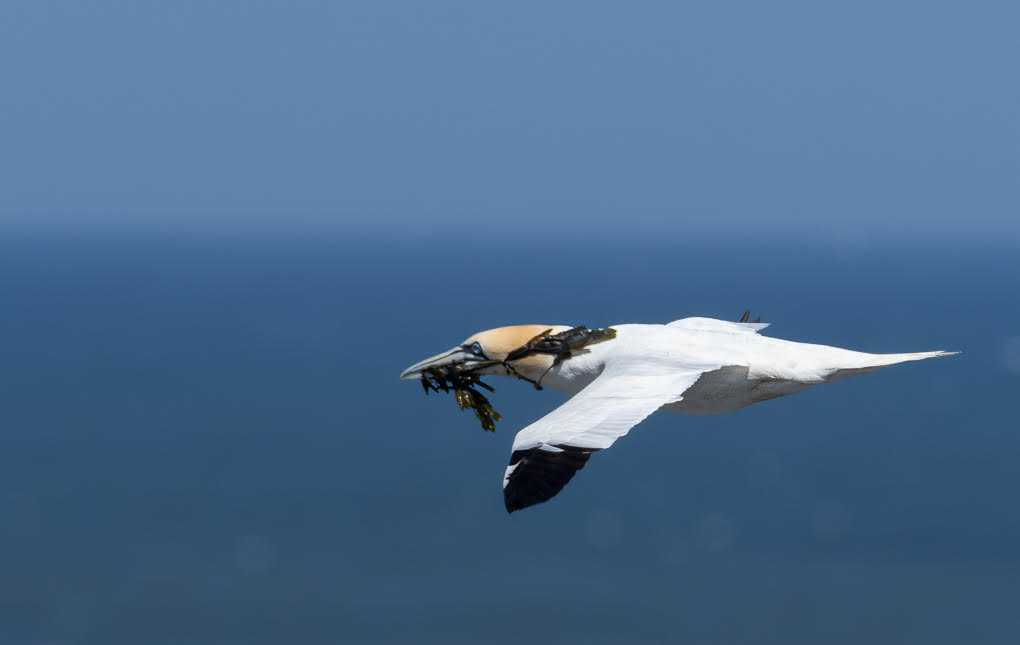
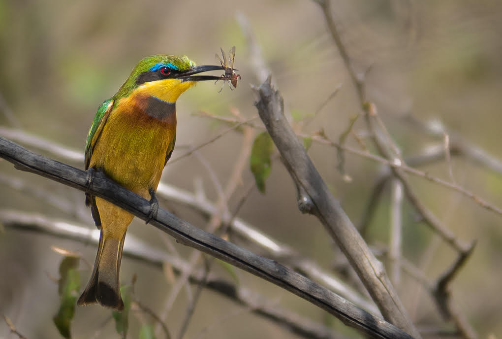
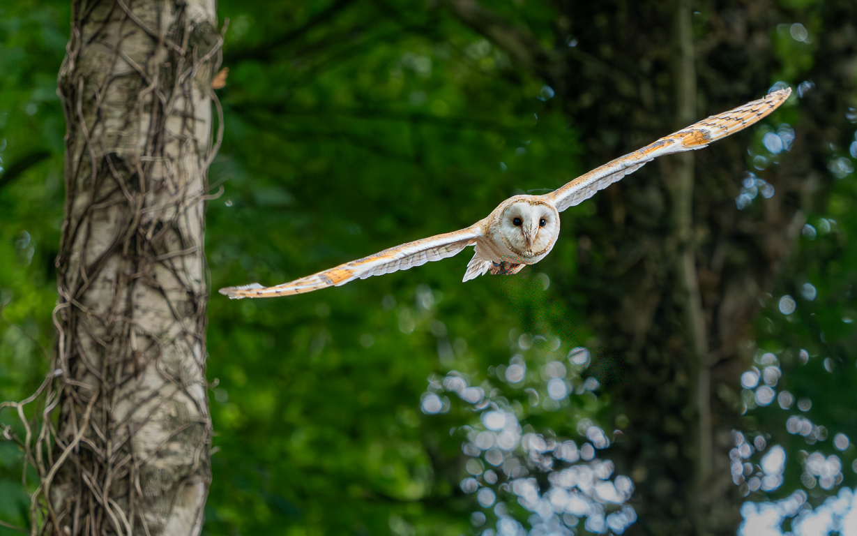
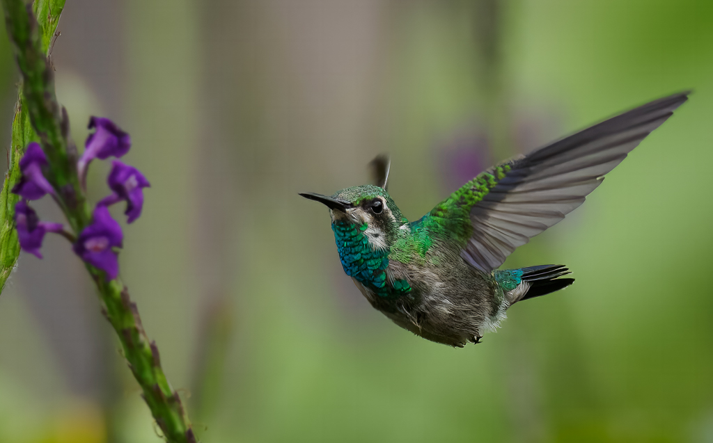
Nov 20 |
Comment |
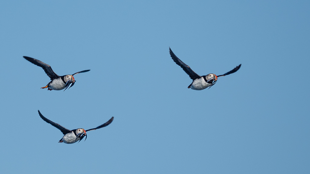
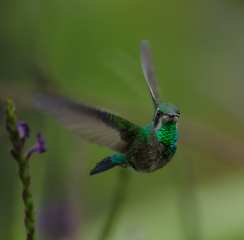
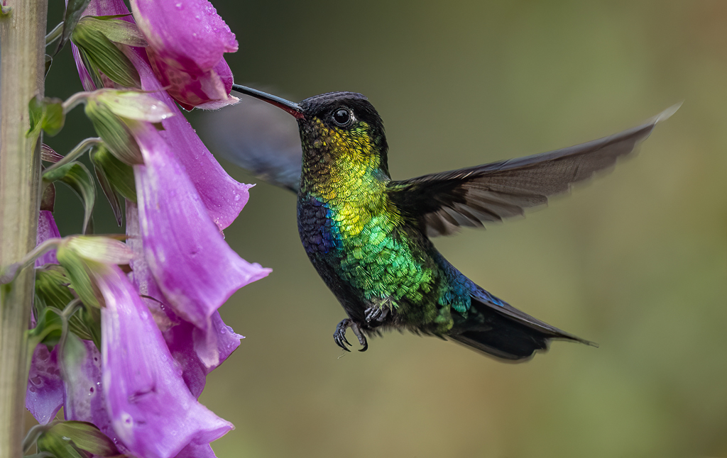
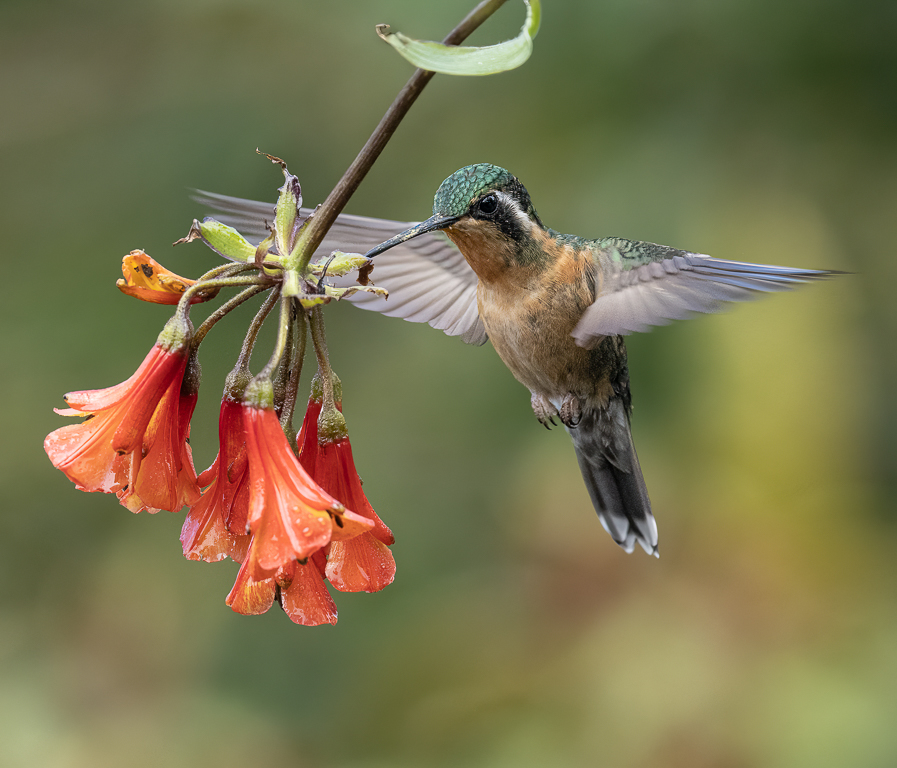
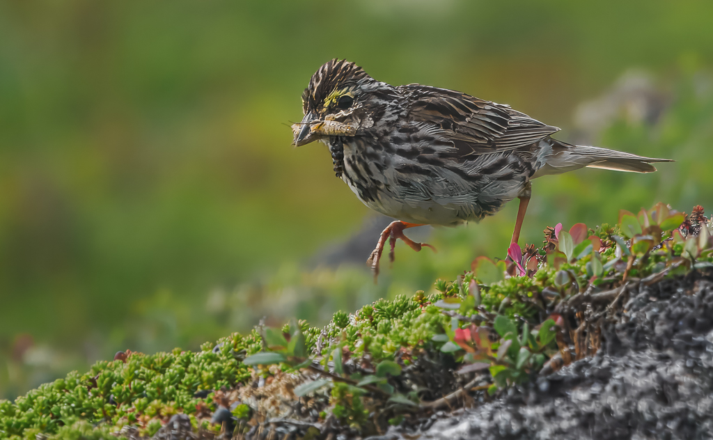
Randy - I think this is a case of you capturing a rare animal perfectly; the fact it was flying in front of distracting background should not stop you taking it! It looks a lovely bird and you timed your shot perfectly with full wings out and it's head turned slightly to its right. You might be able to darken the greens to help the background. Lovely owl! |
Nov 21st |
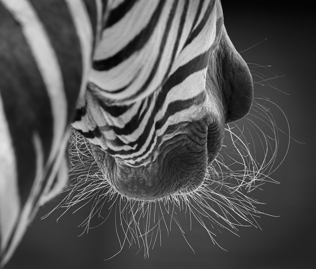
| 72 |
Nov 20 |
Comment |
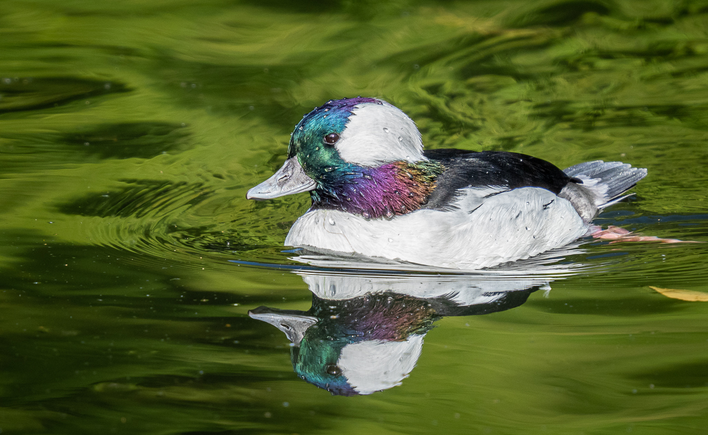
A great capture Bruce - the expression will make all viewers smile! I too like your crop and you have a lot of detail. My only belief is that the background should ideally be a tad darker.......this would make the whiskers stand out and be less distracting. Lovely image though. |
Nov 21st |
5 comments - 0 replies for Group 72
|
11 comments - 1 reply Total
|