|
| Group |
Round |
C/R |
Comment |
Date |
Image |
| 47 |
Feb 20 |
Comment |
Jen
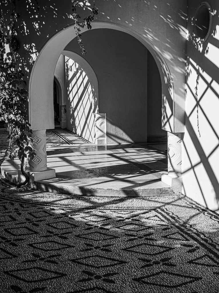
This is a nice B&W image. Before reading the reviews posted, I had concluded it may be stronger not having much sky visible, possibly making it a square format. Others have suggested this. By removing the sky, it keeps ones eye going through the tunnel.
I like the people! The fact that they are looking at phones, is natural and the position they are in within the tunnel seems a natural think to do and gives scale plus breaks up the long left wall.
Lovely shot Jen! |
Feb 27th |
| 47 |
Feb 20 |
Comment |
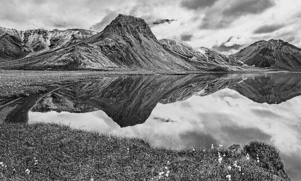
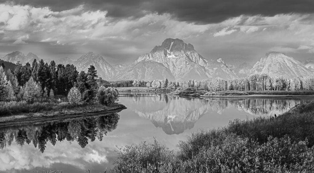
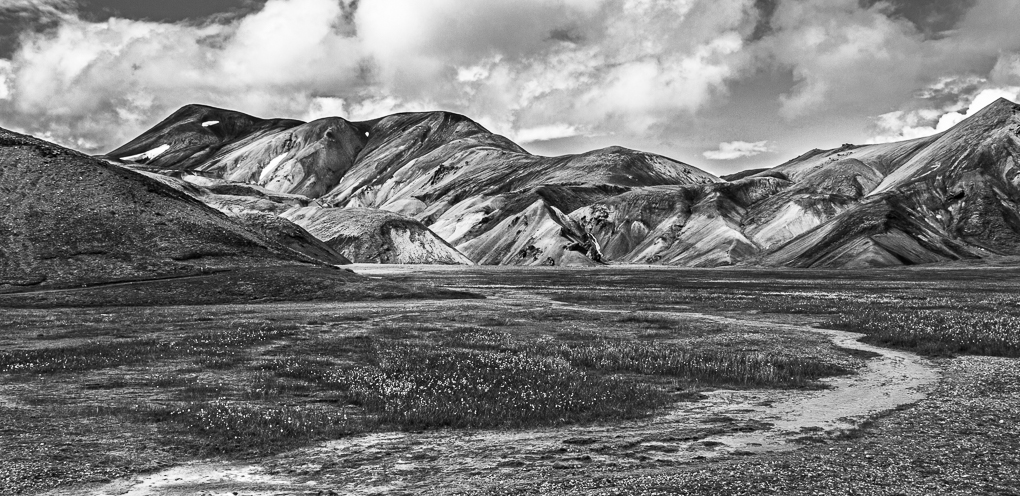
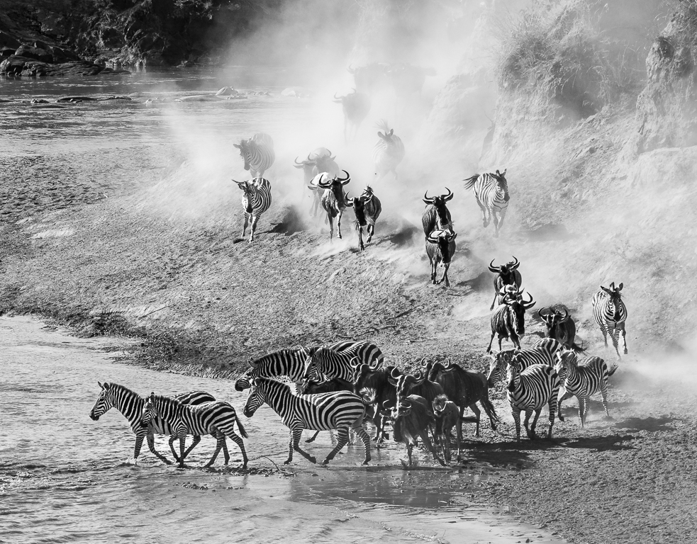
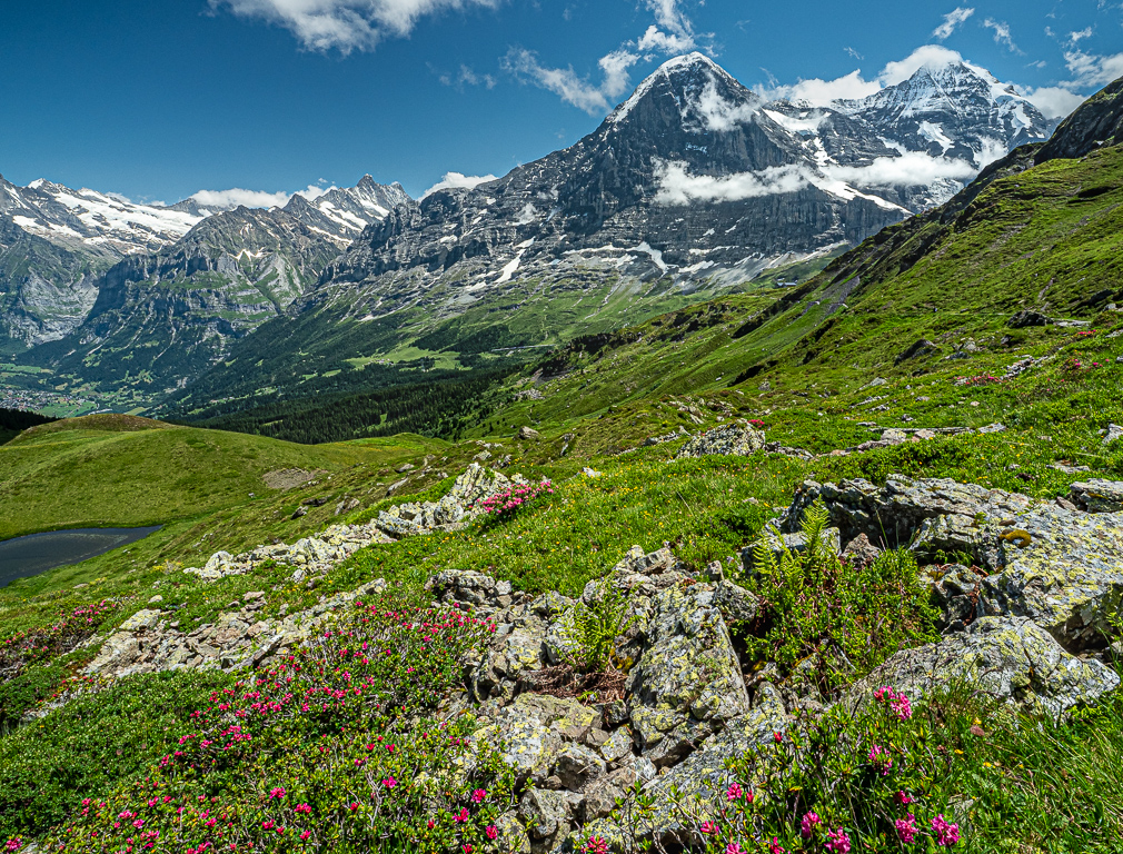
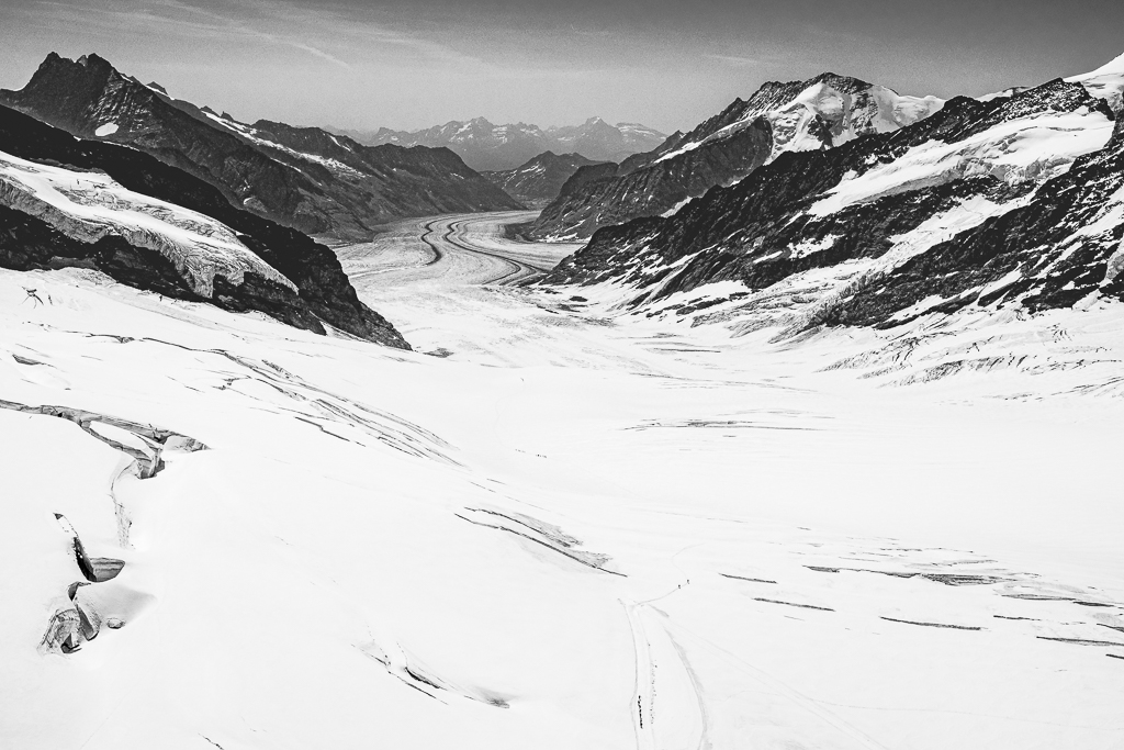
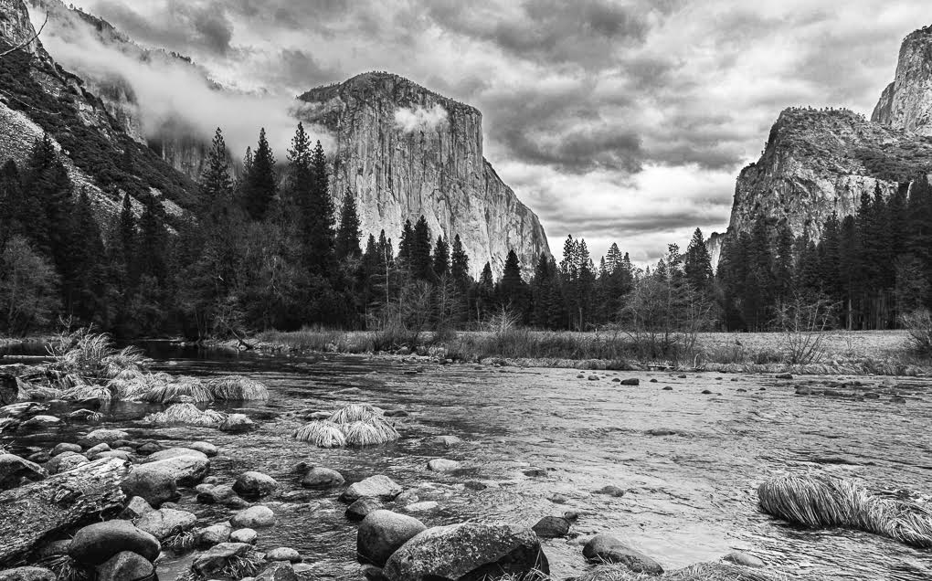
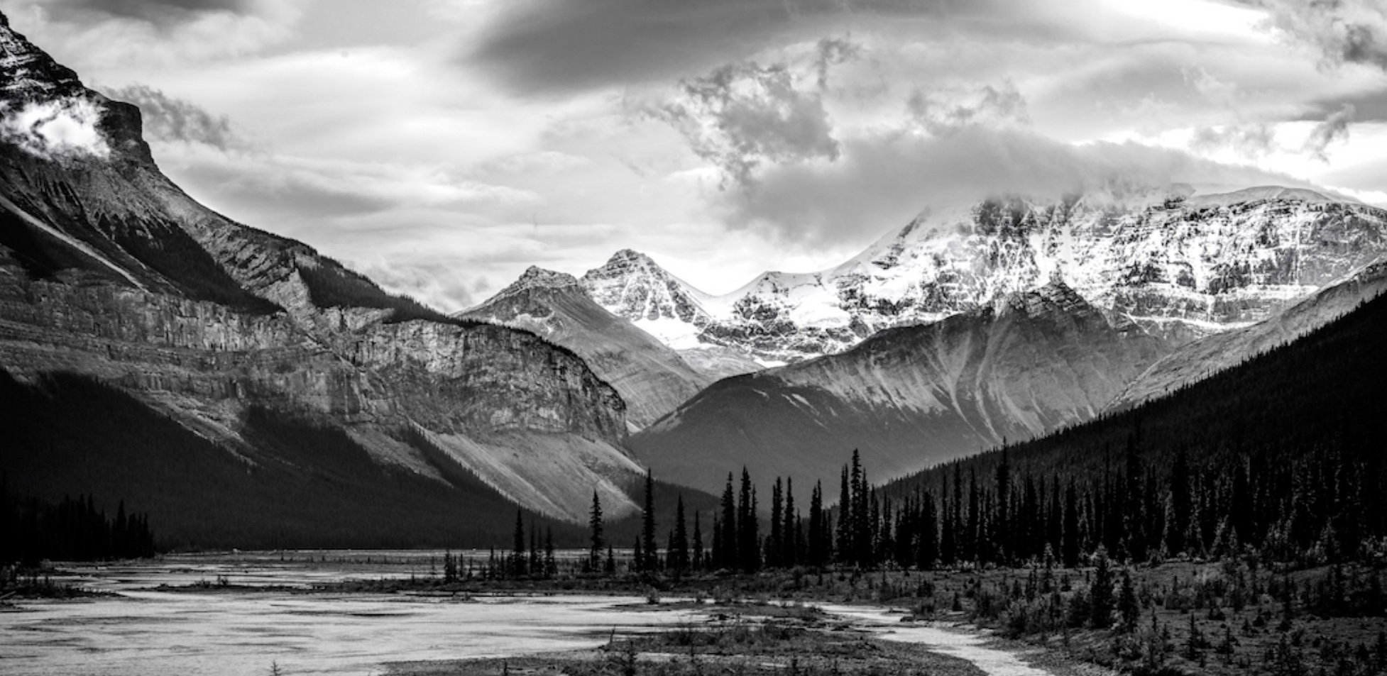
Albert. I've come to this discussion late in the month! Your image captures the huge landscape fabulously and B&W works. As to which is 'best', I don't believe there is one clear winner.
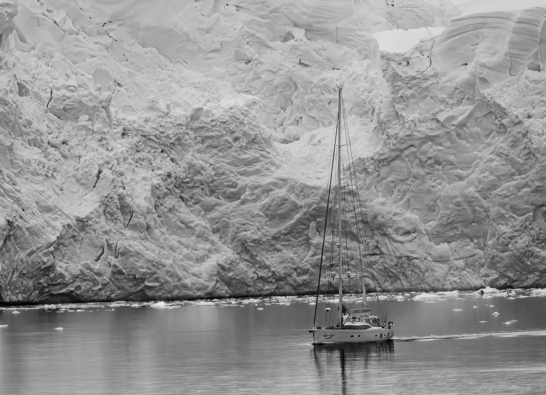
The new cropped version places more emphasis on the mountains, but it has lost some of the scale of the width of the original view. A third option is therefore to crop the original just from the bottom a tad as here. I personally think there is now more of the left part of the river to lead the eye forwards.
Well done in getting your image accepted! |
Feb 27th |
 |
| 47 |
Feb 20 |
Comment |
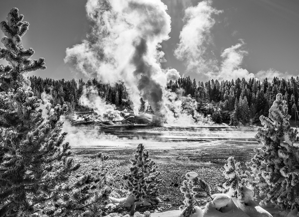
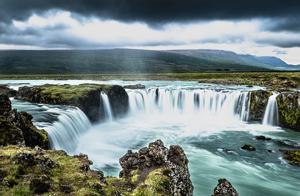
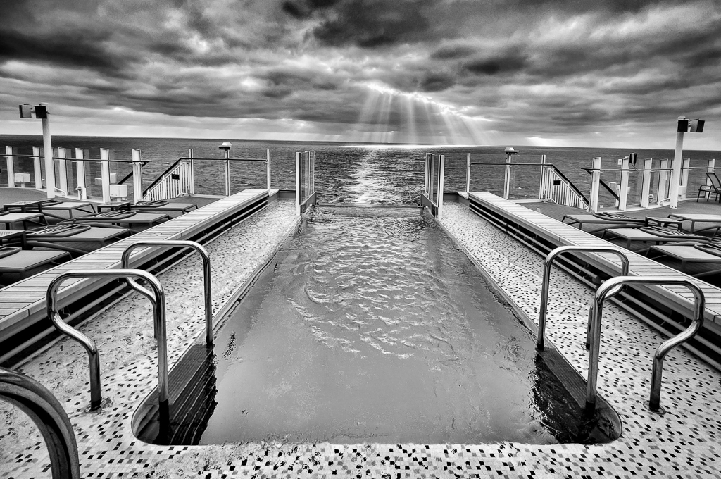
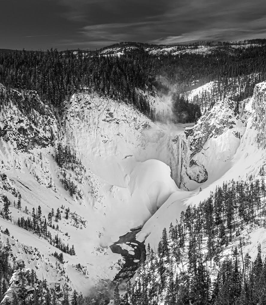
There is much to enjoy in this fabulous image Don. I particularly like the sky and it really works in B&W. You captured the waves very well.
My only observation is that I find the bottom area below the income waves a significant distraction, because the area is so bright. I would certainly crop to reduce the size of this area and possibly tone down the brightness of what's left. I was told not to have light areas at the foot of a landscape image! |
Feb 27th |
| 47 |
Feb 20 |
Comment |
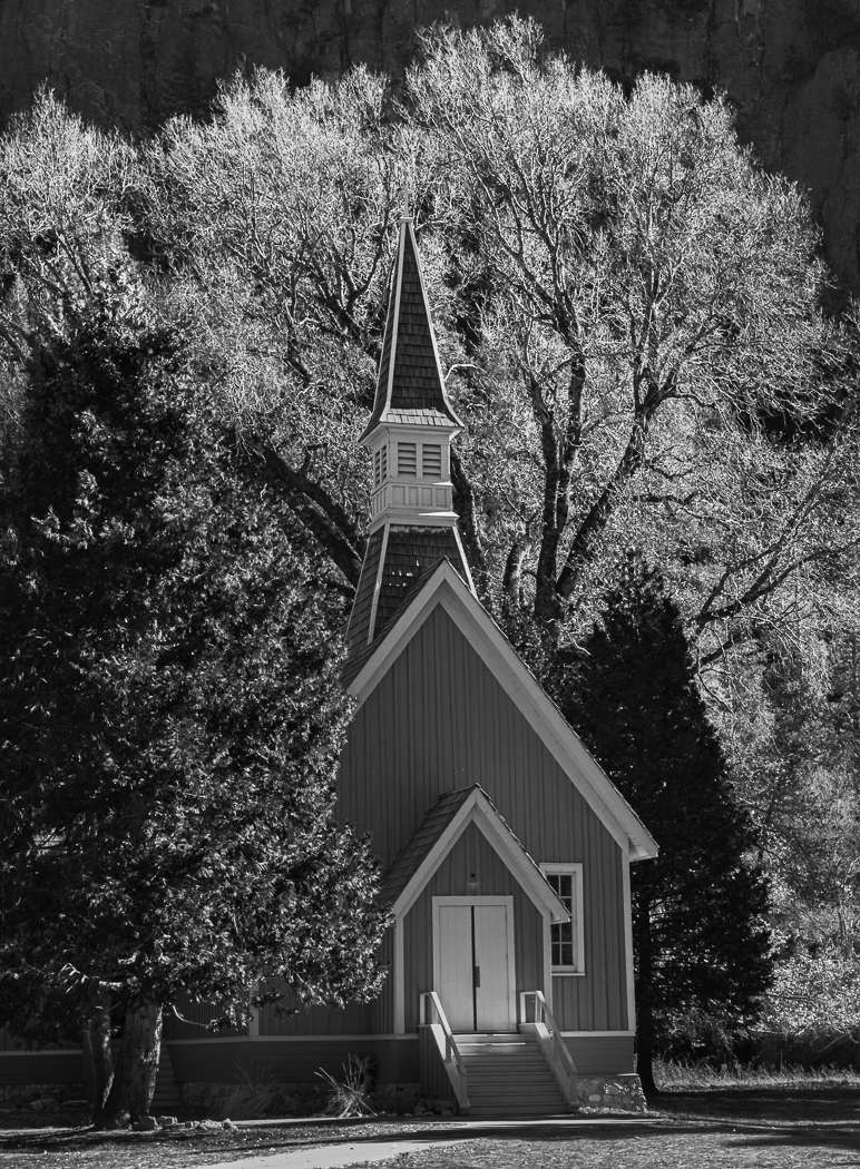
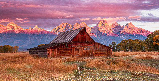
Ed, I'm coming into this discussion late, so I've got the benefit of seeing yours 2nd version, which I very much prefer. I understand it's important to have sufficient amount of the field to portray the isolation of the farm house and removing the building to the left helps this story.
I would suggest taking some of the sky off from the top: even half of it, to create a letterbox shape. This would still leave enough of the sky to enjoy, but put more emphasis on the farm and its location in the landscape. At the moment, I feel there is too much sky to compete with the less interesting, but important field. |
Feb 27th |
| 47 |
Feb 20 |
Comment |
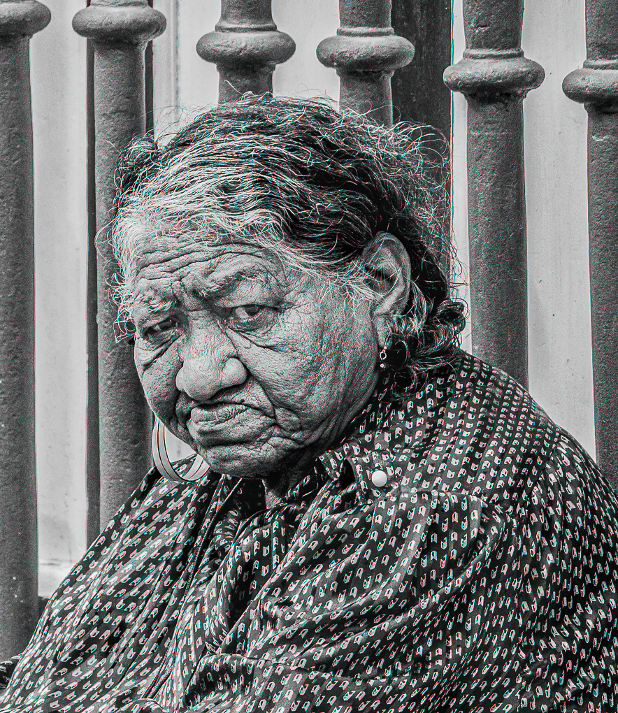
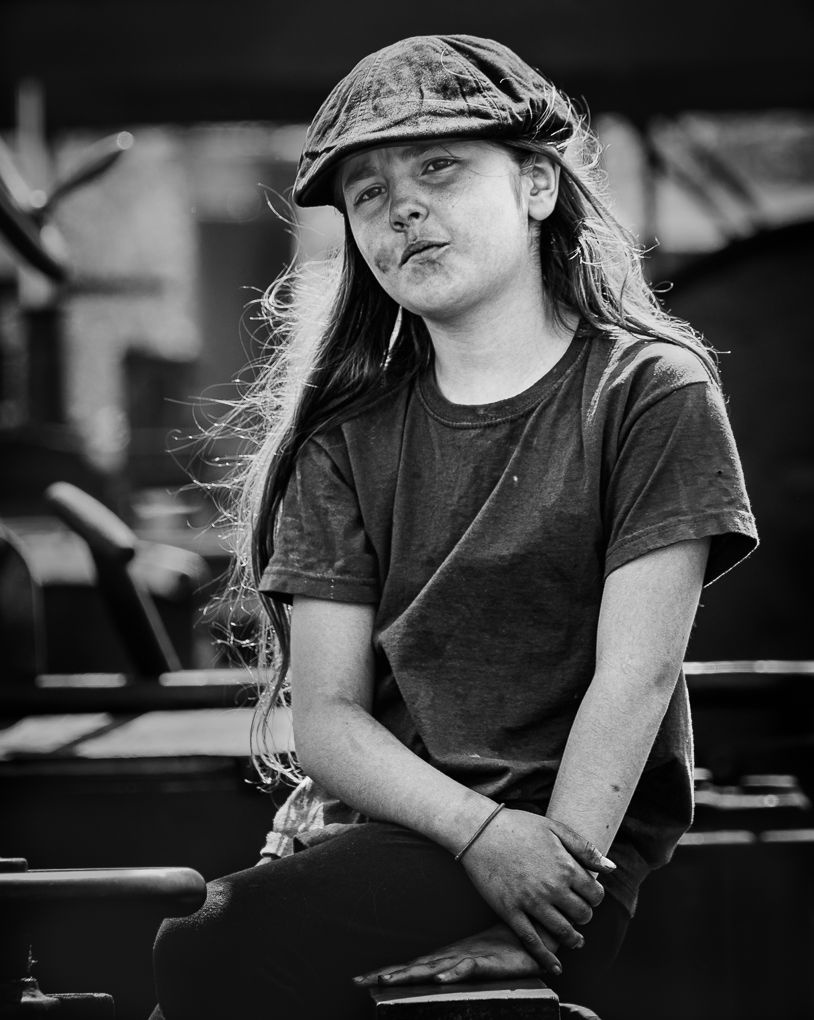
A lovely image and making I am sure this B&W is right: it puts the emphasis on her face, with a lovely expression and character. It could have been taken anywhere in the world and somehow that adds something to me. As has been said, the open position of her hands adds further closeness with you, the photographer. I loved viewing this John, thank you. |
Feb 27th |
| 47 |
Feb 20 |
Comment |
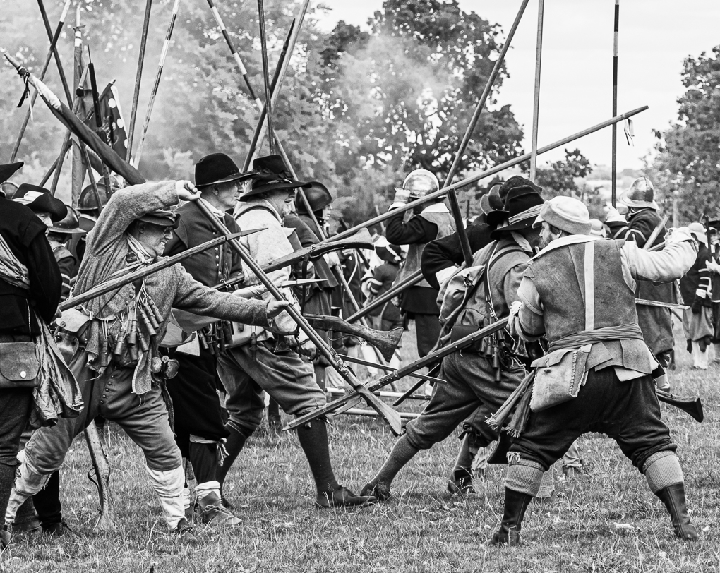
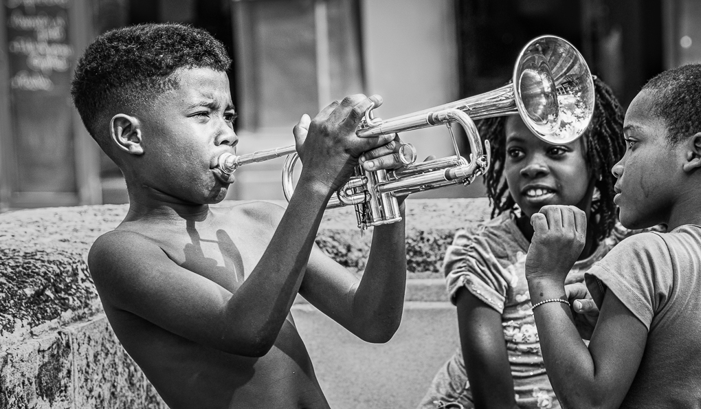
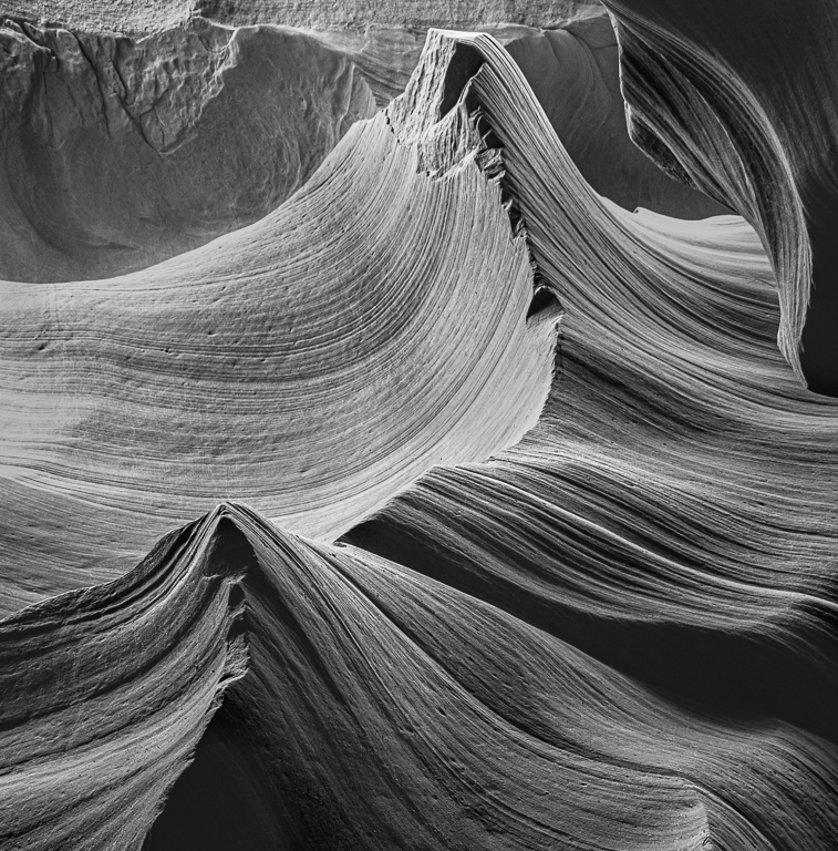
Interesting images Jack. Like both. They are addressing 2 audiences, with the tight crop an art form image which makes one think 'what is this', with 2 separate areas. I wouldn't change this.
The wider views describes what you witnessed. I agree with Albert's crop suggestions. Taking space off the bottom makes more of a letterbox shape, which I think helps and off from the left will move the peak line to the left, making this prominent line far less central. There is much to enjoy in this version in the background and sky.
Nice Jack! |
Feb 24th |
6 comments - 0 replies for Group 47
|
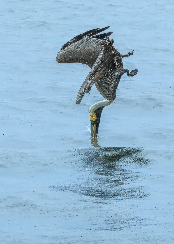
| 72 |
Feb 20 |
Reply |
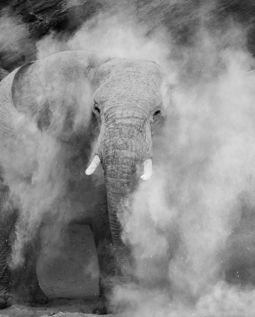
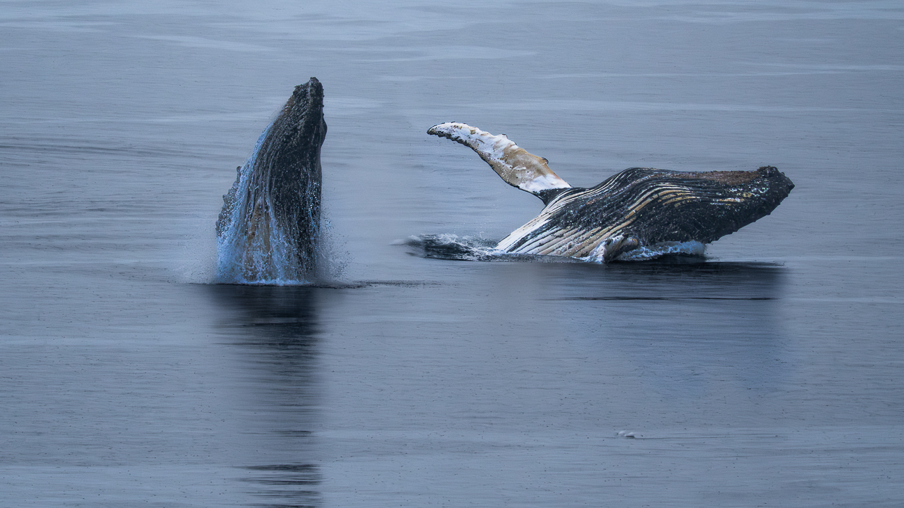
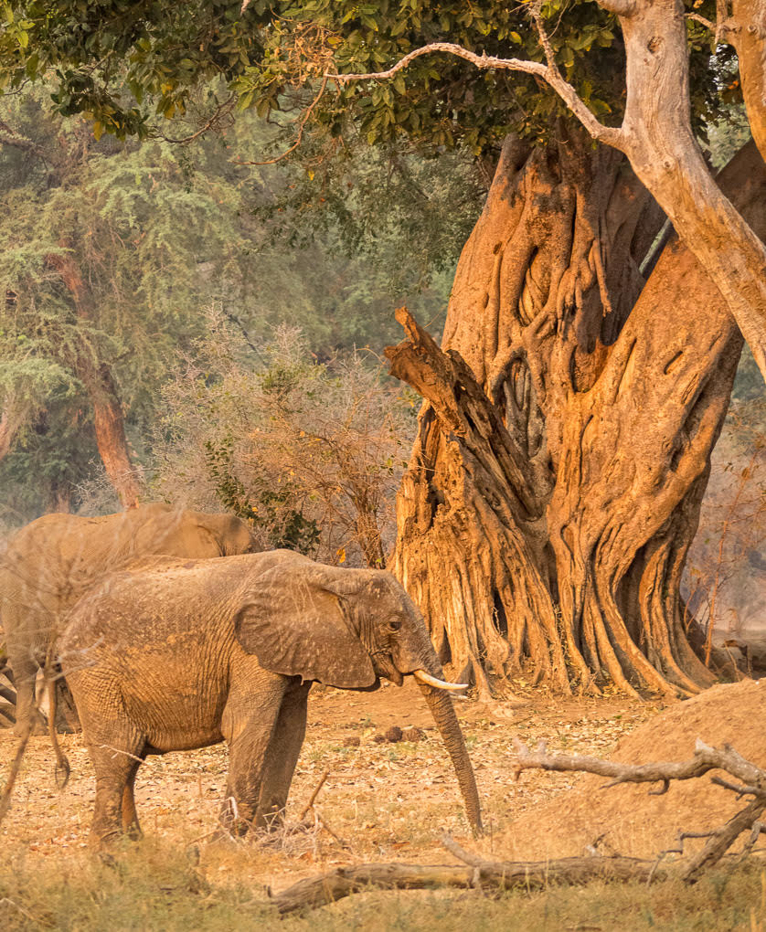
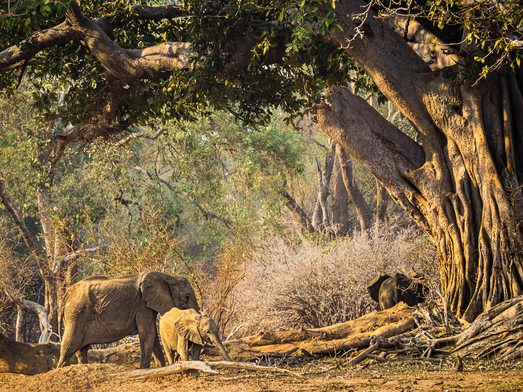
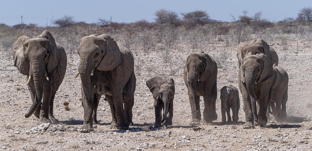
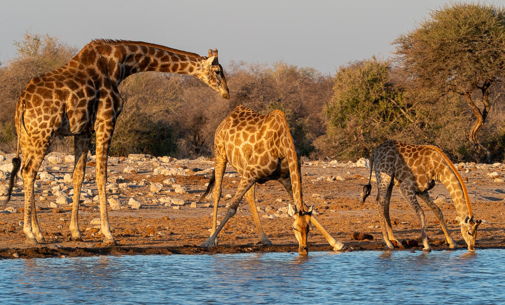
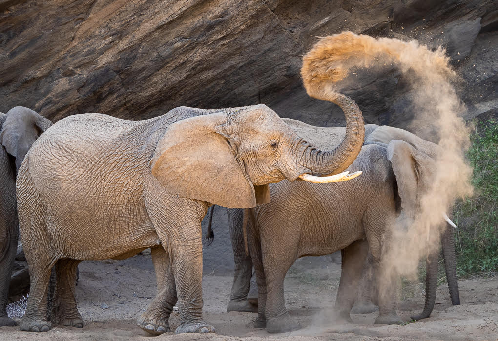
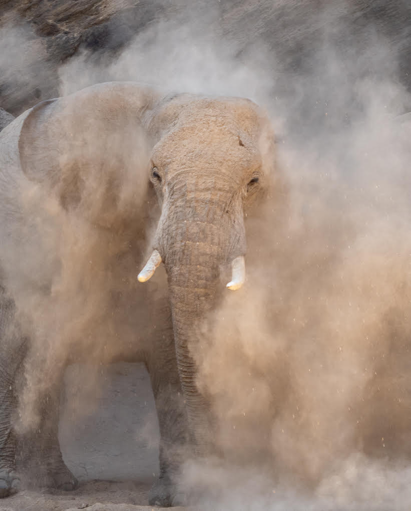
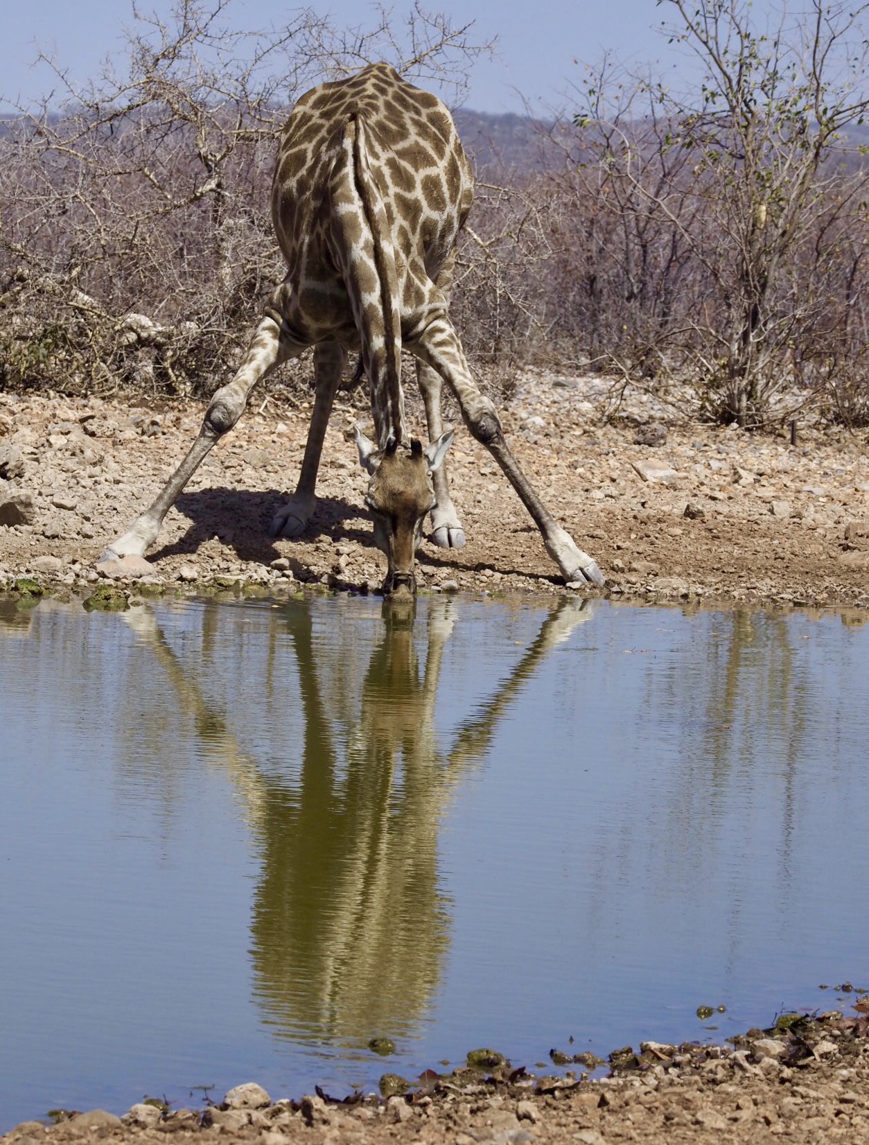
Here's another picture JFYI - nothing like as strong as above 3 one, but we were lucky in Namibia that it was so dry, there was always a lot of activity around the waterholes. |
Feb 25th |
 |
| 72 |
Feb 20 |
Reply |
Thanks Bruce - I like that idea! |
Feb 25th |
| 72 |
Feb 20 |
Comment |
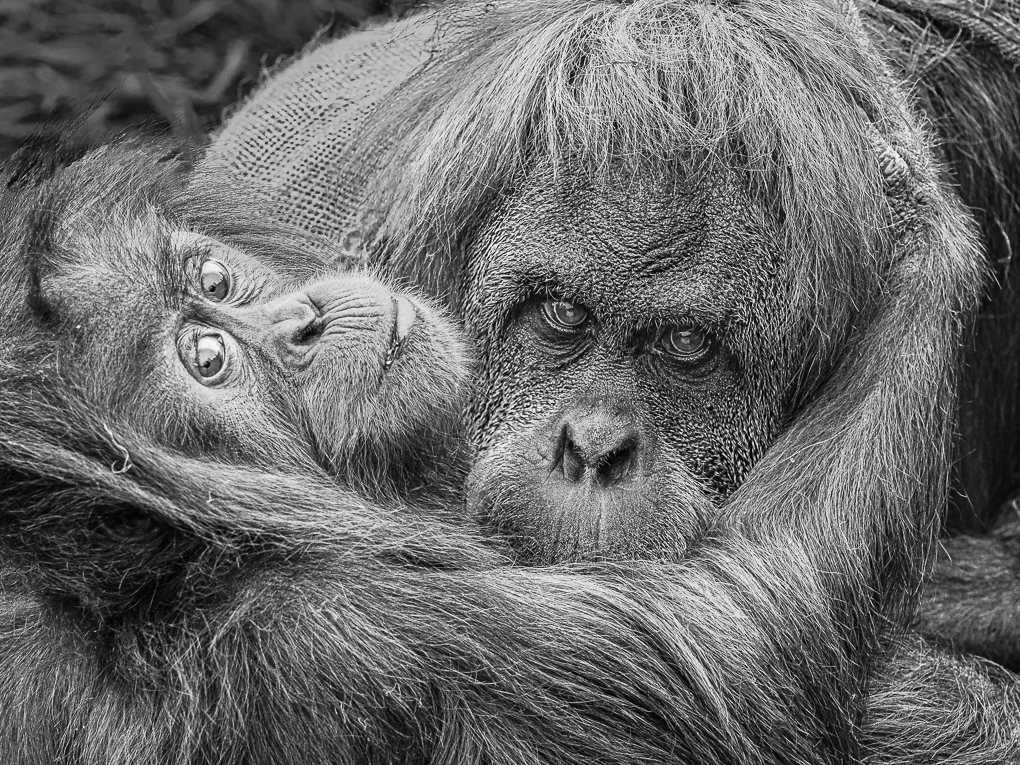
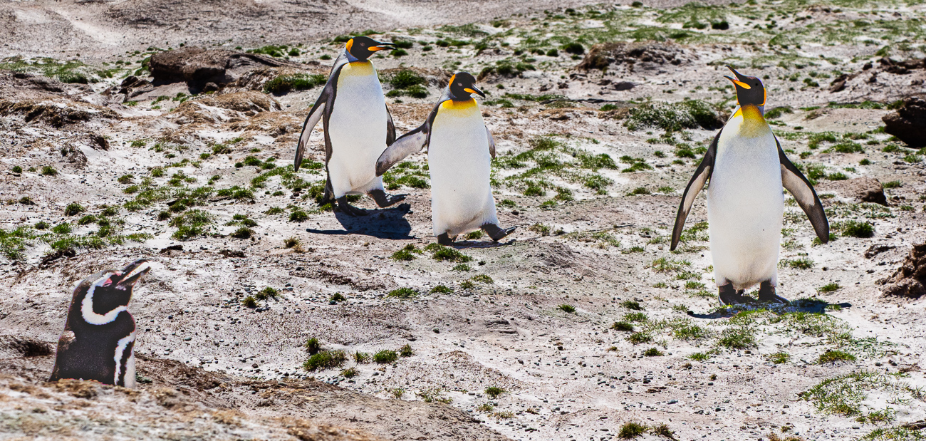
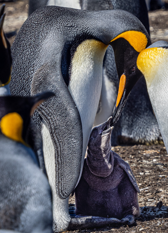
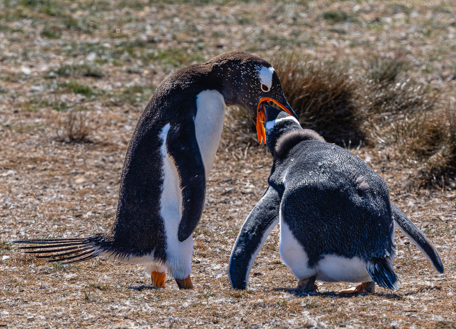
Thank you Isaac for your story and extra pictures. I've never heard of Dog Monkey events - what fun! Your main image is fabulous, with so much character and enjoyment on the dod's face, plus the Monkey's hat really helps to tell the story of fun. Love it! |
Feb 23rd |
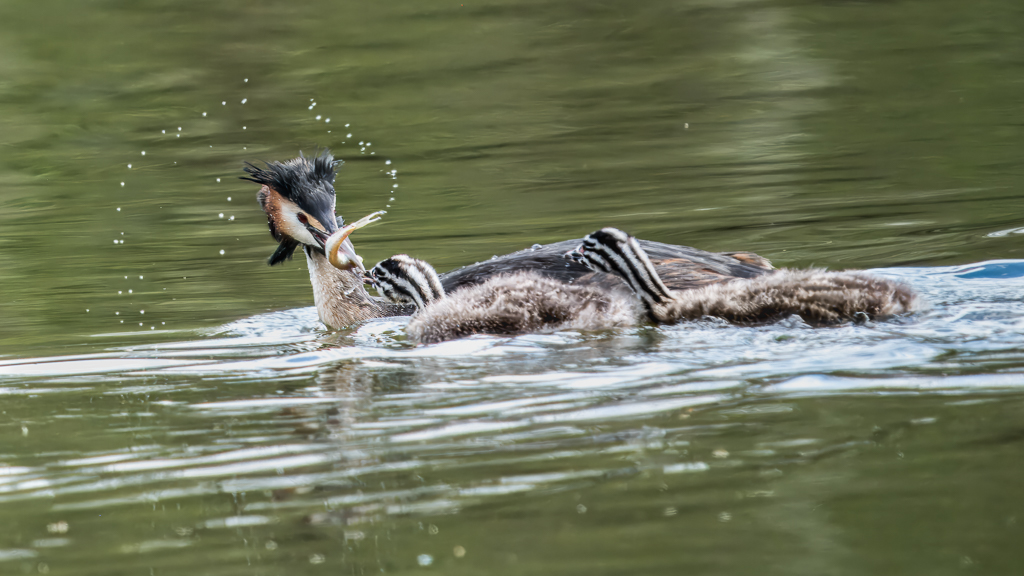
| 72 |
Feb 20 |
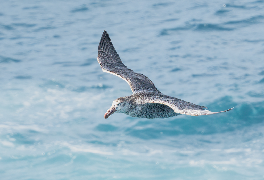
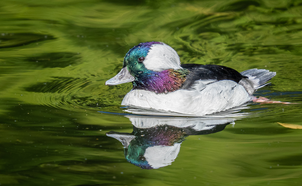
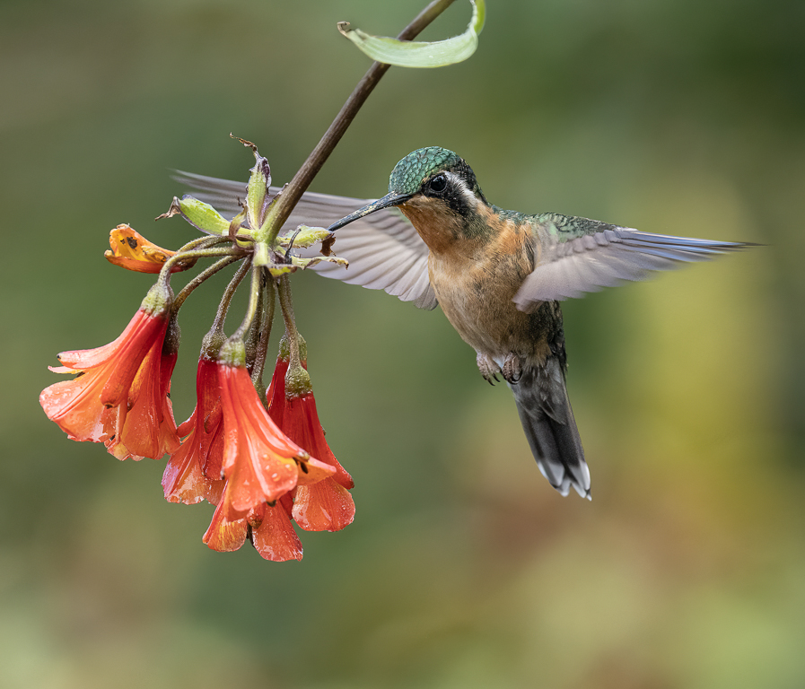
Comment |
A good capture Marie. Isaac is right I think, it is better to keep more of the environment round the bird, particularly as there is variety of scene for the viewer to enjoy. Well taken at such a slow speed. Thank you for sharing. |
Feb 23rd |
| 72 |
Feb 20 |
Comment |
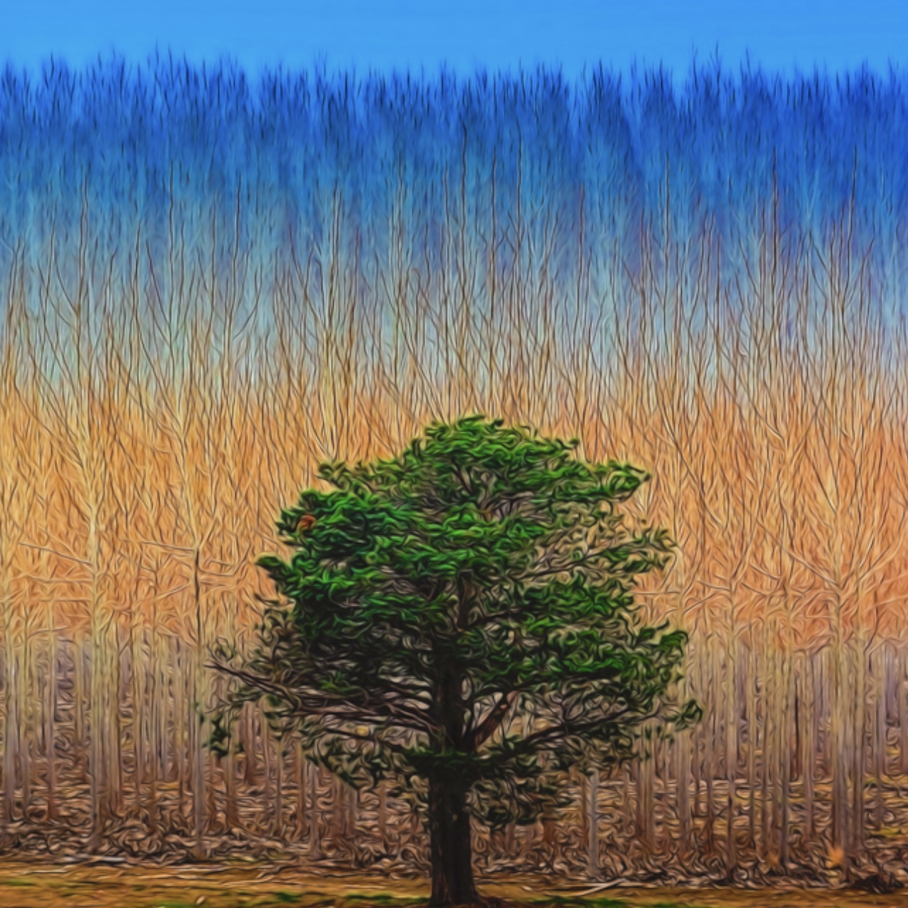
A very interesting image Walt! Significant skill to achieve this. I don't believe it matters that it isn't real - it's an art creation and accordingly, the tree being central works. Well done in your Award of Merit.
Here is a square crop - I don't know if this is 'better', but may be more applicable for an arty image |
Feb 23rd |
 |
| 72 |
Feb 20 |
Comment |
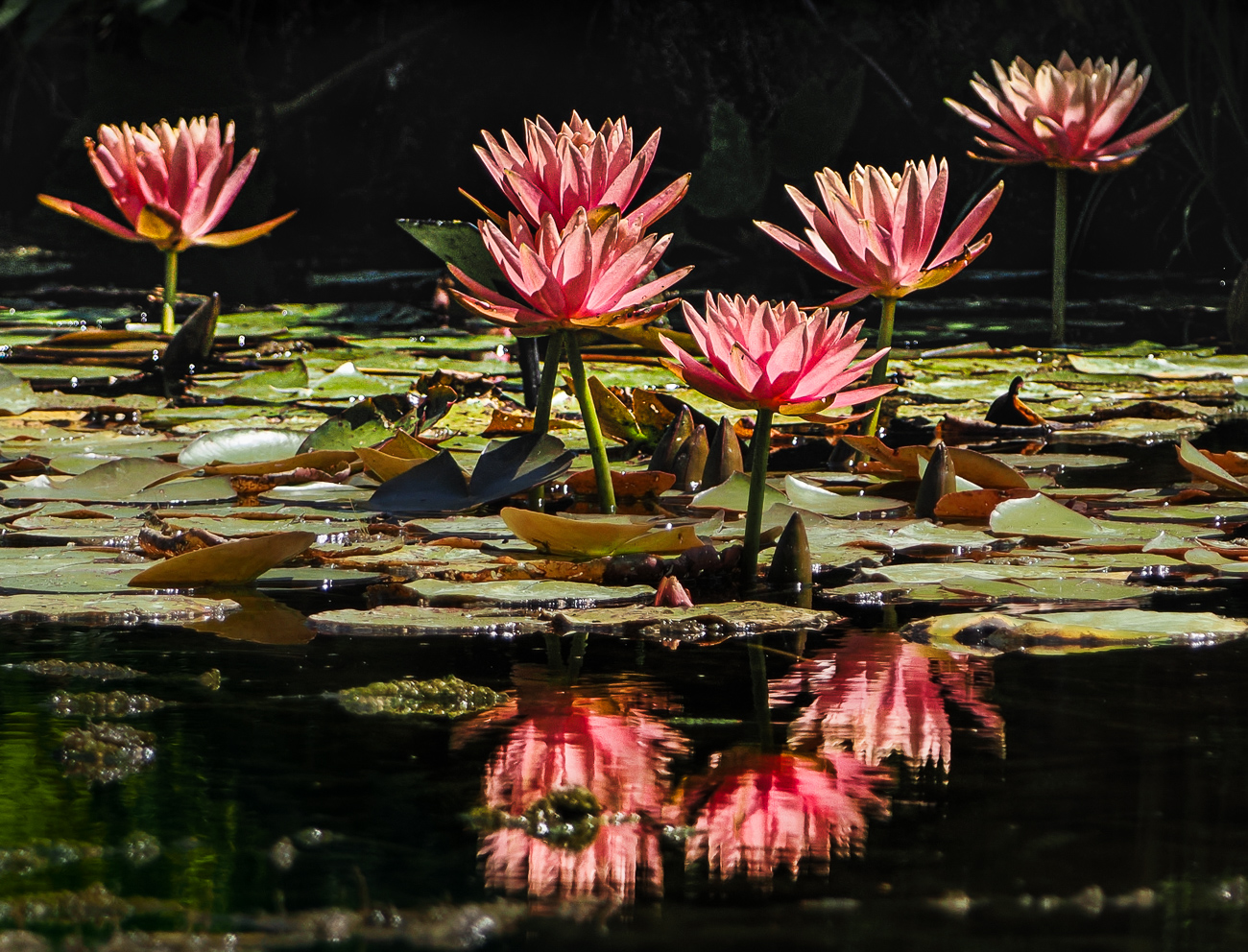
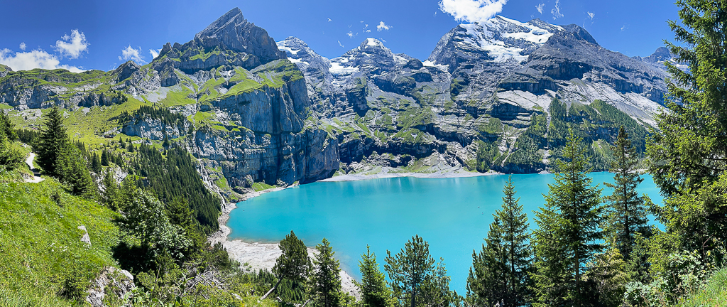
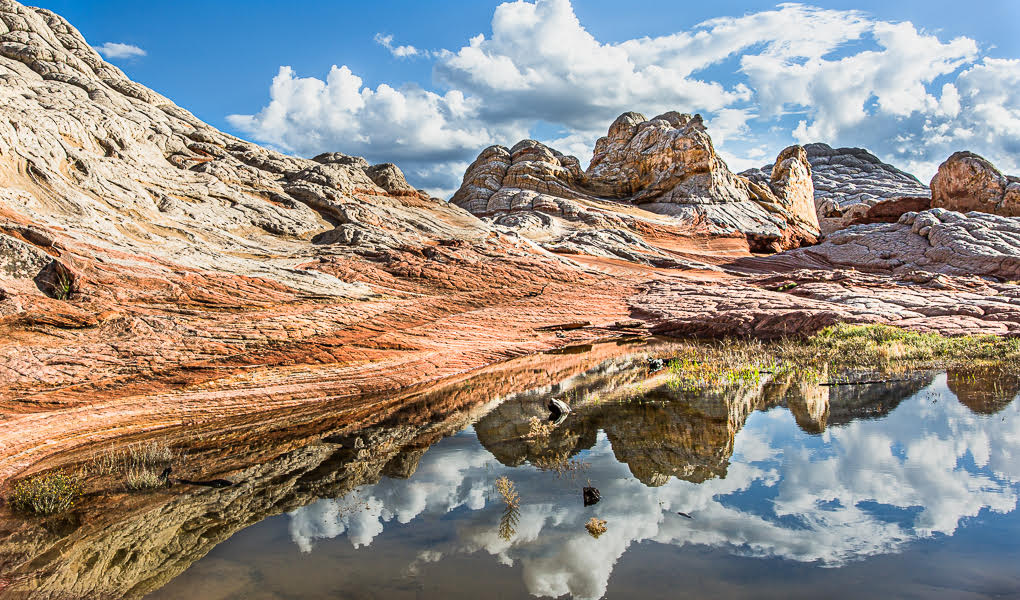
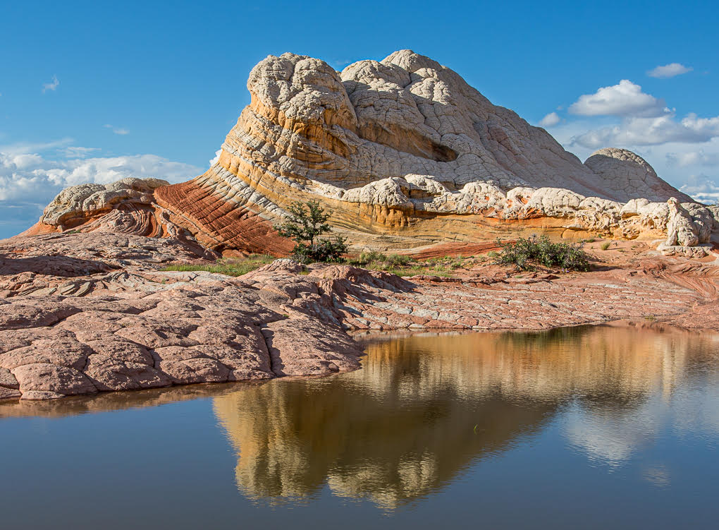
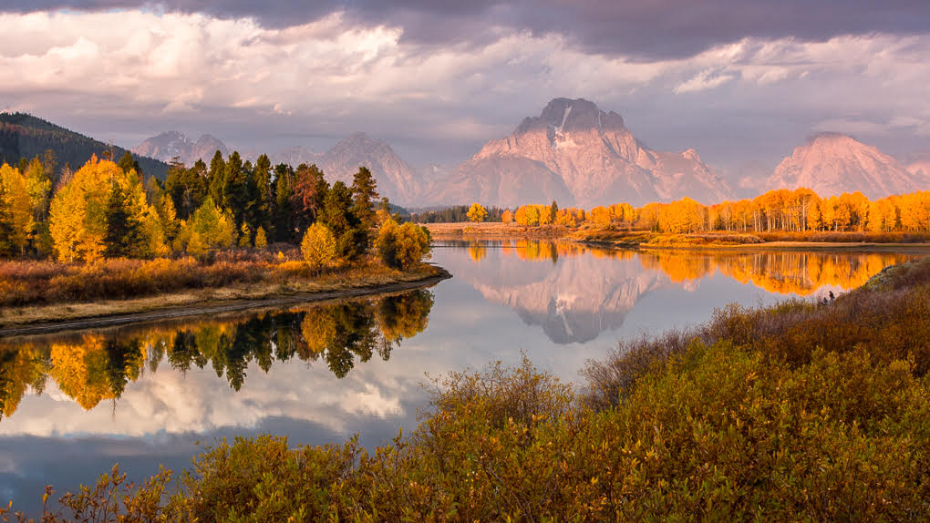
A lovely landscape Mary! A really enjoyed looking round the lake at all the detail which is well lit. Perfect for a large print on a wall!? |
Feb 23rd |
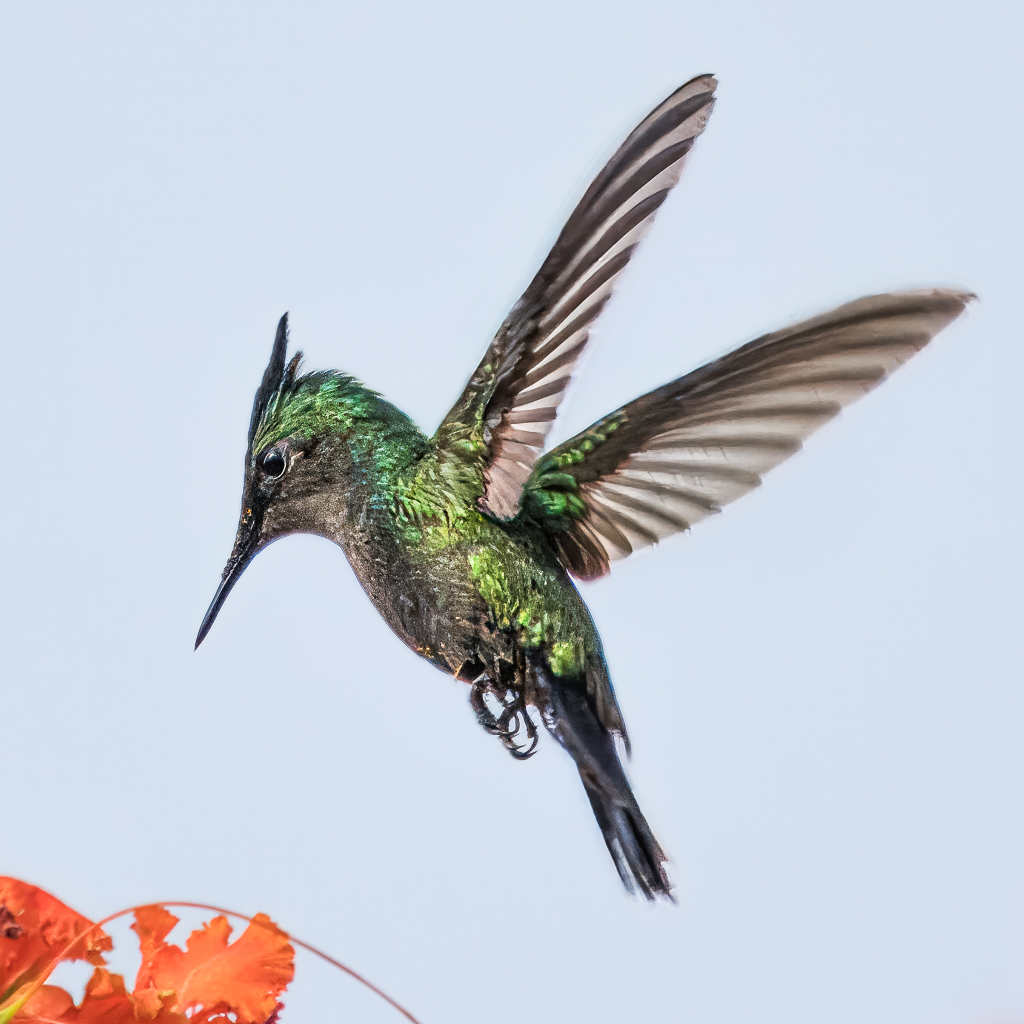
| 72 |
Feb 20 |
Comment |
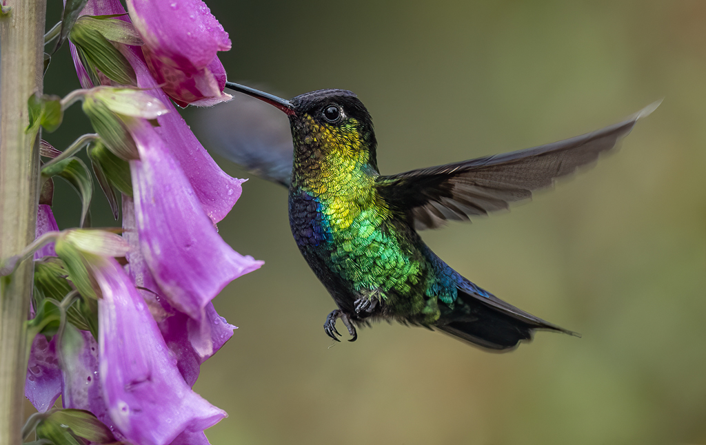
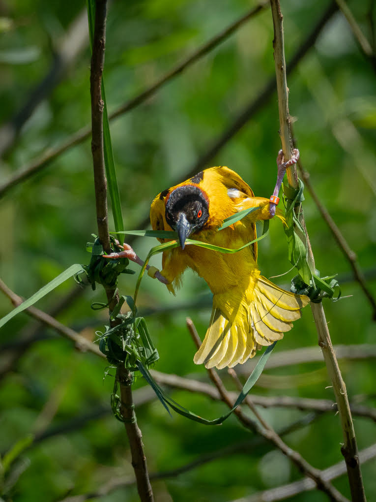
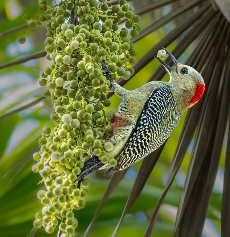
I agree with Isaac that a crop which achieves the birds positioned away from the centre is preferable: I also find the colours of the background (particularly the grass) too contrasty and thus distracting. Did you add texture to the birds? This may help the apparent softness.
Sorry to state negative things here Abhijeet, as you captured a nice and interesting shot - I enjoyed looking at it, and hopefully a tweak to the processing will improve your image.
|
Feb 23rd |
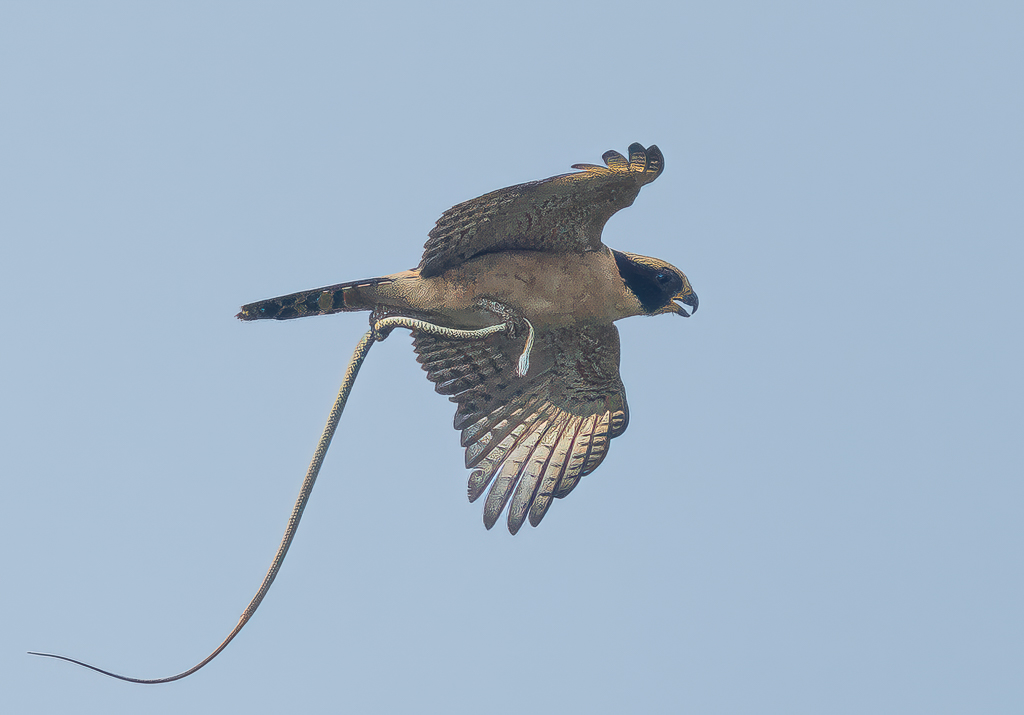
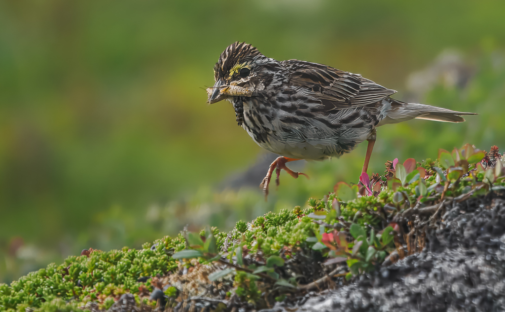
| 72 |
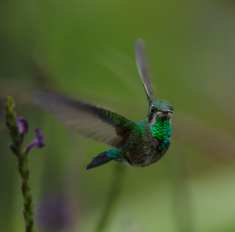
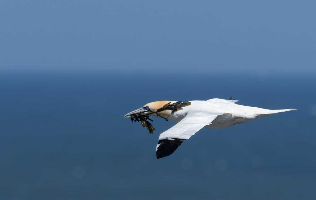
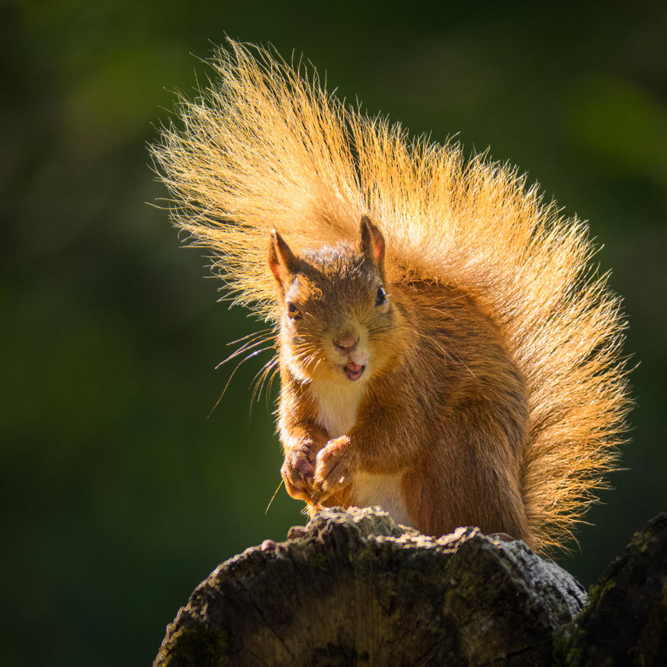
Feb 20 |
Comment |
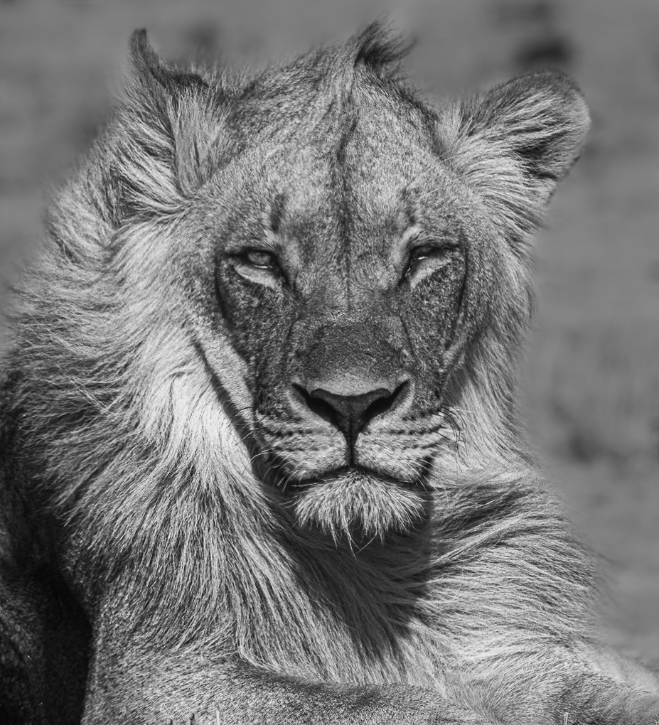
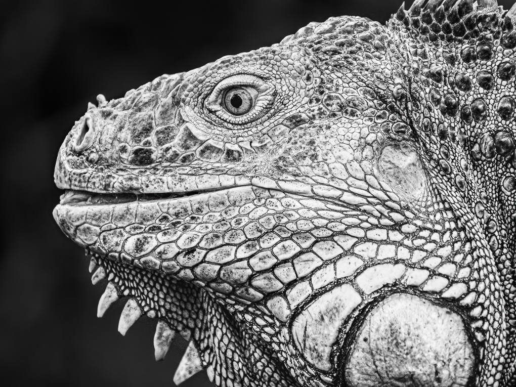
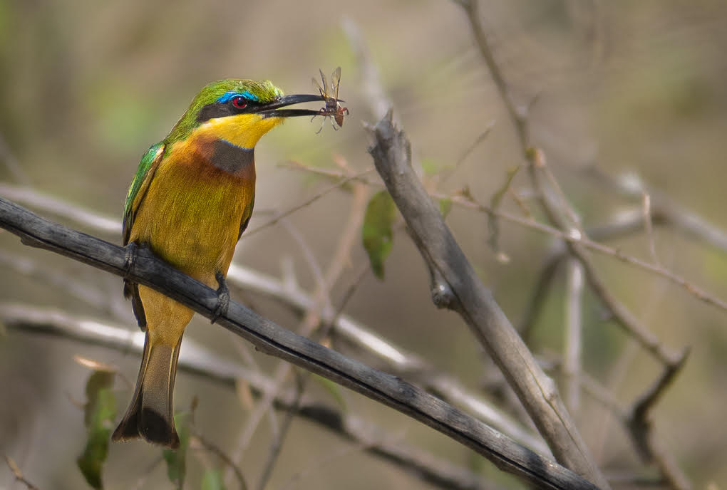
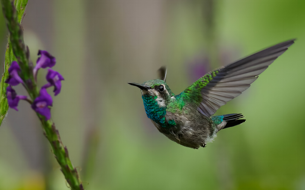
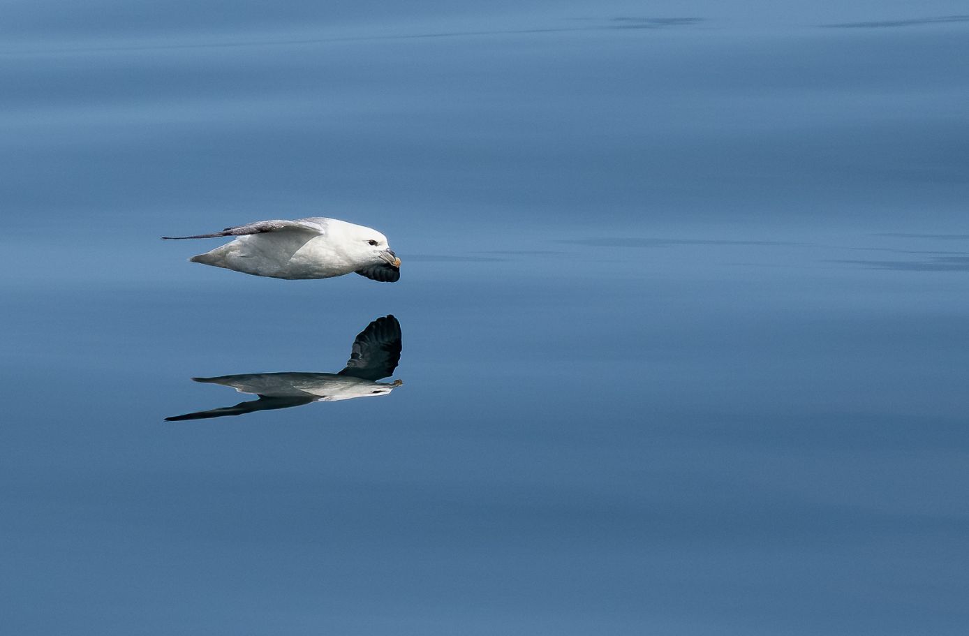
A very nice shot Bruce, made so by your very low position. A real character! There is a lot of detail, which isn't easy with such a wide variation of tones in the bird. I can see the feather detail in the white area to the right of the eye, but am less sure with the area below it's beak. |
Feb 23rd |
6 comments - 2 replies for Group 72
|
12 comments - 2 replies Total
|