|
| Group |
Round |
C/R |
Comment |
Date |
Image |
| 47 |
Jan 20 |
Comment |
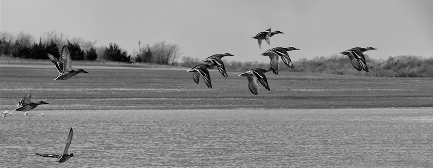
Jen, I am offering a different idea (I am not at all saying better!!)...
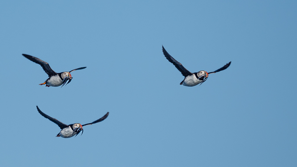
Try flipping horizontally (I will try to add an image showing this). I feel it is more natural to view your image from left to right (being the normal way we read) and think that this way, there is a better argument to keep the other birds there to tell the story fully (nature shots must tell a story) as I see the bottom one informing the viewer that all these birds have recently taken off, rather than just flying across.
Certainly, your picture works better in B&W than colour IMHO.
Thank you for posting this. |
Jan 27th |
 |
| 47 |
Jan 20 |
Comment |
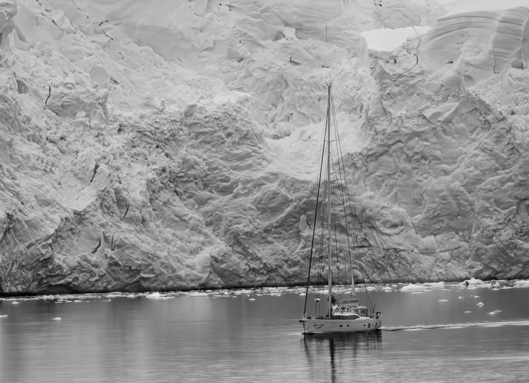
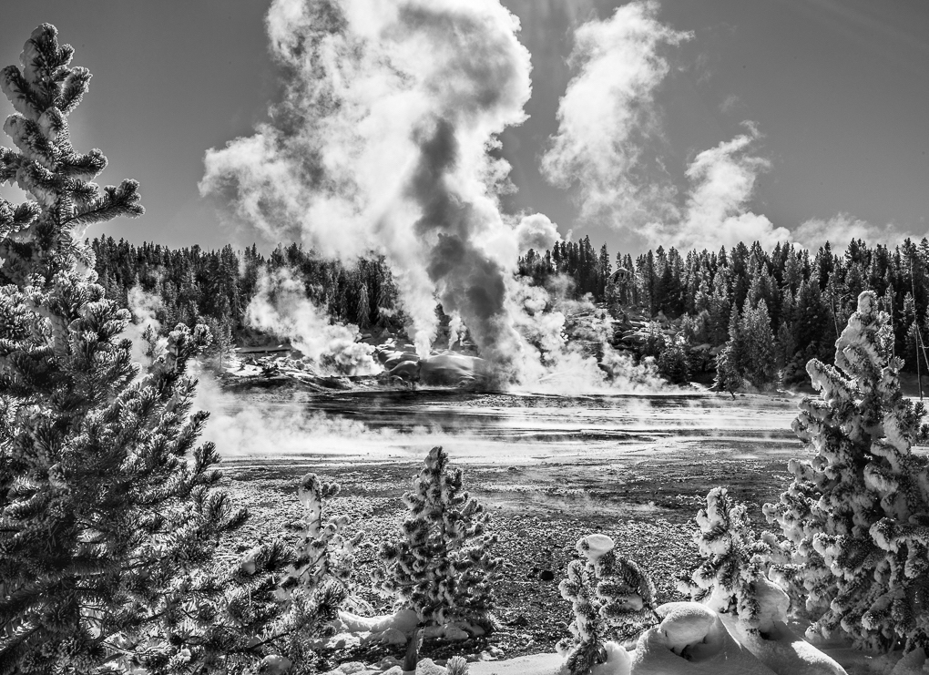
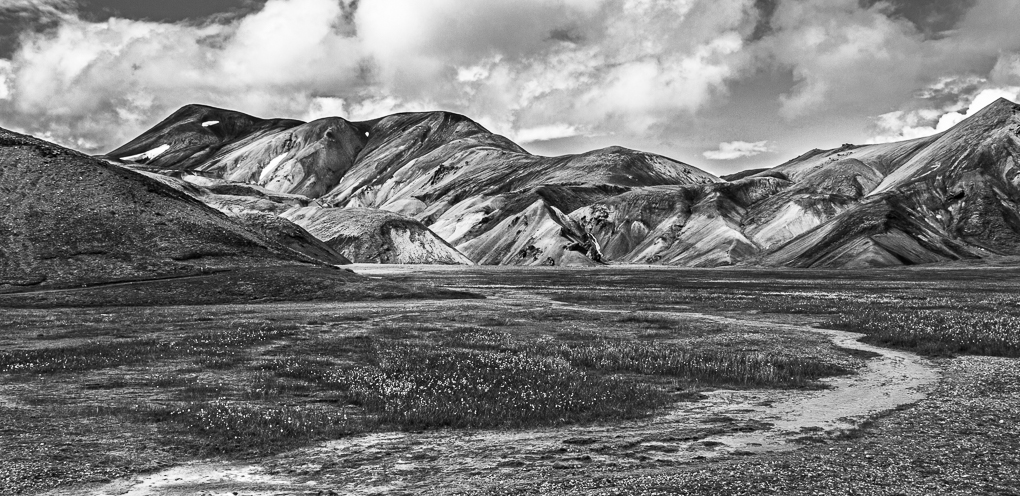
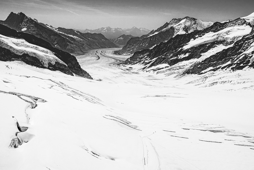
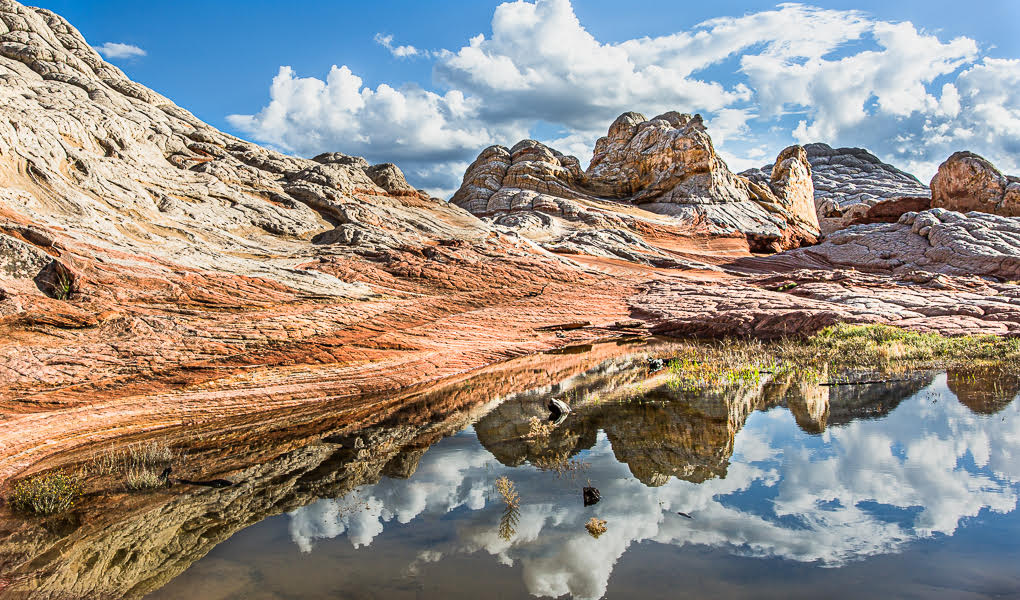
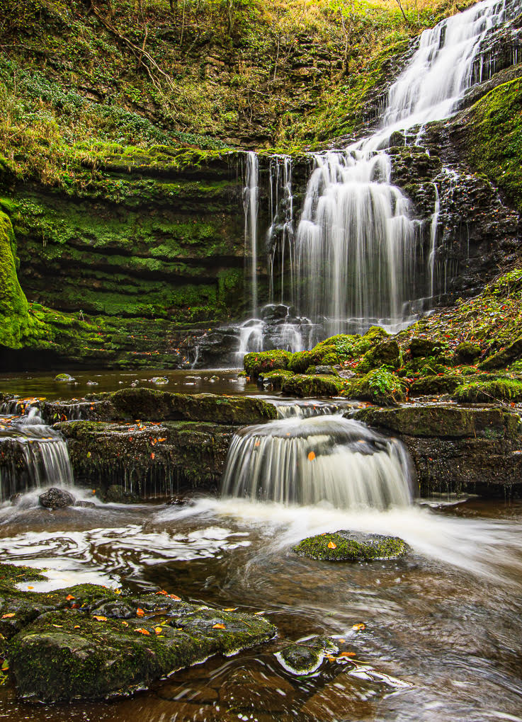
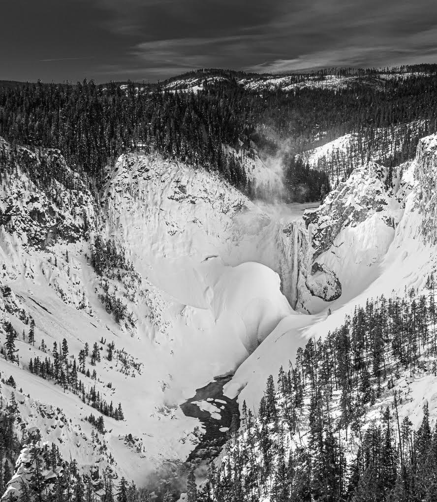
There is so much to look at here Don! I love it! Fabulous in B&W! The curve takes you right through the image, with much interest either side - then the lovely clouds really add interest at the top.
A truly fabulous landscape! Loved admiring it! Thank you. |
Jan 27th |
| 47 |
Jan 20 |
Comment |
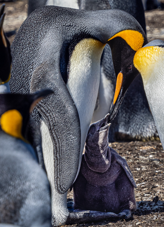
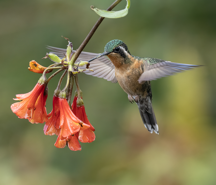
Ed, I like the texture of the pod in B&W, but I'm not sure the conversion makes the overall image better than the colour version (once worked on). I think that in B&W, one will always be fighting the bright background, while in colour the grey pod with its yellow centre stands out better from its surroundings. A very central flower study like this has to shine I feel vs its background. Thank you for sharing. |
Jan 27th |
| 47 |
Jan 20 |
Comment |
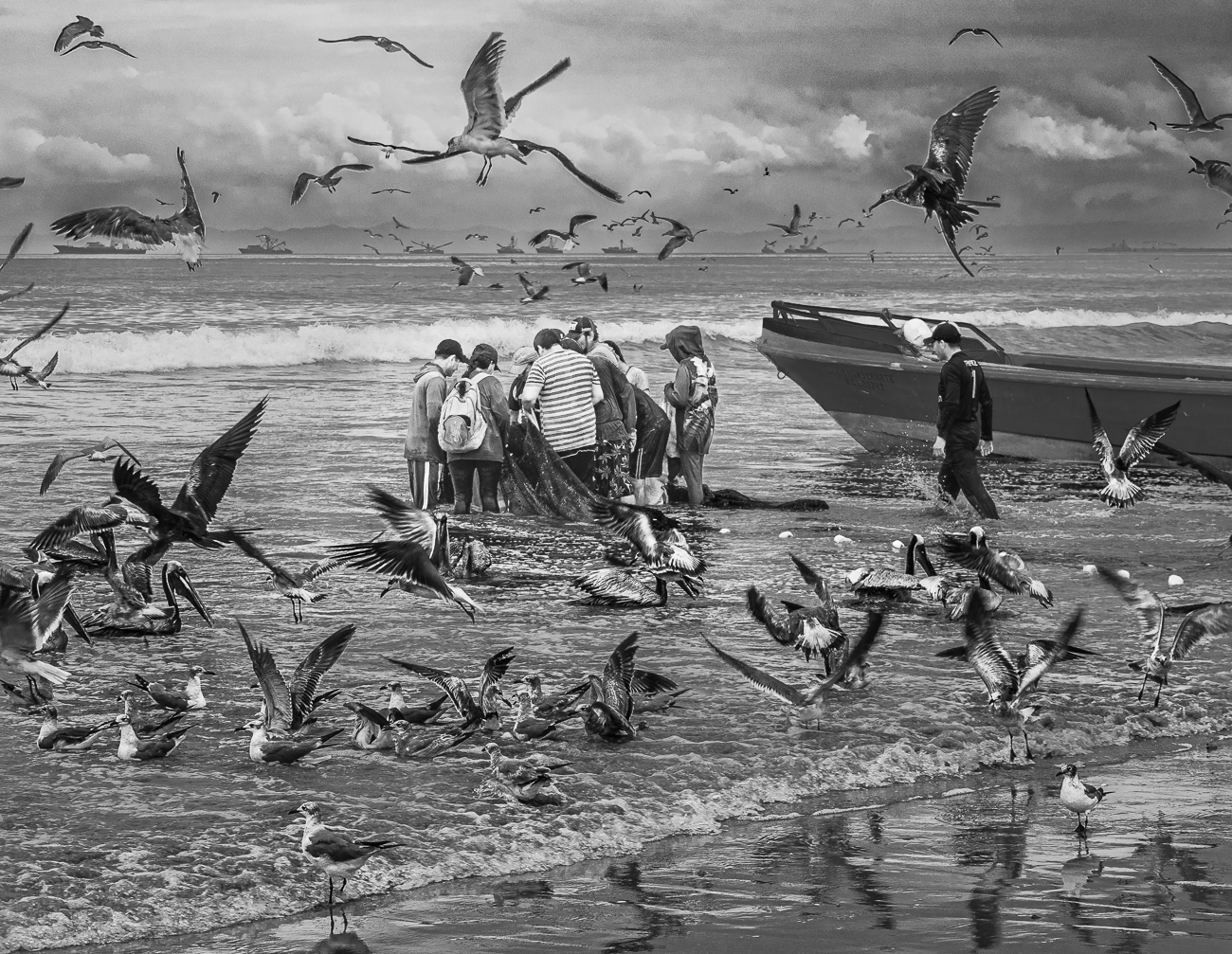
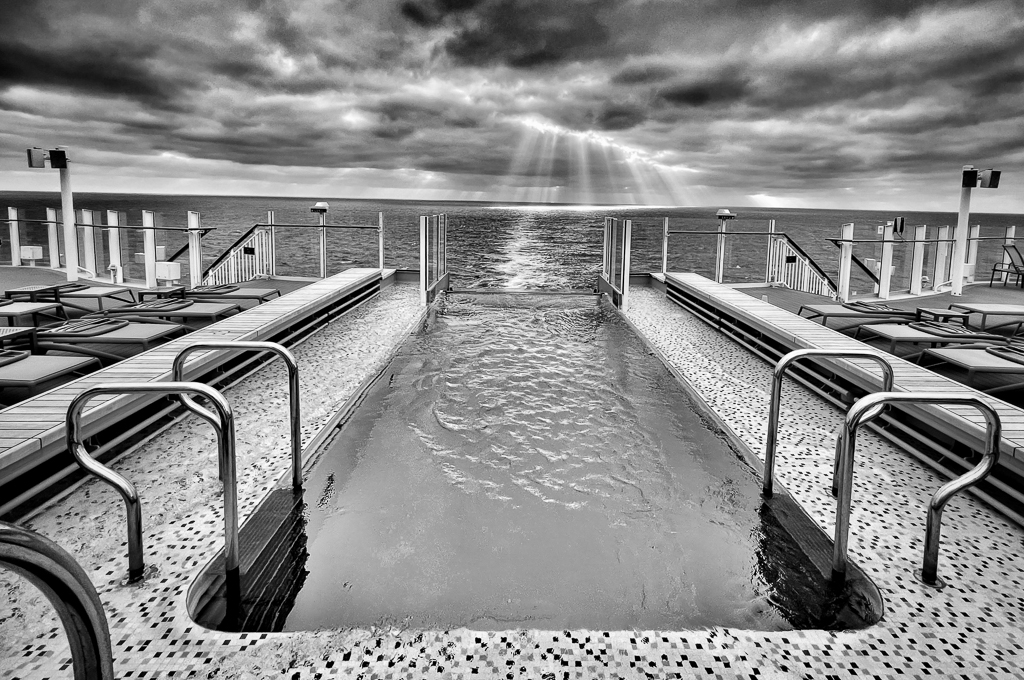
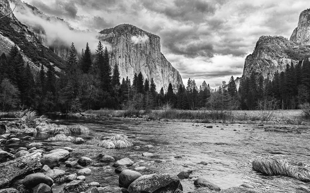
Nice image John and your patience is well rewarded! I also like the treatment. I am inclined to agree with the others, that the top part of the image adds nothing to what you have created, but adds the 'complication' of the group of people, so I would letterbox the shape. This retains the diagonal created by the waves and wet sand, which adds significantly. Thank you for sharing. |
Jan 27th |
| 47 |
Jan 20 |
Comment |
I agree with what has been said here, your image asks questions. It is not 'over done' with high contrast. It's simplicity is the key and there is detail to enjoy everywhere. It's believable, with lack of understanding at the same time. A very cleaver image. |
Jan 26th |
5 comments - 0 replies for Group 47
|
| 64 |
Jan 20 |
Comment |
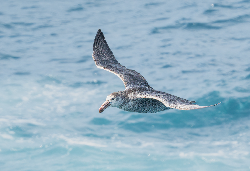
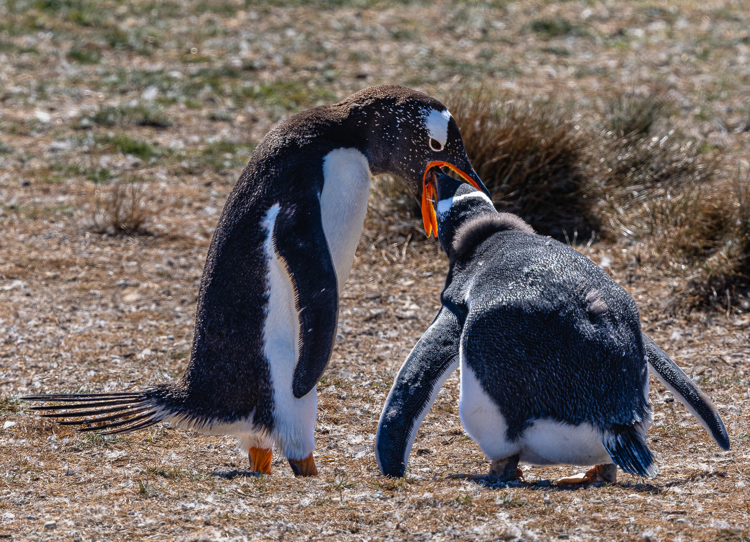
Abhijeet - Visiting from your Nature+ Group of 72 (a colour image from the same session) - I love this B&W one! You were amazingly close to achieve this at 220 mm!
Yes, for B&B world, I would agree with your colleagues here that the right egret is distracting. You will end up having 2 versions of this image, Mono and Nature.
Congratulations on the FIAP Gold! |
Jan 25th |
1 comment - 0 replies for Group 64
|
| 72 |
Jan 20 |
Reply |
Congrats Marie! |
Jan 26th |
| 72 |
Jan 20 |
Comment |
Fabulous image Abhileet - Congratulations! |
Jan 26th |
| 72 |
Jan 20 |
Comment |
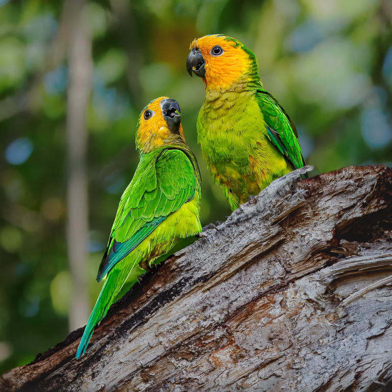
Wow, what a great end result Isaac. I wonder how many others would have come up with that idea! A high-impact result. Cant offer any ways to improve it - it works so well with such a limited colour pallet! Well done - I really enjoyed viewing it and will think of copying the idea sometime! |
Jan 25th |
| 72 |
Jan 20 |
Comment |
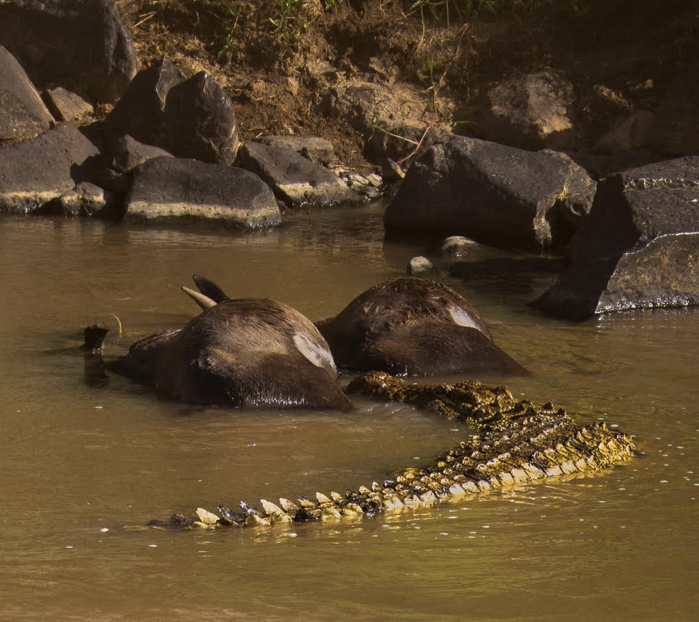
I like this image and what you have done Marie. When I looked at your images ahead of reading the prior reviews, I very much preferred what you have done in achieving your main image. I still am! I am not convinced the subdued tones of the original work to achieve a pleasing viewing.
I also 'see' and croc or alligator by the tree - even if they don't exist in Lake Ontario!
You're exceptionally lucky to live near there!
|
Jan 25th |
| 72 |
Jan 20 |
Comment |
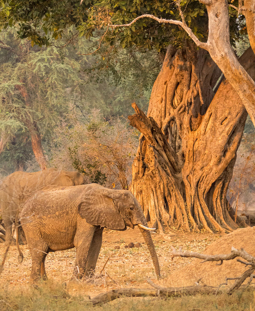
Walt - A great image and I admire the planning to get your wife to stand in that position for you!
I think your image works in both B&W and colour. It depends on what you do with it/them! For non-competition viewing (and if you were to enter this into a Nature Comp), I agree with others re the colour one being stronger. I understand the enhancement of the shadow of your wife in B&W though, thus you've got many options fro the same image. Thank you for sharing. |
Jan 25th |
| 72 |
Jan 20 |
Comment |
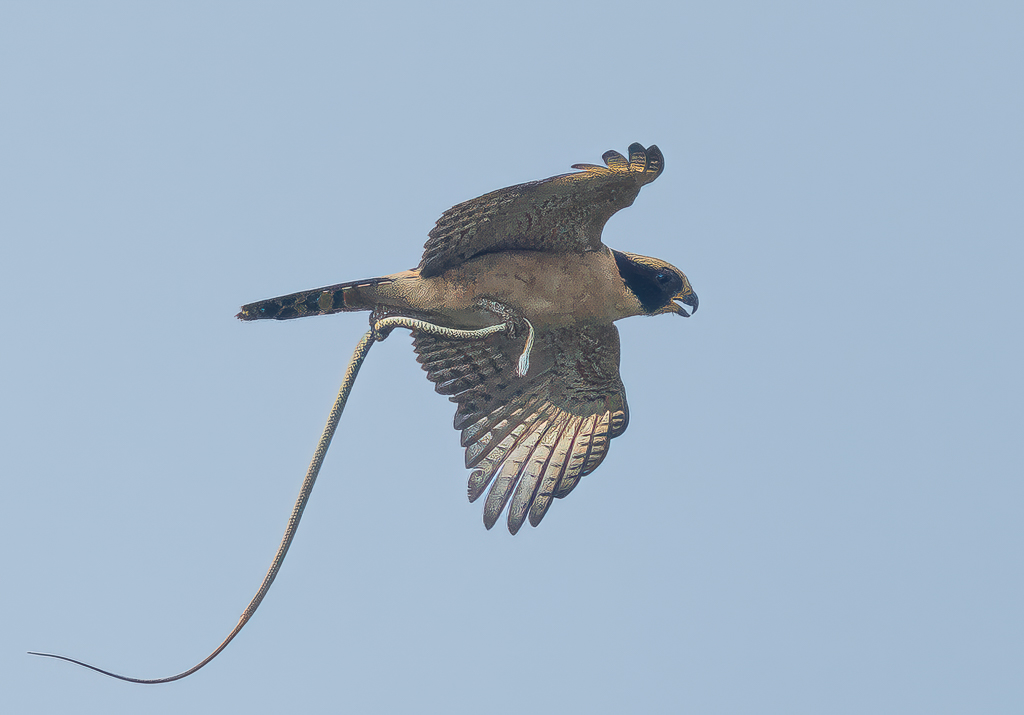
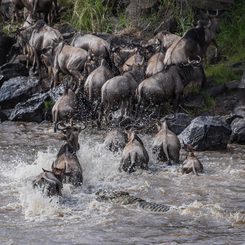
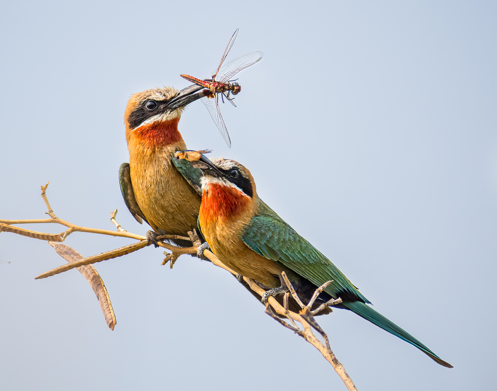
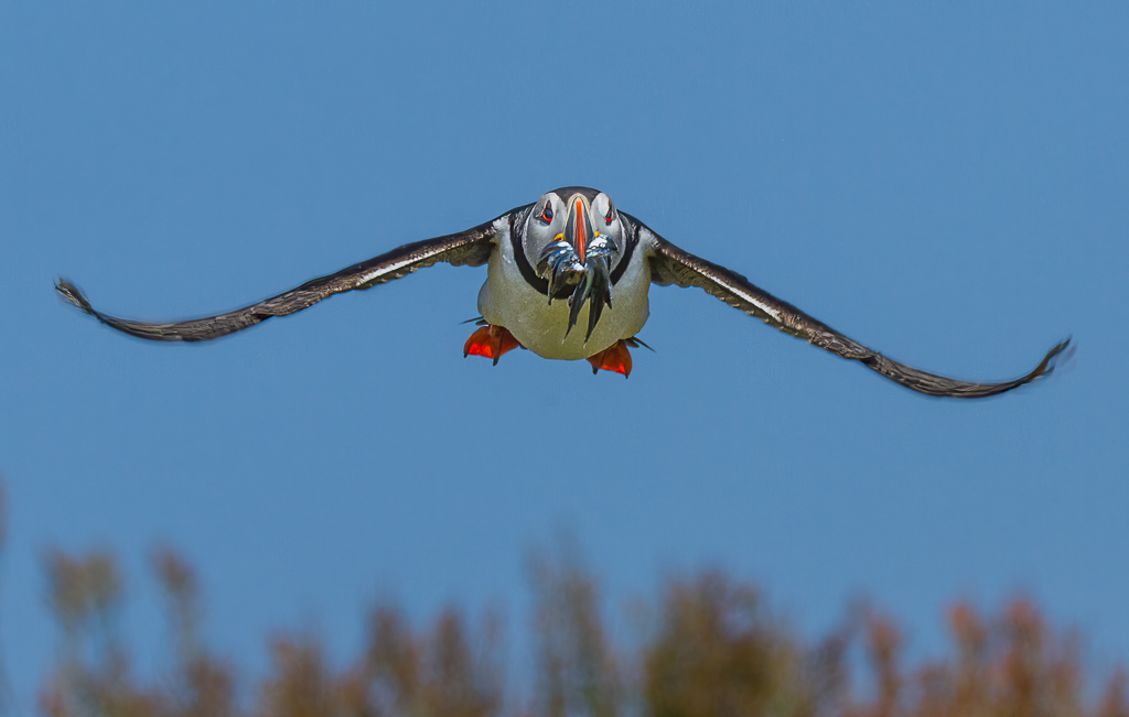
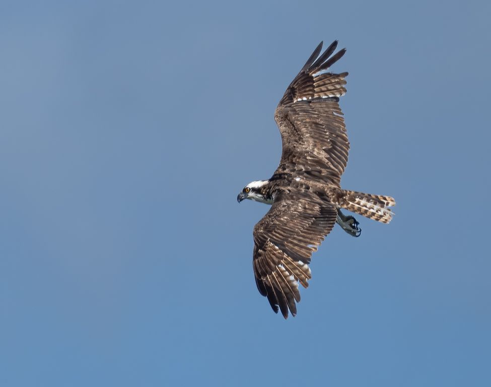
Fabulous capture Abhijeet! Amazing that you were so close. I recommend others here look at your B&B one in Group 64!
Here you state you got a FIAP Gold Award for another shot in this session - Are you able please to share this here?
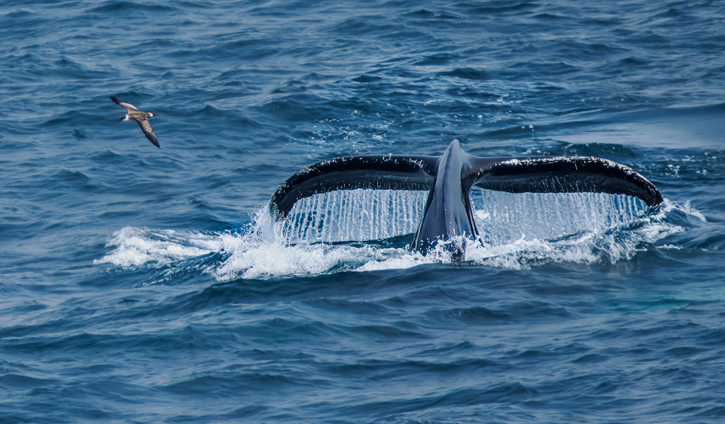
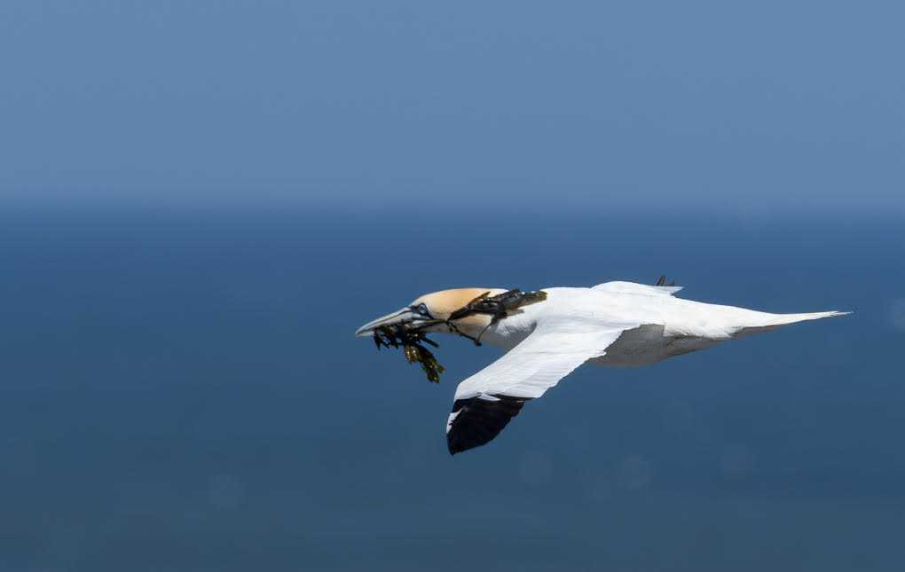
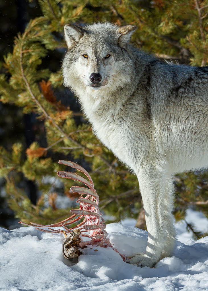
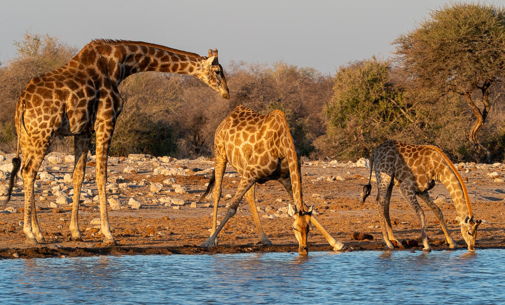
I read your image as the egrets being spooked by the action going on and thus flying off - love that story line!
I'm not so sure about cropping any more out - I feel the foreground adds distance between you, the viewer and the action, thus adding to the nature story. As to the grass, obviously for Nature classes, you must not remove anything. If you enter this version into General Class, you could consider doing this, but I'm not convinced the image would be materially better.
Very much looking forward to seeing other Nature images from this sequence here! |
Jan 25th |
| 72 |
Jan 20 |
Comment |
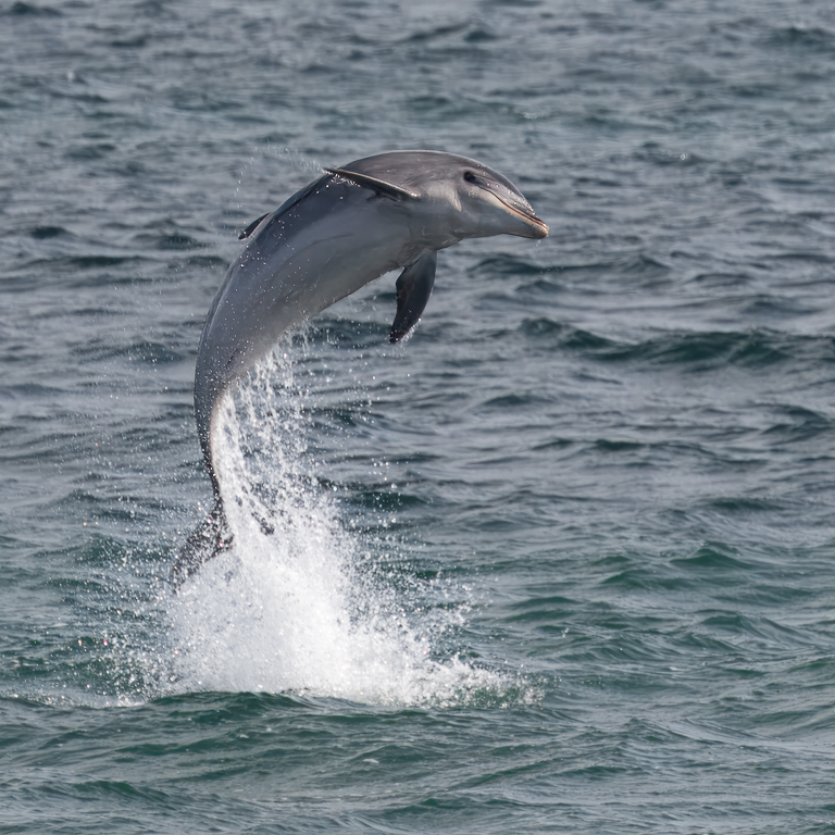
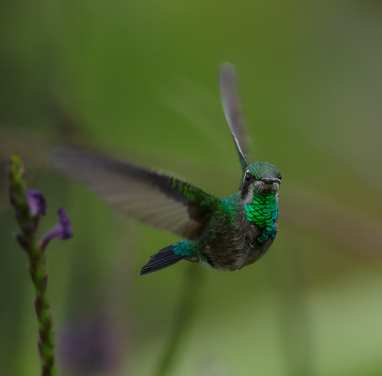
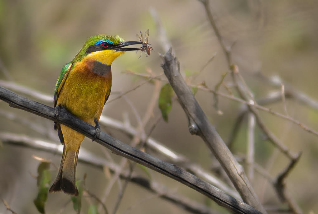
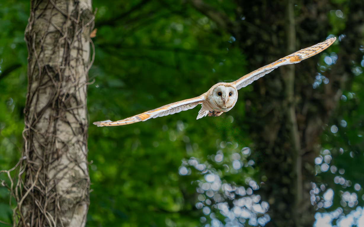
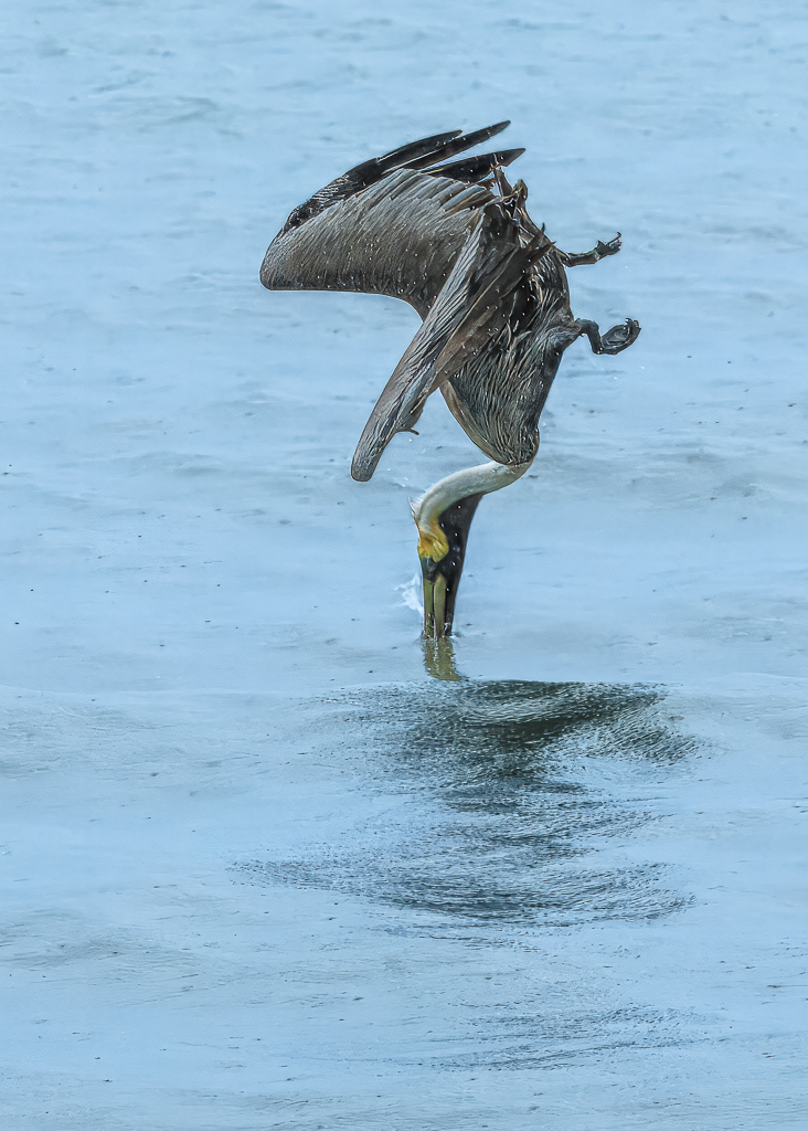
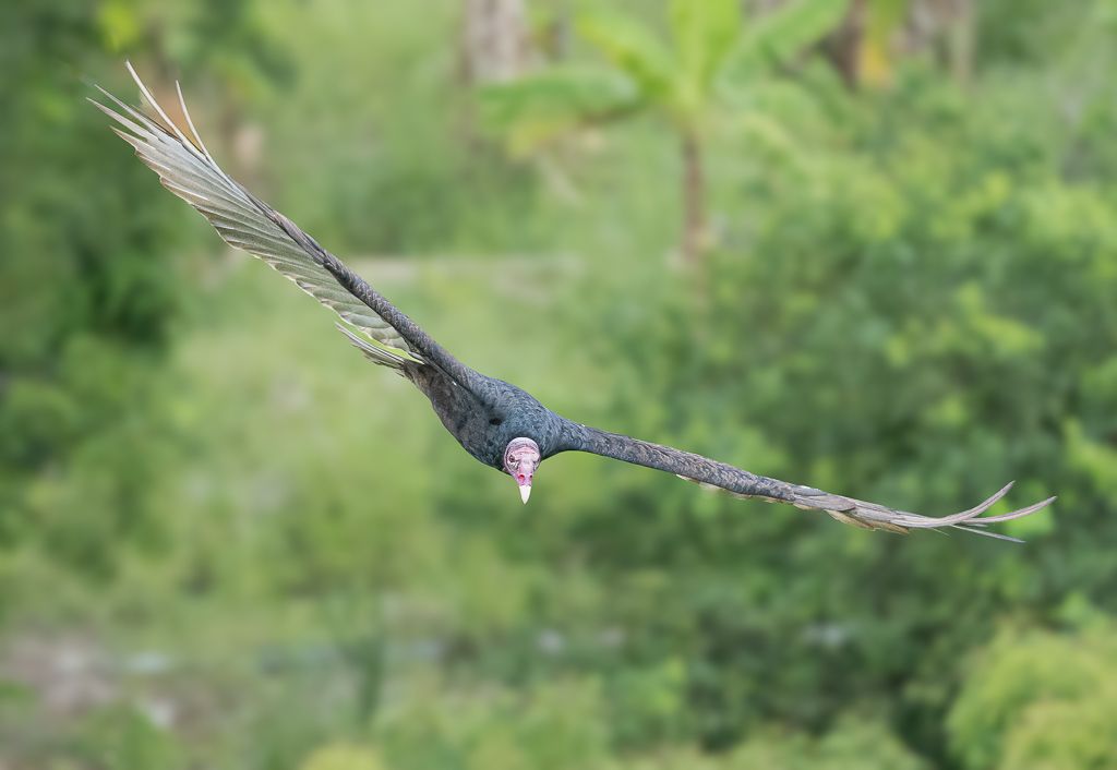
Bruce - I like this a lot! To get the head, body and feet sharp and well resented is quite an achievement! I actually like the blur to the wings, as this adds impact to their movement.
I accept that the sky is whiter than fully desirable, but I feel the image is about the impact on the viewer of goose landing in front of 'you'. I do wonder whether a letterbox format, taking space off the top would enhance the feeling of the bird descending (as well as making it less central).
An image with strong impact - thank you for sharing Bruce! |
Jan 25th |
6 comments - 1 reply for Group 72
|
12 comments - 1 reply Total
|