|
| Group |
Round |
C/R |
Comment |
Date |
Image |
| 79 |
Sep 19 |
Comment |
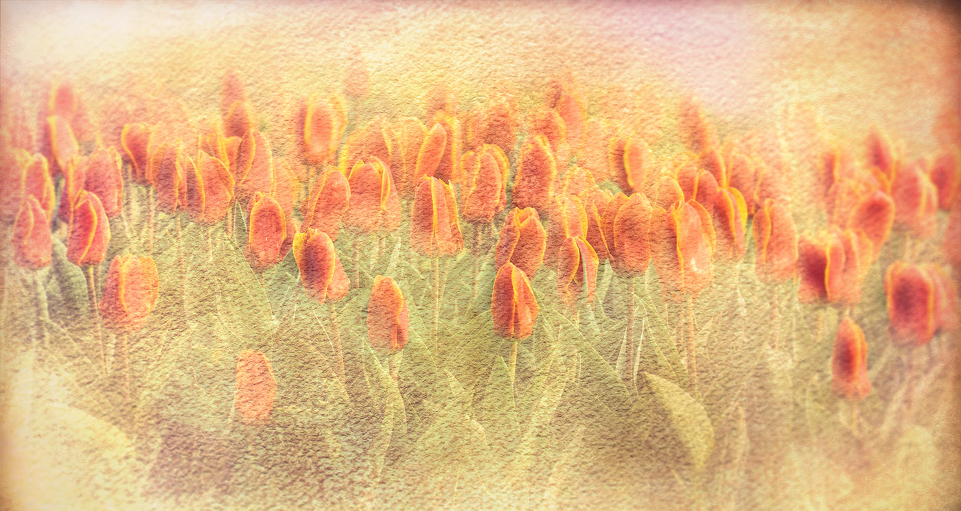
I also like Karls crop here and thanks Karl for the tips. |
Sep 12th |
| 79 |
Sep 19 |
Comment |
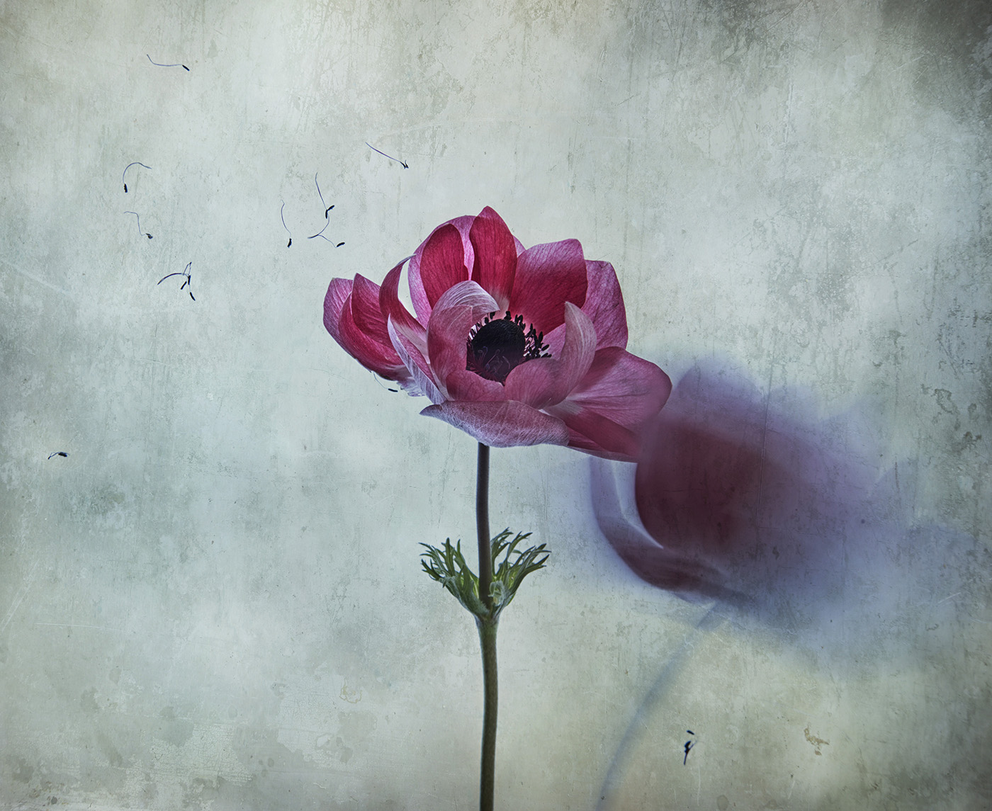
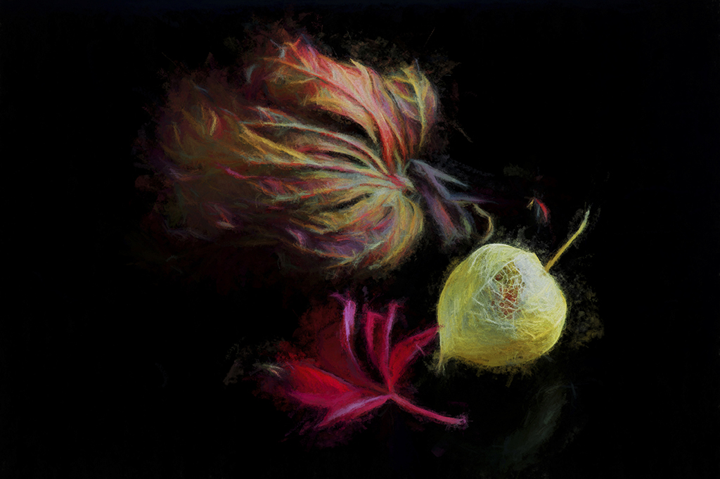
Hi Sandra,
What gorgeous colours here, especially the red veins that trickle along and rest at its base. You have executed a good crop , however i agree with the comments shared here that it is a little soft , and a shame that the dark spot above the 2 shapes is too strong and overpowering. |
Sep 10th |
| 79 |
Sep 19 |
Reply |
Hi Karl,
Thanks to you and Valerie for guiding me to the dark areas.
I did print this on Permajet Gallery Etching 310 , however i intend to take all comments on board and reprint it. |
Sep 10th |
| 79 |
Sep 19 |
Reply |
Thanks Valerie, I agree with your observation and didn't notice the dark area right corner. I am always pleasantly surprised by what the viewer picks up on,that is what is great about being part of this group. |
Sep 10th |
| 79 |
Sep 19 |
Reply |
Thank you Karl for sharing the image,
I hope the image does well for you in the all -media art Exhibit,
and no doubt there will be members here who will voice totally different opinions to mine.
|
Sep 6th |
| 79 |
Sep 19 |
Comment |
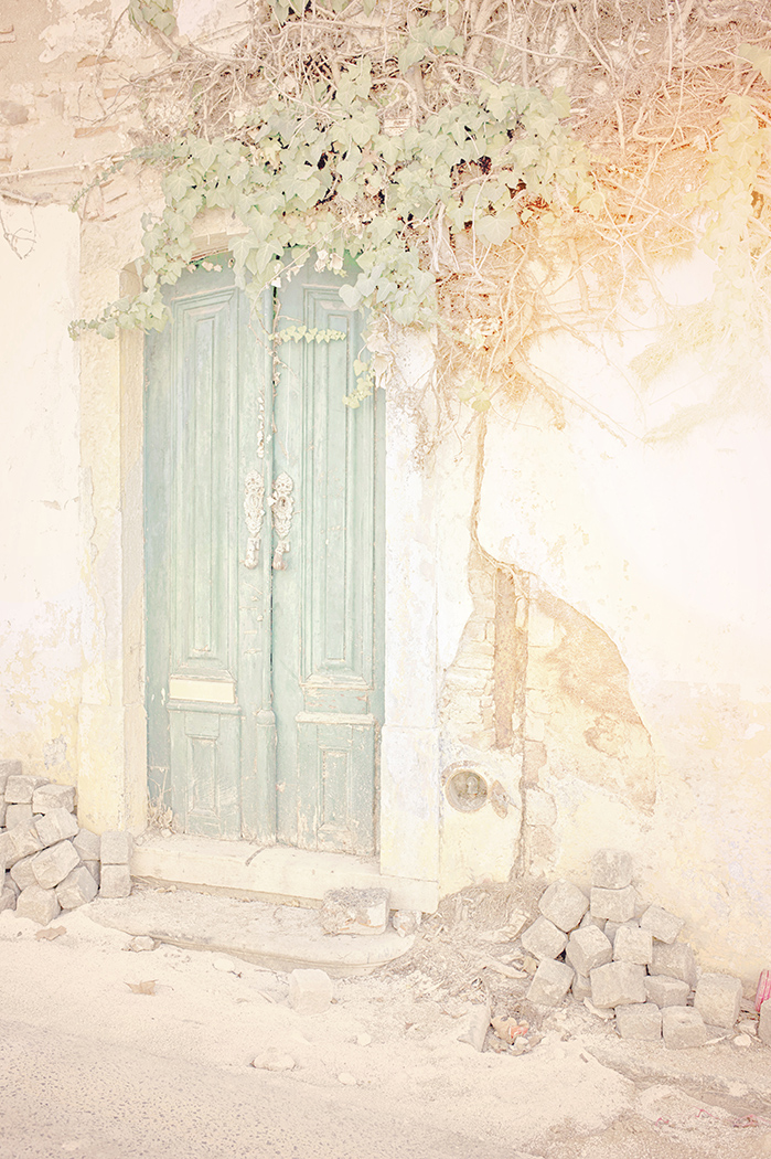
Hi Valerie,
This is a beautiful gentle landscape , and i enjoy your angle where you lead us into the image. I also enjoy the effect you chose in Topaz.
I agree with your suggestion about removing both white road markers and the concrete rectangle.
My only contribution would be to slightly darken the top edge of the sky, a similar tone to the darker blues on the sky edges, as this would hold our eye in into the image.
Very nice work.
|
Sep 6th |
| 79 |
Sep 19 |
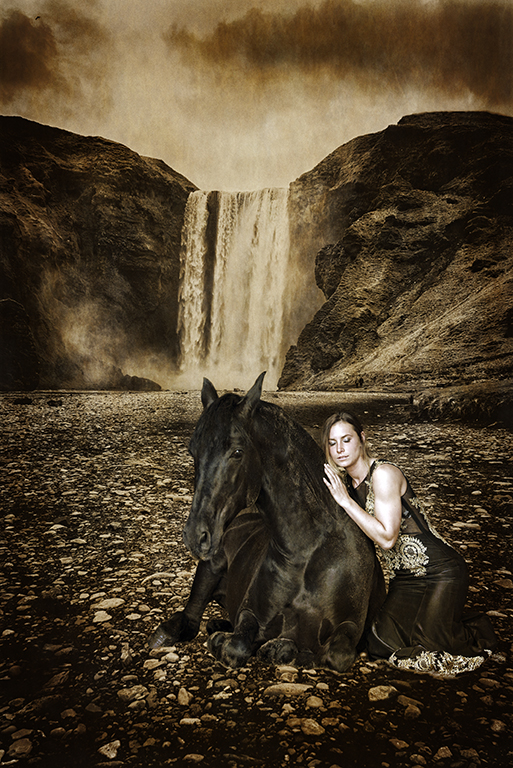
Comment |
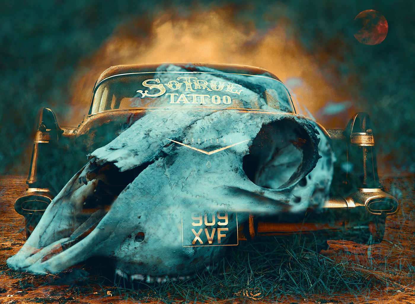
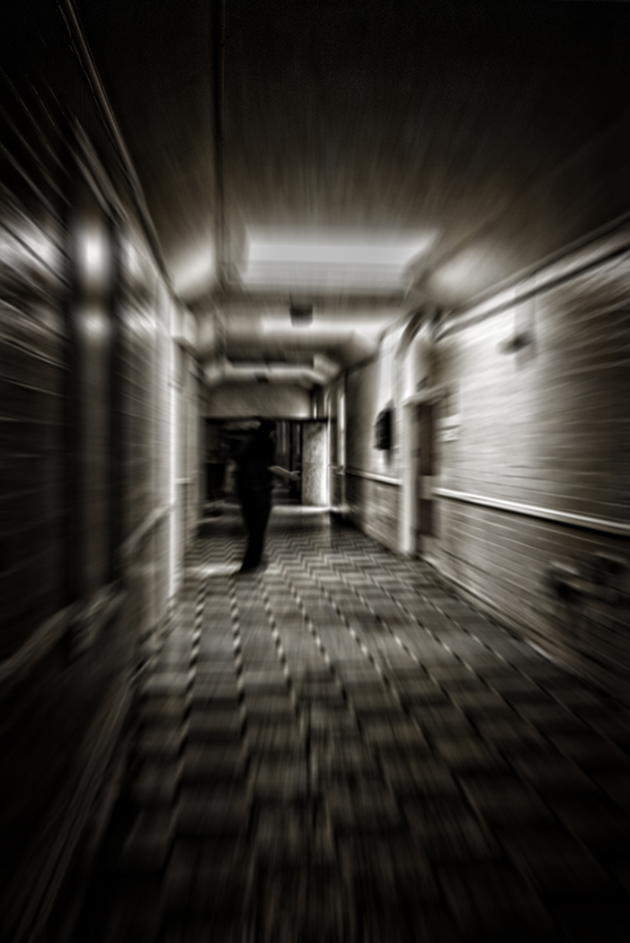
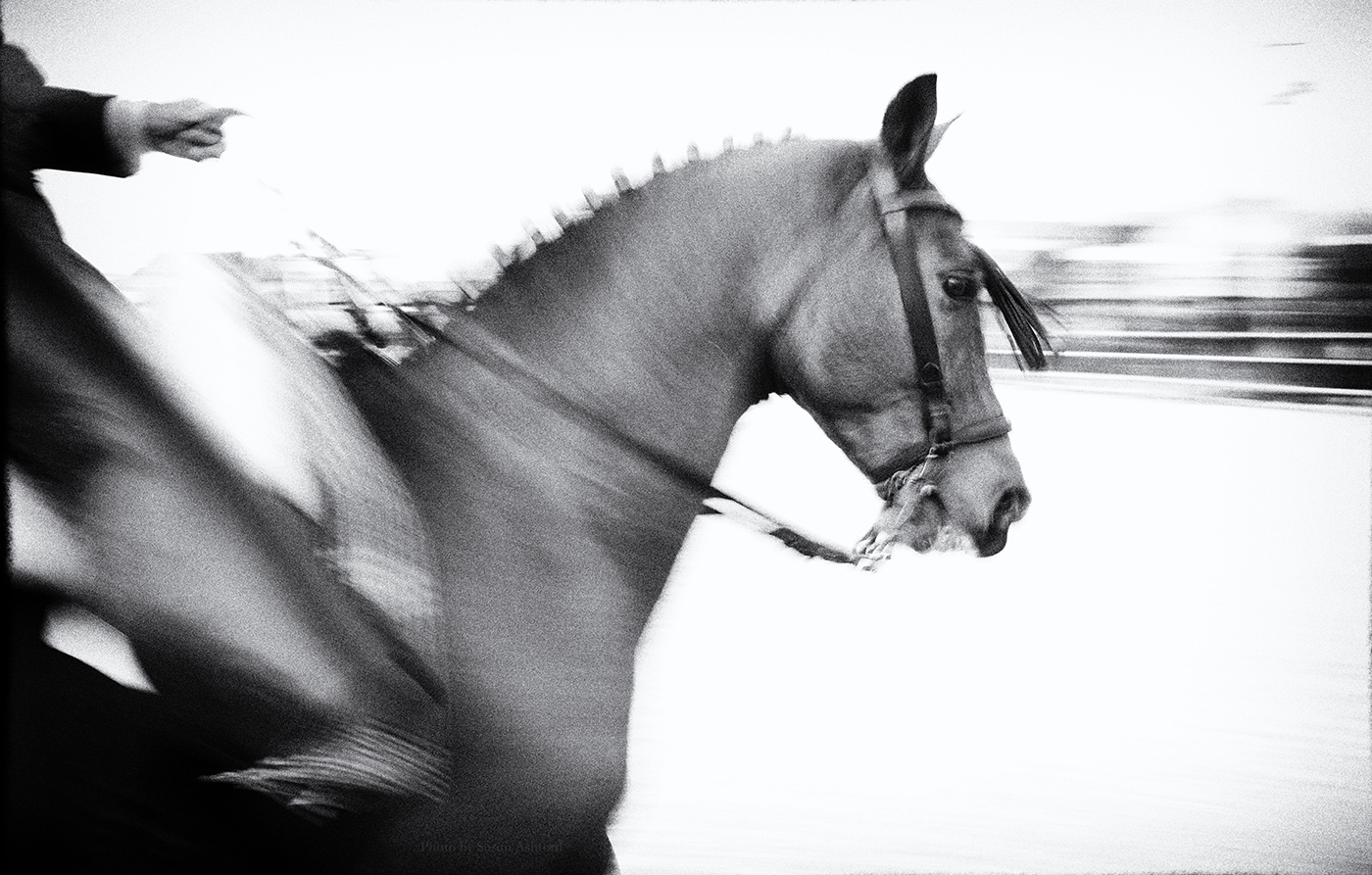
Hi Karl ,
I am sure this image fits in with the books you love but in all honesty it does nothing for me personally. It sure is different from your gorgeous
vibrant colour work.
The saying is just because we don't see Art doesn't mean it isn't there....... but i am still looking .
I really do like the facial expression and the angulated pose of her arms , however
there is a horizontal line just above her right elbow that travels all the way across, i think its a border at the waters edge thats distracting.
If the image were mine i would remove the distracting horizontal line and crop from under her armpits , and perhaps use a strong contrasty Black and white .
I feel it is a good image to work on .
You did ask ...
|
Sep 6th |
| 79 |
Sep 19 |
Comment |
What i usually do to darken highlights is
in photoshop CS6 , select Image, Adjustments, Then you will see
Shadows and HIGHLIGHTS,
the highlight has a sliding bar that reduces the highlights and also a slider for highlight colour which can reduce the whiteness.
I am not sure about Lightroom but they may well be a shadows and highlight option.The trick is to very gently creep the slider bar.
I hope this is helpful to you Judith. |
Sep 4th |
| 79 |
Sep 19 |
Comment |
Hi Marie,
I love Peonies and their layers and layers of petals , i enjoy the composition here that takes my eyes around them all.
Im glad you managed to salvage this sentimental image , and you have done well to capture its beautiful shape and form. |
Sep 3rd |
| 79 |
Sep 19 |
Comment |
I really like this image . The bokeh and reflected colour on the web is fabulous , great angle and crop , and lots of detail.
My only tiny critique is the highlight on the long straightest part of the web .
An idea for future webs,
take along a small spray bottle of water. Preferably a bottle that will spray water as fine mist , and shoot at differing angles so as to catch the light. |
Sep 3rd |
| 79 |
Sep 19 |
Reply |
Hi Judith,
Painterly Pathology , very interesting , thanks for the link.
Using the 70-200 gave me a close up texture , and i also zoomed it in on my edit , in order to see the stippled texture which reminds me of skin.
I shall revisit the raw file, zoom out the textured layer to reduce its strength, and see which one i prefer. Thanks for the advice.
|
Sep 3rd |
7 comments - 4 replies for Group 79
|
7 comments - 4 replies Total
|