|
| Group |
Round |
C/R |
Comment |
Date |
Image |
| 67 |
Nov 18 |
Reply |
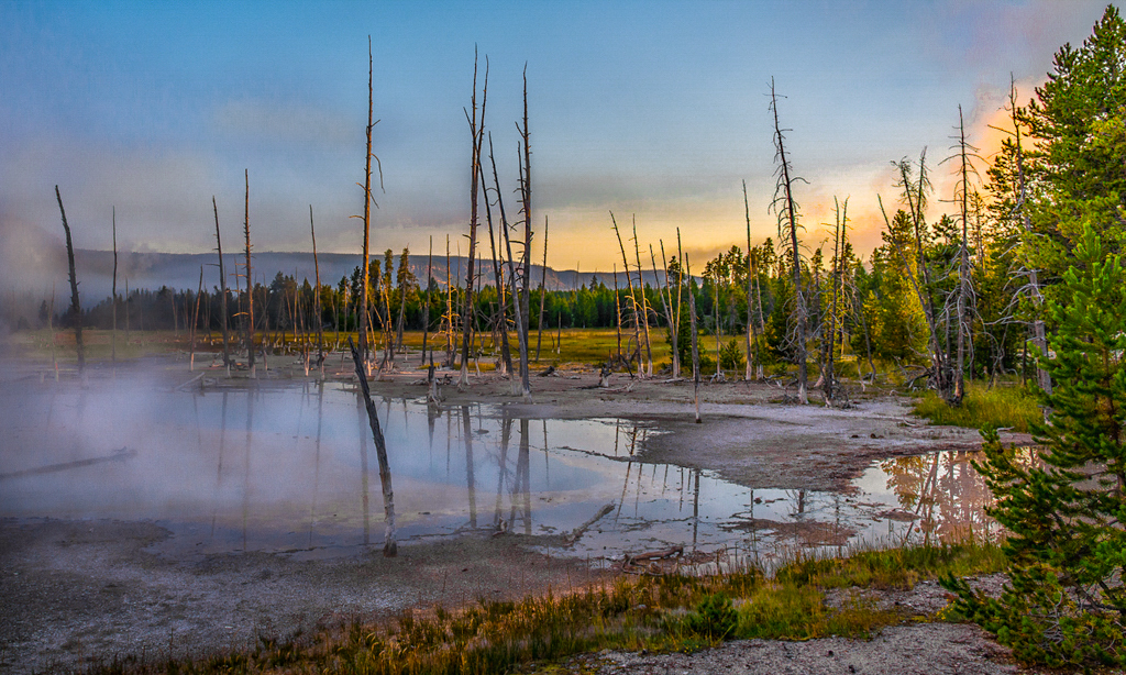
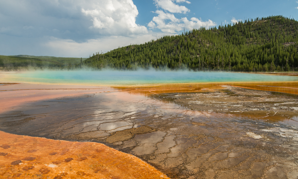
Hi Wayne. Thank you for your comments. I hope you enjoy Yellowstone as much as we did. It's totally amazing! This photo was shot at 24mm. I agree with your assessment about cutting off the edge of the pool . It would have been better had I shot it with my 14-24mm lens and gotten more of the view in the photo.
Have a great time in Yellowstone! |
Nov 26th |
| 67 |
Nov 18 |
Comment |
Larry, This is a beautiful image and I greatly appreciate it because I was at Watkins Glen this summer. I took photos from the same place. I think your image is much nicer with the fall foliage (which also let in more light than summer foliage). The water flow was at a good level and the long exposure gives it a wonderful silky effect. I was taken with all the leading lines along the walls as well. However, I like your image vertically since it does emphasize the depth of the canyon. My eye is attracted to the pool in the vertical image which leads up the smaller waterfalls into the larger one and then to the bridge. The same tree branch in the foreground was also there this summer. All together a fabulous image where excellent photographic skills are clearly evident. |
Nov 21st |
| 67 |
Nov 18 |
Comment |
Max, Thanks for creating another version of your photo. I like the saturation in this one better but like the cropping in the original one best. I too need to check my monitor calibration. |
Nov 21st |
| 67 |
Nov 18 |
Comment |
Richard, This is an even better shot, and no Photoshop needed! Great job!
Larry, thanks for the update on Photoshop and post-editing. |
Nov 19th |
| 67 |
Nov 18 |
Comment |
This is a stunning photo! It is sharp and the colors are a delight to the eye. Looks like you had all your settings programmed perfectly. I also would like to hear more about your flash settings and diffuser. Definitely a winning photo! |
Nov 19th |
| 67 |
Nov 18 |
Comment |
He is amazingly beautiful and you captured him well. I too like where he is positioned in the photo, the frosty grass and the way you accentuated the colors in the background. It all looks very real and not overly saturated. If you have some other images, might there be one with his head held a little higher? That would probably eliminate the bit of grass on his nose. Or perhaps it could be removed in Photoshop (is that allowed in Group 67?). But I can see this photo winning honors in my camera club. Great shot! |
Nov 19th |
| 67 |
Nov 18 |
Comment |
Wayne, I get where you're coming from. My husband (of 43 years) and I decided that I need some designated alone time with my camera on vacations but have to admit that I still struggle when an amazing shot comes along.
The tree roots really attracted my attention. They stand out nicely after post-processing, which overall brought the image closer to reality. The smoke in the canyon makes the background a few shades lighter than perhaps would be normal, but it sets the hoodoos off nicely from the background.
I agree that cropping the tree on the right out the photo would be helpful. I also tried flipping the photo horizontally just to see how that looked but the curve on the left side is definitely a stronger lead in. I often do that if the subject matter allows.
Overall a lovely picture with a great job on the post processing. |
Nov 13th |
| 67 |
Nov 18 |
Comment |
In this photo the tree on the left draws my attention and leads me into the scene. It is the "door" that leads my eyes up through the multi-colored ferns and into the trees where I wonder what is behind them. The green and orange are striking together, even though a bit over saturated for me. However, this is just the kind of photo I love to take.
I like Larry's comment about adding a buck or fawn. (I have so many images where I could place one of them.) There could be an anchor point that would make the photo stellar, but what to do when there isn't one? Not sure, but would a lower vantage point have helped so it would appear that you are looking through some of the taller ferns in front?
Kudos to you to getting out there with those snakes! |
Nov 12th |
| 67 |
Nov 18 |
Comment |
I'm always torn between black and white or color. This photo is striking in black and white but I also like her red shirt and the green of the mountains, the details in her face, and she is wearing an earring as well. It looks like she has a cloth in her hand and there is a little blur indicating movement. Is she wiping down a menu perhaps?
The most striking part in the black and white image is the silhouette of her face which is worthy of the photo. If some of the peripheral items and mop/broom handle were removed it would isolate her nicely. I also noticed that there is just an edge of the stickers in the upper left of the window. Overall, the mystery of exactly what she is doing against the beautiful background draws the viewer's eye into the photo. |
Nov 12th |
| 67 |
Nov 18 |
Comment |
Thank you all for your encouraging comments. I struggle with getting the color and intensity right. This is one reason I joined Group 67. I really like your version Larry. When entering nature images in my camera club's competitions I try to keep it as realistic as possible so I waffle as I attempt to remember what the photo site actually looked like.
I agree with Madhusudhan that the blues and greens could be more intensified. And Richard, setting the image aside a couple of days is always a good idea. Sometimes I come back and say "Oh my goodness! Did I really do that?" And brushing in the clouds would definitely help.
I'm learning so much already! Thank you all! |
Nov 12th |
9 comments - 1 reply for Group 67
|
9 comments - 1 reply Total
|
