|
| Group |
Round |
C/R |
Comment |
Date |
Image |
| 34 |
Aug 23 |
Comment |
I like your result. I love the original. Your choice to 'go low' with your perspective adds a lot of inerest. The blurred background is fine, but so was the original. |
Aug 12th |
| 34 |
Aug 23 |
Reply |
From the Group 34 home page description: " In some cases, group members will post a rework of the image to demonstrate their suggestions."
I assume this applies to all group members and images. I am here to share my process, and to learn. My process includes repetition and theme, as represented by many famous artists and photographers such as Andy Warhol, Rick Griffin, Alfred Hitchcock, and Ann Geddes. I truly appreciate your opinion, and will consider your suggestions, but my process is my process, and my artistic choices are my artistic choices. I hope my future submissions to the group will reflect what I have learned here, regardless of subject. Thanks for all you do. |
Aug 12th |
| 34 |
Aug 23 |
Reply |
Interesting. I like your color choices, but the overall final image is too dark. And it has lost all detail in the hair and beard. I understand photoshop has many interesting filters, but I use gimp. If you've noticed that my use of selfies seems repetitive, that's good. Because that's the whole idea of using a theme to develop different objectives and perspectives from a similar or even identical subject. |
Aug 12th |
| 34 |
Aug 23 |
Reply |
Something else you could try is applying the filters selectively to individual layers that need it, to reduce the overall de-focusing. To my eye, the clockwork and doorway should be as sharp as the star points. Having the foreground be dark and mysterious is good, but the effect of that should be to accentuate the subject rather than obscure it. |
Aug 8th |
| 34 |
Aug 23 |
Comment |
Which one is the alien? I wasn't sure until you explained it. My only suggestion is that the mirror image doesn't look natural. If you flipped one side to make it asymmetric it would still frame the subject, but might look less obvious. |
Aug 4th |
| 34 |
Aug 23 |
Comment |
This is an excellent composite. Using the cement to evoke a galaxy is ingenious. The various blur methods you used to obscure the extra people are a bit distracting. If you had used a clone tool or healing brush instead, the clockwork could have a lot more impact. |
Aug 4th |
| 34 |
Aug 23 |
Comment |
My father lived in Jogja (Dutch sp). Your composite of the masks is appropriately evocative of the spirits shown. The low contrast of the masks is sharply balanced by the high contrast of the dancer/drummer. I can almost hear the Anklung. I do think you've removed too much texture from the stage floor. The footprints were part of the story. |
Aug 4th |
| 34 |
Aug 23 |
Comment |
I absolutely love this. My only suggestion would be to put a glow behind the edges of the glasses to imply depth. |
Aug 4th |
5 comments - 3 replies for Group 34
|
| 68 |
Aug 23 |
Reply |
And yes, I do see the window violation at the bottom right. But in this case it's very subtle, and doesn't detract from the overall image. In fact, it adds to the abstract character of the scene.
I really like this image. |
Aug 30th |
| 68 |
Aug 23 |
Reply |
The canon software is for vr180. These are vr360, so it would not work. |
Aug 19th |
| 68 |
Aug 23 |
Comment |
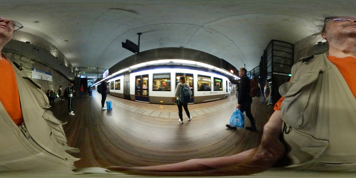
Just for fun, here's the full sized 'defished' left image. Unfortunately, these defished 360 images don't work for stereo. |
Aug 13th |
 |
| 68 |
Aug 23 |
Comment |
A beautiful and lucky shot. It's too bad the leaf on the left limits the phantogram window. |
Aug 12th |
| 68 |
Aug 23 |
Comment |
This has excellent depth all the way through. The carpet and stanchions accelerate that depth. Armstrong was definitely an interesting character, pioneering in hydraulic transport and hydroelectric applications. |
Aug 12th |
| 68 |
Aug 23 |
Comment |
Sounds like the Tesla was almost as depleted as the snow cap. Nice image. The foreground looks great. The background looks a little washed out, but not too hot. I guess that's just how it looked. |
Aug 12th |
| 68 |
Aug 23 |
Comment |
This tells the story well, with good 3d (except for the window violations). It seems a little underexposed though. |
Aug 12th |
| 68 |
Aug 23 |
Comment |
It's hard to express minimalism in 3D. You've nailed it here. Extraordinary leading lines that go in almost EVERY direction (X, Y, Z), with classic Fibonacci structure and elements of nature make this completely awesome. 10 out of 10. |
Aug 12th |
| 68 |
Aug 23 |
Comment |
An interesting sculpture, and a perfect subject for the W3. I can't tell if it's carved wood, or cast metal. |
Aug 12th |
7 comments - 2 replies for Group 68
|
12 comments - 5 replies Total
|