|
| Group |
Round |
C/R |
Comment |
Date |
Image |
| 21 |
Aug 21 |
Comment |
Your composition is very interesting. And the exposure shows just enough movement. But the cascading leading lines leave me wanting to see more of the rock at the top edge, while taking my interest toward the bottom edge. |
Aug 14th |
| 21 |
Aug 21 |
Reply |
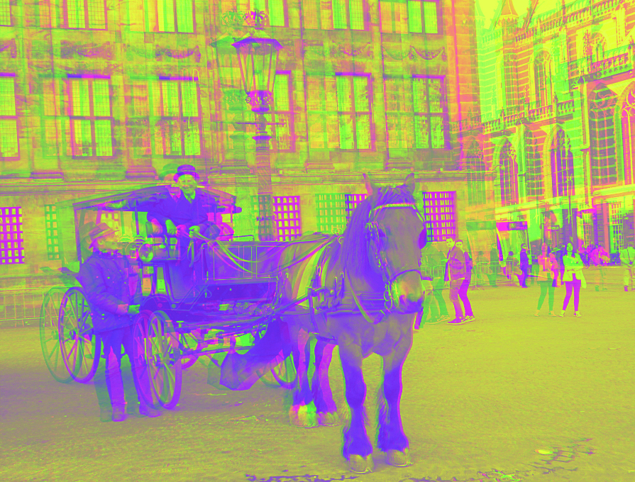
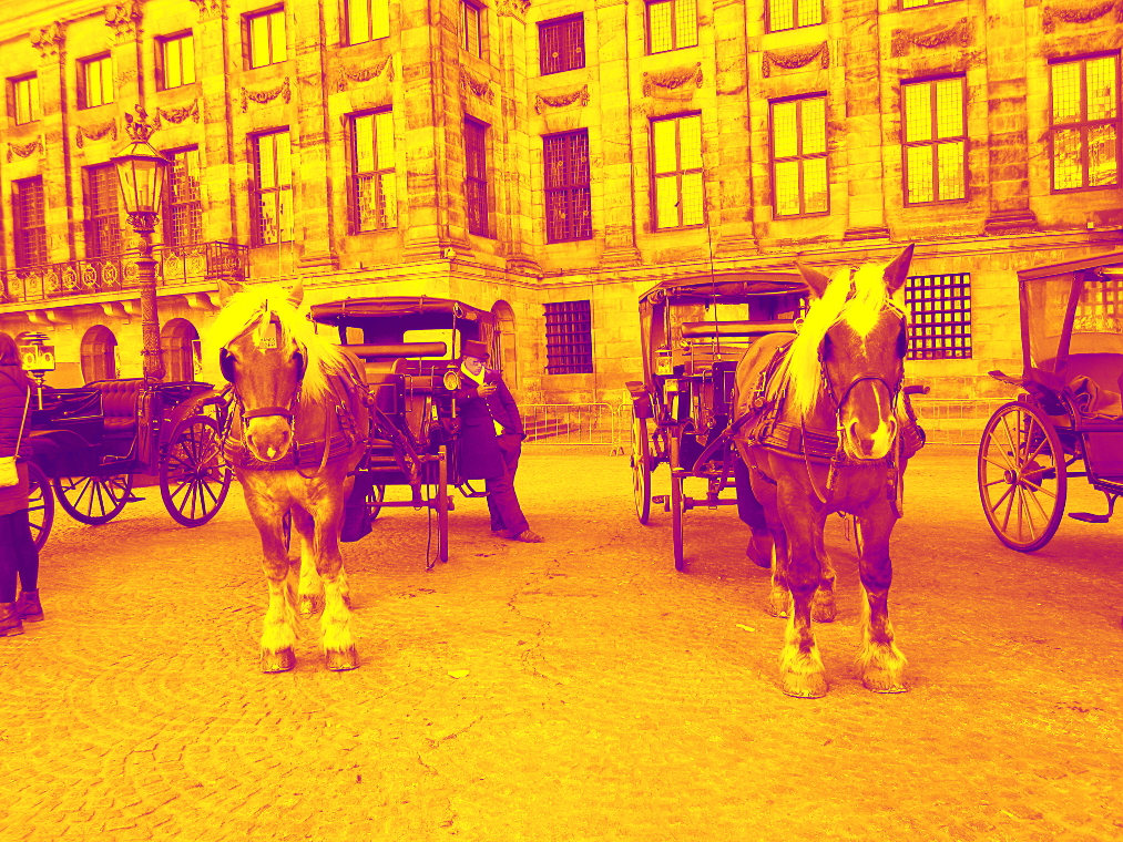
This historical image was taken by me, on the 24th of April 2018, at Dam Square in Amsterdam. My thoughts on psychedelic art are fairly well known in this group. Posterization is thought to have originated in the USSR, some time before 1950. It was originally created as a technique to reduce the amount of ink used in poster printing. In the mid 1960s, poster artists started using the technique with vibrant new ink colors, resulting in the psychedelic look now widely associated with it's use. |
Aug 13th |
| 21 |
Aug 21 |
Comment |
Here is a 3D shot from the next image in the camera. It has less distractions. (use red/blue glasses) |
Aug 13th |
 |
| 21 |
Aug 21 |
Comment |
Your original ICM photo is creative and striking. I think the addition of the basic fire takes some of the drama out of the image. |
Aug 11th |
| 21 |
Aug 21 |
Comment |
I also see a dog, but it's a Bichon Frise. |
Aug 11th |
| 21 |
Aug 21 |
Comment |
You succeeded. I love this. The colors, the texture, the simplicity, the juxtaposition... It all works. |
Aug 11th |
| 21 |
Aug 21 |
Comment |
I am confused by this. The placement of the elements is fine (maybe a bit crowded), but the lighting doesn't fit the scene. |
Aug 11th |
| 21 |
Aug 21 |
Comment |
The slight washout from color saturation is intentional. I wanted the 1960s psychedelic look. I originally made a version with more detail, by overlaying a grayscale layer, but in the end, I liked the slight flare better than the dampened version.
Here is that version... |
Aug 11th |
 |
7 comments - 1 reply for Group 21
|
| 68 |
Aug 21 |
Comment |
Sometimes I use the auto correct twice. Once left to right, and once right to left.
|
Aug 22nd |
| 68 |
Aug 21 |
Comment |
I like it both ways, but the one in the hand looks more natural, since he isn't in a jumping stance. |
Aug 22nd |
| 68 |
Aug 21 |
Comment |
An excellent example. It looks like he's sitting on my tablet.
|
Aug 22nd |
| 68 |
Aug 21 |
Comment |
An excellent image. You might have brought out a bit more detail in the dark areas by by lightening the shadows a bit, but excellent overall. |
Aug 11th |
| 68 |
Aug 21 |
Comment |
SPM has an automatic color match feature (Adjust-Auto color adjustment) that should be able to fix this. |
Aug 11th |
| 68 |
Aug 21 |
Comment |
Rain is great for moody shots. Always try to shoot the mood, as you have here.
I've learned from shooting in Portland and Holland that rain is not to be feared, but to be expected and prepared for. A square of plastic sheeting can cover a large camera rig, a medium ziplock bag can protect a small camera like the fuji. Both will fit in a small pocket, and I always bring them. I also carry separate cloths for wiping a damp camera and a dry lens. I keep dessicant packs in my camera case and bag. I've gotten some great shots in the rain.
|
Aug 11th |
| 68 |
Aug 21 |
Comment |
You got the separation and framing right. That's pretty good for hand held shooting. I like the moodiness of the diffused light and haze. |
Aug 11th |
| 68 |
Aug 21 |
Comment |
Very sharp image. This is the perfect range of depth and focus for the Fuji.
|
Aug 11th |
| 68 |
Aug 21 |
Reply |
Yes, the main problem with the Hydrogen one (or almost any cellphone or action camera) is the fixed wide aperture. This is why there are so many articles promoting 'bokeh', so the shallow depth created is now trendy. Hopefully the trend will fade and some manufacturers will add aperture adjustment, or create some awful digital equivalent. Meanwhile, I haven't found a high quality ND filter set for celphones, so I accept the limitation and keep shooting. |
Aug 5th |
8 comments - 1 reply for Group 68
|
15 comments - 2 replies Total
|