|
| Group |
Round |
C/R |
Comment |
Date |
Image |
| 21 |
Aug 19 |
Reply |
In gimp it's in the image-map menu. There is a 'map to sphere' option. Not sure about PS, as I don't have a current version. |
Aug 24th |
| 21 |
Aug 19 |
Reply |
The panorama mode uses a vertical slot shutter to sequentially capture 360 degree composites, similarly to the way a scanner or xerox machine works. As you move, it captures vertical lines and combines them. If you move slowly and evenly you get good panoramas. The idea here is: Don't do that. :) |
Aug 22nd |
| 21 |
Aug 19 |
Comment |
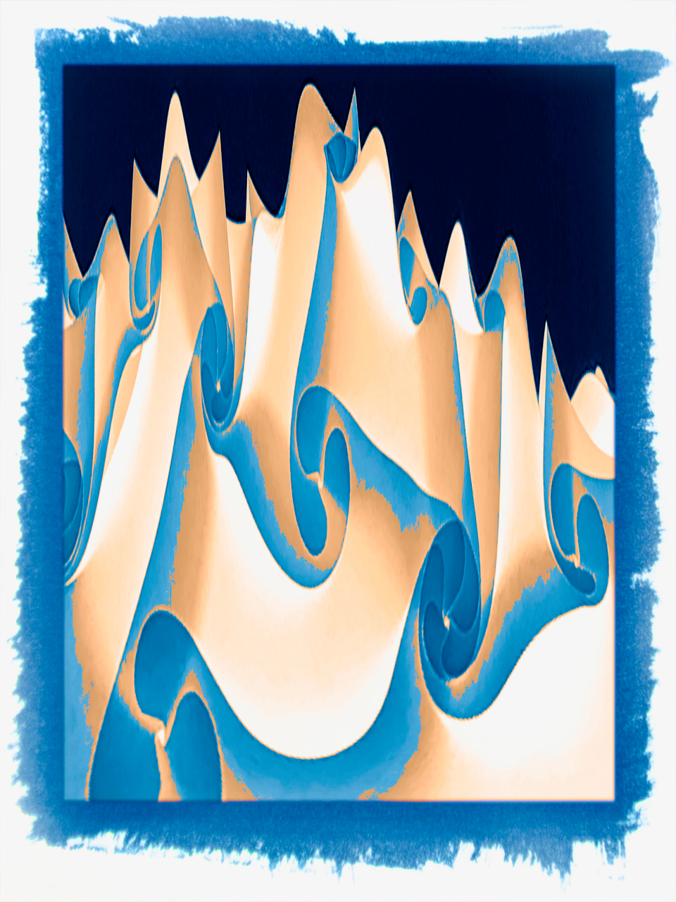
Great lines and dynamic colors. But if I was asked to hang it in a gallery, I would hang it upside down. The highlights and shadows look more natural that way. |
Aug 22nd |
 |
| 21 |
Aug 19 |
Comment |
I love the idea, and your edit. I do think the image looks over sharpened. I think using a posterization tool to further reduce the color palate, and using contrast adjustments rather than a film grain tool would give it more punch. |
Aug 22nd |
| 21 |
Aug 19 |
Comment |
I like the overall effect of the layer blending. It has a water color like feeling to it. I think your edit of the pearl is fine, but the sharpness of it's silhouette doesn't match the softness of it's pastel color, or the overall ethereal nature of the image.
If you give the pearl's edge a softer feeling, it would match the image better.
If you made it more transparent and gave it some shiny highlights, it would match it's current edge better. |
Aug 22nd |
3 comments - 2 replies for Group 21
|
| 68 |
Aug 19 |
Comment |
Thank you for your comments. I guess the somewhat abstract nature of the image, combined with the repeating squares, made it hard to decide which squares to merge and where to focus. I have no problem merging it correctly, but I'm already familiar with the image so my eyes know where to look. I'm curious how people will see it when projected. |
Aug 22nd |
| 68 |
Aug 19 |
Comment |
The flower itself has good depth, but the ground, tree, and sky all seem to merge pretty quickly. That combined with the low resolution makes me wonder what camera was used. |
Aug 22nd |
| 68 |
Aug 19 |
Comment |
I don't see over saturated red. I see under saturated yellow.
I love your image, but I don't think that Christmas tree is going to fit in the living room. |
Aug 22nd |
| 68 |
Aug 19 |
Comment |
What makes the window violation disappear, are the reflections of the lights behind it. The reflections create a false window at the table surface. The glow of the background is bright, but it isn't really distracting to me. |
Aug 22nd |
| 68 |
Aug 19 |
Comment |
I like the bulb. I'd buy it. :) I like the idea of it popping through, but the hand is indeed violating the window. I think there is room to fix the hand and still have the bulb pop out a bit. |
Aug 22nd |
| 68 |
Aug 19 |
Comment |
An excellent composition that not only holds interest, but also depicts it. I think the slightly uneven contrast in the lighting gives it an extra feeling of depth. |
Aug 22nd |
| 68 |
Aug 19 |
Comment |
I agree with all the above comments. I especially like the color. I will point out a tiny distraction at the bottom edge. A tiny portion of something is visible just at or near the stereo window. It doesn't seem to violate the window, but it pulls my focus away from the subject. |
Aug 22nd |
| 68 |
Aug 19 |
Reply |
I created the depth in the original stereo pair, then used the same settings in the app for each side. Your description of the giant dog behind glass bricks, is exactly the effect I wanted. I'm glad at least someone could see it. |
Aug 16th |
| 68 |
Aug 19 |
Comment |
Maybe it will be easier with a standard pair... |
Aug 15th |
 |
| 68 |
Aug 19 |
Reply |
I can understand the difficulty, with so many squares. Just merge the dots above the image and it should be clear. |
Aug 14th |
8 comments - 2 replies for Group 68
|
11 comments - 4 replies Total
|