|
| Group |
Round |
C/R |
Comment |
Date |
Image |
| 21 |
Apr 19 |
Comment |
I also love the overall image, and agree that Brian's crop is a better composition. Another idea might be to leave some space between the three lower images, allowing more of the green to carry through. |
Apr 26th |
| 21 |
Apr 19 |
Comment |
Using traditional darkroom techniques to make a difficult image more interesting is definitive of creative photography. So, yes.
The only 'problem' I see is the transition to the background around the girl's hair. A softer edge on her left side might improve it. |
Apr 26th |
| 21 |
Apr 19 |
Comment |
Great use of color, good choices for texture, and a very interesting result. I was immediately reminded of George Rodrigue's blue dog. I think the angle is fine. It adds to the 'folk art' feeling of the image. |
Apr 26th |
| 21 |
Apr 19 |
Comment |
A bold image. Maybe a bit too bold for pastel. I like Peter's color adjustments. They add interesting contrast, and make the scene more recognizable.
i would echo Joan's suggestion of darkening and lightening. It might also be interesting to apply selective blur or texture to areas that were in shadow to add more definition. |
Apr 26th |
| 21 |
Apr 19 |
Comment |
I always prefer bright color. I like the juxtaposition of the flower with the round and square framing, and the overall composition is good.
My eye is somehow distracted by the relationship between the flower petals and the outer frame on the right. The position of the flower relative to the frame gives ambiguous depth cues (It's not clear if it's in front or behind the frame). Overlapping the tip of the furthest right point of the flower on the outer frame would clarify the distraction and let the eye see the whole image.
Also, the left bubble is flipped. It would look more natural with a new bubble, centered from a slightly different point in the image. |
Apr 18th |
| 21 |
Apr 19 |
Comment |
It does seem disconnected. The elements also seem a bit crowded, but the composition is interesting. I can imagine the baby saying "Take me back Mr. Stork, I don't like it here!" |
Apr 10th |
6 comments - 0 replies for Group 21
|
| 68 |
Apr 19 |
Comment |
Thanks for the comments. In hindsight, I should have corrected the horizon. I could have gotten a shot from the front angle, but the background was dumpy and unappealing. |
Apr 26th |
| 68 |
Apr 19 |
Reply |
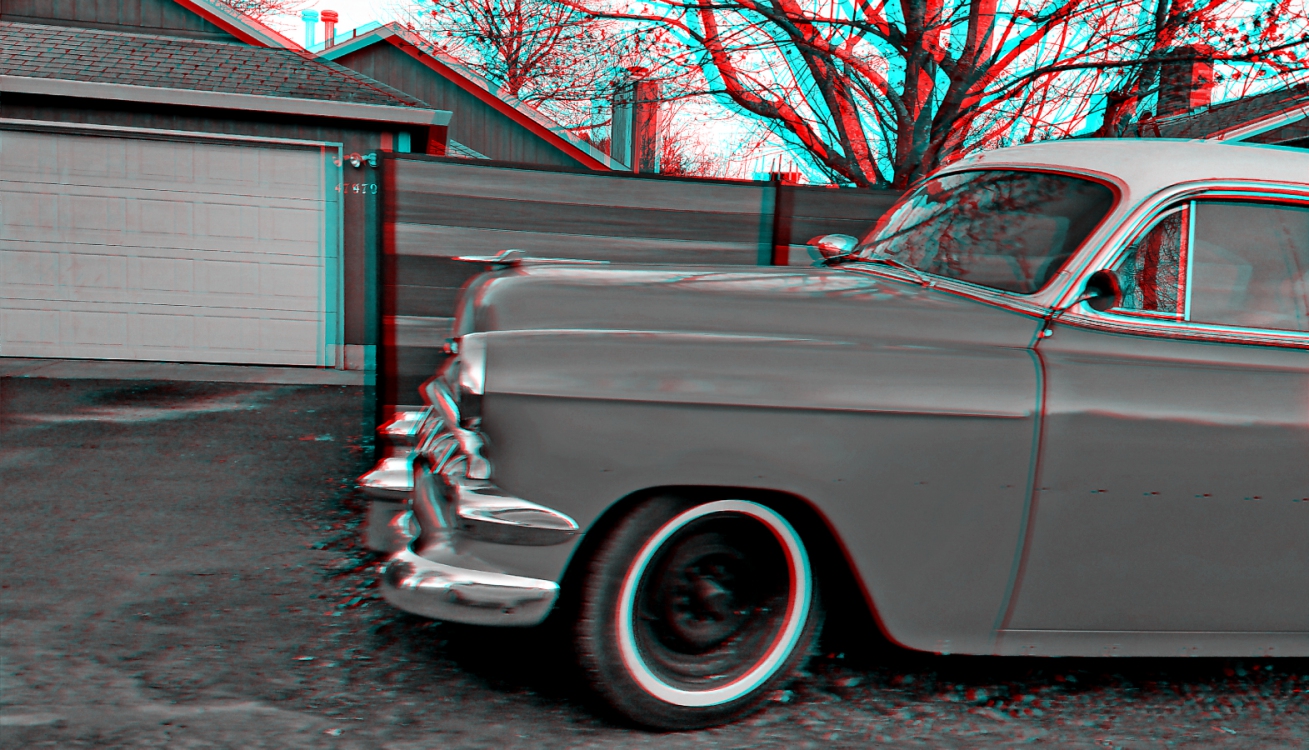
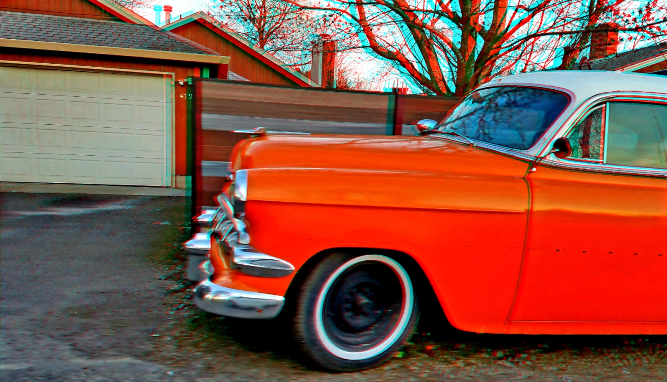
These are sequential images, taken from a slow moving car on a narrow street. I was too close to get a good image of the whole car. |
Apr 26th |
| 68 |
Apr 19 |
Comment |
The isolation of color works well for the 2d image, but it exaggerates the problems David pointed out. I would be interested to know how this was taken/processed. A slight difference in angle between shots (toe out) could cause some of the problems. I suspect others might have been caused during the desaturation process. |
Apr 26th |
| 68 |
Apr 19 |
Comment |
You already know I like this image. My only suggestions would be that his nose should be bigger, and his eyes deeper set. |
Apr 26th |
| 68 |
Apr 19 |
Comment |
A nice composition and subject. I am seeing a slight distortion in the right bloodroot leaf, and another just behind the left flower. Not sure what would cause that in a synced image pair. I'm also seeing a tiny window error at the top right. And, I would boost the color saturation to bring out more detail in the log and flowers. |
Apr 26th |
| 68 |
Apr 19 |
Comment |
I like the mirror effect, but I agree the single image is more interesting. In the quad version, the effect of the butterflies coming through the hole in the cd is lost. Also, the globe seems stretched (more hyper than the whole image). I would have liked the globe further forward, and with more contrast. |
Apr 26th |
| 68 |
Apr 19 |
Comment |
This is the essence of life in much of the world. Rice grows in the valley, while people and animals live above. A hard life indeed. If I walked down, I might never get back up! I would not reduce the green, but I might try increasing the magenta/blue levels to warm the colors a bit. |
Apr 26th |
| 68 |
Apr 19 |
Reply |
|
Apr 15th |
 |
| 68 |
Apr 19 |
Reply |
I posted the Dubois anaglyph because the standard color anaglyph was too disturbing. I'll post it here. and a grey one. |
Apr 15th |
 |
| 68 |
Apr 19 |
Reply |
It's missing a bunch of chrome. You can see the holes in the door where it was attached. |
Apr 15th |
6 comments - 4 replies for Group 68
|
12 comments - 4 replies Total
|