|
| Group |
Round |
C/R |
Comment |
Date |
Image |
| 21 |
Jan 19 |
Reply |
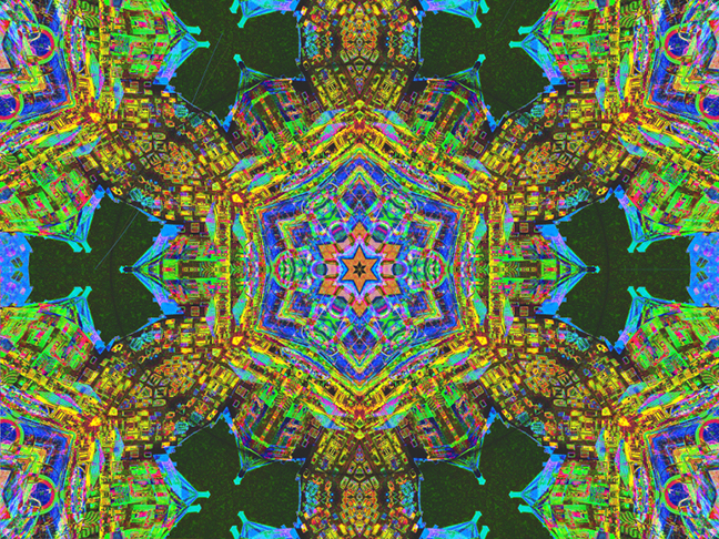
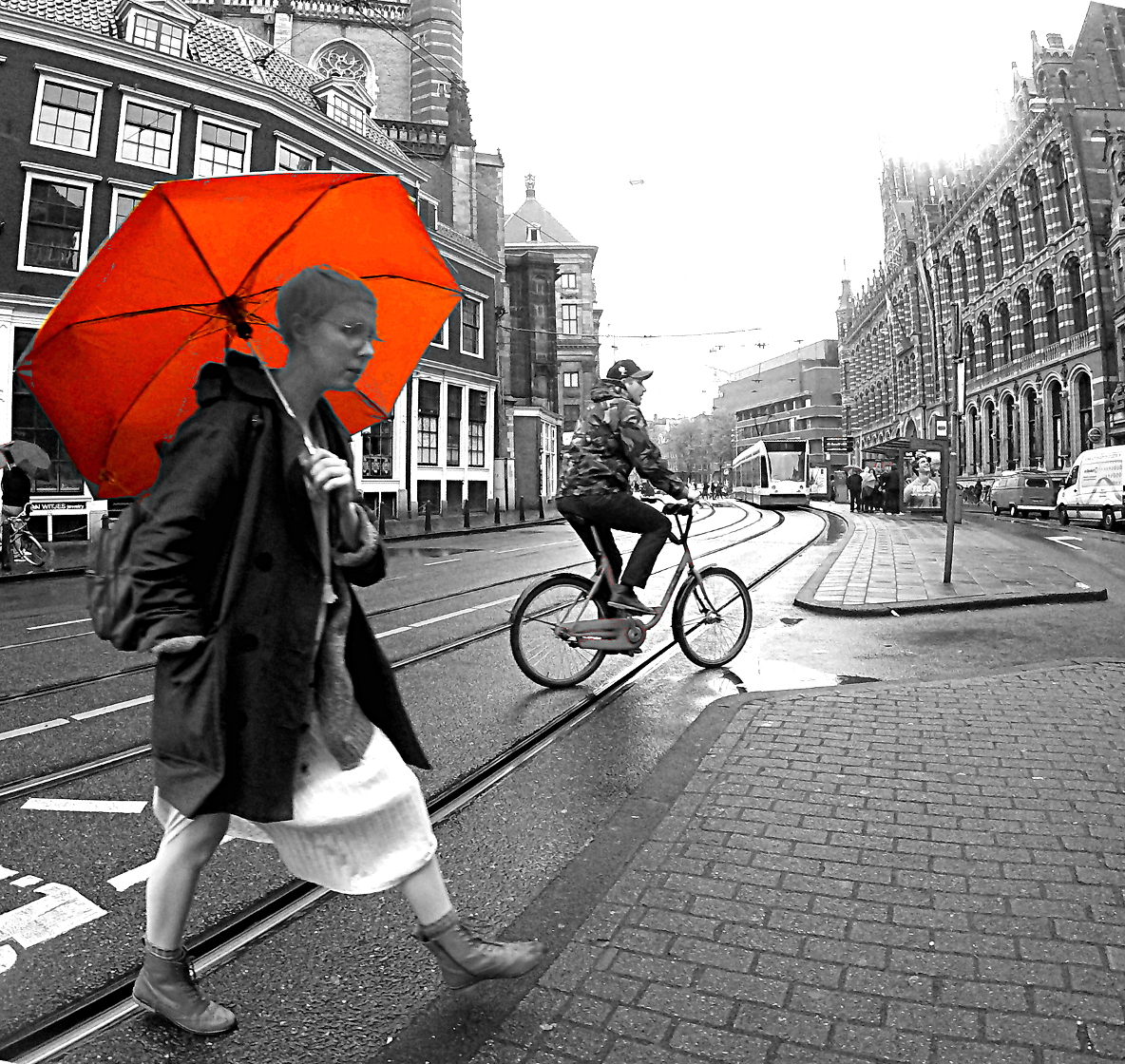
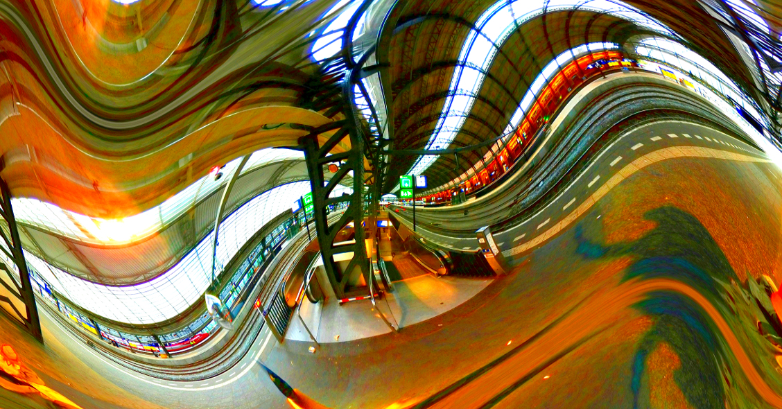
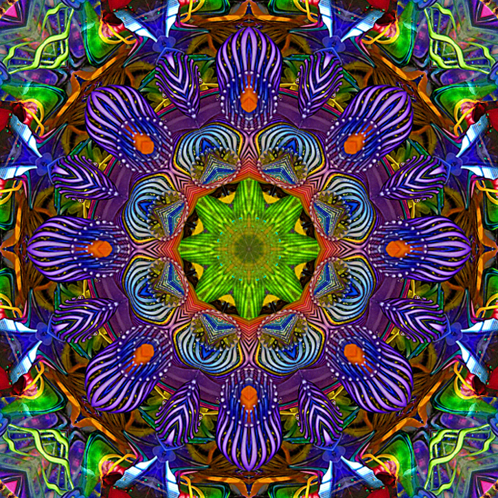
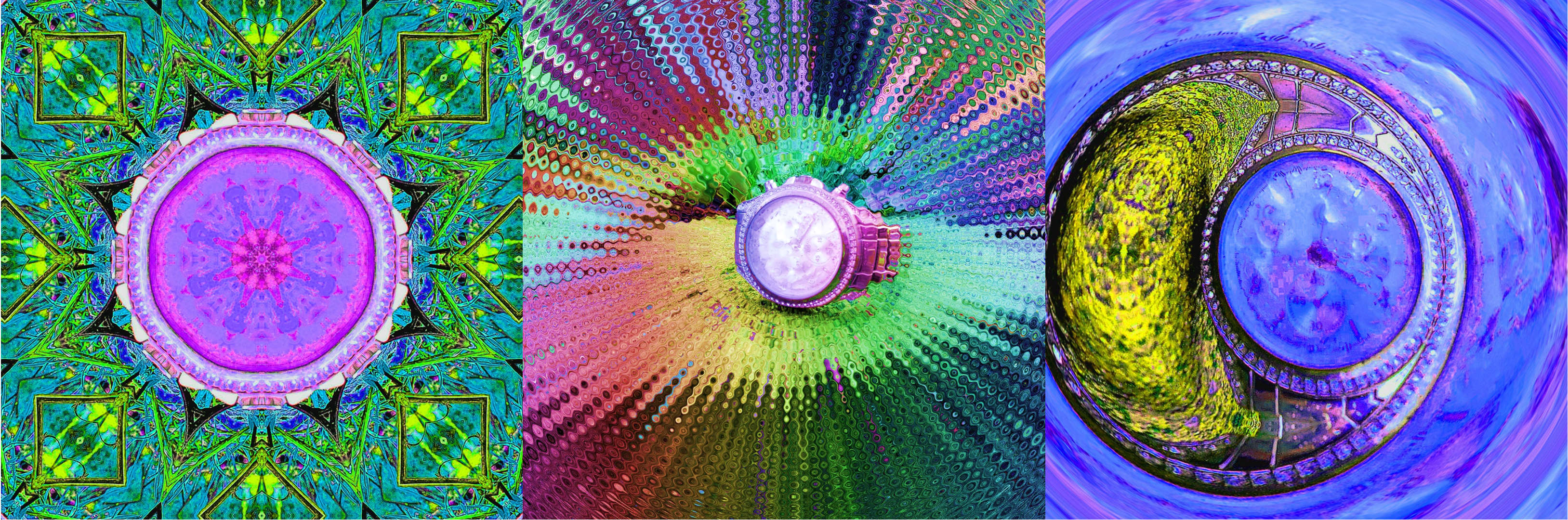
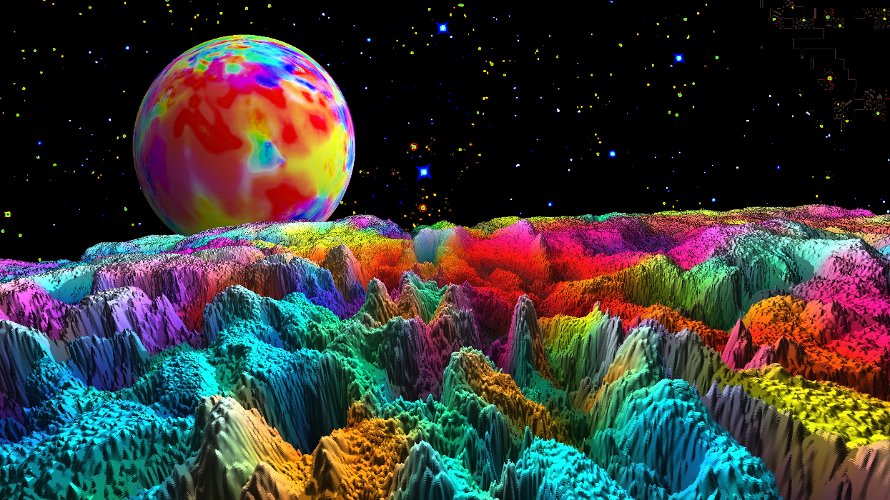
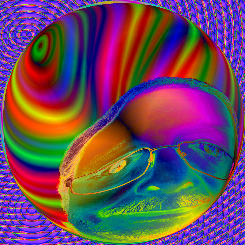
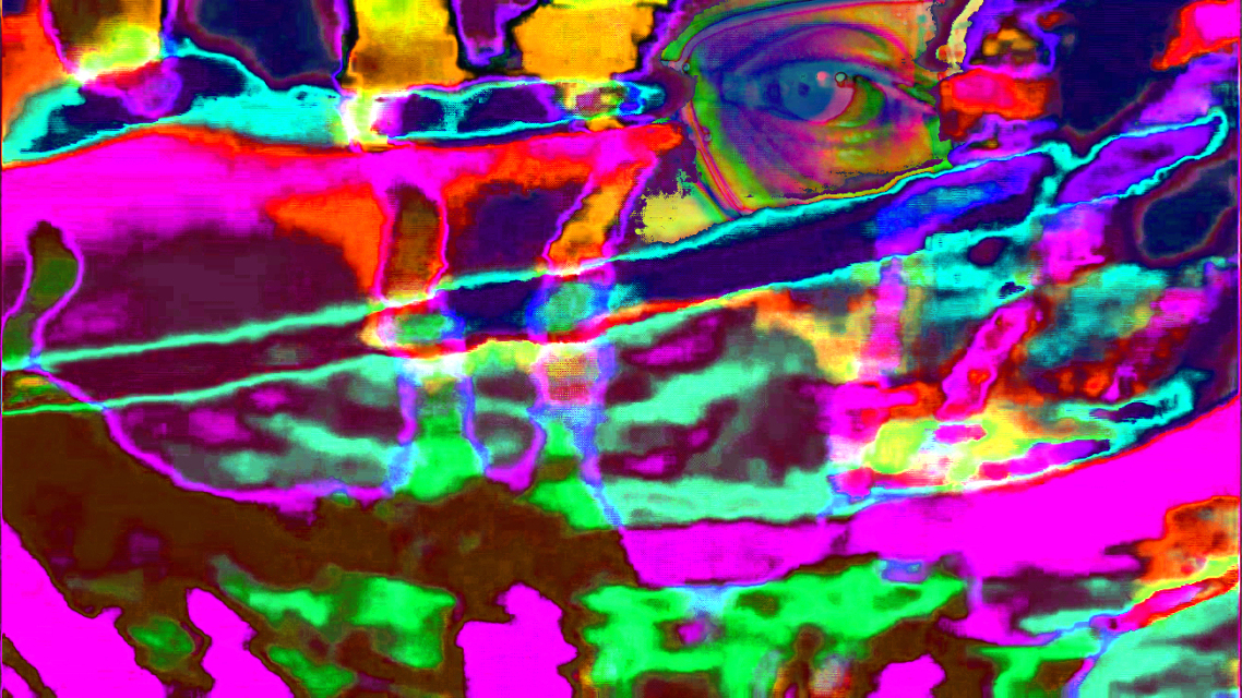
Thank you for your kind comments. Here is a twirled example @.72. |
Jan 26th |
 |
| 21 |
Jan 19 |
Reply |
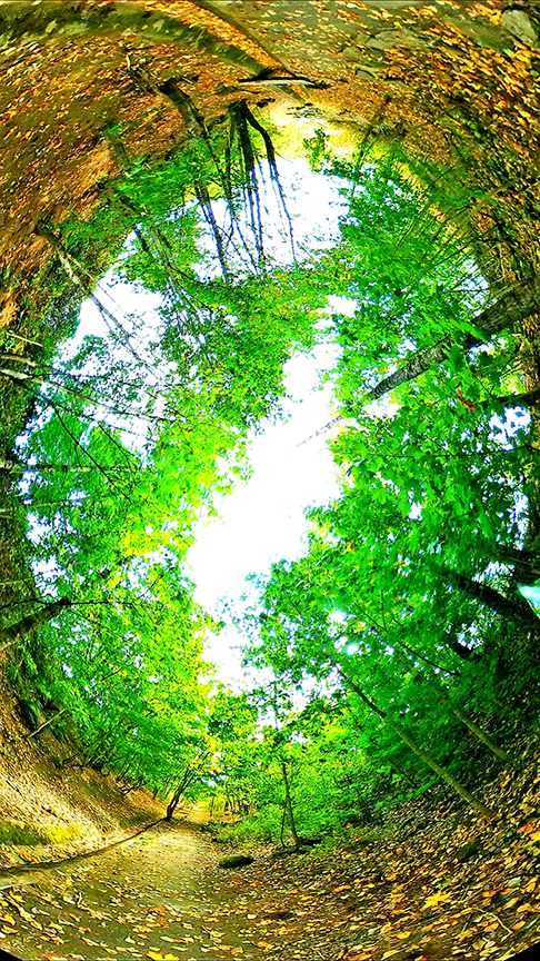
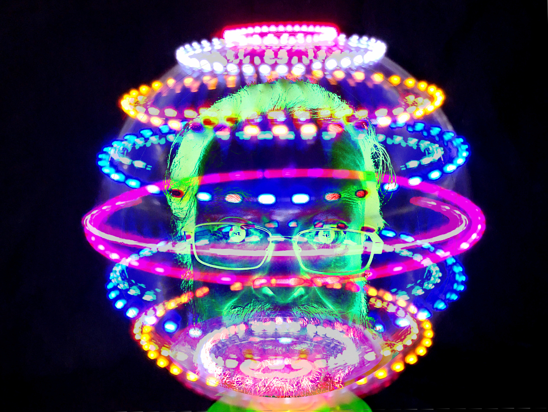
I like this amended version best. Great color balance, and it looks surreal without feeling unnatural.
|
Jan 23rd |
| 21 |
Jan 19 |
Reply |
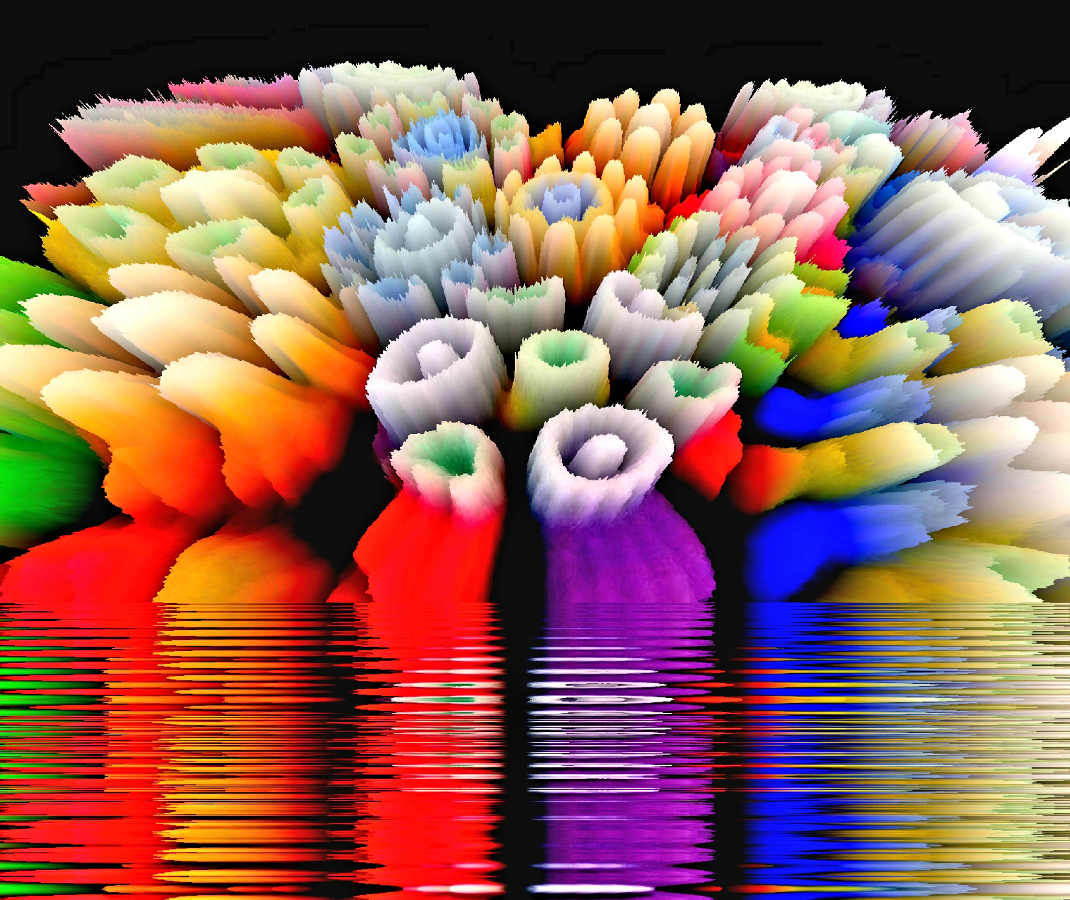
Thank you for your comments, and for looking at the finished 3d. My obsession with depth and perspective probably influences my perception. Ultimately I hope to create 3d-360 animation in a similar style.
Side note... Kaleidoscopes and stereoscopes were invented by the same person. |
Jan 23rd |
| 21 |
Jan 19 |
Reply |
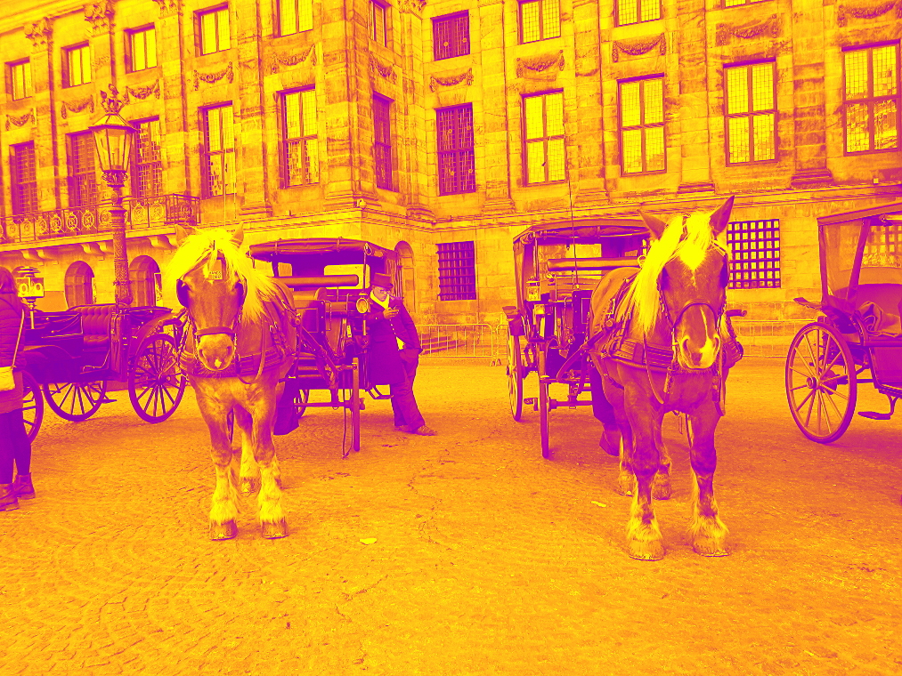
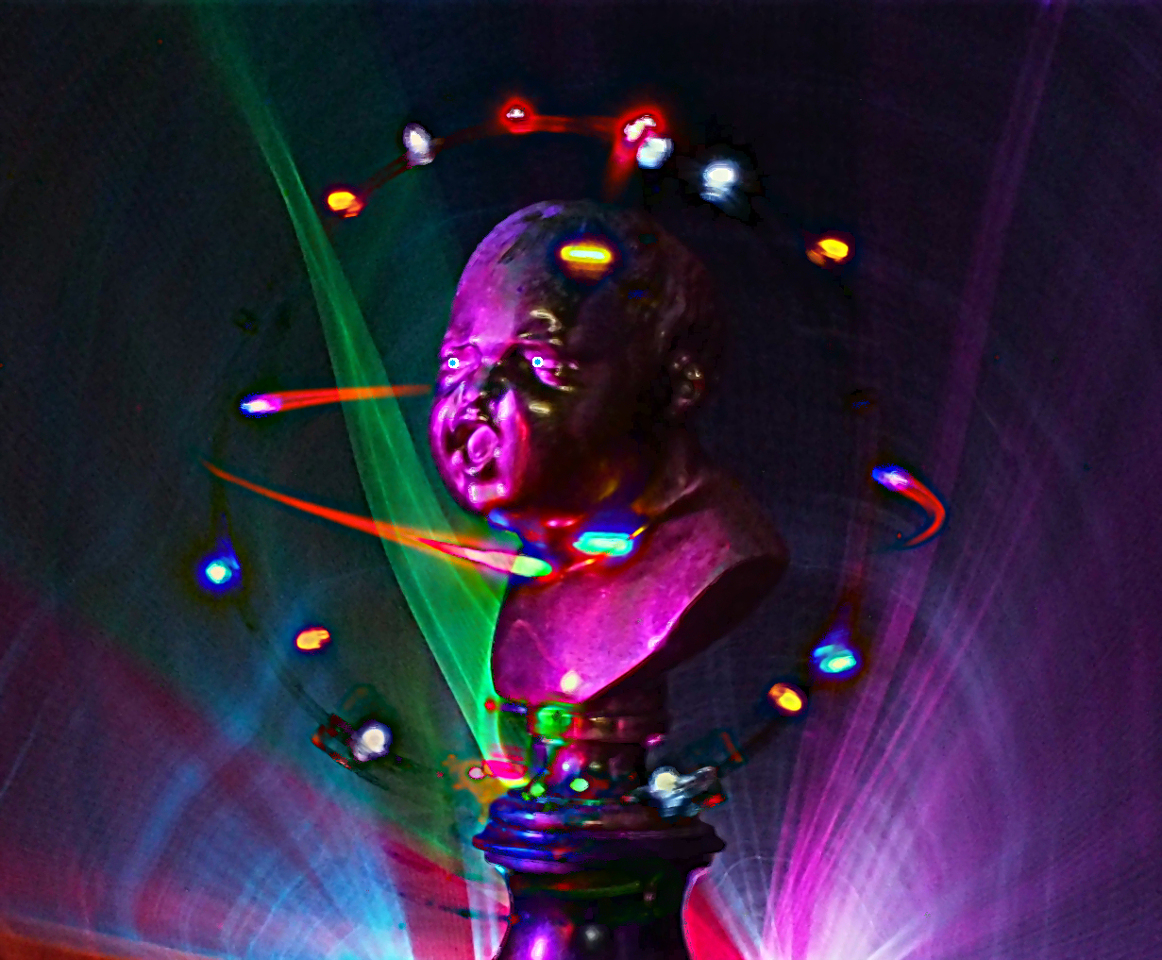
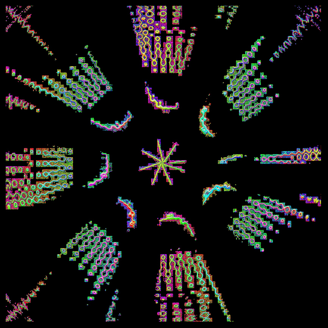
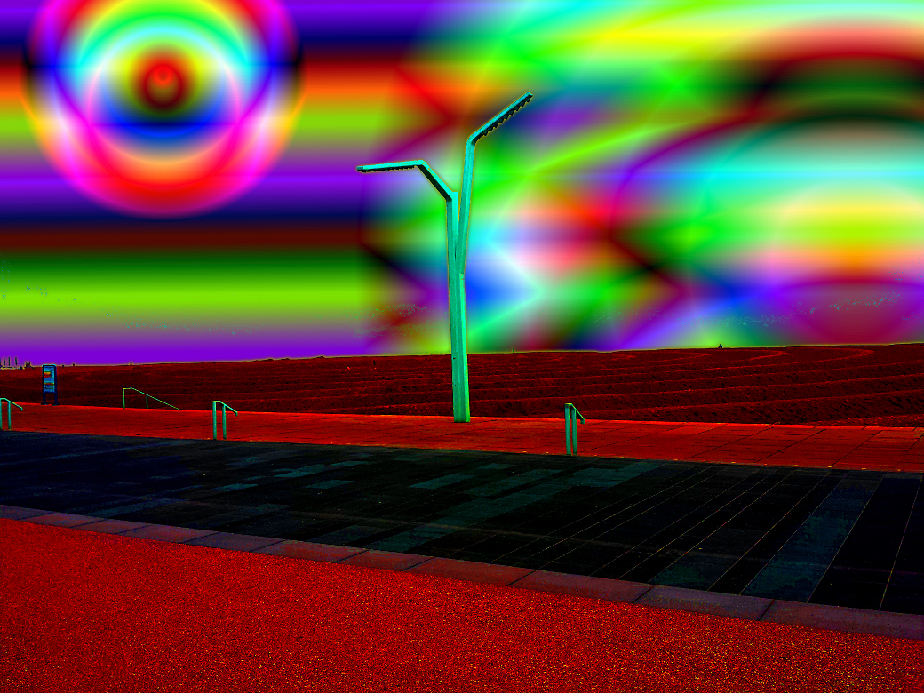
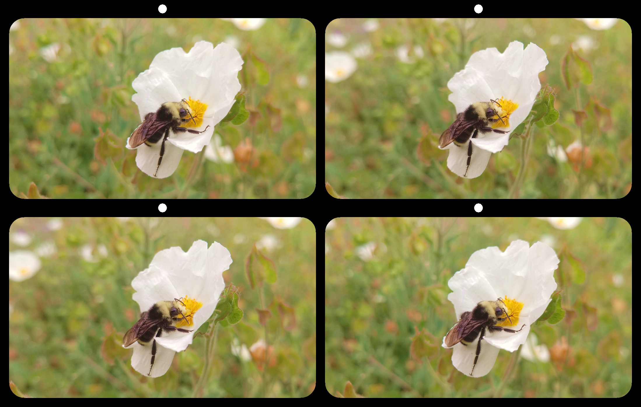
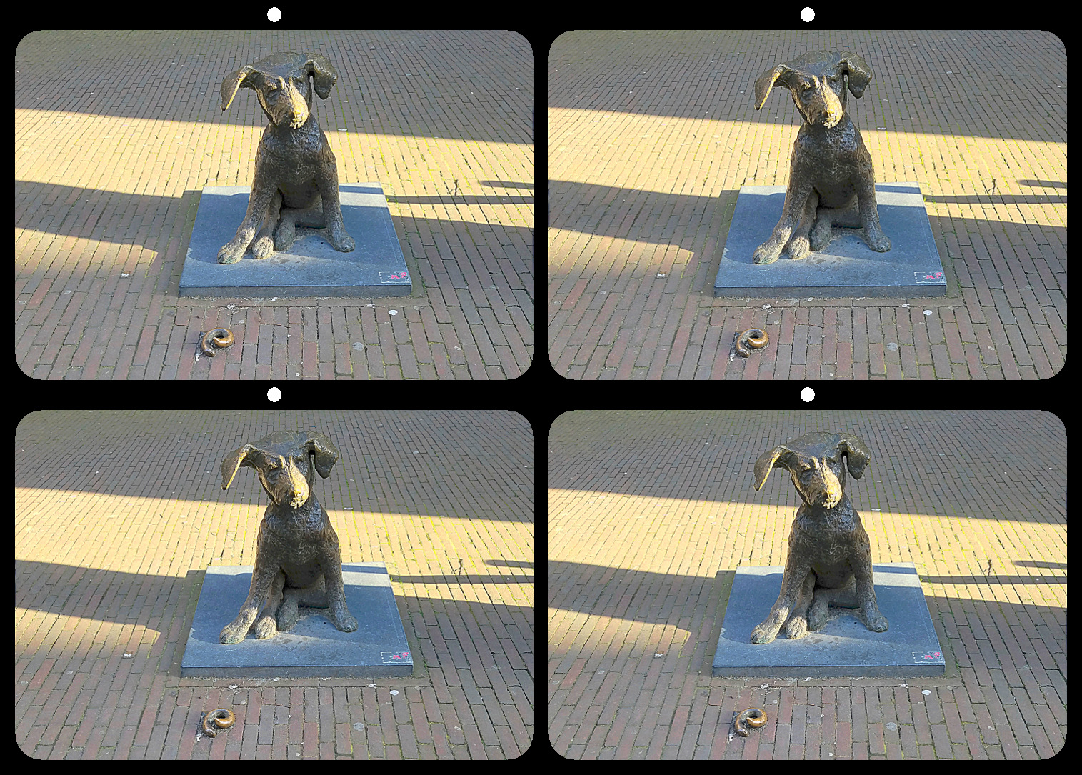
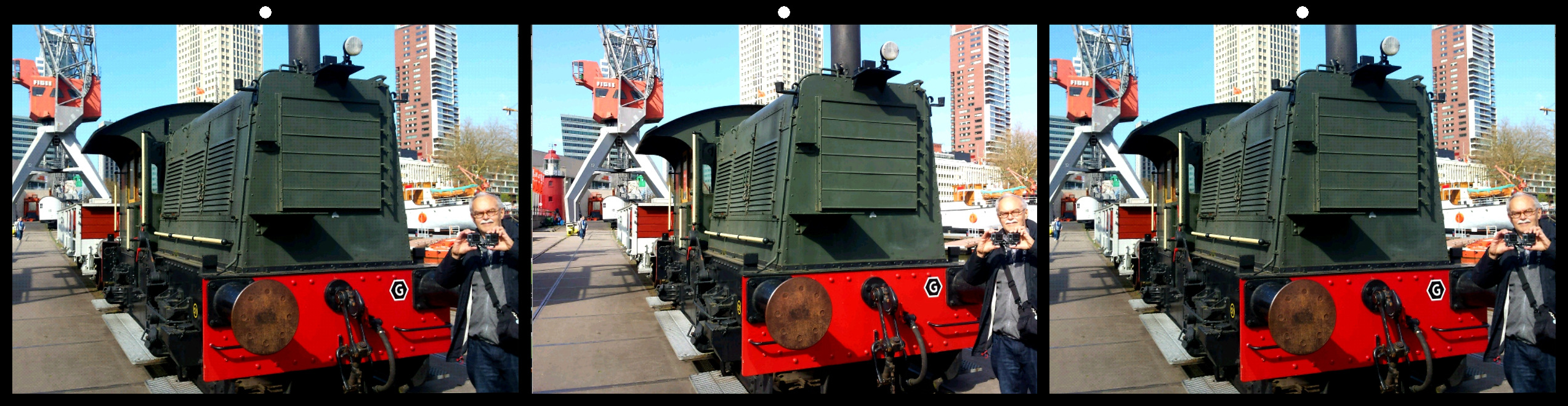
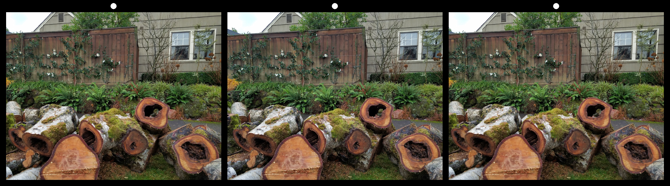
The dots are only a quick example of one way to add depth, and not intended to improve the image. They are meant only as a way to illustrate that an image can become more dynamic if we go beyond the surface by adding simple depth cues. |
Jan 23rd |
| 21 |
Jan 19 |
Reply |
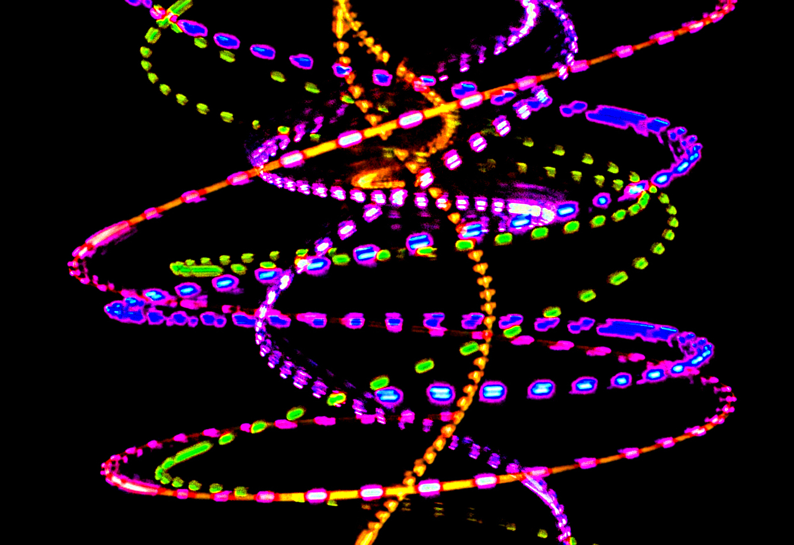
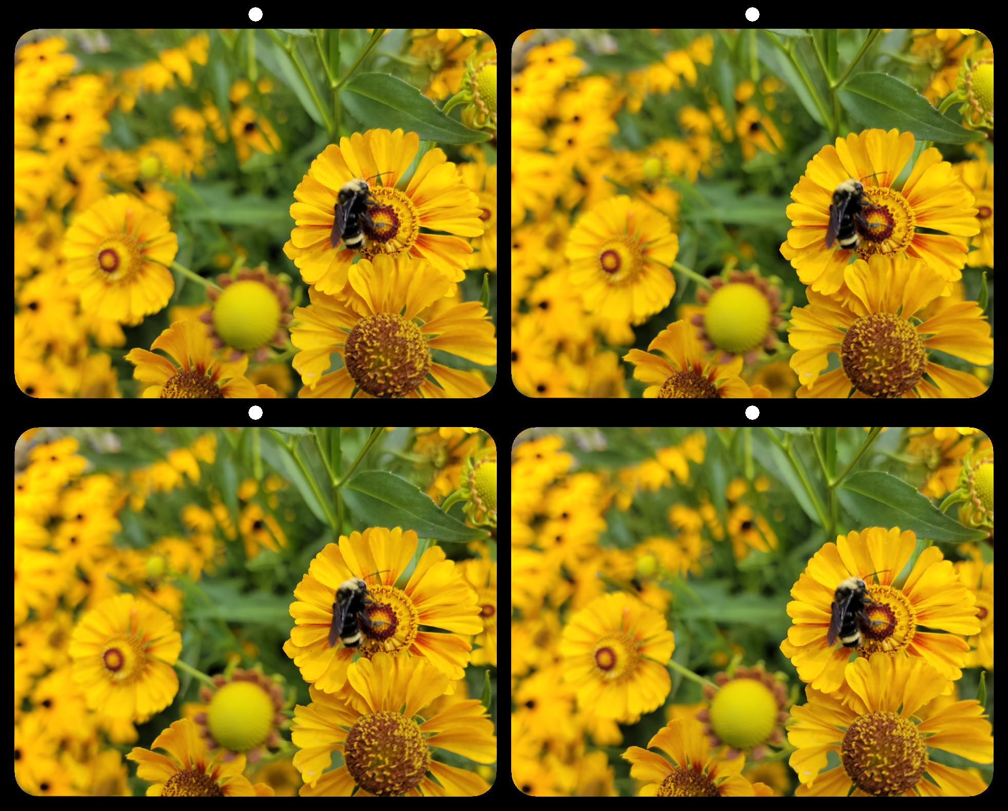
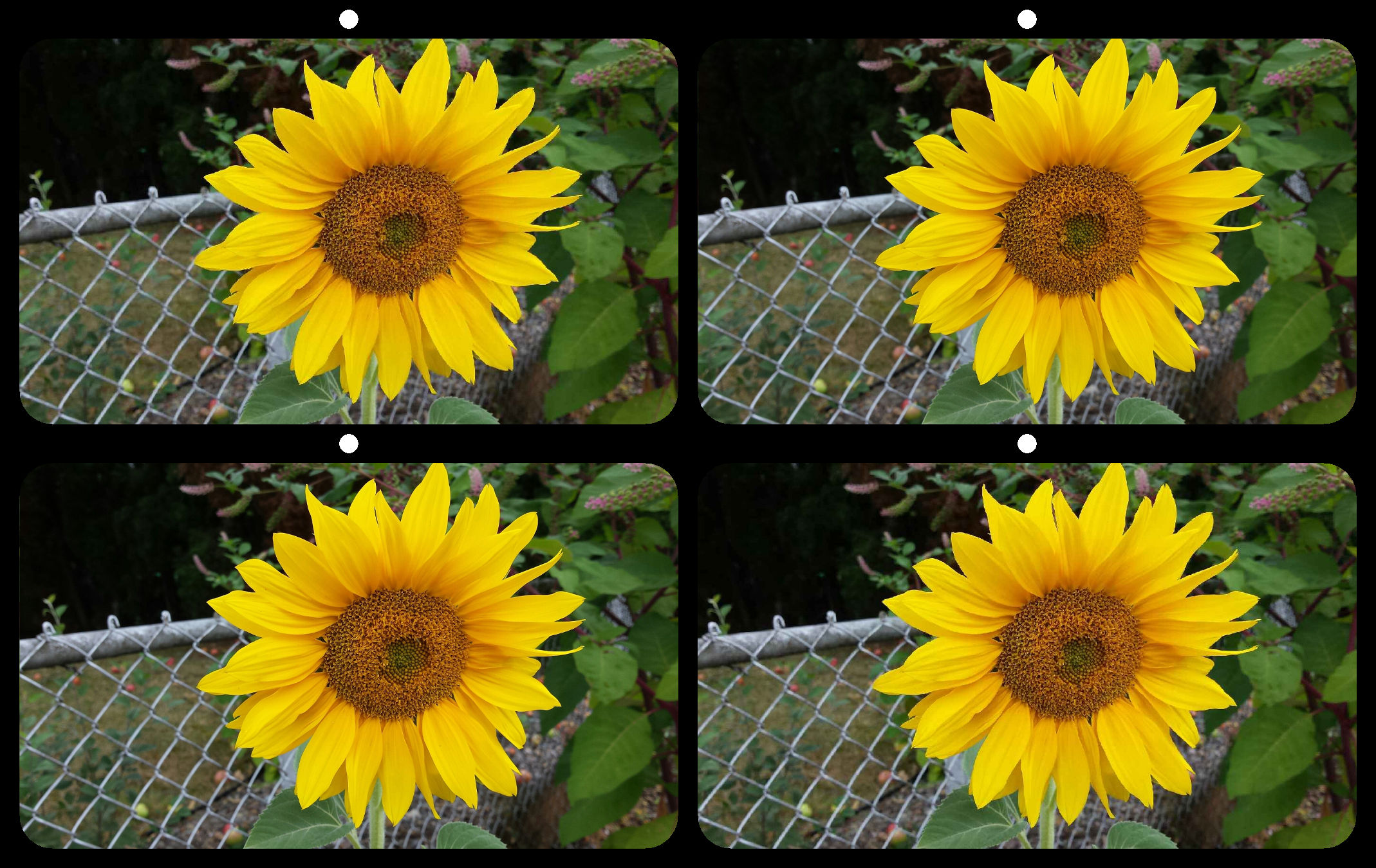
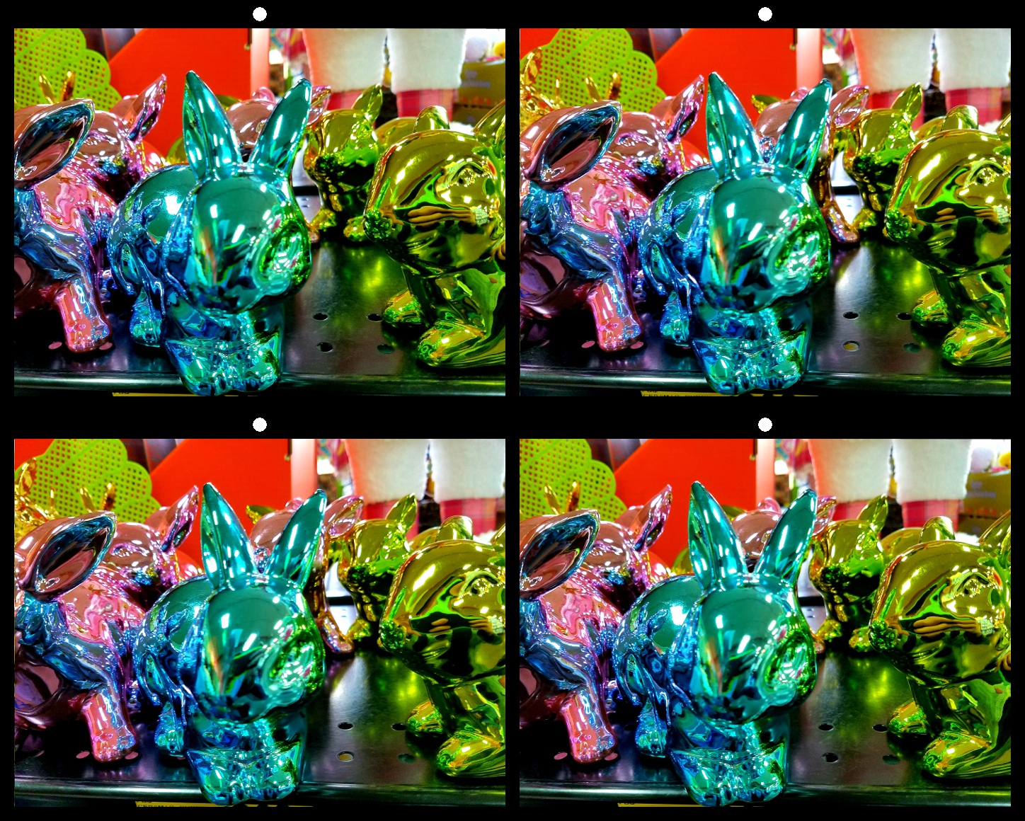
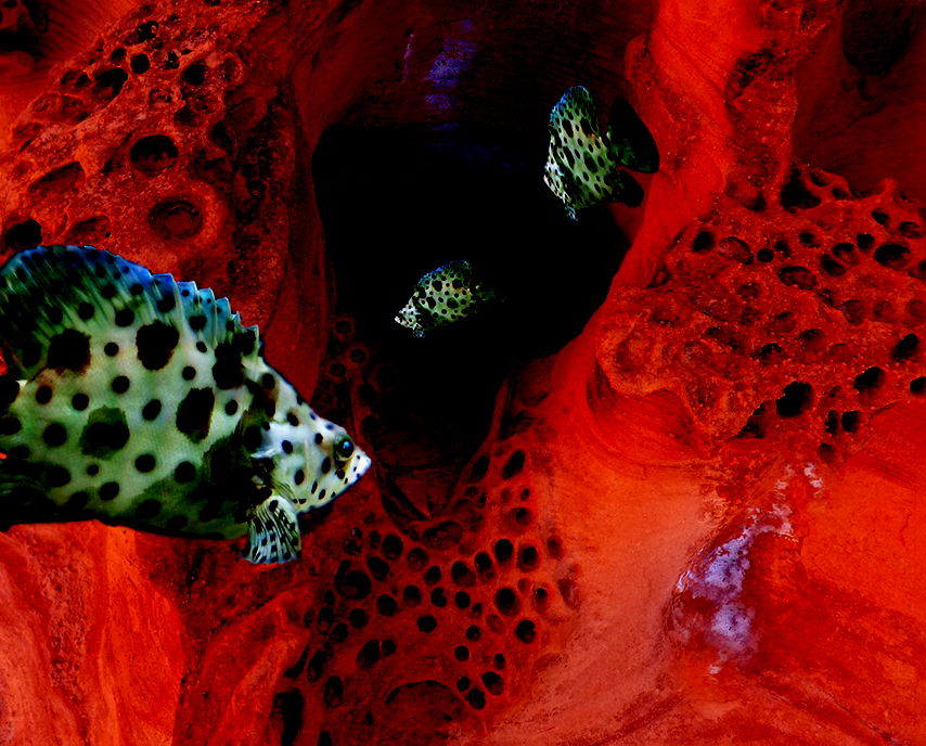
Brian, The black is excellent as a backdrop for the subject, but it doesn't give any spacial cues to the scene. It makes the scene seem less dynamic to me.
I've attached an example of another method for introducing a sense of depth to a space. I've added three tiny blue dots. 1, 2, and 3 pixels each.
These are just my impressions, and I still love the image as it is. Your results may vary. |
Jan 22nd |
 |
| 21 |
Jan 19 |
Reply |
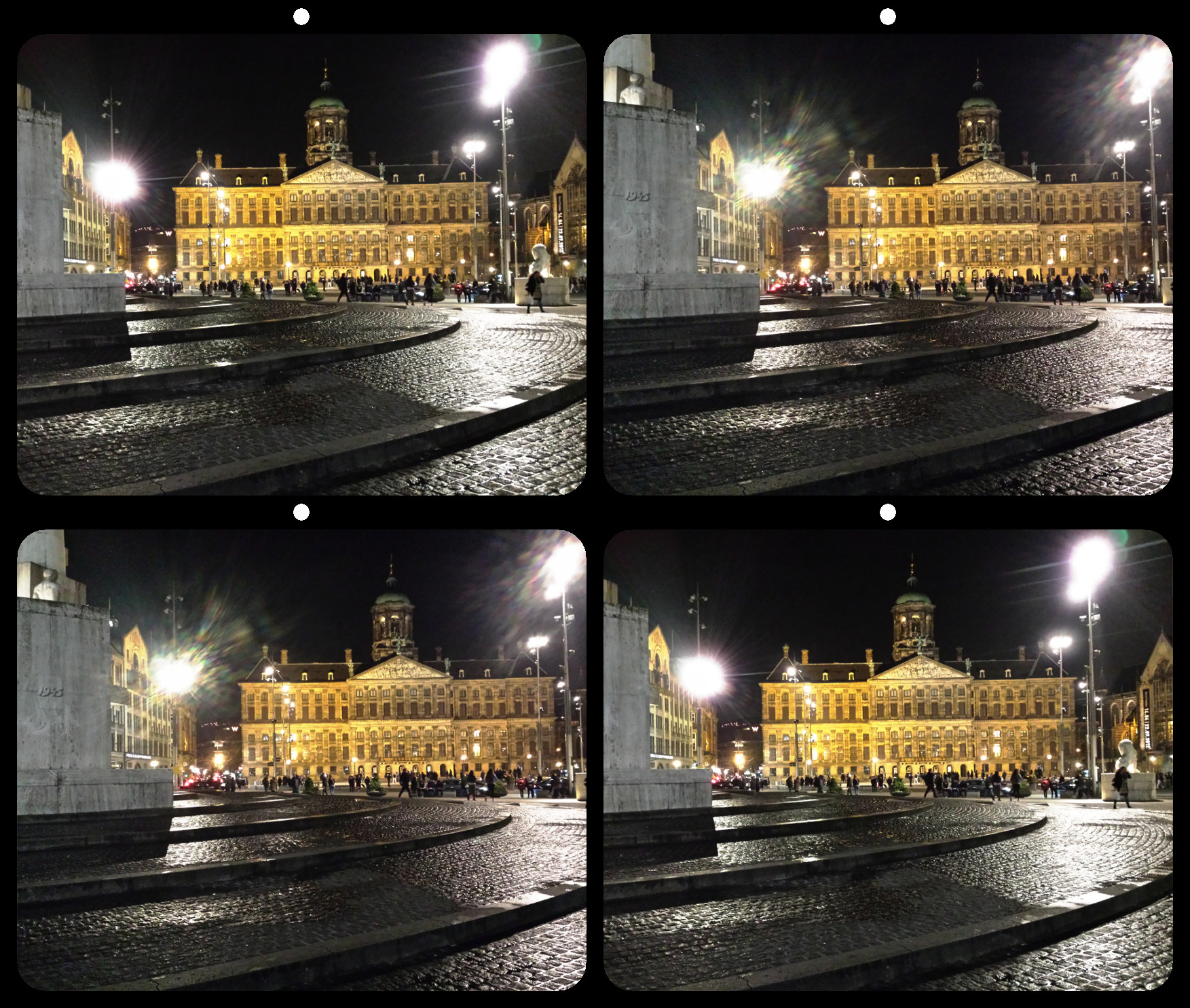
Peter, When I see the image, it is the whole image. Not just the subject. To my eye the black space draws my attention away from the subject, rather than through it. |
Jan 22nd |
| 21 |
Jan 19 |
Reply |
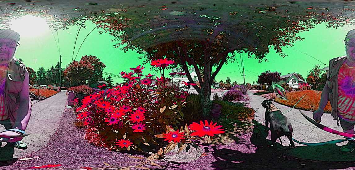
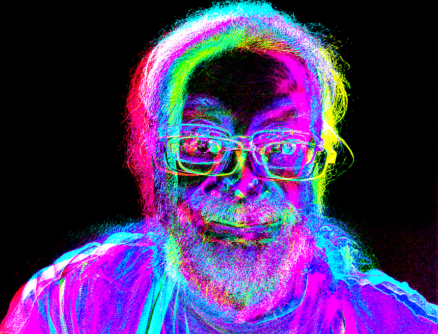
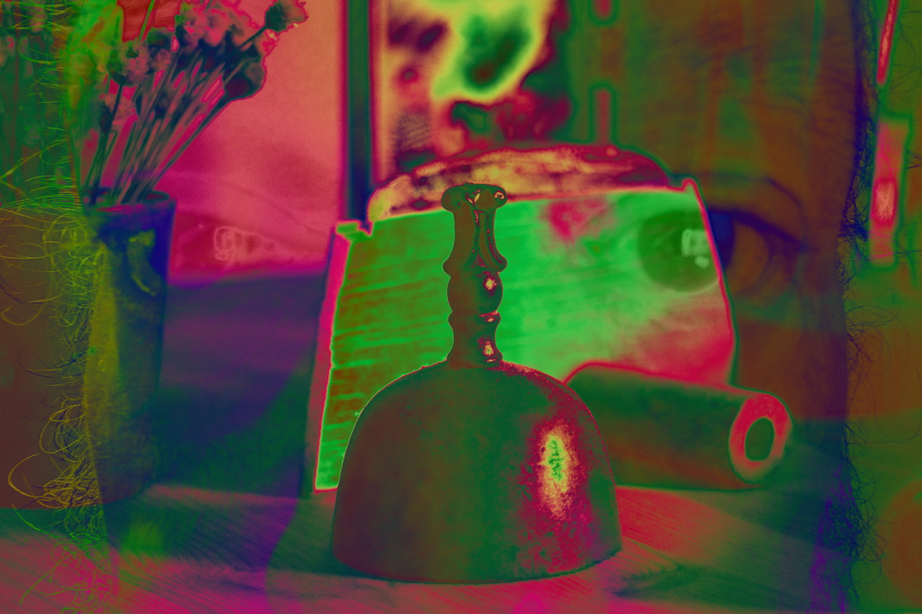
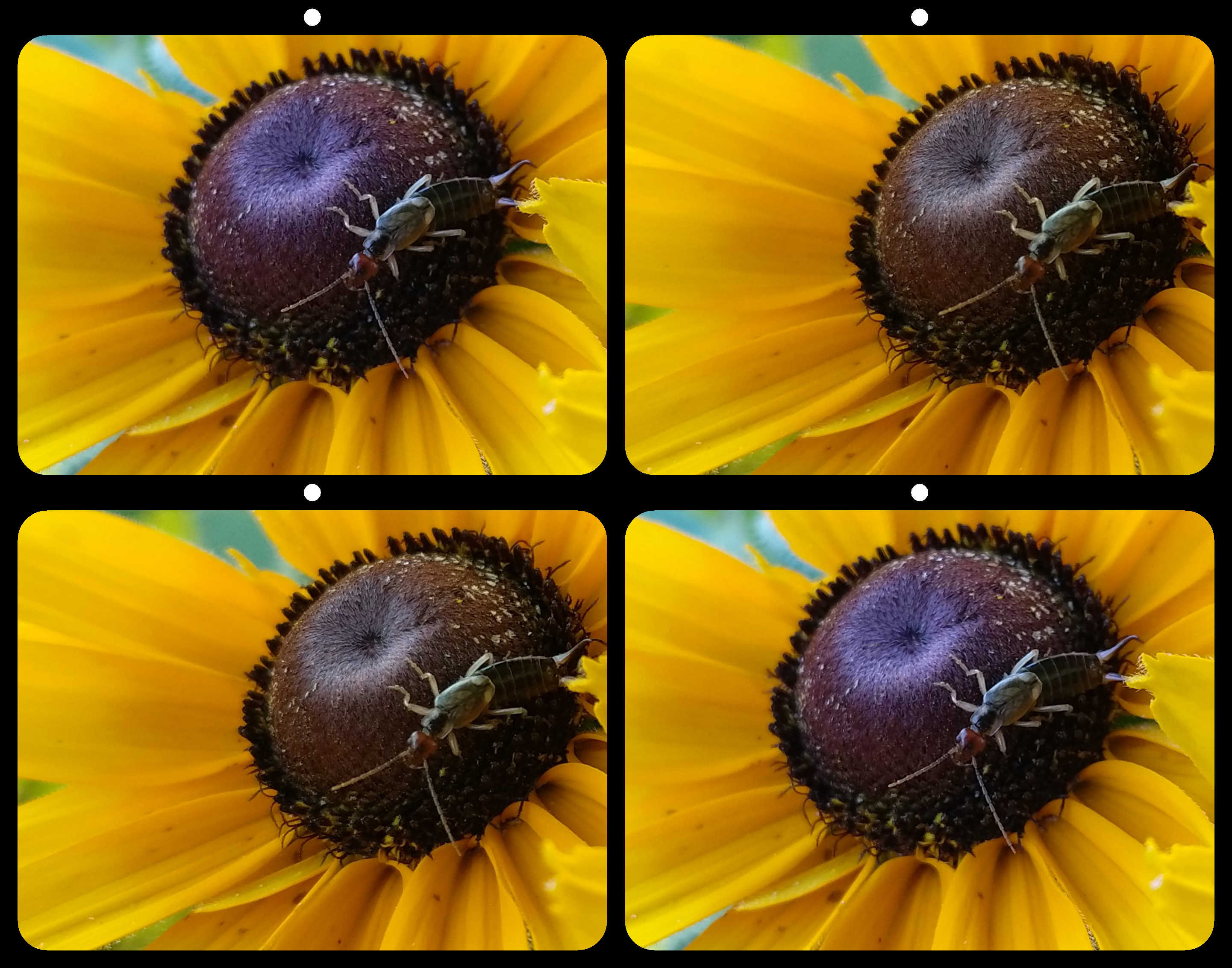
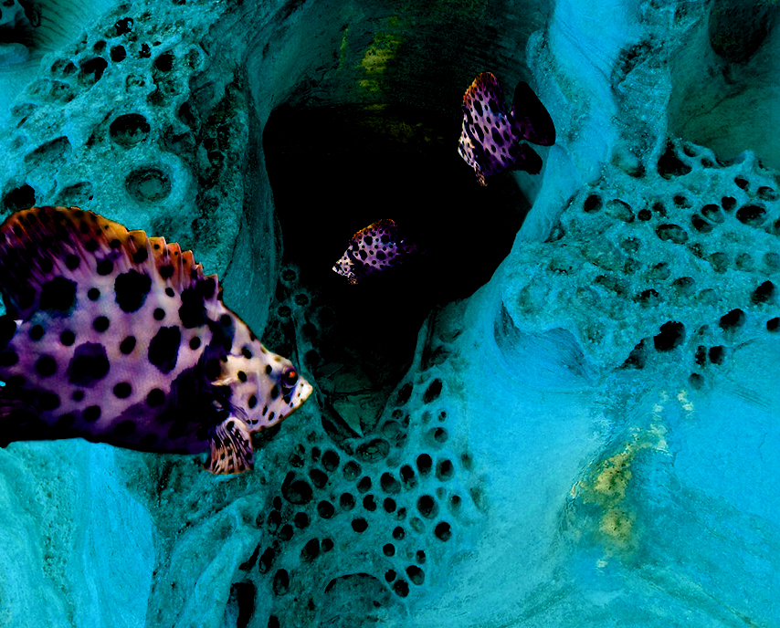
I've also attached the image with only the Subtracted layer visible. |
Jan 11th |
 |
| 21 |
Jan 19 |
Comment |
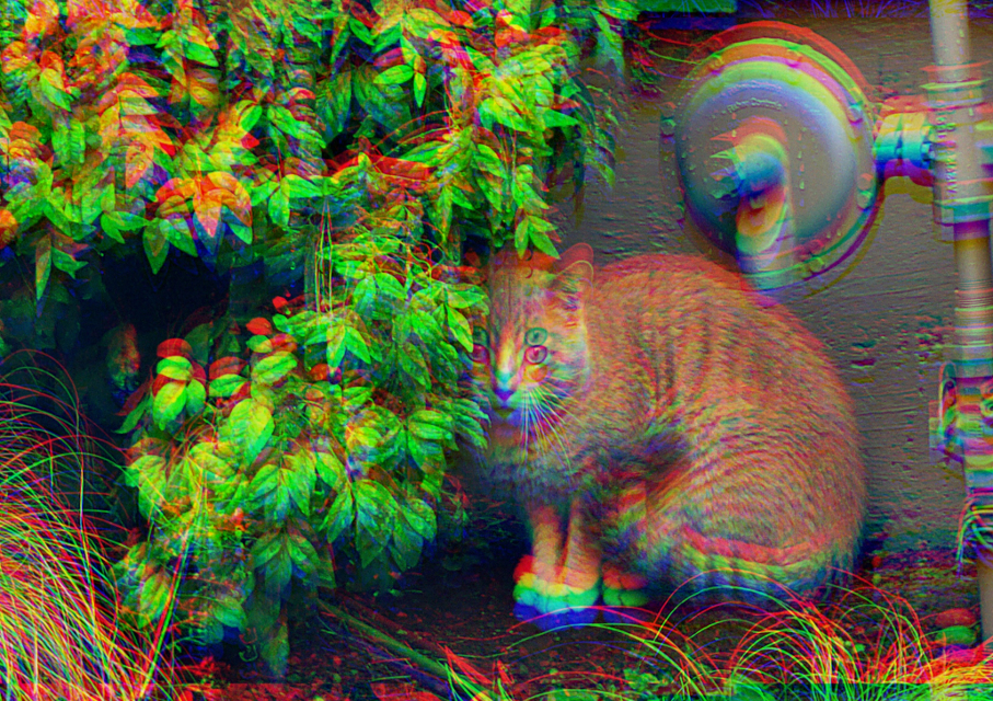
Terrific composition, and I like the colors. But you're right that the rock textures seem unnatural. When looking at the fish, they don't seem completely integrated due to the contrasting textures.
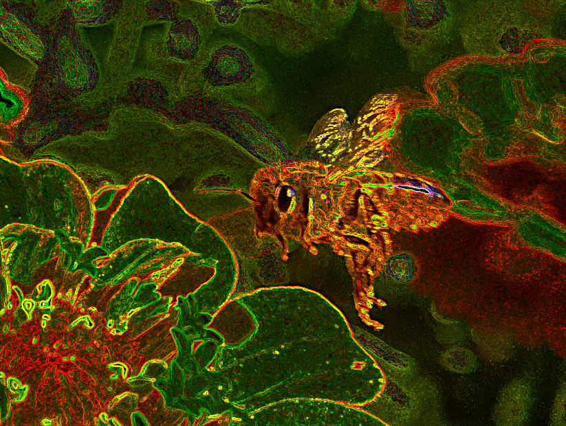
I opened your original in Gimp, then opened your inverted image as a layer. I matched the layer size, dropped the opacity to 50% and aligned the two layers. I restored the opacity of the top (inverted) layer, and changed the layer mode to Subtract. Next, I created another duplicate layer, and changed it's mode to Hue. I've attached the result. |
Jan 11th |
 |
| 21 |
Jan 19 |
Comment |
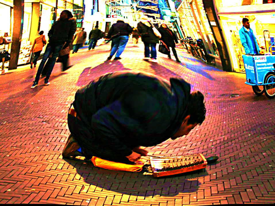
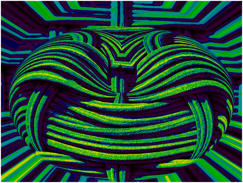
I love it. I haven't been able to try this filter yet. I'm temporarily without photoshop, and I haven't mastered installing plug ins for gimp, so I'm not much use for technical comments. The one thing that stares back at me when I look at this image is the large negative space emanating from the bottom right. While the objects reflect a left-right movement, the movement is buffered by the space. I might have considered adding a subtle lighting effect, beaming from top left toward that bottom right corner to push the eye through the darkness. |
Jan 11th |
| 21 |
Jan 19 |
Comment |
Excellent. I love the textures and the contrast. I couldn't think of anything that I'd change or add.
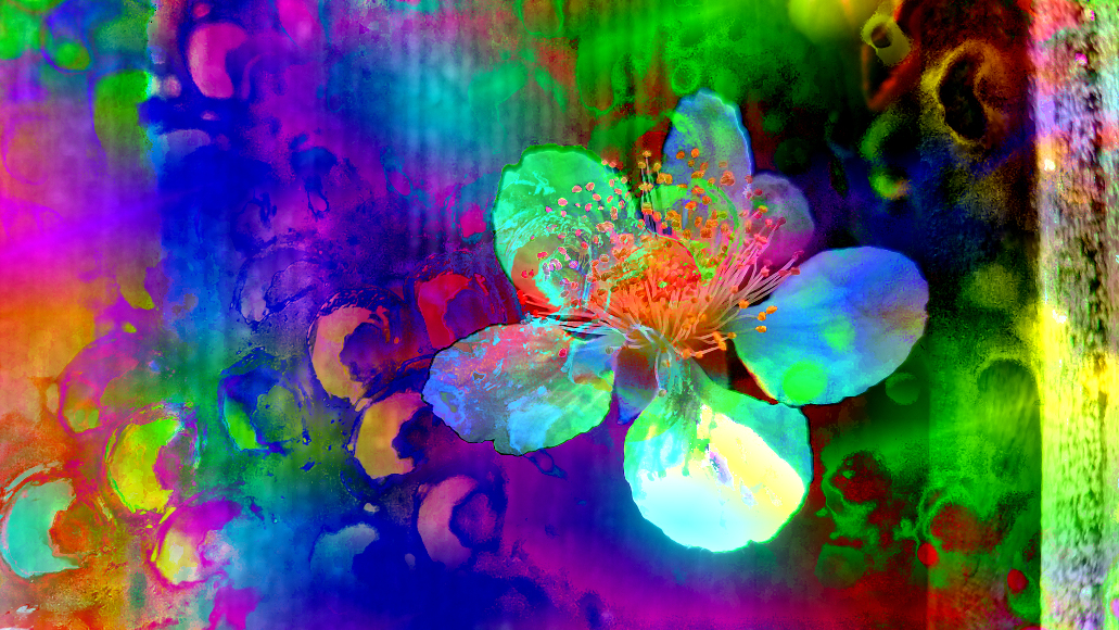
...But I added color in gimp anyway just to see what would happen. :)
I made a duplicate layer, set the gradient to Full saturation spectrum CW, and used Color-Map-Gradient. Then I changed the layer mode to Multiply, and added a bit of brightness and contrast.
I still like yours better. |
Jan 11th |
 |
| 21 |
Jan 19 |
Reply |
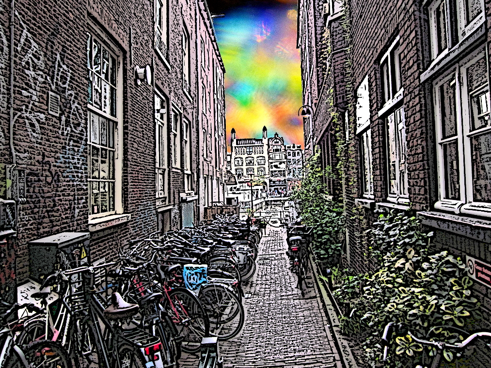
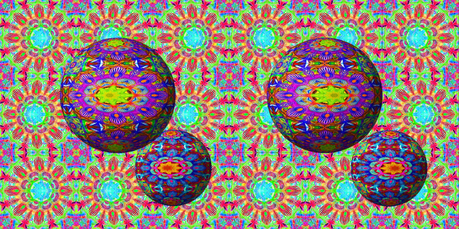
Thank you! Your suggestion of polar coordinates may be useful in an upcoming project. The horizontal symmetry makes it a great option for 3D rendering. |
Jan 10th |
| 21 |
Jan 19 |
Comment |
I like the original. Good horizontal and vertical alignment, good light and shadow contrast, and good color. The inverted image is nice too, but the change makes it a bit harsh. I might have boosted the saturation a bit, maybe warm up the color temperature. But the original is a more pleasing image to my eye. |
Jan 9th |
| 21 |
Jan 19 |
Comment |
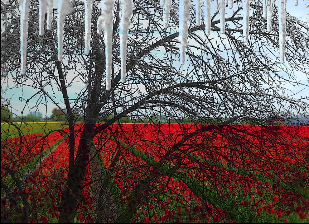
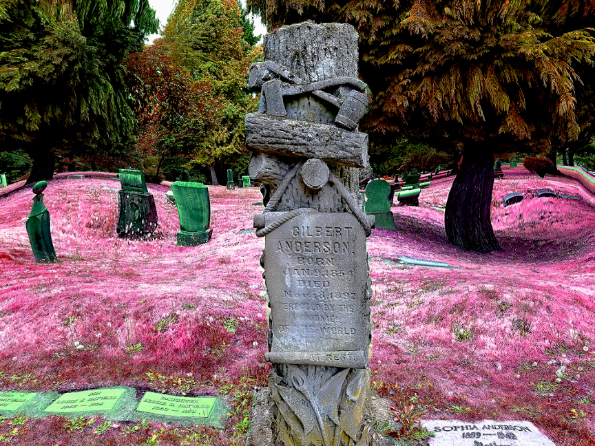
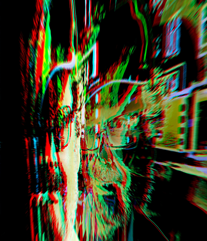
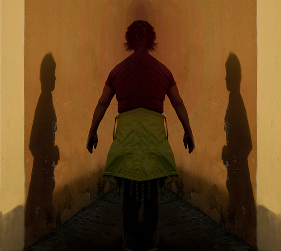
To my eye, the shadow looks like it's painted on the wall. The whole image has a painted feeling reminiscent of Diego Rivera. One thing I noticed is the lack of perspective behind the central subject. I added black and red shadow layers in gimp to emphasize space behind the subject. |
Jan 6th |
 |
| 21 |
Jan 19 |
Reply |
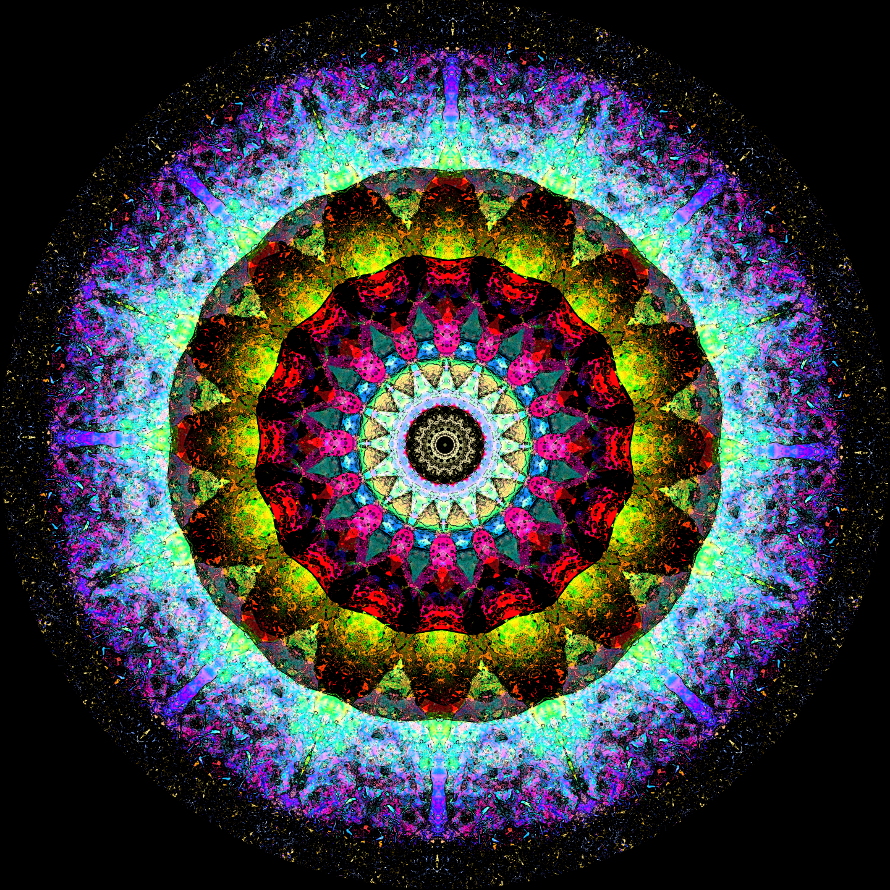
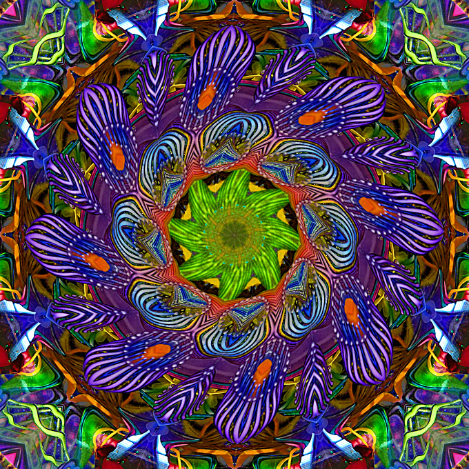
Thanks for your observations. I like the glow effect, but while the increased sharpness and contrast adds richness to the color, it also adds graininess to the lines. I had tried sharpening it more but decided this version had the best overall clarity. The center lines are not pronounced, but visible (especially at higher resolutions). |
Jan 6th |
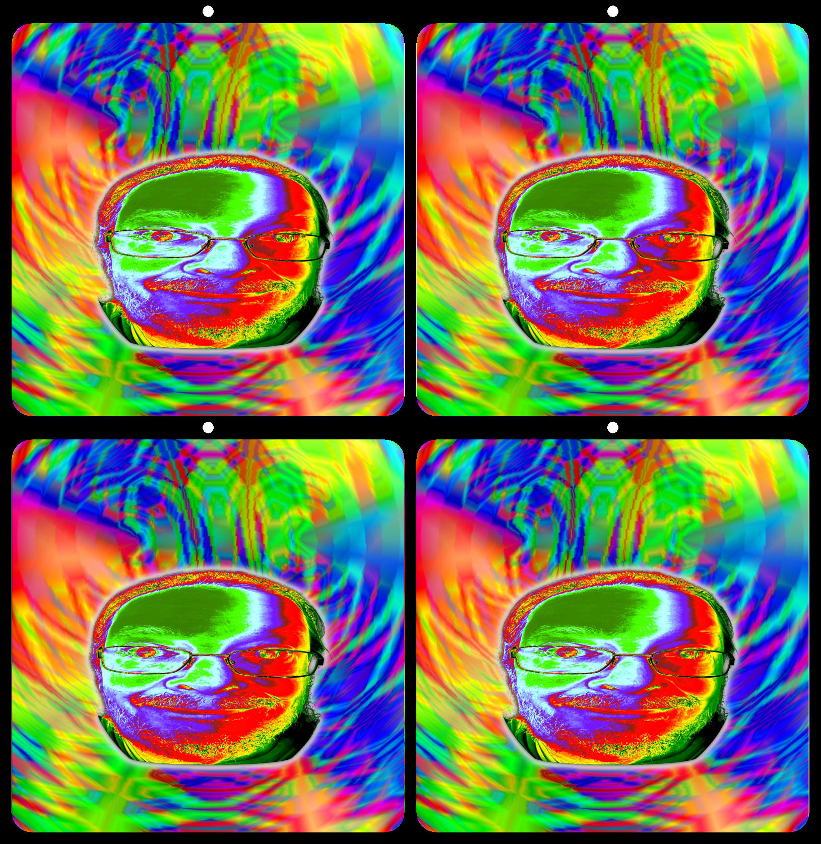
| 21 |
Jan 19 |
Comment |
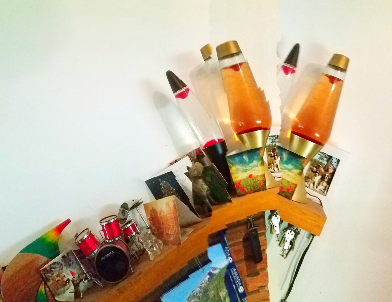
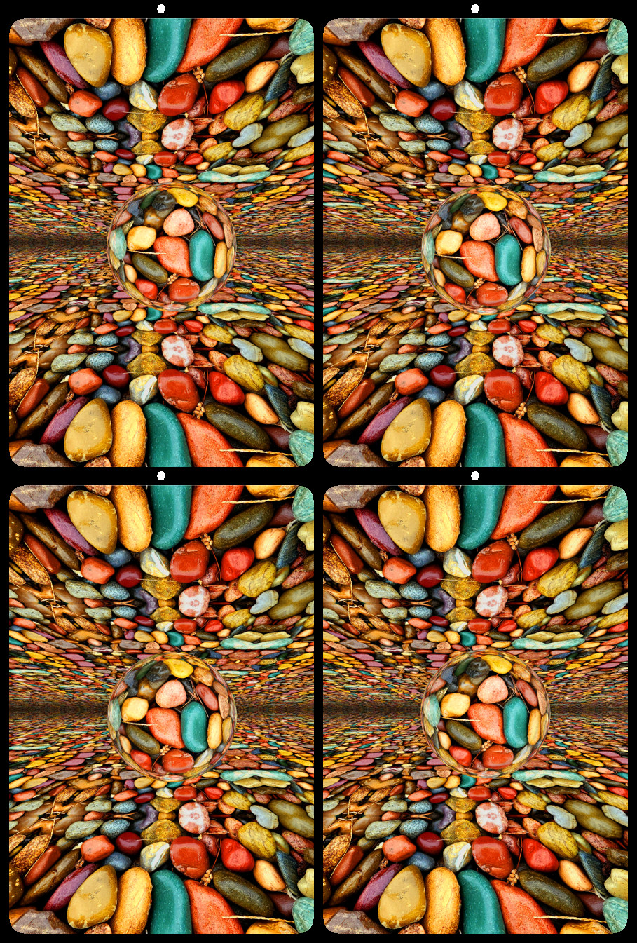
Sorry for the typo. My finished 3D image can be seen in Group 68.
|
Jan 2nd |
6 comments - 9 replies for Group 21
|
| 68 |
Jan 19 |
Reply |
Thank you! I apologize for the technical jargon. I find it difficult to explain in only a few paragraphs, and the different wording between gimp and photoshop makes it all the more confusing. If you have any questions or want to try altered reality 3d, I am happy to elaborate. |
Jan 19th |
| 68 |
Jan 19 |
Reply |
Thanks. In hindsight, I could have added shadows to the background, to better match those on the globes. That might have made it seem less 'flat' in 2D. |
Jan 17th |
| 68 |
Jan 19 |
Comment |
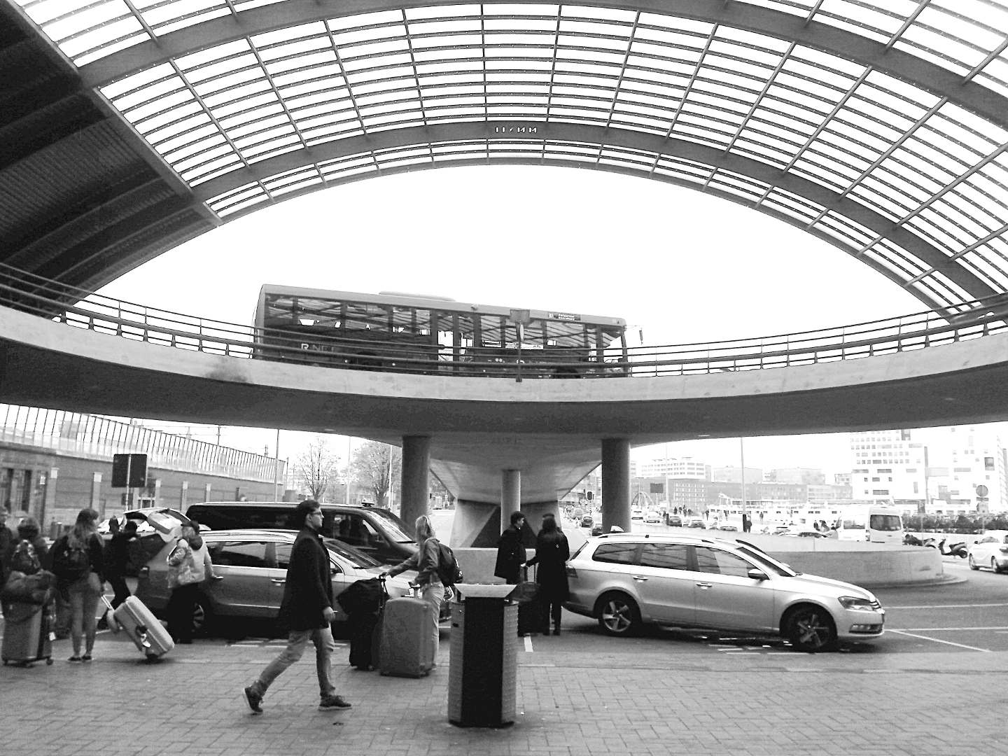
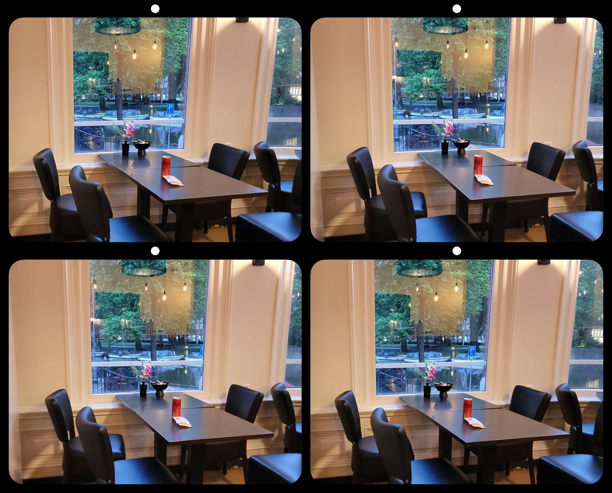
I think the platform tells part of the story, and helps define the space. It literally points to the action. Also, its blue color helps me notice the green water as a point of interest. And cropping would take away the shallow depth of the water, which is again part of the story. Instead of cropping, another idea might be to give the sky a bit more saturation to balance the blue of the dock. |
Jan 17th |
| 68 |
Jan 19 |
Reply |
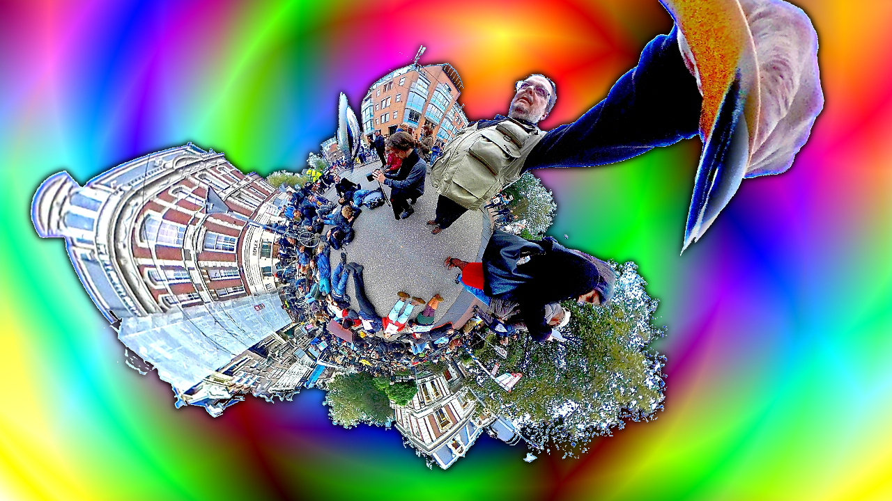
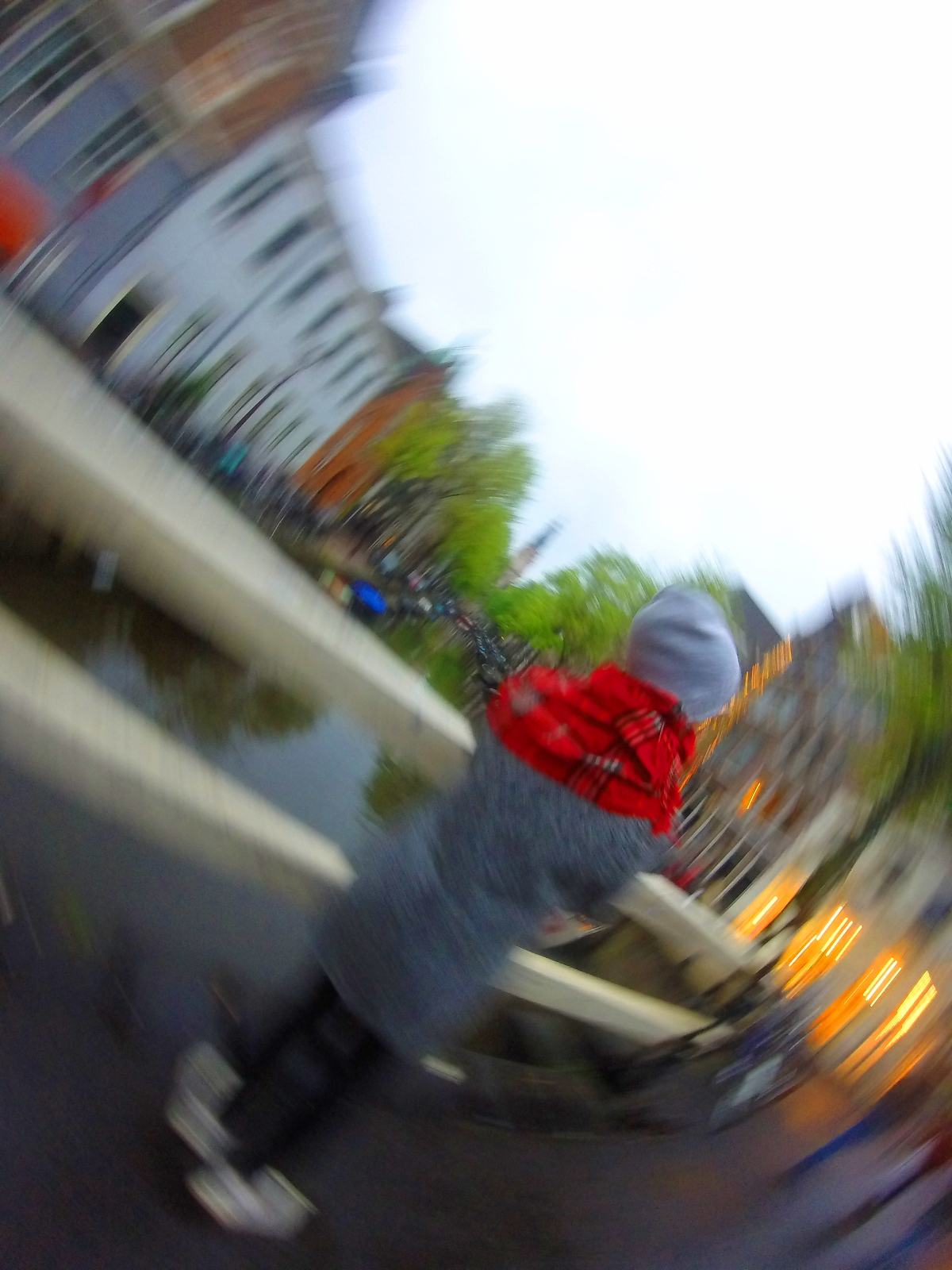
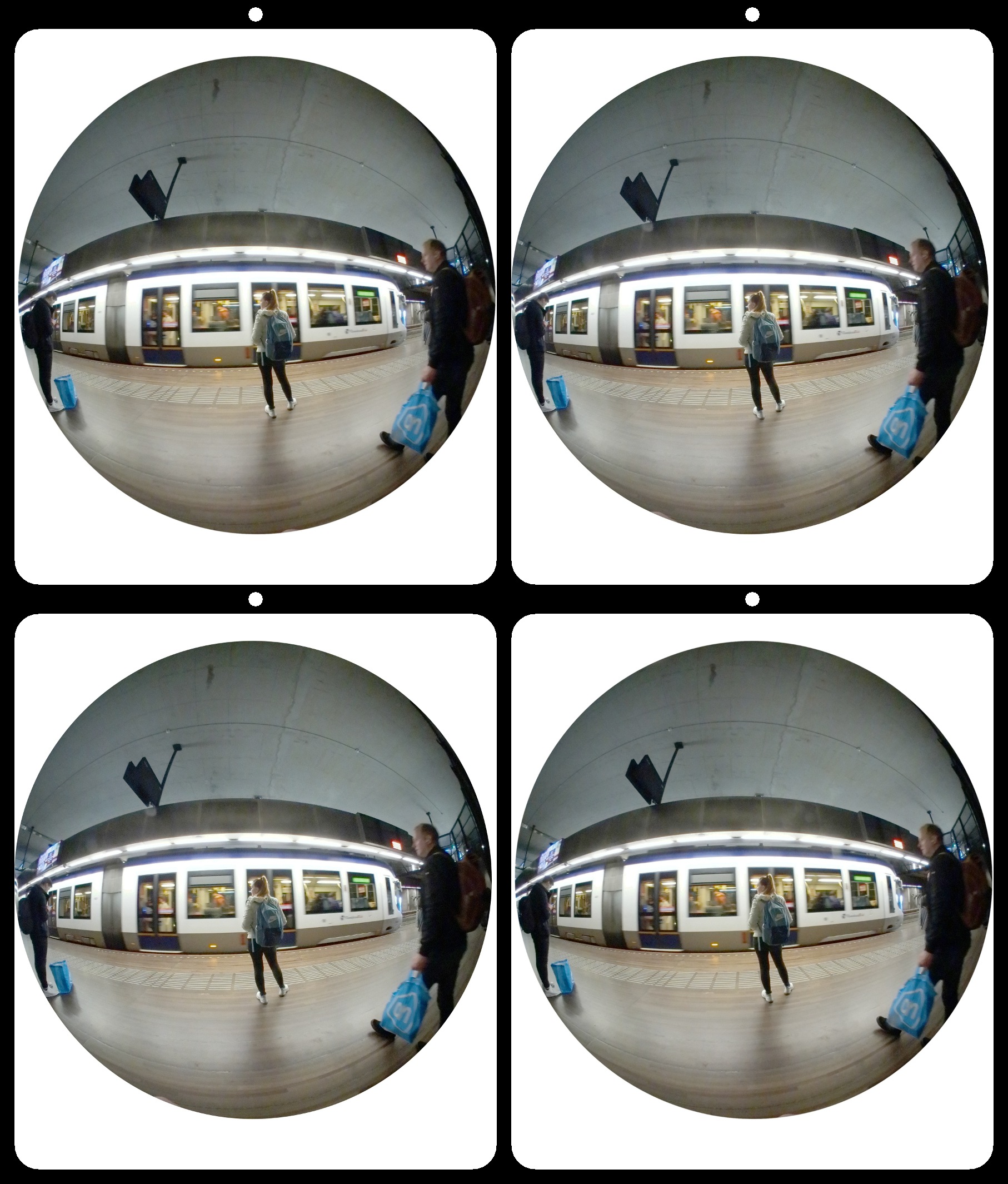
Hello David. I'm glad I found my way into this group.
I am a big fan of artists like Escher and Dali who used distortion of perspective. I guess that's part of my fascination with hyper-stereo too. This image was created over four days, and took about 11 hours total. Much of that was wasted time because it was originally going to be part of an animation, so I created hundreds of layers that never actually became part of the image. If I had set out to make this image as it is, it would have taken about 4-5 hours. |
Jan 14th |
| 68 |
Jan 19 |
Reply |
Thank you. I started with a Realist too. Now I use many different cameras and rigs depending on my subject. The original stereo pair for this project was shot with my Samsung S7 smartphone, for it's close focus capability. |
Jan 14th |
| 68 |
Jan 19 |
Reply |
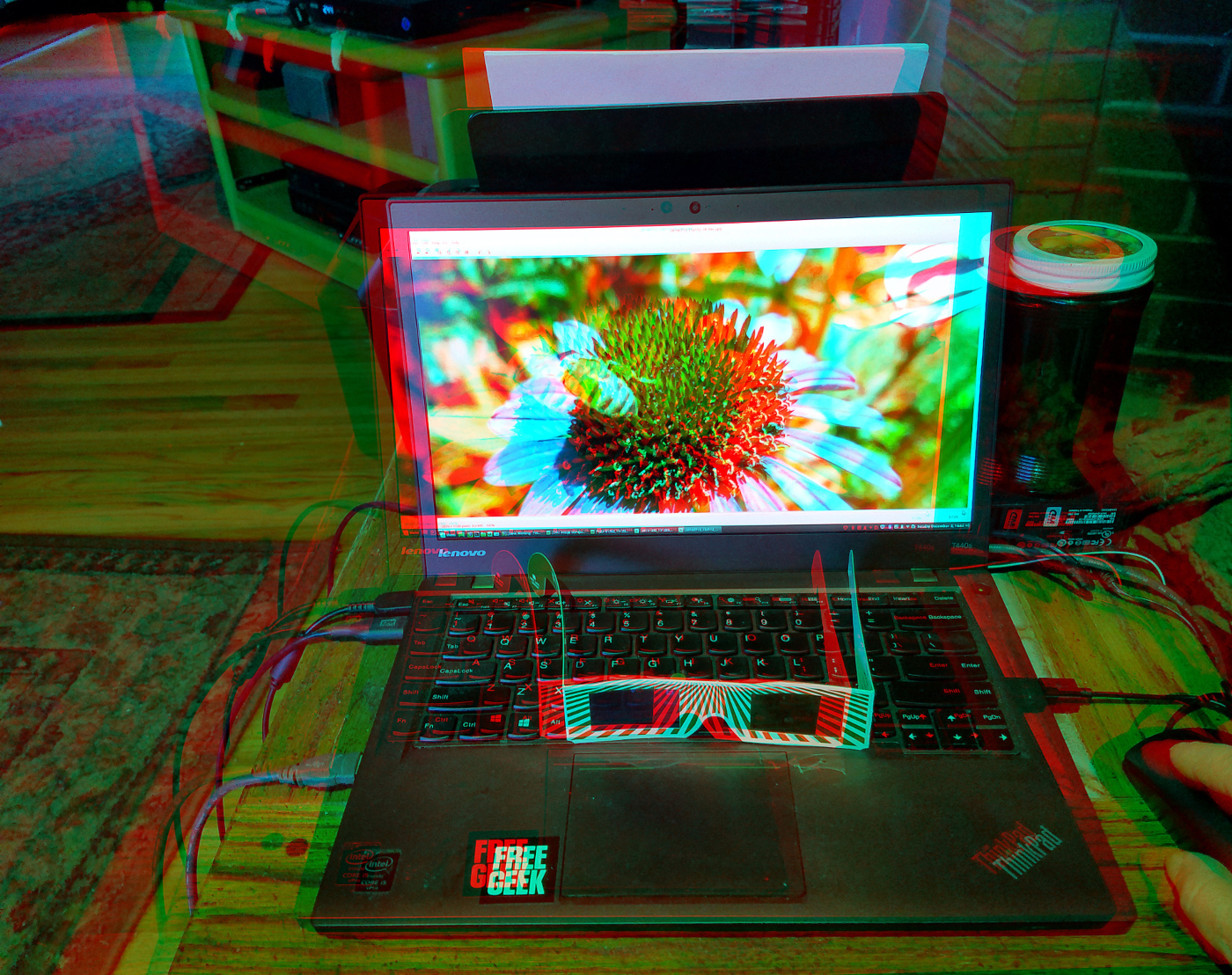
Thanks!
I created it on a 14" Lenovo Thinkpad, and formatted it on my Samsung S7 phone. |
Jan 14th |
| 68 |
Jan 19 |
Comment |
This shot stretches the limits of the Fuji with excellent results. The infinity point is just beyond the sand bar, accentuating just enough difference between it and the shore horizon. I like the way the lines of the subjects are just off parallel, expressing added perspective and movement.
My only critiques would be that the horizon is slightly tilted, and there is a (barely noticeable) difference in luminance between the right and left.
Overall, a great image with multiple points of interest, and good color balance. Well done. |
Jan 10th |
| 68 |
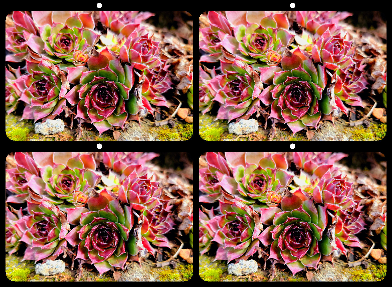
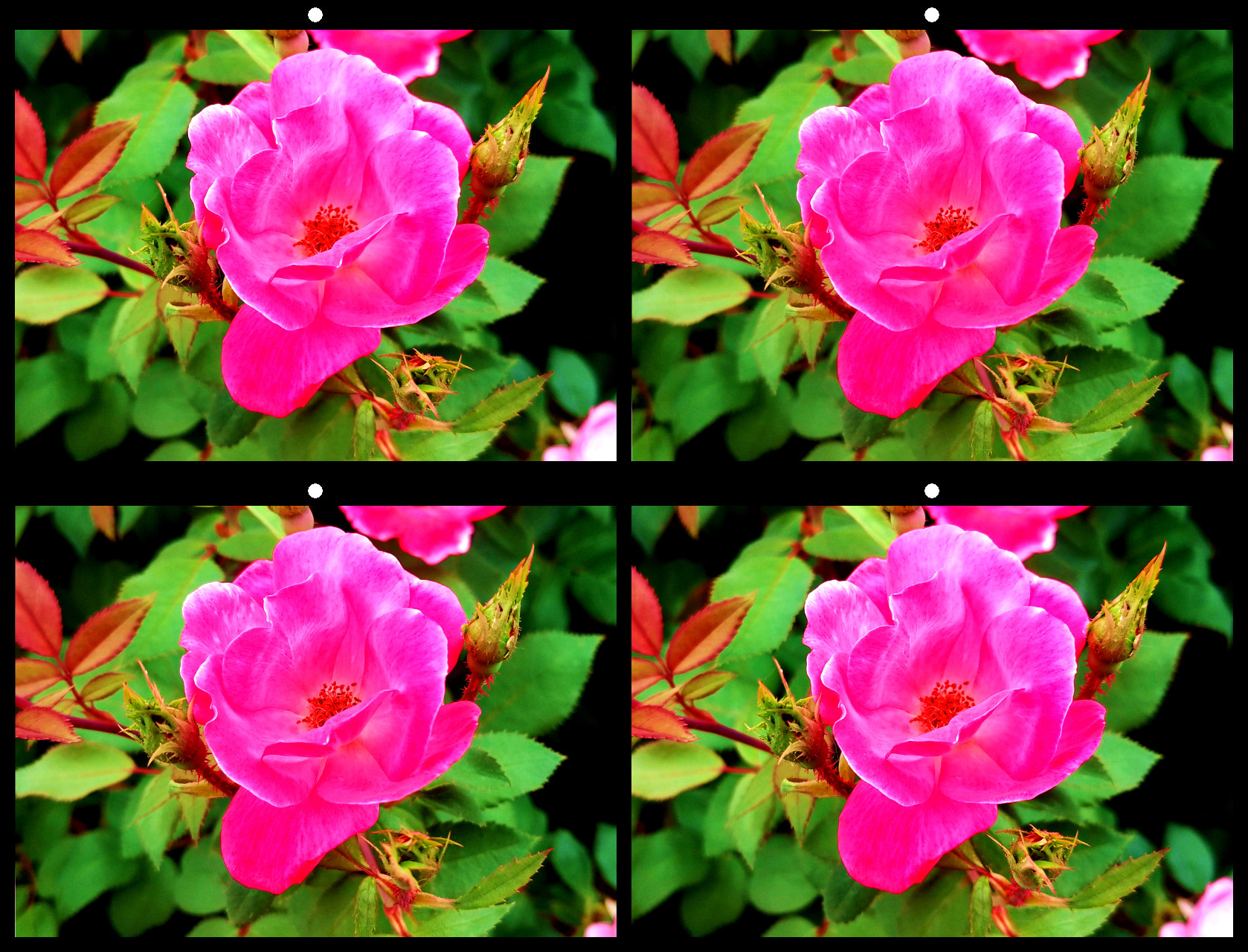
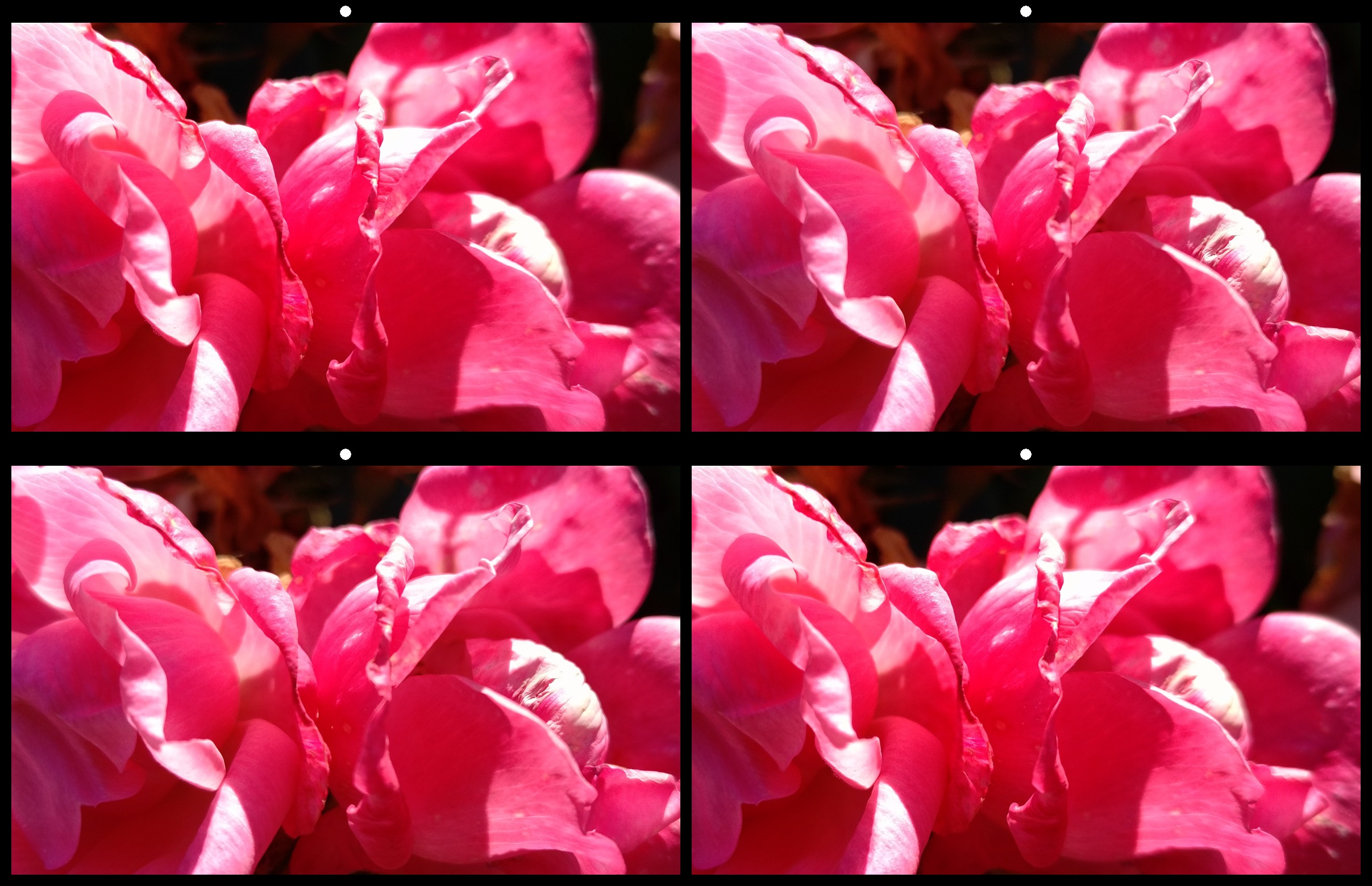
Jan 19 |
Comment |
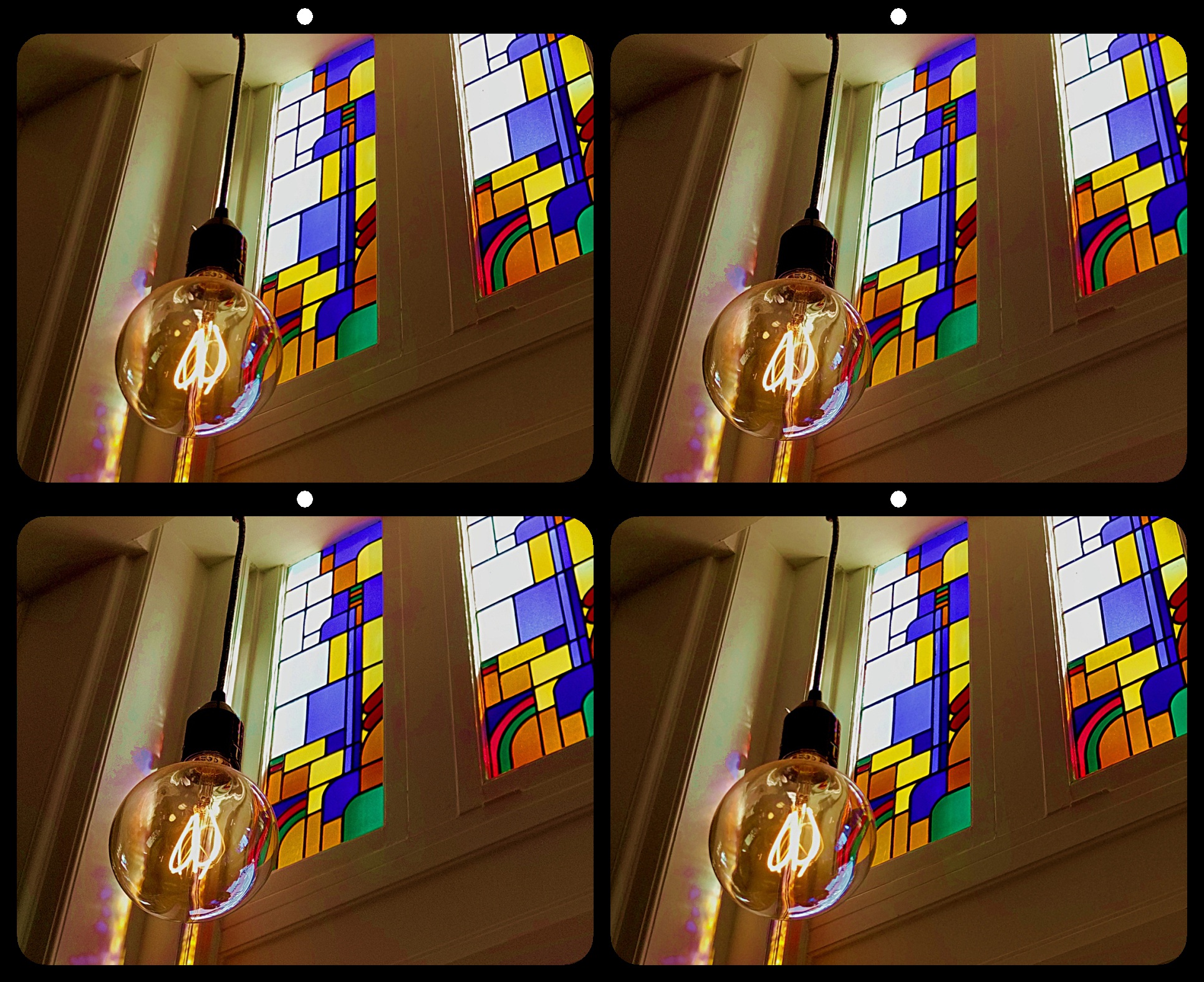
I like the effect, but it looks slightly uneven. My eye wants the stems in the center to match up better. There is a slight vertical misalignment which seems more apparent on the right facing roses than the left facing ones, pushing them back slightly further from the window. I think the overall image would also benefit from a bit more contrast. |
Jan 9th |
| 68 |
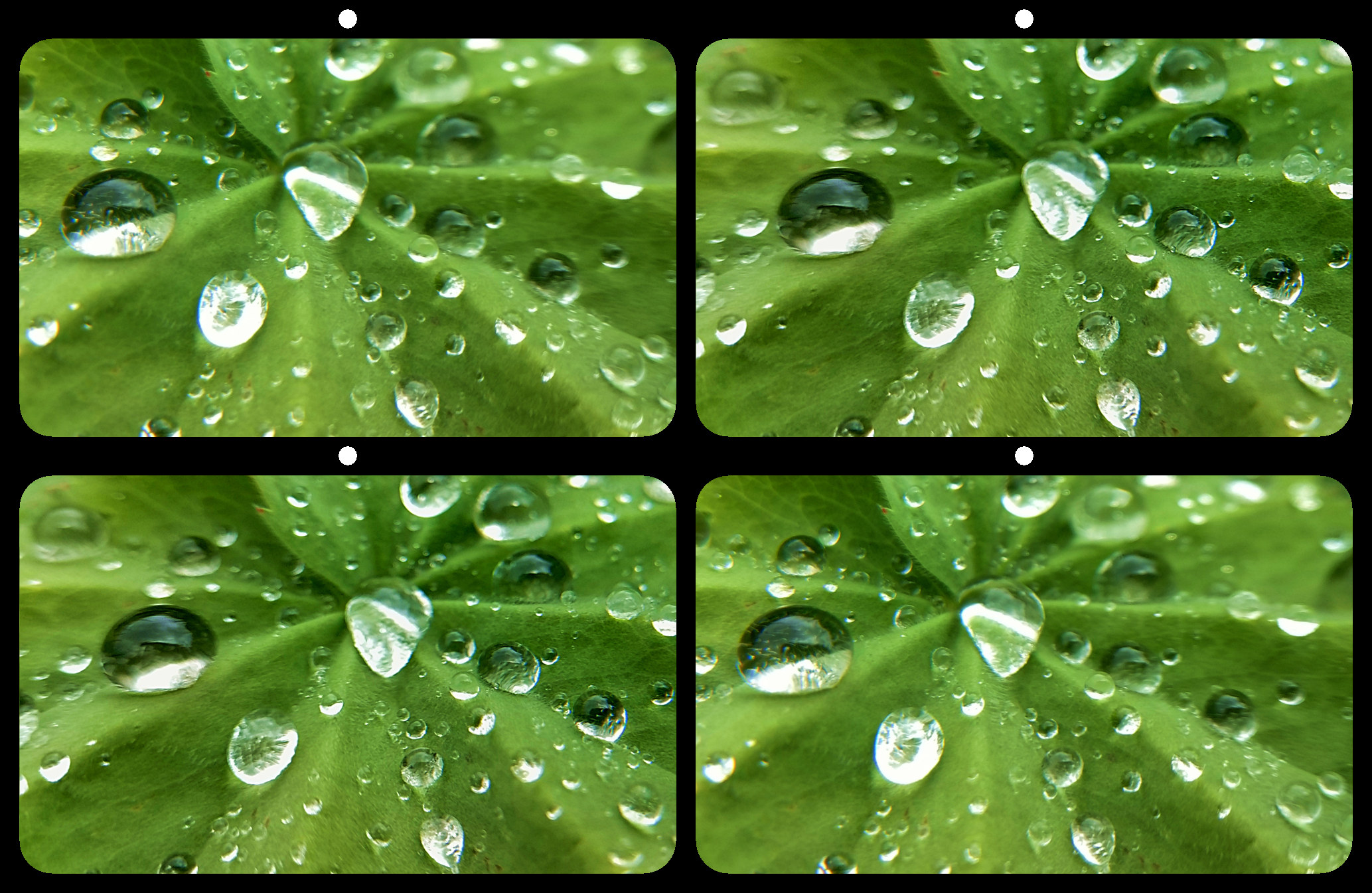
Jan 19 |
Comment |
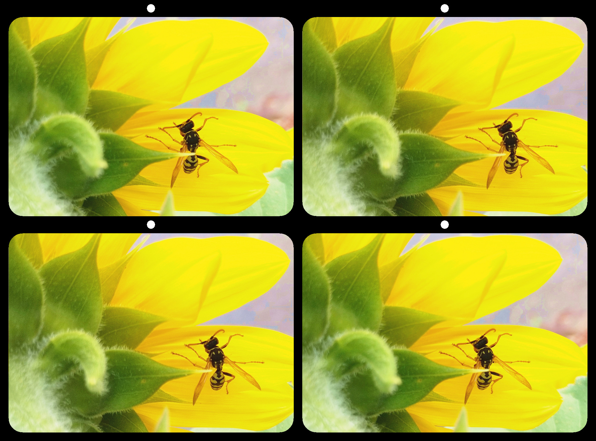
More reflections would have distracted from the transparency and depth of the puddles. The reflected color adds just enough balance to draw the eye forward, while maintaining the vastness of the scene. |
Jan 7th |
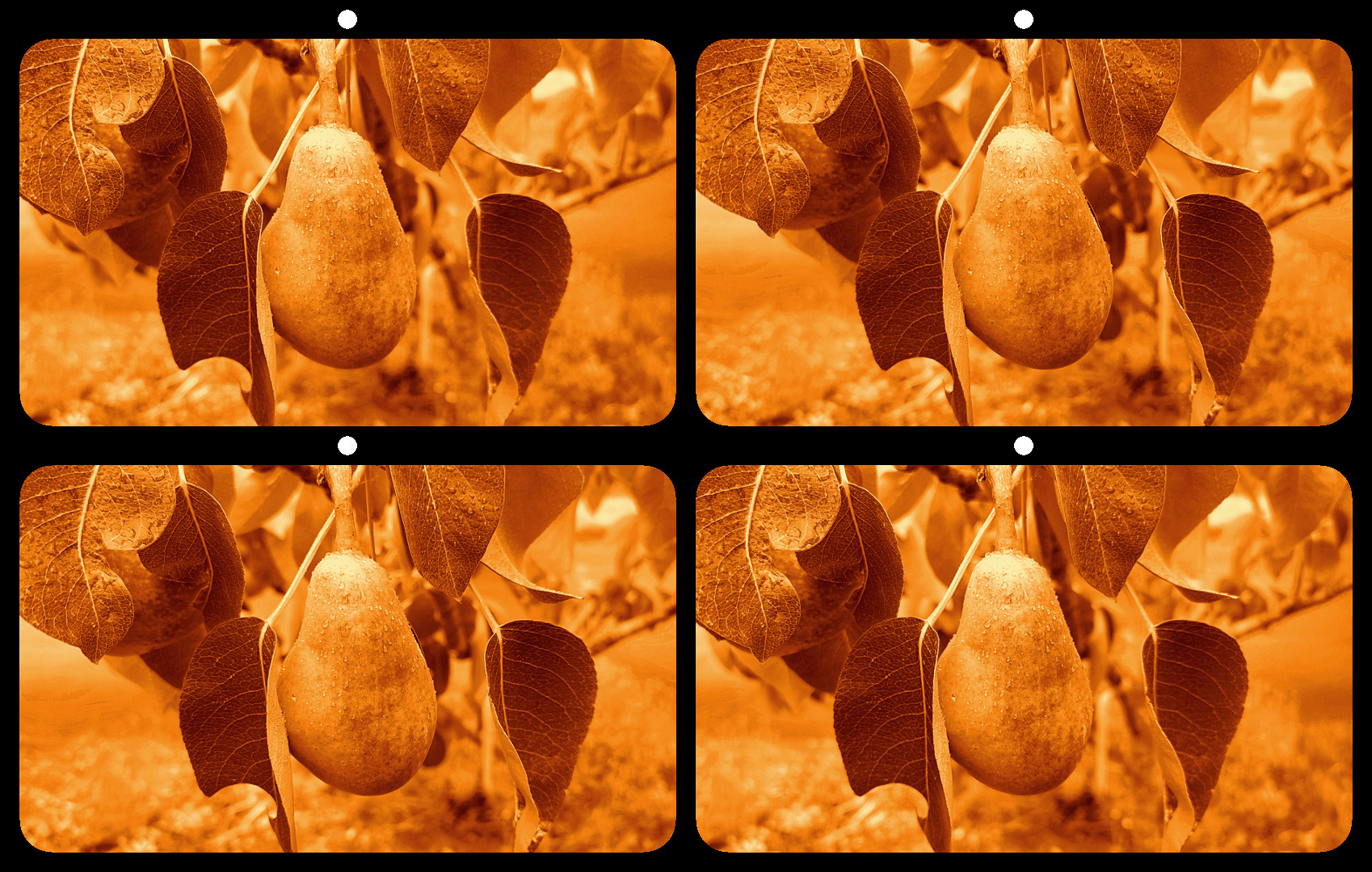
| 68 |
Jan 19 |
Comment |
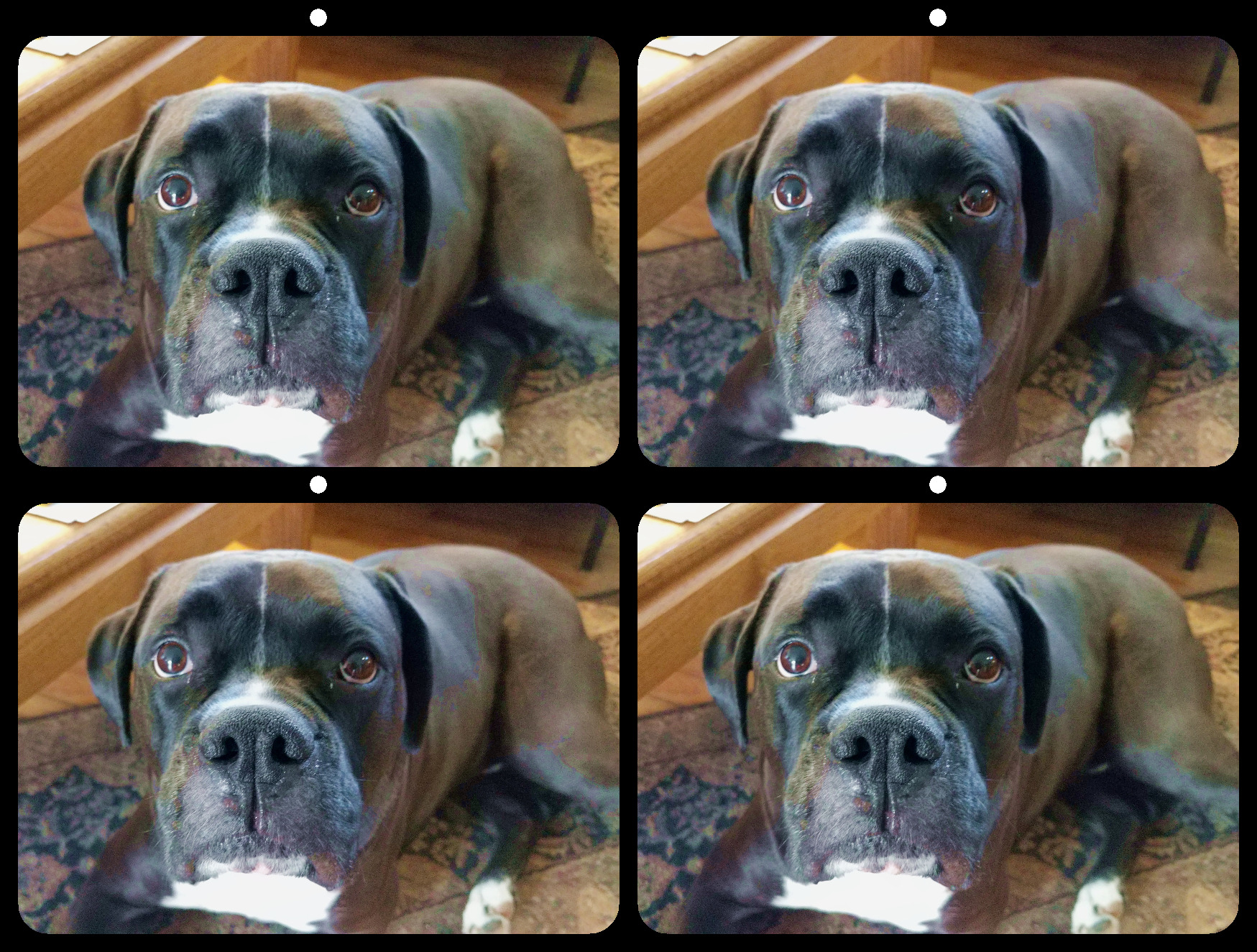
This is a great image. I might have boosted the color saturation, but one could also reduce the saturation and still have a great image. Well done. |
Jan 7th |
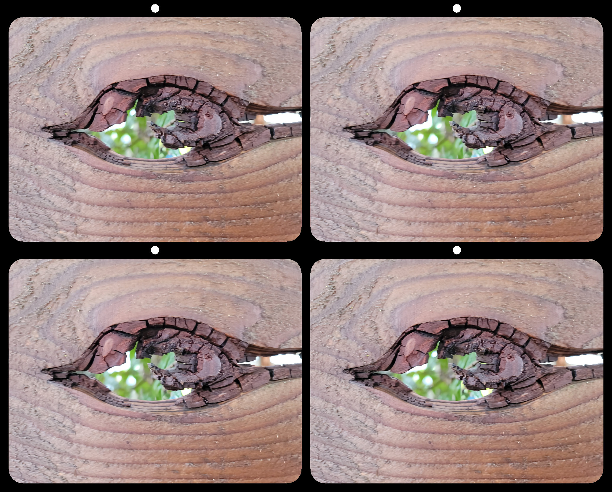
| 68 |
Jan 19 |
Comment |
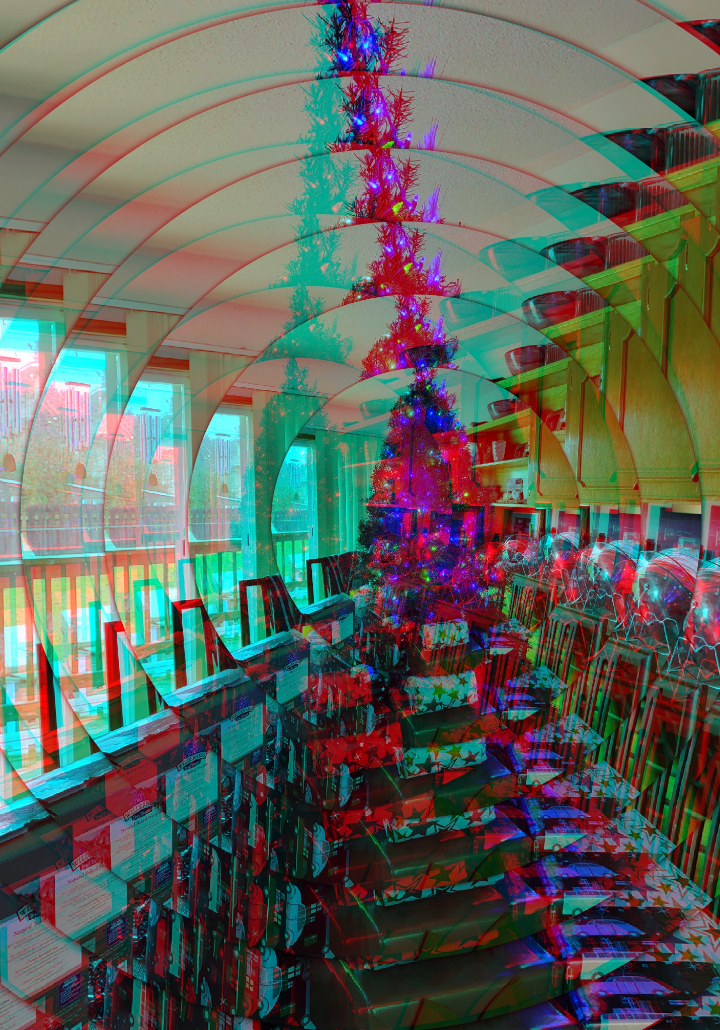
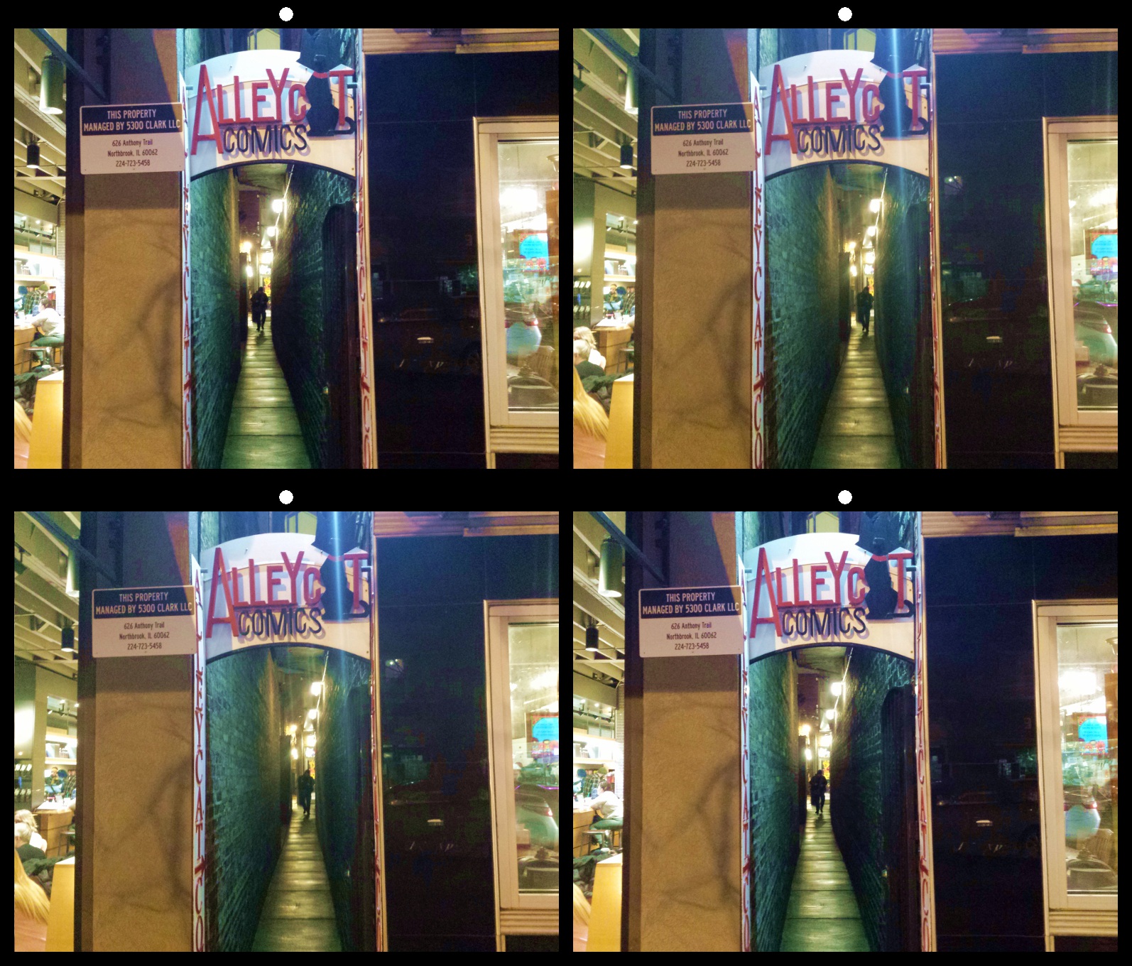
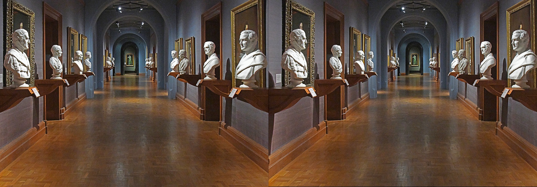
It seems as if the left image is off center. Notice how the platforms on the left seem to protrude further from the wall than those on the right. Also notice how the stereo window is pushed further back on the right side of the image than the left.
I opened the image in 3dSteroidPro, and adjusted the left image to correct the window and lessen the distortion of perspective. This caused some edge disparity, which I cropped to eliminate edge ghosting when viewed as anaglyph. Notice the window is no longer violated, and the depth of the left and right platforms are more natural. I also boosted the color saturation by 10% to warm up the long hallway.
Hope this helps.
|
Jan 7th |
 |
6 comments - 5 replies for Group 68
|
12 comments - 14 replies Total
|