|
| Group |
Round |
C/R |
Comment |
Date |
Image |
| 70 |
Jun 20 |
Reply |
Color |
Jun 24th |
 |
| 70 |
Jun 20 |
Comment |
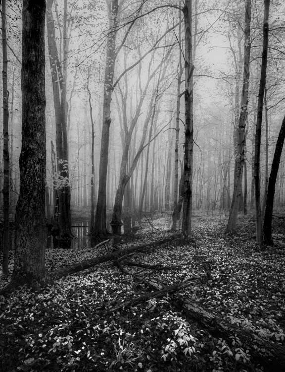
Hi Pierre,
You have captured a very compelling scene. When I initially looked at this I strongly preferred the color version but after looking at both for awhile and working with them in LR and PS I think that B&W is just as interesting. I have been trying to learn how to increase "luminosity and contrast" in my images (thanks to Alister Benn--and his U tube channel "Expressive Photography") So, I pumped up the color image using a duplicate image and multiply blend mode in PS and cropped so the dead tree hits the Right lower corner. I tried to increase the feeling of hazy with an Orton effect and increased hazy (with the Dehazy slider)in the top part of the image. B&W conversion done in PS. I hope you don't mind my experimentation.
|
Jun 24th |
 |
| 70 |
Jun 20 |
Comment |
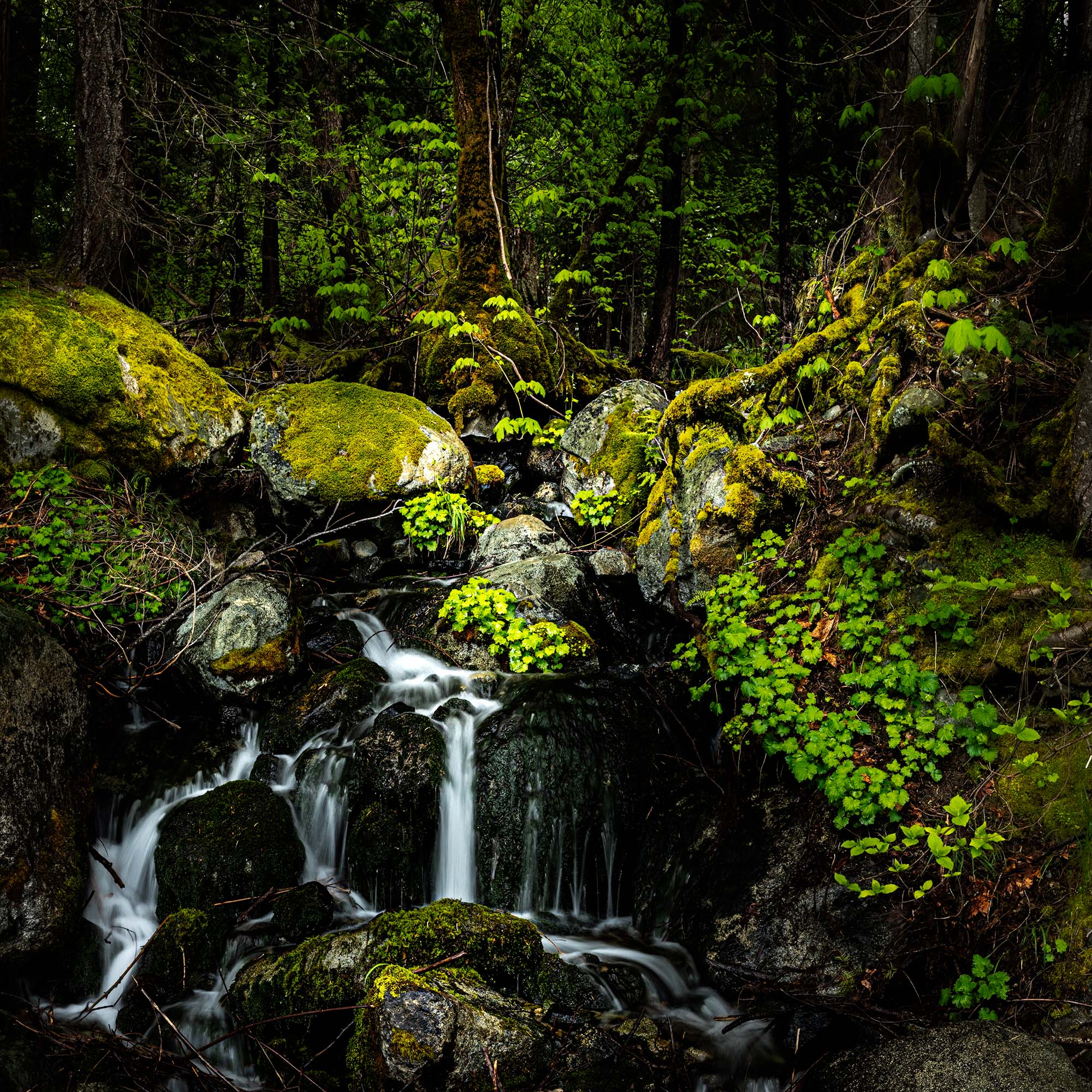
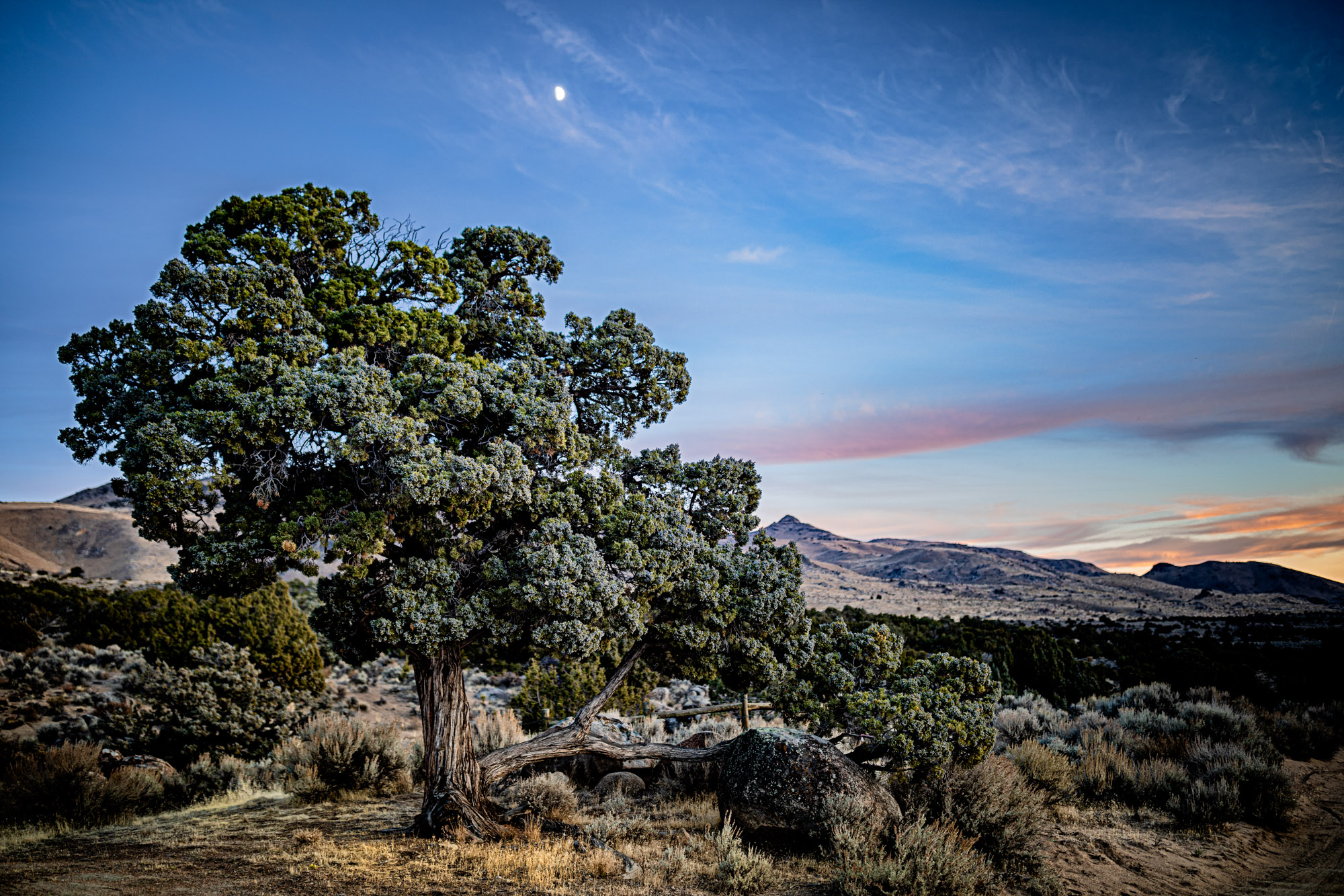
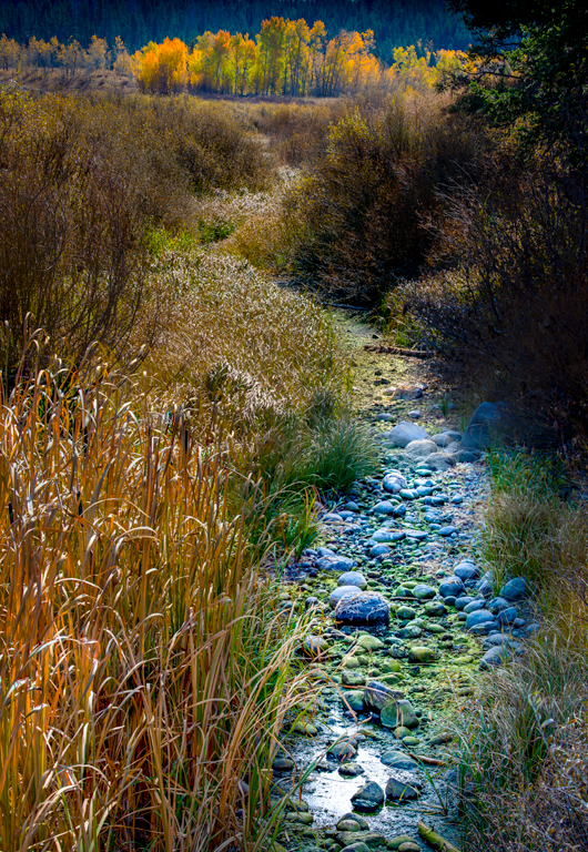
Hi San,
This is just fantastic! The light on the foreground tree and leaves in the air is perfect. The composition reminds me of an article by Erin Babnik called "Five compositional patterns worth finding in nature". I think this would fit into the idea of an echo, with the background tree being a great match to the tree in the foreground. I enjoyed the article and you can find this it on her website or on the Photo Cascadia website.
Best wishes, Todd |
Jun 24th |
| 70 |
Jun 20 |
Comment |
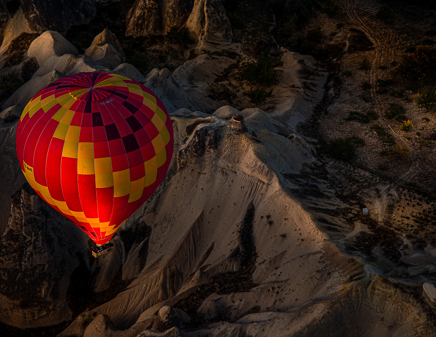
Hi Frans,
I really like the perspective of looking down on the balloon and landscape. Also, the light and color tone on the balloon. My only suggestion would be to consider a slightly tighter crop. In this case I just applied an 8.5x11 aspect ratio.
Todd |
Jun 24th |
 |
| 70 |
Jun 20 |
Comment |
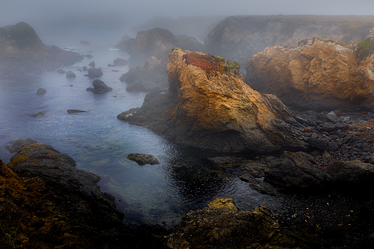
Hi Judy,
My eye fist goes to the white foam and I would keep this as light as possible without loosing any of the detail. I do like the top half of Frans' vignette and I agree the rope is a distraction and should go. I think what I like most about this image is all the little shells in the foreground--you may consider increasing texture and clarity of these little gems.
Best wishes,
Todd |
Jun 22nd |
| 70 |
Jun 20 |
Comment |
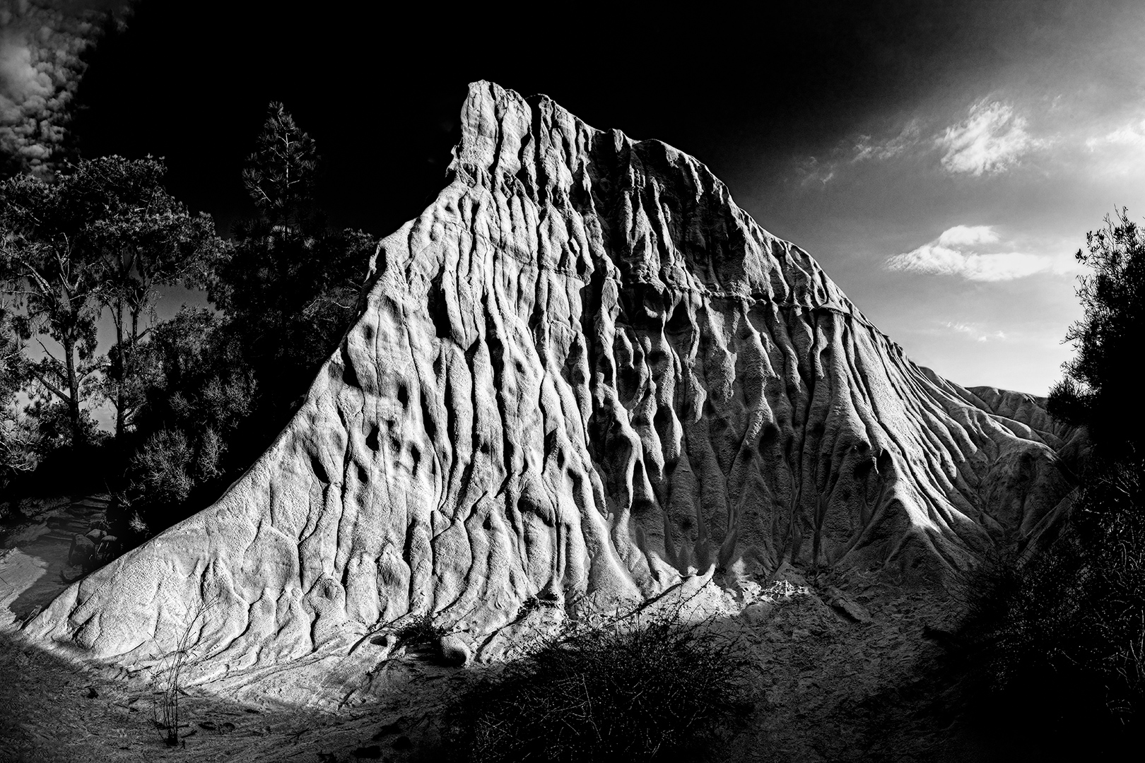
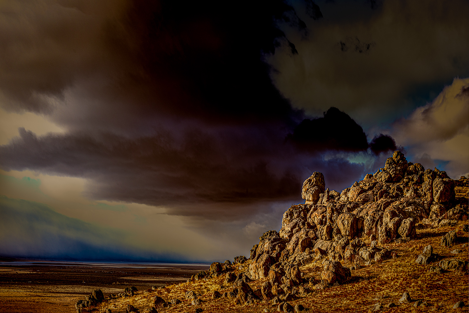
Hi Lamar,
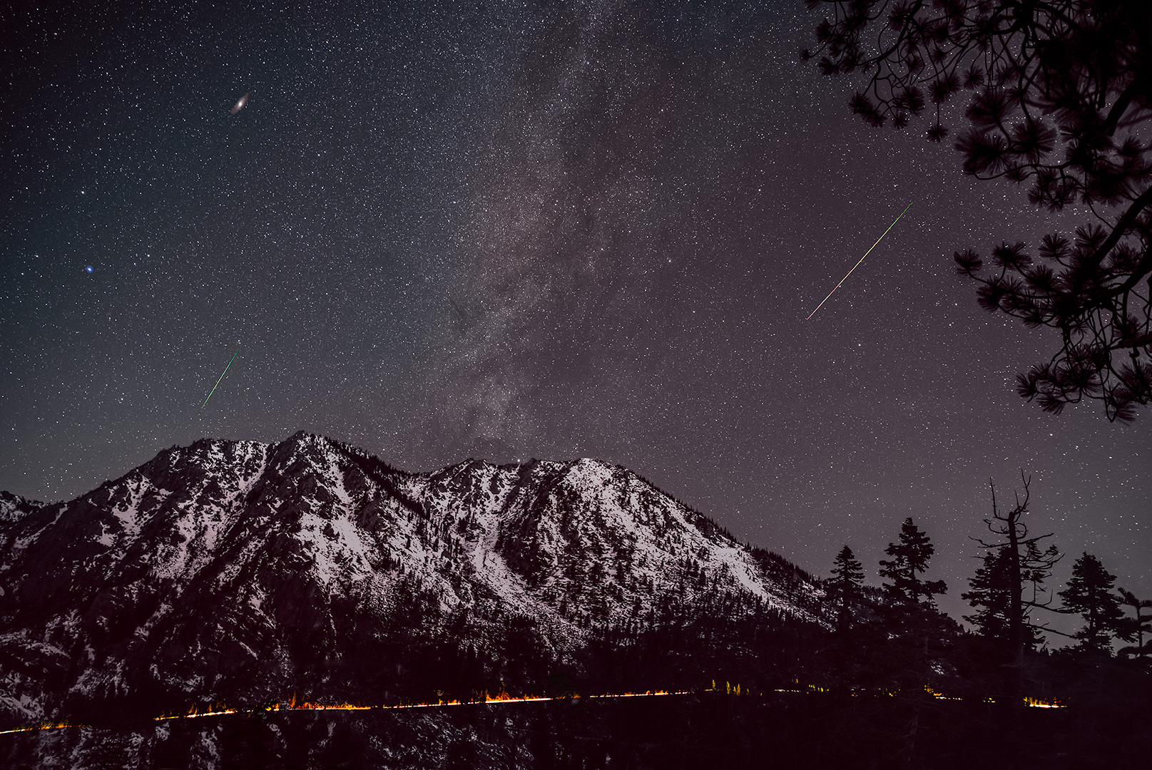
I think the B&W version does a better job of showcasing the textures in the grass and the fence seems to be a stronger element then in the color version. The clouds are very dramatic. It might give the image a bit more depth if the clouds are slightly softer possibly by decreasing clarity or texture. The position of the tree balances the image well.
Nice composition and good choice to go B&W.
Todd |
Jun 22nd |
| 70 |
Jun 20 |
Reply |
Hi San,
Thank you for your comments and suggestions.
I'm way behind on everything this month so sorry for the delay. Of the changes you made I really like the increased detail in the foreground rocks and removing the branches is helpful as they seem a bit distracting.
Thanks, Todd |
Jun 22nd |
| 70 |
Jun 20 |
Reply |
Thanks Frans! Sorry for the delayed response this month. I would be honored if you use my image as a reference! Also, you are right, I am very tempted by Pierrs's color image! |
Jun 22nd |
| 70 |
Jun 20 |
Comment |
Thanks! |
Jun 10th |
6 comments - 3 replies for Group 70
|
6 comments - 3 replies Total
|