|
| Group |
Round |
C/R |
Comment |
Date |
Image |
| 70 |
Oct 19 |
Reply |
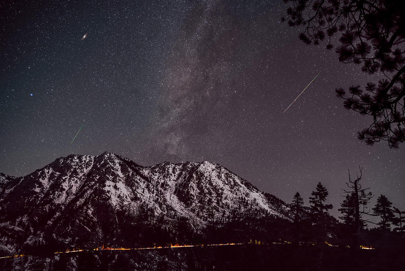
I watched a few tutorials on IR editing today and it looks real interesting. Maybe I need to convert a camera! |
Oct 29th |
| 70 |
Oct 19 |
Comment |
Hi Frans,
I really like this, It immediately felt like a story book image to me. Great job shotting from a bus! I like how you bring your edges and lines to a corner--in this case the lake shore to the lower left corner. Personally I like the boats in the foreground as I feel it adds interest and story. Also, I feel you handled the sky well--the sky we can see is just blue and you left enough in to show the ridge line. Nice work!
|
Oct 24th |
| 70 |
Oct 19 |
Comment |
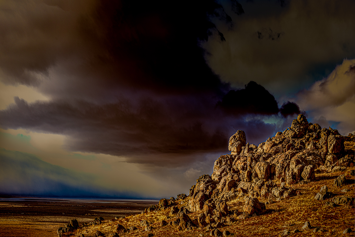
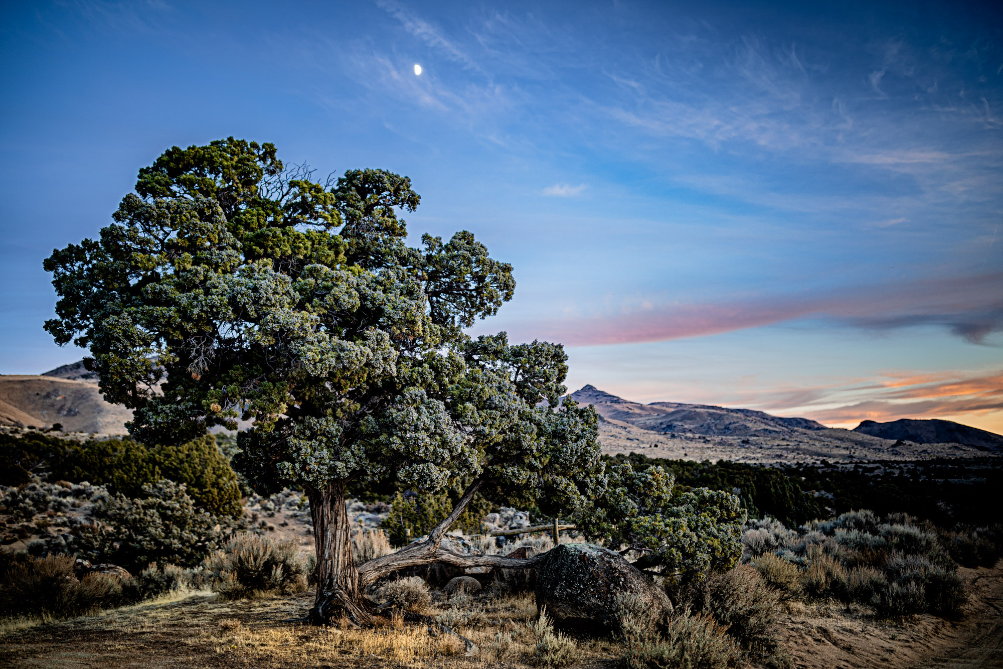
Wow, I really like the sky in the B&W version. Curiously I also like the strange colors of the original! One minor quibble is that the grasses on the far side of the fence look a touch soft I don't know if this is due to a slight breeze or if that area is a little light. The IR genre looks very interesting! Your placement of the tree and fence are just perfect! |
Oct 24th |
| 70 |
Oct 19 |
Comment |
Hi Glenn,
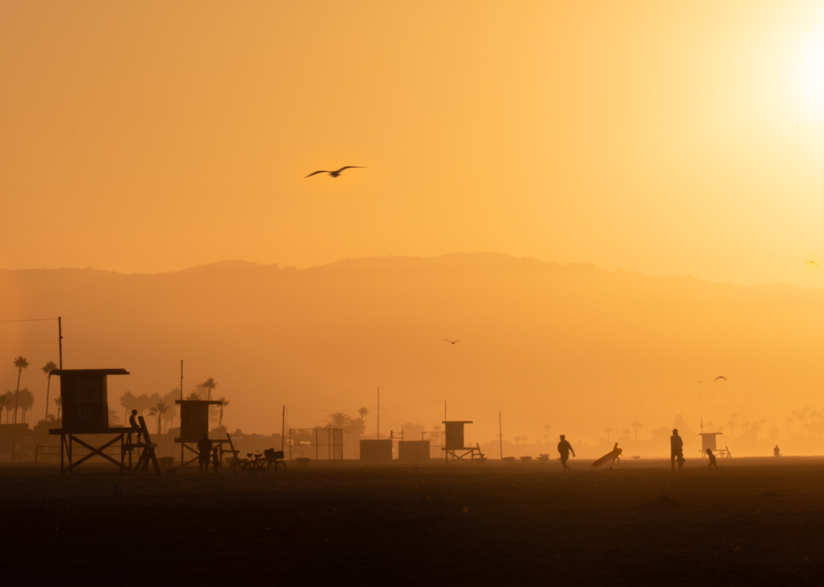
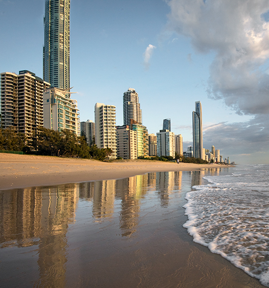
I really like the contrast of the big buildings and the empty beach--I'll bet you only see this very early in the morning. After all the discussion of cropping in Pierre's post I thought it would be interesting to try and emphasize the tallness of the buildings with a portrait crop and the best I could do was a square. I think you did a nice job catching the reflection and I like the color/temperature balance of the image. The issue of the top of the building being cut off could be addressed by cutting off even more so the viewer has no idea how tall the building is--or in this case I used the clone stamp tool to give it a few extra floors! Either way getting rid of the taper at the top of the building makes it look like a more intentional crop.
Best Wishes, Todd
|
Oct 24th |
 |
| 70 |
Oct 19 |
Comment |
Hi Pierre,
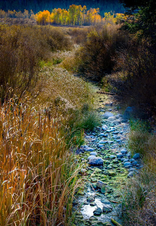
I'm so used to seeing Palouse photos in green that I feel this fall shot is a nice change! The photo already seems to have a slight transition from warm foreground to cooler background and I think that could be emphasized a little more. Also, I like the idea of a portrait crop used to show how the hills go on and on. The current crop looks almost square to me and I feel it would be interesting to use something even narrower like a 5x7 ratio. |
Oct 24th |
| 70 |
Oct 19 |
Comment |
I like the light dappled on the canoes and feel that the row of canoes pulls my eye through the scene to the white door. It might be interesting to play with the color of the doorway and see how it feels. I like that you left the background dark but I feel it may be a little too dark. I'd like to be able to see just a bit more detail in the side of the shed and I think you could lift the luminosity of the light greens in the forest just little bit. Overall I feel the image conveys the idea of the end of summer very well. |
Oct 24th |
5 comments - 1 reply for Group 70
|
5 comments - 1 reply Total
|