|
| Group |
Round |
C/R |
Comment |
Date |
Image |
| 70 |
Mar 19 |
Comment |
Hi Frans,
The shot gives me a feeling of vertigo--like I'm going to fly down the stairs and off the edge! The handrails form strong leading lines and I like that you were able to maintain detail in the floor on the landing and did not blow out the beautiful windows. Making the figures dark works well as they play a role in the story but do not interfere at all with the windows. Very nice. |
Mar 13th |
| 70 |
Mar 19 |
Comment |
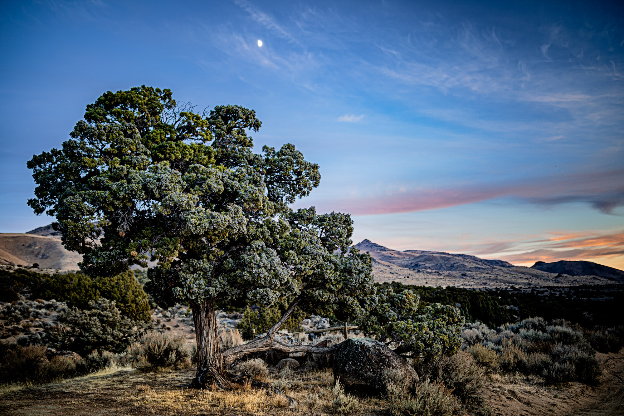
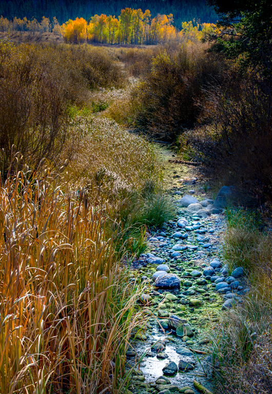
Wow! Nice job Judy. By now you probably guess I love the bright saturated colors. The composition is also very well done. You caught the birds in the perfect position with nothing interfering with them. I also really like the contrast of the vertical grasses against the sky. Great job!
|
Mar 13th |
| 70 |
Mar 19 |
Comment |
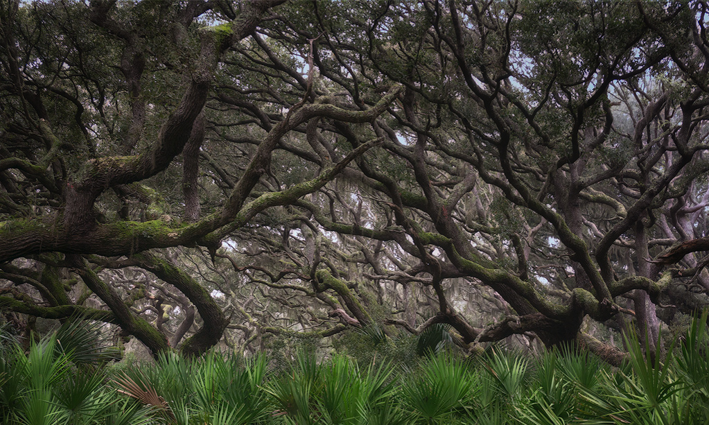
Hi Kathryn,
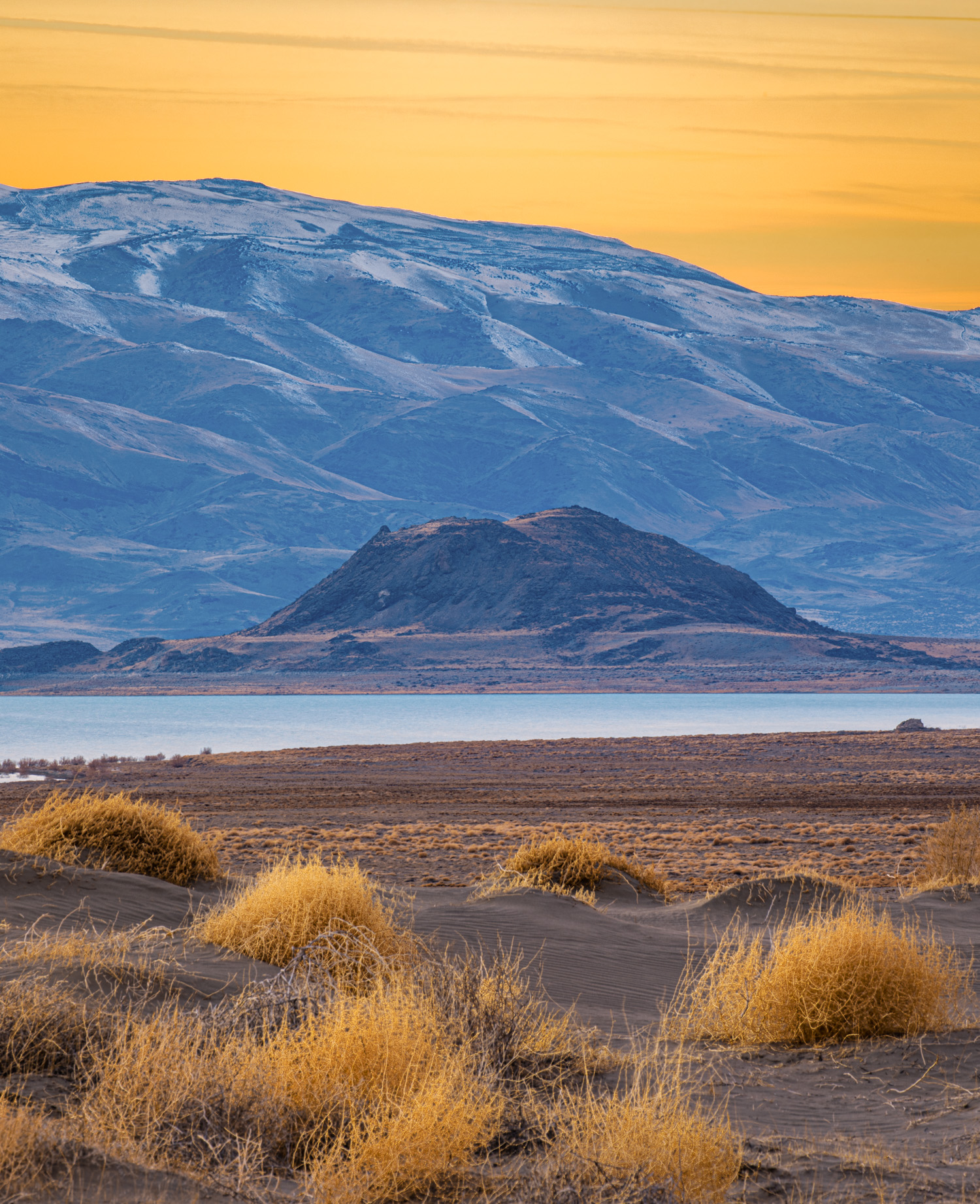
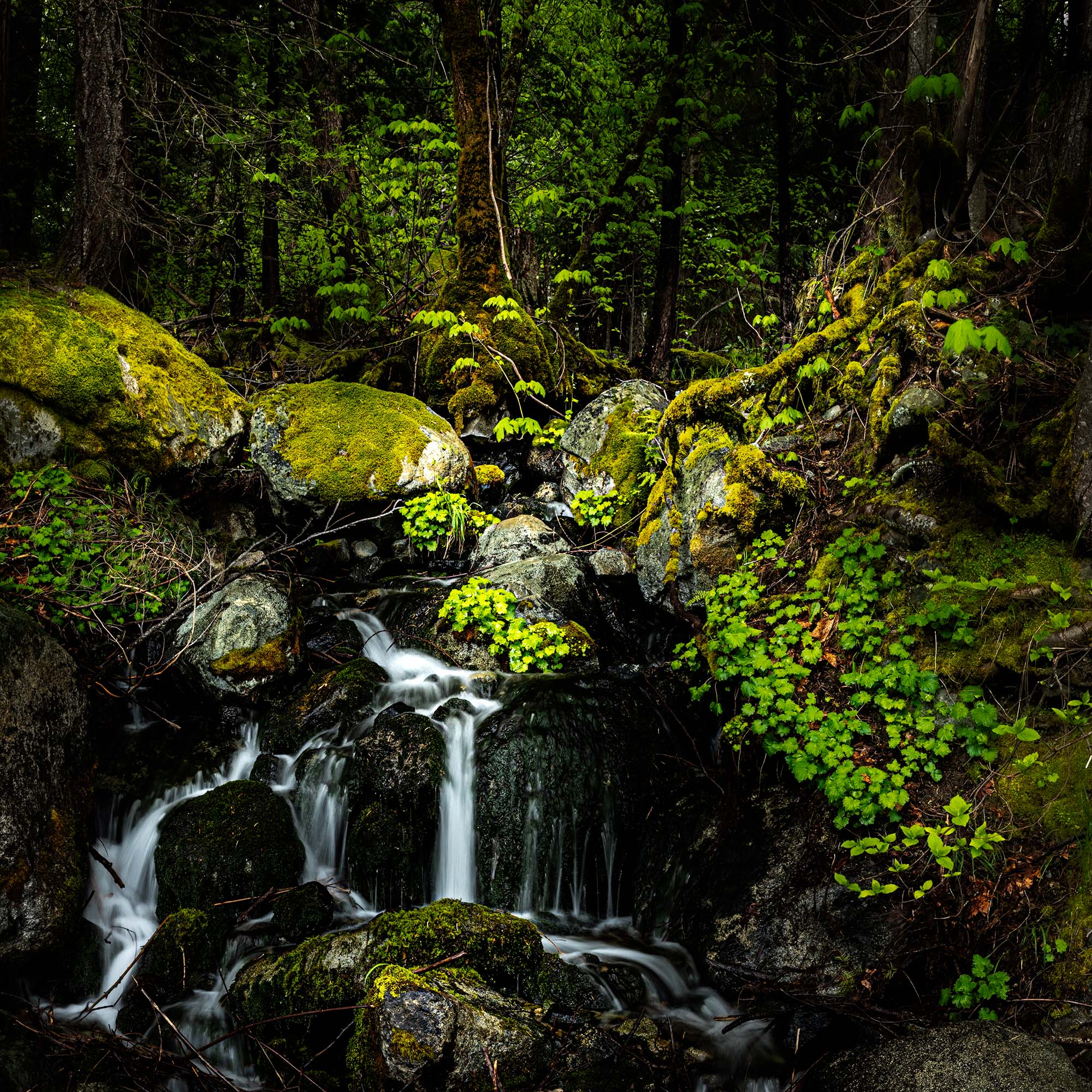
Nice contrast of patterns. I really like the feeling of the dark dense forrest I get from this photo. The trees seem to form an opening or passage and I tried to emphasize this by darkening to upper outer corners. For me, the palms at the bottom of the image form a wall and I think cropping them down just a little leaves the pattern intact but doesn't block the viewer from entering the forrest. |
Mar 13th |
 |
| 70 |
Mar 19 |
Comment |
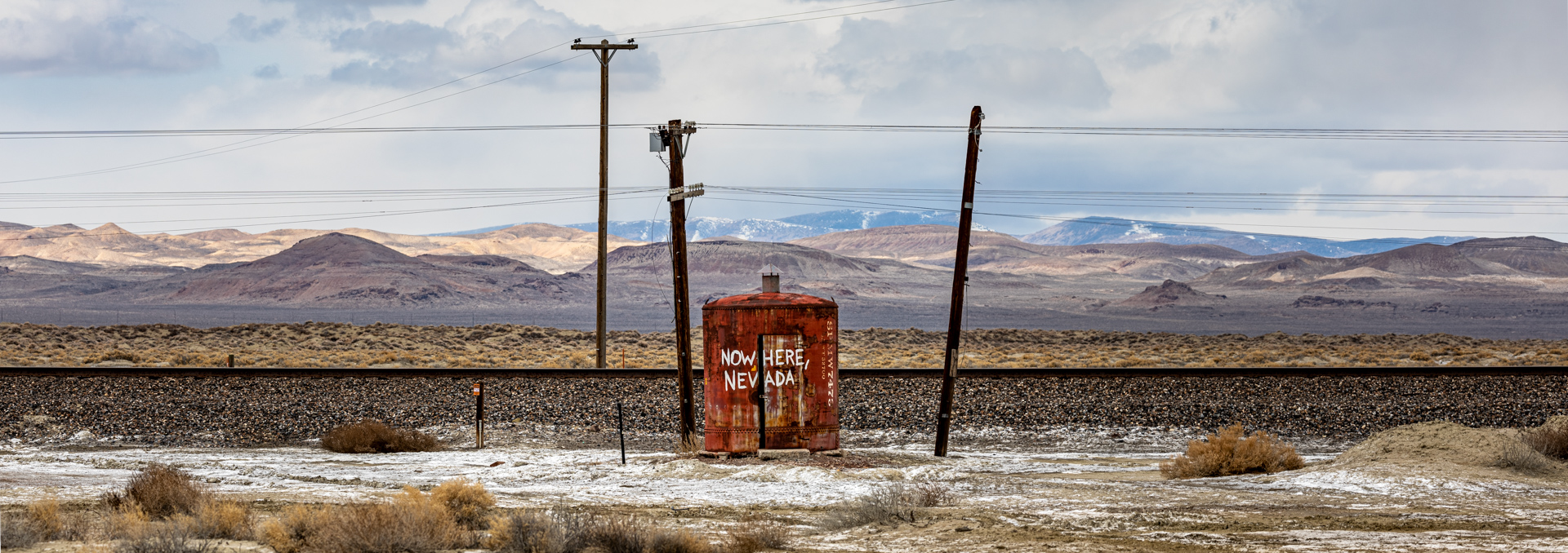
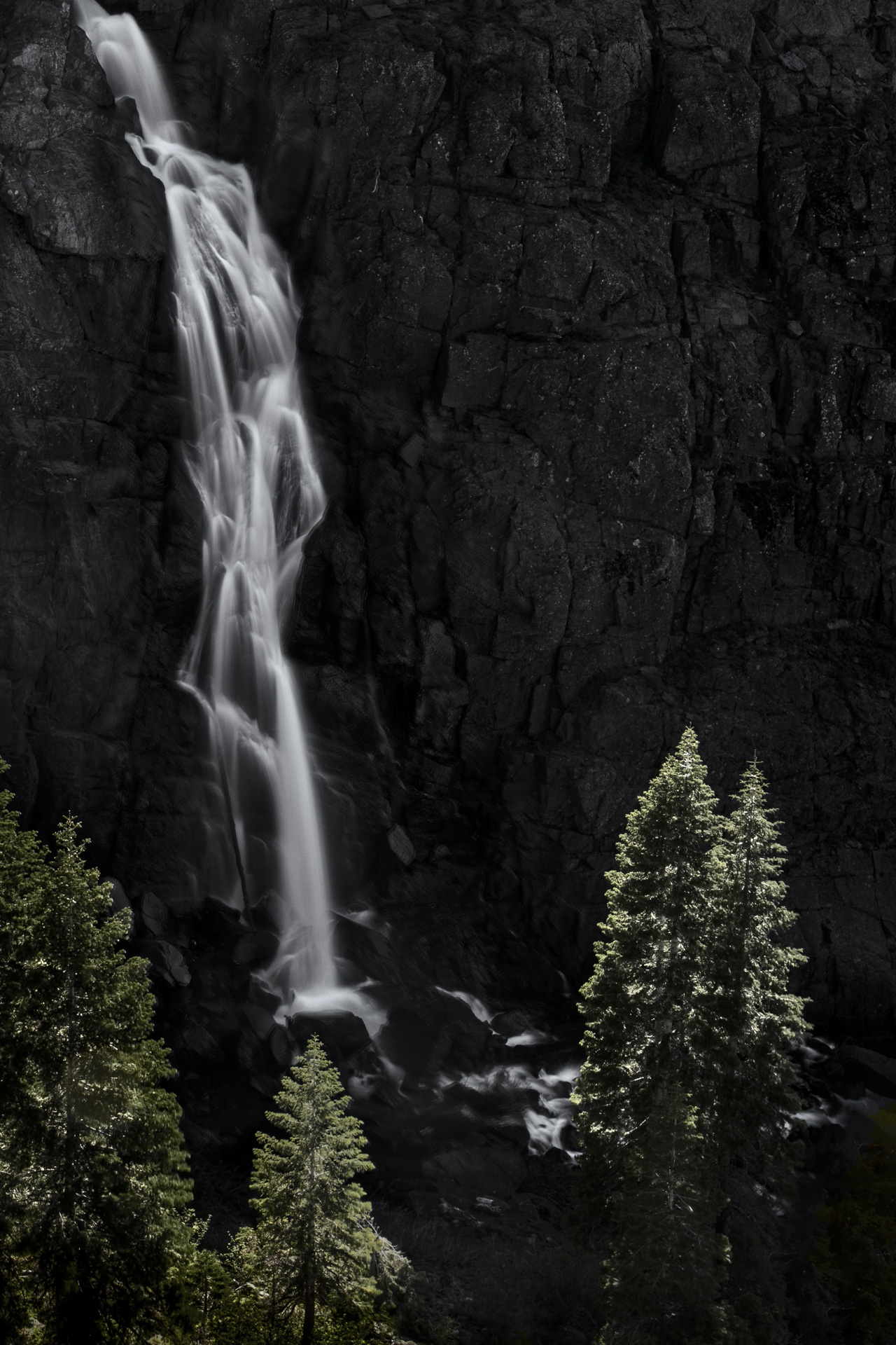
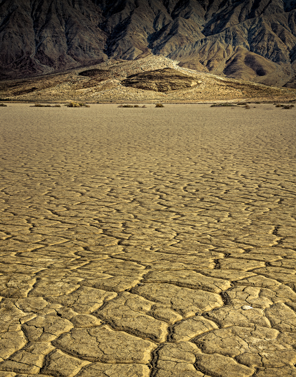
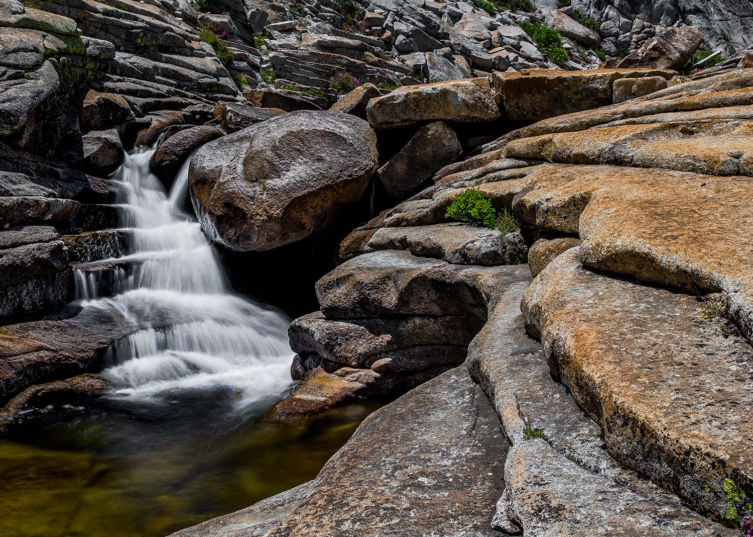
Hi Glen,
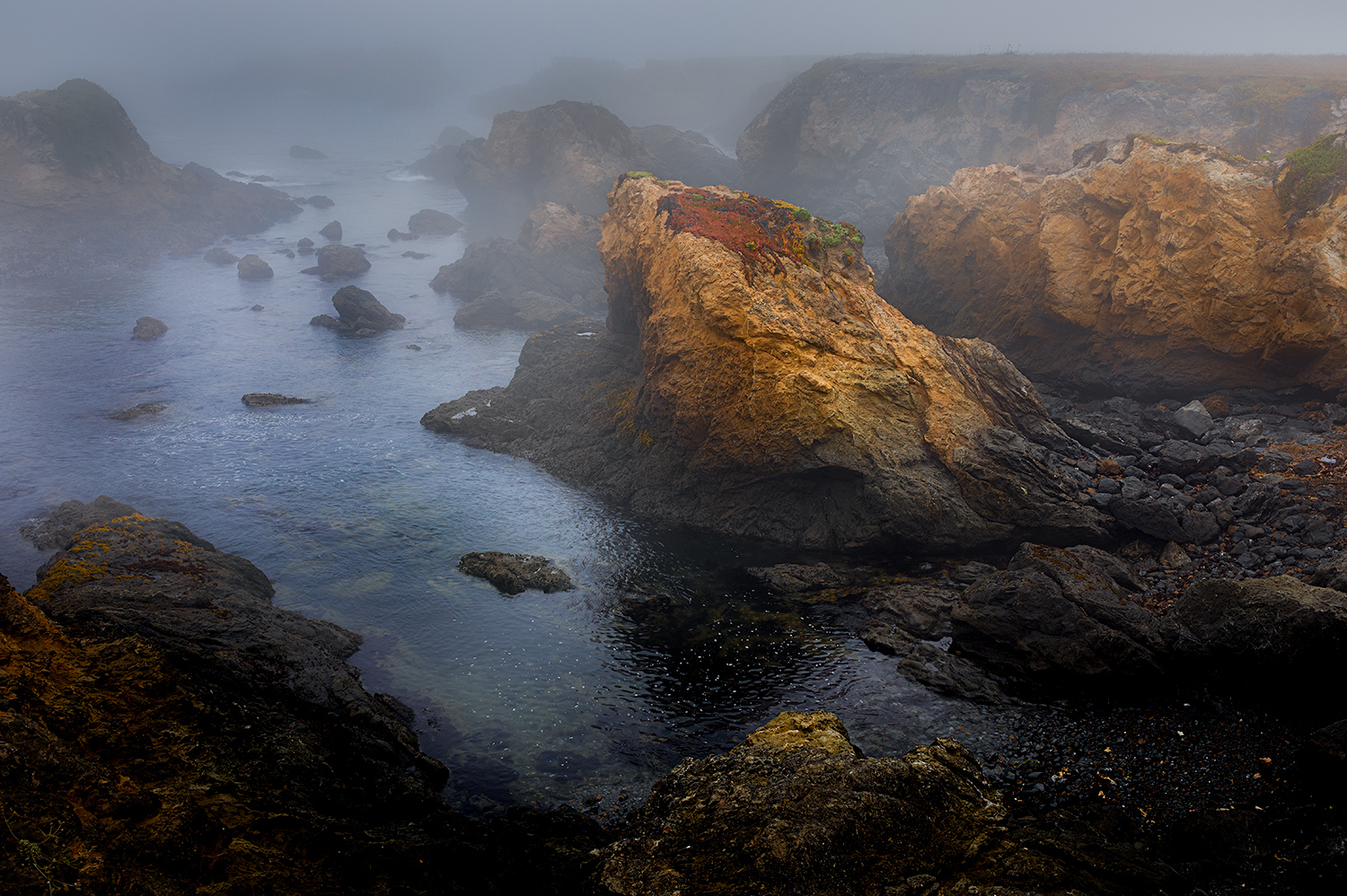
For me the primary area of interest in the photo is the great texture of the water you achieved with a longer exposure. The flowing water over the dark rock is really interesting. I agree that if you are going to crop the original shot I would really focus on the falls as Pierre has suggested. |
Mar 13th |
| 70 |
Mar 19 |
Comment |
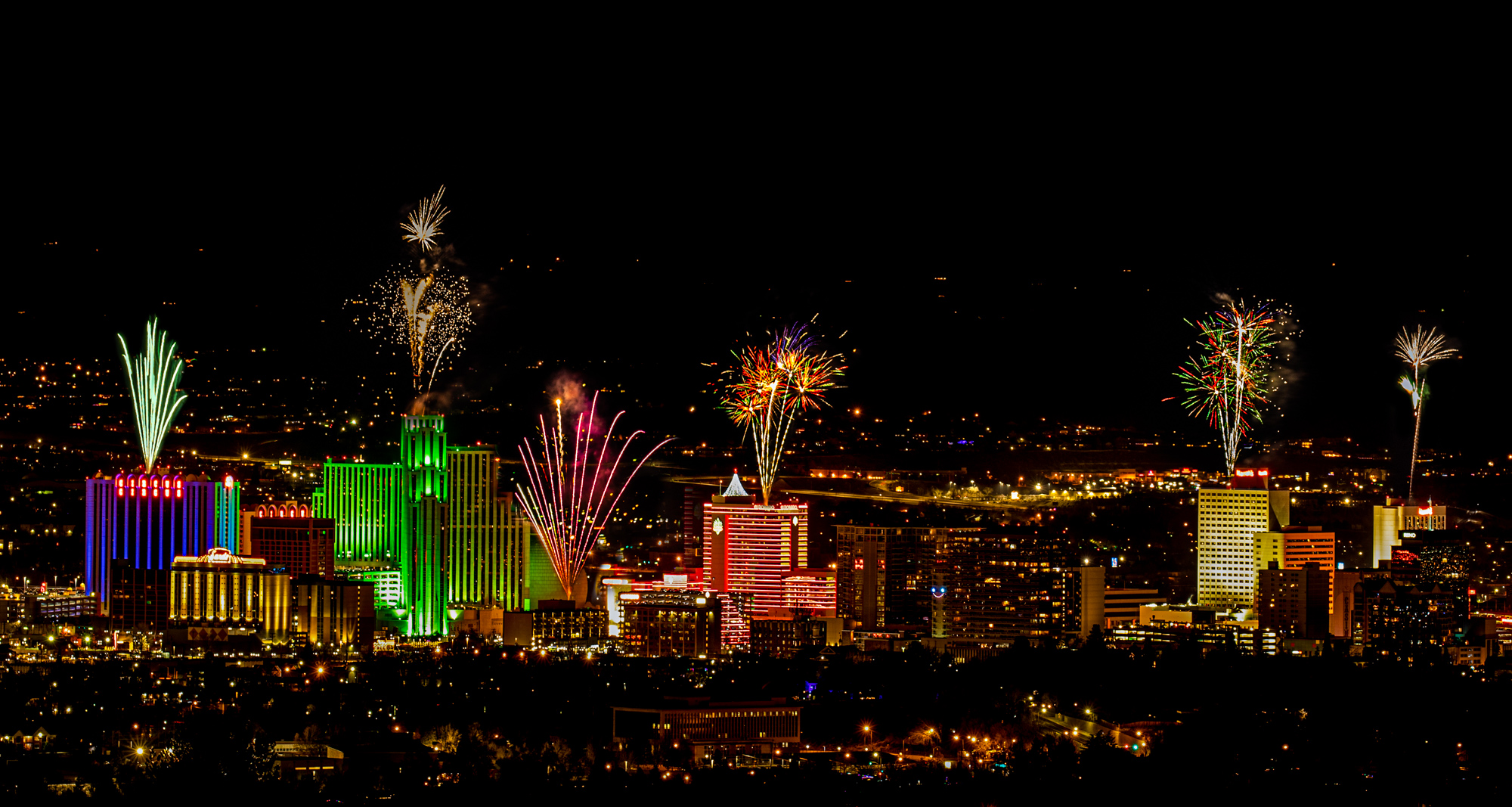
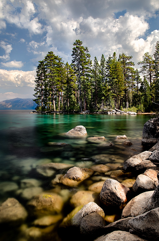
Hi Pierre,
For me this photo is all about strong geometry. I like Kathryn's edit as the sky is basiclly empty. I also like the colors with the cool blues contrasting with the warm highlights on the rocks and city. I wish the rock block in the lower left was placed a little more to the right so it occupied the center of the triangle formed by the wall and the lower left corner of the photo. I also feel the geometry could be further strengthend by shooting this so the wall touches the horizontal of the cityscape. Finally, you may want to consider a deeper depth of field or focus stacking to get the distant docks and buildings into sharp focus. |
Mar 13th |
| 70 |
Mar 19 |
Comment |
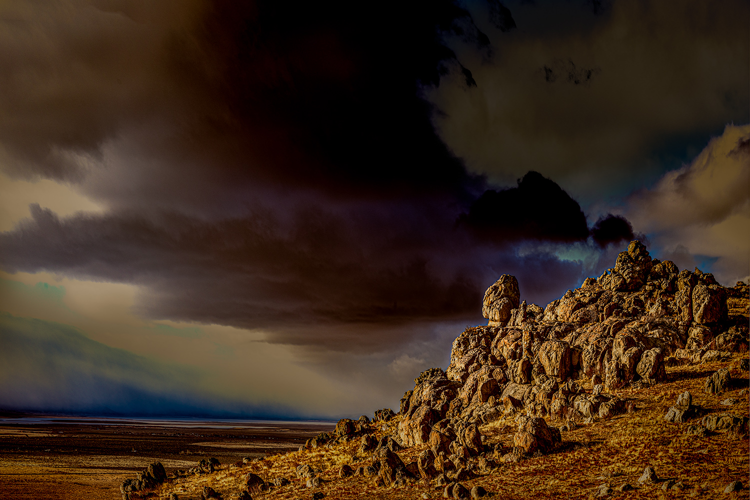
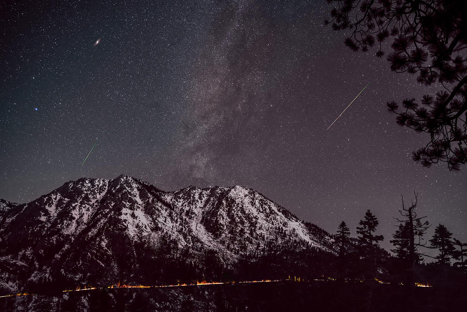
For me the dramatic sky is the primary area of interest. I love how the leading lines of the dark shoreline and the currents in the water take the eye right to the lighthouse which points straight up to the brightest part of the sky. This is a really nice composition. You have the lighthouse in the perfect position. In terms of areas to improve, I would do whatever you can to show off the sun rays in the sky and accentuate the shoreline and the currents in the water leading to the lighthouse. Nice job! |
Mar 13th |
| 70 |
Mar 19 |
Reply |
Thanks Pierre,
I was able to remove that dark band using a luminosity mask and a solid color adjustment layer. |
Mar 8th |
| 70 |
Mar 19 |
Reply |
Thanks Glen, I was a bit concerned about the amount of saturation so I'll be interested in what the others think also. |
Mar 3rd |
6 comments - 2 replies for Group 70
|
6 comments - 2 replies Total
|