|
| Group |
Round |
C/R |
Comment |
Date |
Image |
| 85 |
Feb 23 |
Reply |
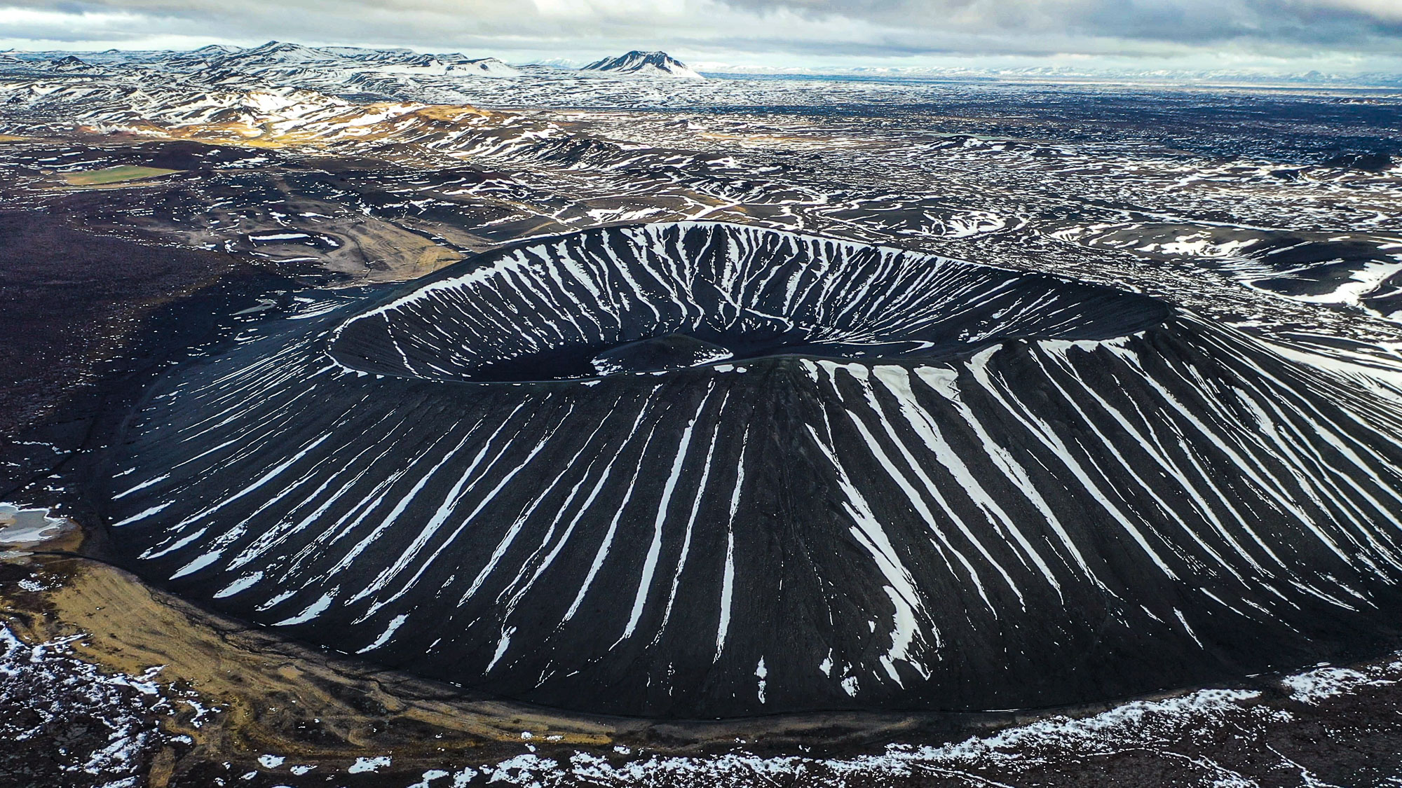
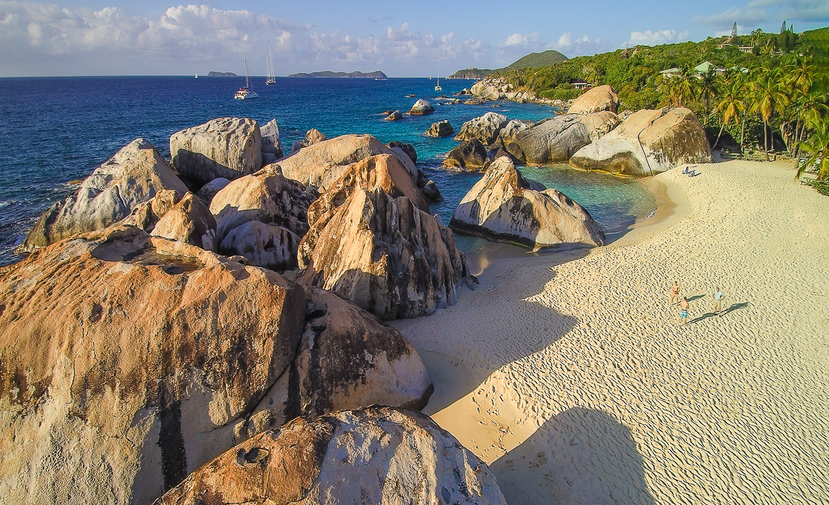
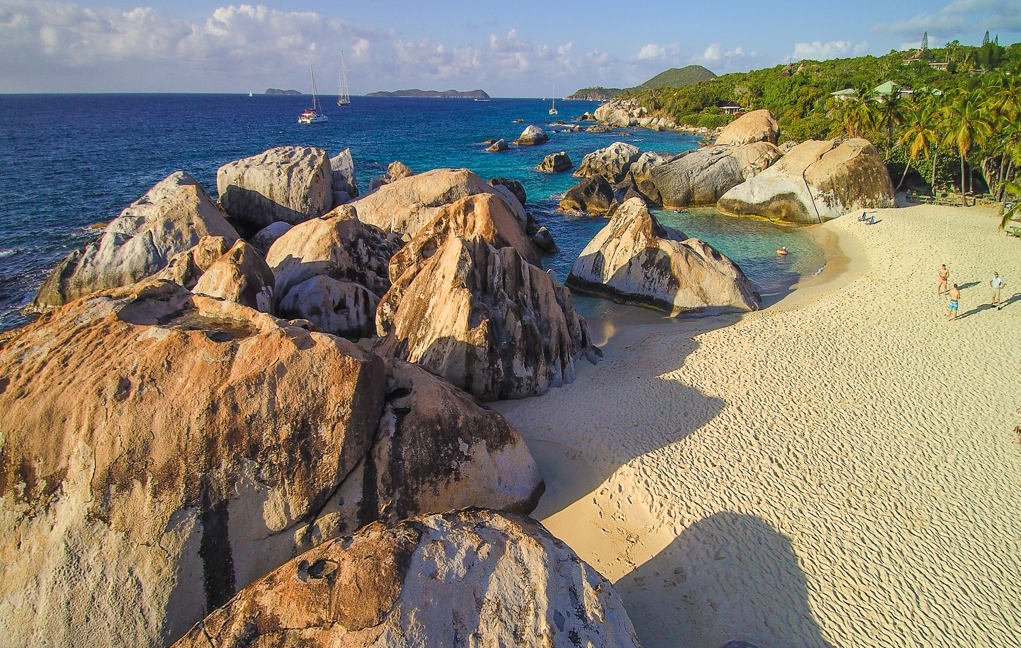
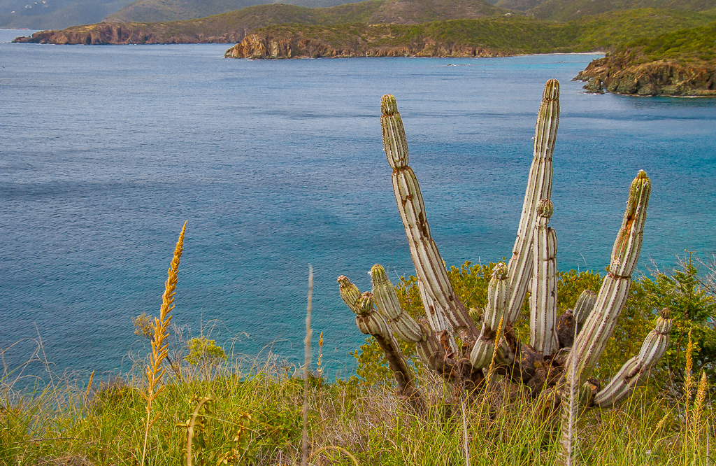
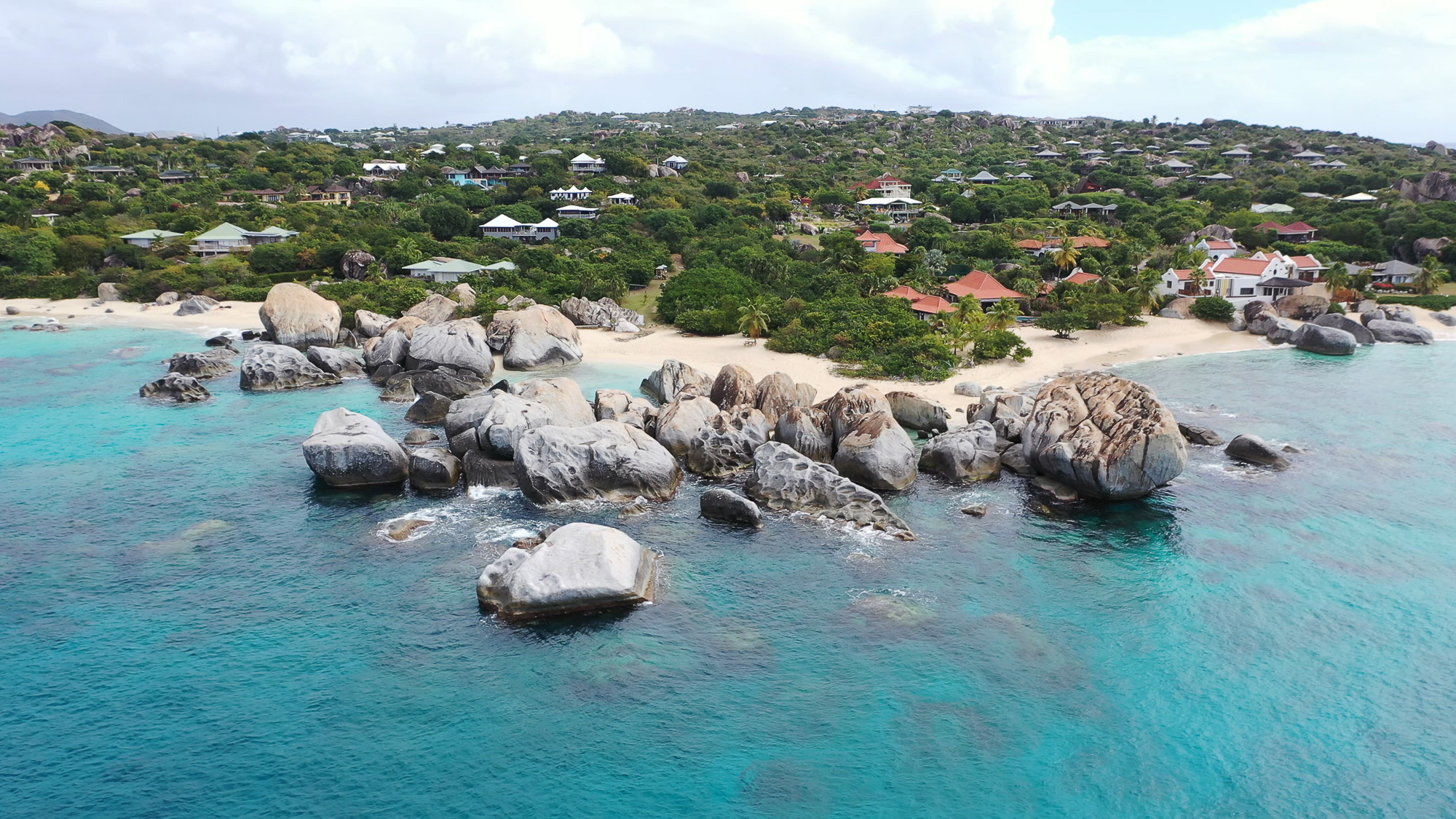
Well, I just googled it and apparently the name origin is unknown. Virgin Gorda means fat lady, early sailors apparently thought the island as seen from a distance looked like a fat lady on her side. |
Feb 25th |
| 85 |
Feb 23 |
Reply |
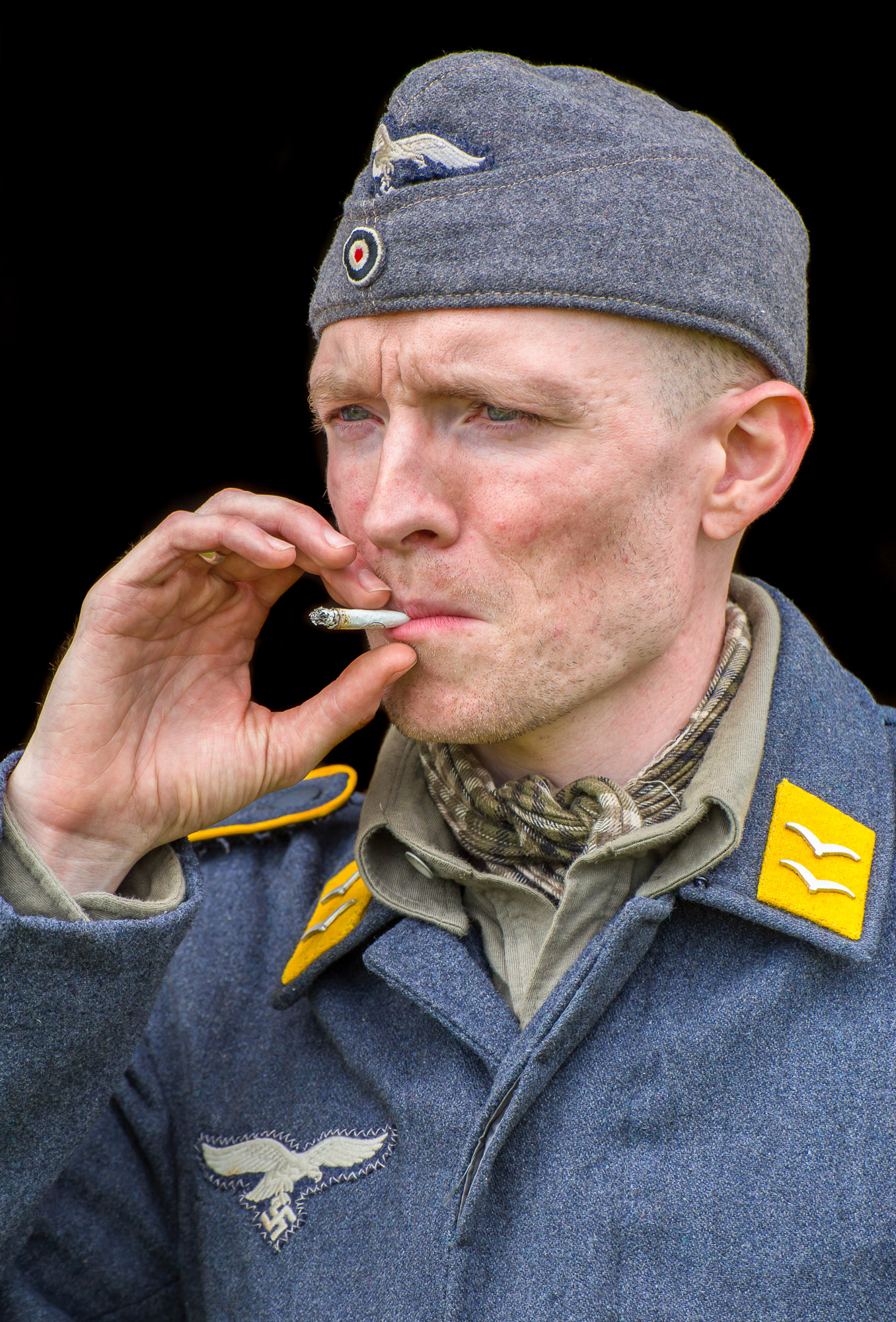
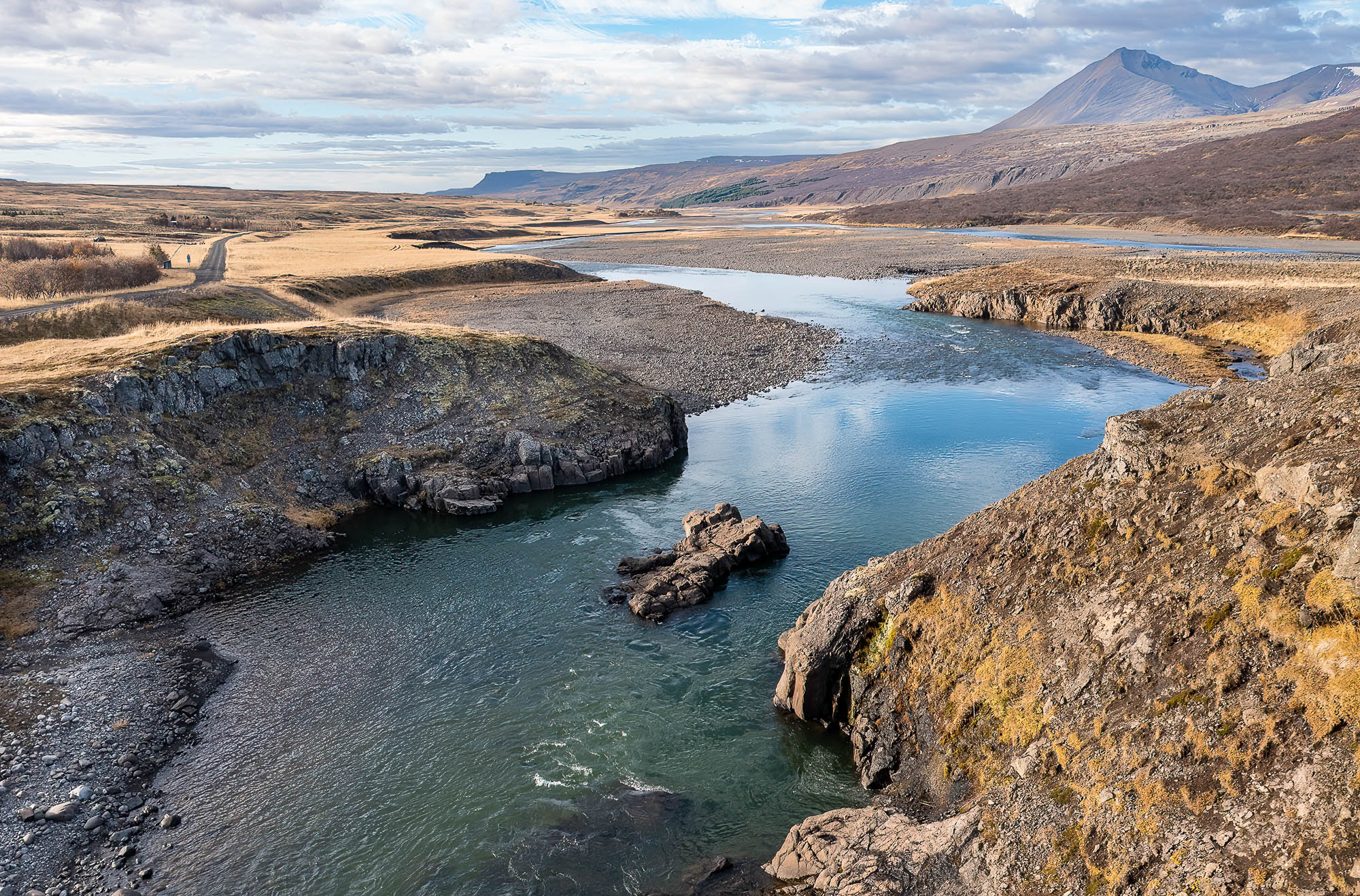
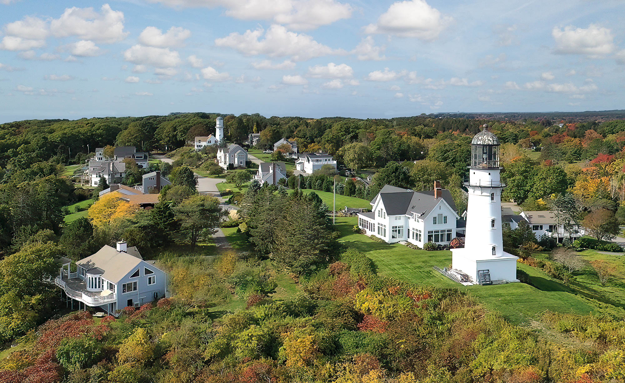
Hi Don, thanks for the comments. Here is the original taken from a video. |
Feb 19th |
 |
| 85 |
Feb 23 |
Reply |
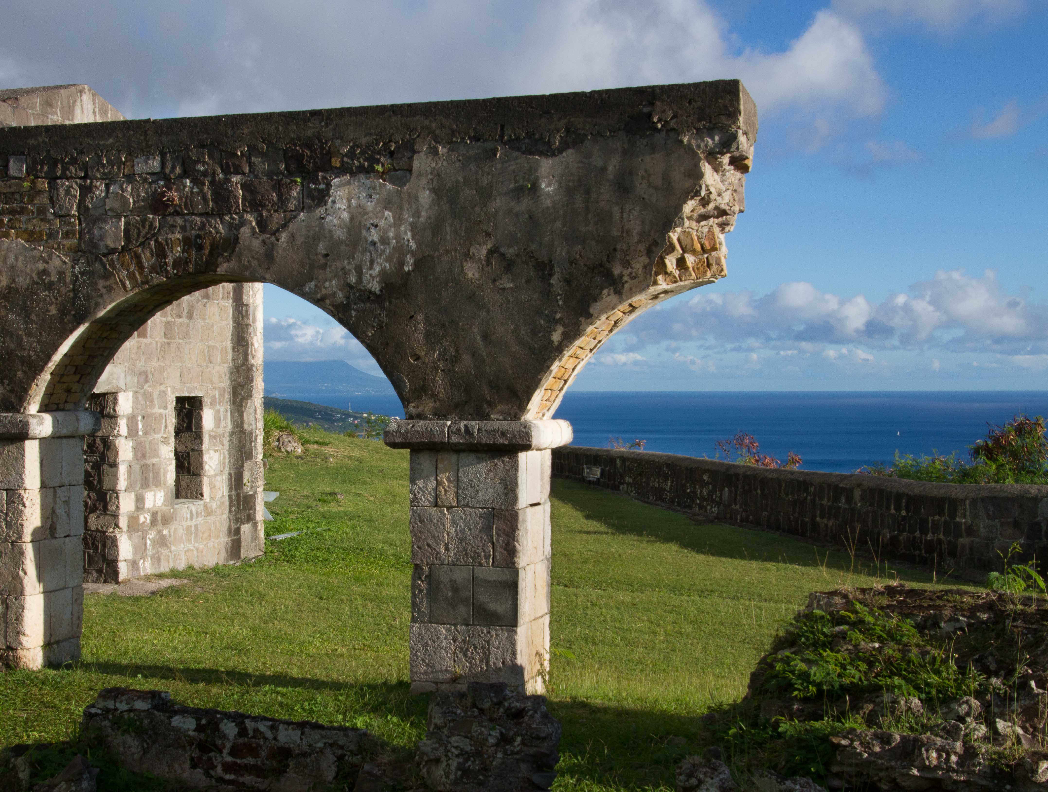
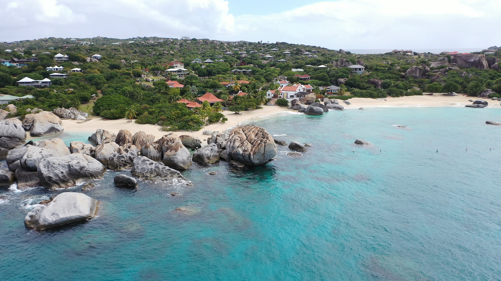
Hi Janos, here is an unedited image showing more the right side. |
Feb 19th |
 |
| 85 |
Feb 23 |
Reply |
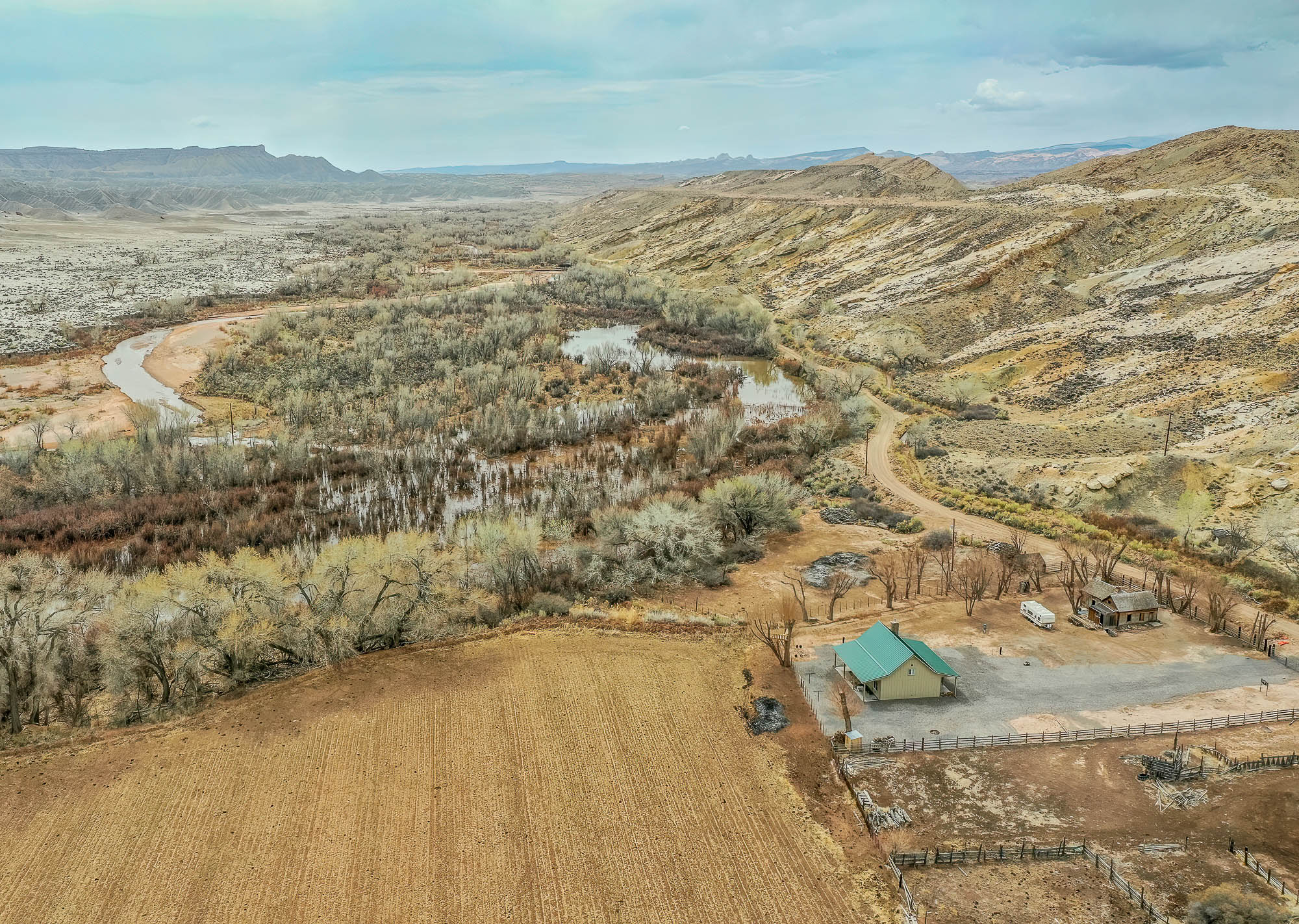
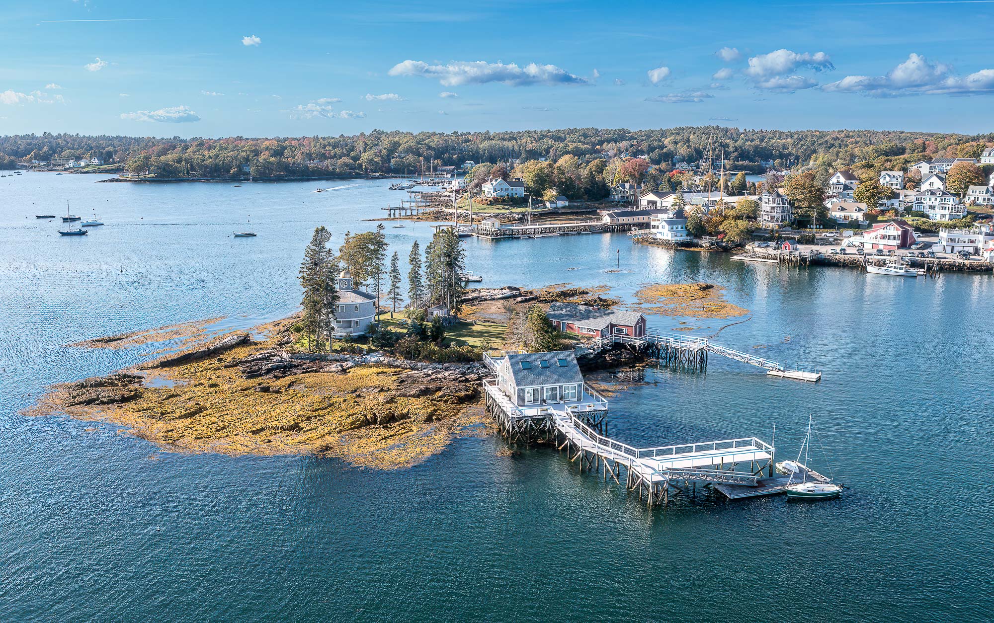
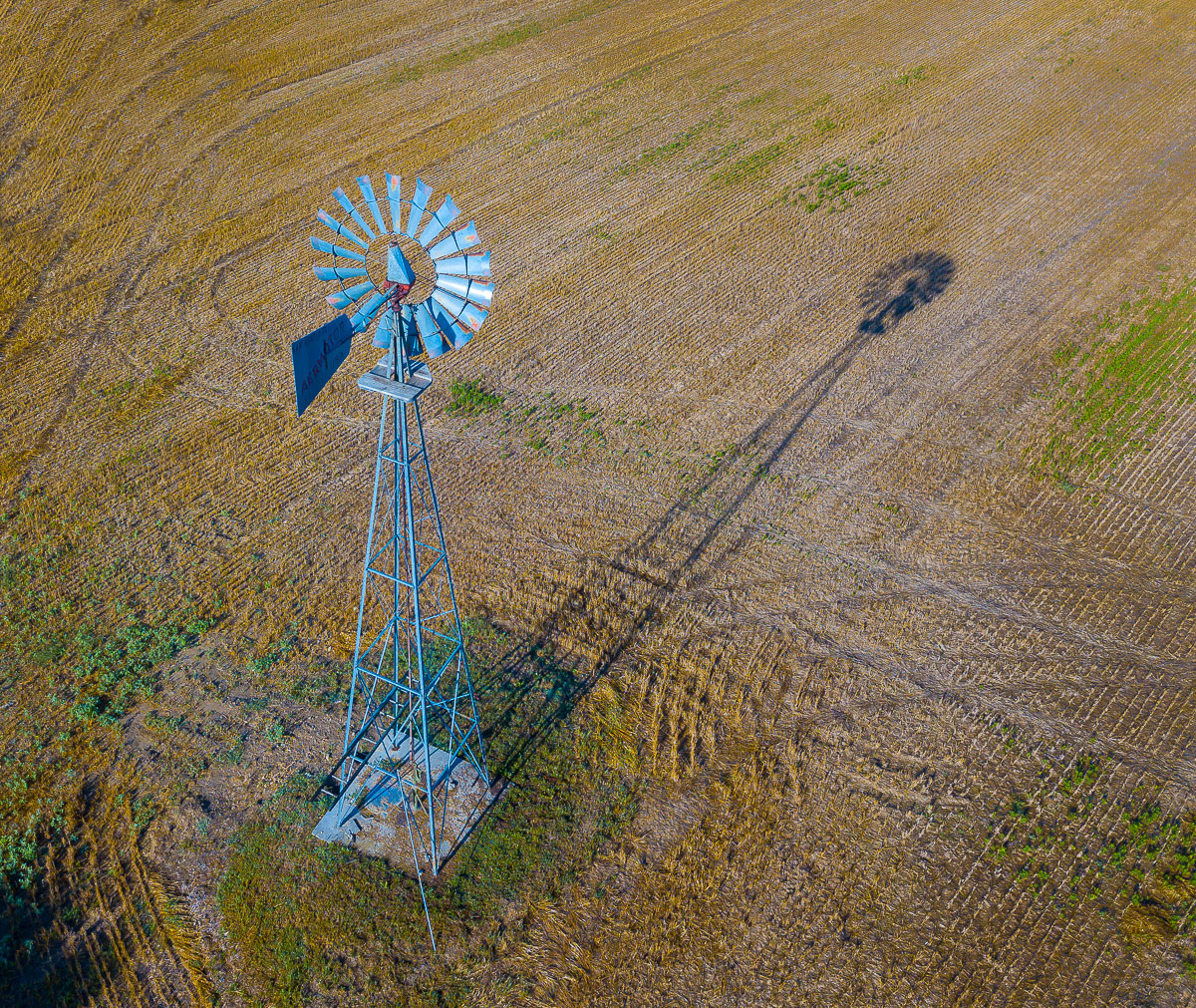
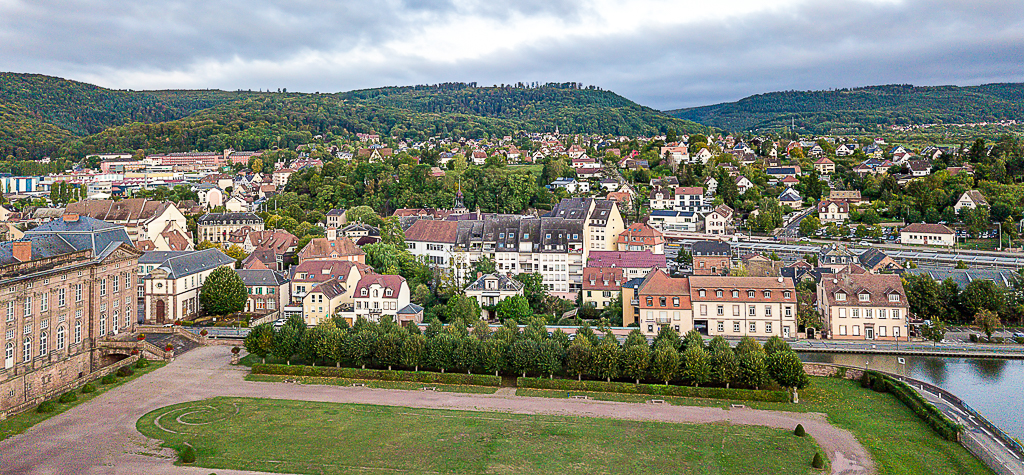
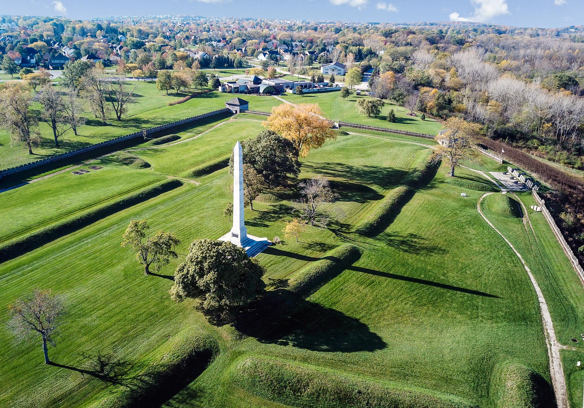
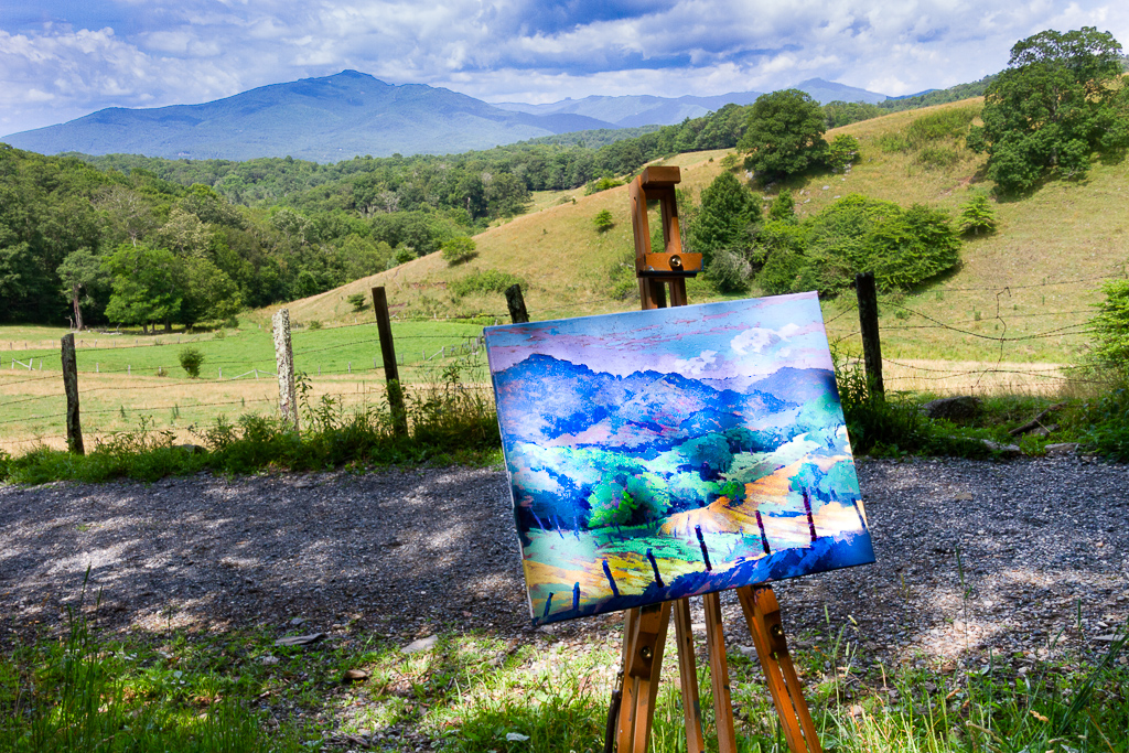
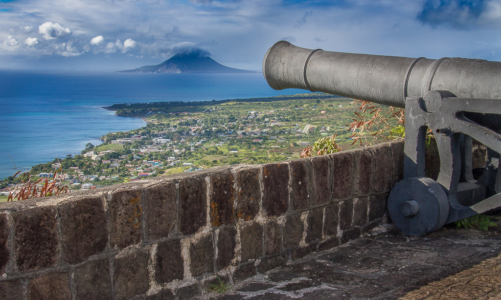
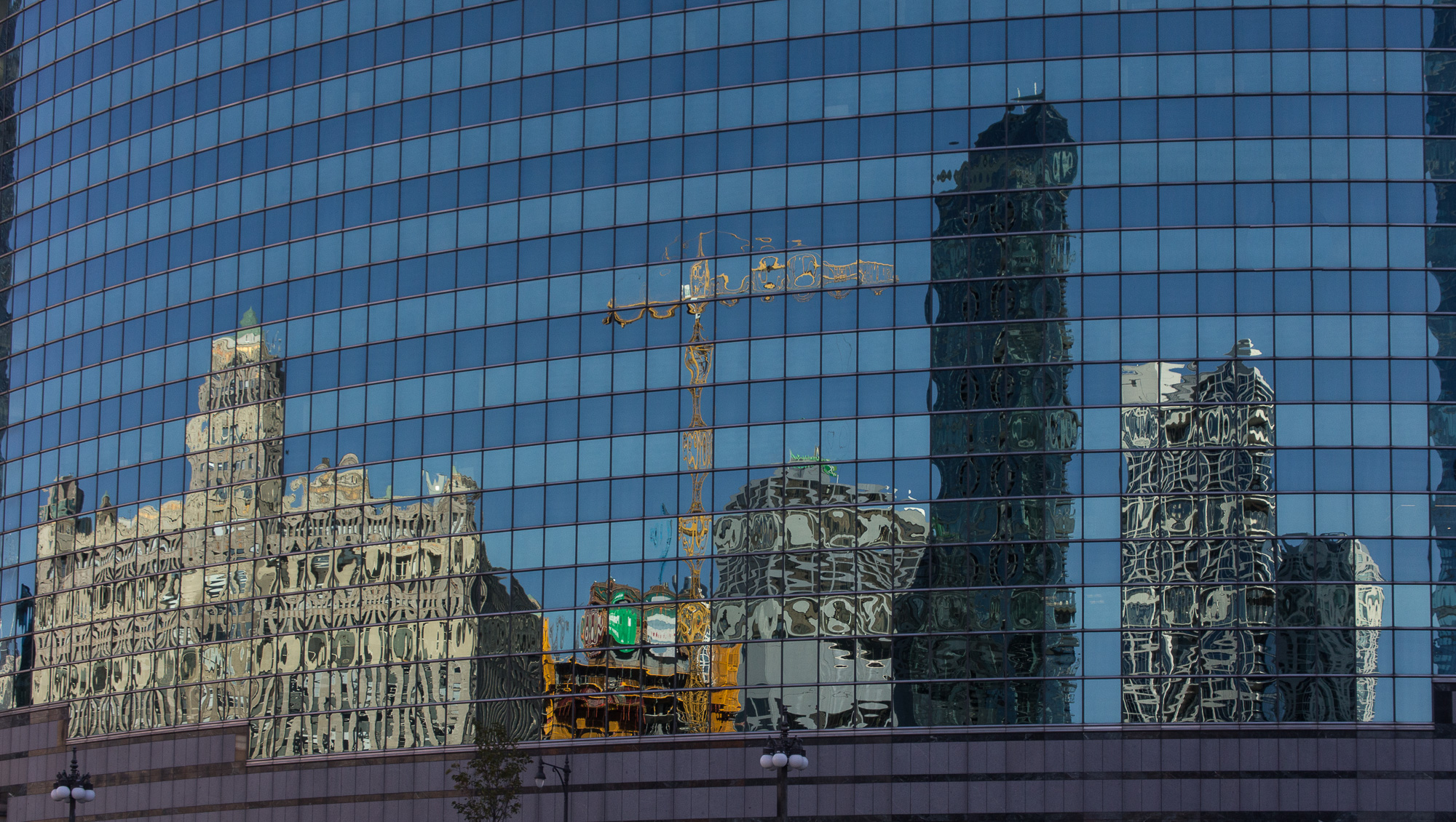
Thanks for the comments Janos. I agree with you that the rocks could be moved to the left to improve the composition. |
Feb 18th |
| 85 |
Feb 23 |
Reply |
Thanks for the comments Pete. I probably have an image or two showing more of the rock details, it's easy to take lots of images and video in that landscape. |
Feb 12th |
| 85 |
Feb 23 |
Comment |
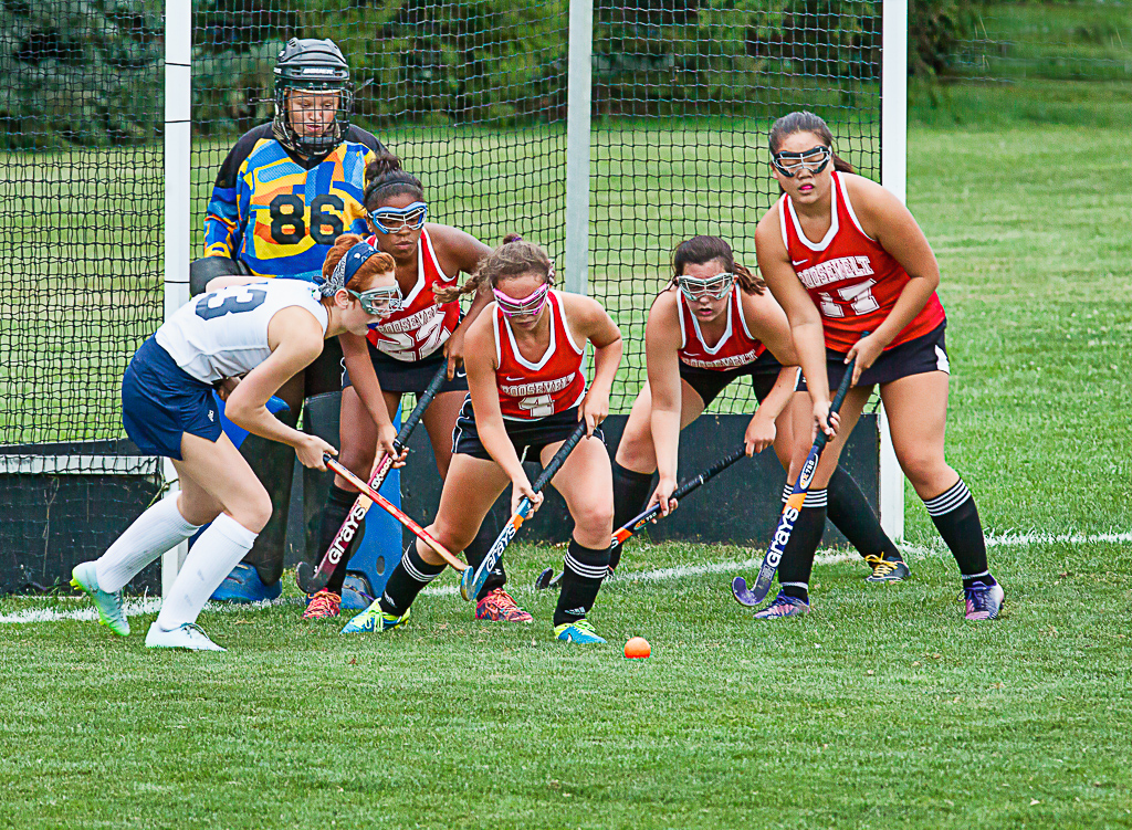
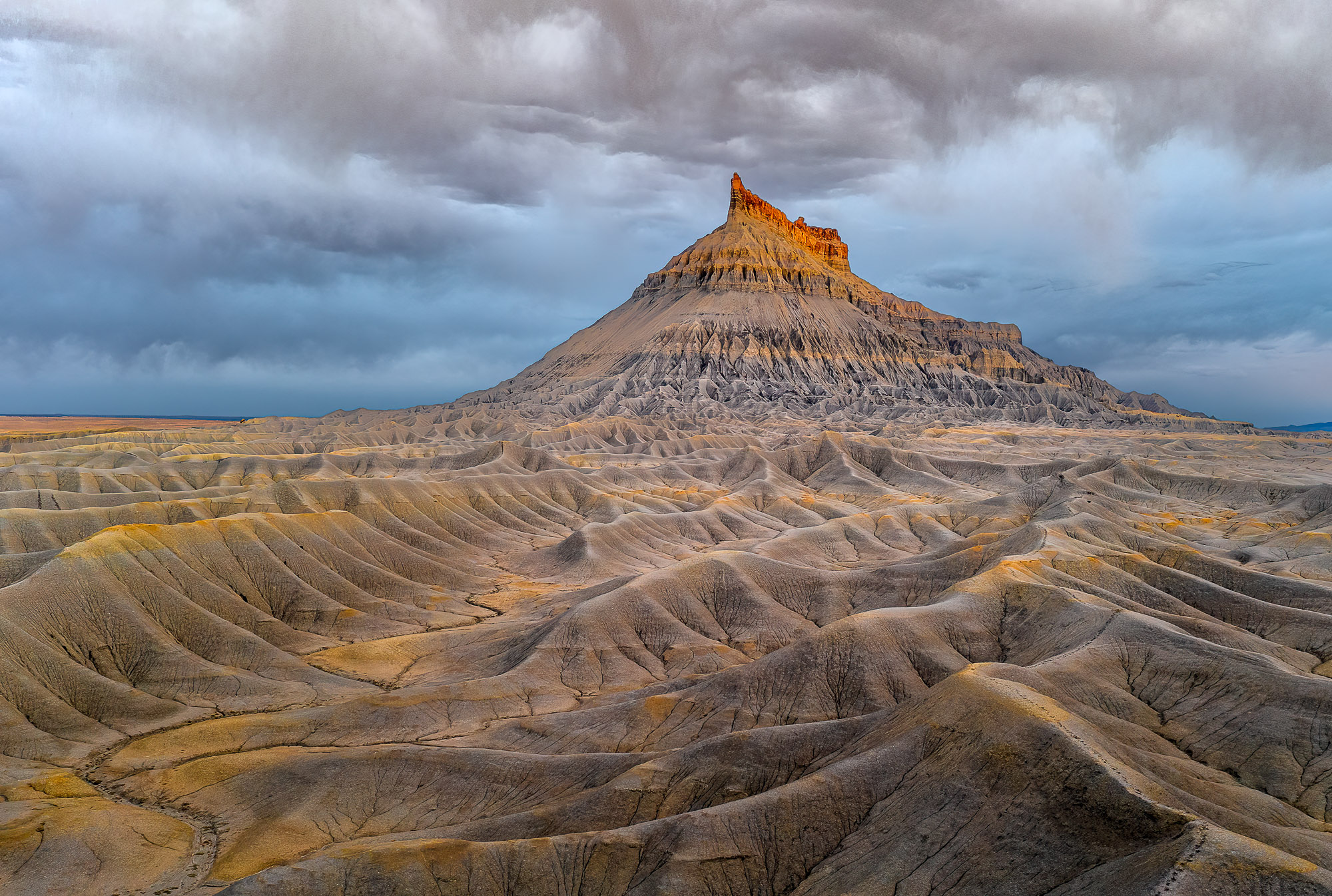
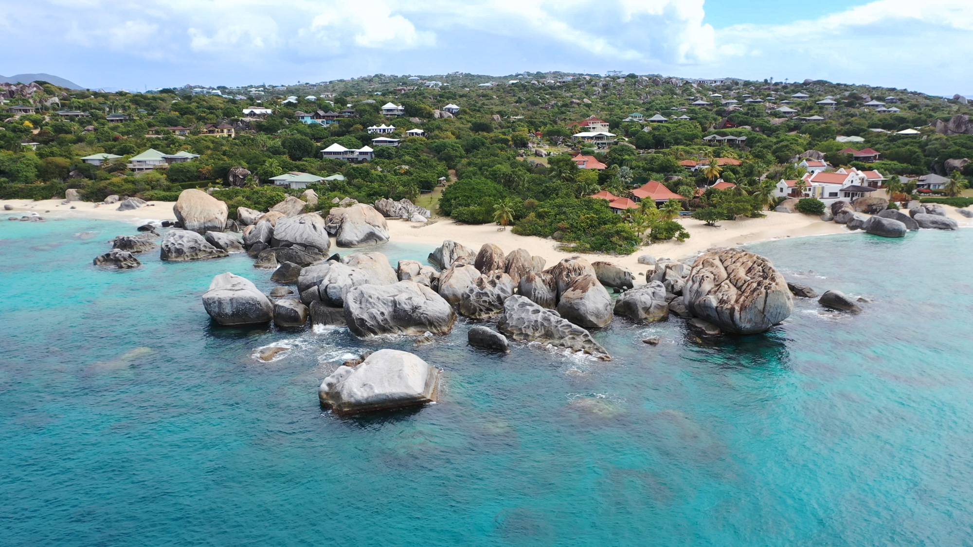
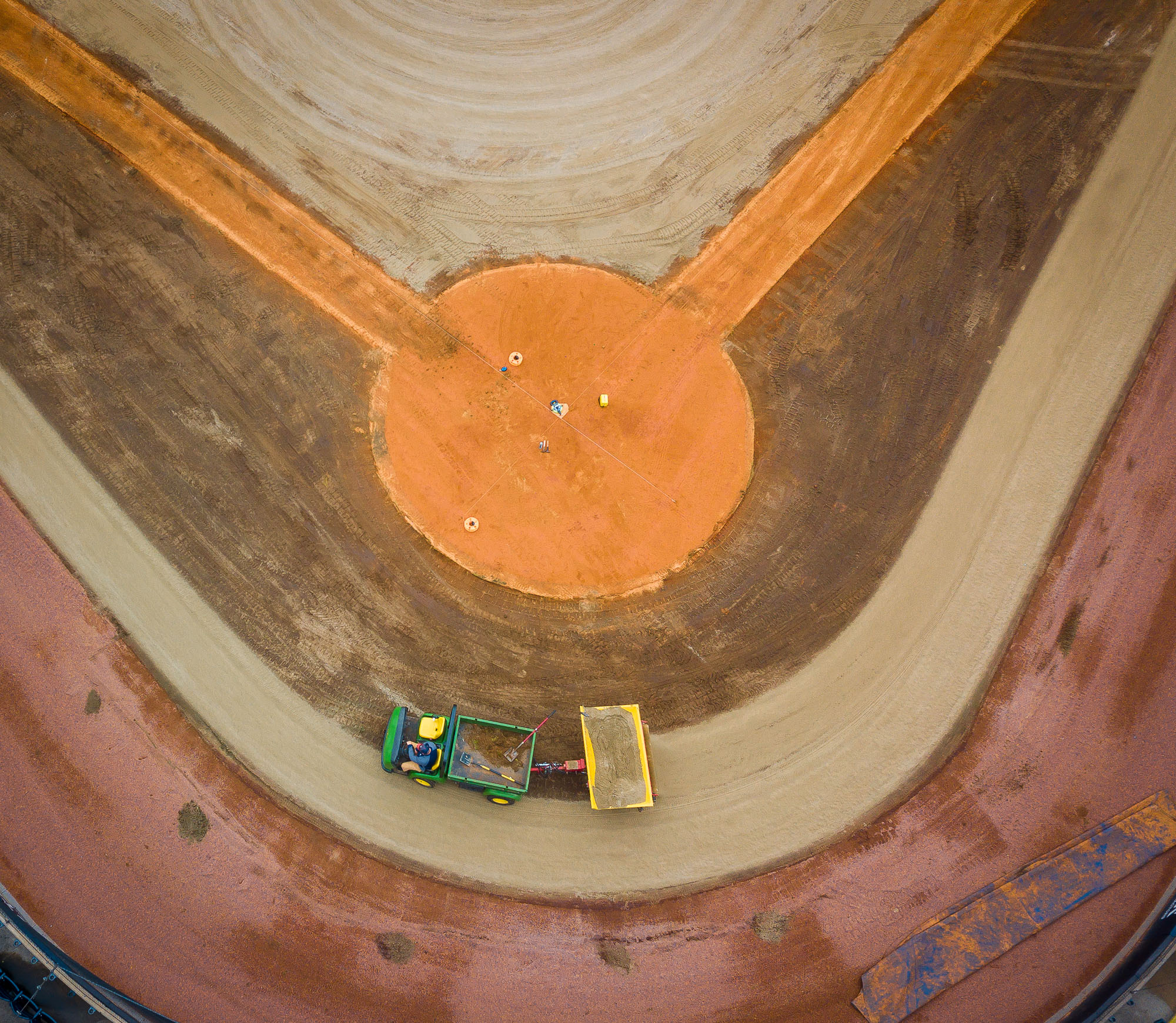
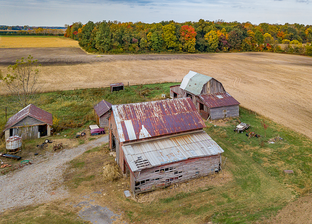
Nicely done Pete. I think the subject matter is great and I love the way you brought out the colors. The composition is strong and the lighting is very nice, it paid to wait for the right time. Great detail and texture throughout the image. I find that a drone gives a photographer the opportunity to get nice depth in landscape image. |
Feb 12th |
| 85 |
Feb 23 |
Comment |
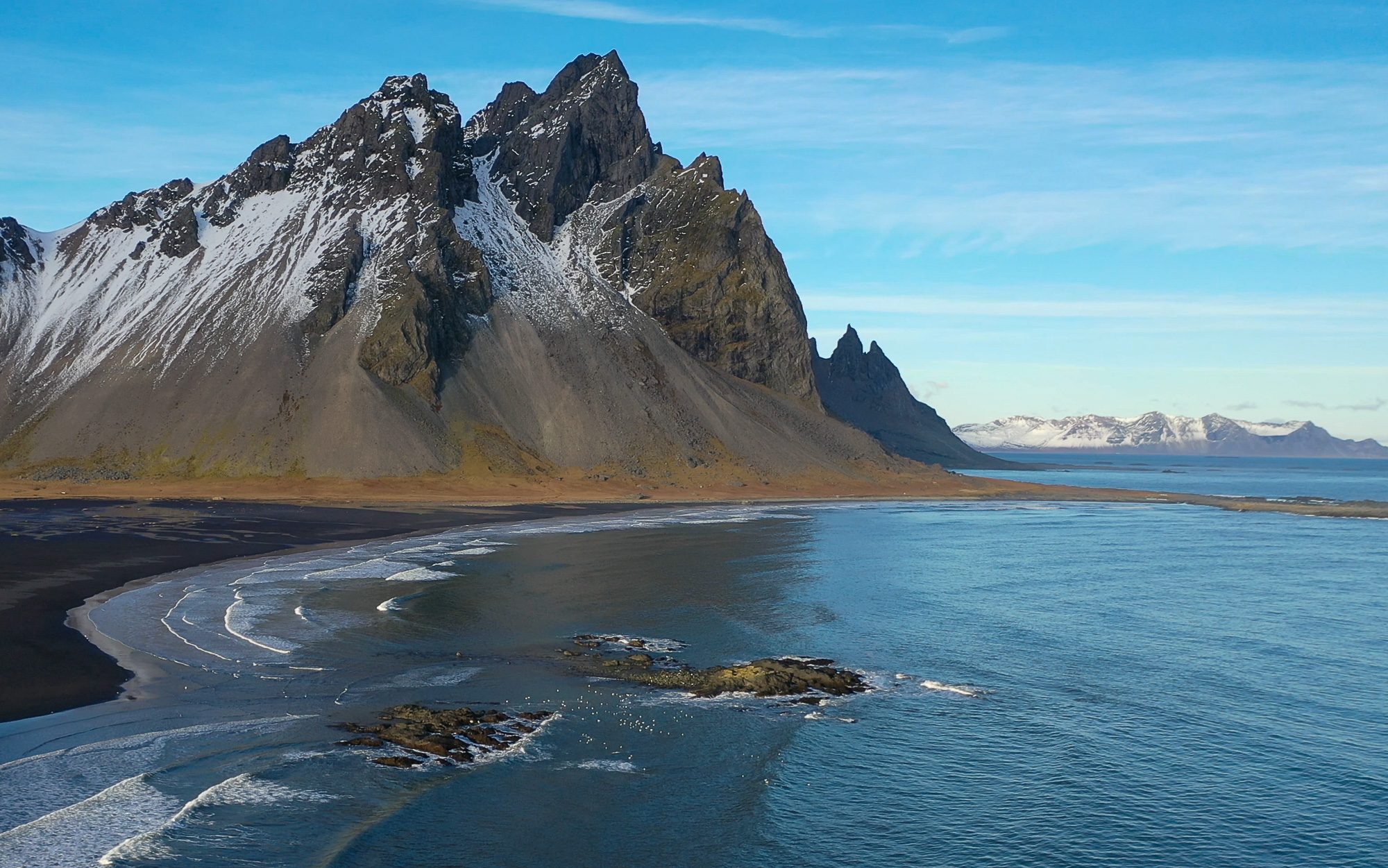
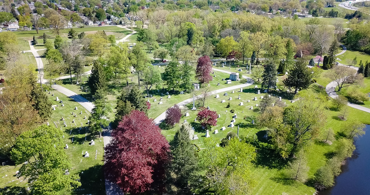
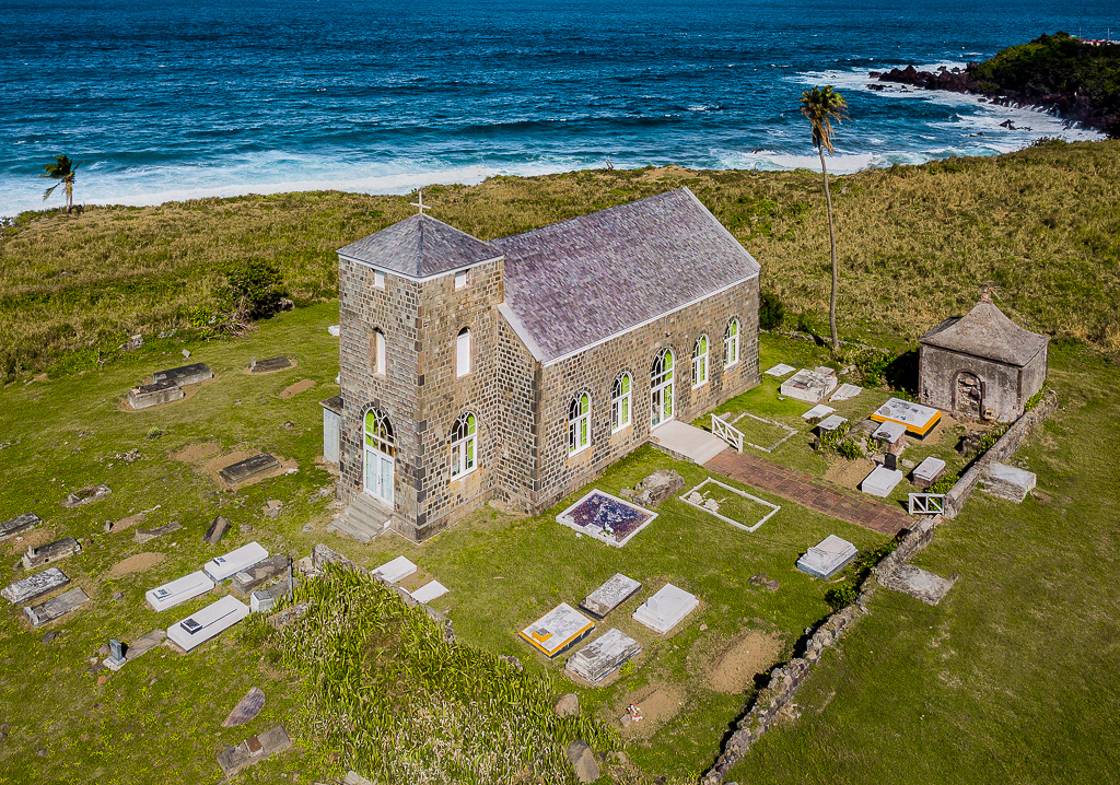
I like the image, I think that the way you cropped out the extra foreground is very good. I agree with Pete that if the tree was off center the composition would be stronger. Upon further consideration I think that it may be possible to crop out the tree and the houses that are up close without altering the feel of the image. |
Feb 12th |
| 85 |
Feb 23 |
Comment |
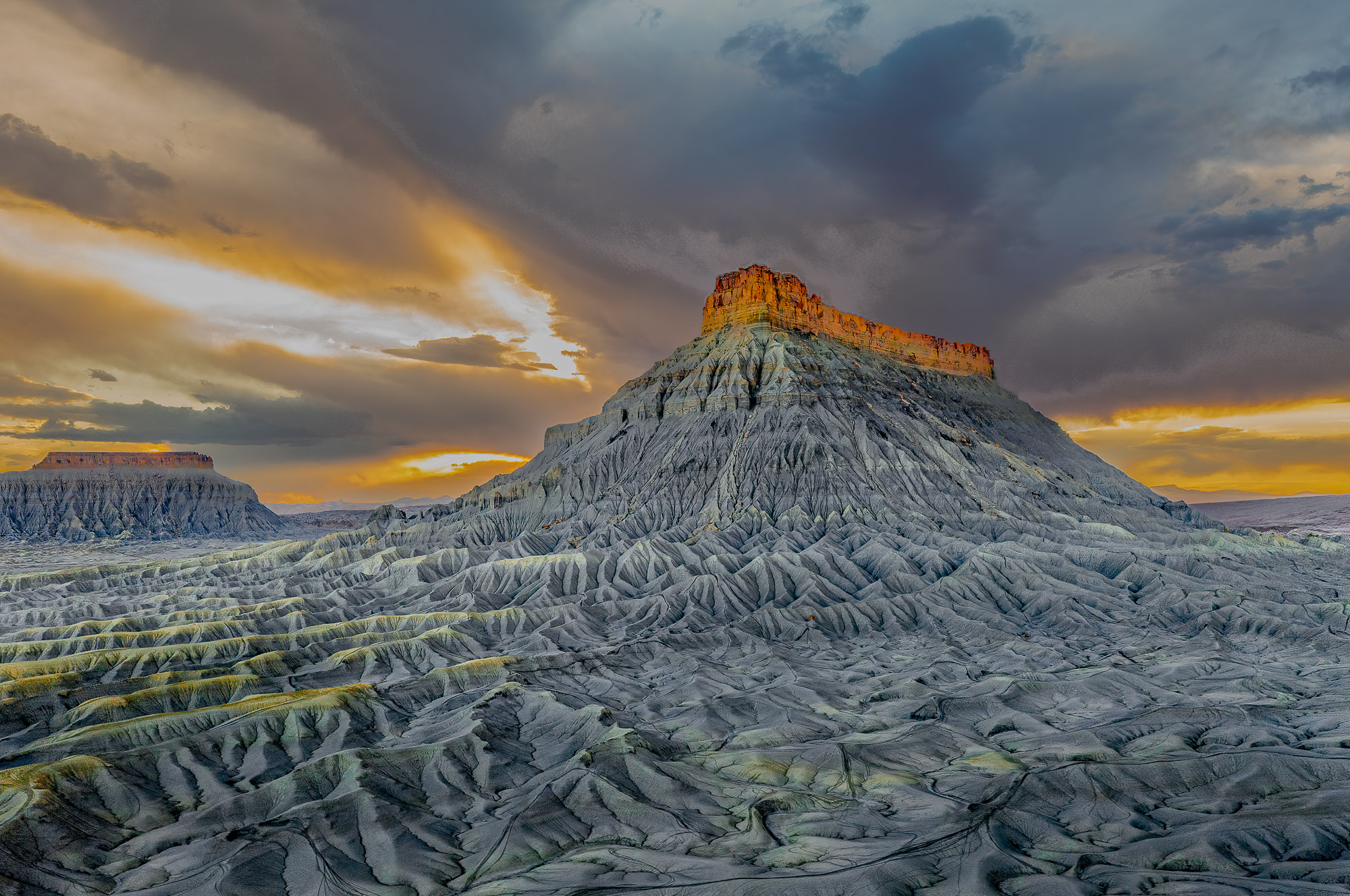
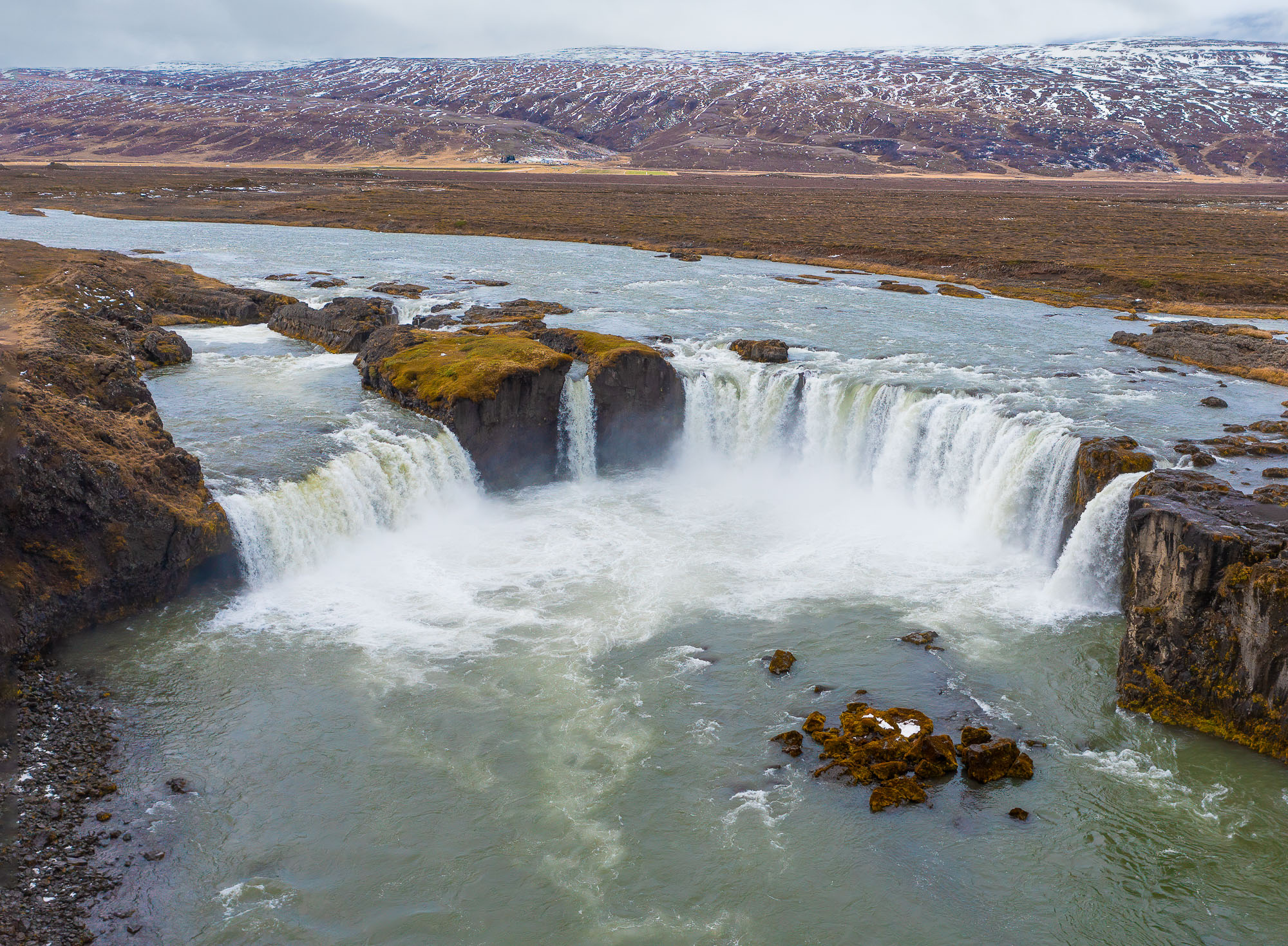
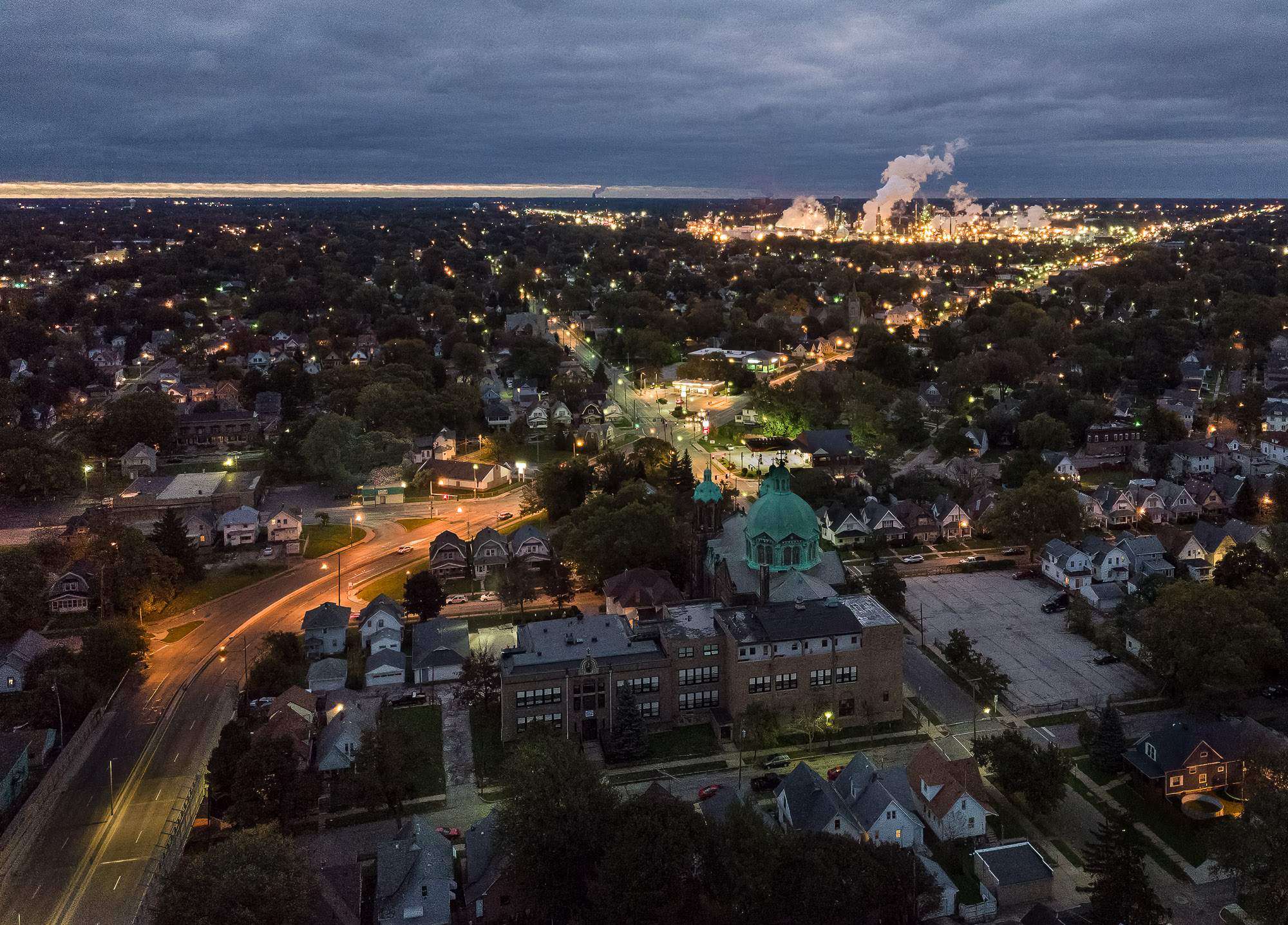
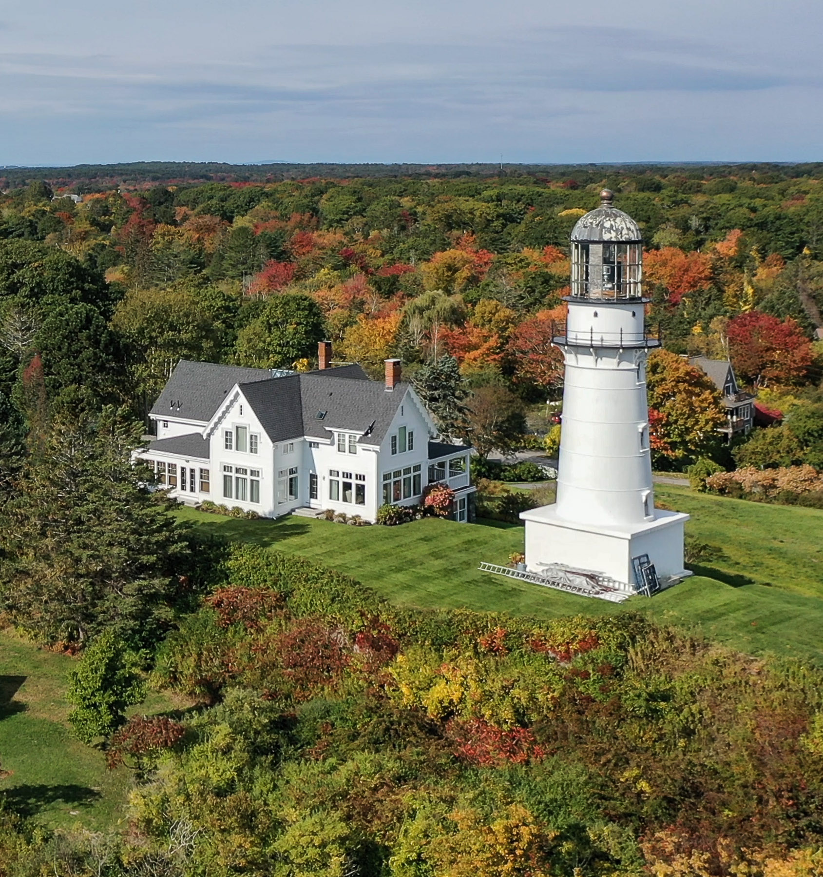
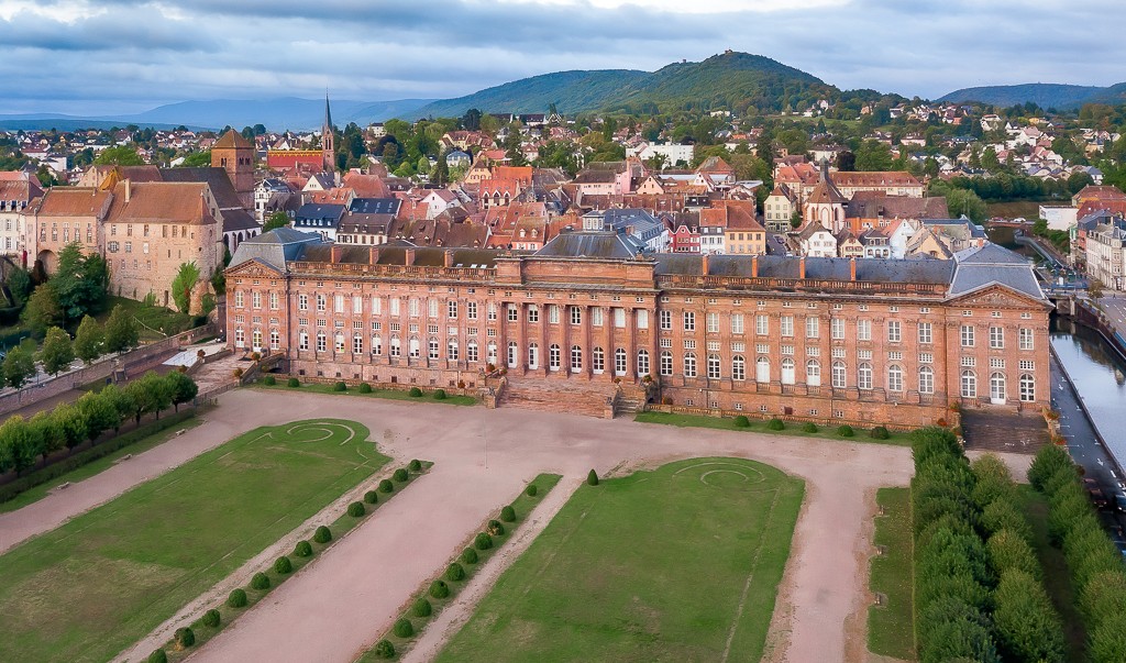
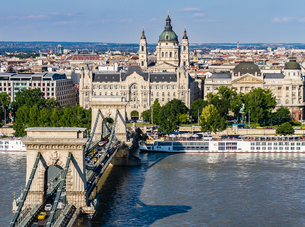
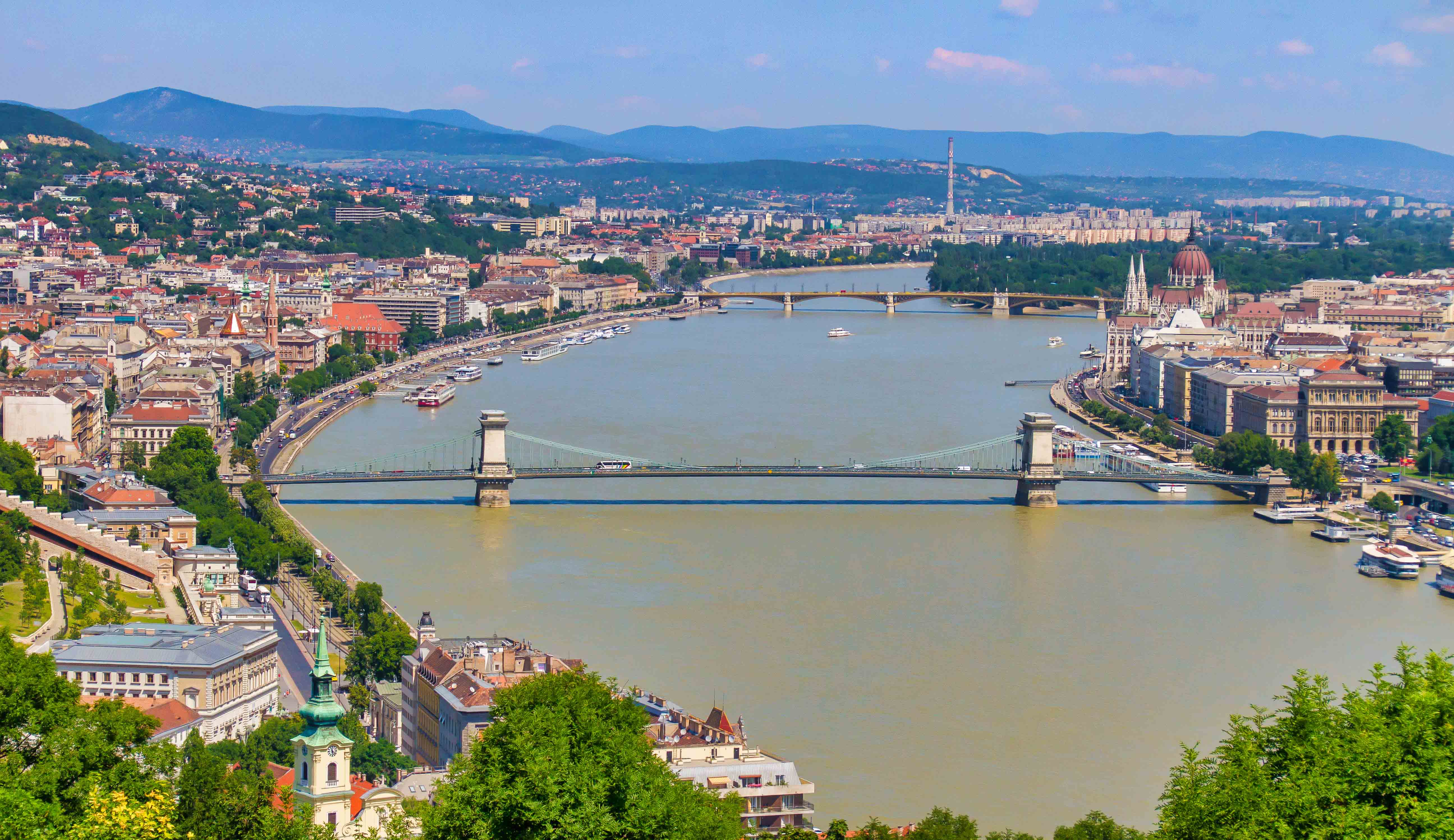
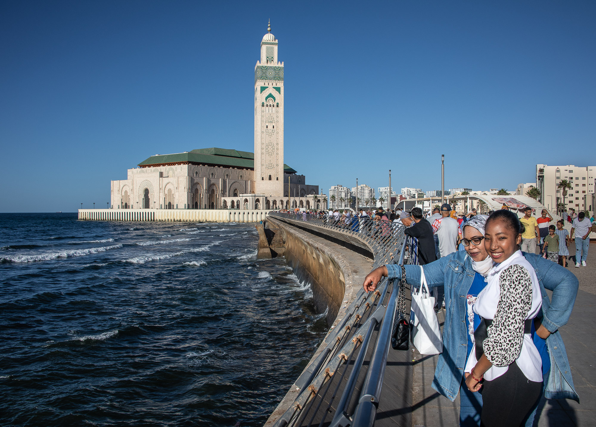
A beautiful image, thanks for sharing it with us. I think the colors and subject matter are right on and the image gives us a breath taking view. I agree with Pete that is castle is not in the strongest position in the image. However, I like being able to see the large expanse of the water and would not want any of that cropped out; so I don't have any ideas for how to reposition the castle while not losing the water. |
Feb 12th |
| 85 |
Feb 23 |
Comment |
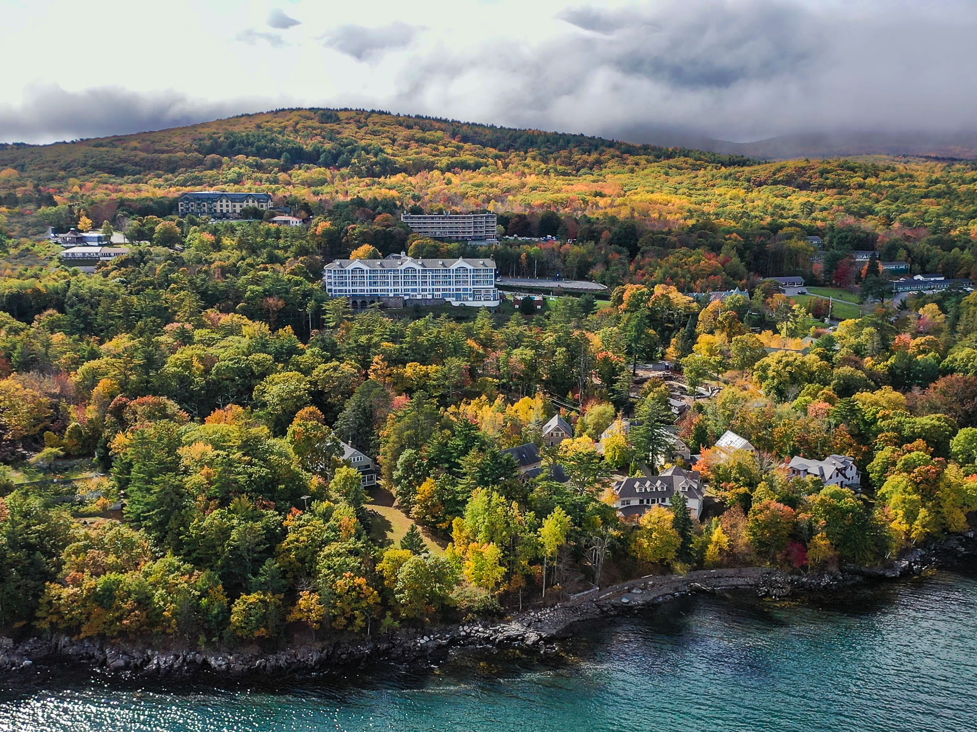
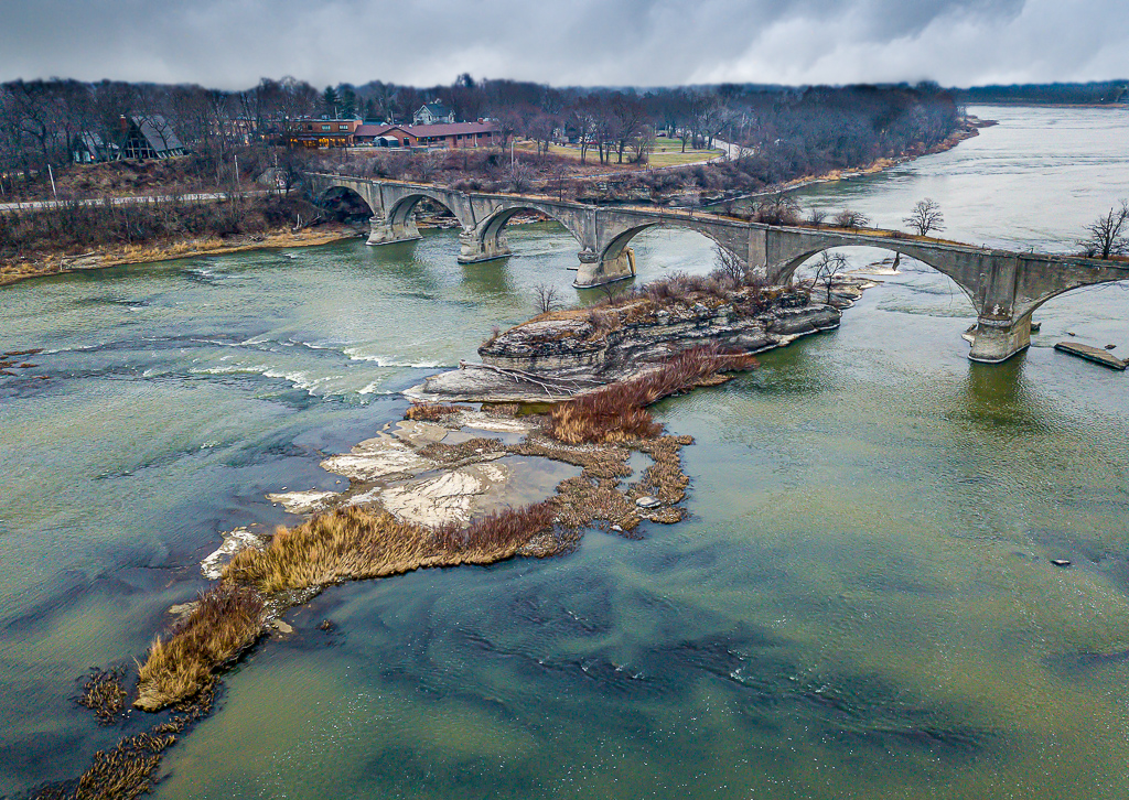
Hi Drema, I really like the colors and the mood of the image. I think the clouds are terrific. I agree with your analysis that the highway is not optimal. With tat in mind I like the way Pete cropped the image and, in my opinion, although that version gives up a lot of real estate I feel that the composition is better. |
Feb 12th |
4 comments - 5 replies for Group 85
|
| 92 |
Feb 23 |
Comment |
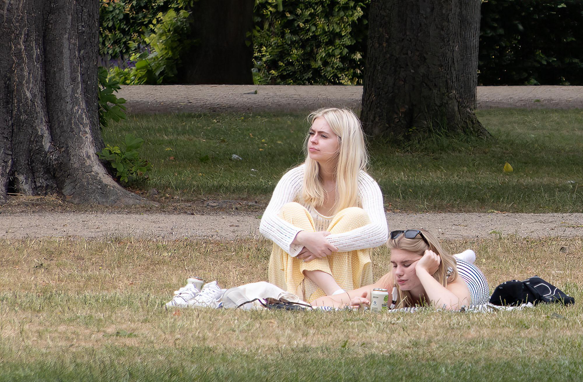
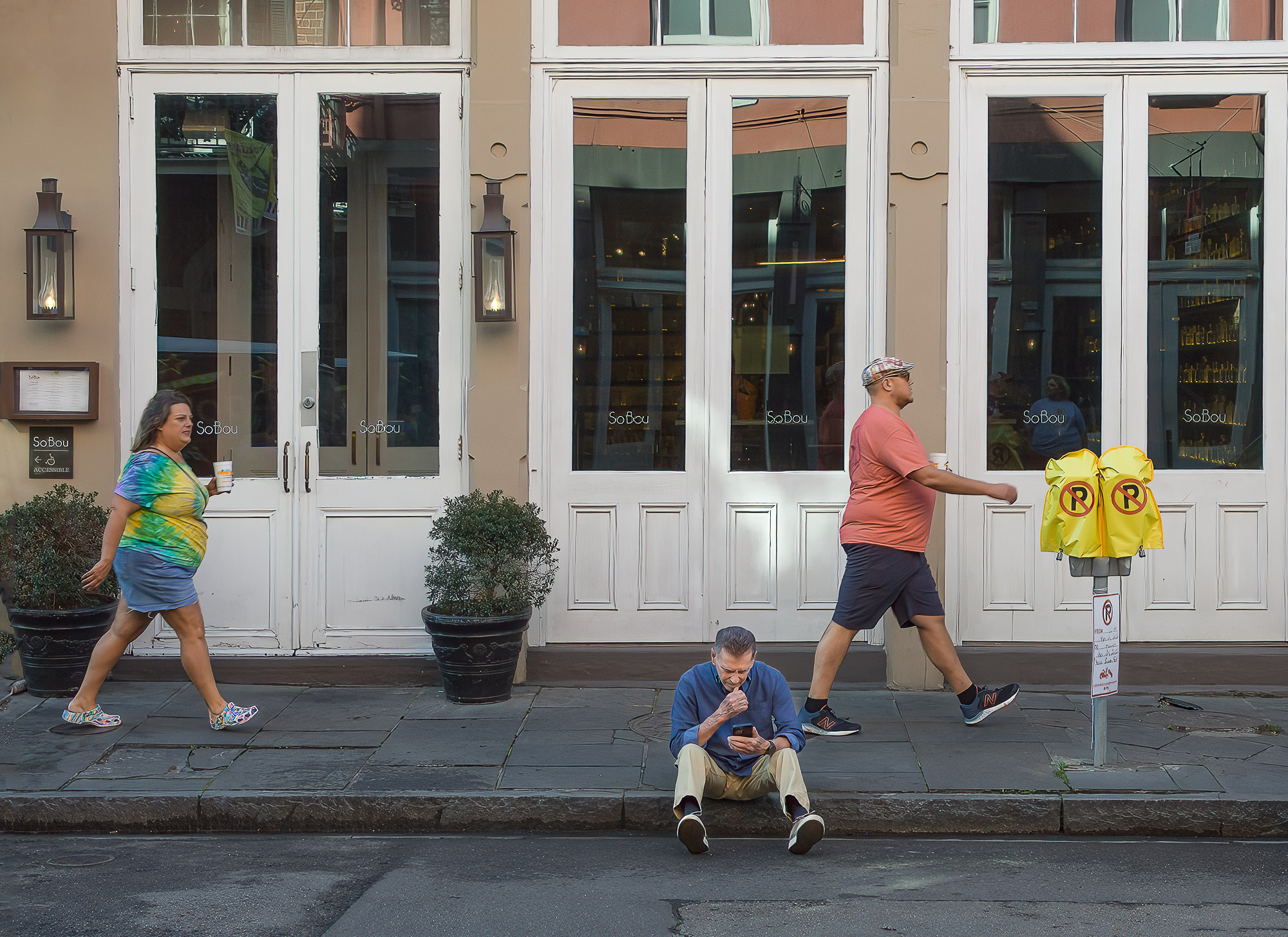
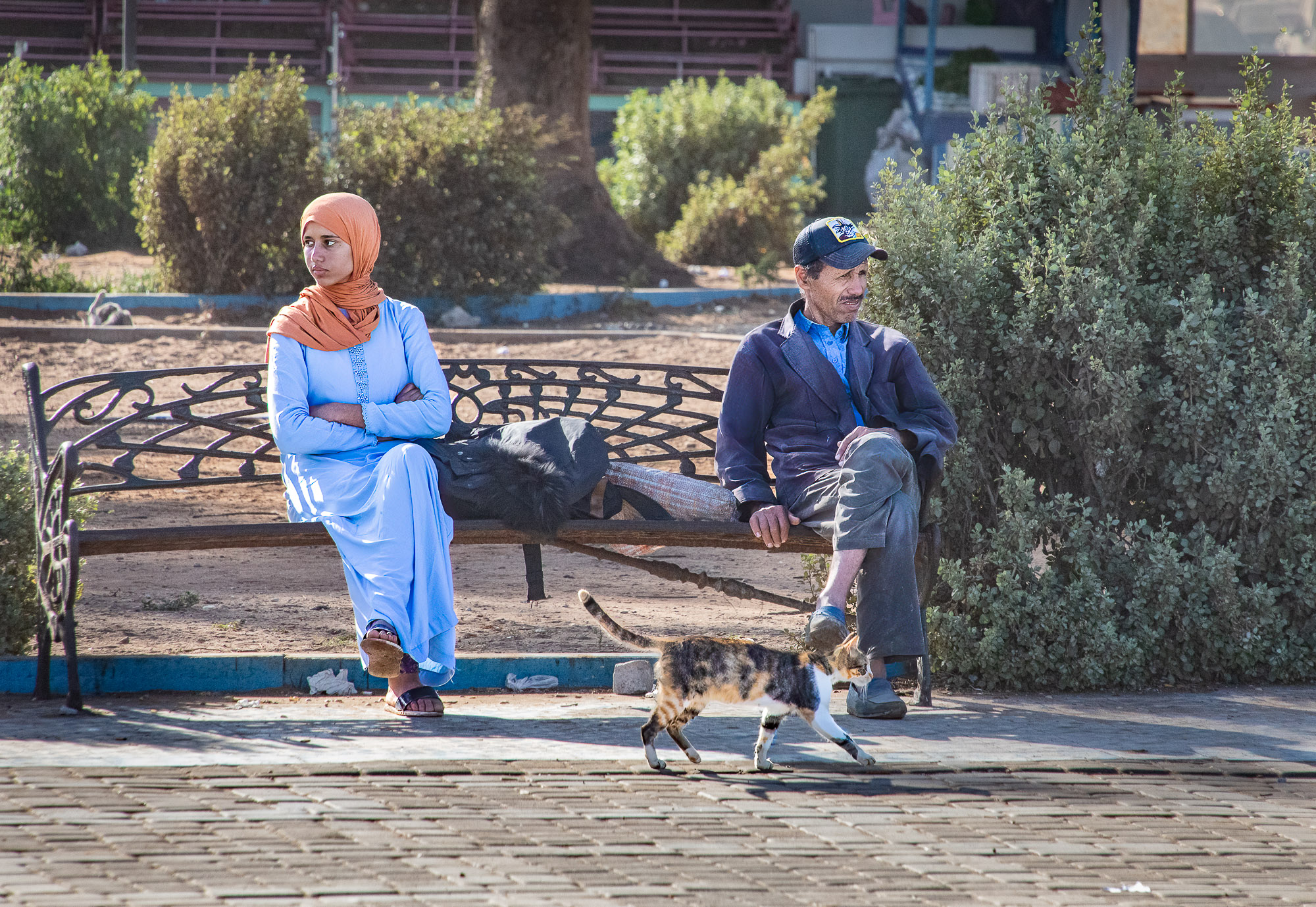
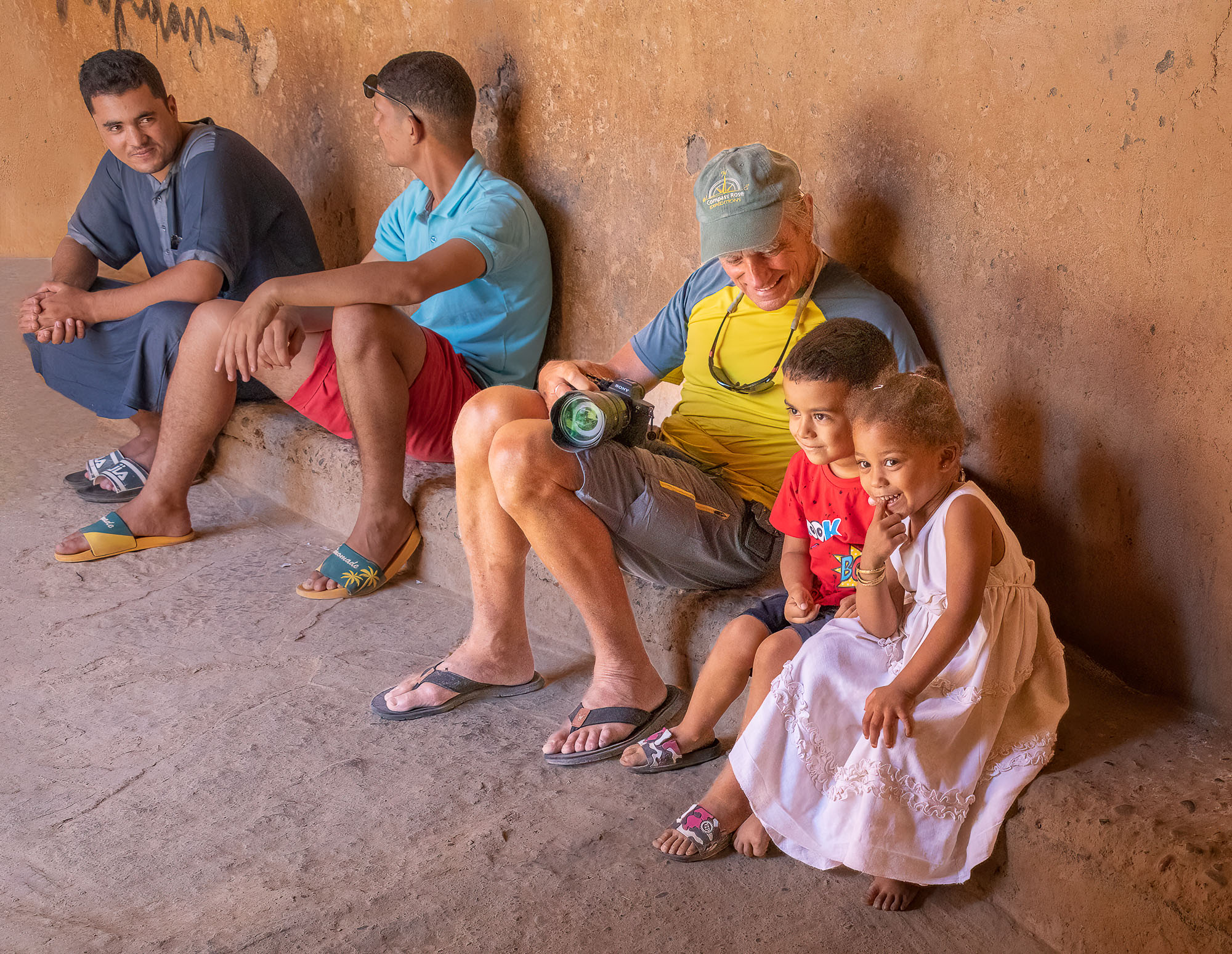
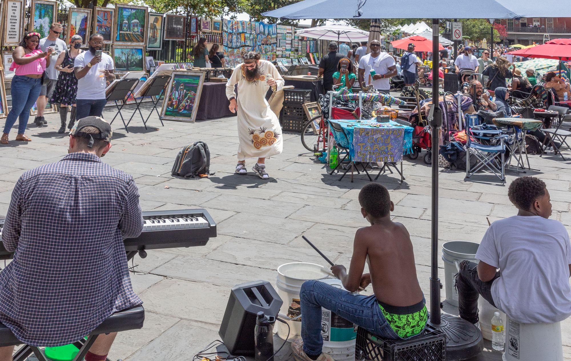
Hi Ian, you certainly took advantage of an opportunity, good for you. I agree with Chuck that a somewhat smaller f stop might have sharpened up the subjects a bit. I like your idea of trying to make the busy background less obtrusive with the narrow depth of field. This is a tough situation, Chuck's suggestion for a B&W is good, I think that you could also use a brush and darken/de-saturate the background somewhat also. |
Feb 24th |
| 92 |
Feb 23 |
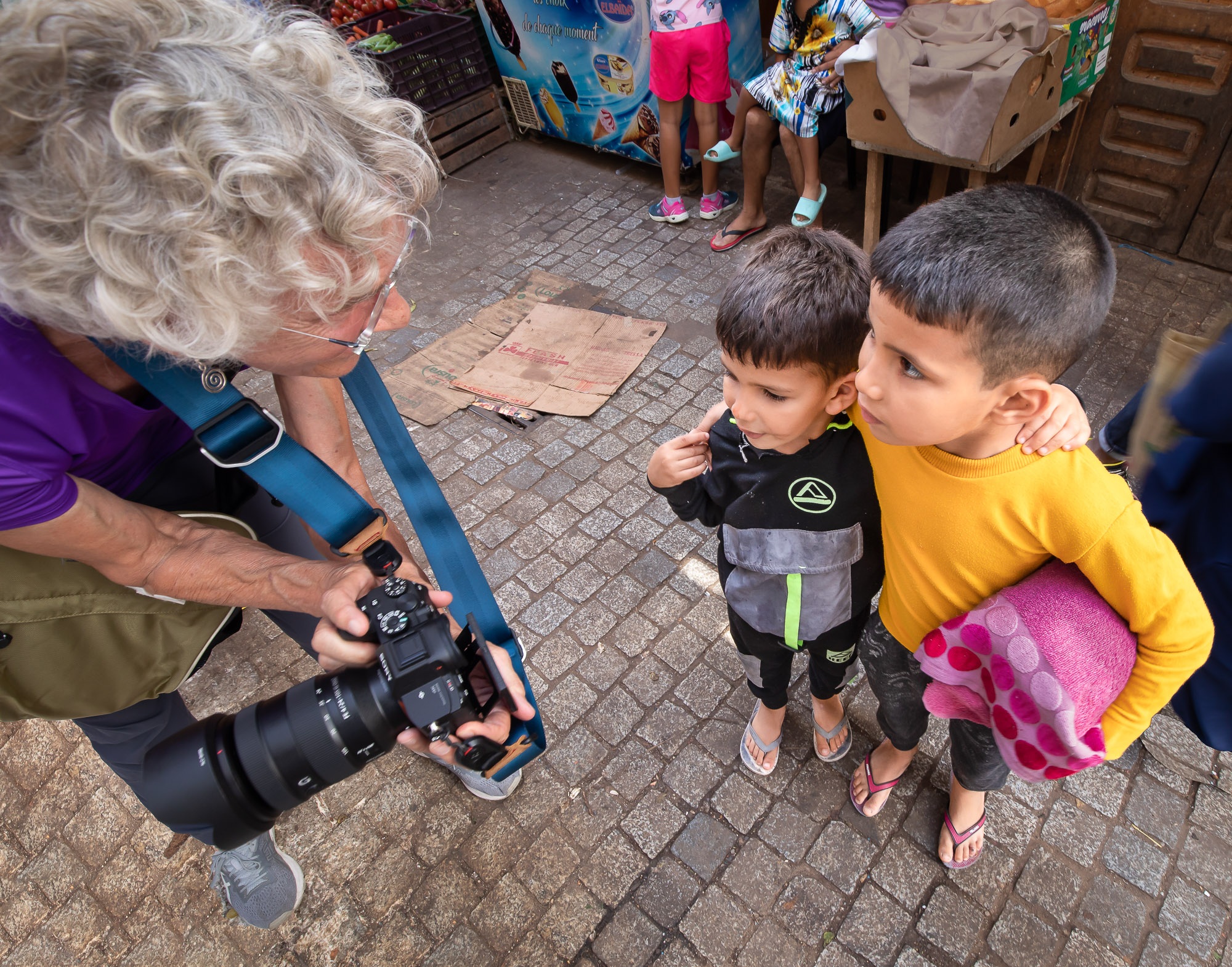
Comment |
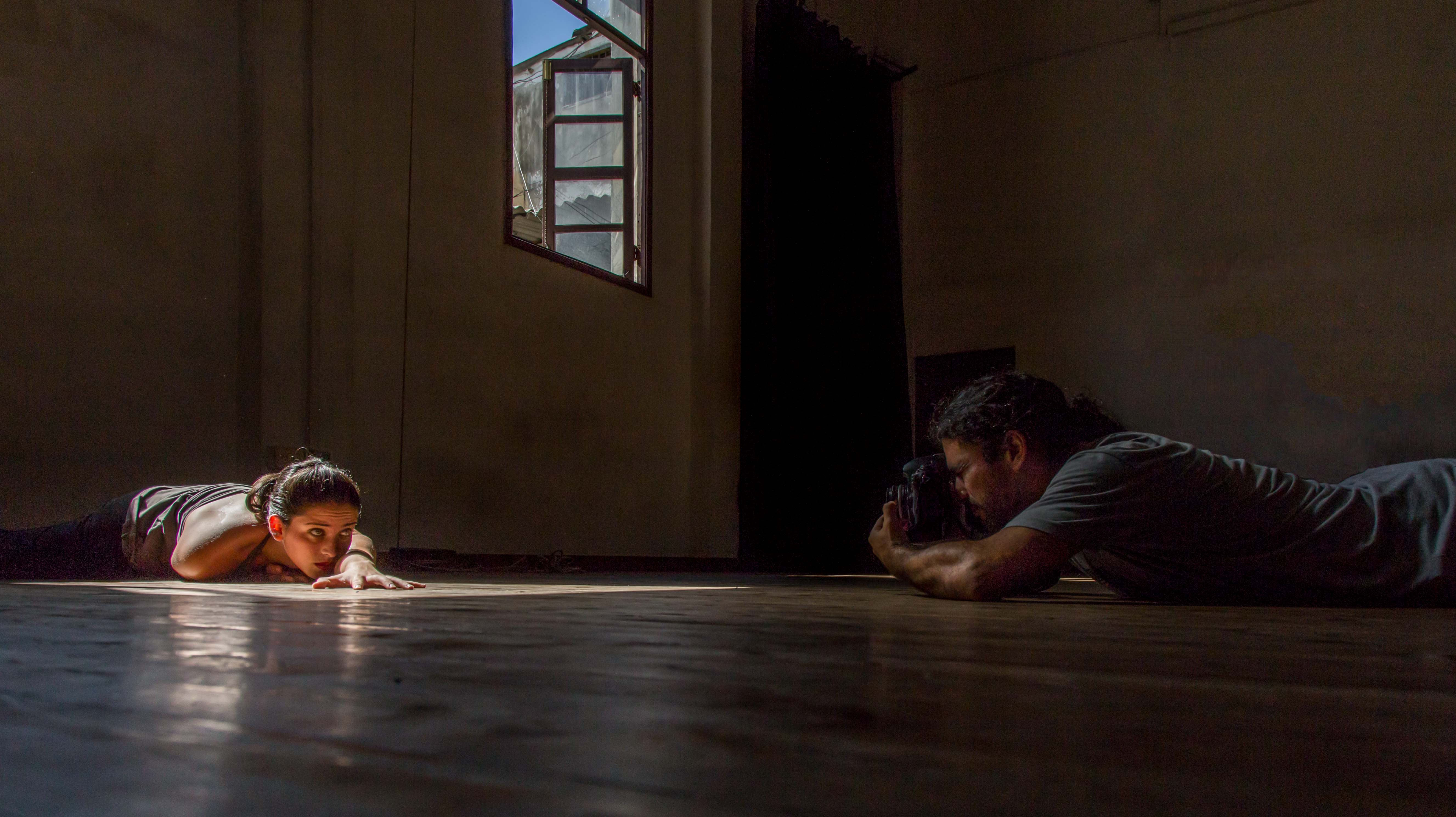
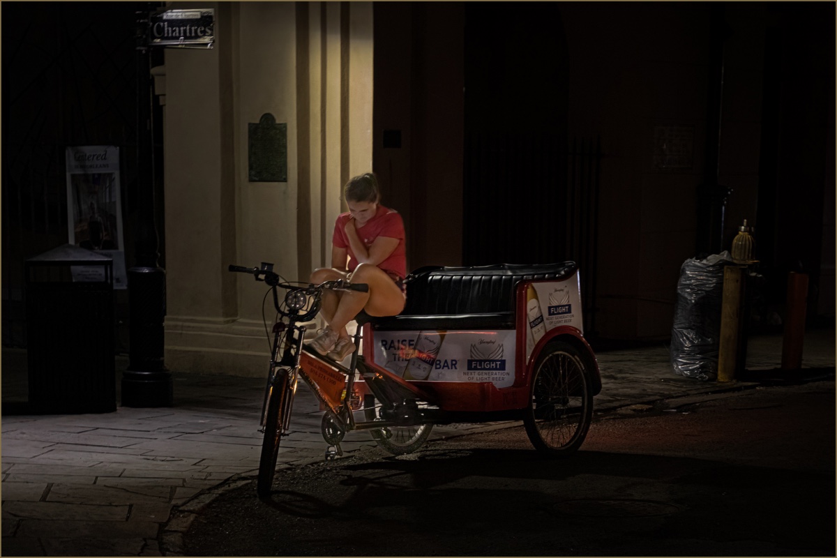
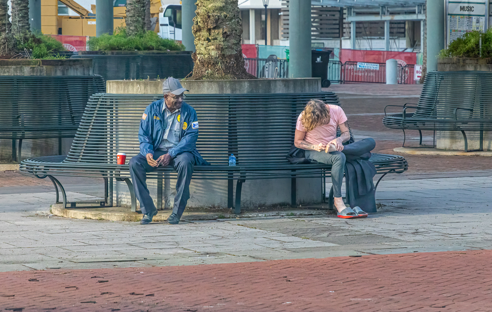
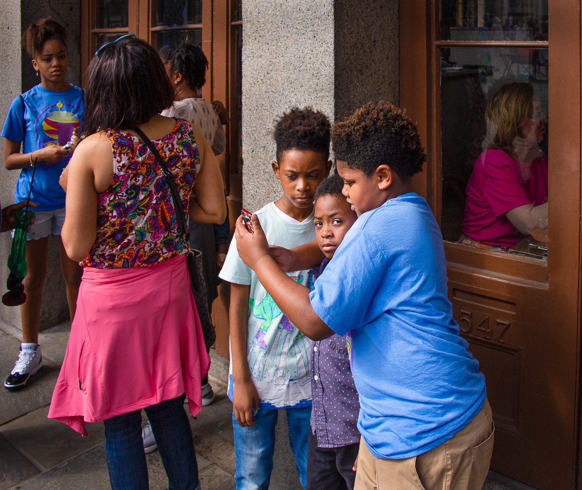
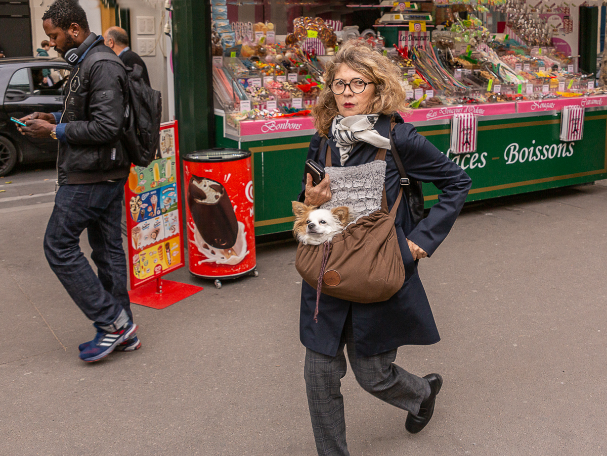
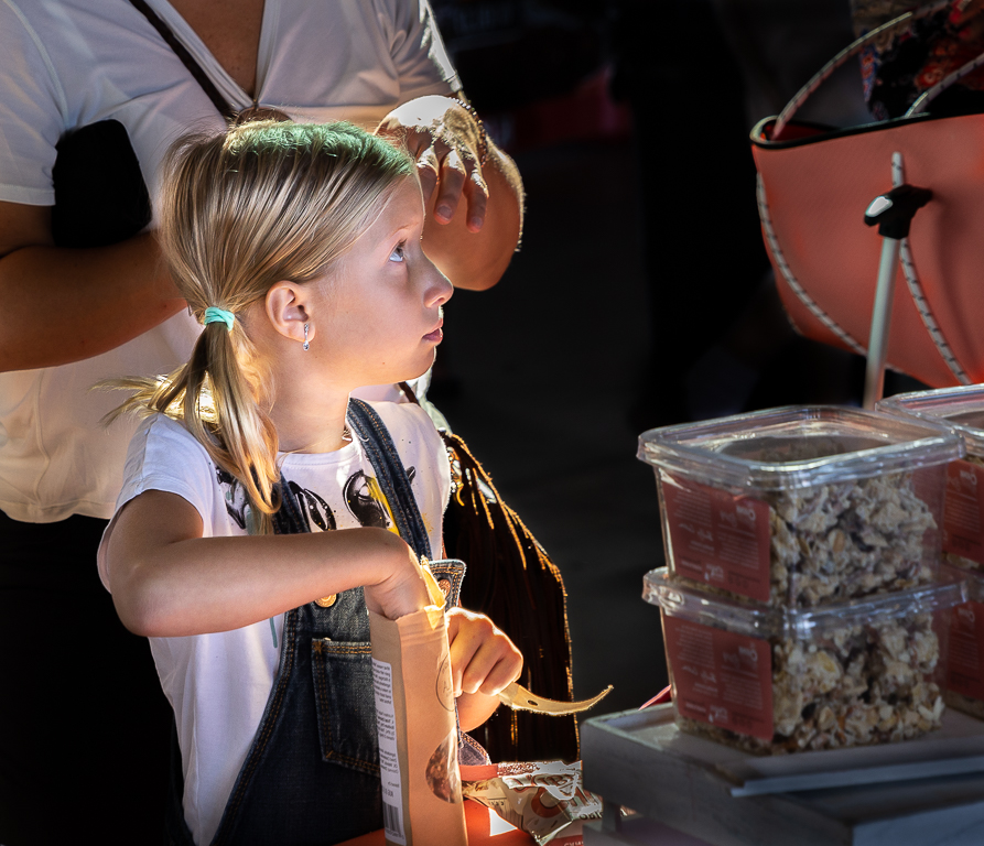
Hi Marianne, I think you have another great image. You have an eye for seeing interesting compositions. I agree about the security camera, the reflection of the boy is another thing. Since you do not have all of his face I think cloning out what is there might be a viable option. In my opinion if we could not see any of him then we would not be distracted by what we do see. I think this image is very well done. |
Feb 23rd |
| 92 |
Feb 23 |
Comment |
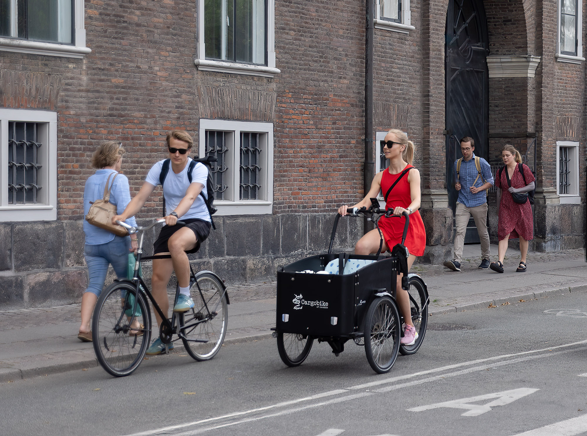
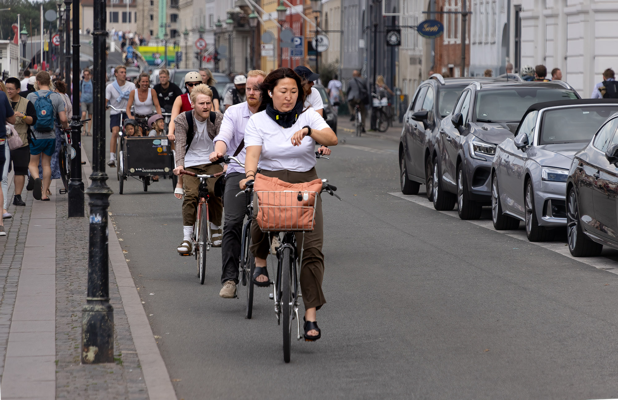
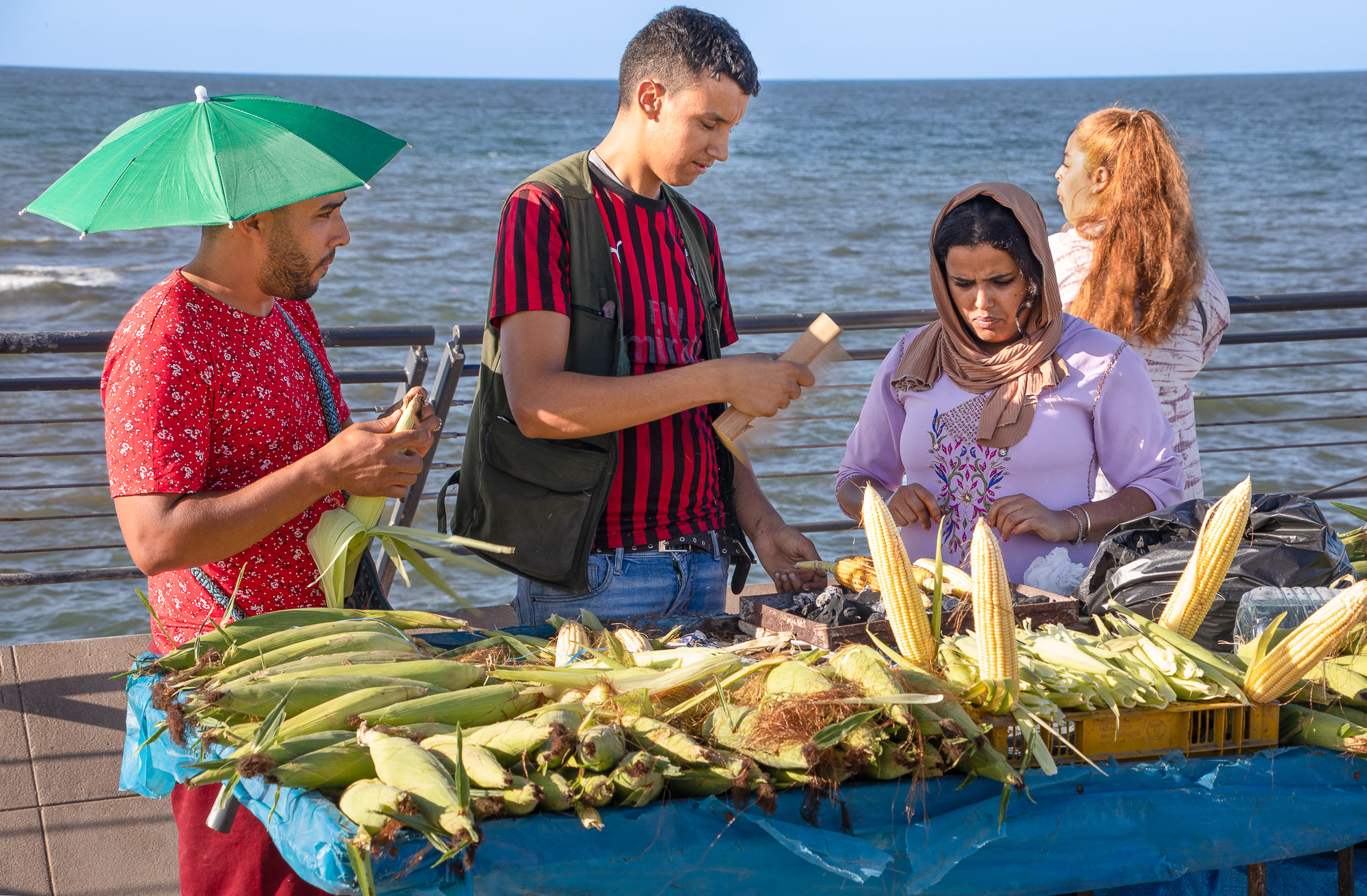
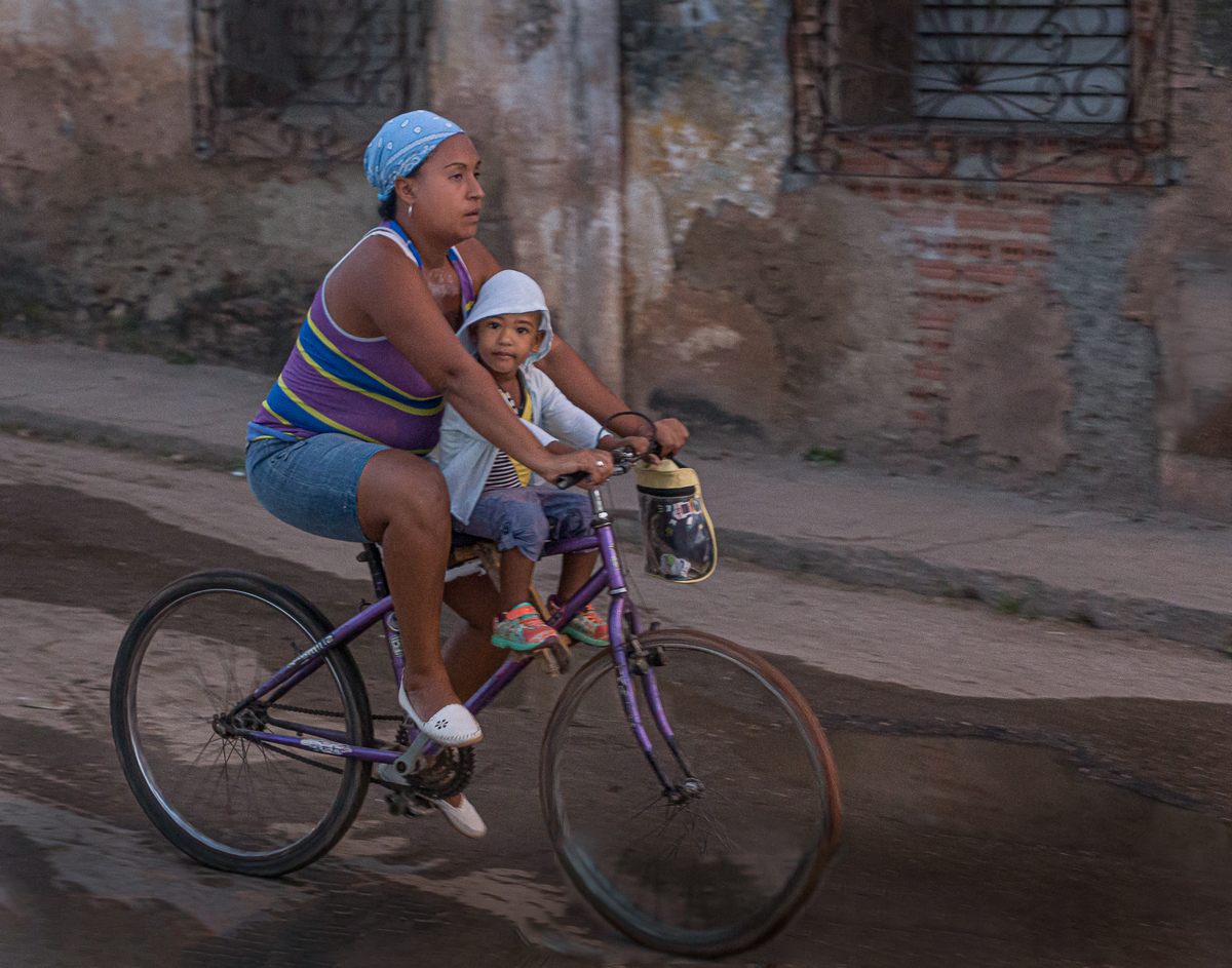
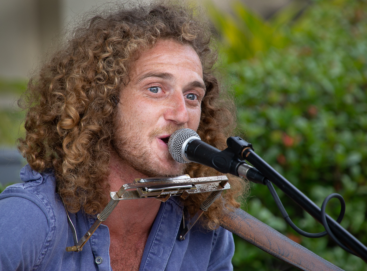
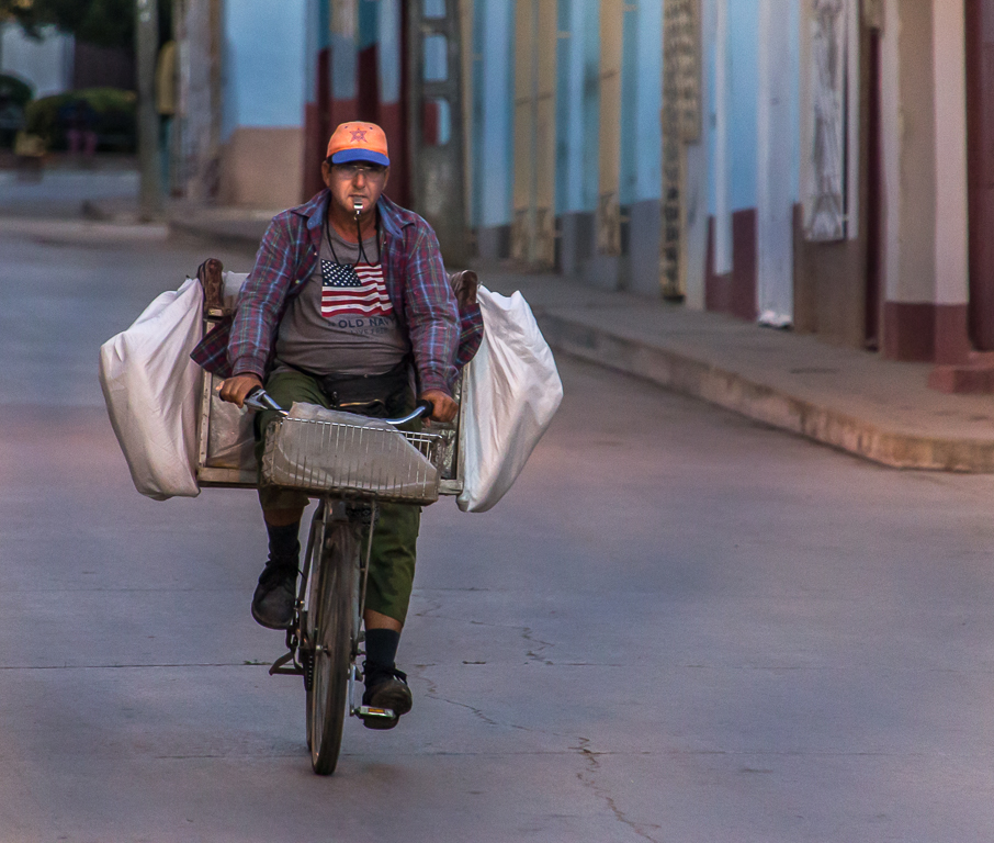
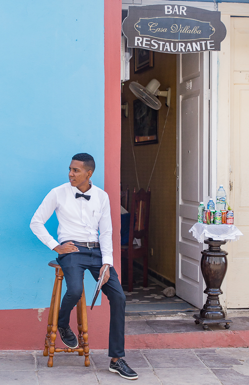
Hi Jeff, I pretty much agree with the other comments. I personally like the color version better, I don't think the the colors distract from the image, I think the richness of the color adds to it. I also agree about leaving the bicycle in, and I think not having the whole bike in the image is great. I'm pretty sure that if this was my image I would have cropped it like you did. Speaking for myself I think I sometimes over crop and image, I find getting just the right composition can be tricky at times. |
Feb 23rd |
| 92 |
Feb 23 |
Comment |
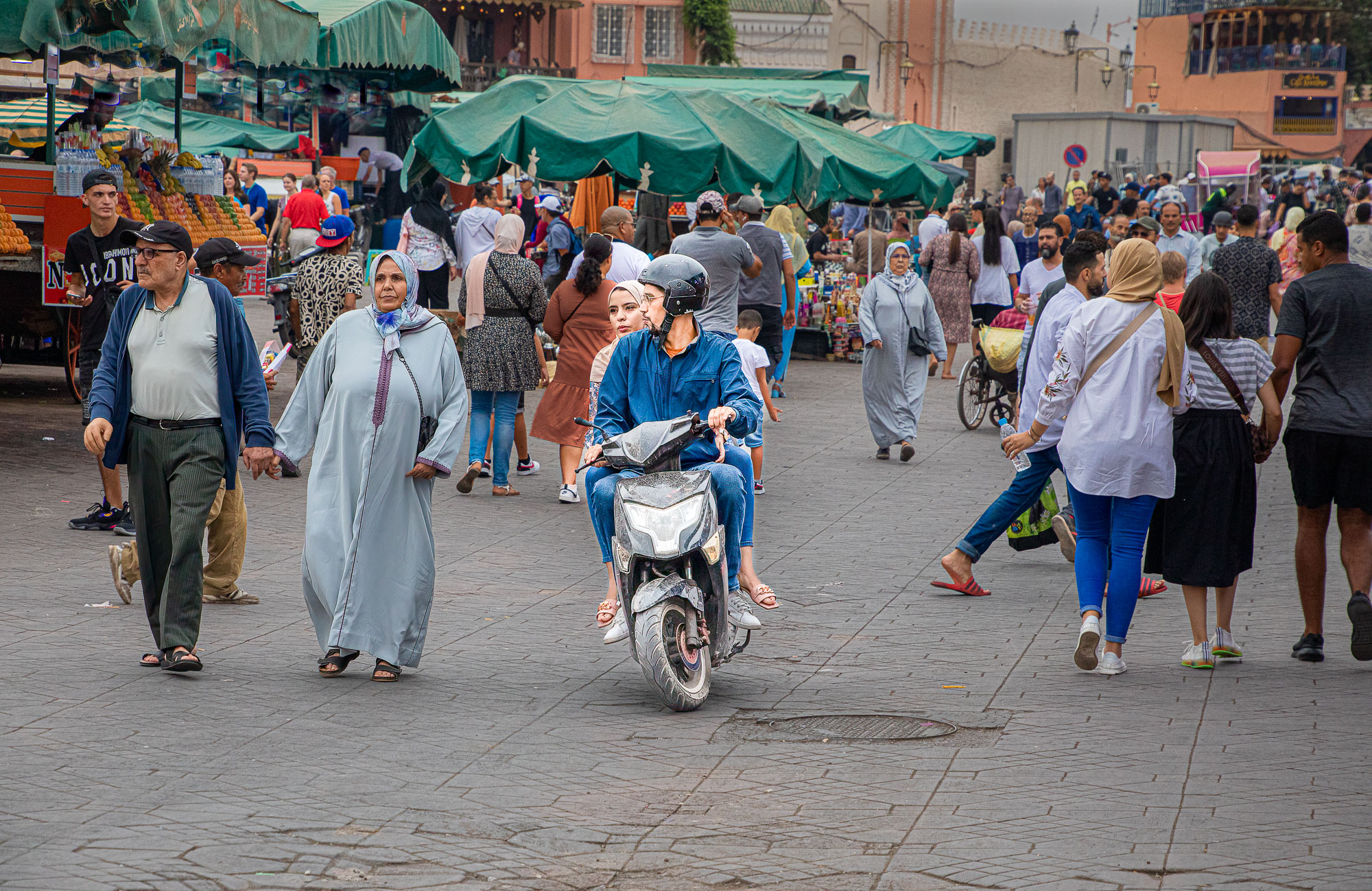
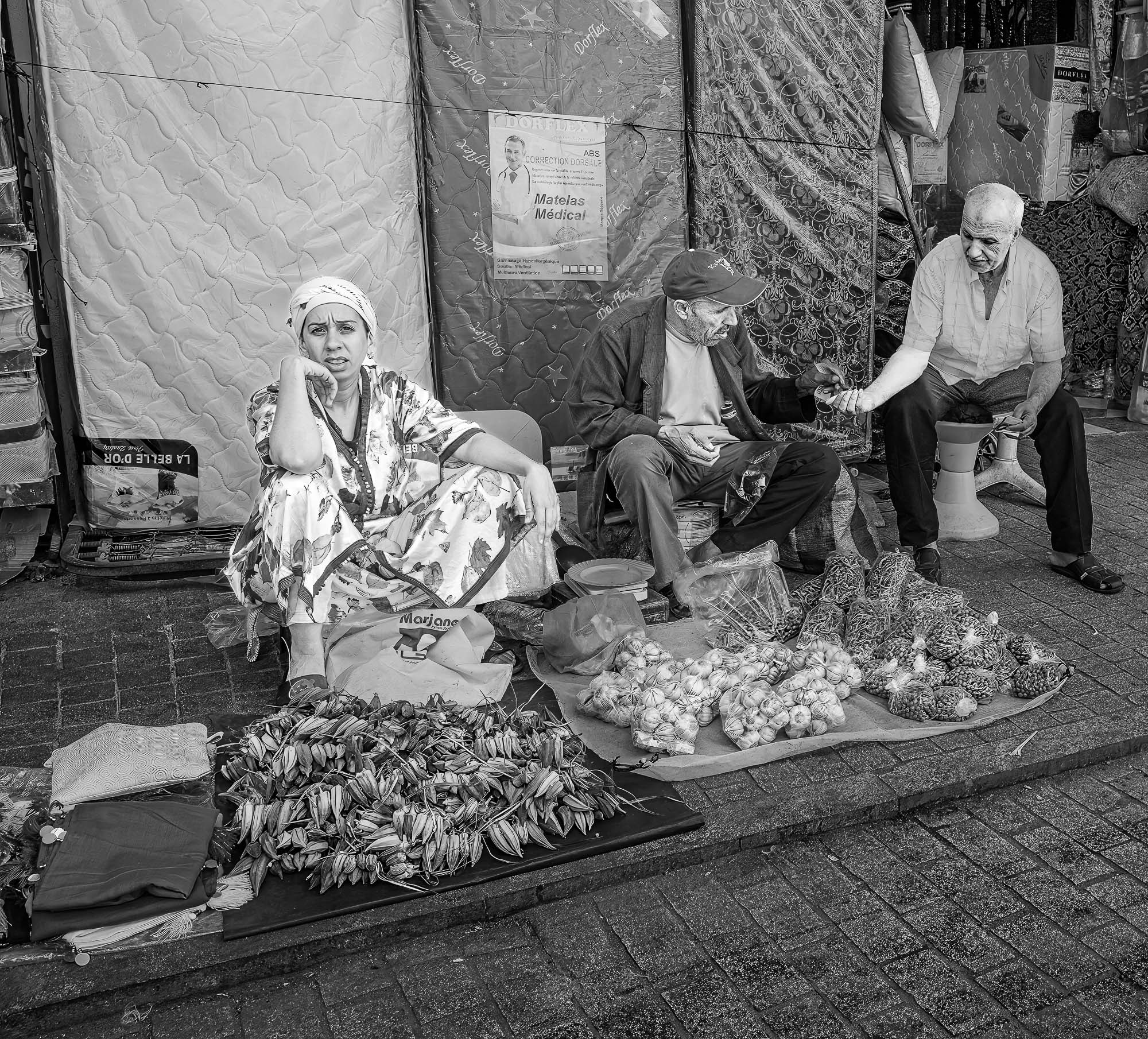
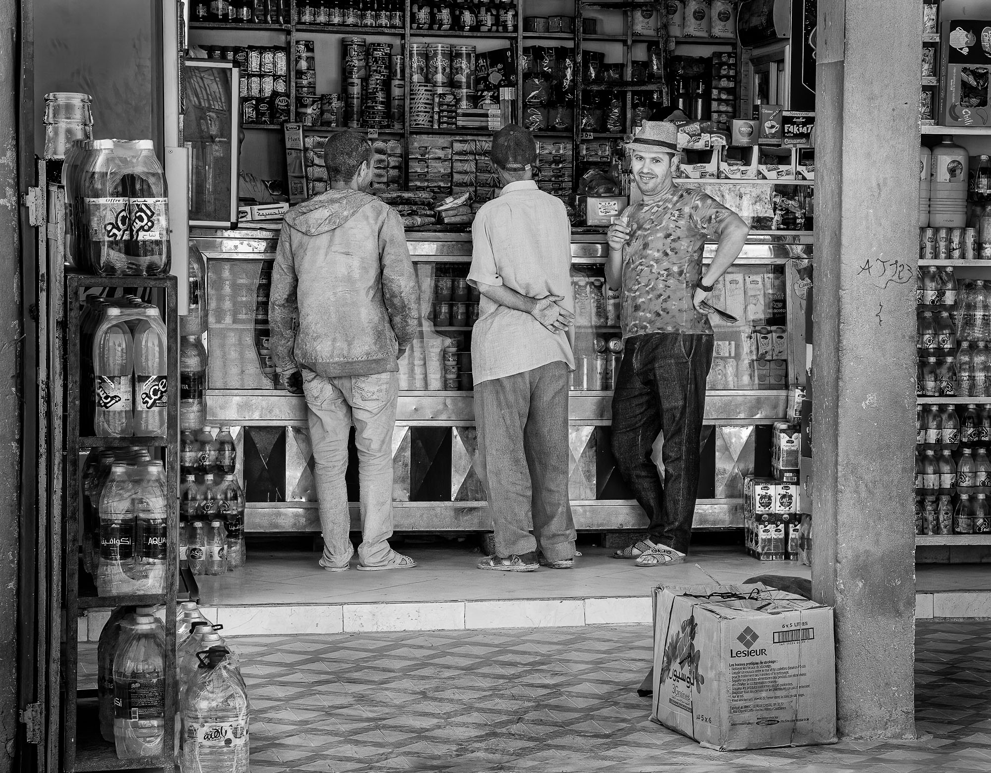
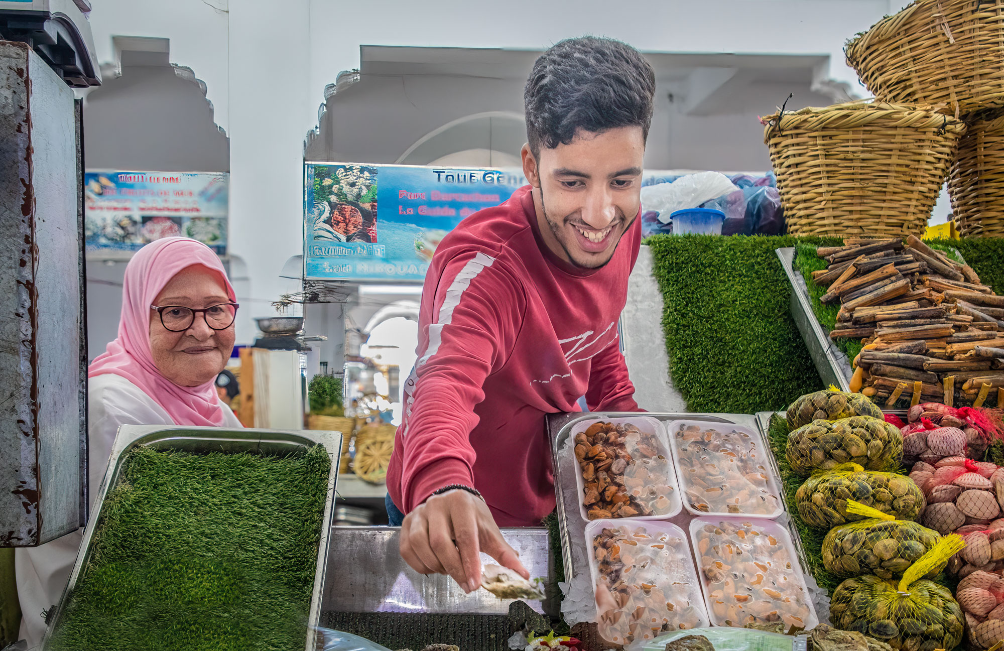
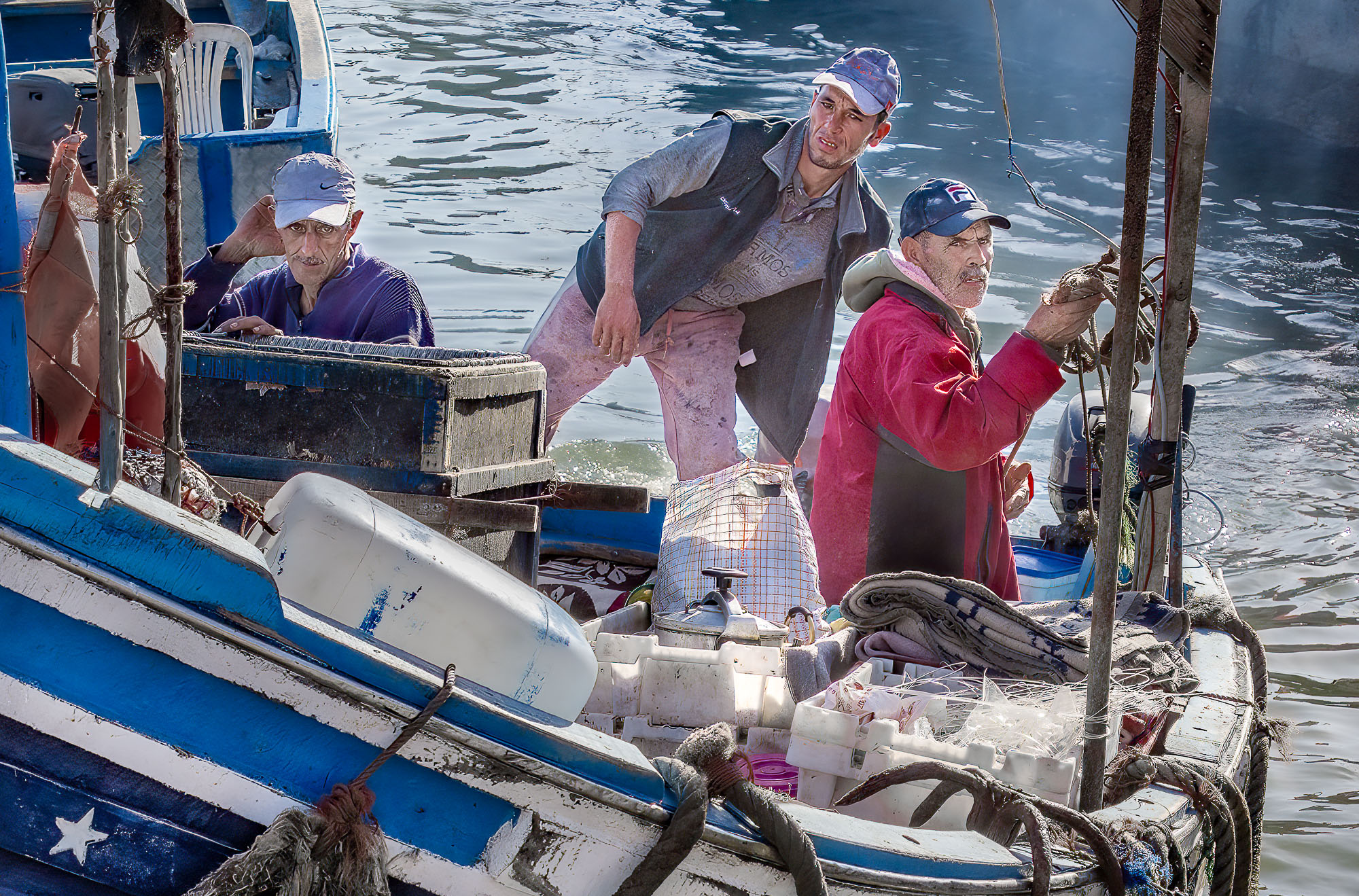
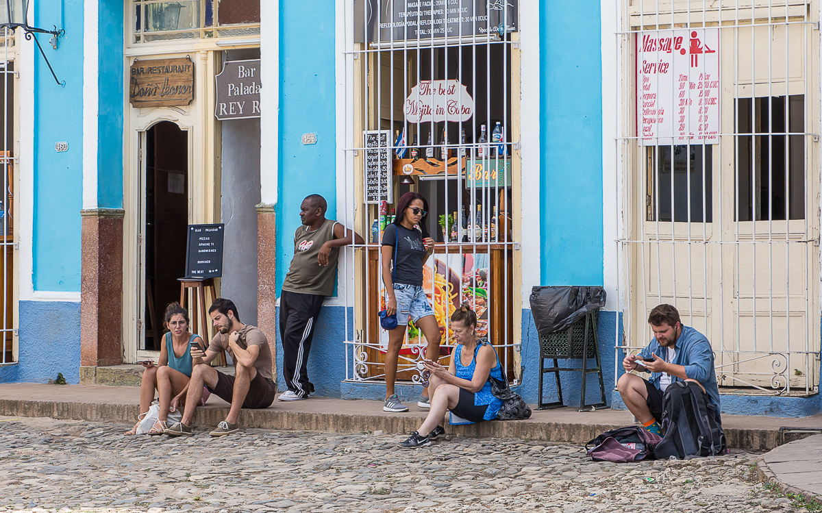
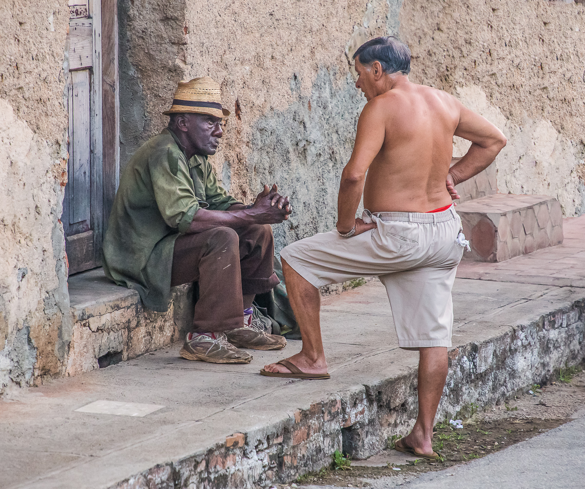
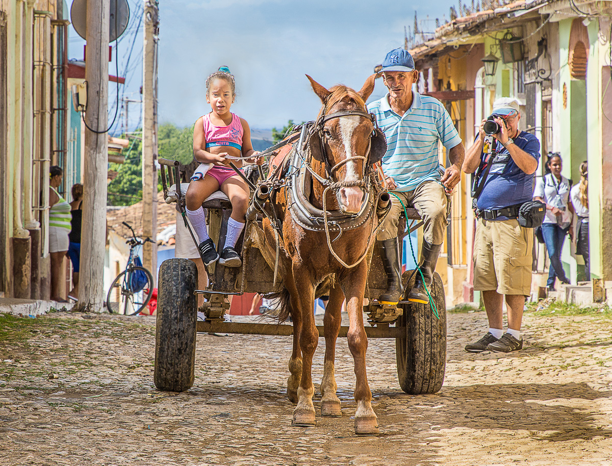
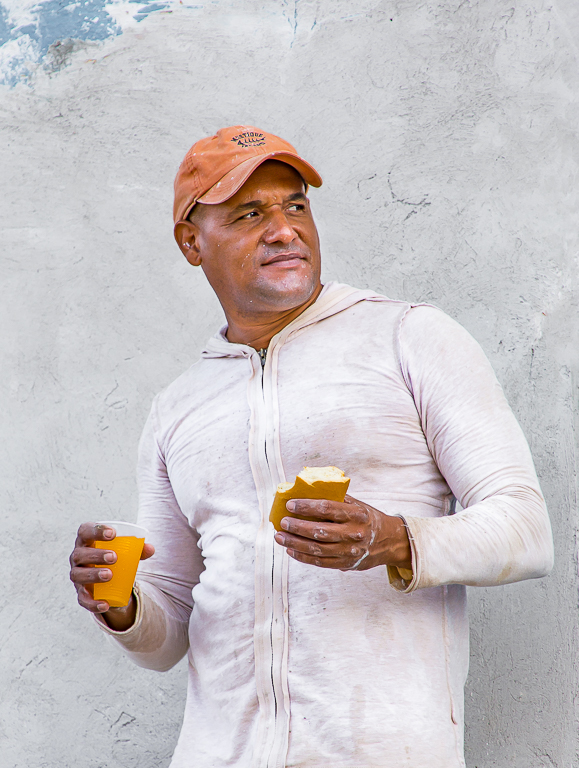
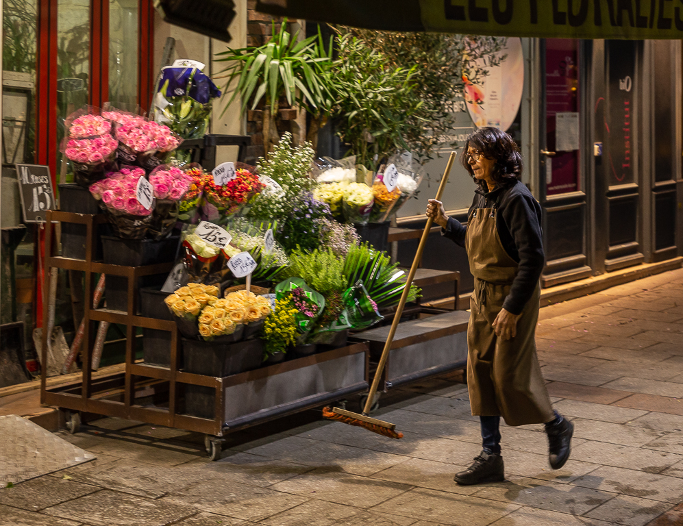
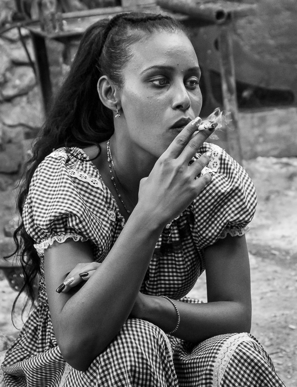
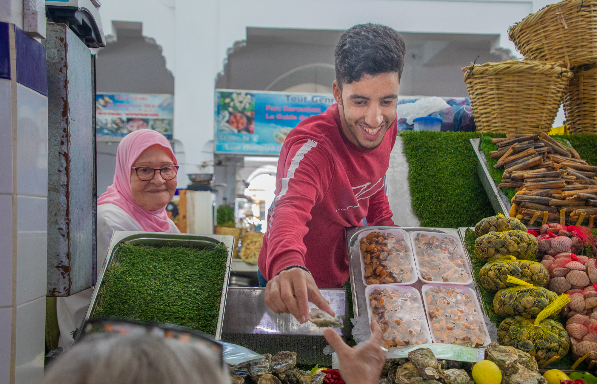
I think this is a wonderful image, lots going on and interactions. I like the composition and how you have cropped the image. The image is active, the shop owner setting up and the interaction of the other people. Do the man and woman know each other, is this a friendly encounter or not? I think that really adds to the interest. The B&W image is well done and I like the gritty feel of it, I think it goes with the subject. That being said, I do like the color image as well, I enjoy seeing the many beautiful colors in places like this. |
Feb 23rd |
| 92 |
Feb 23 |
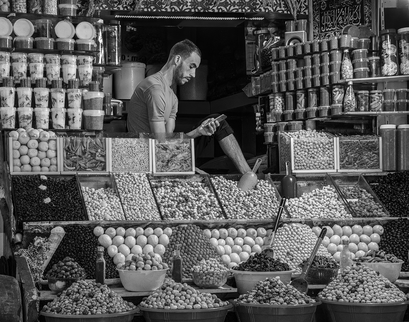
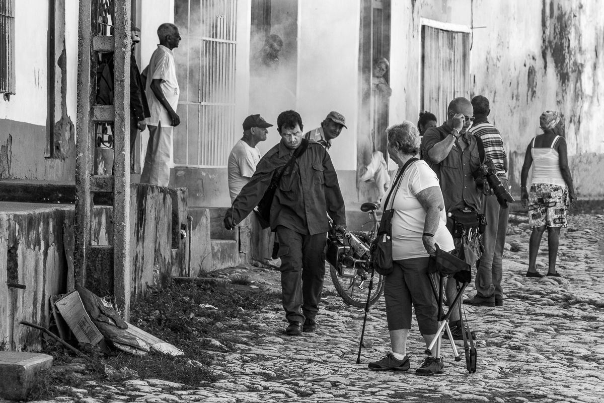
Comment |
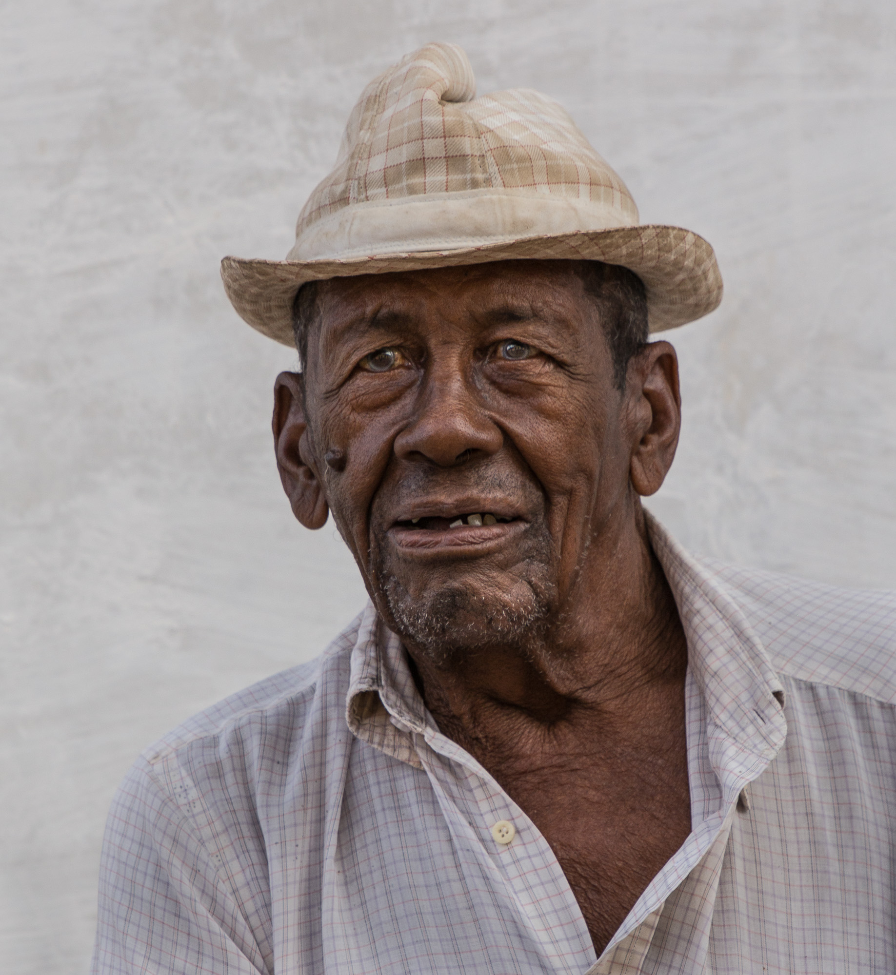
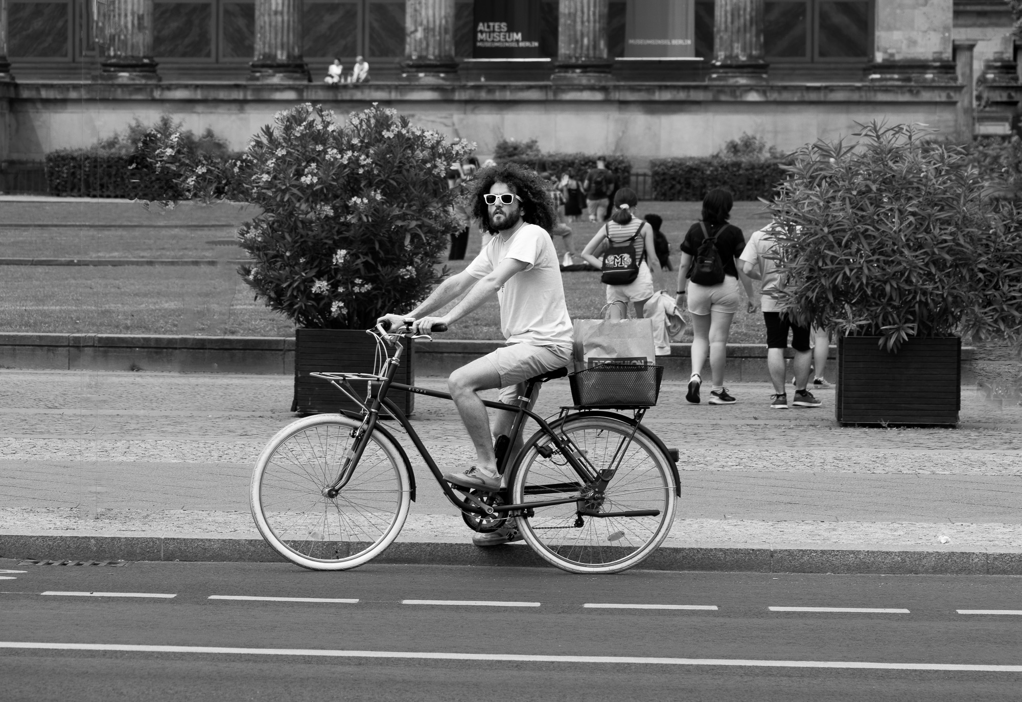
Interesting image Chuck. There is a lot going on here, people just going about their business. The B&W rendition is great, I think it simplifies the image. In my opinion, the look on the man's face makes the image. |
Feb 23rd |
| 92 |
Feb 23 |
Reply |
Thank for the comments Marianne. After reading all the comments regarding the crop I tend to agree with you that not showing the hand is preferable. |
Feb 23rd |
| 92 |
Feb 23 |
Reply |
Thanks for the comments Beth. I tried your suggestion and I like it much better that the bright head showing. |
Feb 23rd |
| 92 |
Feb 23 |
Comment |
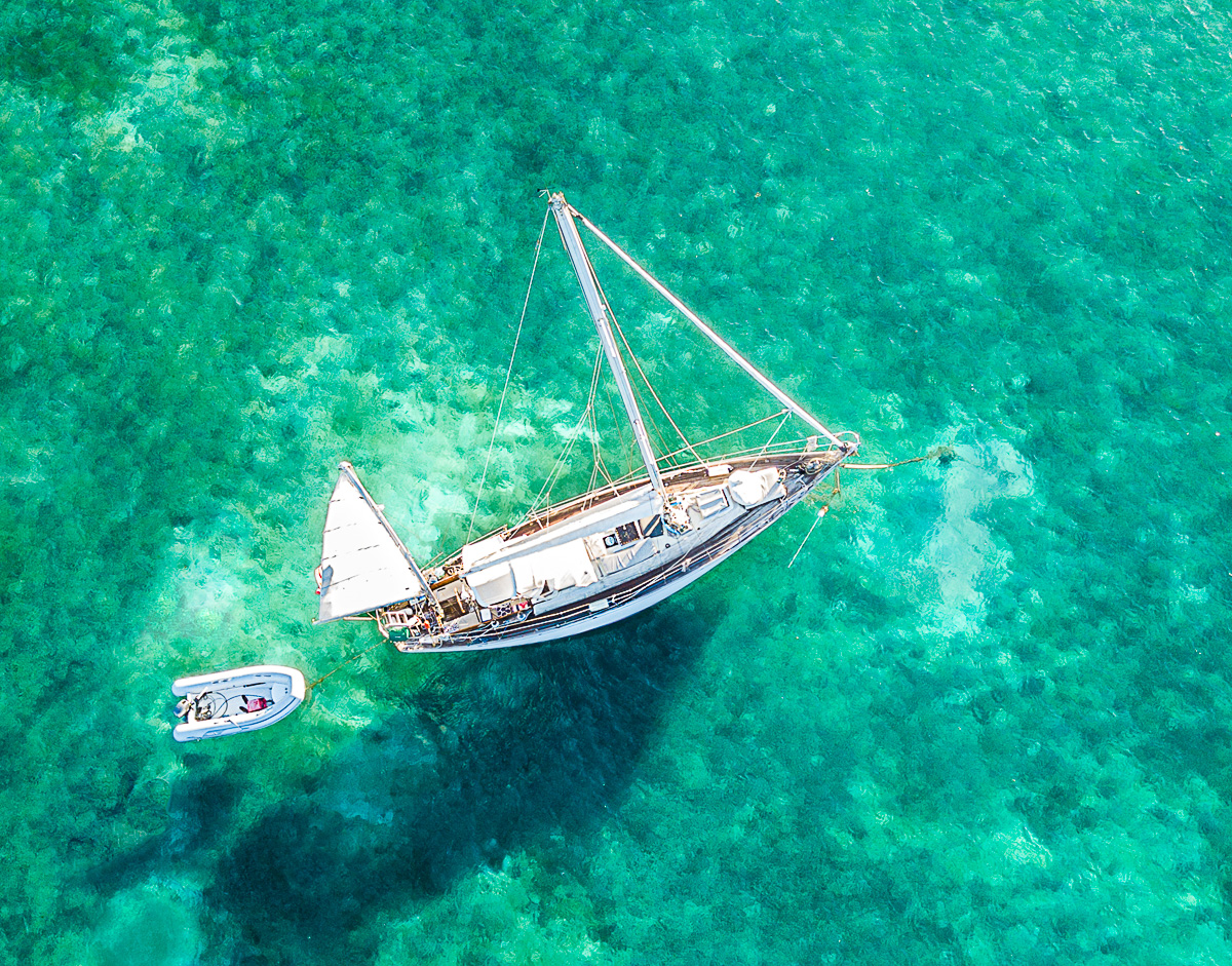
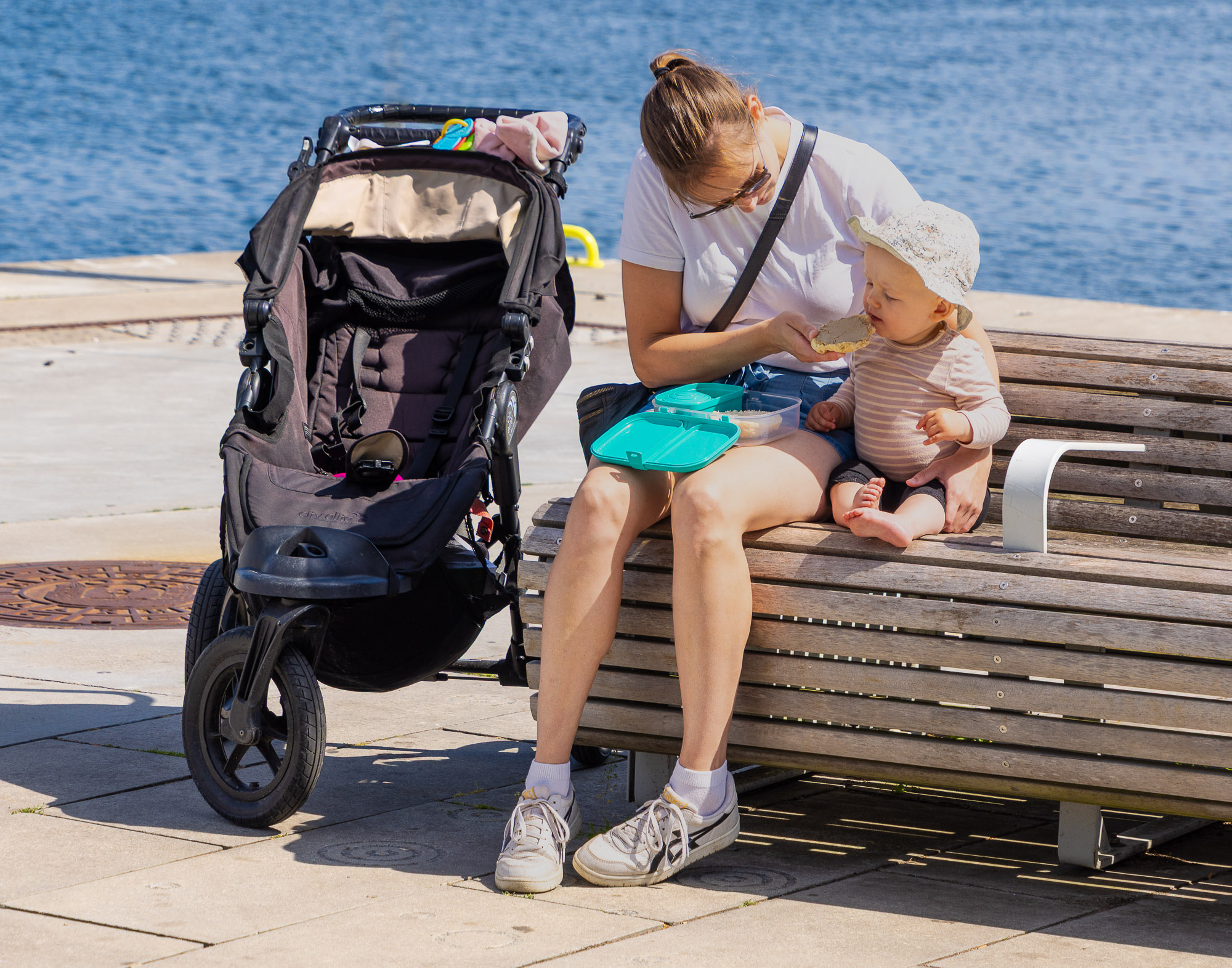
I agree, this is a nice action shot and a good remembrance for the kids. I do like Chuck's crop, to me the original looks as though the board was accidentally cut off but in the crop it is obvious that it was done intentionally. I think that the exposure is right on with nice details in the waves |
Feb 17th |
| 92 |
Feb 23 |
Reply |
Hi Chuck, thanks for the comments. I replied to Ian that the wider view was, in my opinion, too messy thus the crop. I have more of these two but this image has the most interaction of those I took. |
Feb 15th |
| 92 |
Feb 23 |
Reply |
Thanks Jill, I think I have a tendency to slightly over expose my images. It's all correctable in LR but for some reason I just keep going brighter. |
Feb 15th |
| 92 |
Feb 23 |
Reply |
Thanks for comments Ian. I like your suggestion about the background. Here is the uncropped version, I did not like the top of the head in the image, what do you think? It would be nice to see the front of the counter if there would have been no one in the foreground. |
Feb 15th |
 |
6 comments - 5 replies for Group 92
|
10 comments - 10 replies Total
|