|
| Group |
Round |
C/R |
Comment |
Date |
Image |
| 85 |
Jul 22 |
Reply |
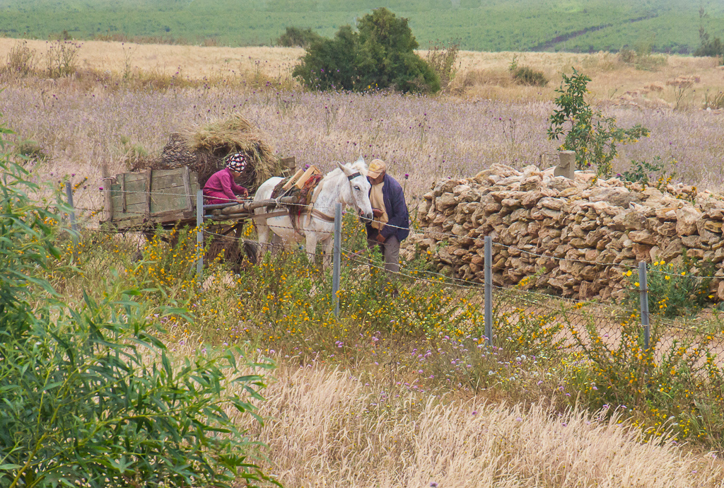
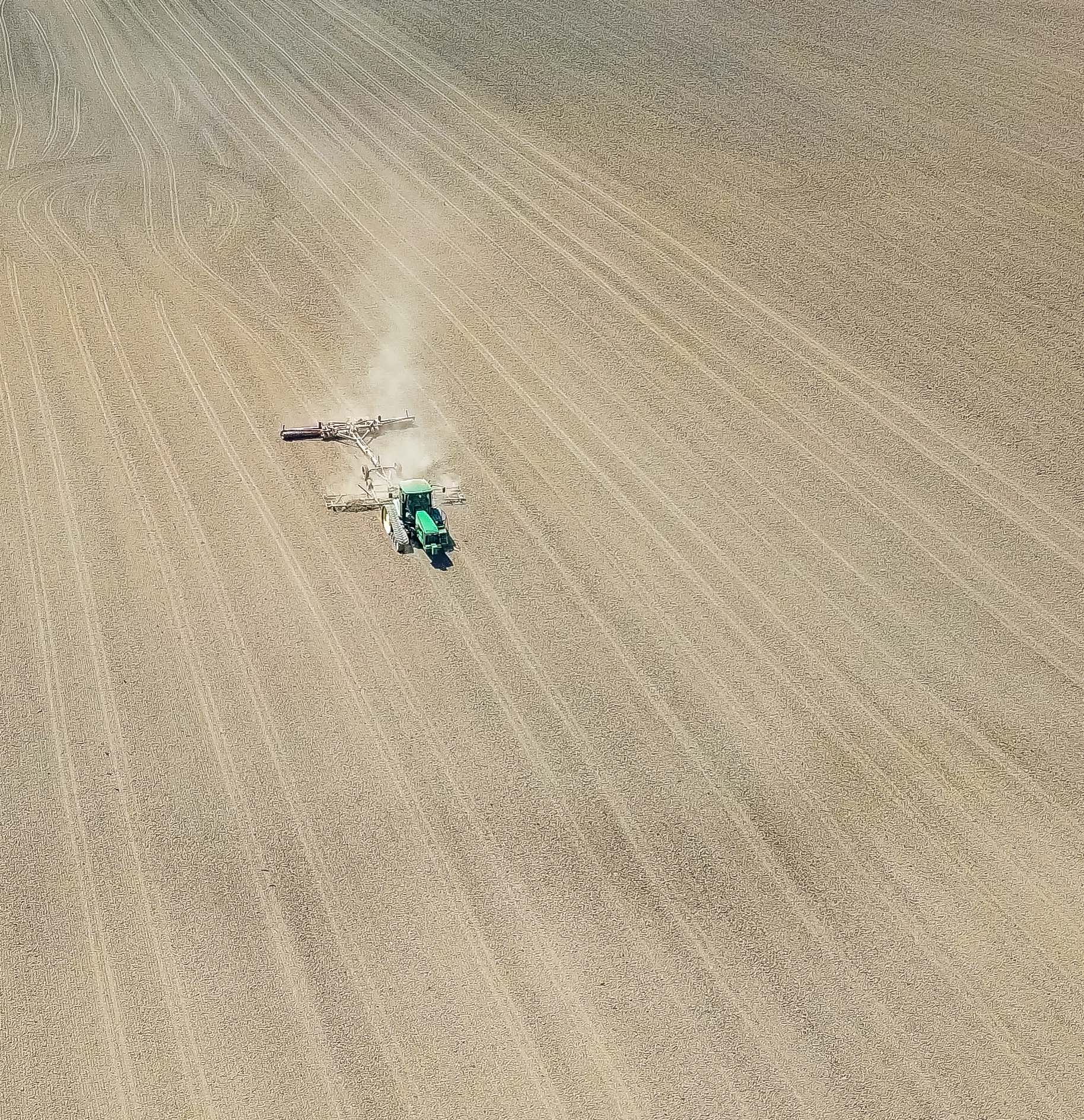
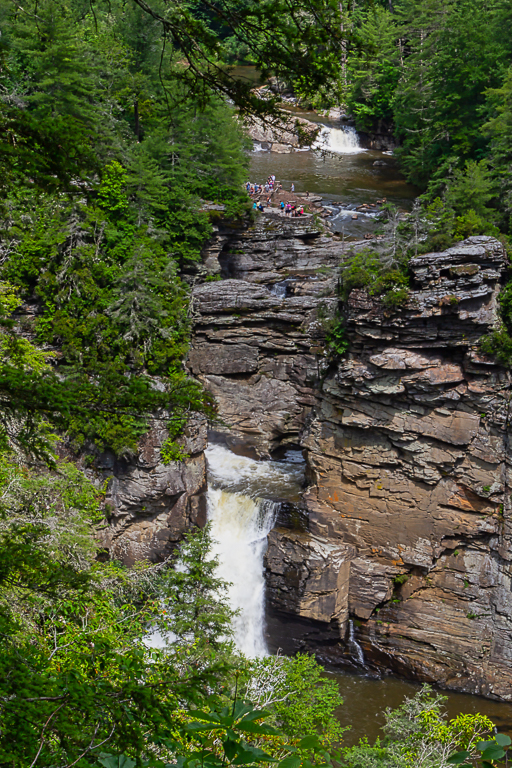
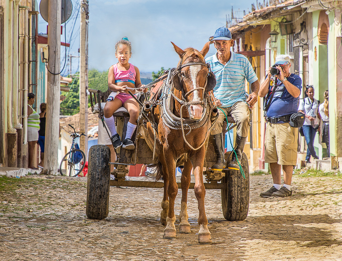
I launched it from outside the course. I kike your comments about the cart. I guess the best composition is based on the story you are telling. |
Jul 17th |
| 85 |
Jul 22 |
Reply |
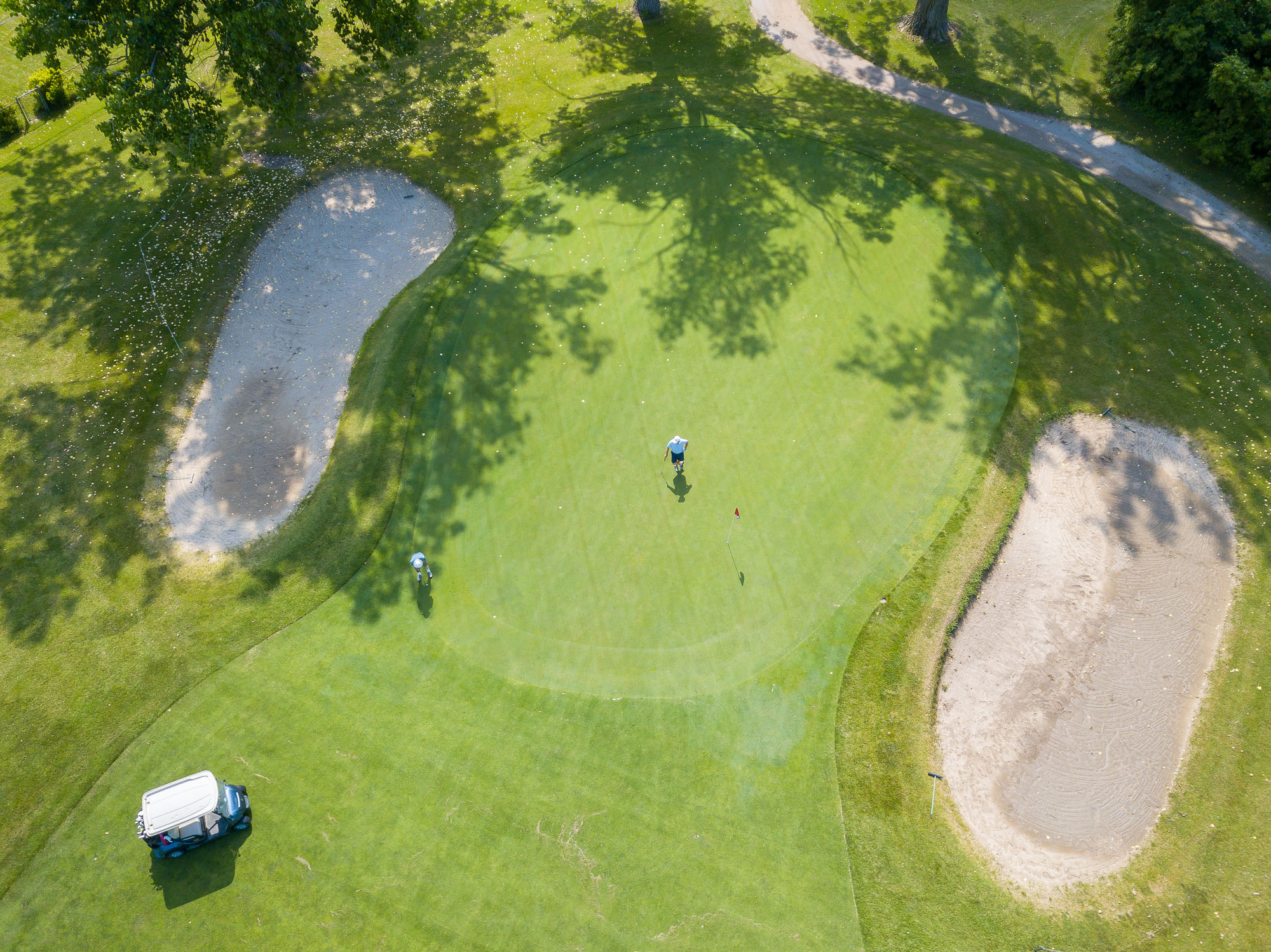
Hi Janos, yes my version is way too sharp. I think perhaps a less sharpness might work. Sadly, I have found out however that if the original is real soft then realistic sharpening does not seem possible. |
Jul 8th |
| 85 |
Jul 22 |
Reply |
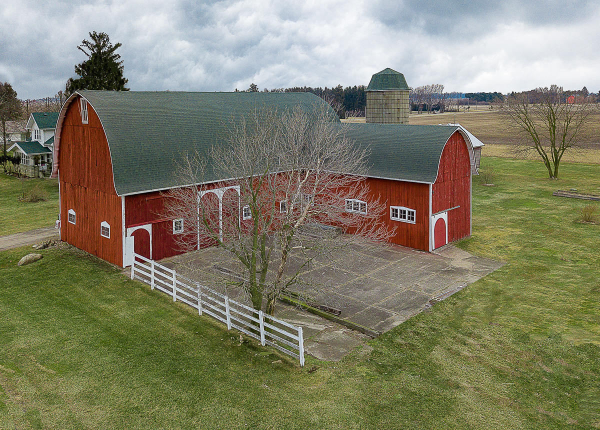
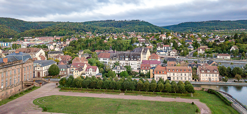
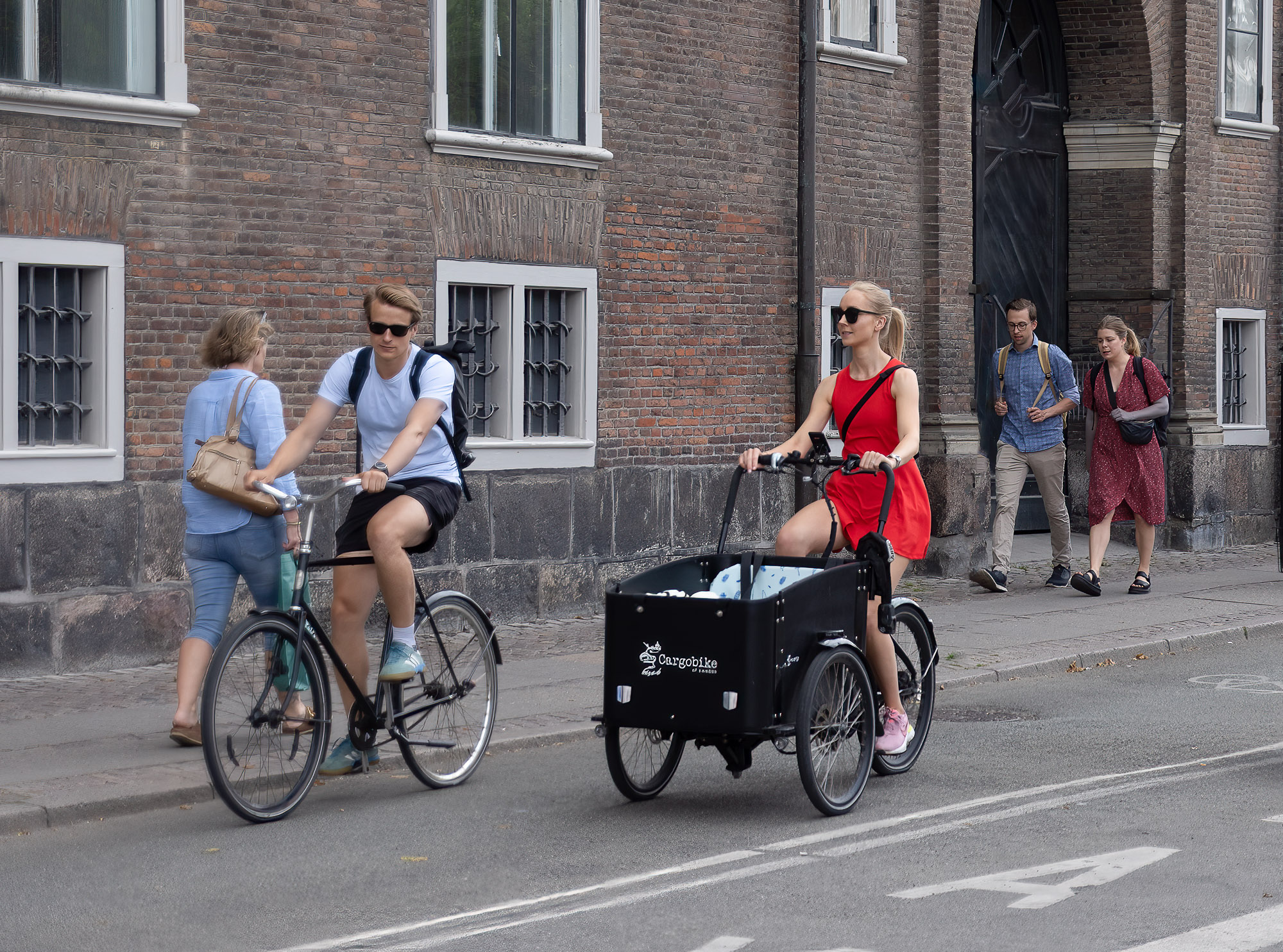
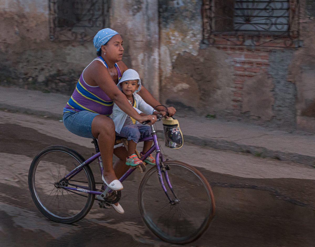
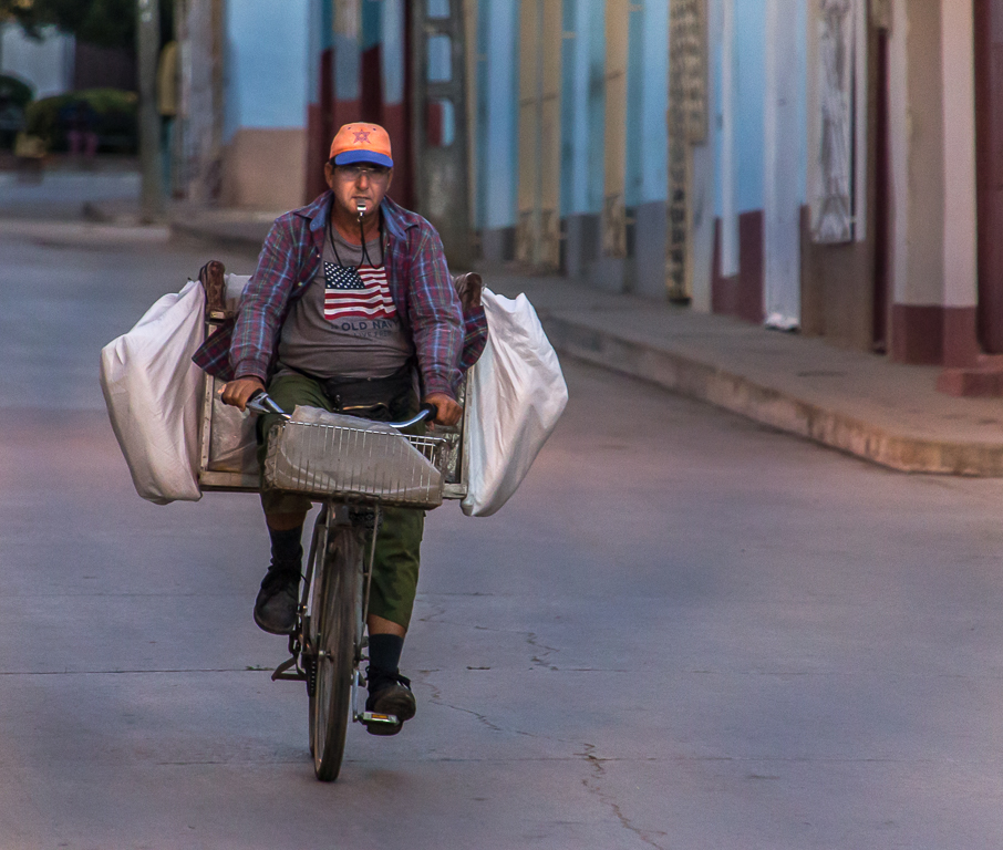
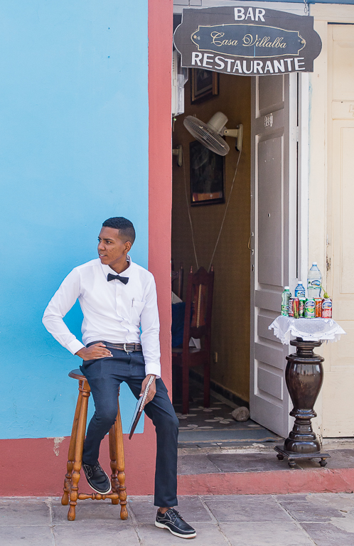
Hi Janos, thanks for the comments. I agree the cart is a real distraction. The image was taken late morning, perhaps I'll try again earlier in the day. Getting the right opportunity is not a given, perhaps I could get some golfers to pose. |
Jul 8th |
| 85 |
Jul 22 |
Reply |
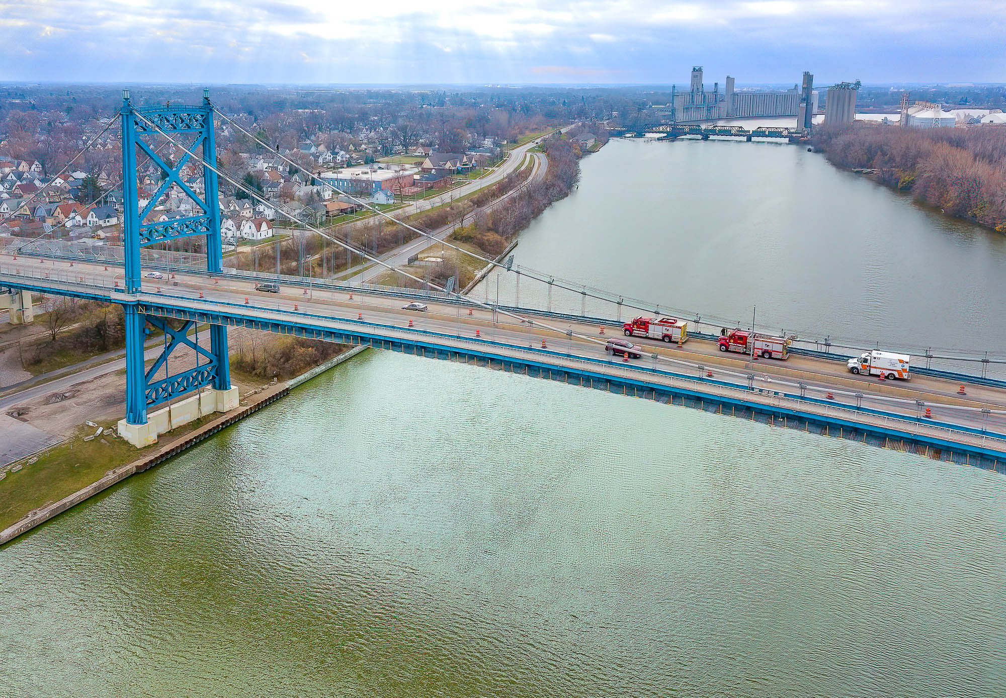
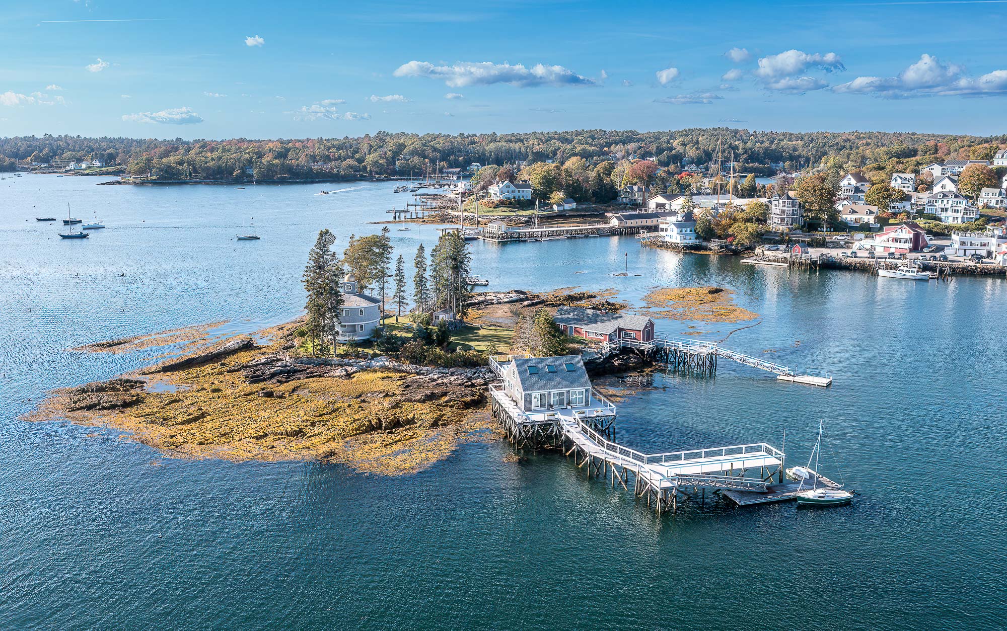
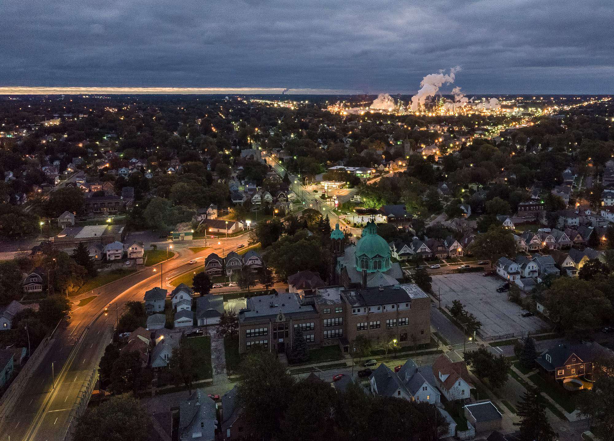
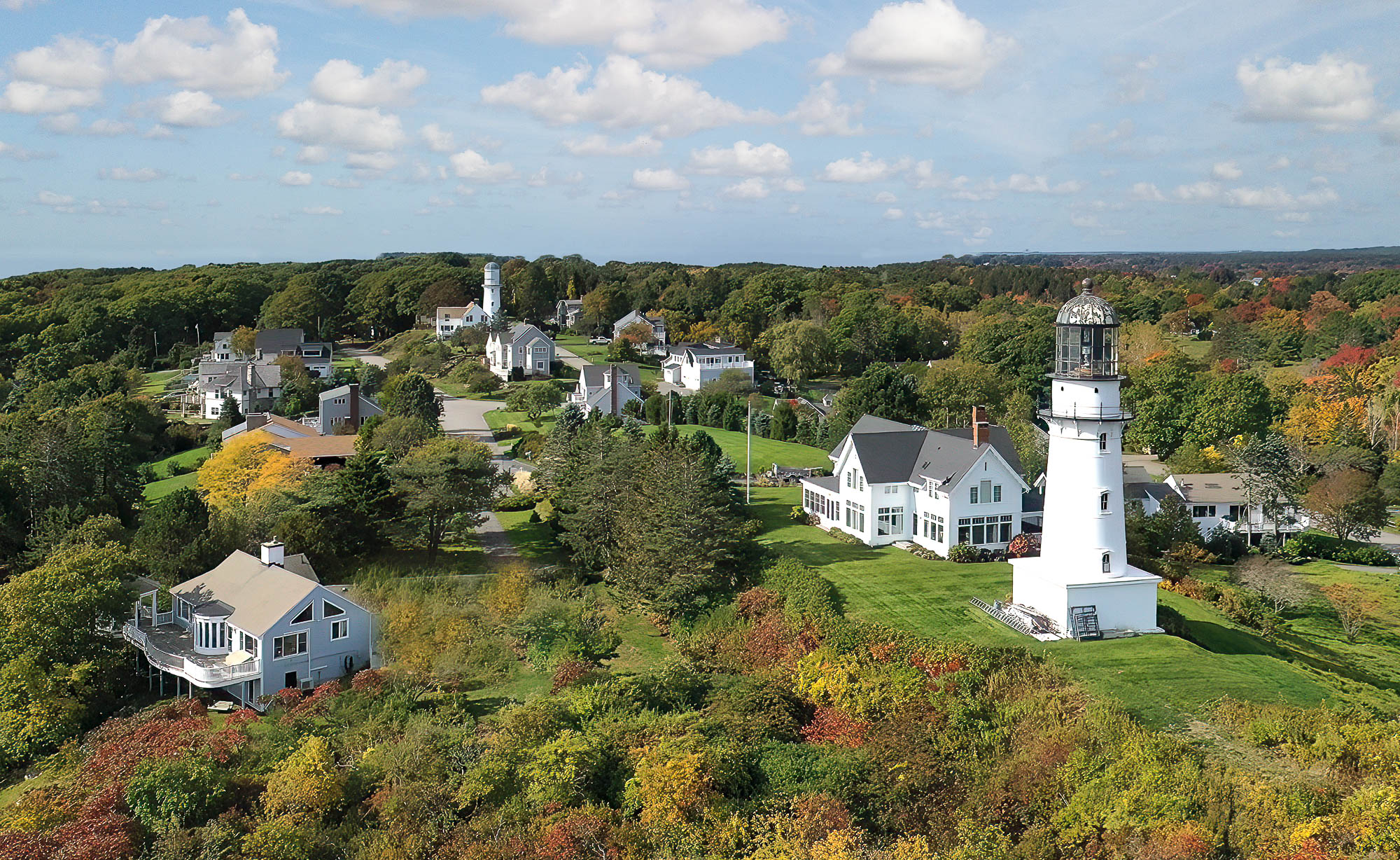
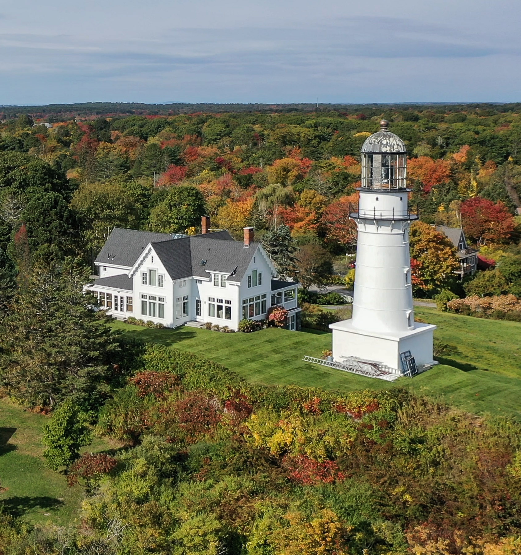
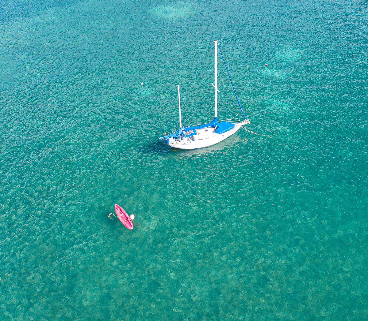
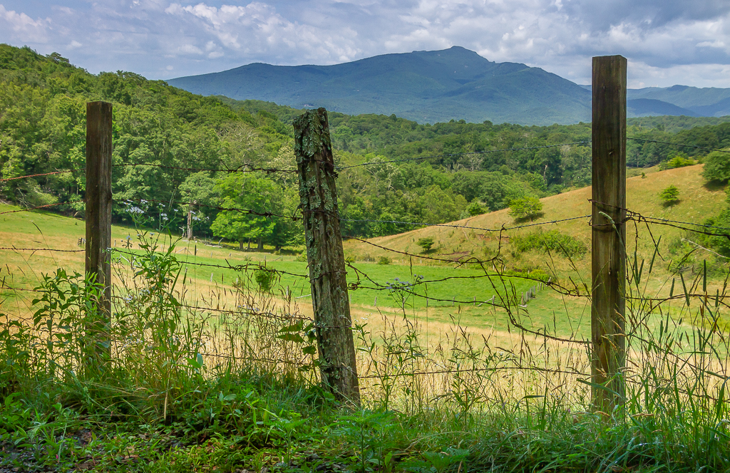
Hi Pete, thanks for the comments. No one noticed the drone, I was well over 100 ft. up. You make a good point on the ball, that would have been better, of course that's pretty difficult to detect from the drone's image on my phone. I think getting rid of the road and golf cart would help the composition. |
Jul 8th |
| 85 |
Jul 22 |
Comment |
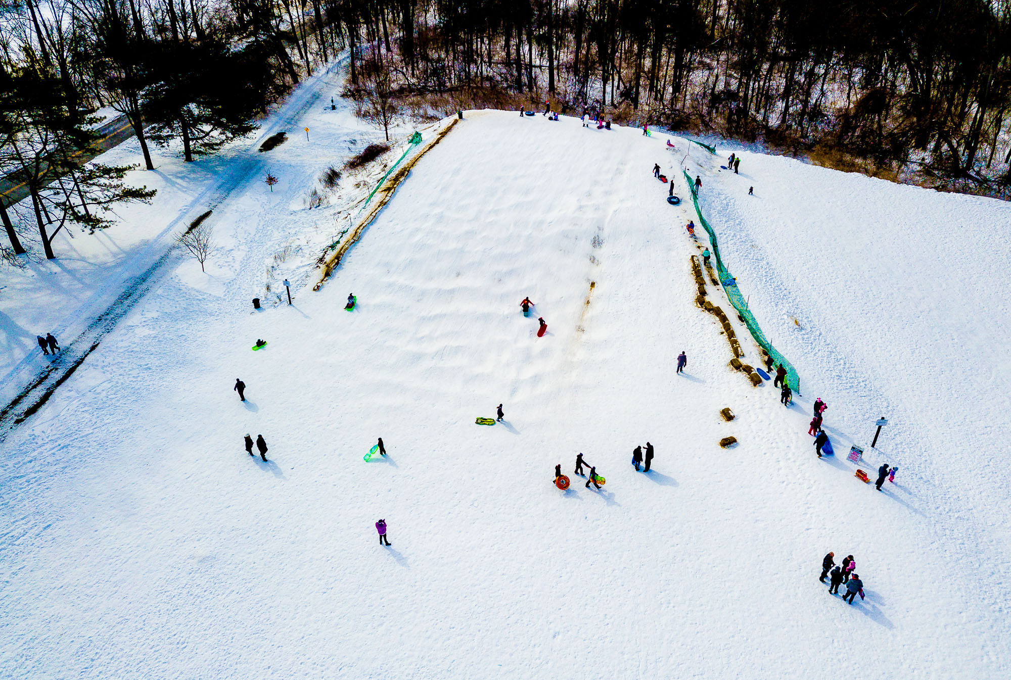
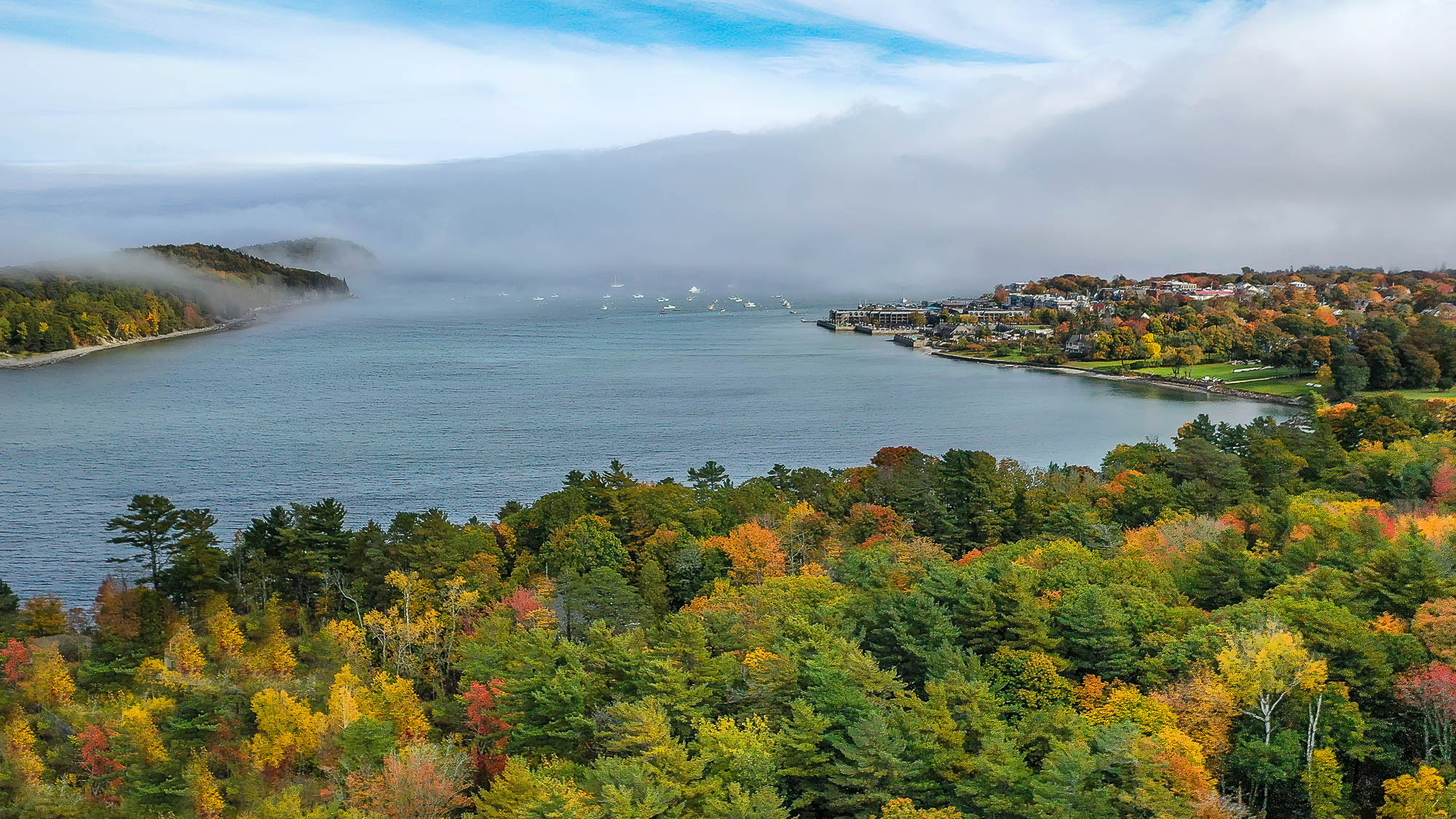
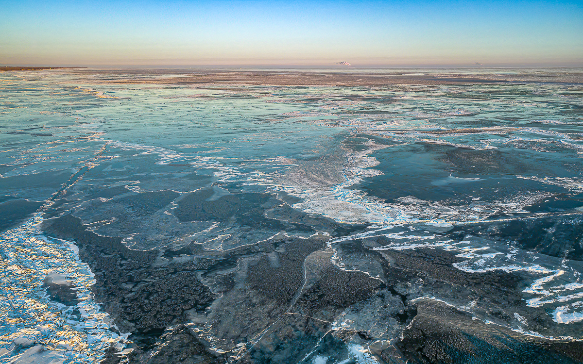
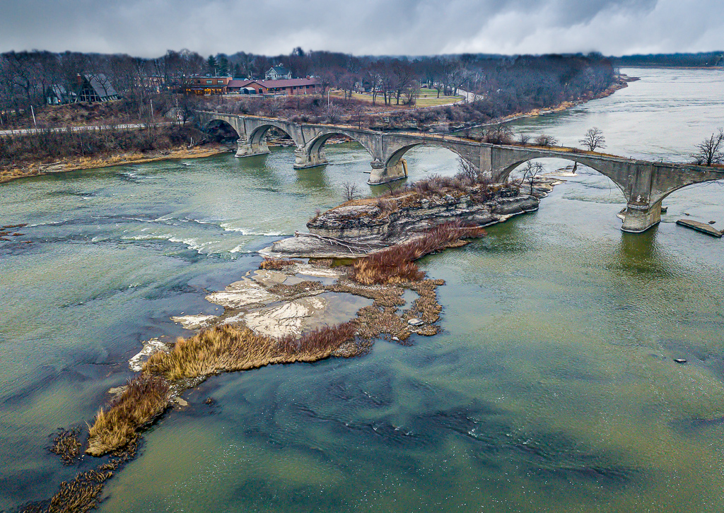
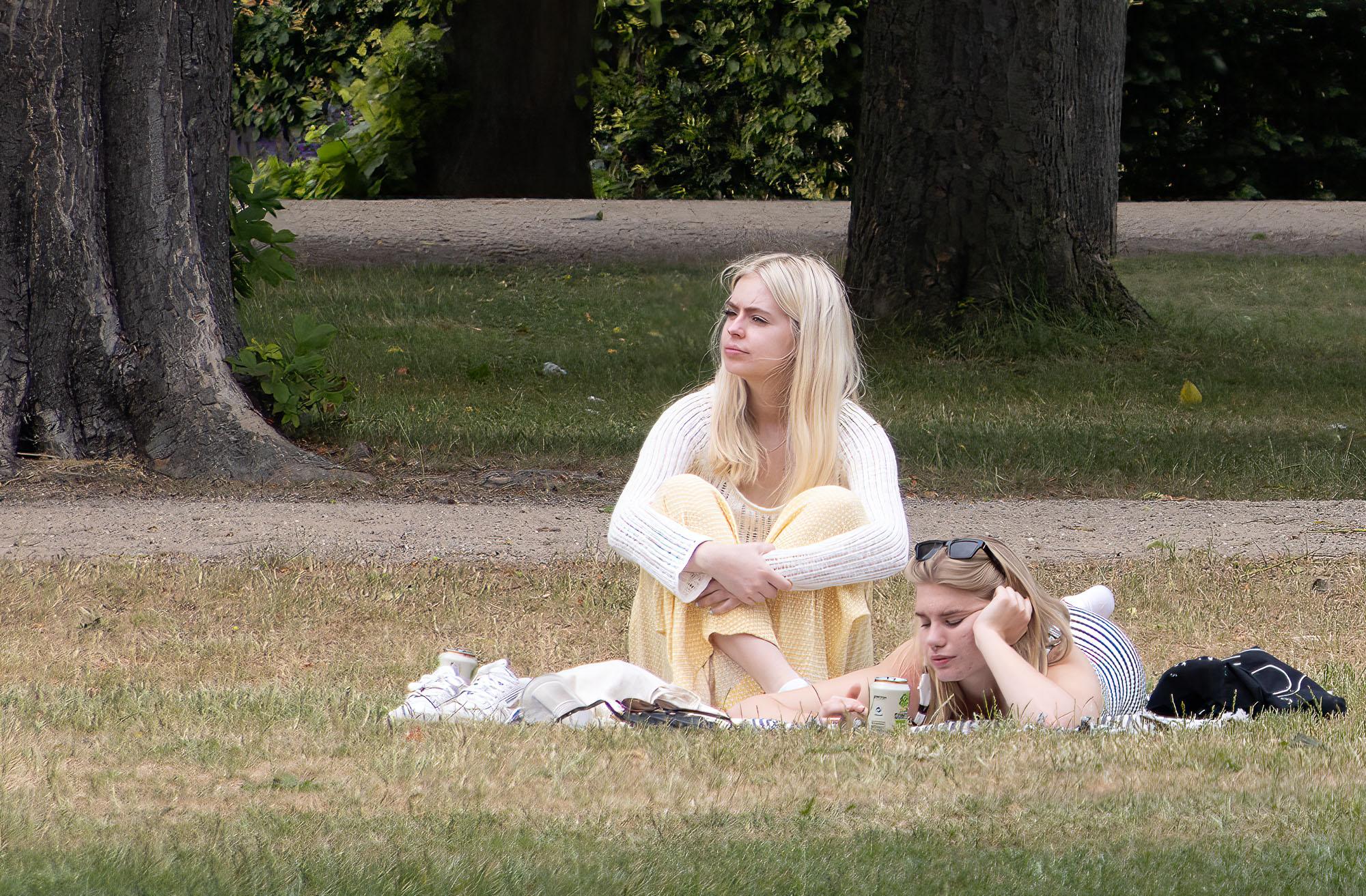
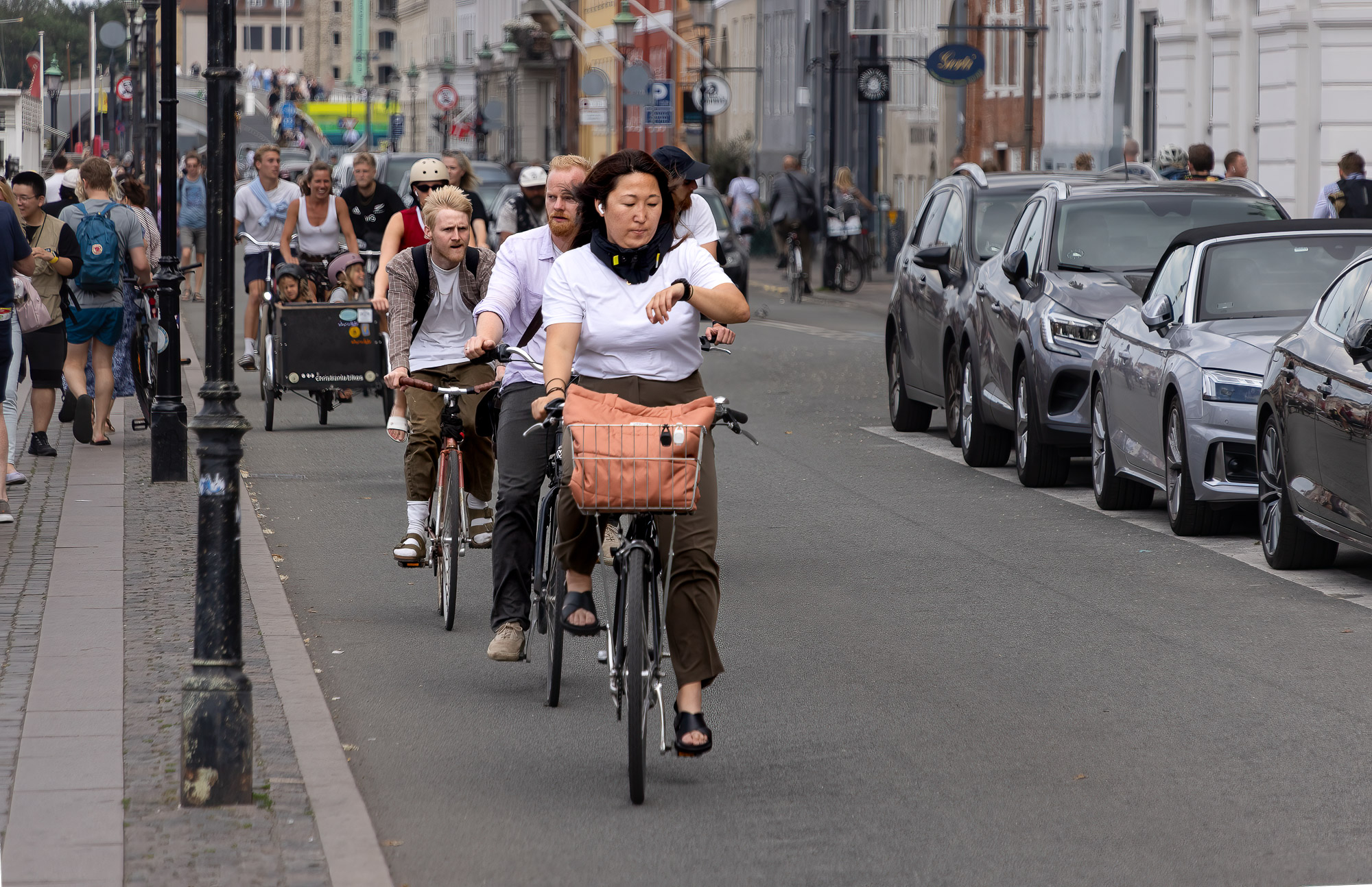
I think this is a beautiful, well composed image. I like the angles and the leading line of the roadway, it leads my eye out of the picture but it keeps returning the the lighthouse. I especially like the angle and that nothing is intersecting with the horizon. To my eye the colors seem true and are well shown. Overall, on my screen anyhow, the image seems just a little soft. |
Jul 4th |
| 85 |
Jul 22 |
Comment |
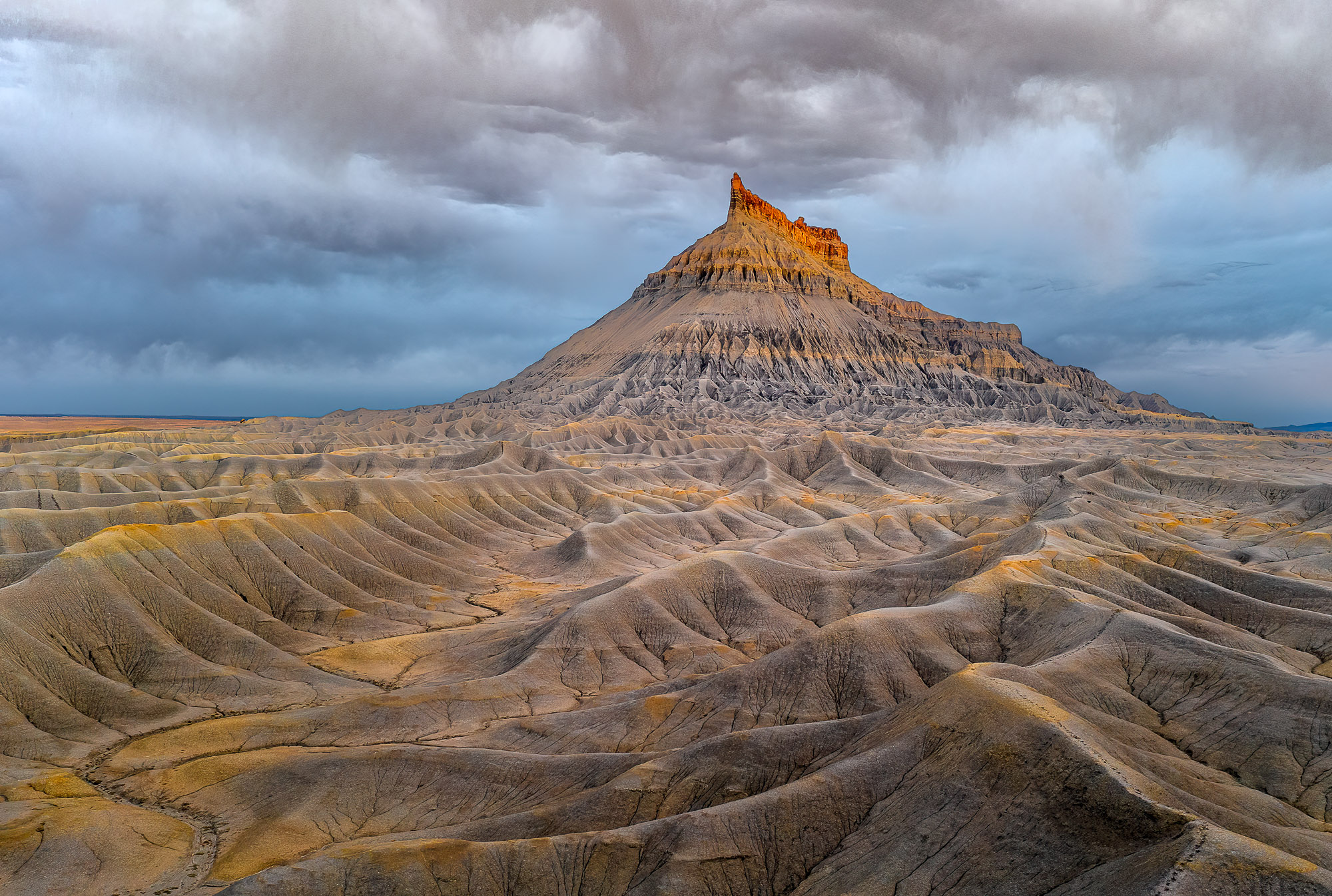
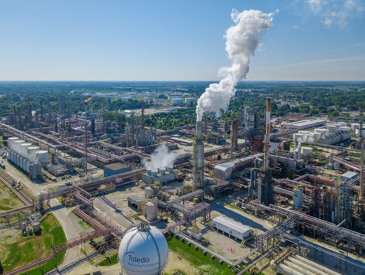
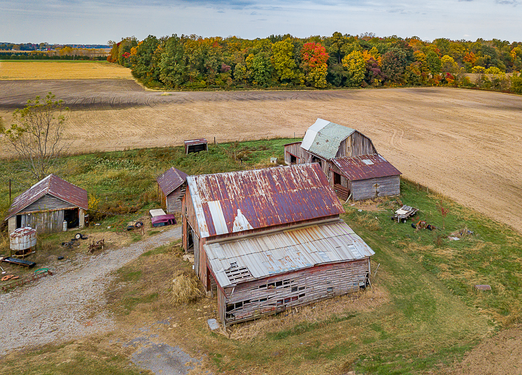
I think this is a great image and I really like the B&W rendering. To my eye you have handled the shadows quite well, I think you have a wide tonal range but perhaps the whites could be brighter. The cloud is beautiful and the landscape you have depicted is other worldly. |
Jul 4th |
| 85 |
Jul 22 |
Comment |
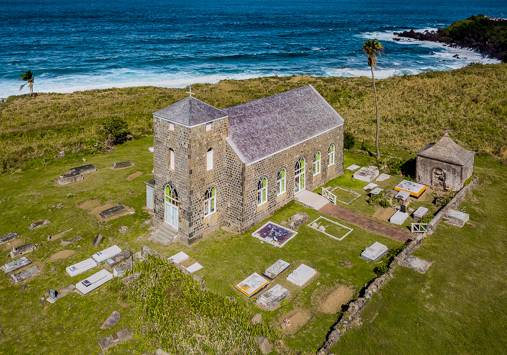
Beautiful image, I think it makes a lovely landscape. I like the composition and how you have cropped the image. I agree with Drema that a little darkening in the lower right might improve the image. I think the image has a surrealistic quality to it, I like it very much. |
Jul 4th |
| 85 |
Jul 22 |
Comment |
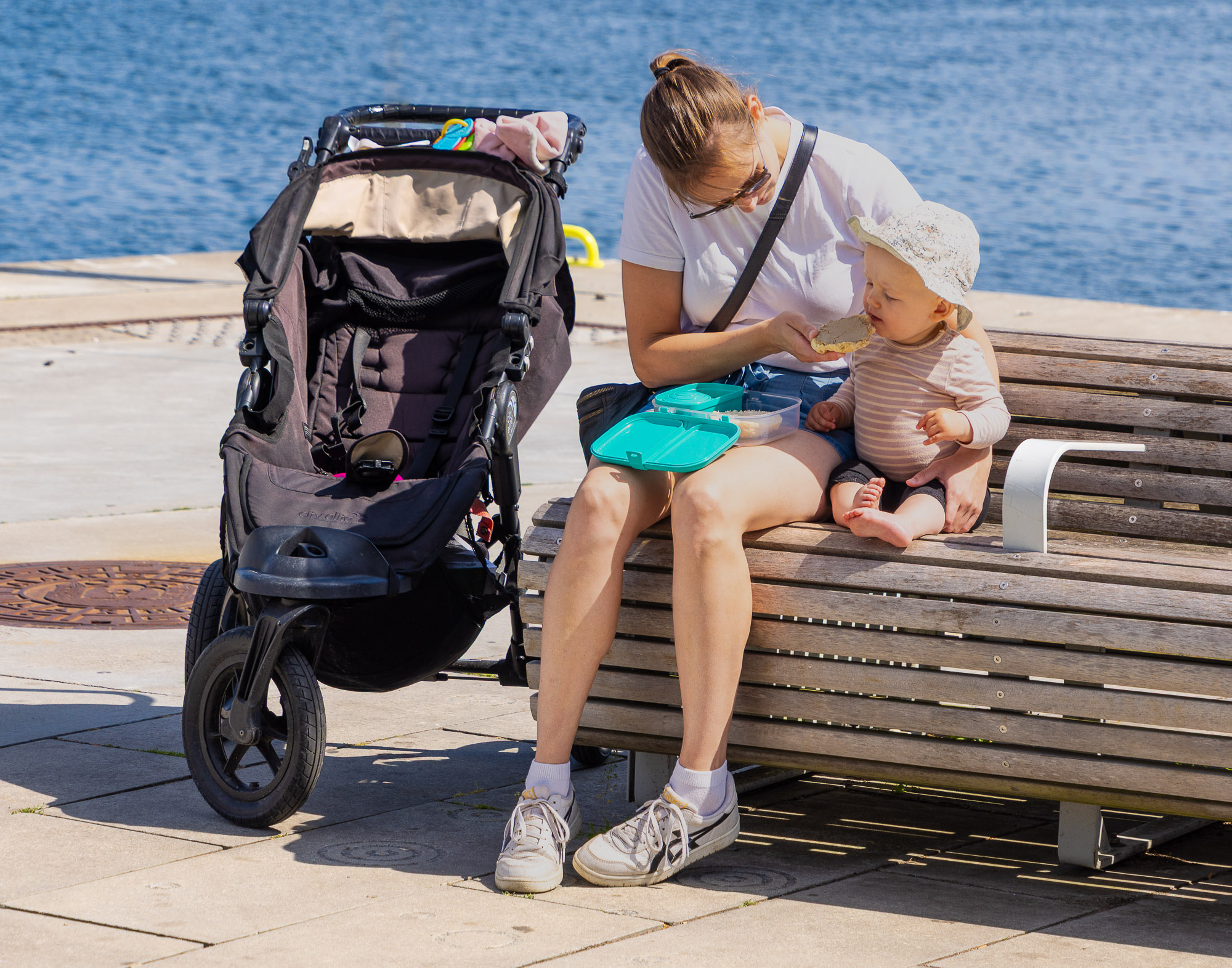
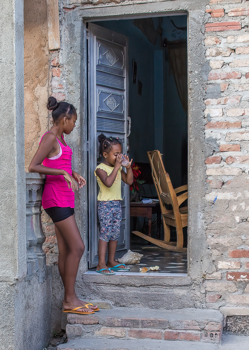
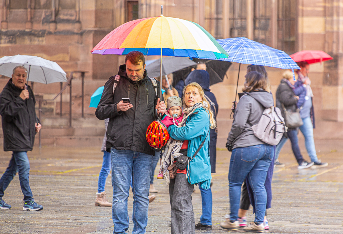
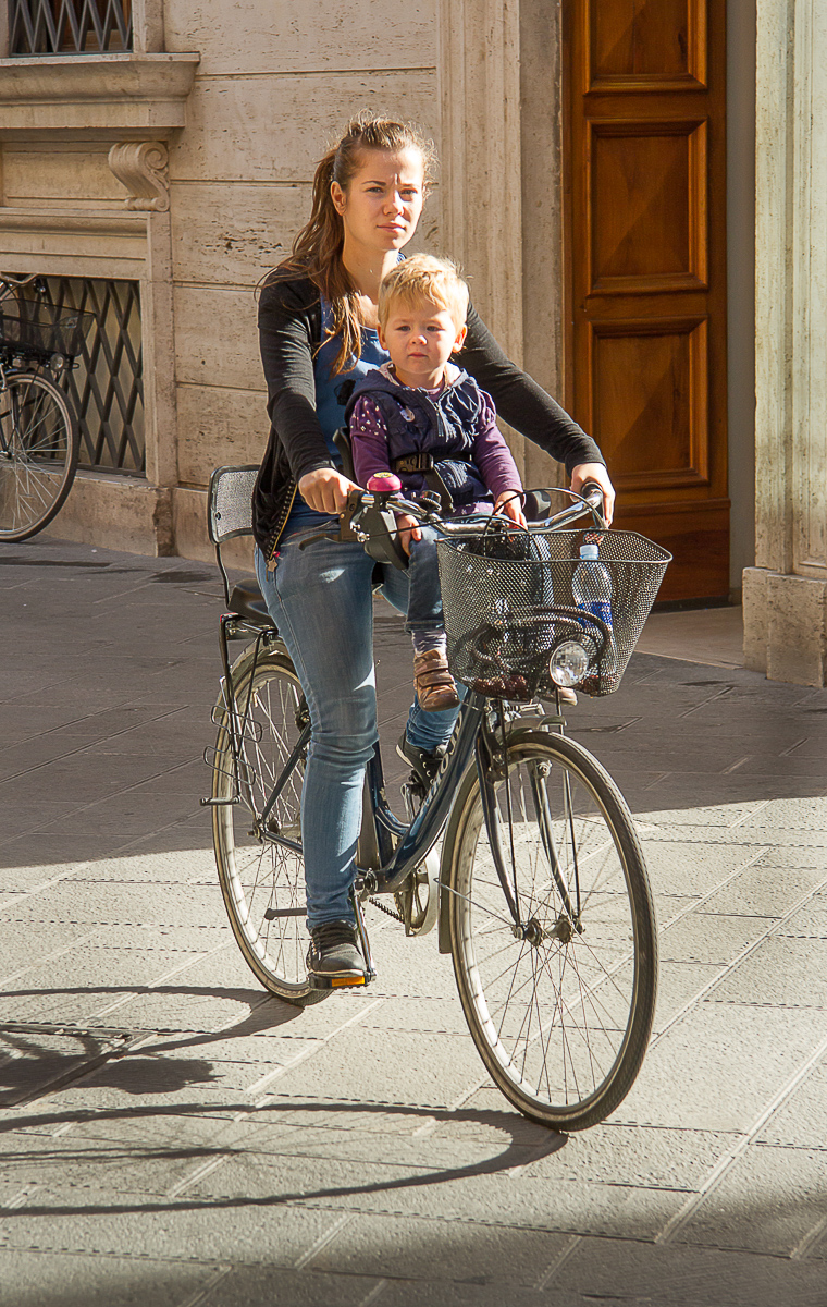
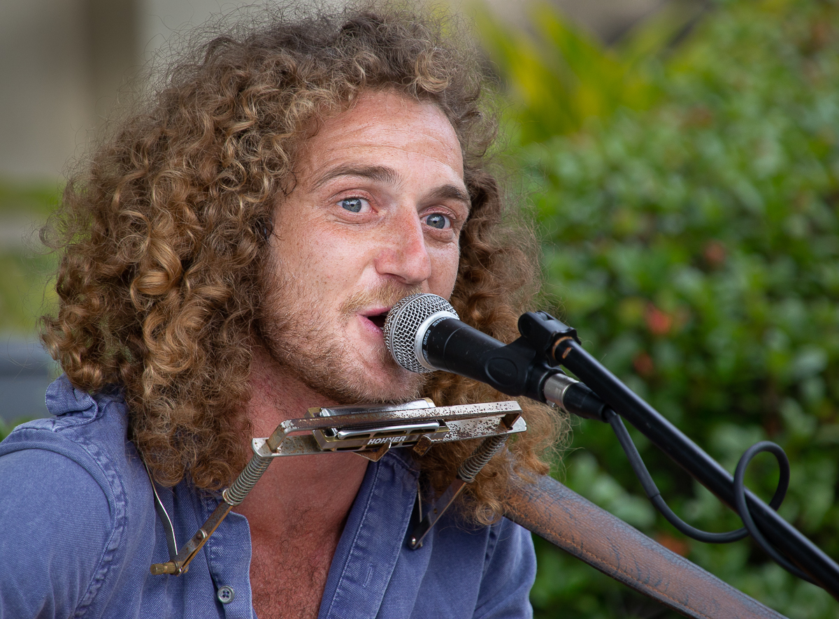
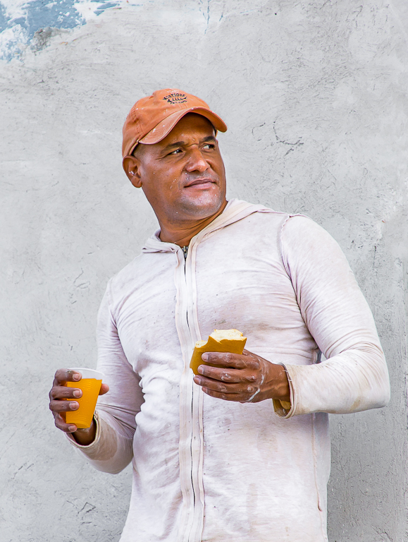
Hi Lisa, this is a nice image and one for your niece to help remember the day. I agree, I prefer still shots but I have have some good results with getting stills from video. I think that your overall image is soft, perhaps out of focus. I shot some video a week or so ago and most of the clips were soft. I thought I focused so I'm not sure what the problem was. Taking Drema's suggestion I took the liberty of cropping your image in LR and then I sharpened it in Topaz Sharpen-Ai. I hope that is okay with you. |
Jul 4th |
 |
| 85 |
Jul 22 |
Reply |
Thanks for the comments Drema. I agree about the cart , I think it should be removed, maybe the road as well. I'll see what it looks like with the greens a little darker. |
Jul 4th |
4 comments - 5 replies for Group 85
|
| 92 |
Jul 22 |
Reply |
Thanks for the comments Jill, I agree about the contrast. |
Jul 25th |
| 92 |
Jul 22 |
Reply |
Hi Beth, thanks for your comments and views regarding my image. |
Jul 13th |
| 92 |
Jul 22 |
Comment |
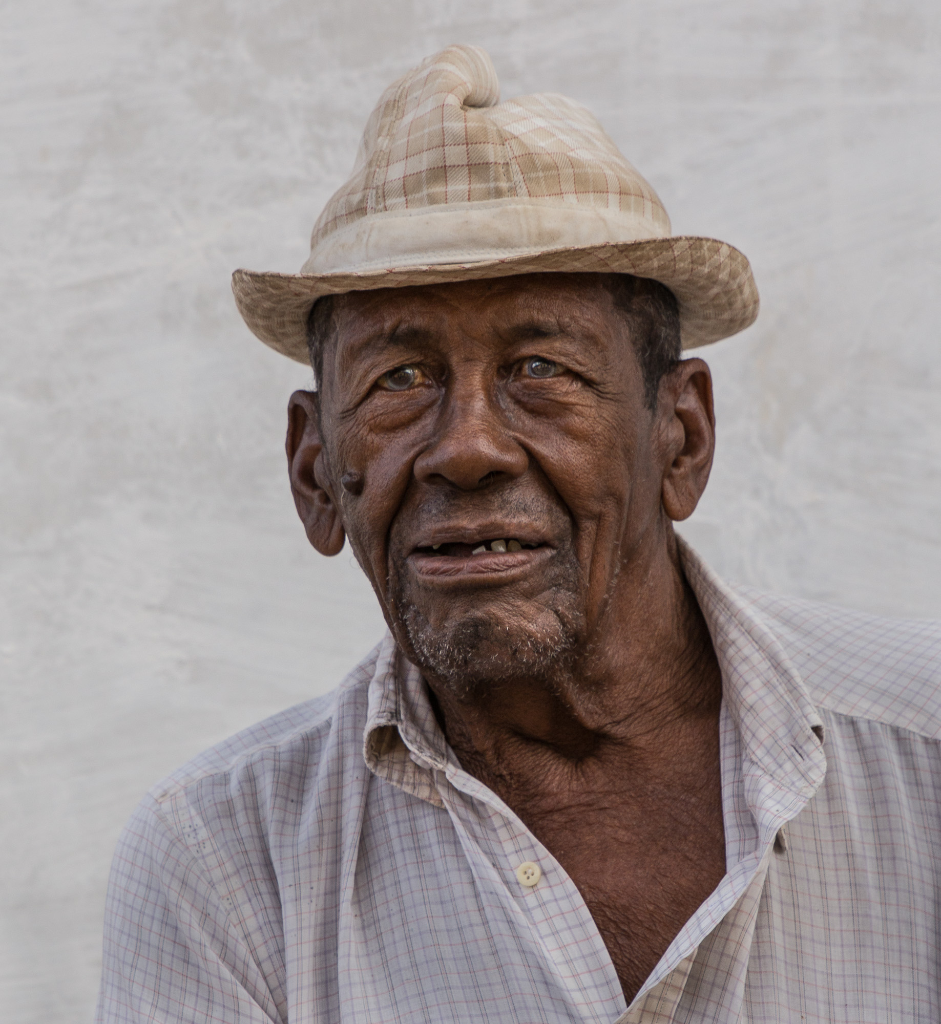
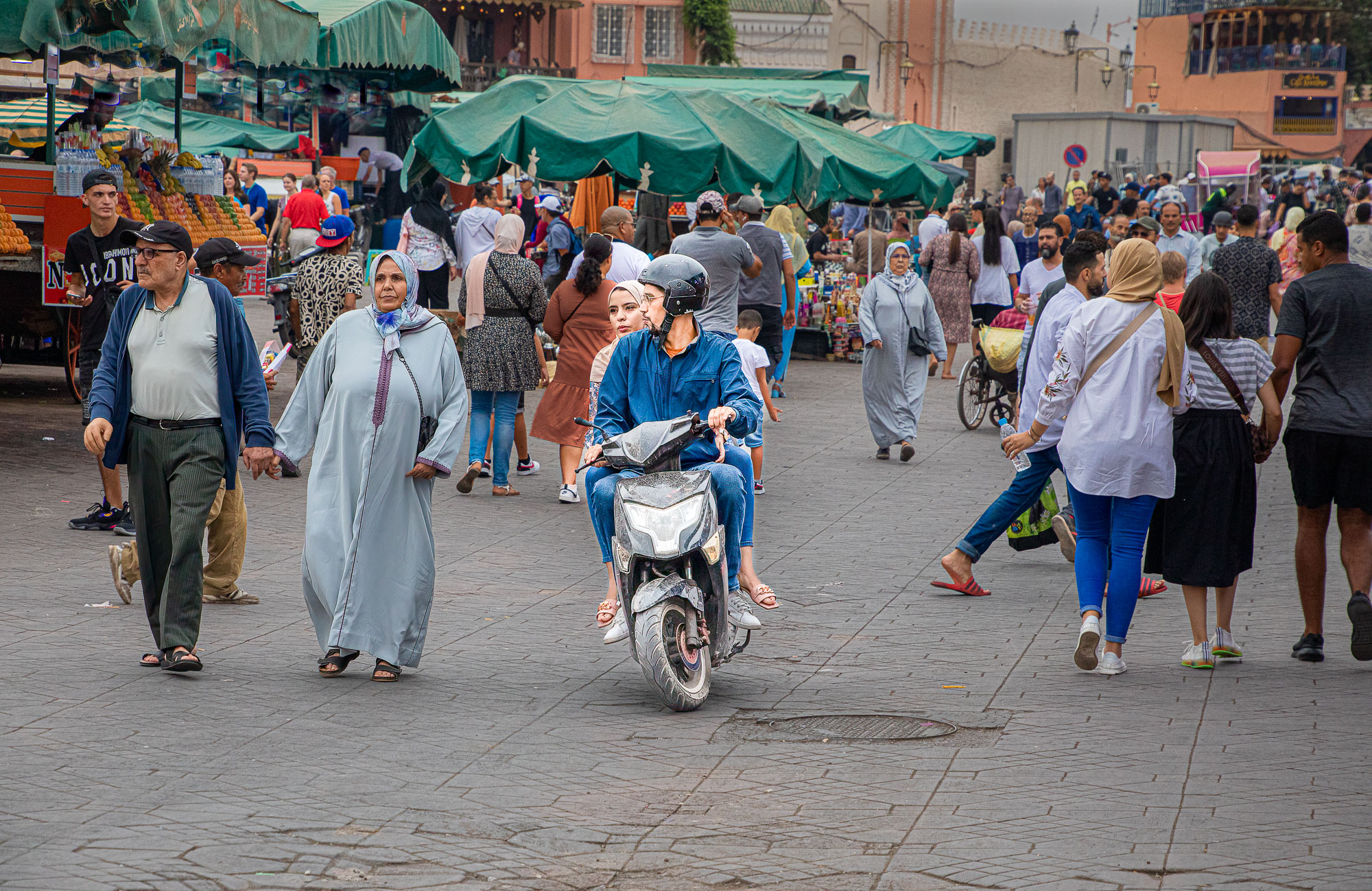
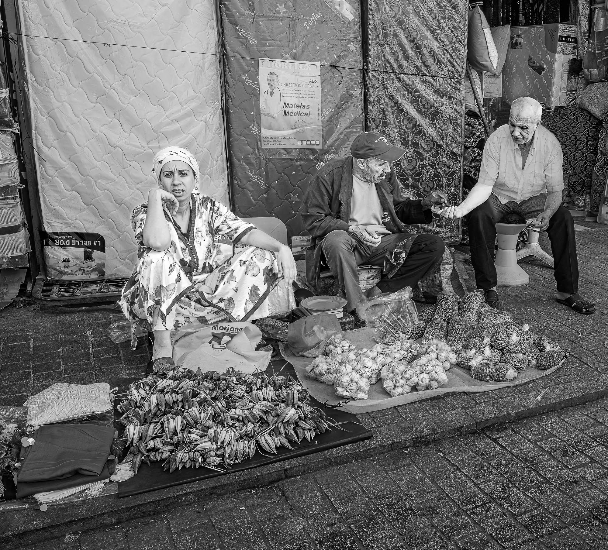
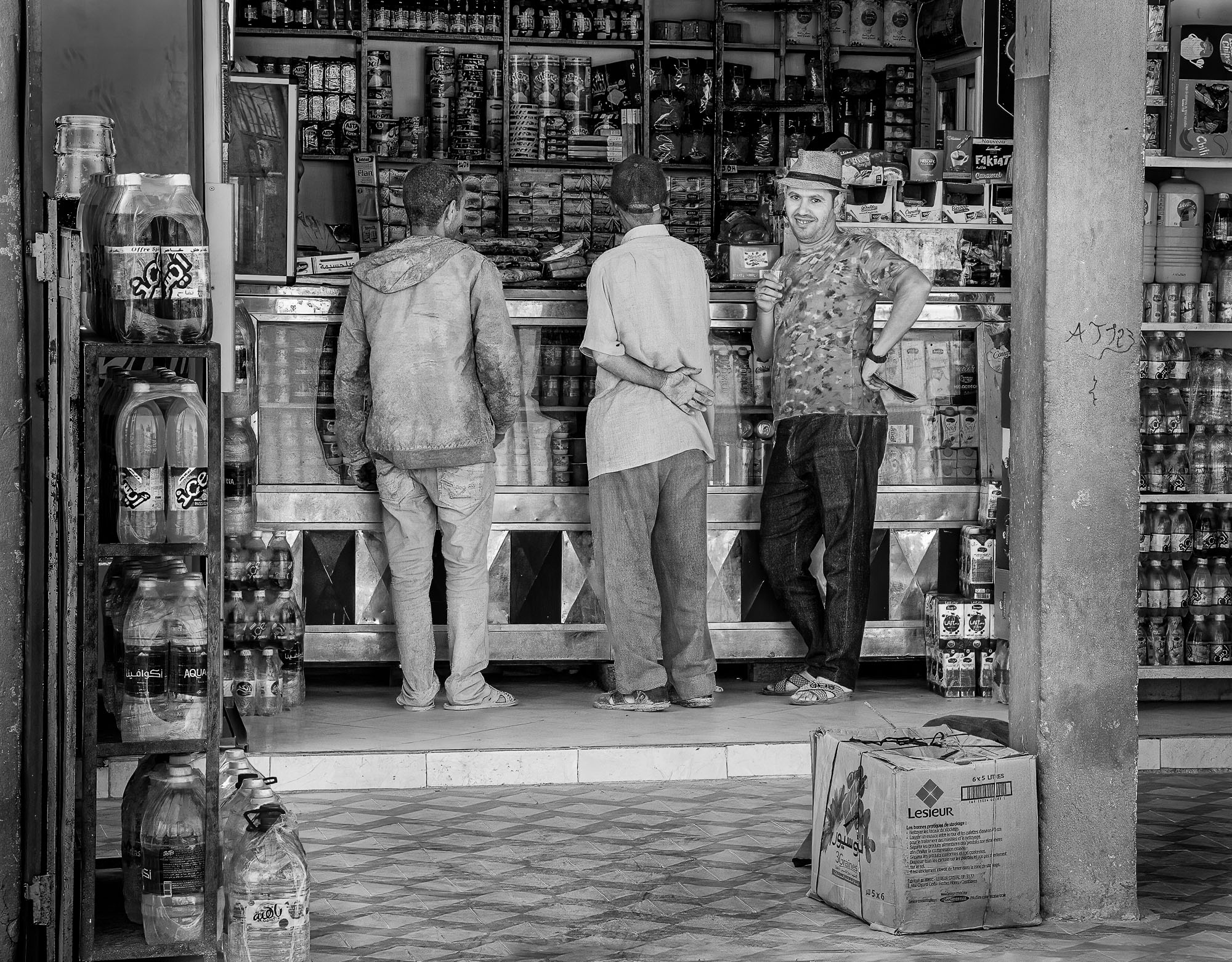
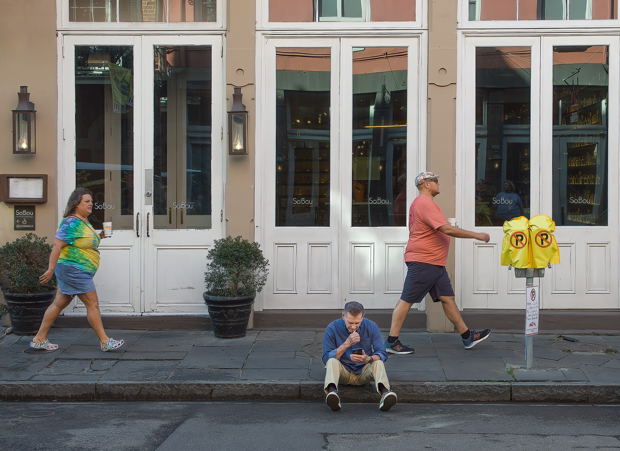
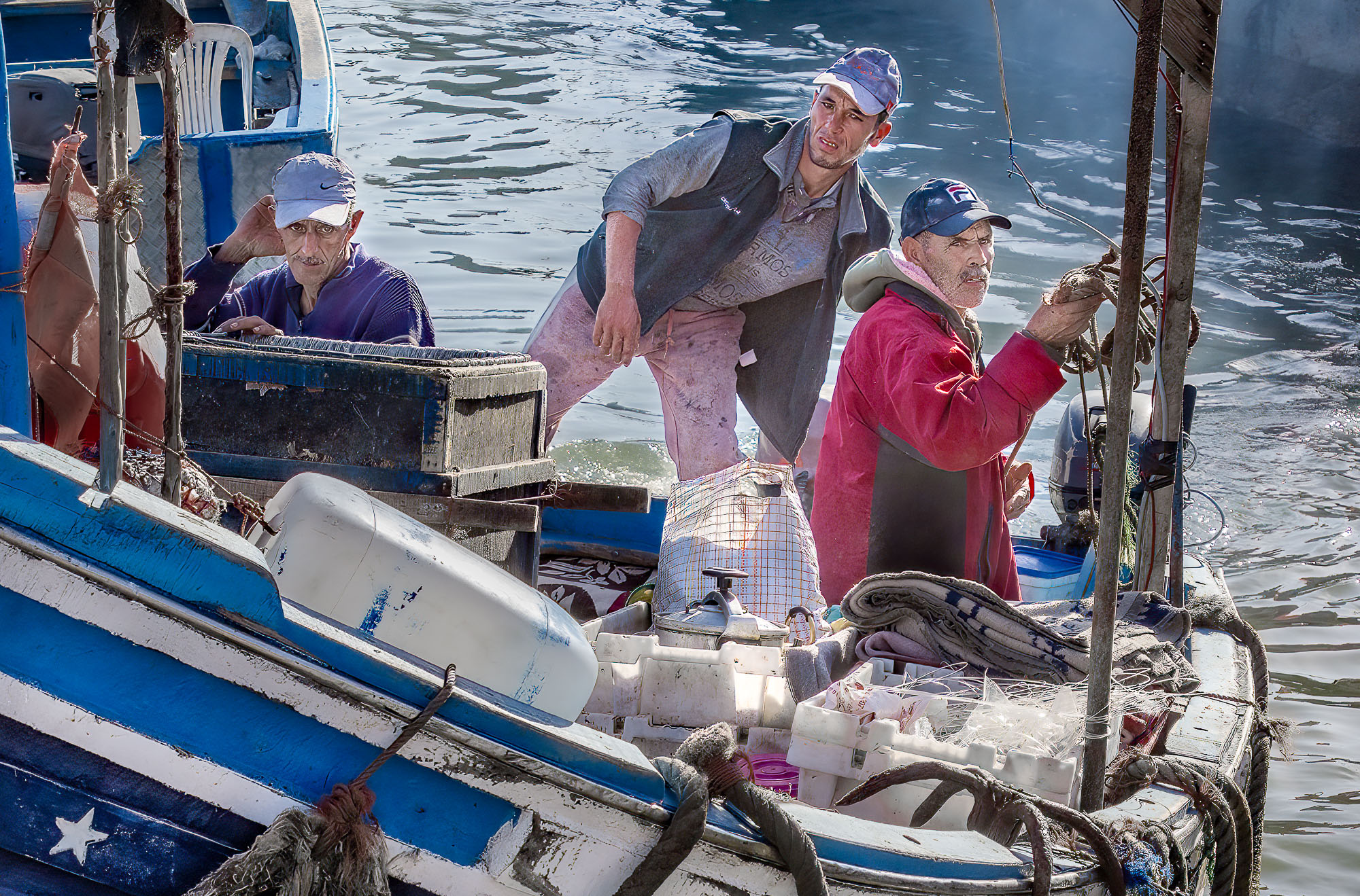
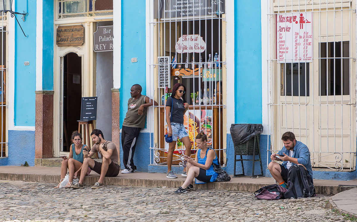
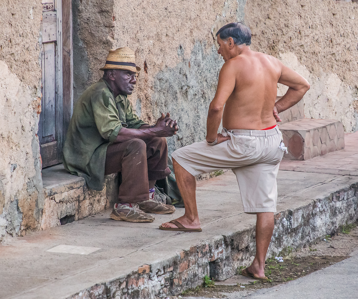
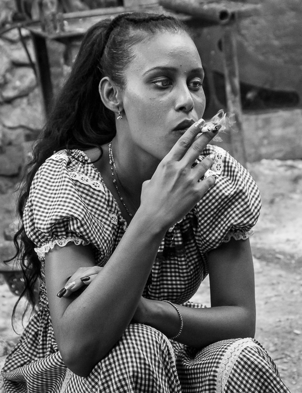
Hi Chuck, I agree with Lance, I think this is a fine example of photojournalism, the type seen in a local paper. I think the shadows could be lightened up some, especially on the man's face. To me the image is very busy but I don't find that too distracting. A nice record of the parade. |
Jul 11th |
| 92 |
Jul 22 |
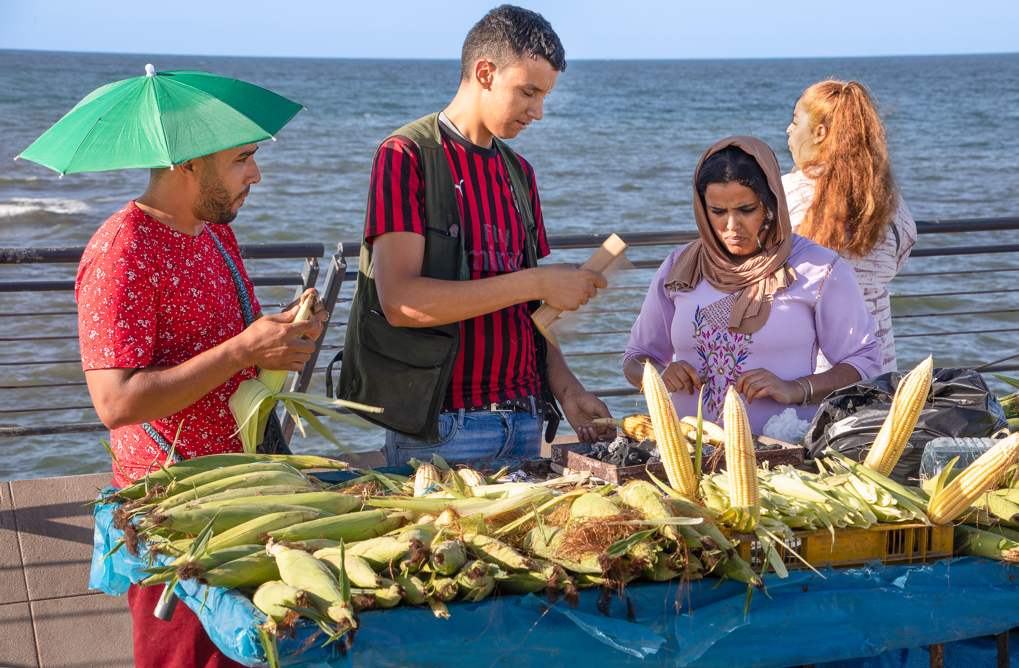
Comment |
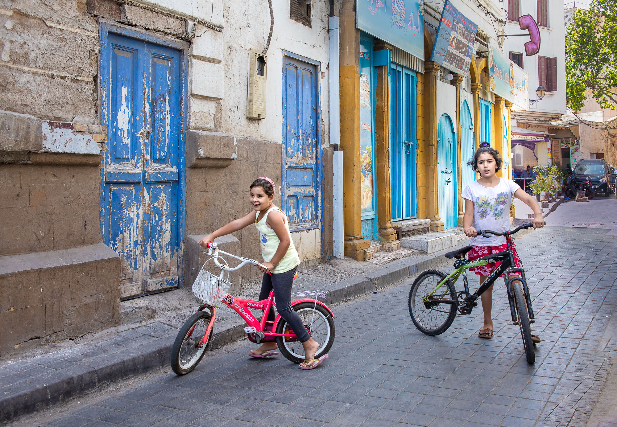
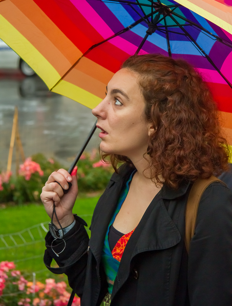
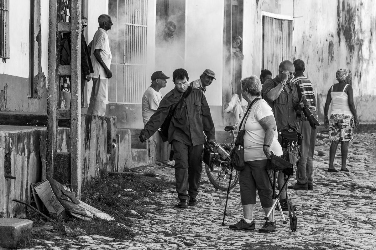
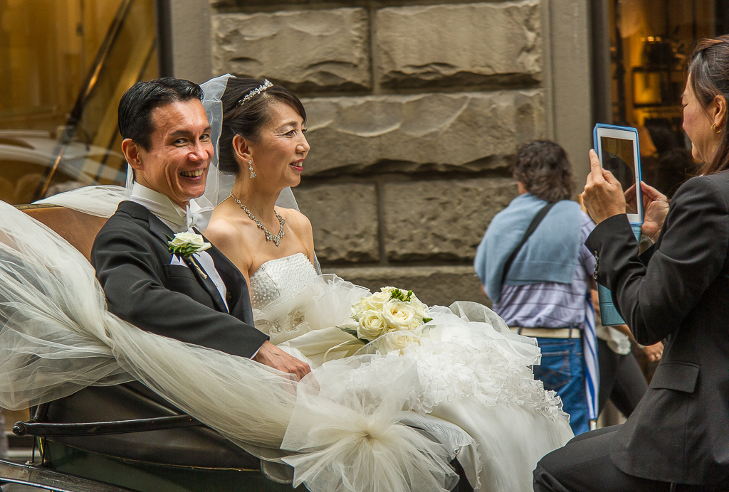
Hello Beth, I think this is a lovely image. The composition is handled well and the focus is right on, the women in the background are just out of focus enough to not be distracting. I love how the repeating reds emphasized the man's head wear. I read Lance's comments about the posters and I can see his point however in my opinion I prefer the muted posters in your submitted image. |
Jul 11th |
| 92 |
Jul 22 |
Comment |
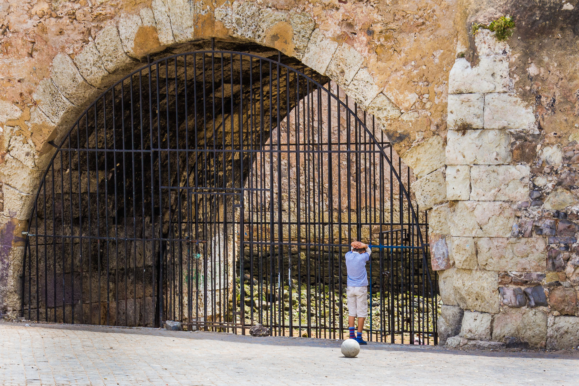
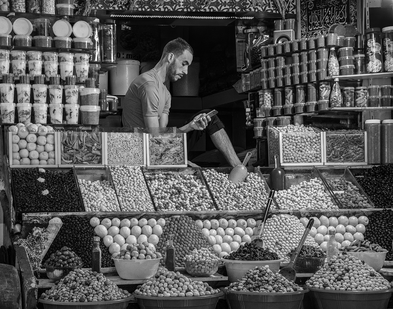
Hi Lance, I think this is an interesting image. I really like the abstract. Overall, as the viewer I can feel the energy and excitement. I agree with Chuck it is perhaps a little too abstract for what most would consider a street photograph. To my eye the squiggly lines distracting and not adding to the image. |
Jul 11th |
| 92 |
Jul 22 |
Comment |
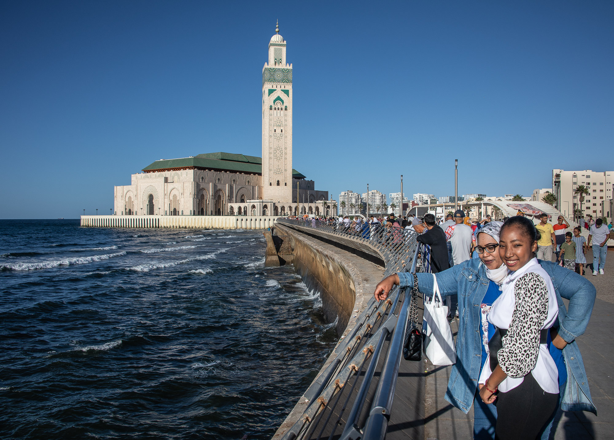
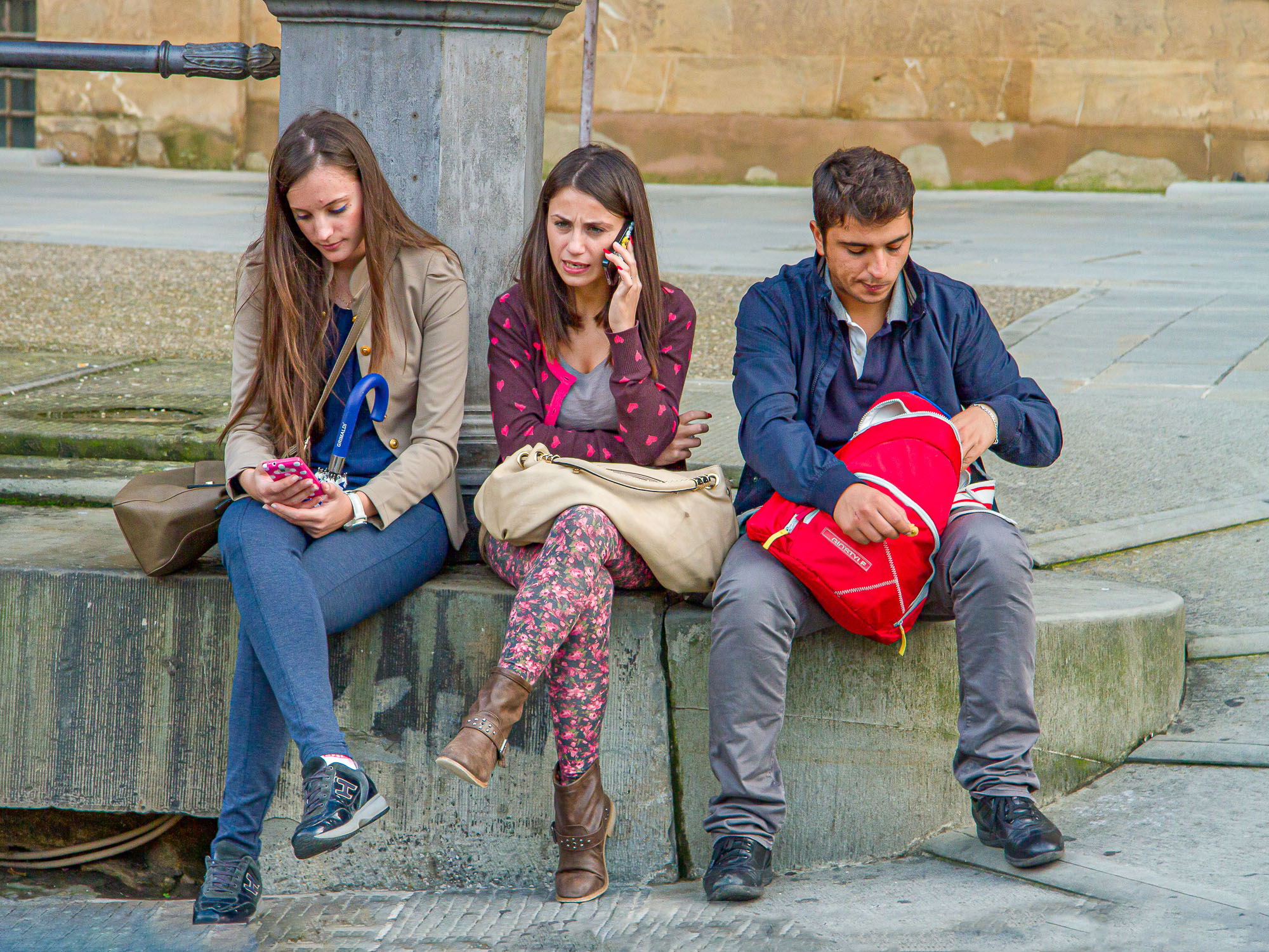
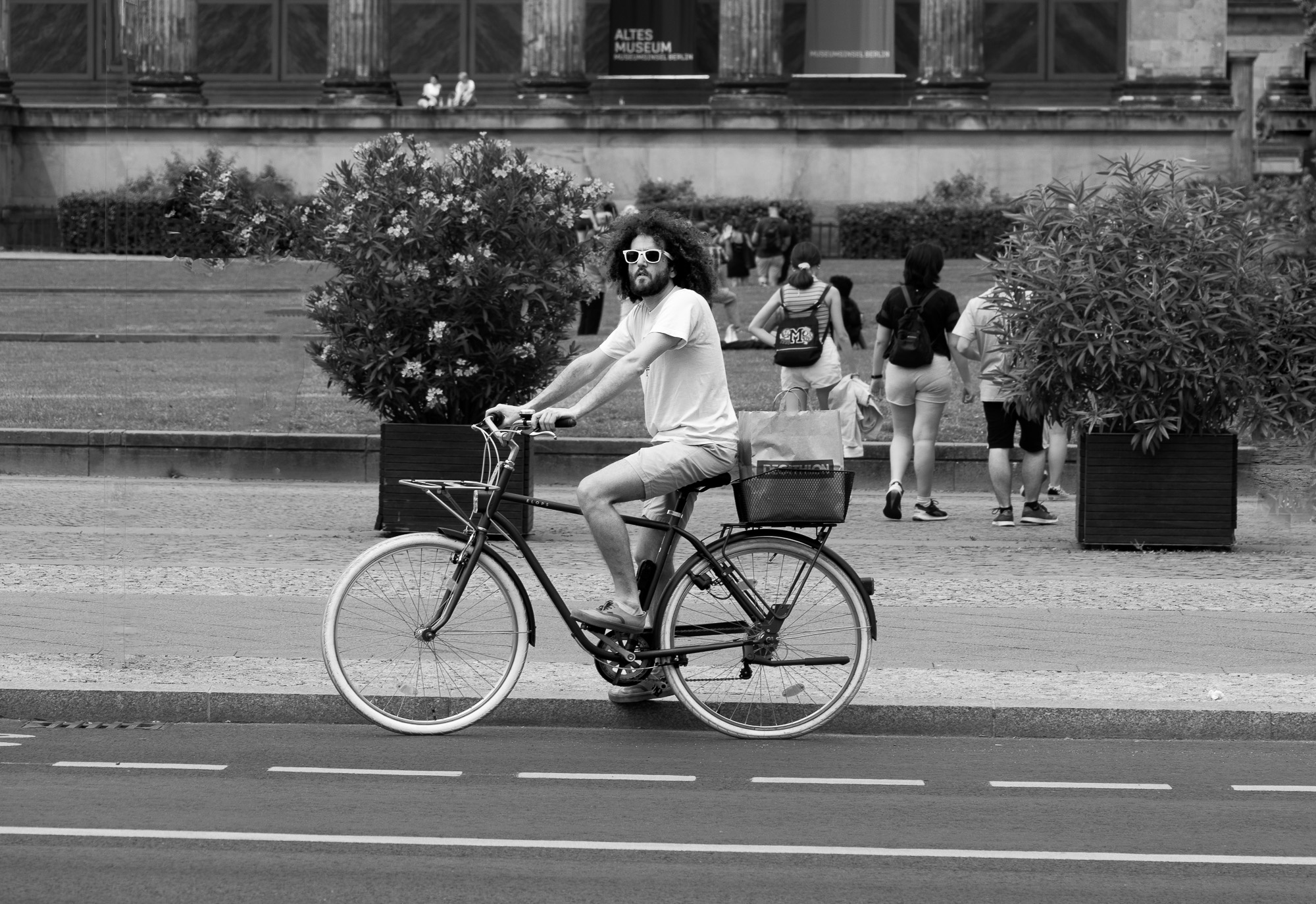
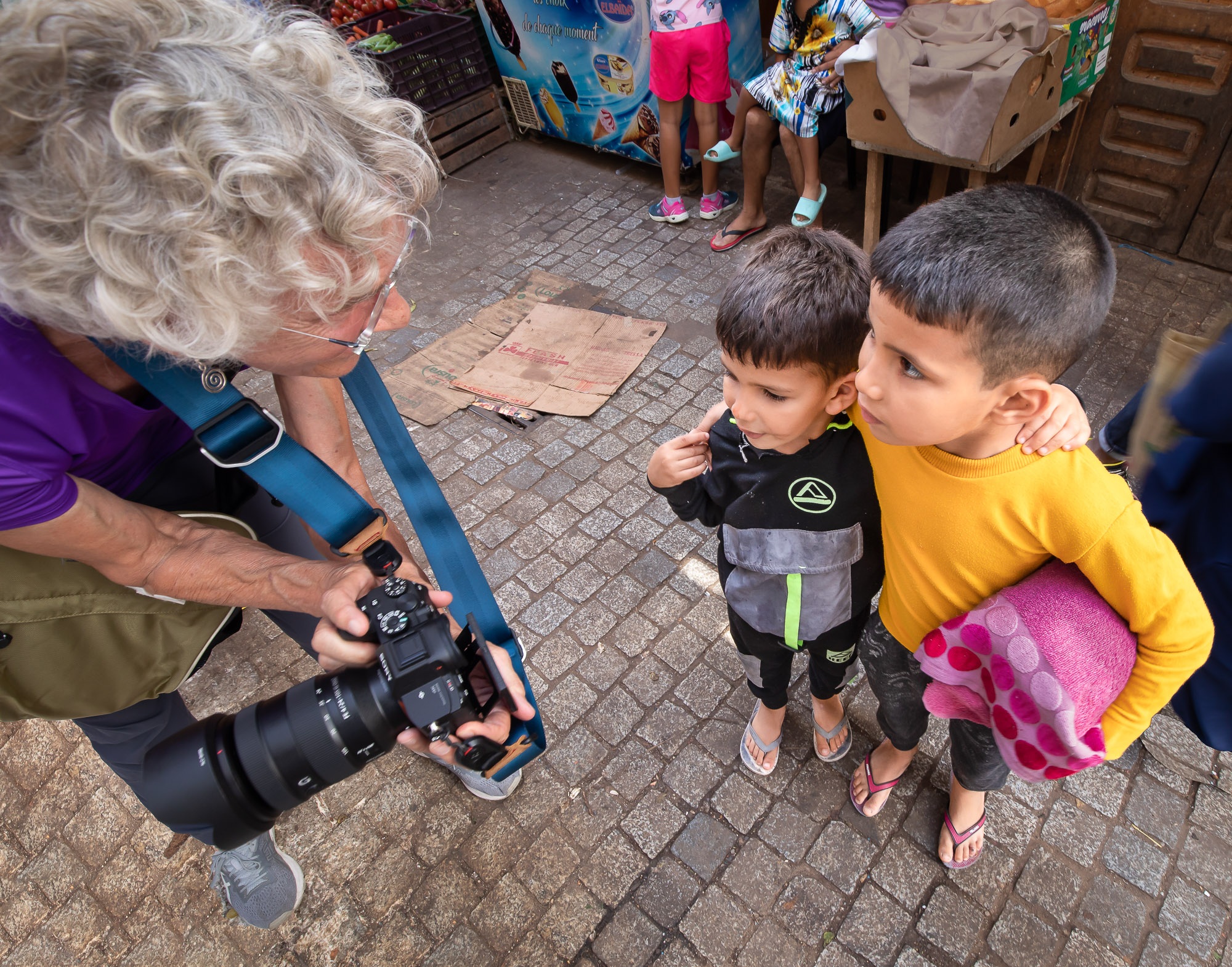
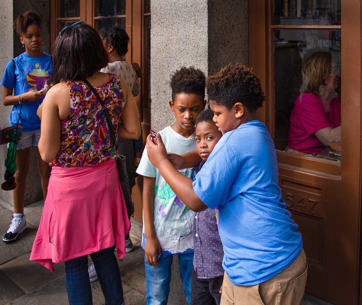
Hi Marianne, I really like your image. I love the composition, to my eye the centering works very well in this image. I think the B&W rending is great, you have a wide tonal range and the image is beautifully sharp. I generally like to have a person in my street images but I don't find it necessary. I read Lance's comments on your image and others, I'm not sure I see his point perhaps that street photography should evoke an emotional response- just a thought. |
Jul 7th |
| 92 |
Jul 22 |
Reply |
Hi Lance, I think I took you comments as intended. I don't dislike cute but uncomfortable is more interesting. Plus, as you said, an uncomfortable image may cause the viewer to think. |
Jul 7th |
| 92 |
Jul 22 |
Reply |
Thanks for the comments Chuck. I see what you mean about the submitted image being flat, I'll have to see what part of the post processing caused that. |
Jul 7th |
| 92 |
Jul 22 |
Reply |
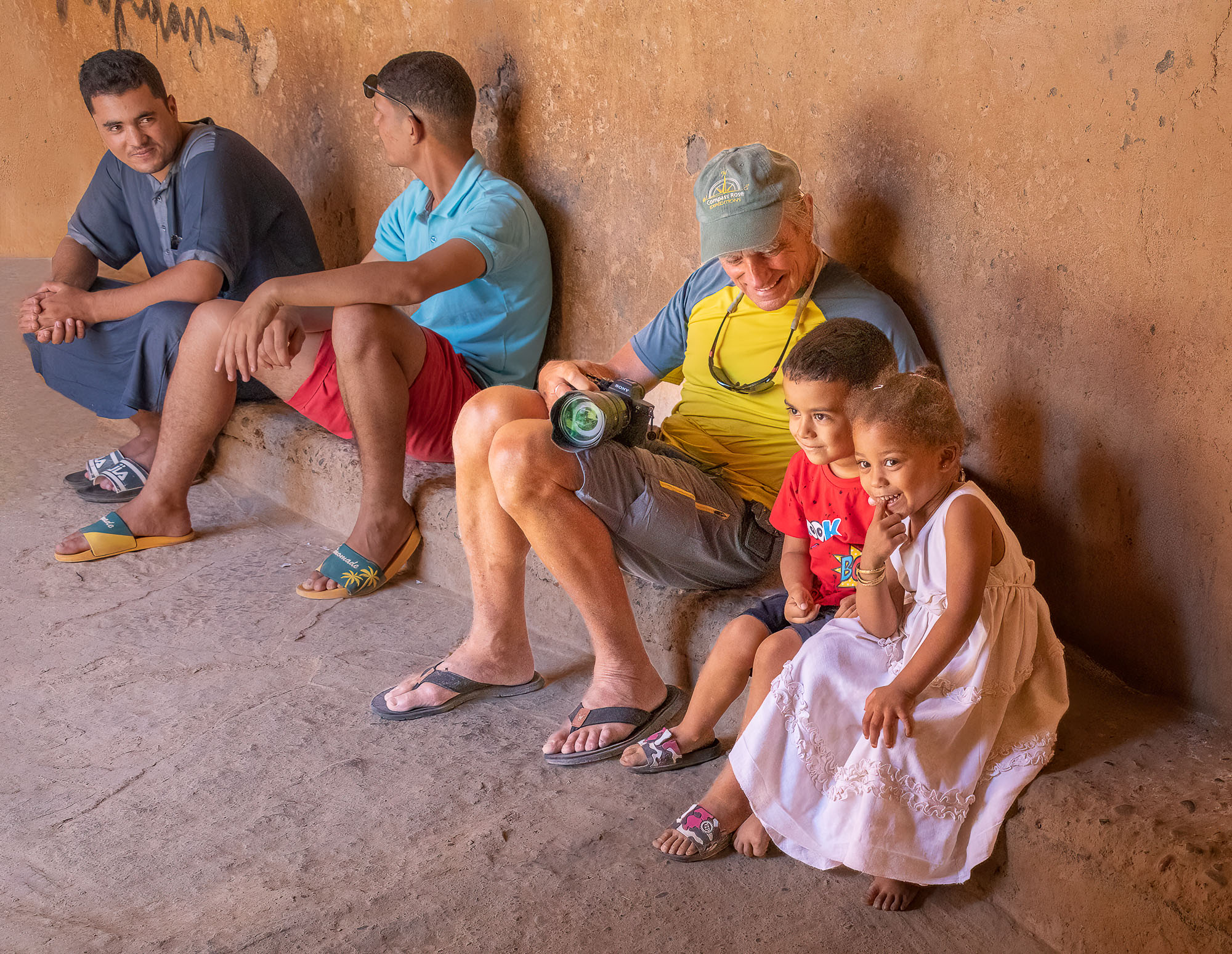
Thanks for the comments Marianne. I agree, I see people on the street corners and think that it must pay better than working. I realize that some but not all of them are not capable of holding a job. It really is a strange world and we are fortunate to be able to capture some of it in our images. |
Jul 6th |
| 92 |
Jul 22 |
Reply |
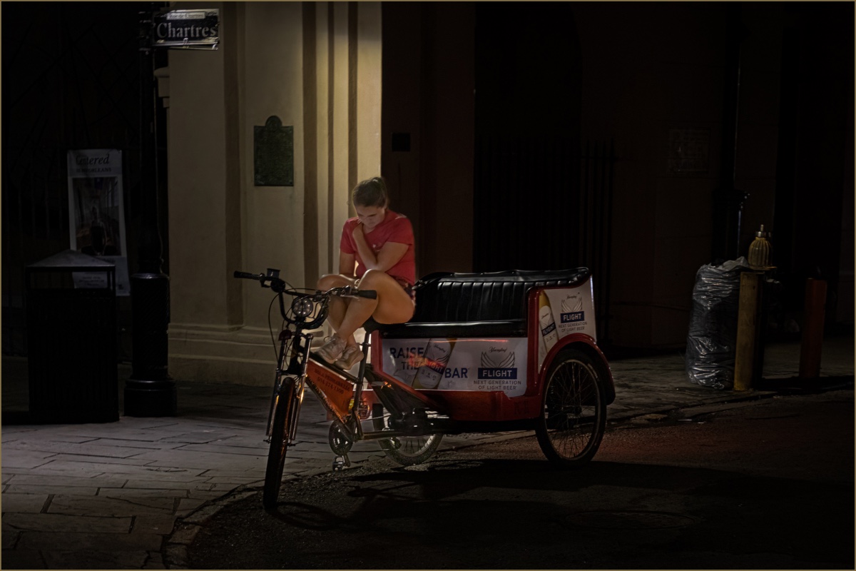
Hi Lance, thanks for the comments. I had originally planned to crop a little tighter, but not so much as to exclude the second person. I think the second person is what makes the image interesting. I agree that displays of public personal hygiene is uncomfortable but should it necessarily be? The gallery image was not an inspiration, I came across it afterwards and was intrigued by the similarity and included as a possible interest to our forum viewers. |
Jul 6th |
| 92 |
Jul 22 |
Comment |
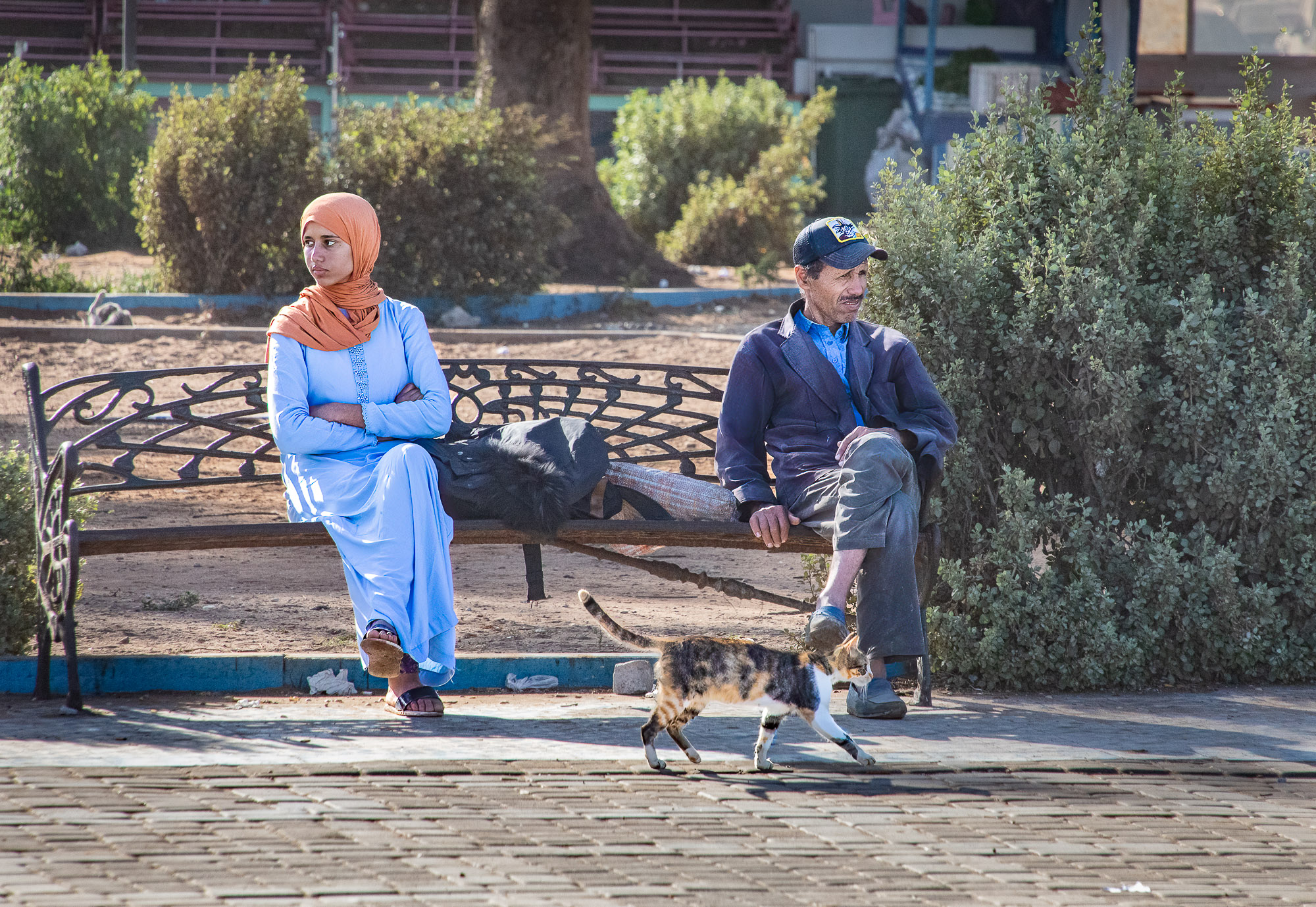
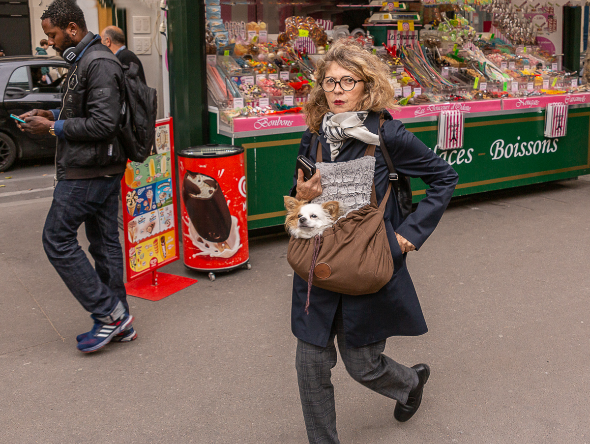
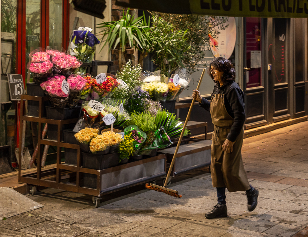
Interesting image and it tells a story. I wasn't sure if the title referred to the streets or the woman's shopping bag. To me the composition and the muted colors are sort of moody, which fits in with the story. Very nicely done. |
Jul 4th |
5 comments - 6 replies for Group 92
|
9 comments - 11 replies Total
|