|
| Group |
Round |
C/R |
Comment |
Date |
Image |
| 85 |
Jun 22 |
Reply |
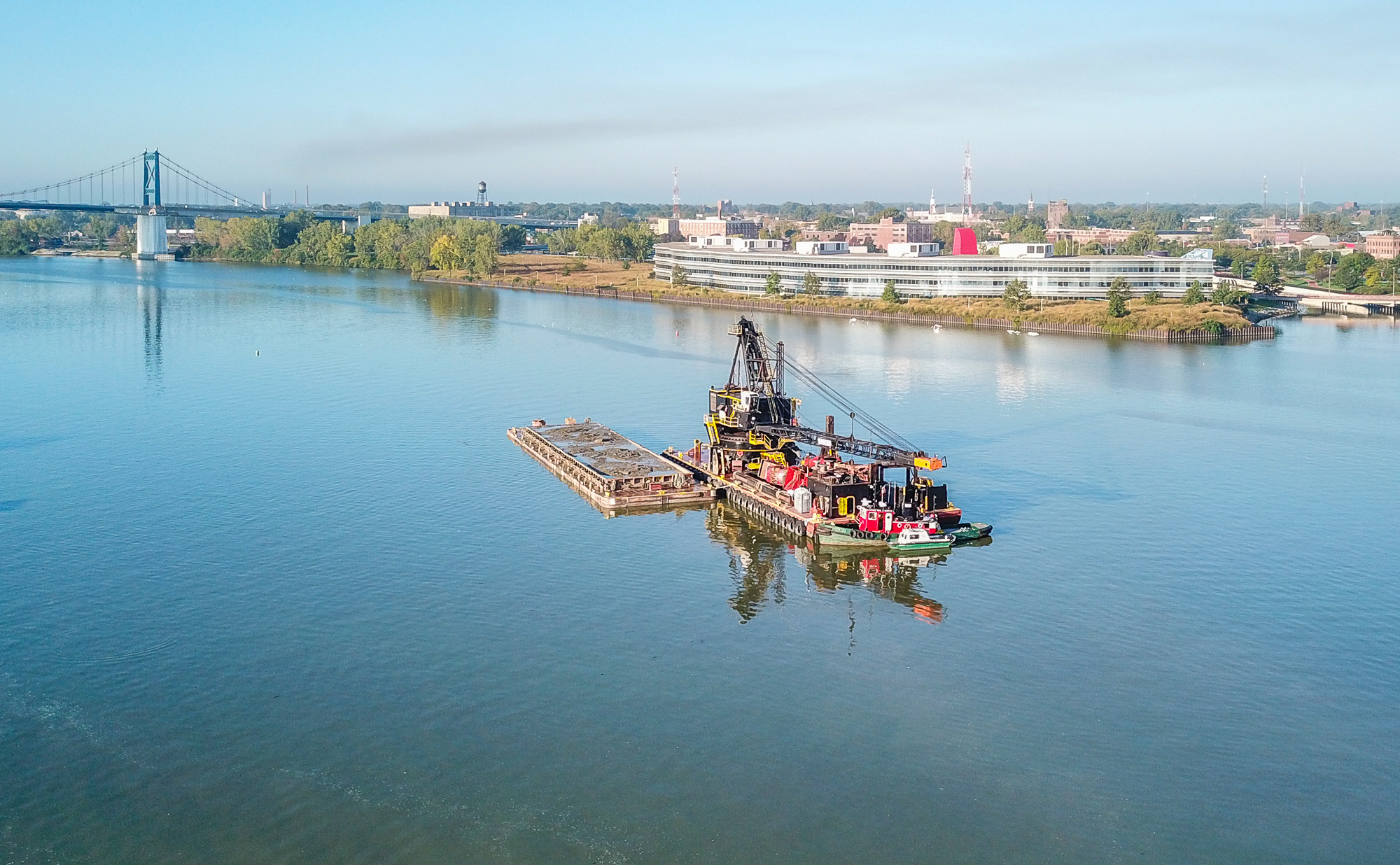
Thanks, I agree with you comments.The opportunities for drone photography are pretty slim, at least around NW Ohio. I have lots of opportunities to fly my drone but not many interesting subjects. |
Jun 28th |
| 85 |
Jun 22 |
Reply |
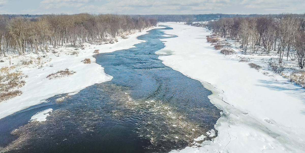
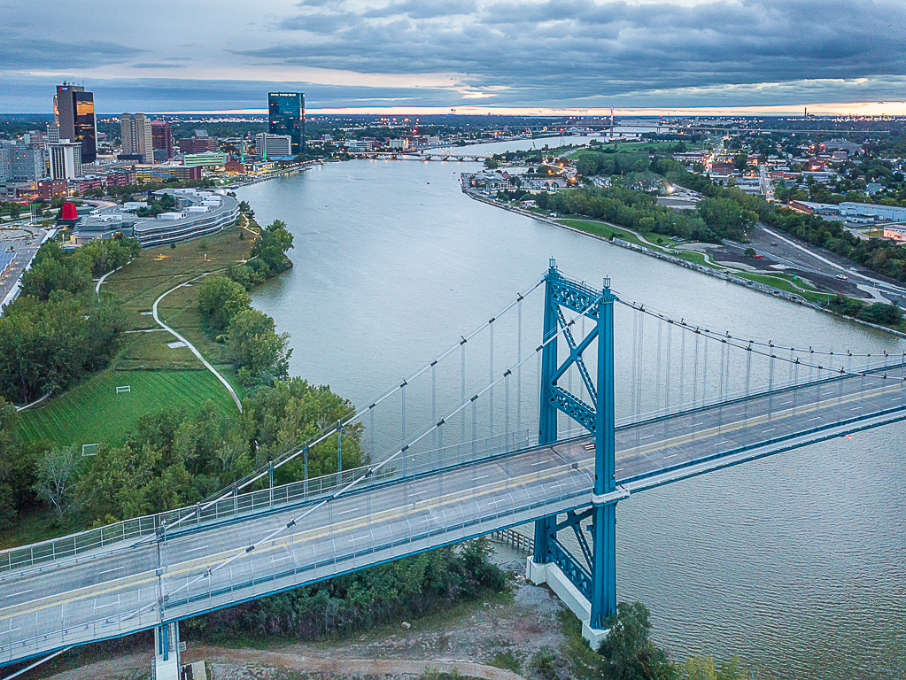
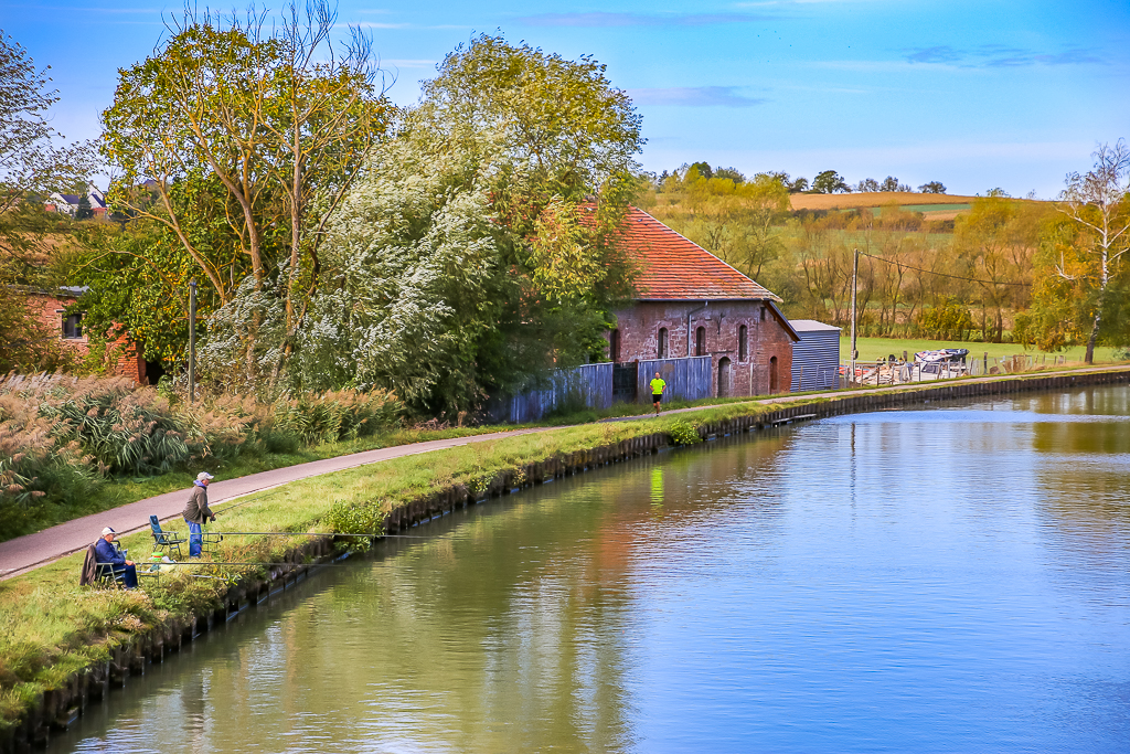
Thanks for the comments Dremma. Other than being a nice image of the river and the fishing activities I think the the image is pretty weak. You comment about not lightening the water is right on, I did not see that until you mentioned it. I took this image early in the day so the light was poor plus it was back lit so I think the shadows are not salvageable. Thanks again for the comments. |
Jun 16th |
| 85 |
Jun 22 |
Reply |
Hi Don, thanks for the comments. I'm not sure that cropping would greatly improve the image. It was a frame capture from a video so the lower pixel count and poor lighting didn't leave a lot to work with. At the time I took the image I thought the scene was interesting but a closer look at part of it would be an overall improvement. |
Jun 16th |
| 85 |
Jun 22 |
Reply |
Hi Pete, thanks for the comments. I agree there is not a definitive subject, I'm not sure that even cropping would greatly improve the image. |
Jun 16th |
| 85 |
Jun 22 |
Reply |
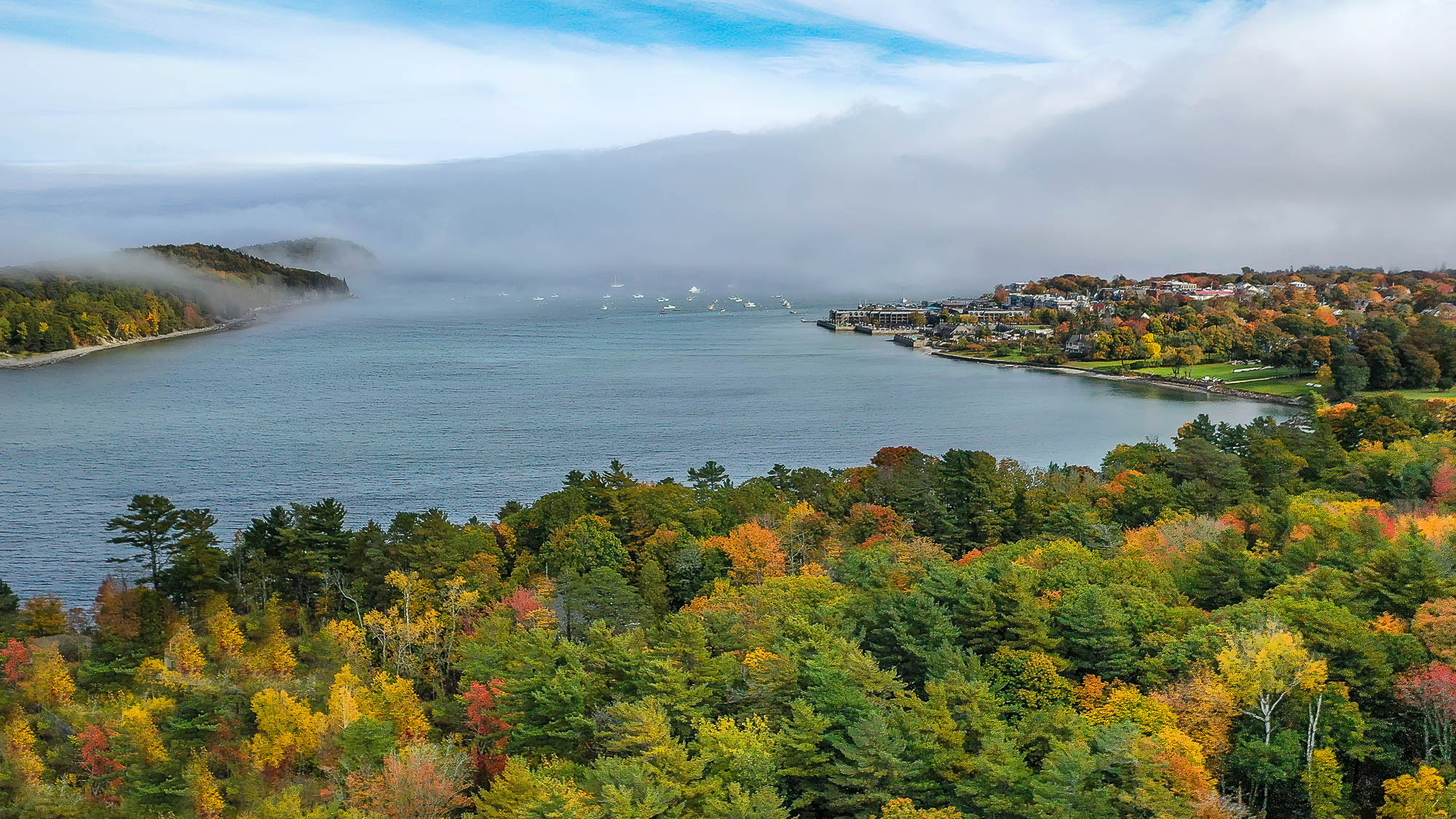
Thanks for the comments Janos. You have made some good suggestions, the sky was not good that day and I think the lighting was poor so that the trees are really muddy. I'll see about color correction on the trees, overall I think it shows an interesting scene but is not a great photo. |
Jun 16th |
| 85 |
Jun 22 |
Comment |
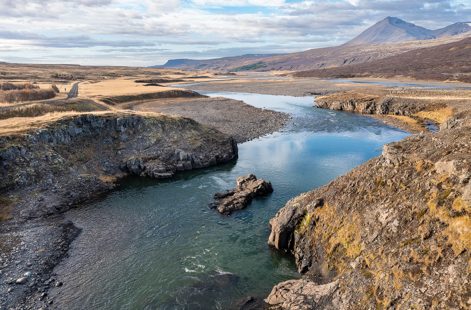
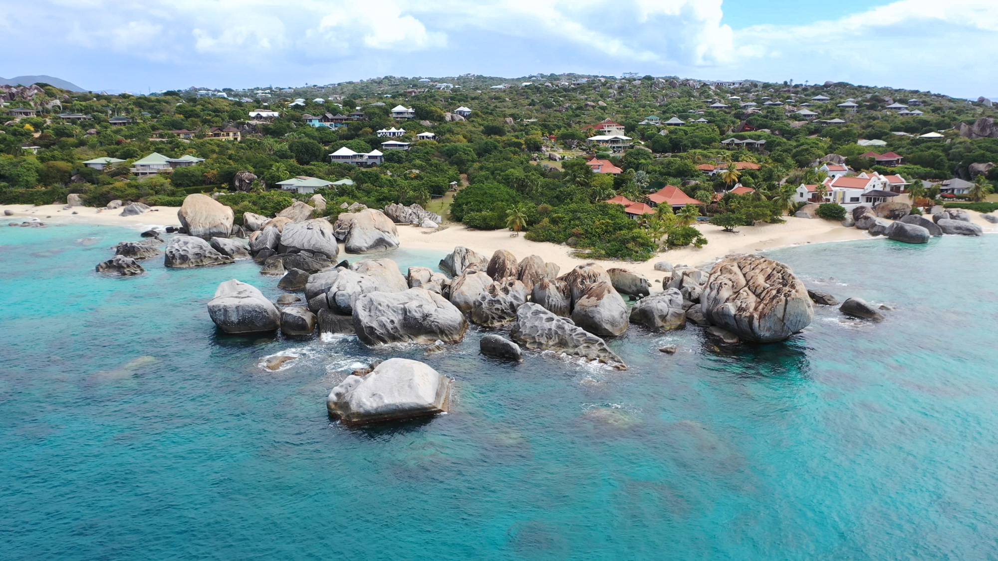
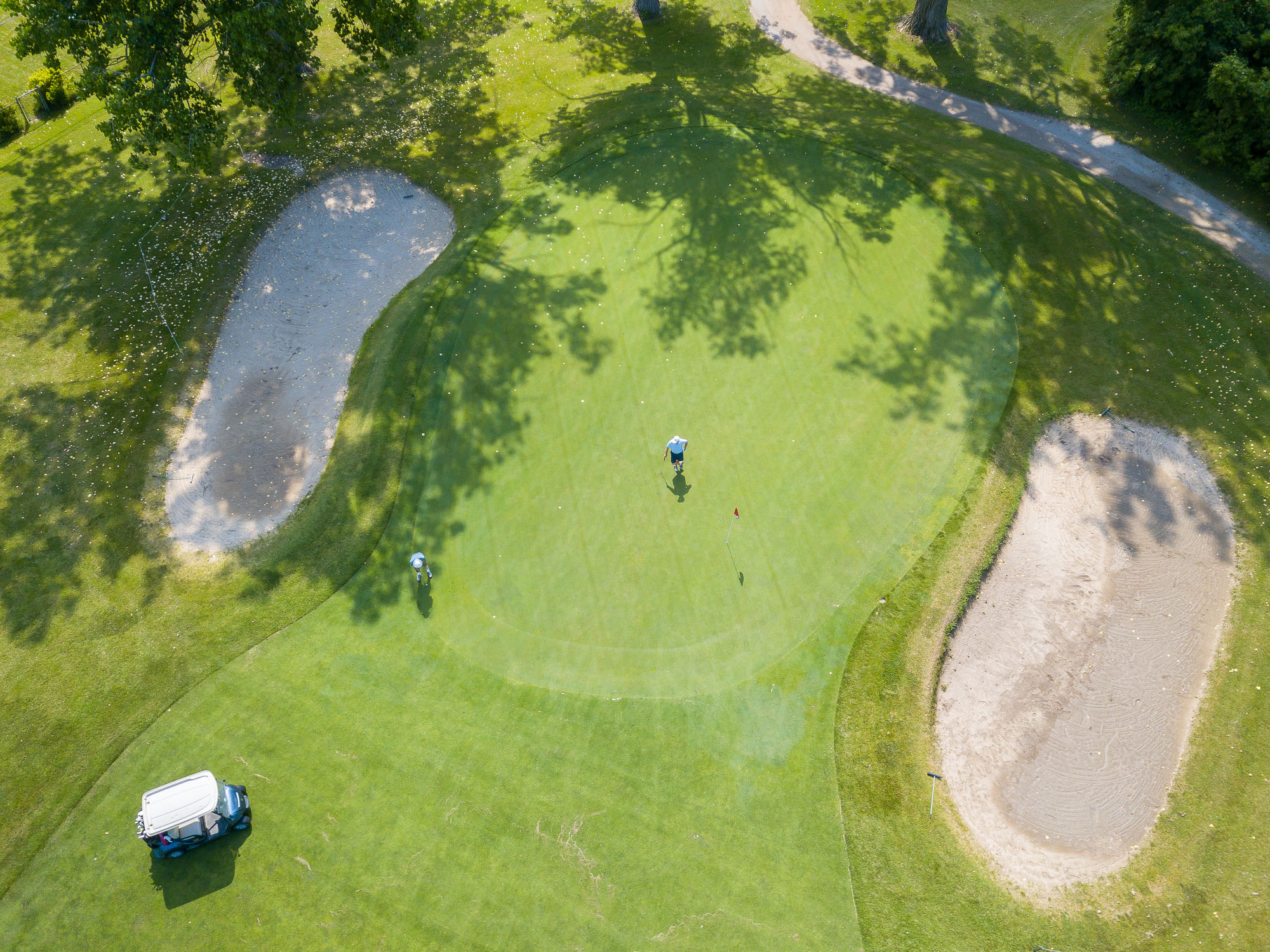
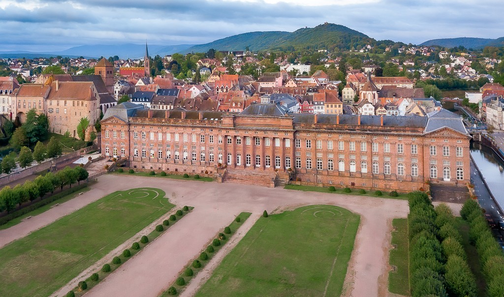
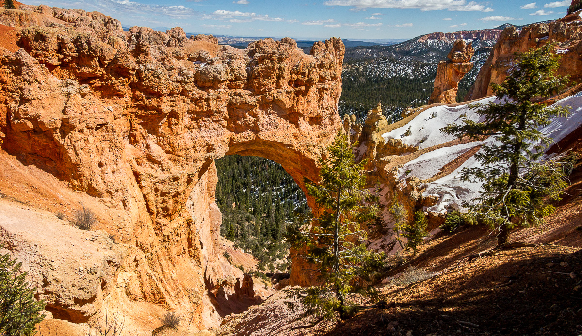
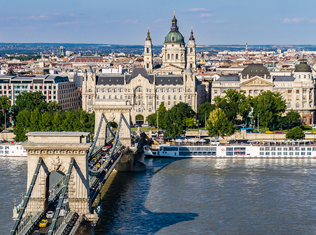
Interesting image, I like the composition and subject matter. It looks like a wonderful place. I think you have handled the post processing well, the sky looks good and I think the sharpness is good. In my opinion I think it could be just a touch brighter in the foreground. |
Jun 6th |
| 85 |
Jun 22 |
Comment |
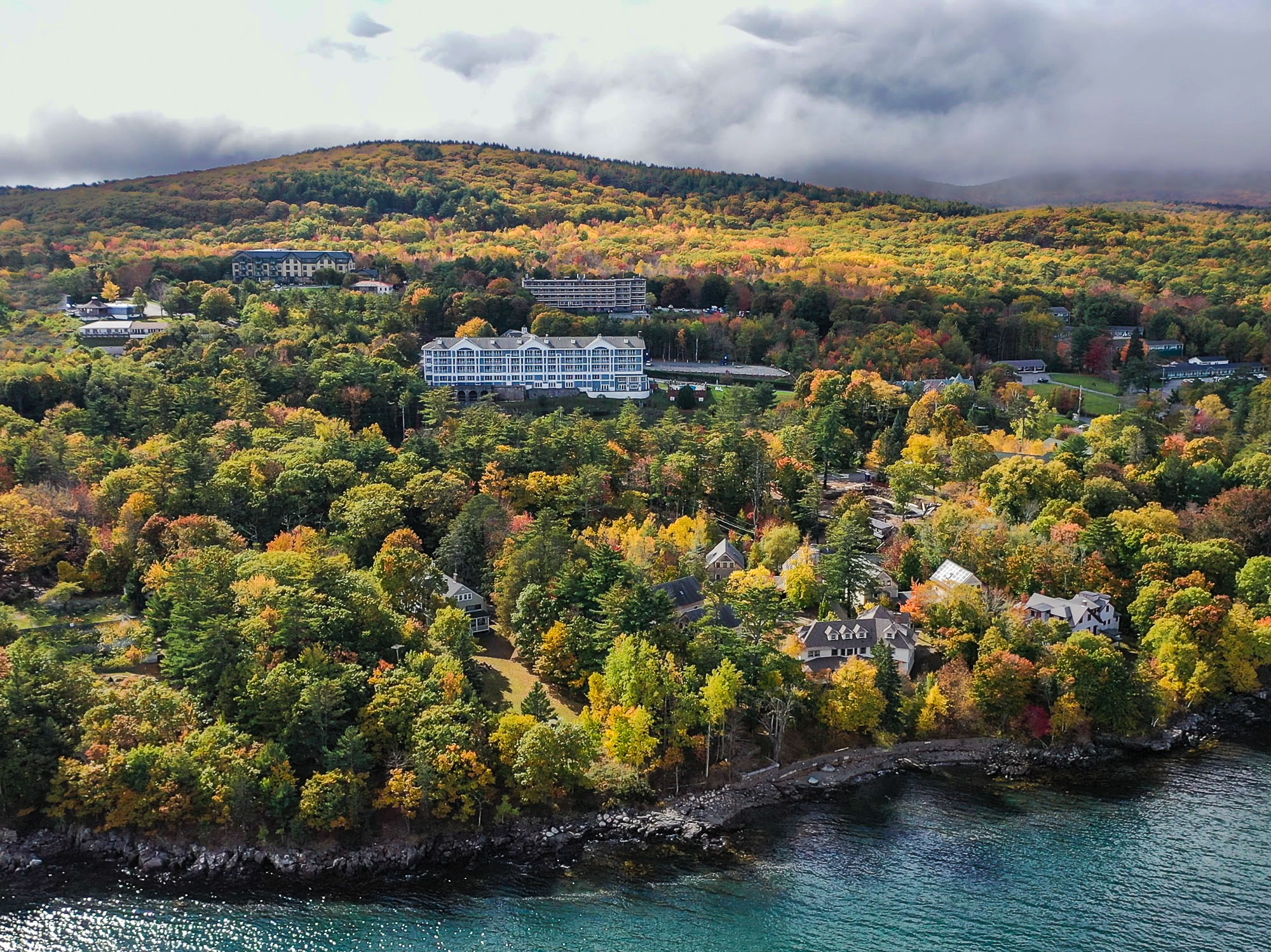
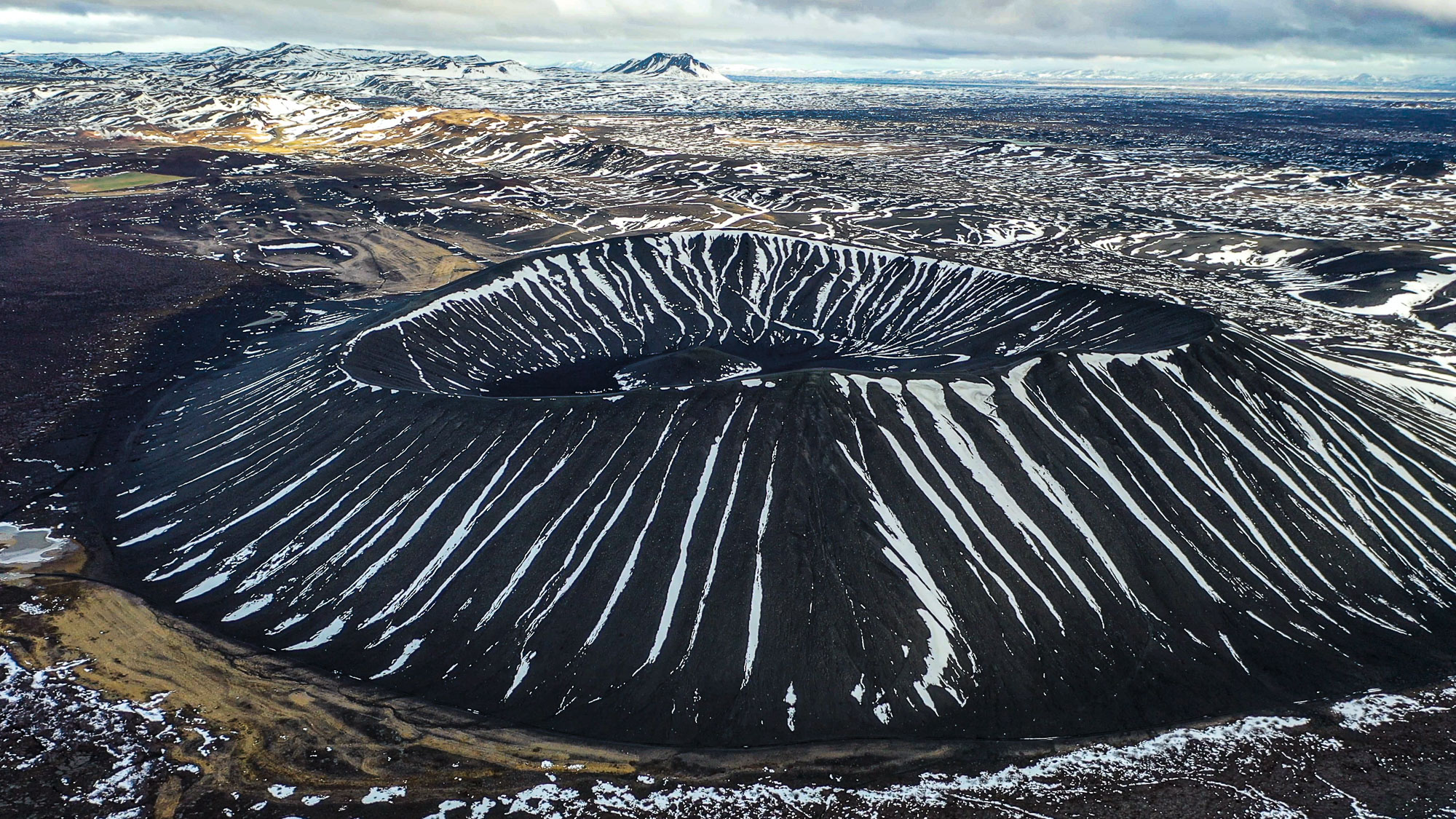
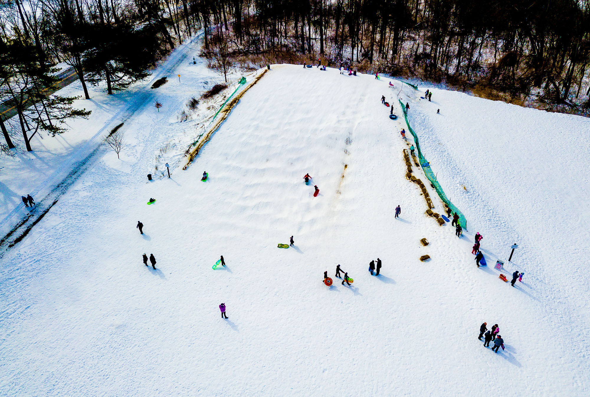
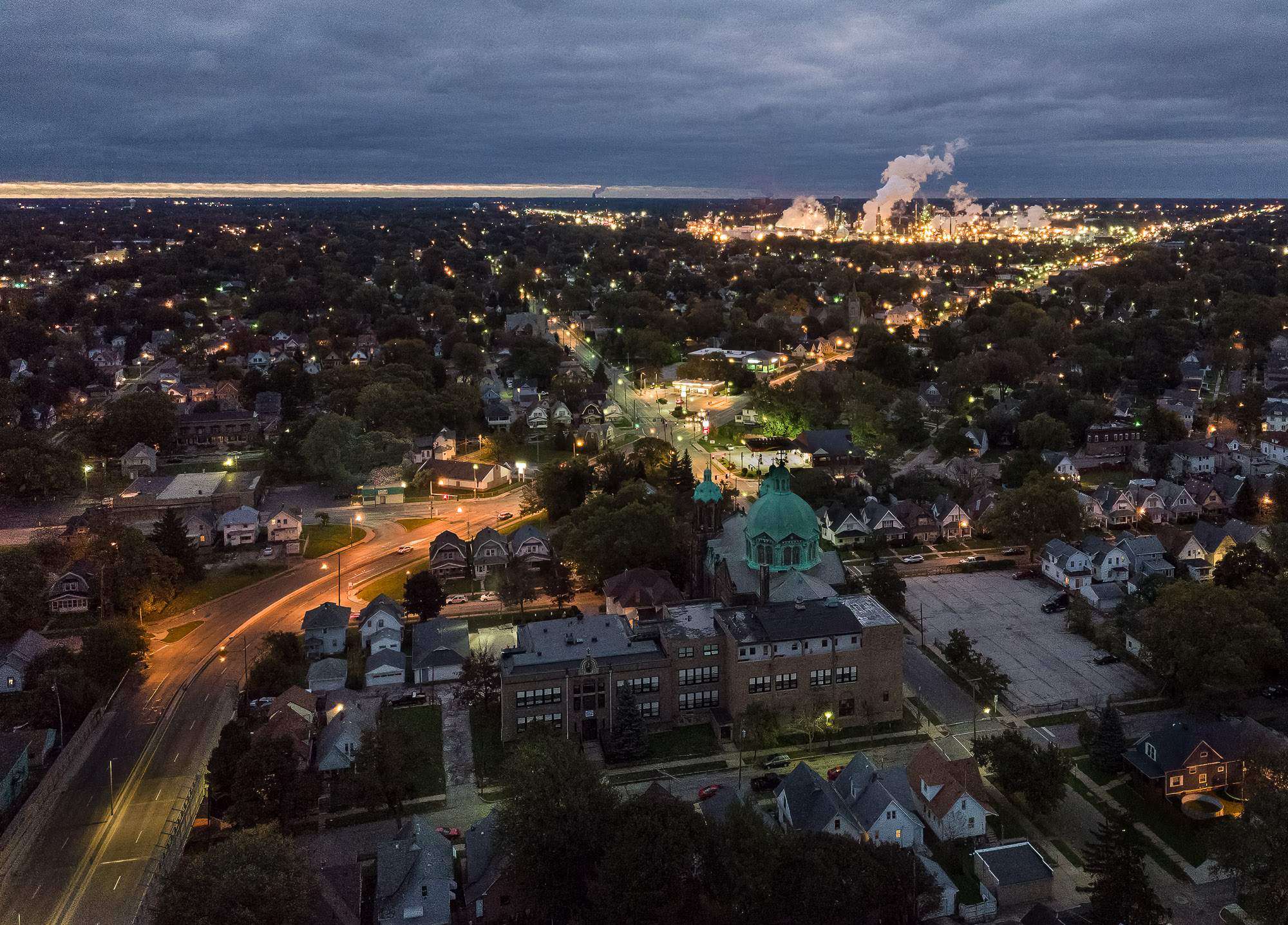
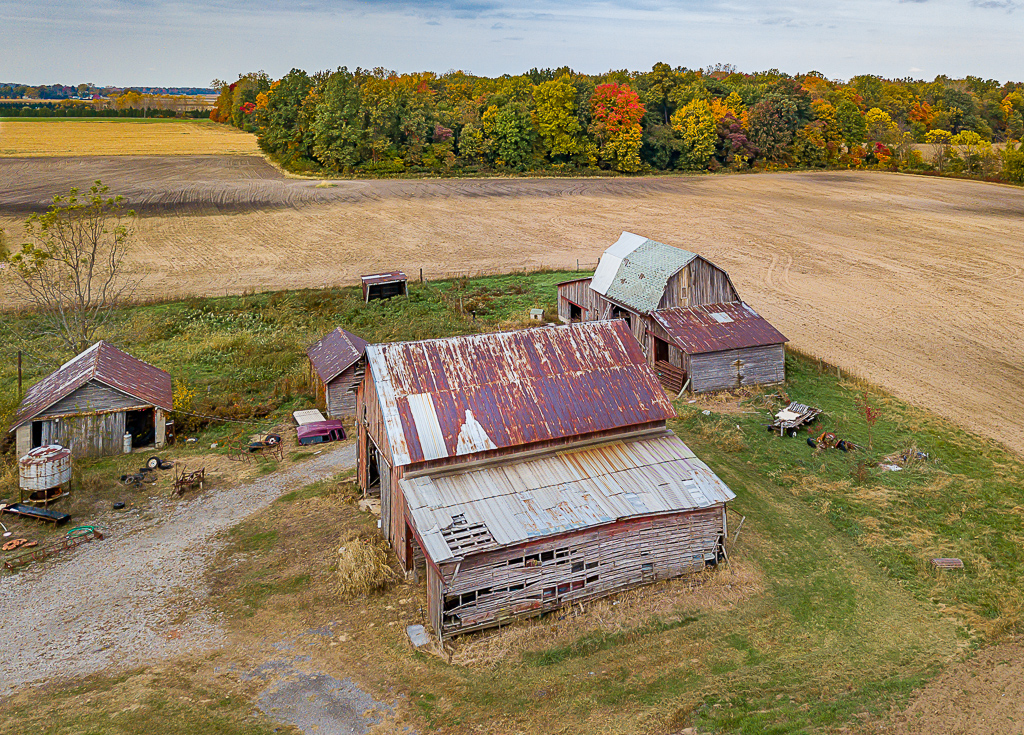
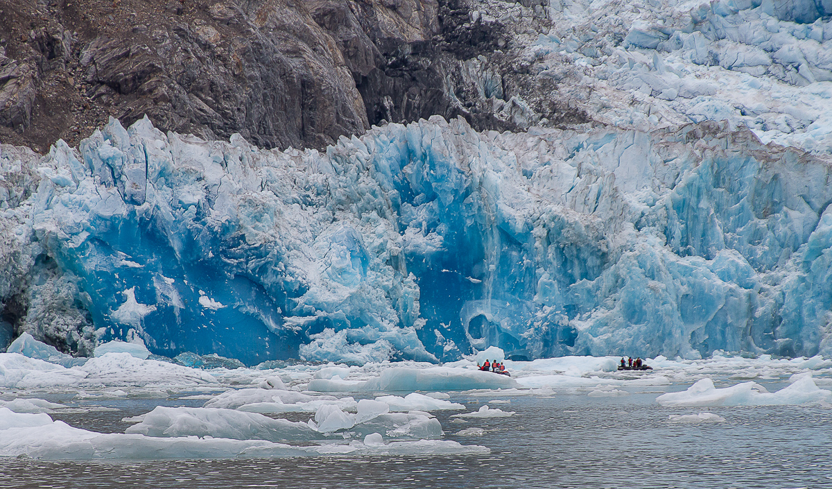
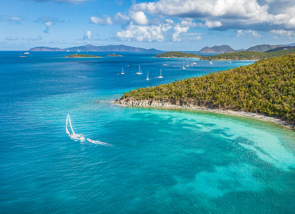
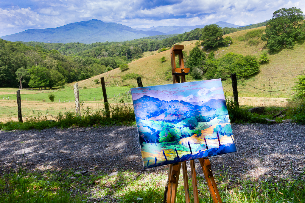
Beautiful image, I love the colors. I think drones can give a great perspective for landscapes. I think your post processing really improved the original, the lighting may be flat but I think the image has a lot of detail and visual impact. Personally, I would like to see the people a little further into the image. |
Jun 6th |
| 85 |
Jun 22 |
Comment |
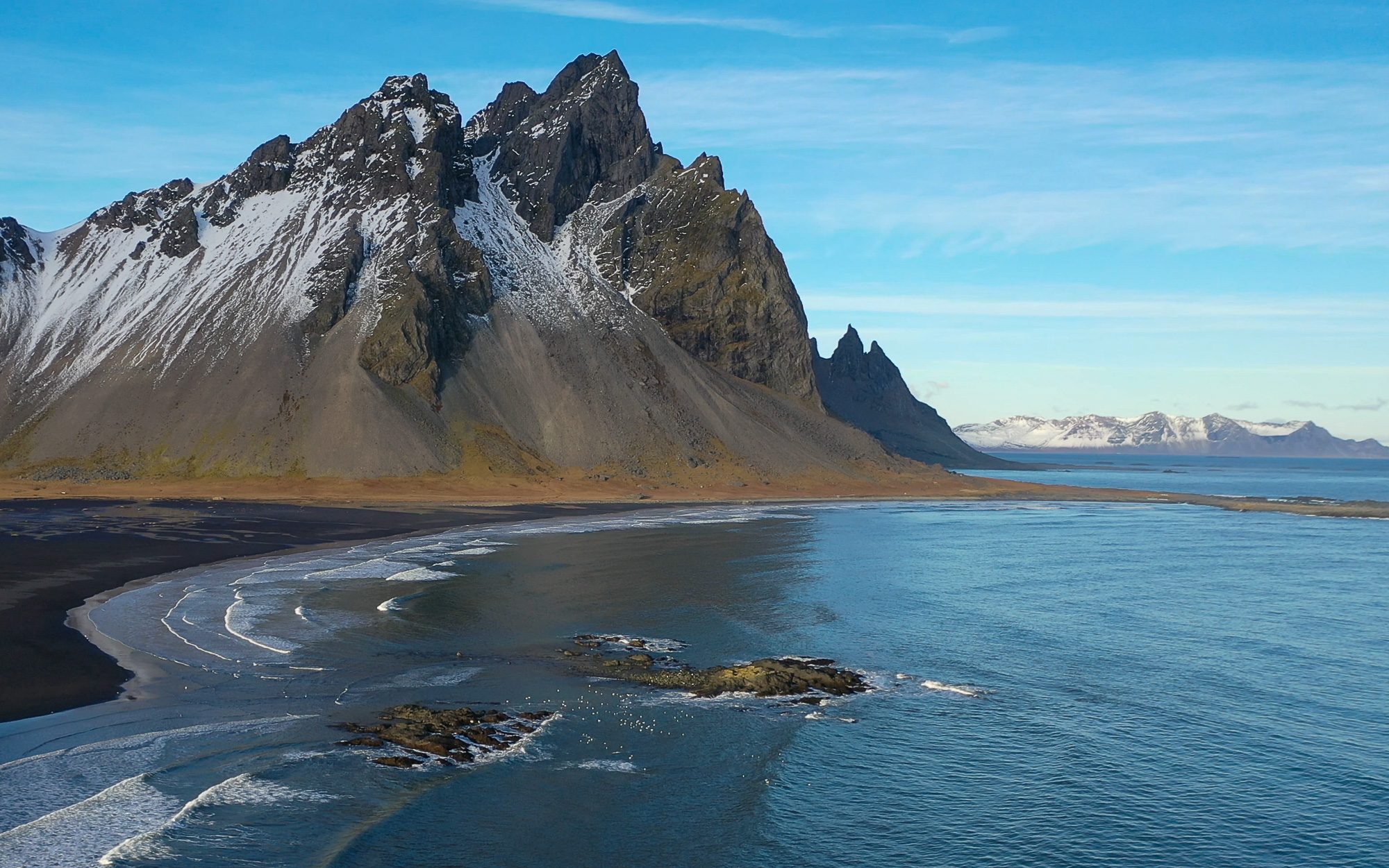
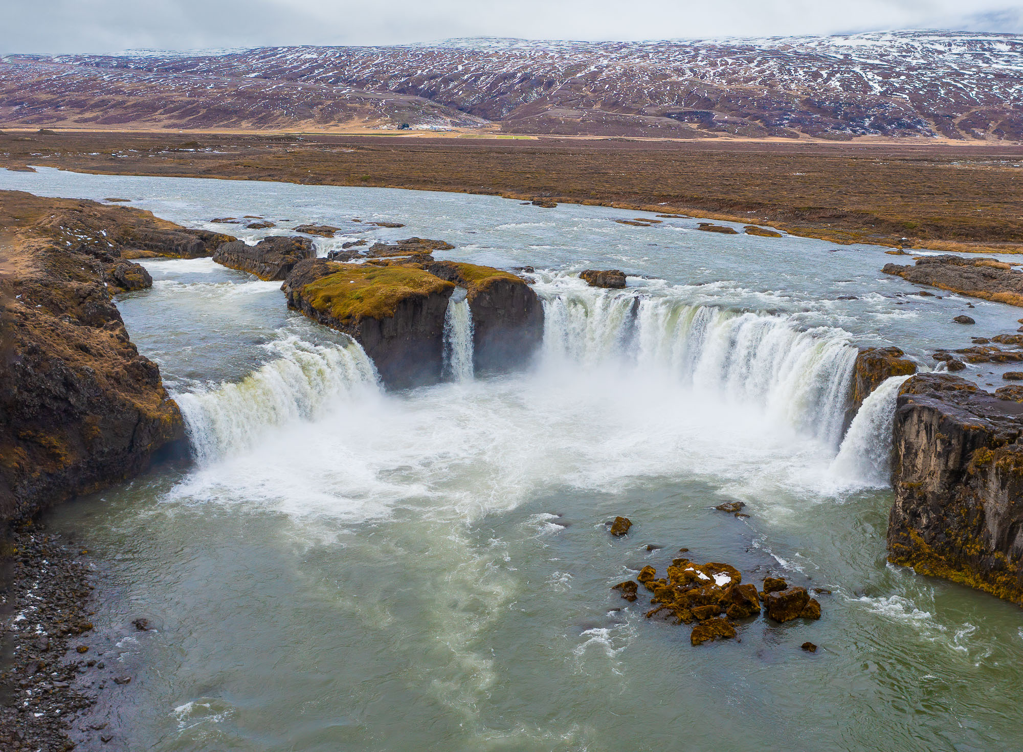
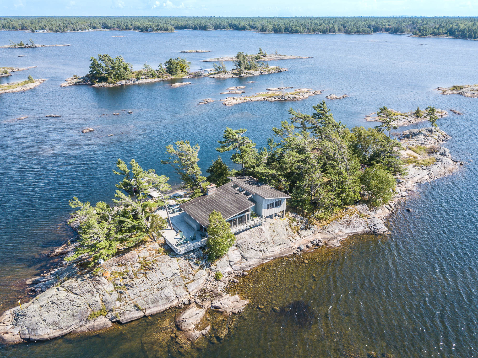
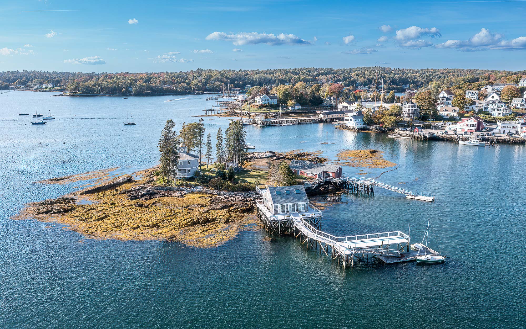
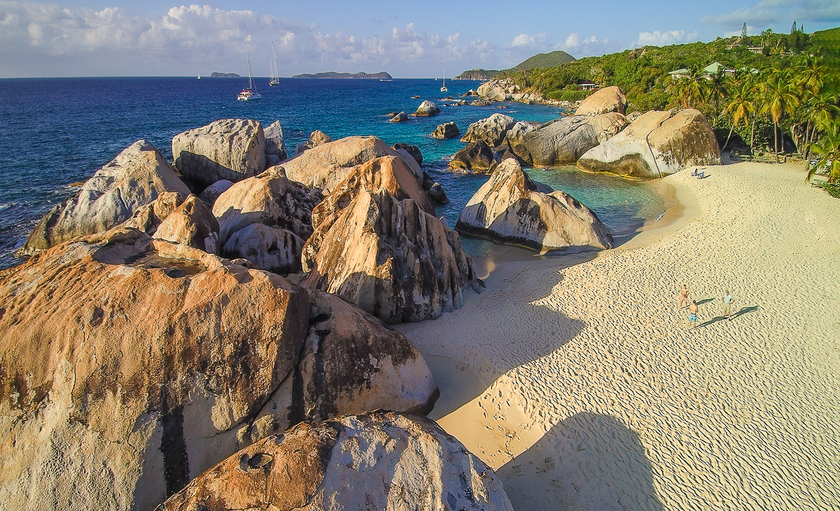
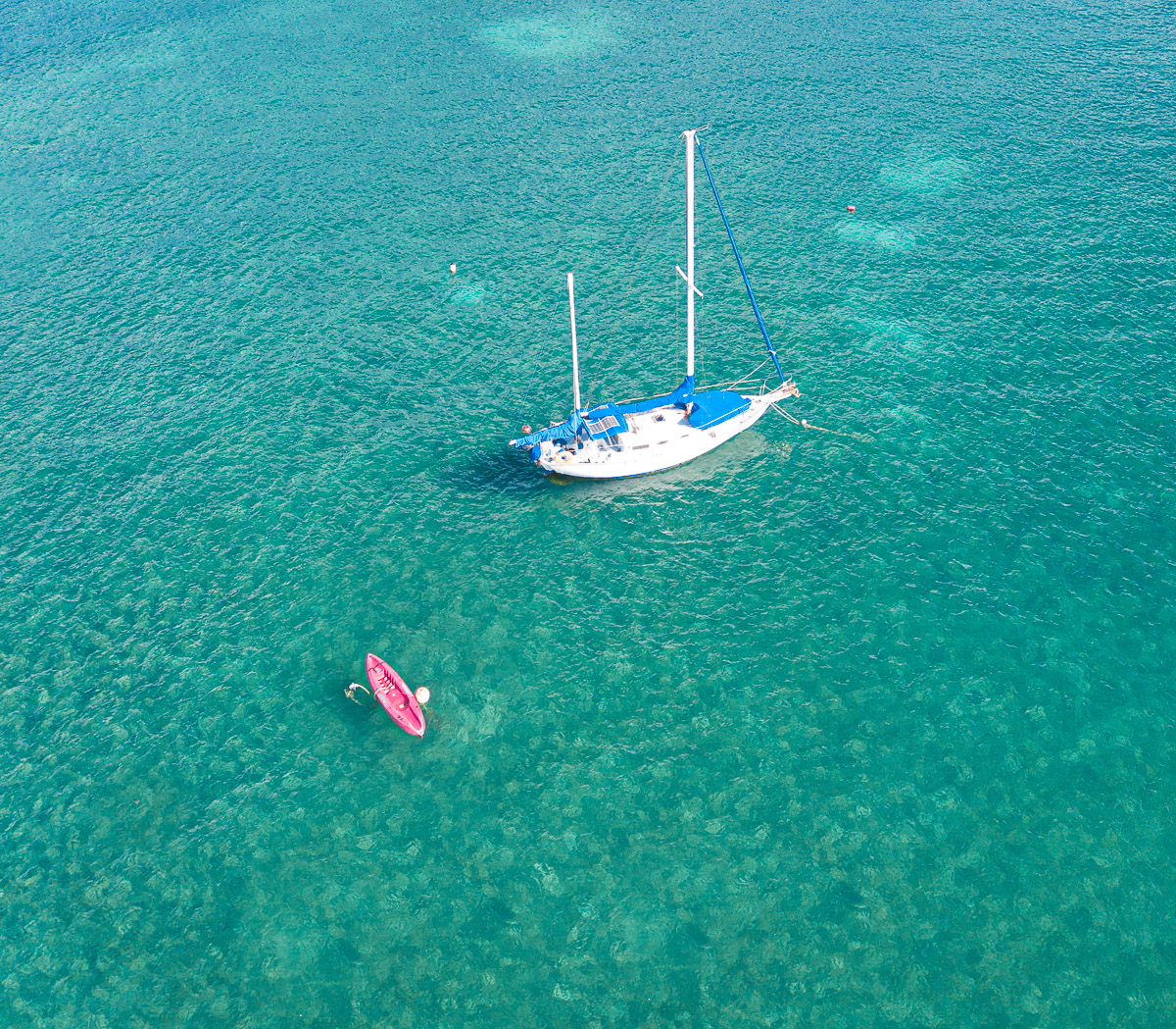
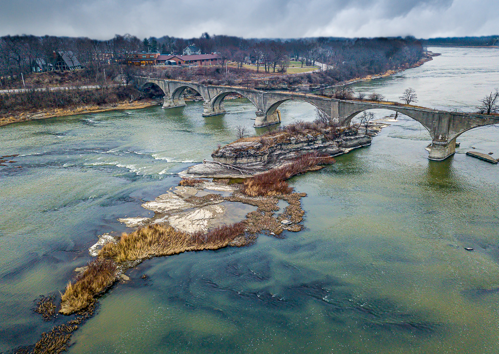
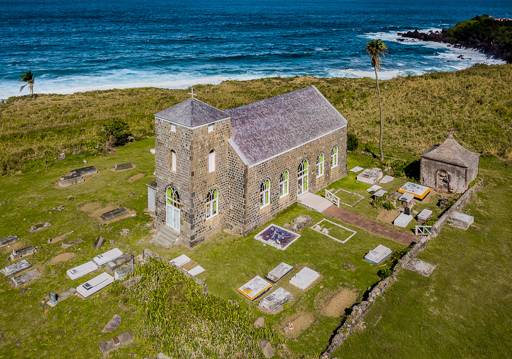
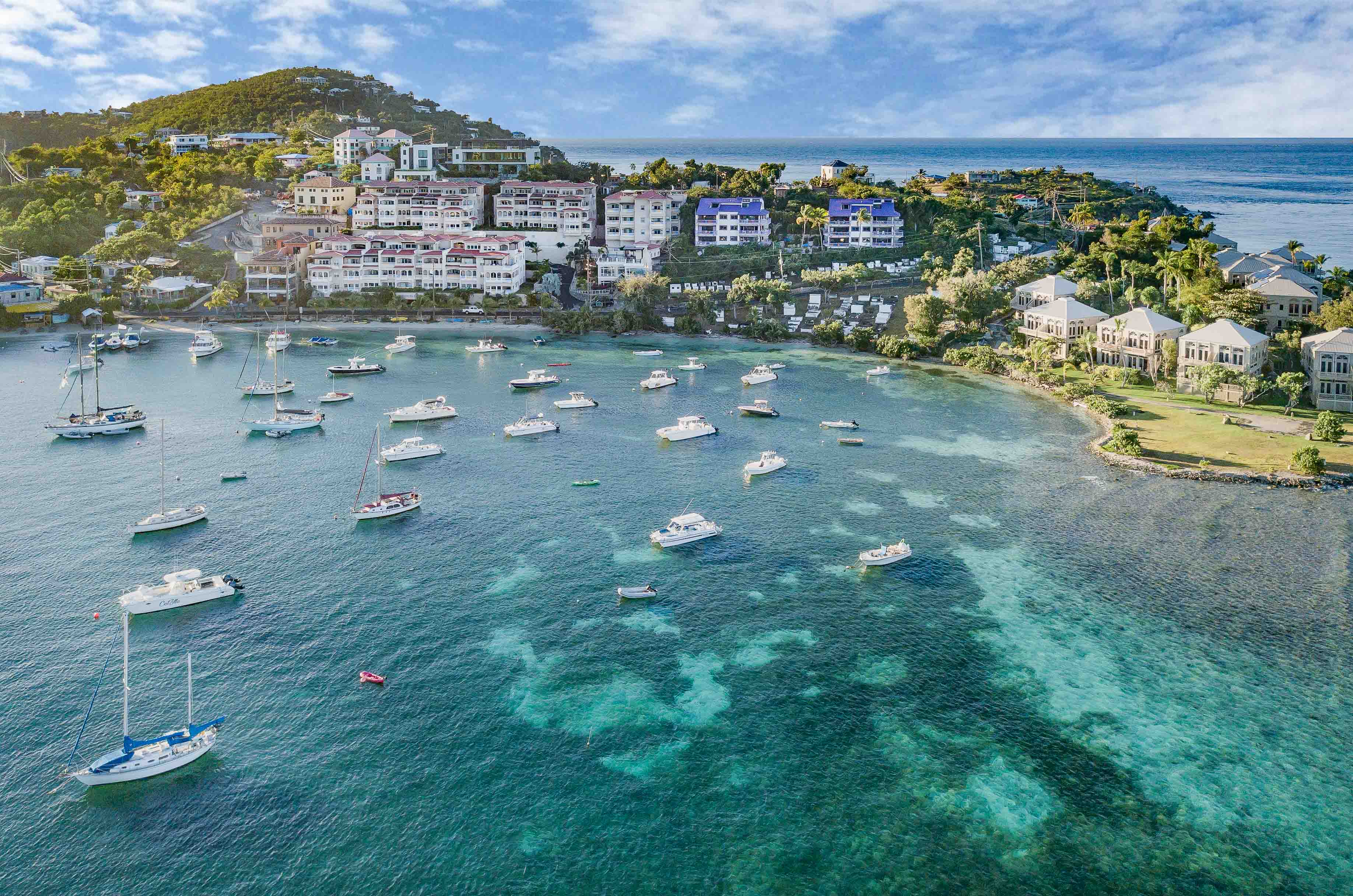
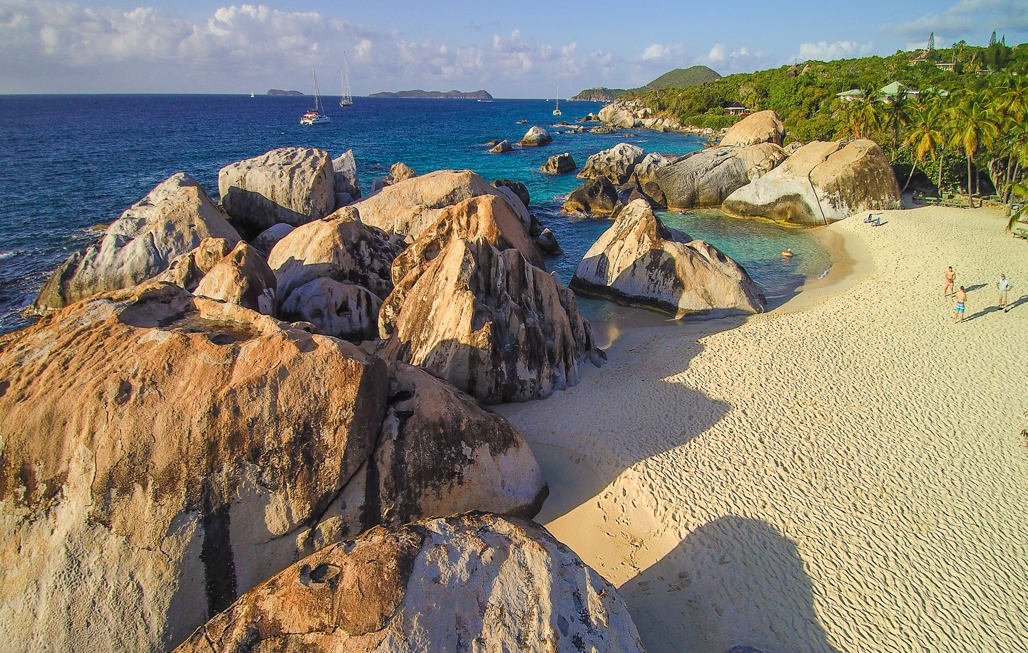
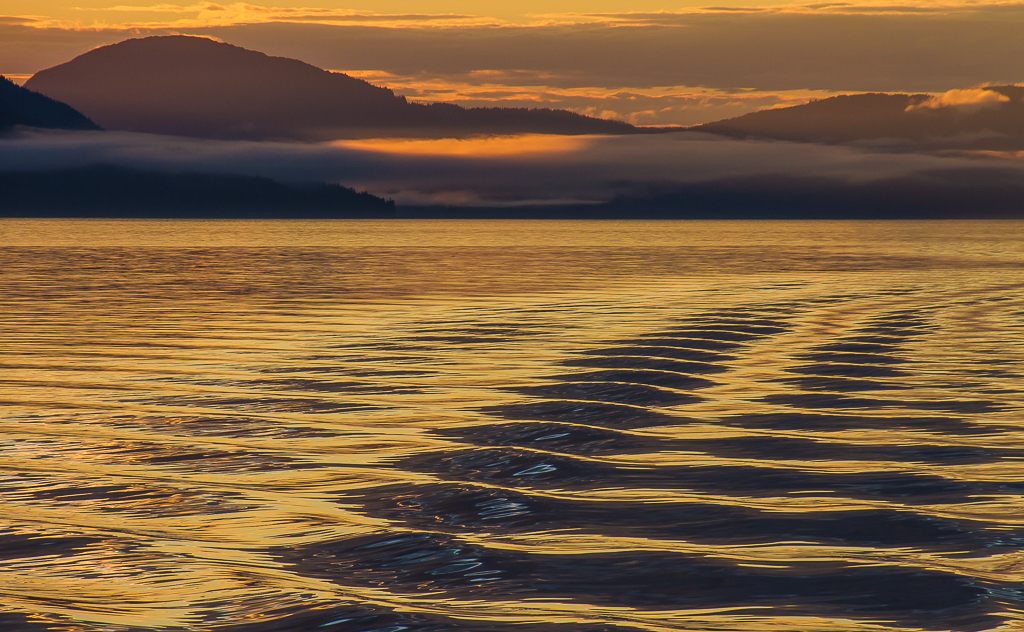
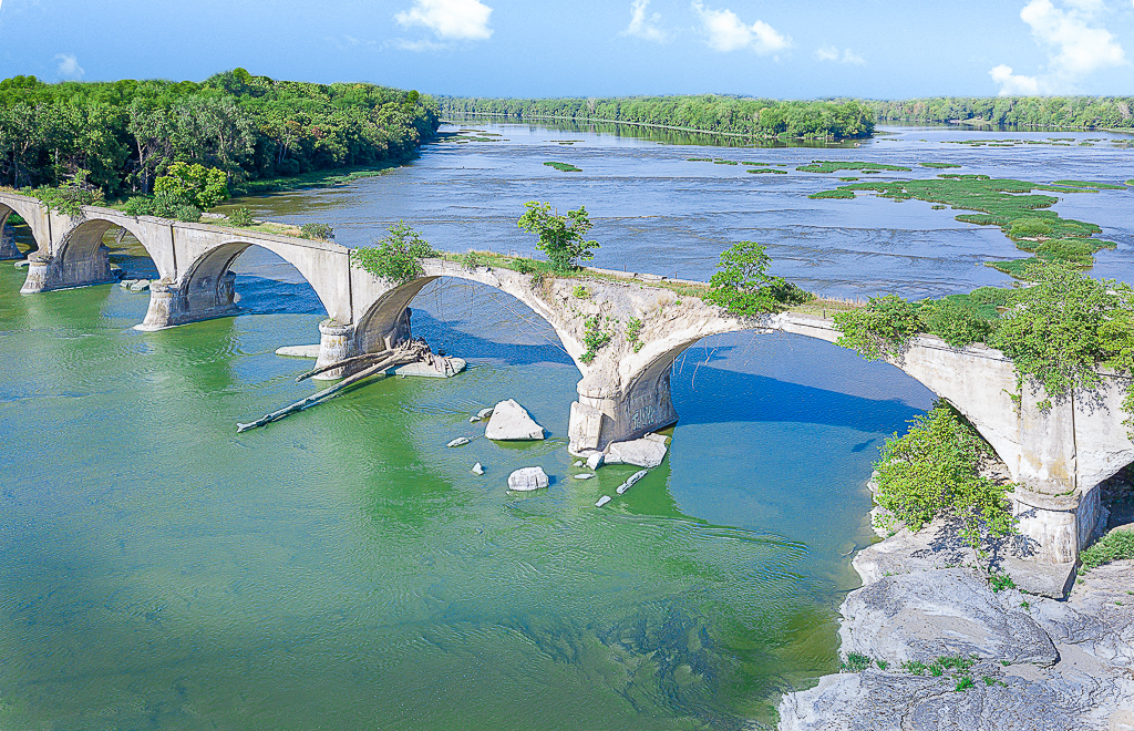
I love the image, the island looks wonderful. I like the way you composed the image, I think the slight diagonal of the top edge of the island gives added interest. I think the lightening of the water is a great touch. |
Jun 6th |
3 comments - 5 replies for Group 85
|
| 92 |
Jun 22 |
Reply |
I didn't realize I took the splashing away. I agree it is better with it in. |
Jun 28th |
| 92 |
Jun 22 |
Reply |
I've had many of those disappointments. In street photography sometimes the photographer has to move quickly and there is not time to cover all the bases. |
Jun 27th |
| 92 |
Jun 22 |
Reply |
Yes, I see what you mean about the chair. Without it the image is really boring. I think many photographers, me included, start to create images for what the judges seem to like. I look forward to reading your article. |
Jun 26th |
| 92 |
Jun 22 |
Reply |
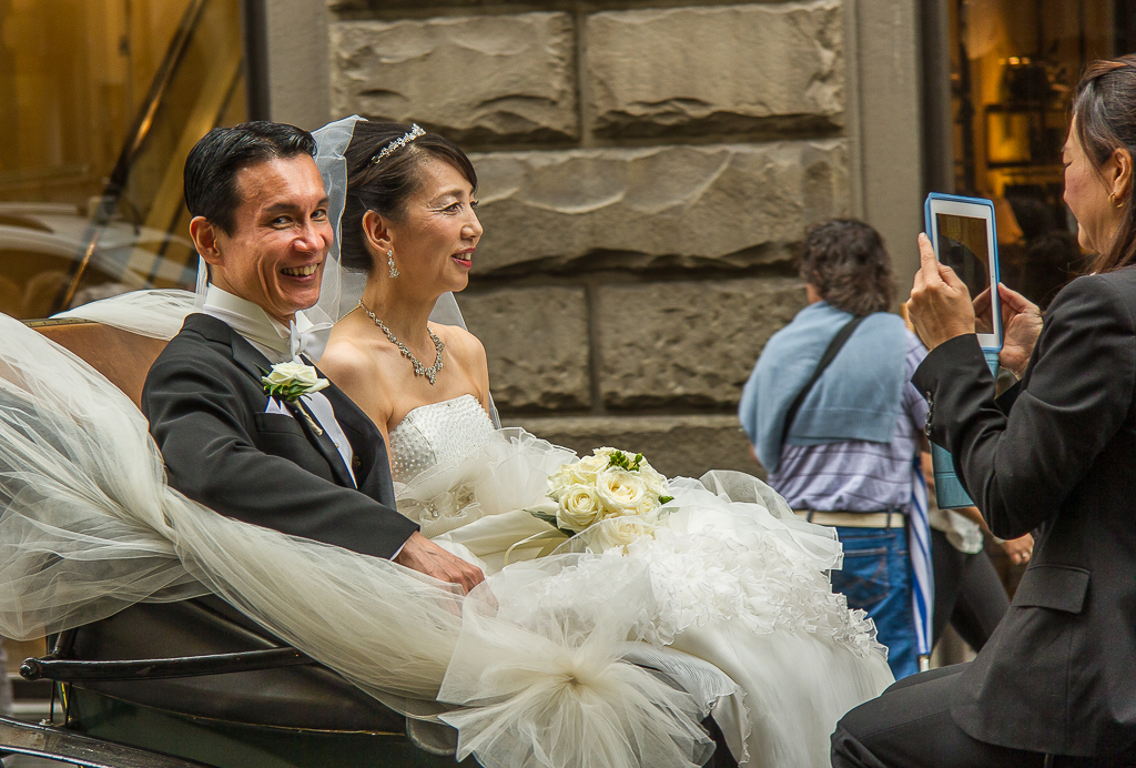
Thanks for the comments Lance, I can definitely see you point. I like the lesser cropped version and I think the brighter background works well with it. The two versions are really different animals to be sure. I like the story telling capacity of your version, I do think that some might object to the bright orange shirt however. Thanks again for taking the time to look at and analyze my image. |
Jun 25th |
| 92 |
Jun 22 |
Reply |
Yes, I agree that removing all of her face would be preferable. If left in her face would be way too prominent. |
Jun 17th |
| 92 |
Jun 22 |
Reply |
Thanks for the comments Ian. The ribbon is one of those things that I just don't know what to do with. It is just so bright, I wish it had some details. |
Jun 17th |
| 92 |
Jun 22 |
Comment |
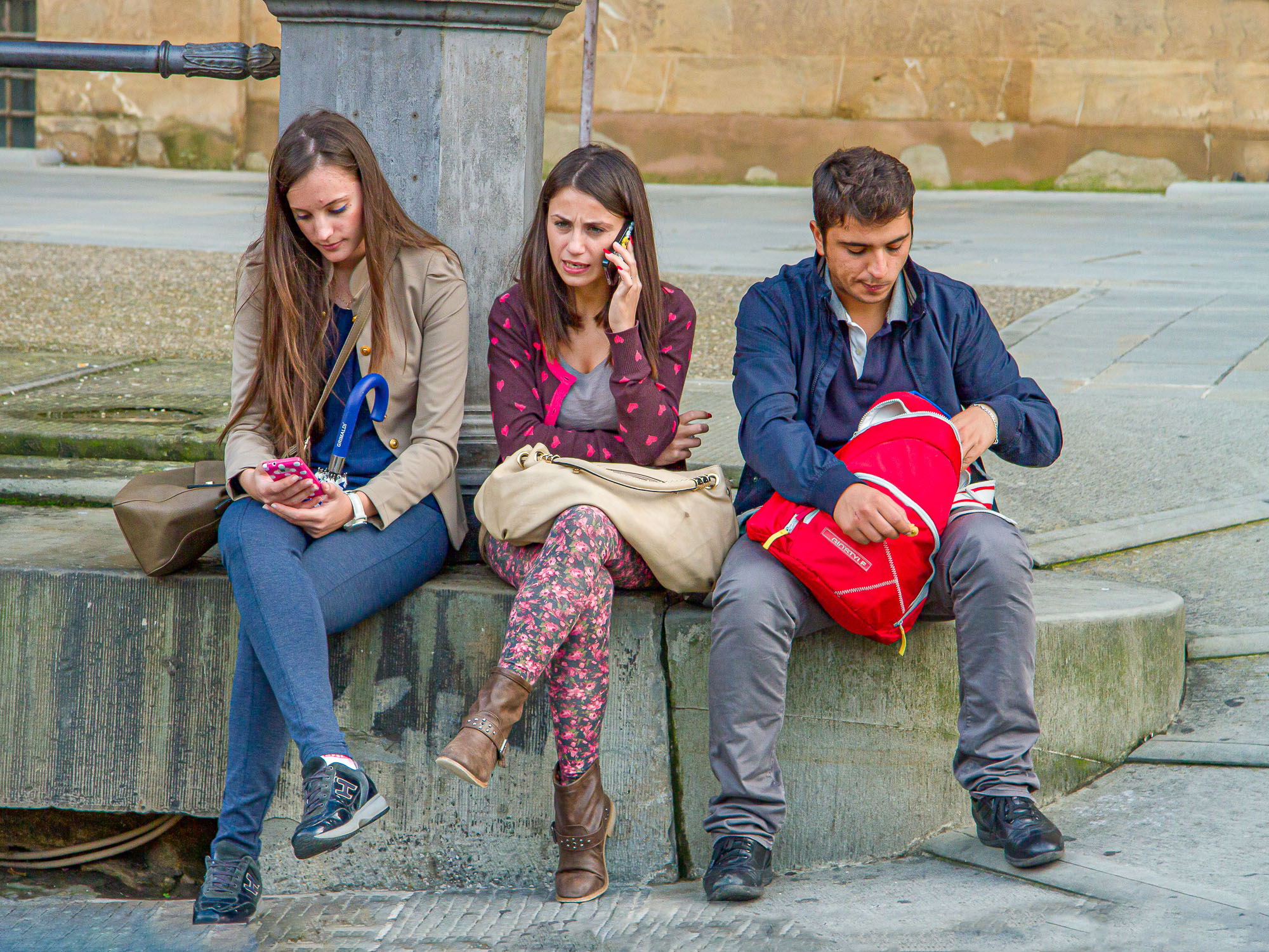
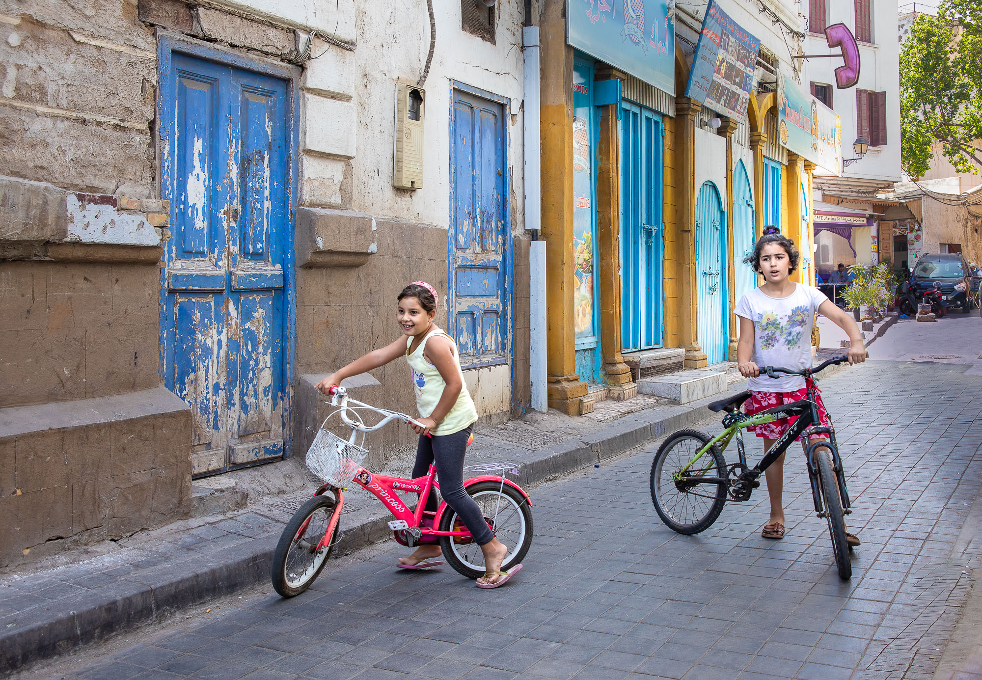
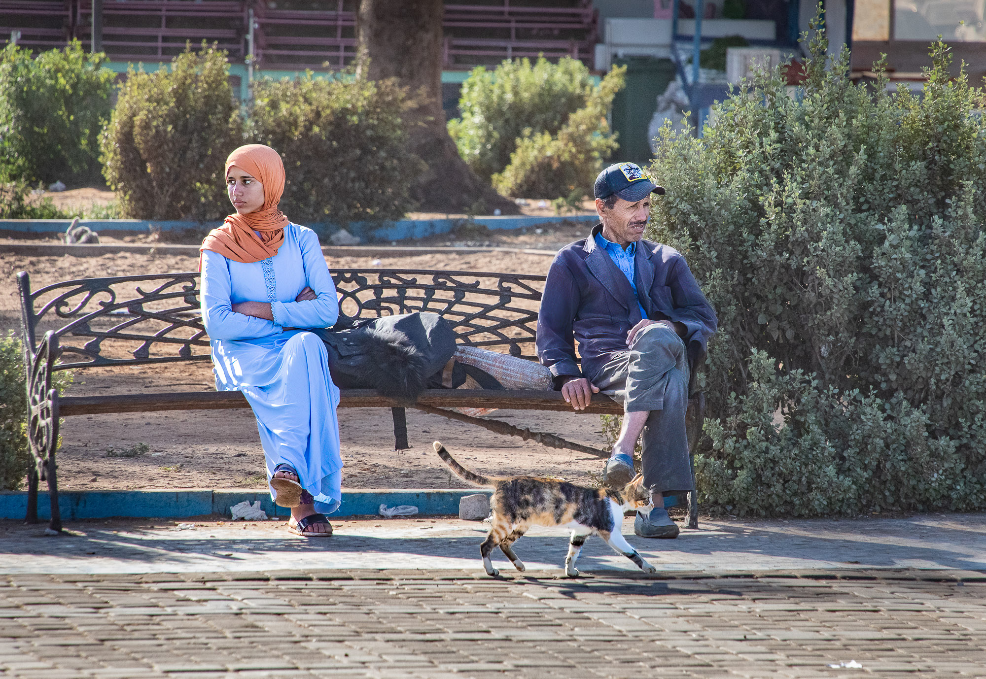
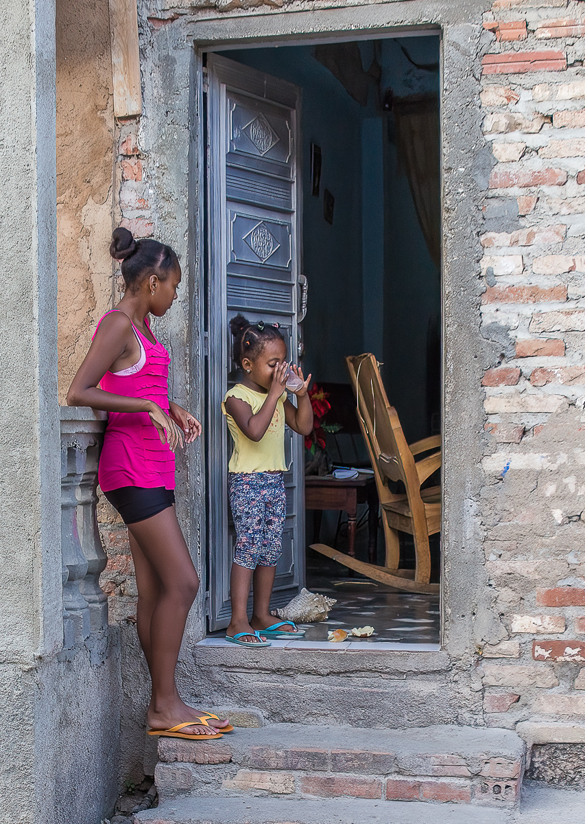
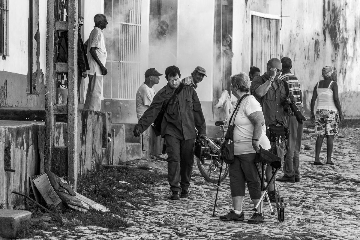
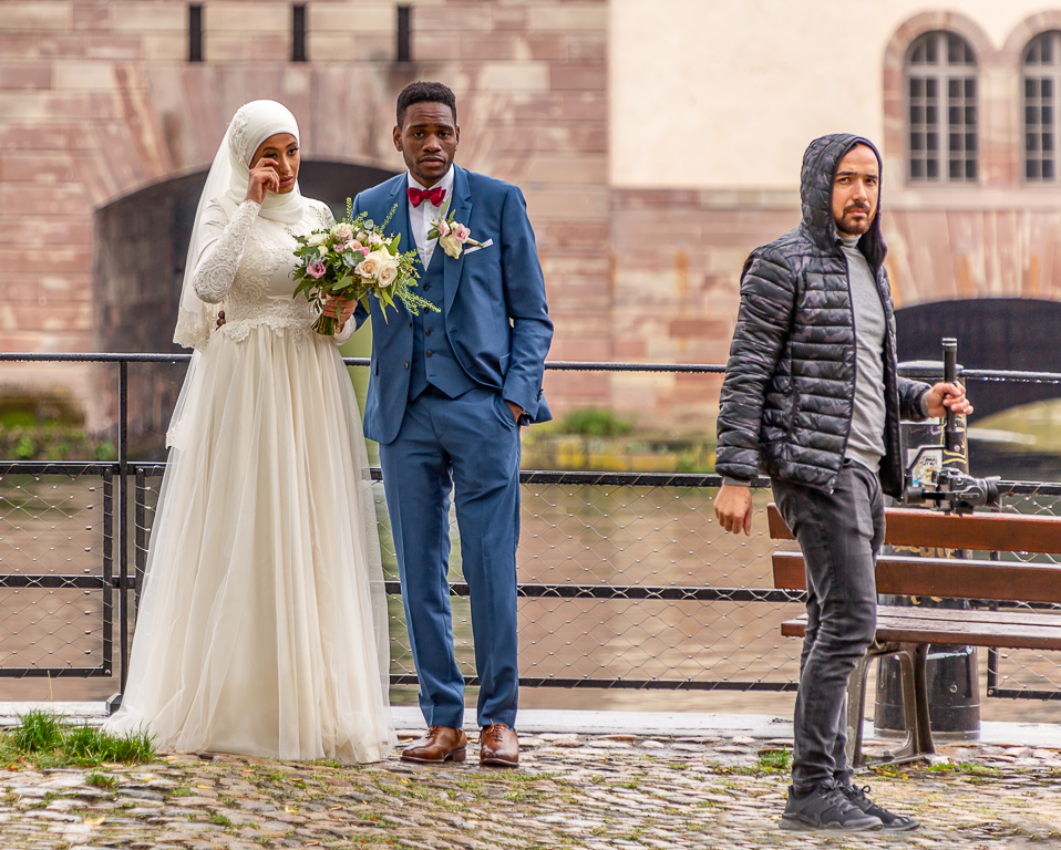
Hello Ian, I really like this image, I think the subject matter is wonderful. I love this kind of setting. I like the composition and I think that you have handled the post processing quite well. I never noticed the guy in the middle until he was pointed out but now I think that a little more light on his face would be nice. Personally I would like to see either all or none of the woman's face in the lower left of the image.
|
Jun 13th |
| 92 |
Jun 22 |
Comment |
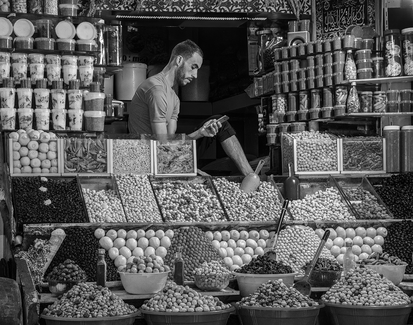
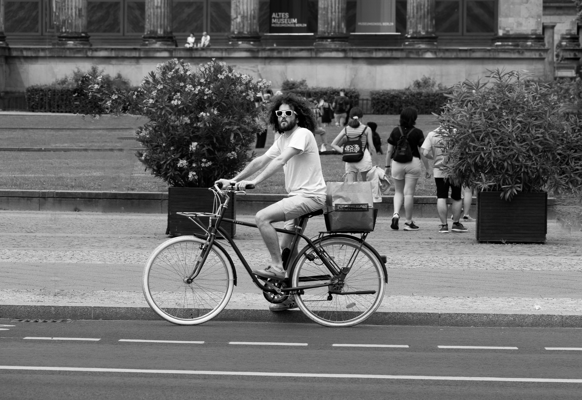
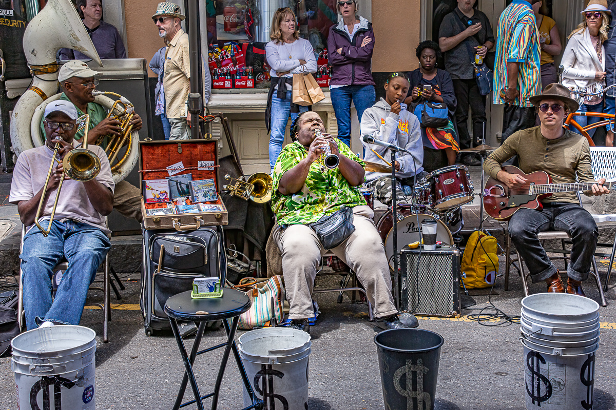
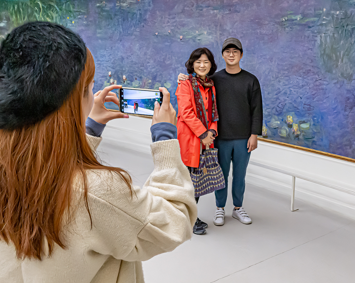
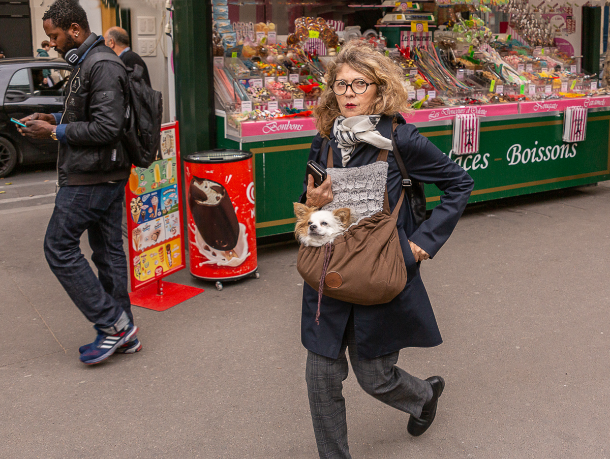
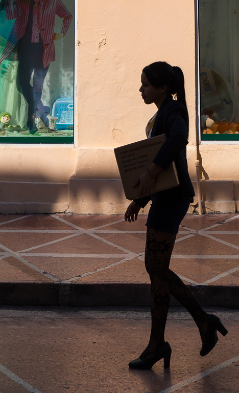
Great image, all parts of it work. I like how the guy is walking along, apparently oblivious to all but his phone. I like how he is walking into the image (more room in front of him) and that he is not over lapping the woman. The look on the woman's is priceless, too bad for him that he doesn't notice. To my eye the merger of the Fishbowl sign with the edge of the image is a little distracting. Overall, a great image. |
Jun 13th |
| 92 |
Jun 22 |
Comment |
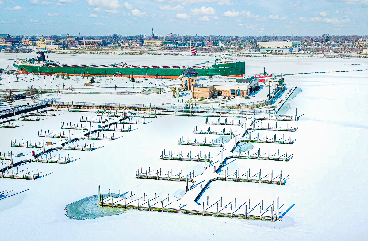
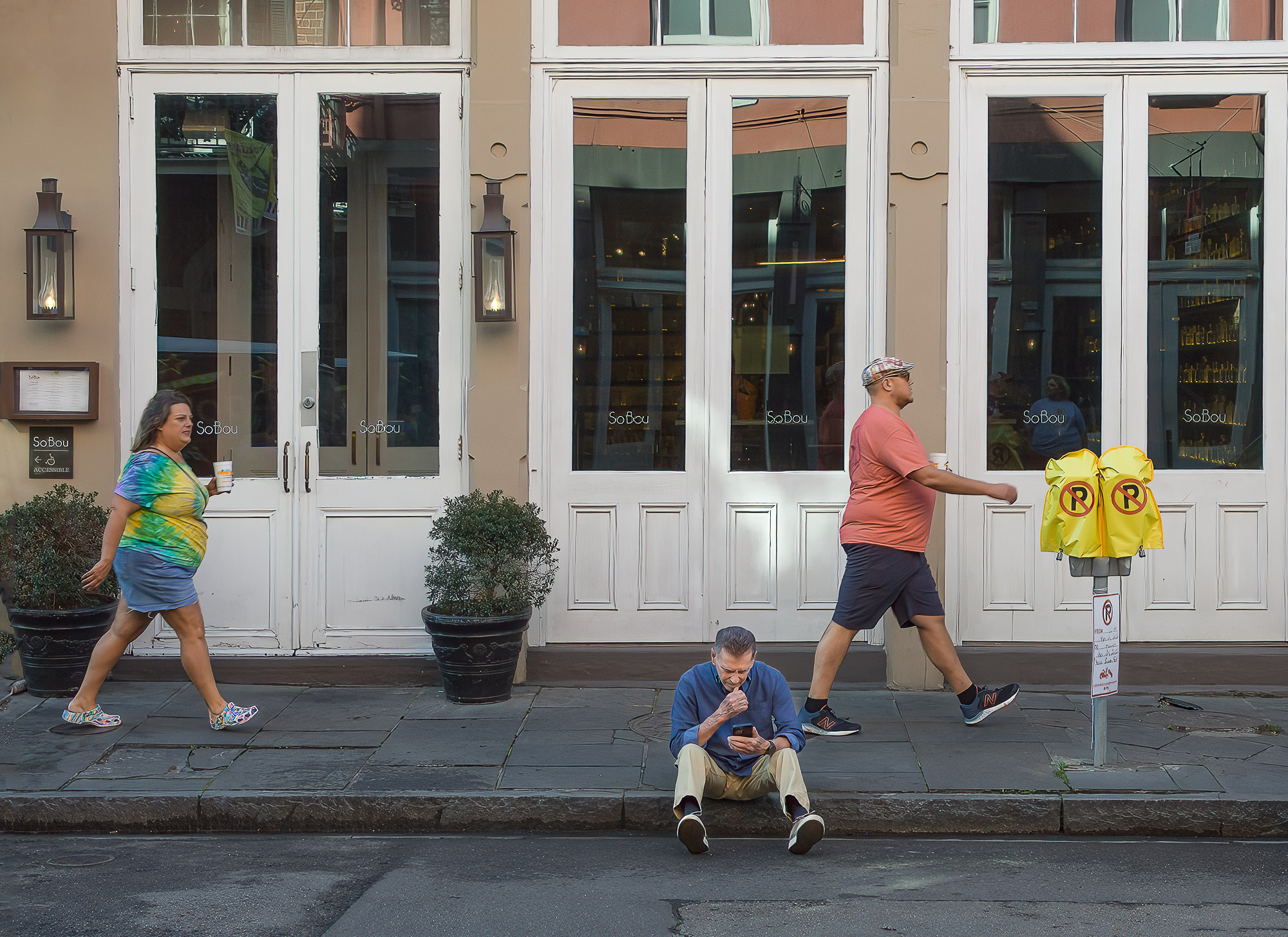
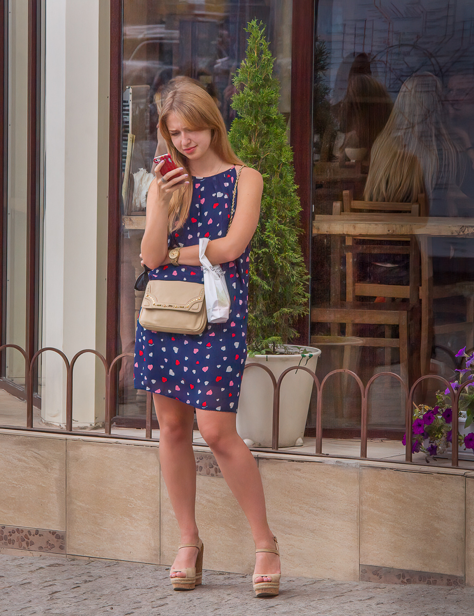
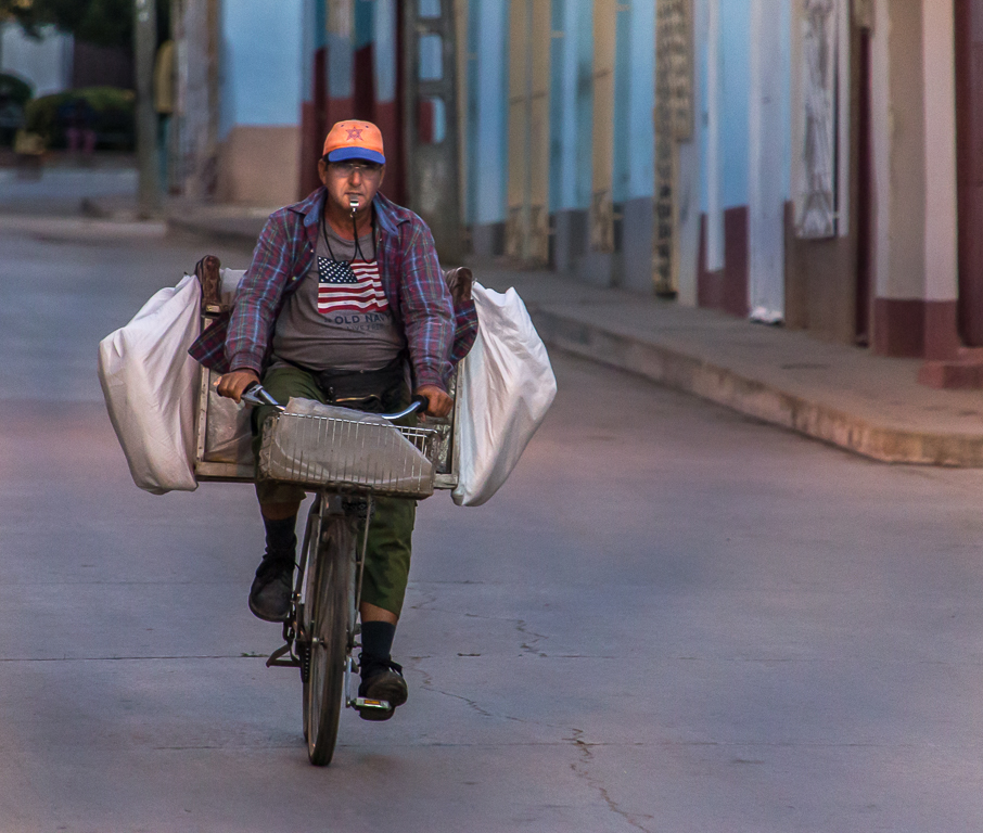
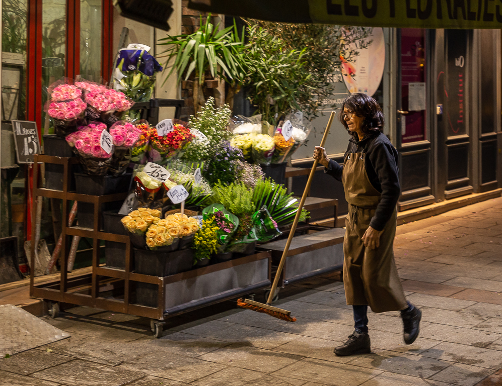
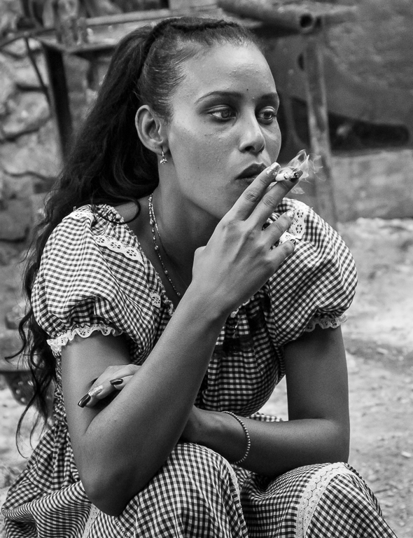
Hi Marianne, I really like this image and the B&W rendering is great. I think the side view of the persons face fits well with the feel of the image. I think the water tower could be cloned out in PS with out too much trouble. It's easy not to notice something like that while you are making an image. I don't know how times I have something like that and never notice it until i am looking at the image on my computer. |
Jun 13th |
| 92 |
Jun 22 |
Comment |
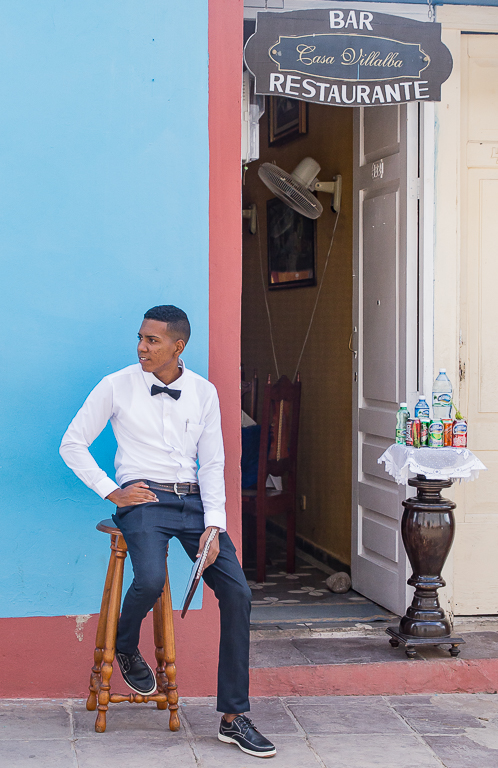
Hi Beth, I think this is a beautiful image and not at all over saturated. I agree with the others that the crop is perfect, just tight enough yet still showing the environment. I've been studying your image a bit and the only distraction I find are the two little bright disks high up in the windows. I never noticed them at first. |
Jun 13th |
| 92 |
Jun 22 |
Reply |
Thanks for the comments Jill. |
Jun 10th |
| 92 |
Jun 22 |
Comment |
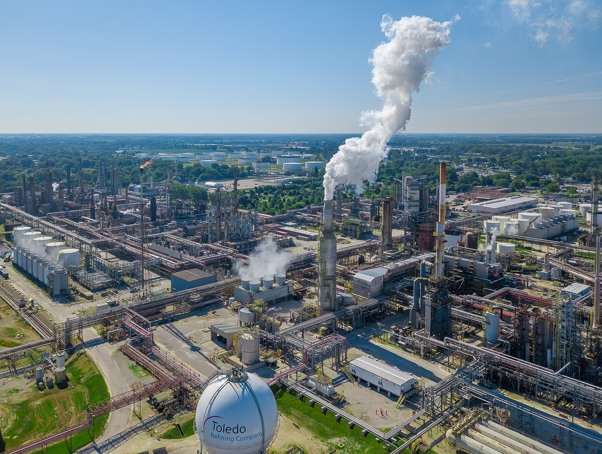
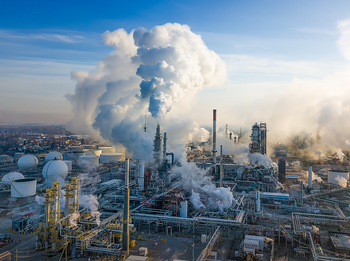
Hi Chuck, I agree with the others. I think this is a nice image which meets your assignment. I love the rust on the tanker, it adds character. I do disagree with Marianne however as I think the image is a little soft. I have occasionally used Topaz Sharpen AI to improve an image of mine. |
Jun 6th |
| 92 |
Jun 22 |
Reply |
Thanks for the comments Marianne. |
Jun 6th |
| 92 |
Jun 22 |
Reply |
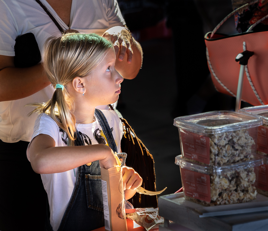
Thanks for the comments Beth. I agree about the depth of field and background focus. Not sure why I shot at f13, I guess I just got too involved taking photos to notice the settings, that happens too often. Taking your advice regarding an out of focus background I used one of the PS filters to blur the background. I also removed the girls white bow which I found distracting (once I noticed it). |
Jun 6th |
 |
5 comments - 9 replies for Group 92
|
8 comments - 14 replies Total
|