|
| Group |
Round |
C/R |
Comment |
Date |
Image |
| 85 |
Apr 20 |
Comment |
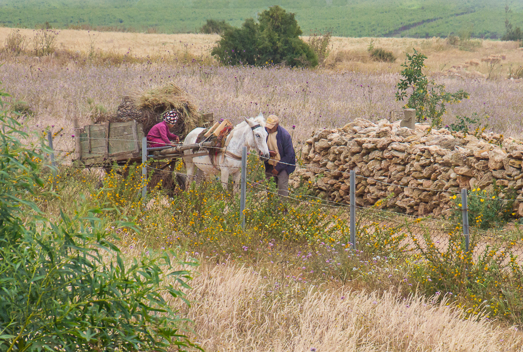
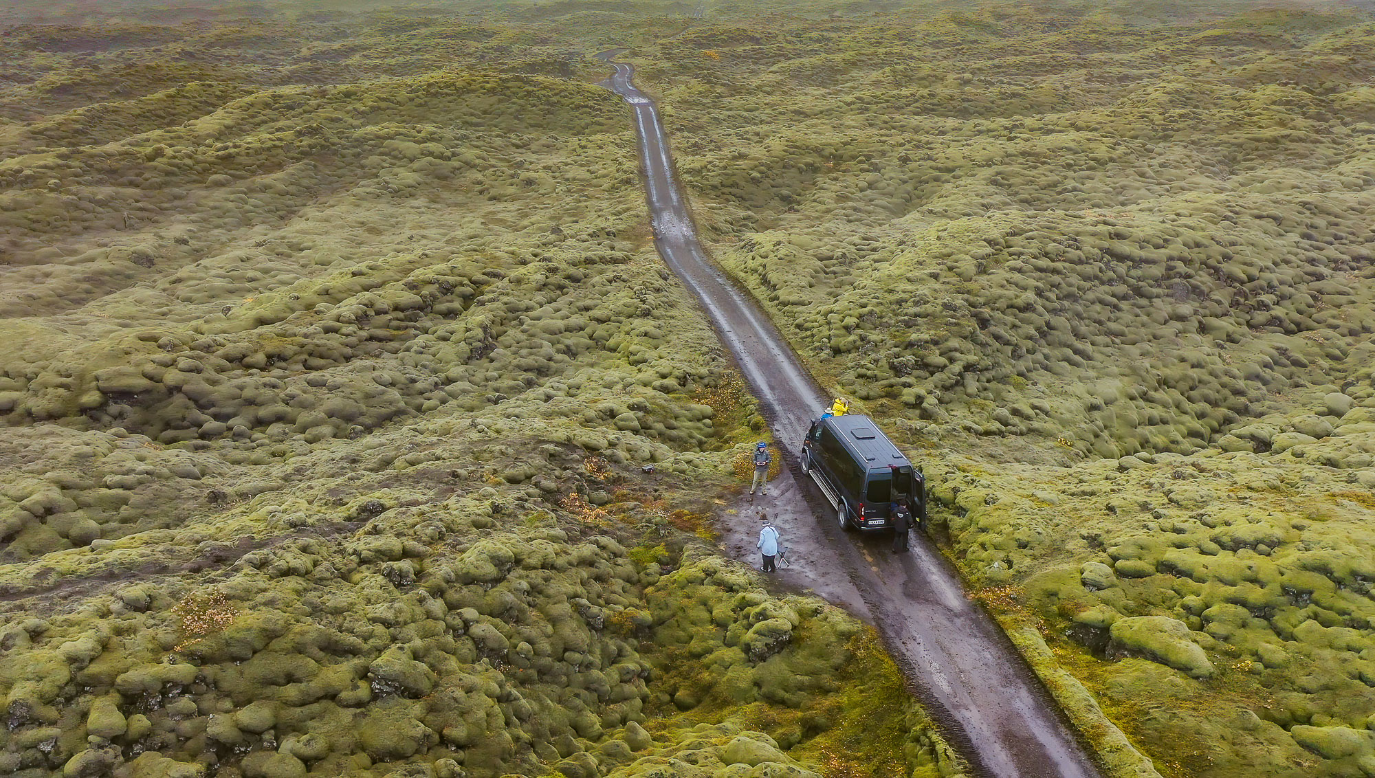
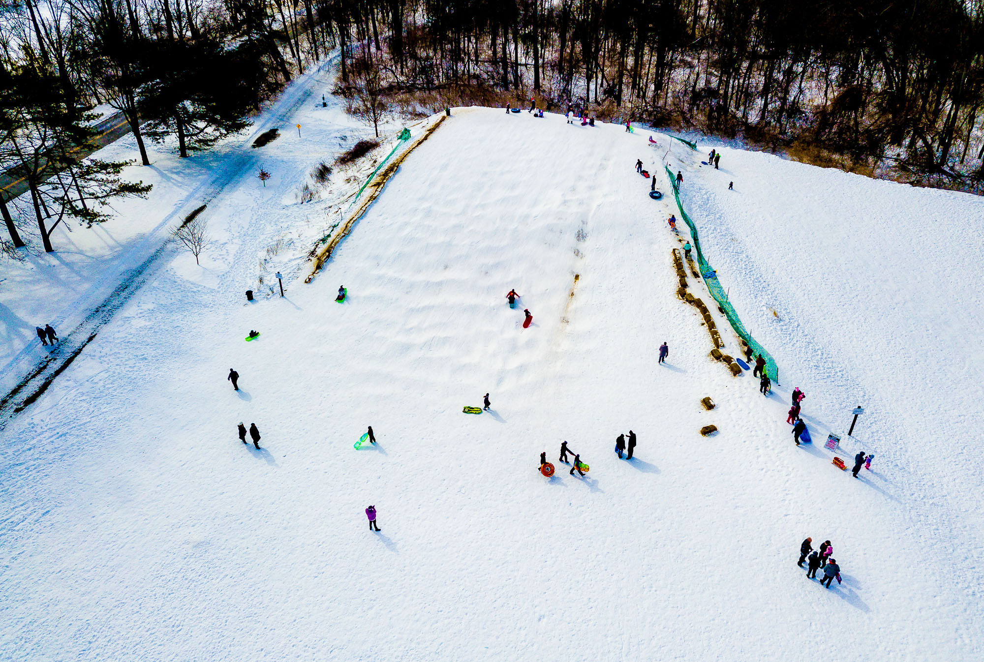
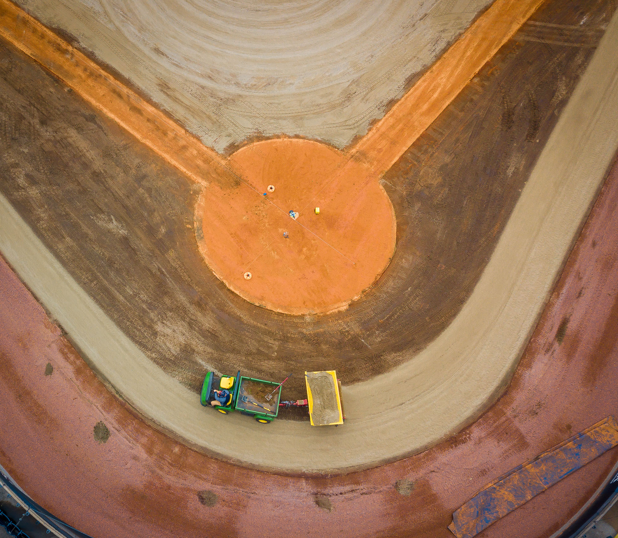
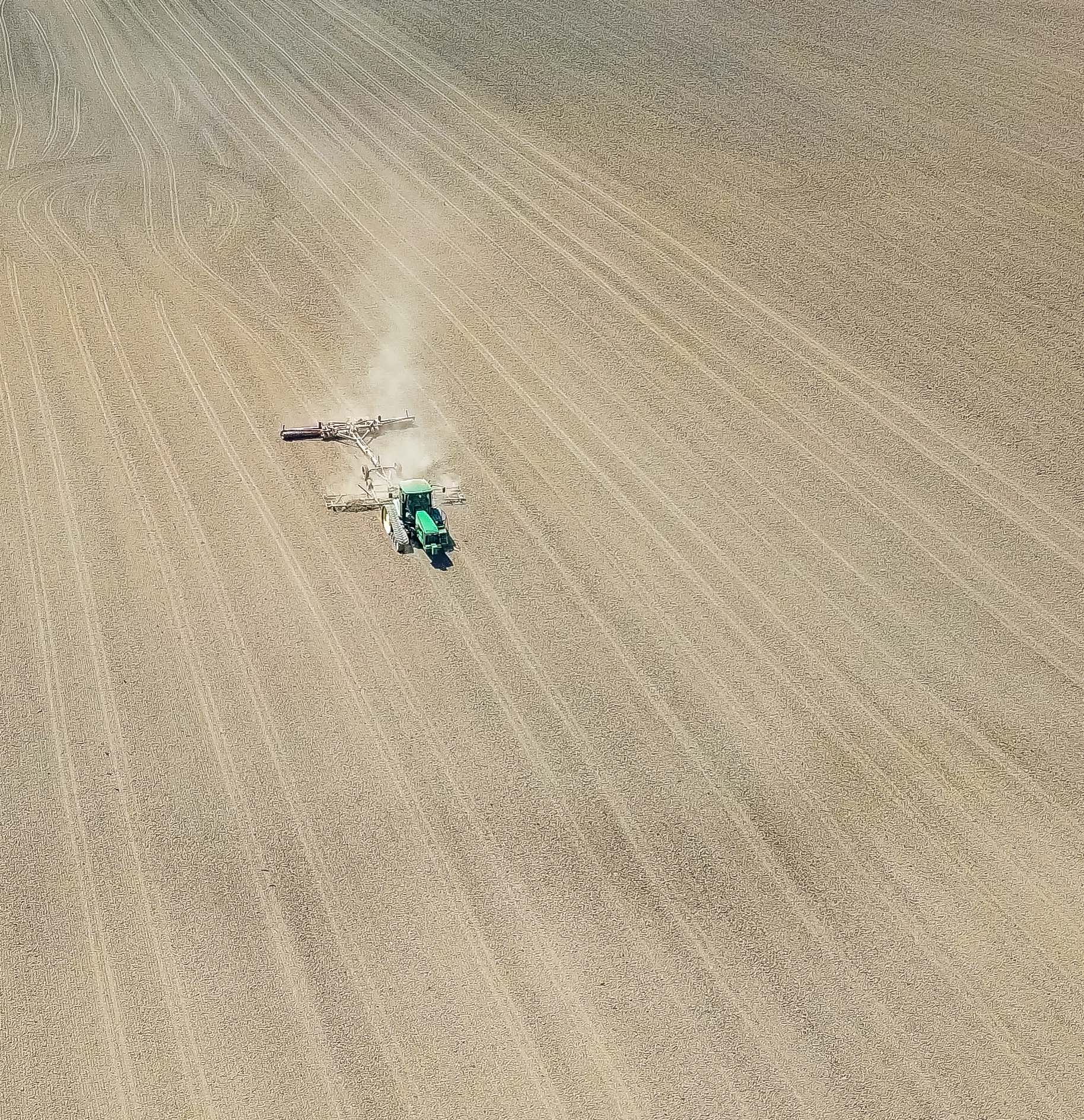
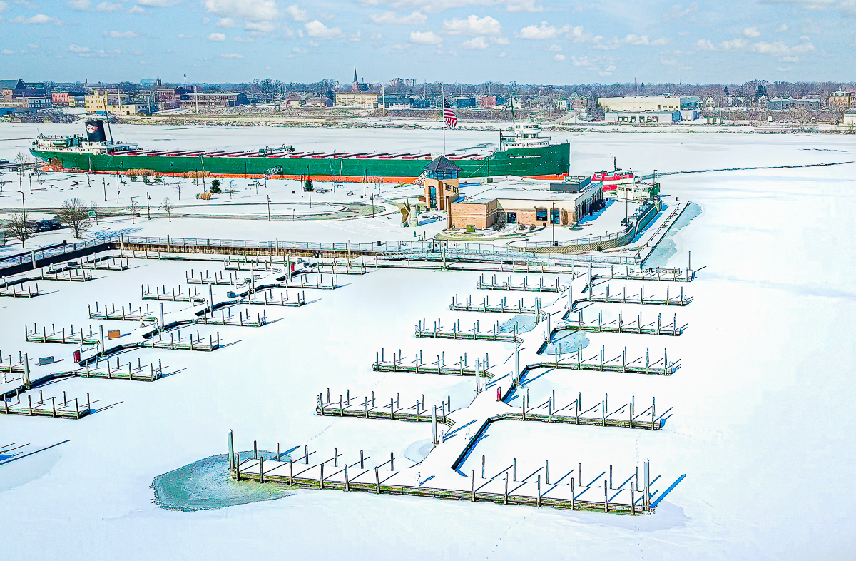
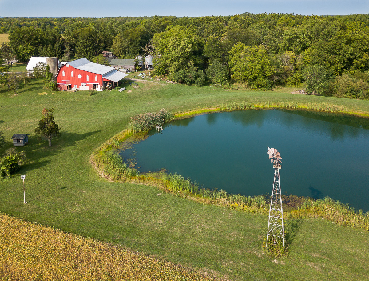
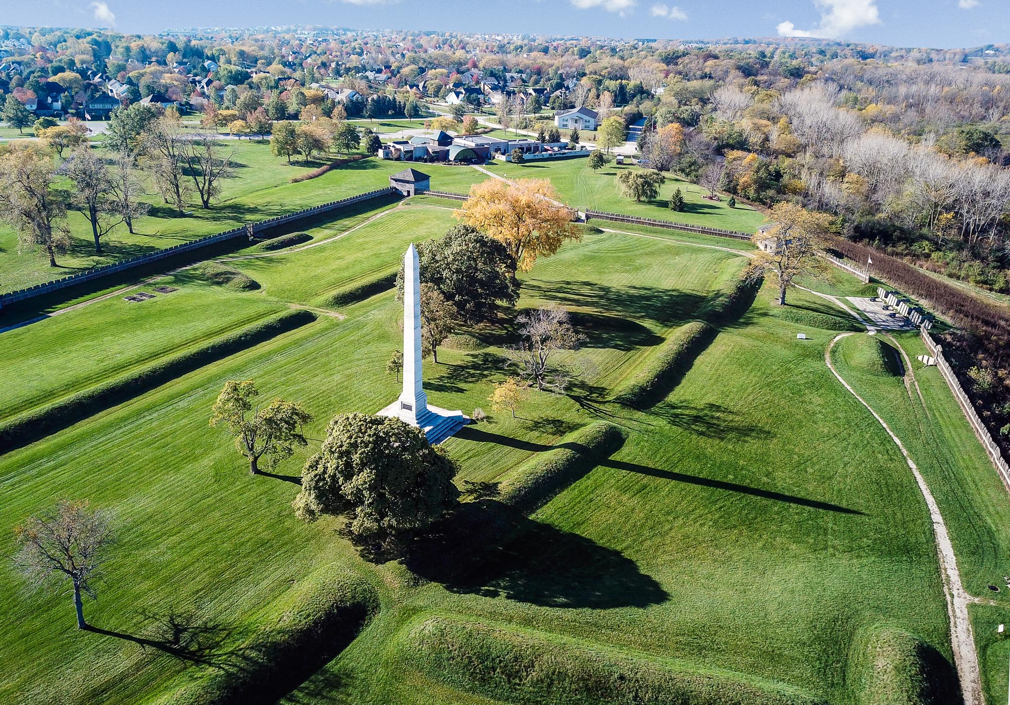
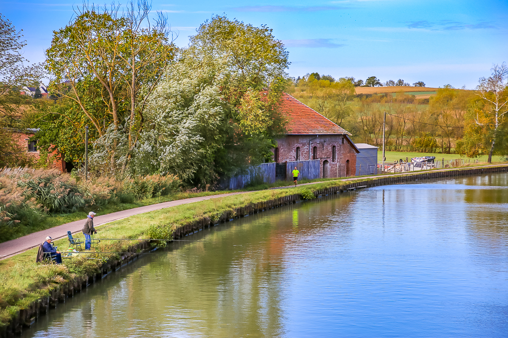
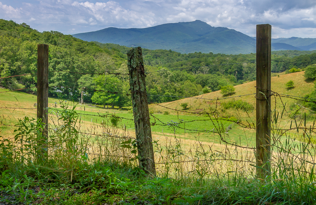
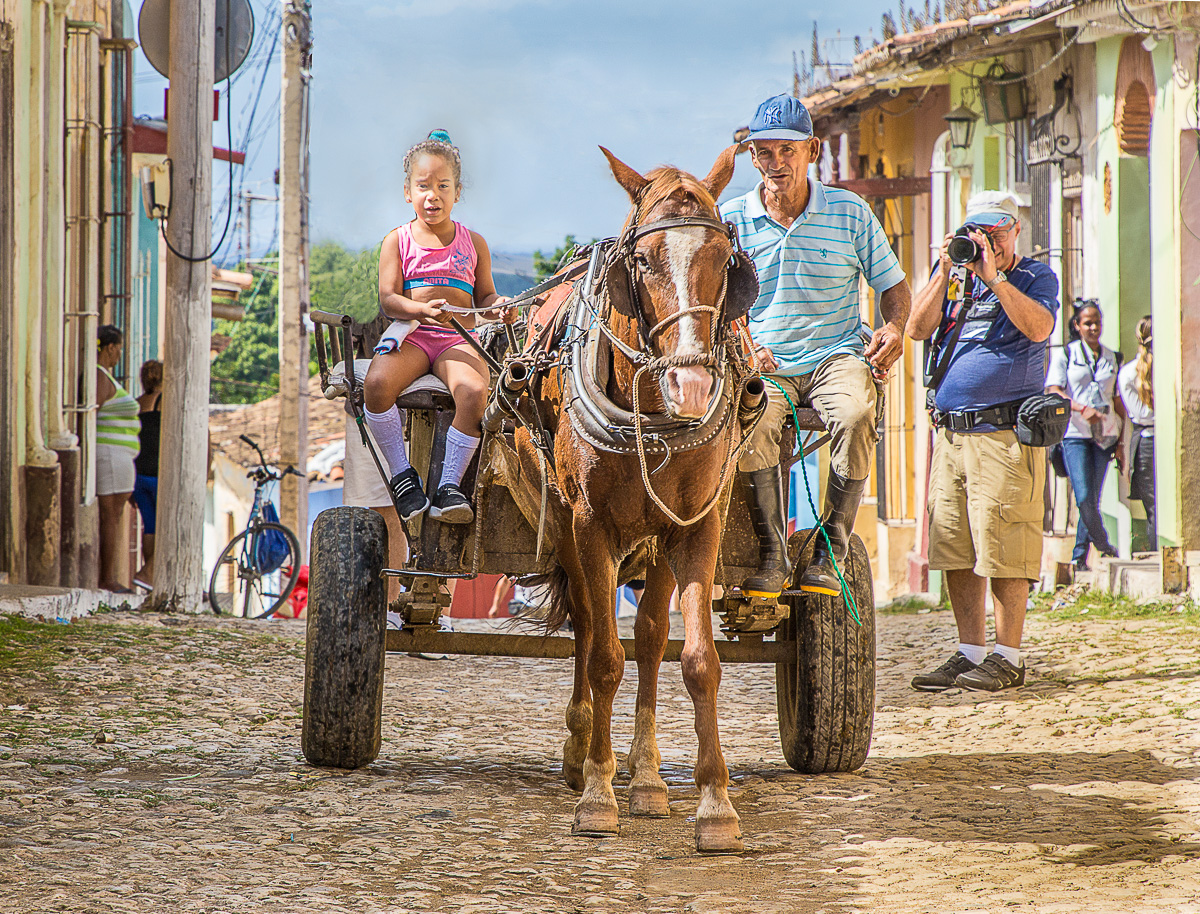
I like this top down view, I think this makes a somewhat abstract image that is interesting to look at. I like the diagonal of the fence line and the shadows from the fence. I think I would like the image more if the red spot in the upper right was cloned out. Also, I think that the blue and white things in the grass are distracting. |
Apr 8th |
| 85 |
Apr 20 |
Reply |
Hi Tony, thanks for tip. I never used PS to edit video, I will give it a try. Now is a good time to try some new things. |
Apr 8th |
| 85 |
Apr 20 |
Reply |
I shot just one one minute long video here. I don't usually shoot video because I have no real use for them. Also, editing can be time consuming. |
Apr 4th |
| 85 |
Apr 20 |
Comment |
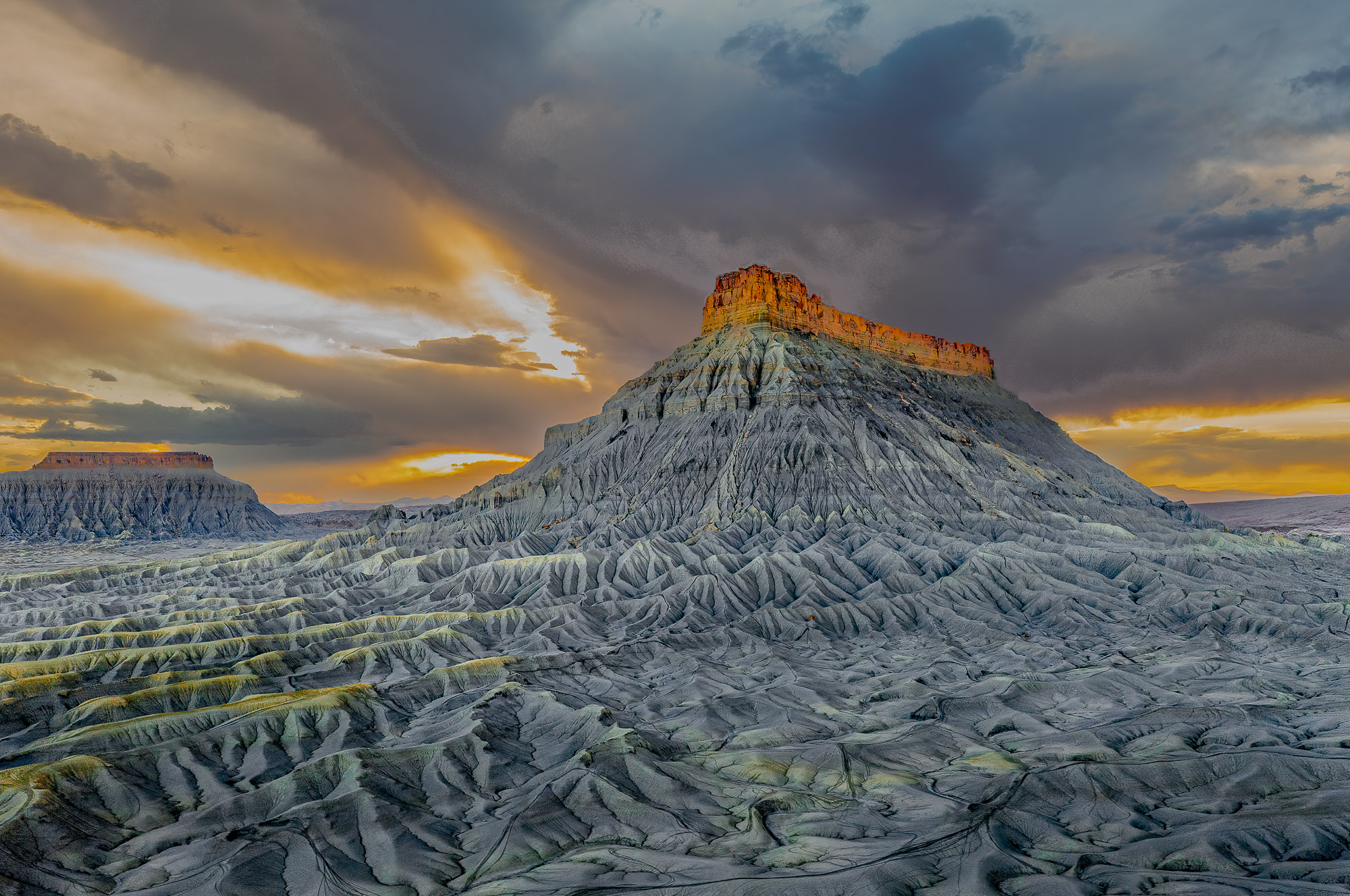
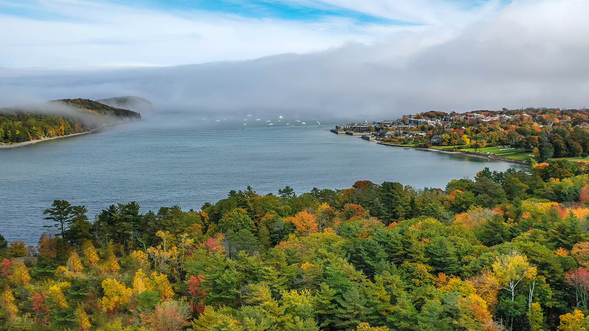
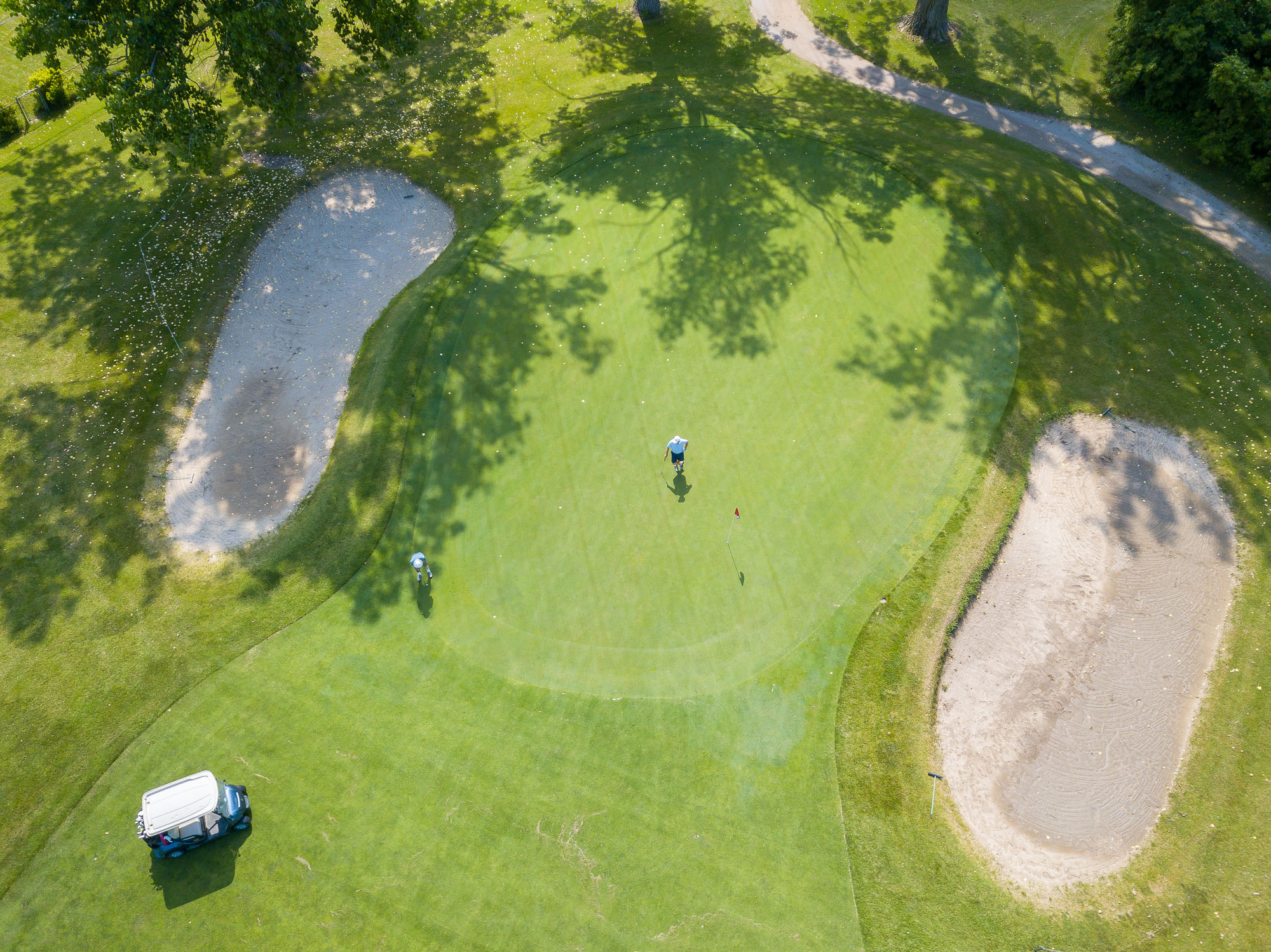
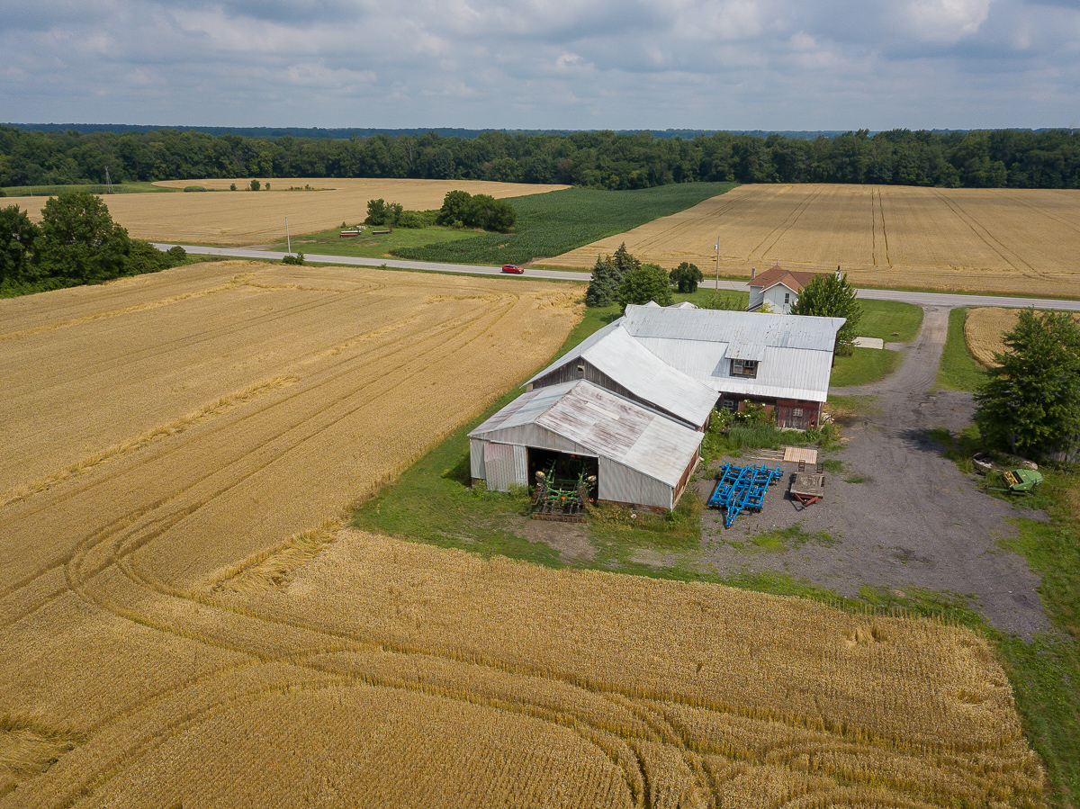
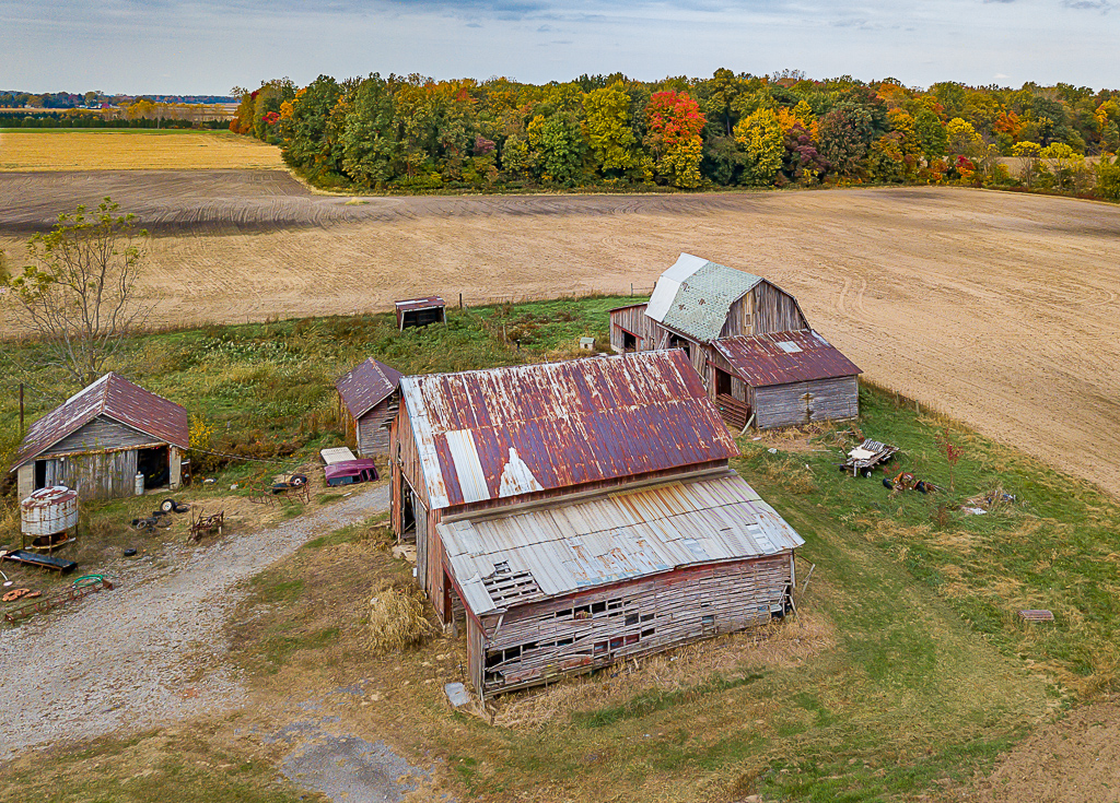
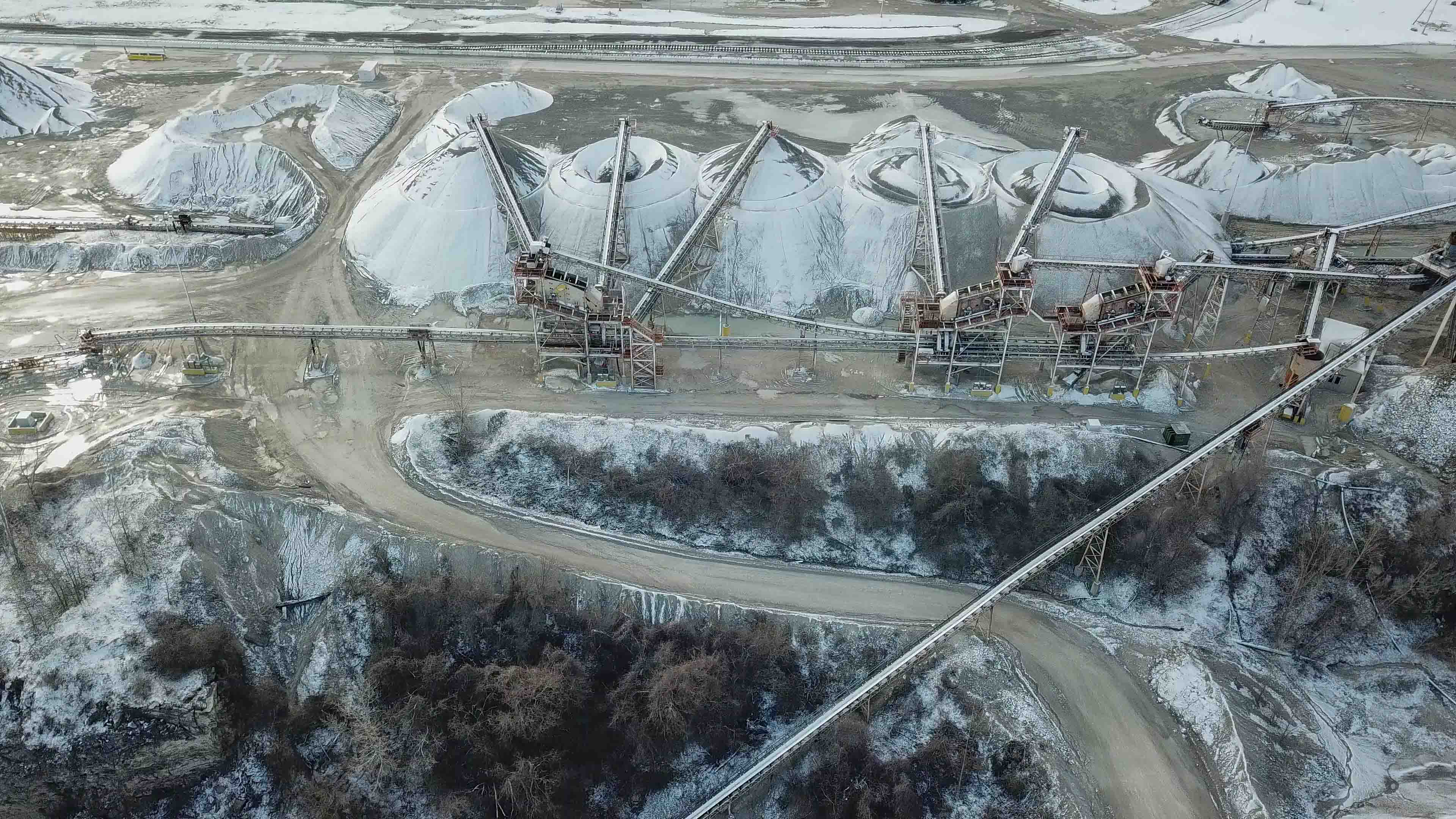
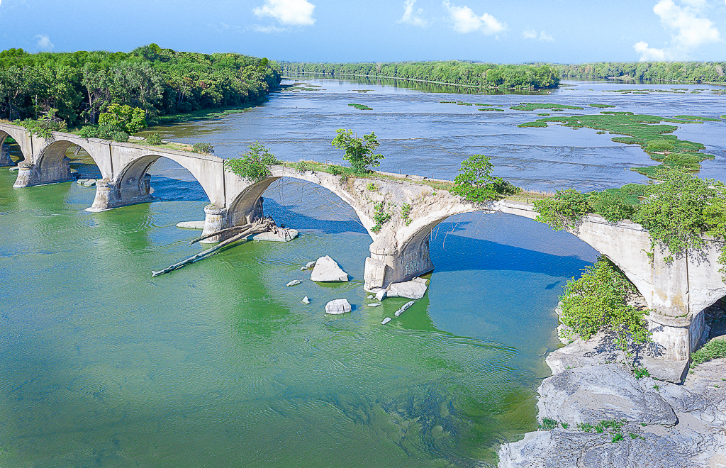
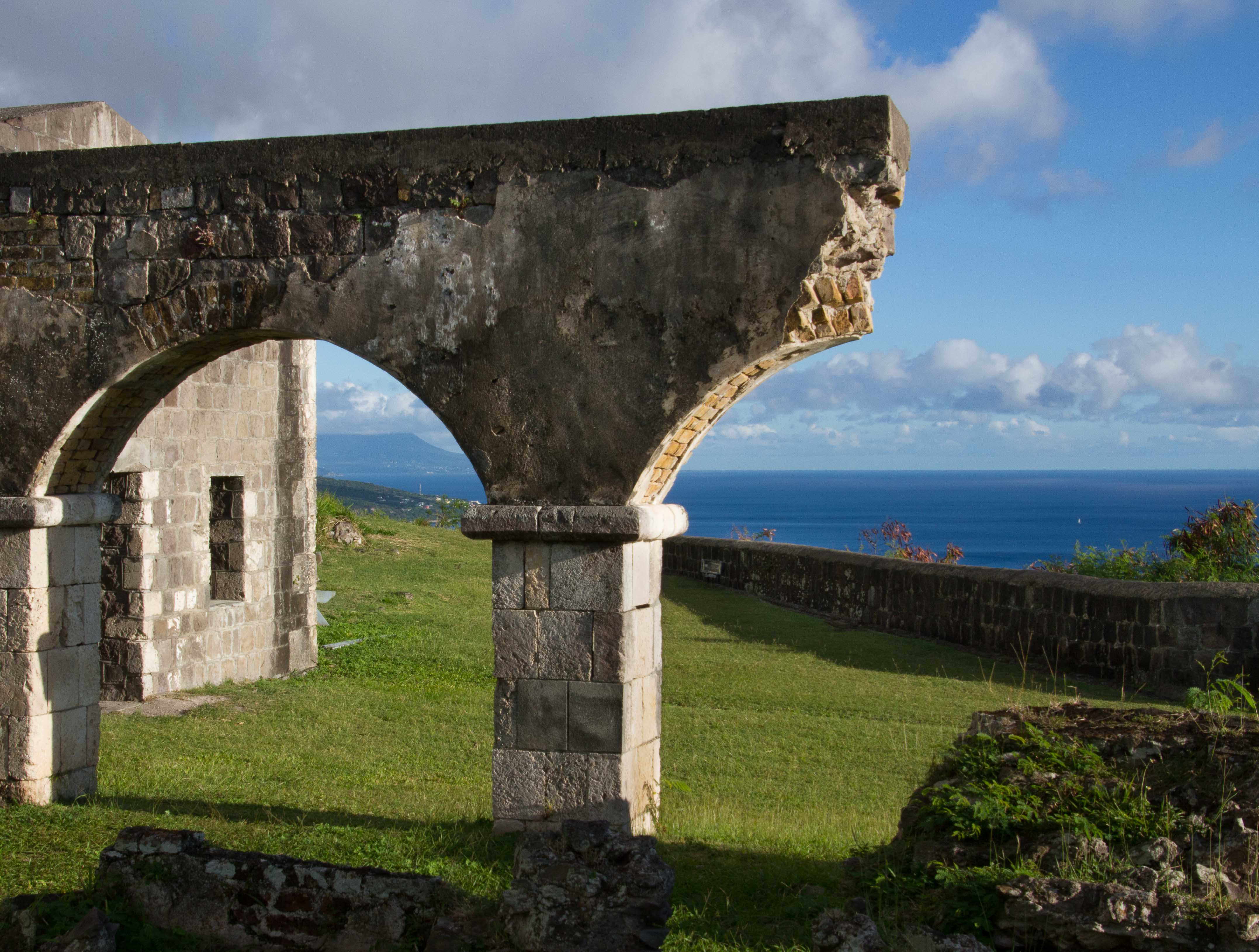
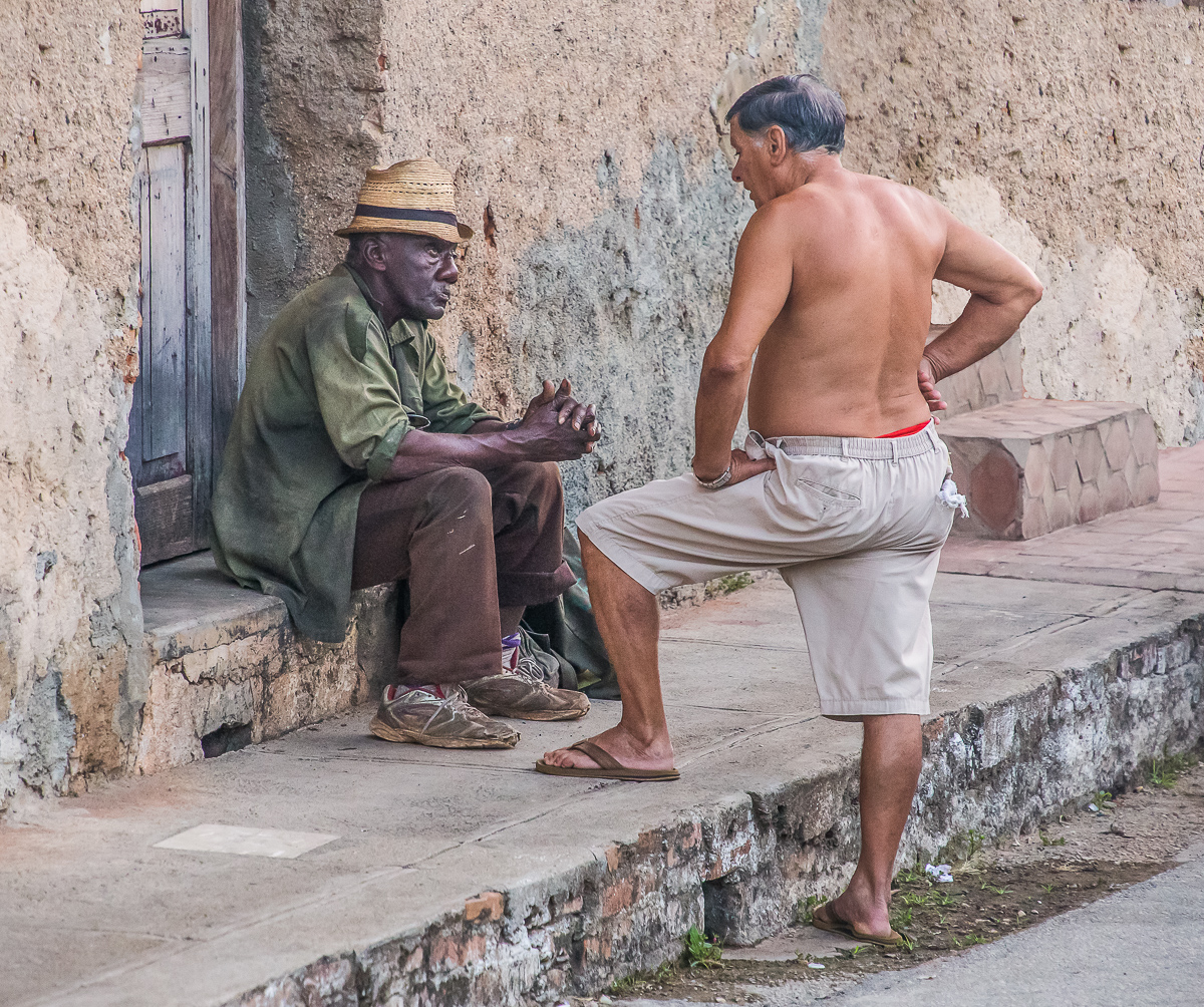
Hi Bob, I think you come up the coolest subjects. I love this place, I think it really has a lot of mood and to me the image has a painterly quality to it. I agree with Tony's comments about the tire but I think you could crop them out by taking some off the right side of the image. In my opinion there is more room than need on the right anyhow. I hope you don't mind, I took the liberty of doing that and also I used a brush in Lightroom to darken the left side a little. |
Apr 4th |
 |
| 85 |
Apr 20 |
Reply |
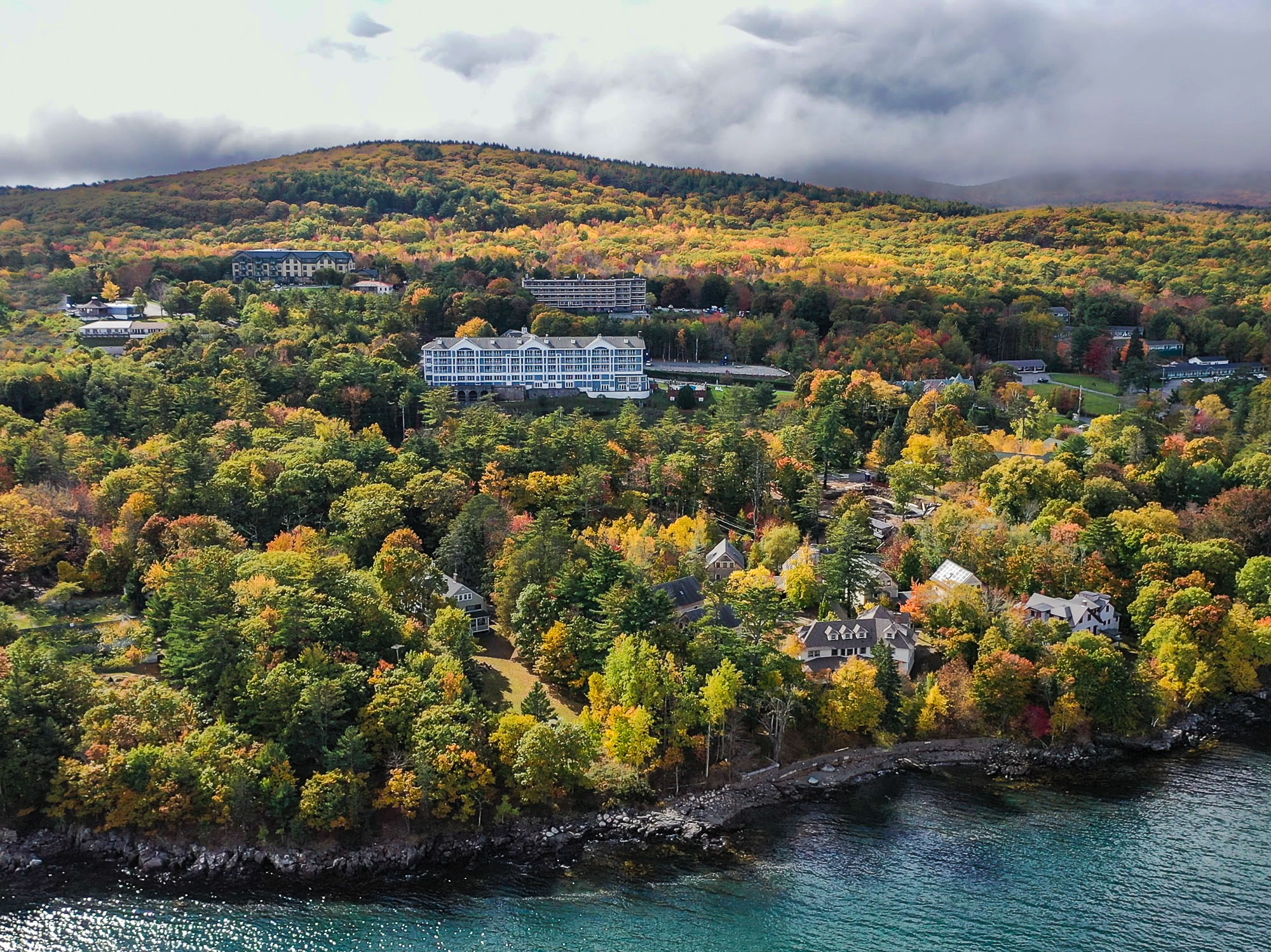
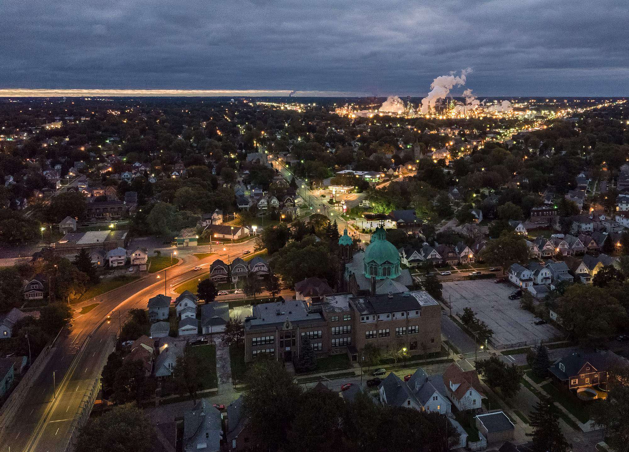
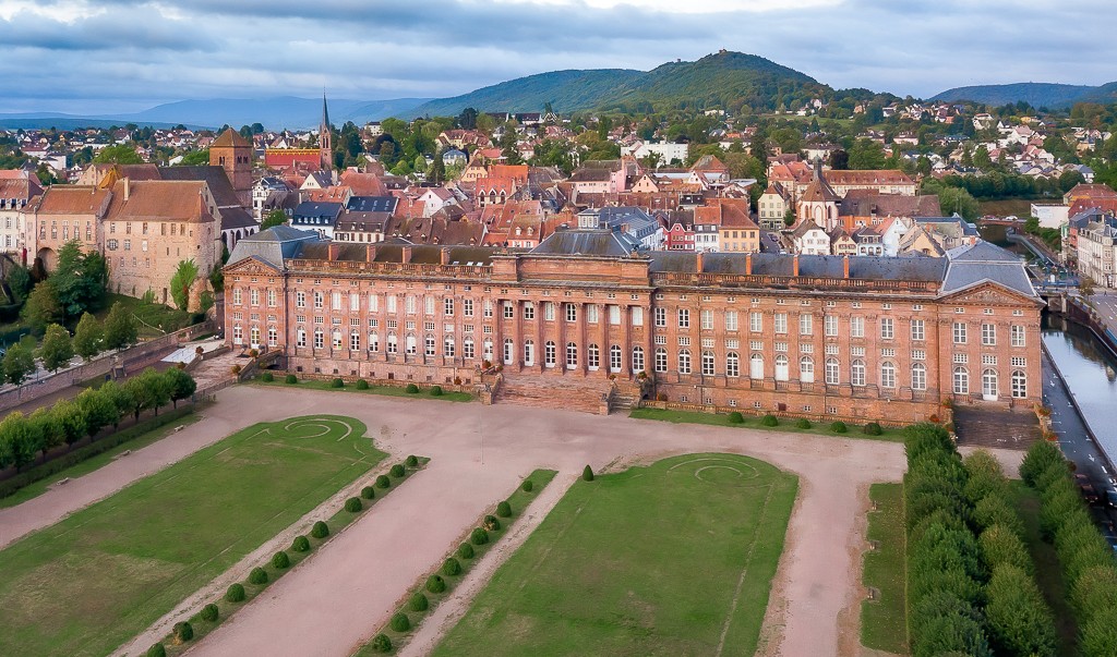
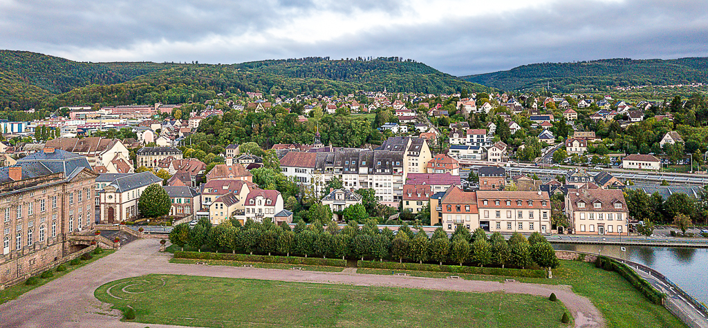
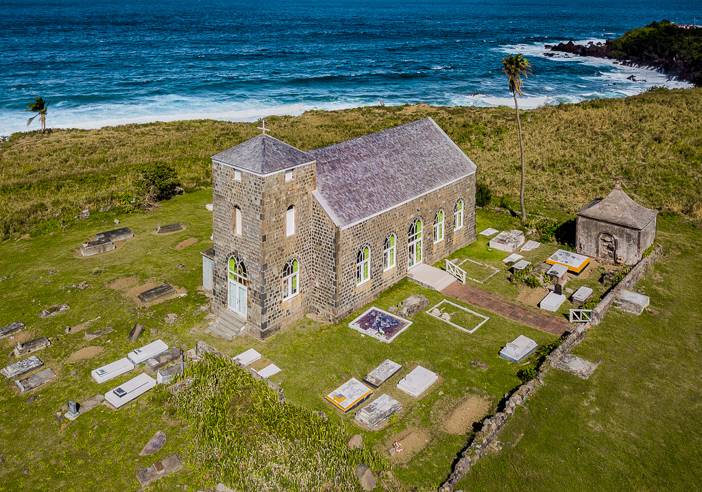
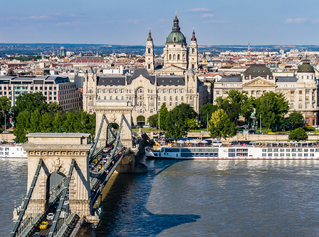
Hi Lisa, I was unsure what you meant about straitening the horizon, I checked it and it is perfectly (almost) level. Now I understand, your suggestion I believe is to move the camera to the left so the edge of the grass lines up with the frame. I like that suggestion, I may have put too much in this image by trying to show the town and the chateau. |
Apr 4th |
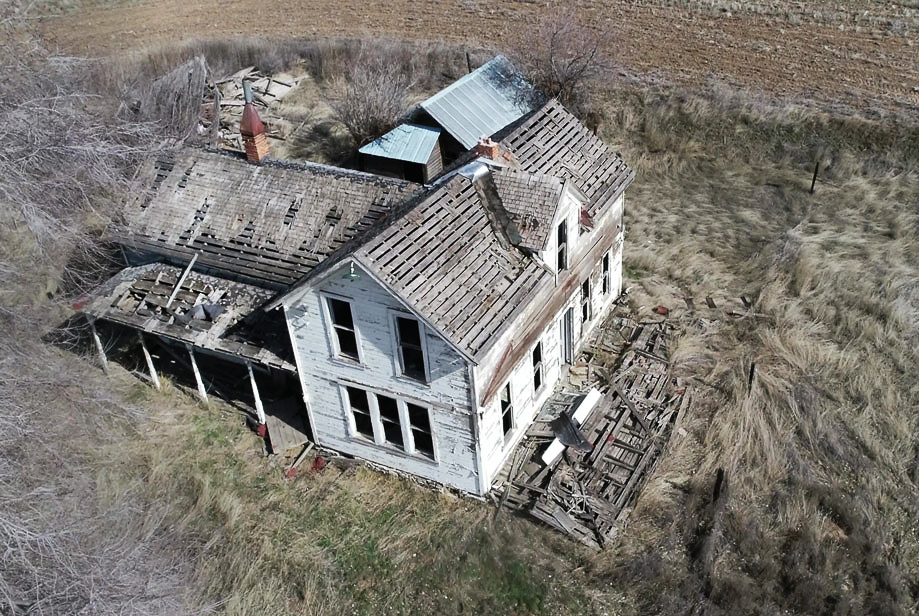
| 85 |
Apr 20 |
Comment |
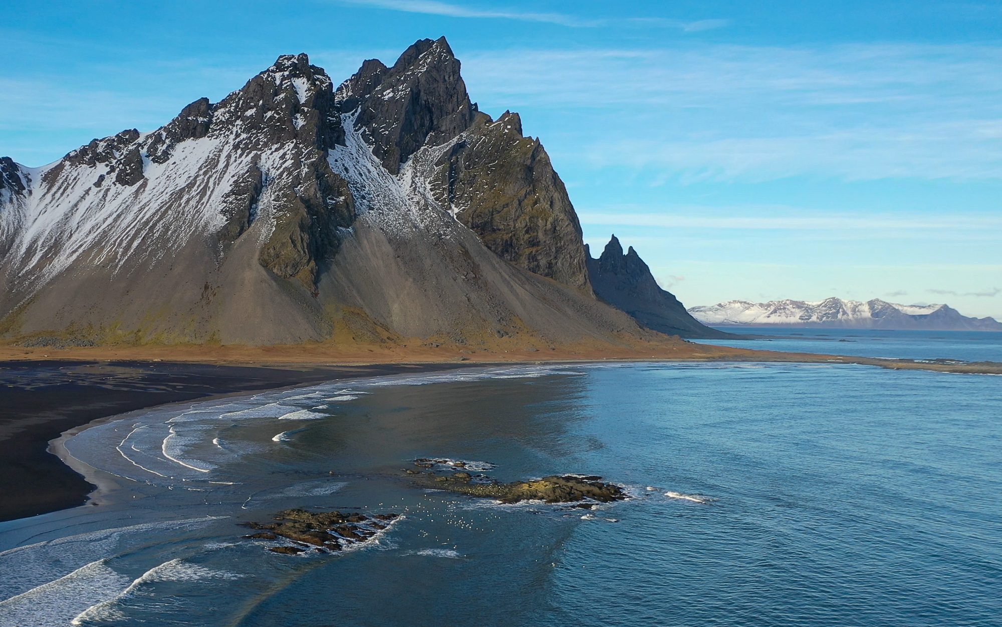
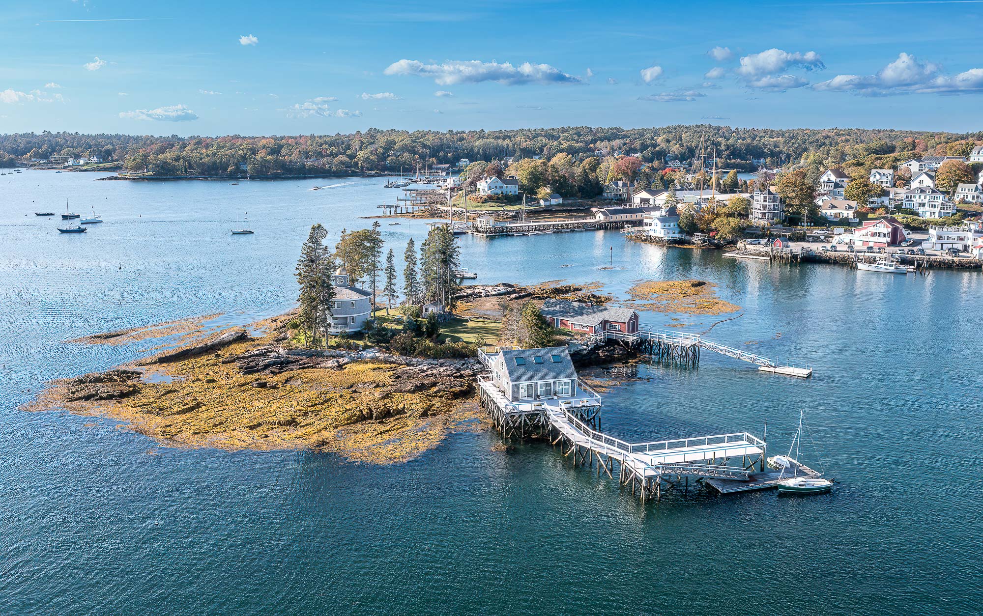
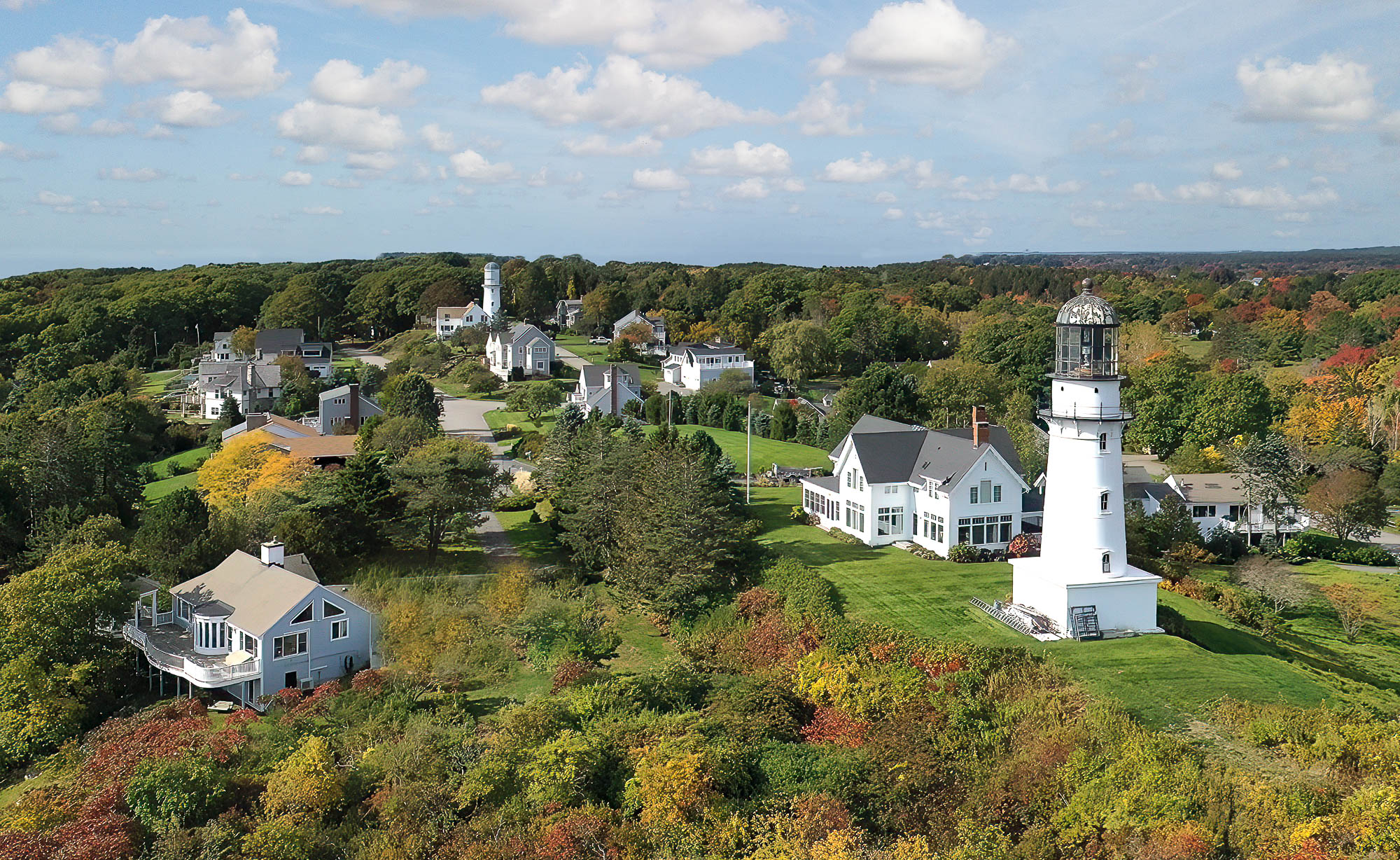
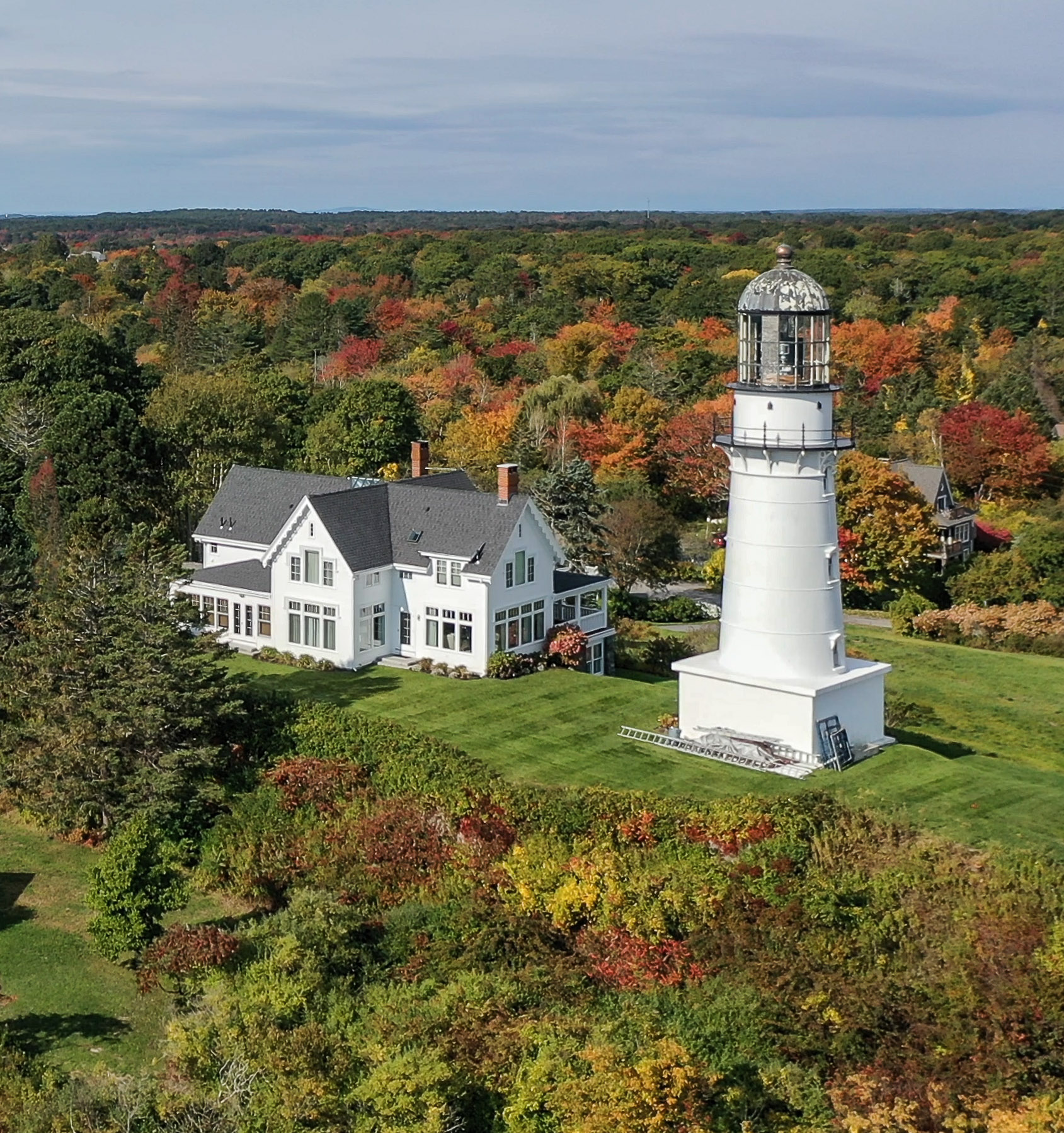
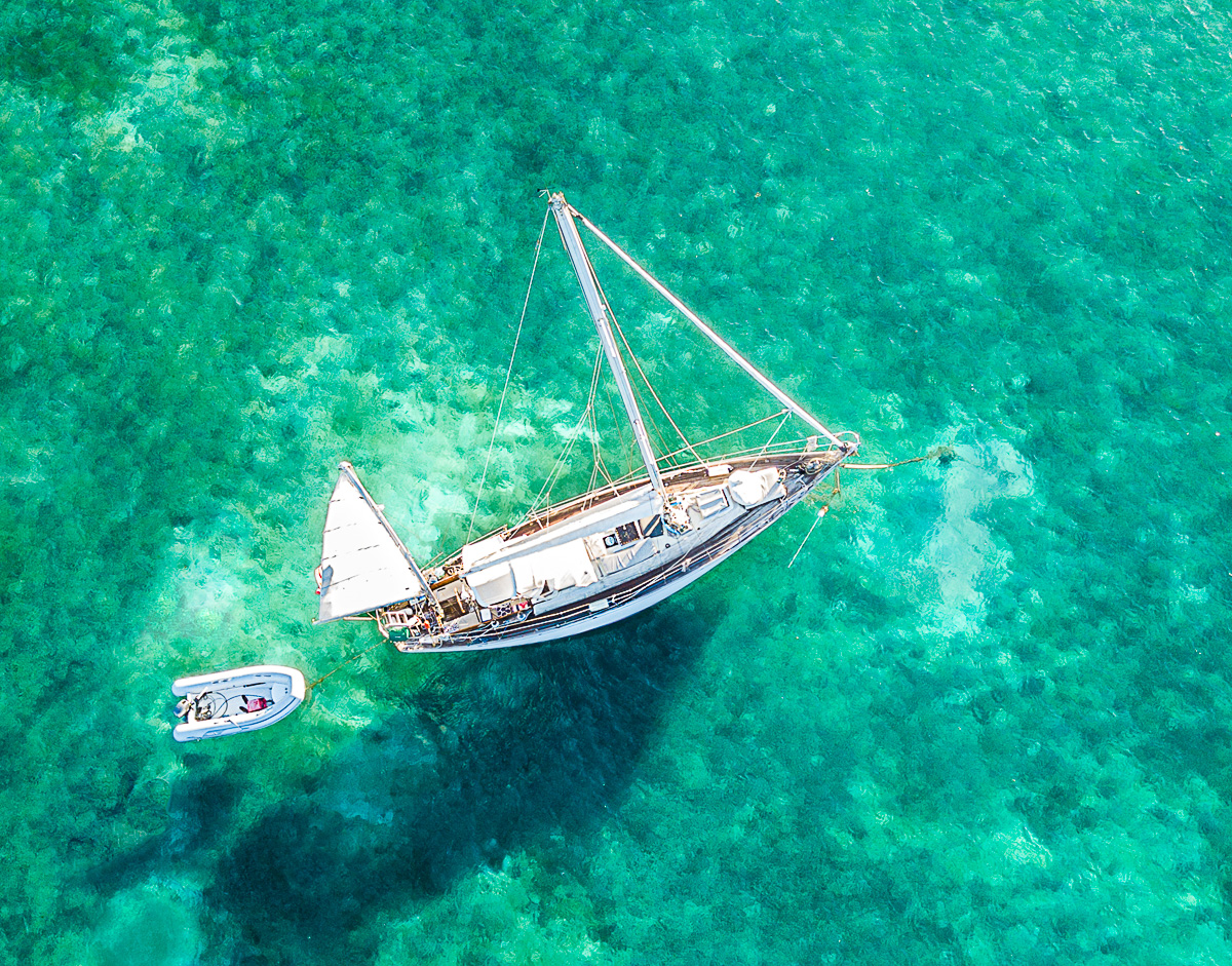
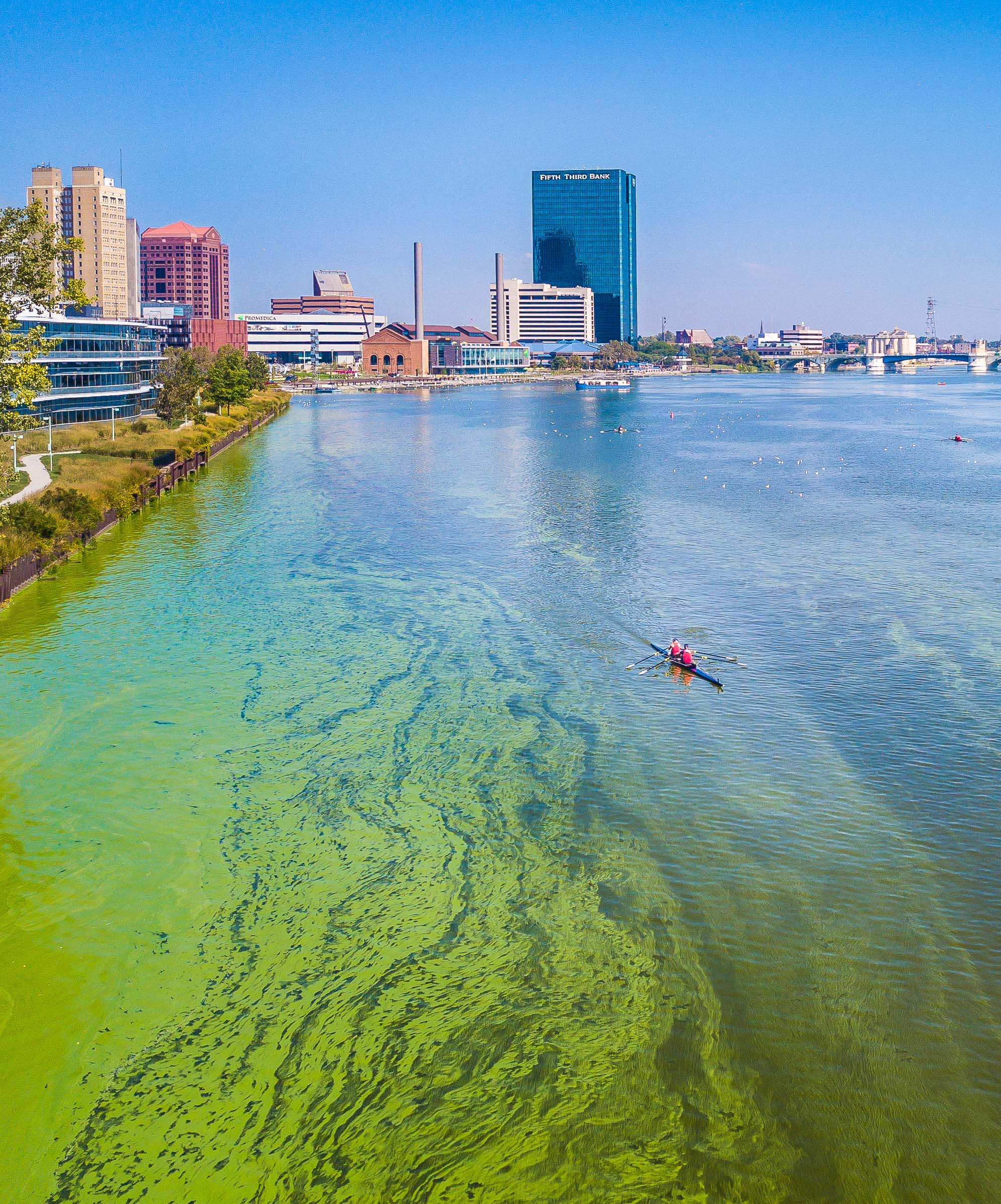
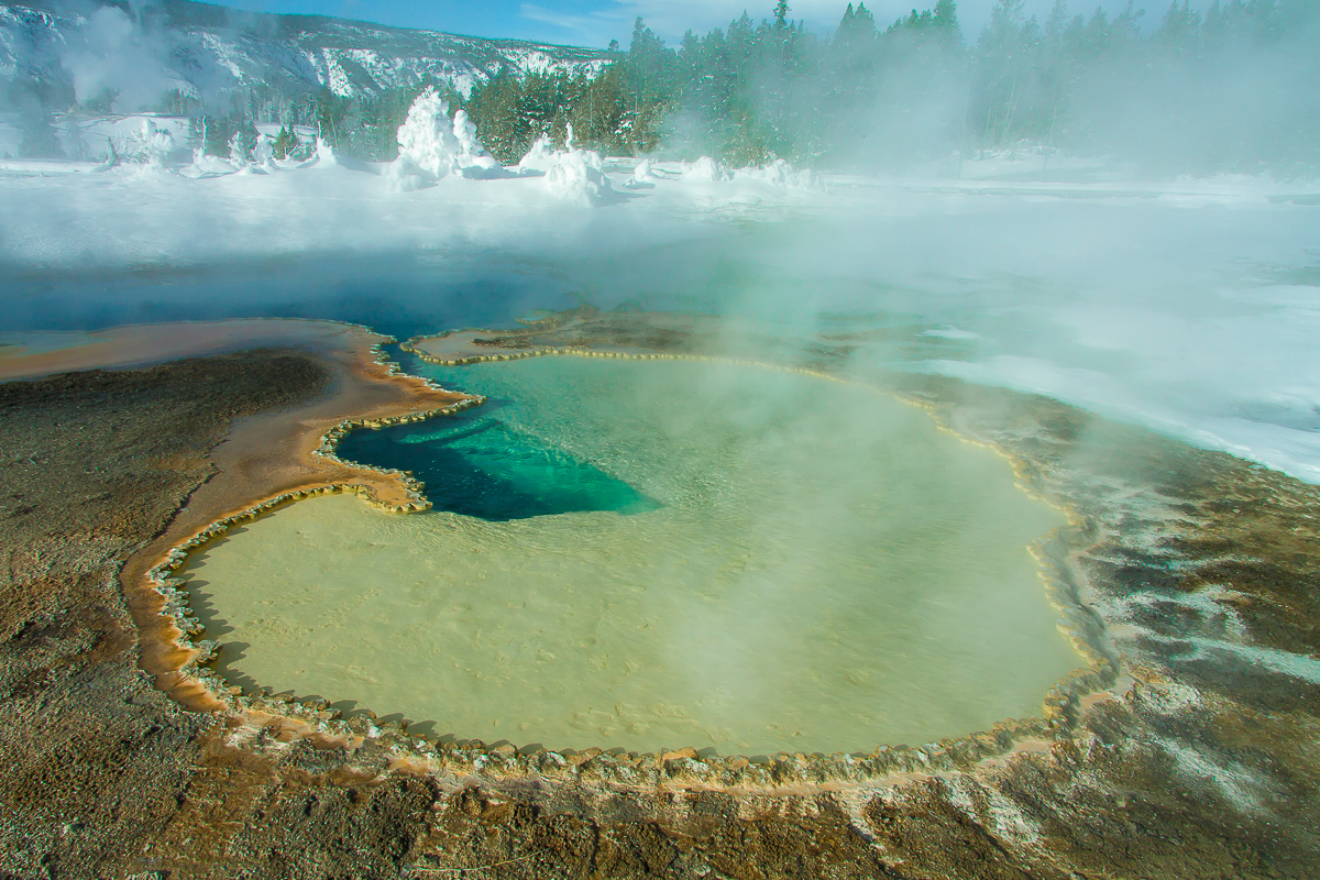
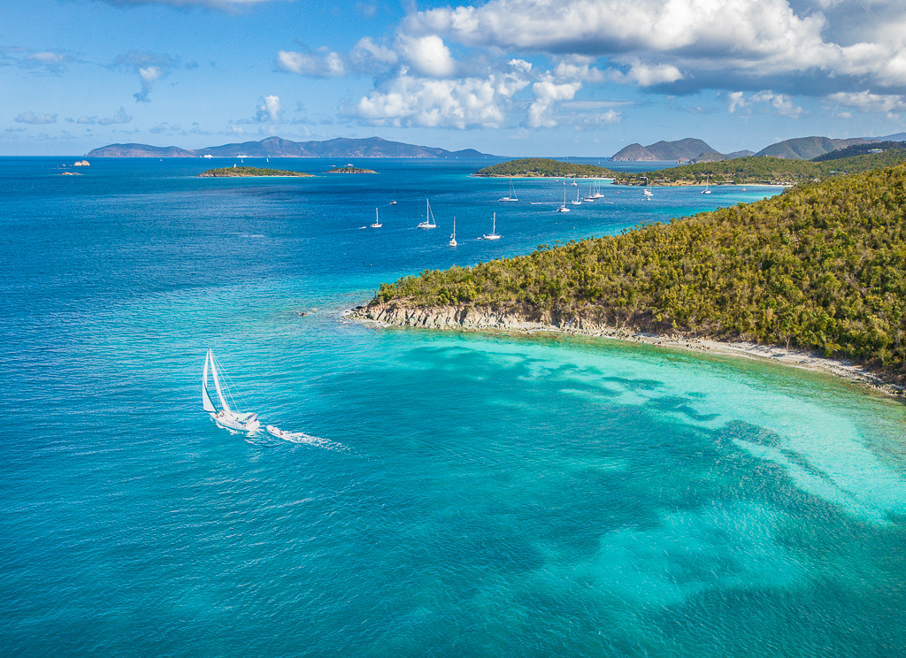
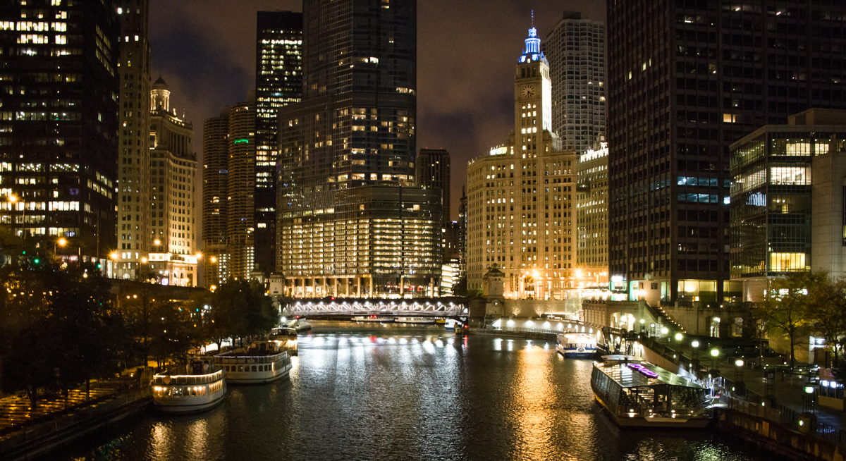
I understand your anxiety when your drone gets far out and the battery is getting low. I think this is a nice image, I really like the sun reflections. I think I would like it better for the statue did not intersect with the horizon and the full statute was silhouetted in the refection. |
Apr 4th |
| 85 |
Apr 20 |
Reply |
Hi Tony, thanks for the comments. I guess I should have titled this differently. I have more shots where the chateau is prominent. I like this view of the town but the title is misleading. |
Apr 4th |
| 85 |
Apr 20 |
Reply |
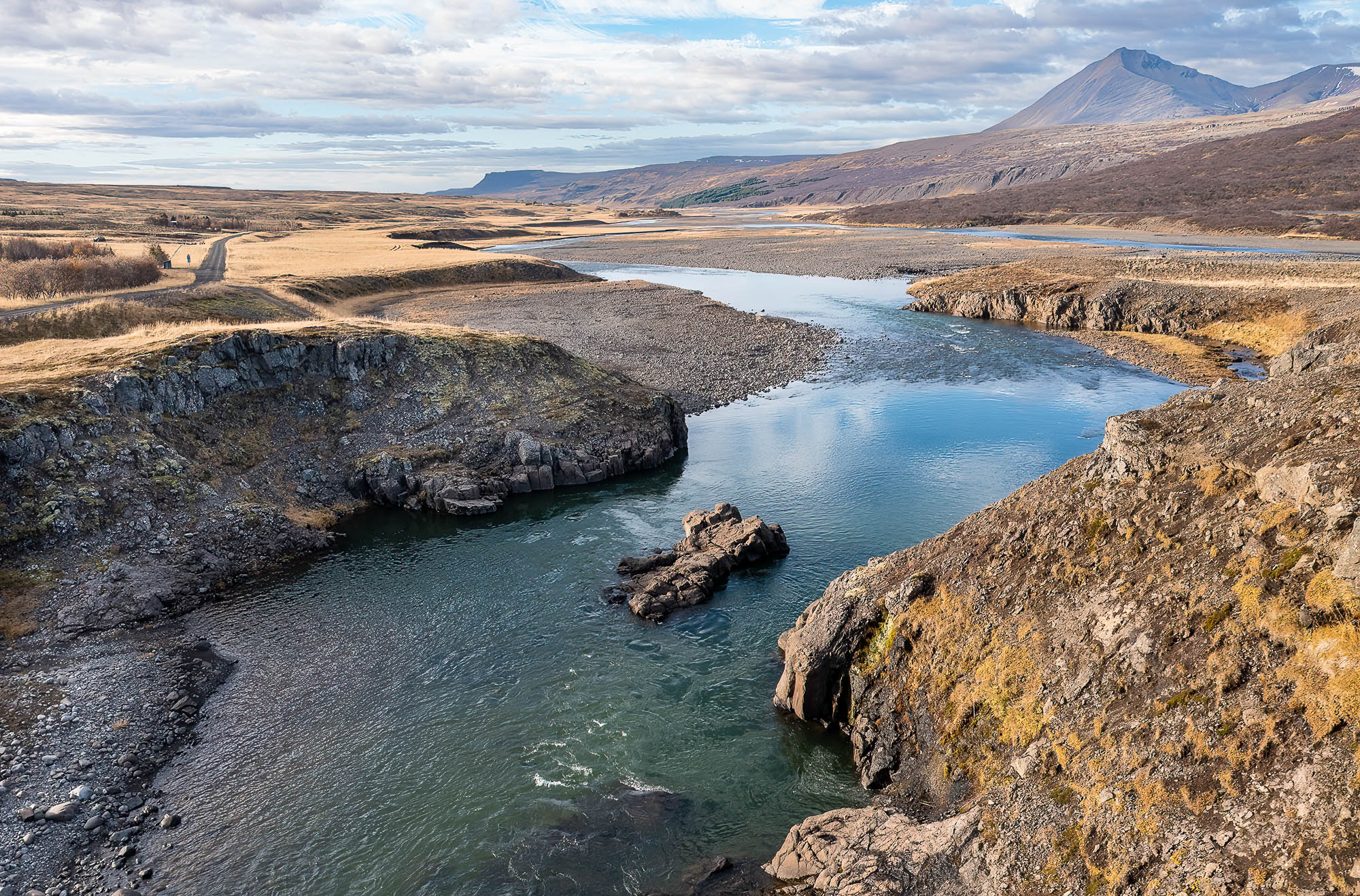
Two hours by train from Paris, no flying restrictions that I know of. |
Apr 4th |
3 comments - 5 replies for Group 85
|
| 88 |
Apr 20 |
Reply |
Thanks for the comments Gary. |
Apr 11th |
| 88 |
Apr 20 |
Reply |
I like it Gary, I think you have made it a much stronger image. Thanks for the suggestion. |
Apr 10th |
| 88 |
Apr 20 |
Comment |
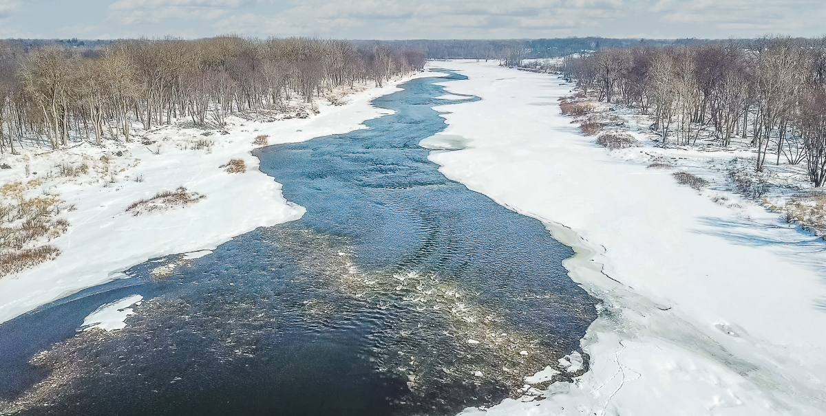
Hi Charles, I think you did a wonderful job with this image. I like how the red barn stands out and focuses my attention. The snow and texture on the trees is well handled. I agree with the comments regarding cropping. |
Apr 7th |
| 88 |
Apr 20 |
Comment |
I agree, I think you did an amazing job in PP. I think the original image had good basics, well composed and framed but you really created something beautiful. I think the colors and exposure are right on and I like the details in the snow and field stubble. I could go either way on the small pines next to the barn. |
Apr 7th |
| 88 |
Apr 20 |
Comment |
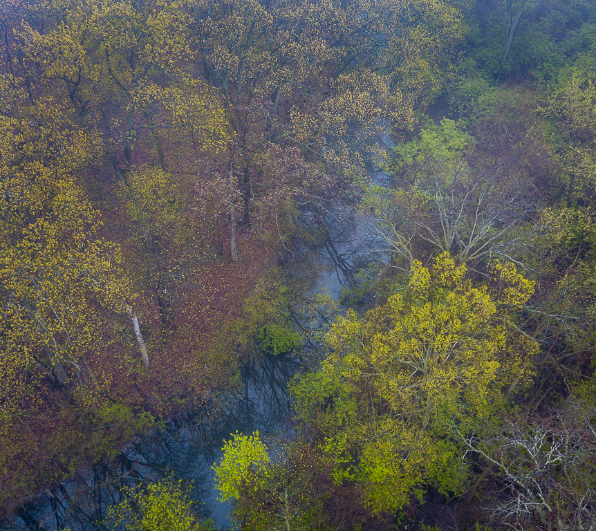
I think you did a great job with this image and the way you worked to capture it. I agree with the other two comments, I think the tree on the left detracts from the image and I think the tree on the right would work better if it was sharp. I like the composition and the look of the water, to me this image has a dream like quality. Well done. |
Apr 7th |
| 88 |
Apr 20 |
Comment |
I think this is a great image, I like the perspective and composition. I agree with Scott, I too like b&w landscapes. B&W doesn't work for every landscape but I think it works well with this one. I agree with Trey about the shadows being darker. IMO the image works well when it has a full range of tonality. I like to darken the blacks until they just start to clip and the same with the whites. |
Apr 7th |
| 88 |
Apr 20 |
Reply |
Hi Trey, thanks for the comments. The out of focus plant, I never even noticed it, I will definitely remove it. Actually I don't like the in focus on either, now I find it distracting. I agree, the image would be better if I move a little to the right. |
Apr 7th |
4 comments - 3 replies for Group 88
|
| 92 |
Apr 20 |
Reply |
I really like this image, I think it is very strong in B&W. One thing certain is that you cannot out guess judges. I think that the white cloud on the left is somewhat distracting, I imagine that a judge may not realize that the black is the sky and the white a cloud. |
Apr 8th |
| 92 |
Apr 20 |
Comment |
I think you created a fine image. I agree that the yellows could be toned down but other than that I find this image very pleasing. I like the composition and I think the exposure is right on. |
Apr 8th |
| 92 |
Apr 20 |
Comment |
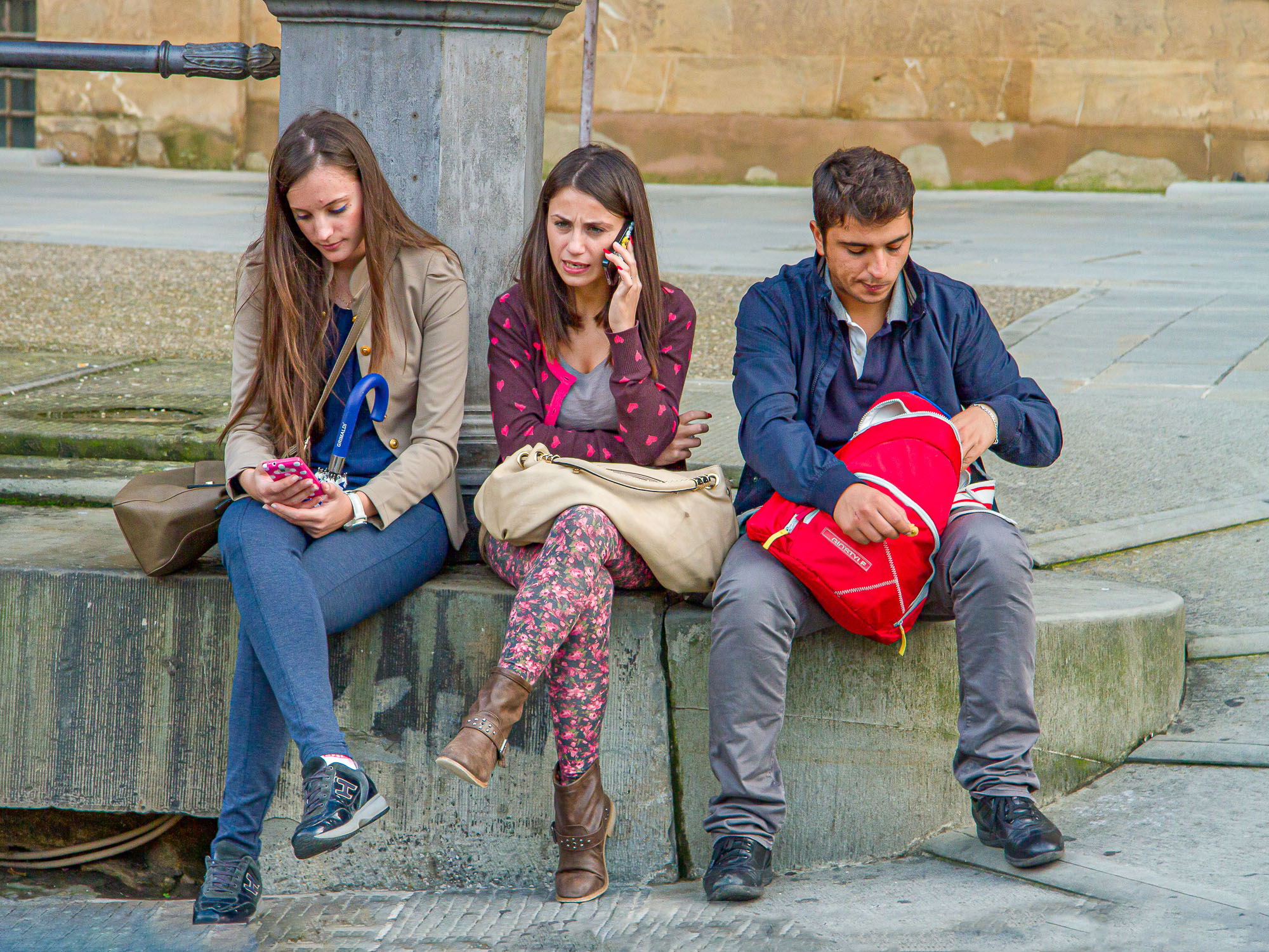
I think this is a very nice image, I like the angular lines. I am usually a fanatic about architectural lines being strait but in this case I thing the angles add a certain dynamic to the image.
|
Apr 8th |
| 92 |
Apr 20 |
Comment |
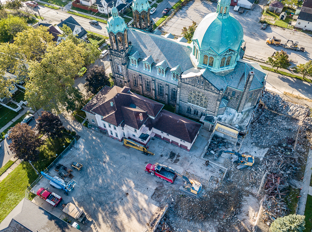
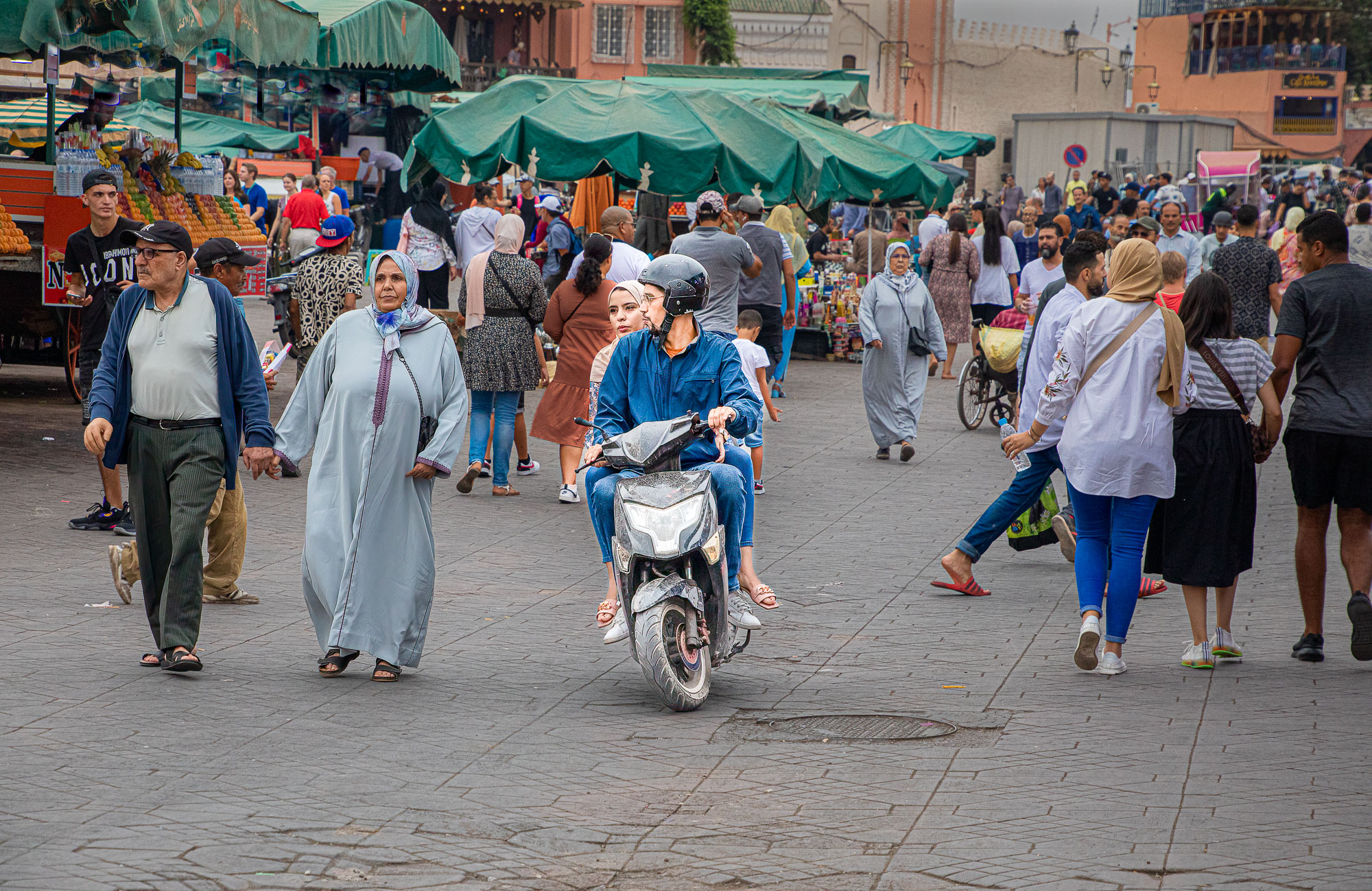
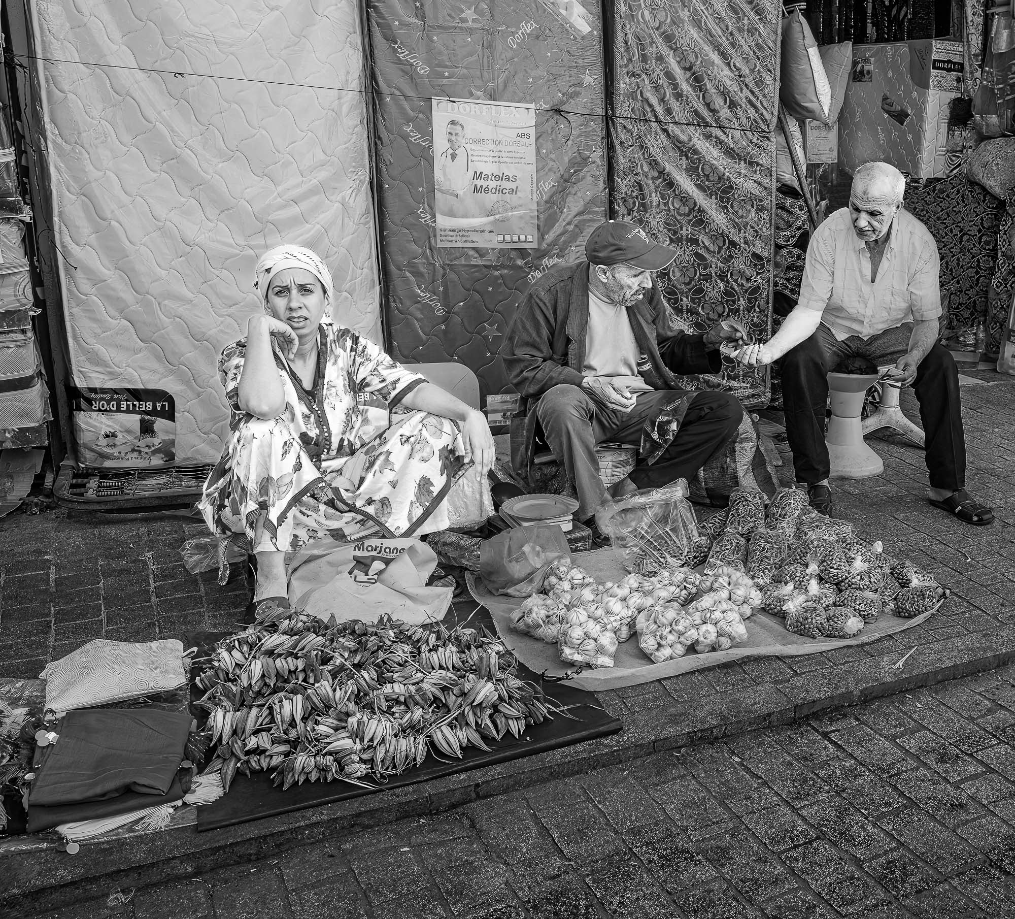
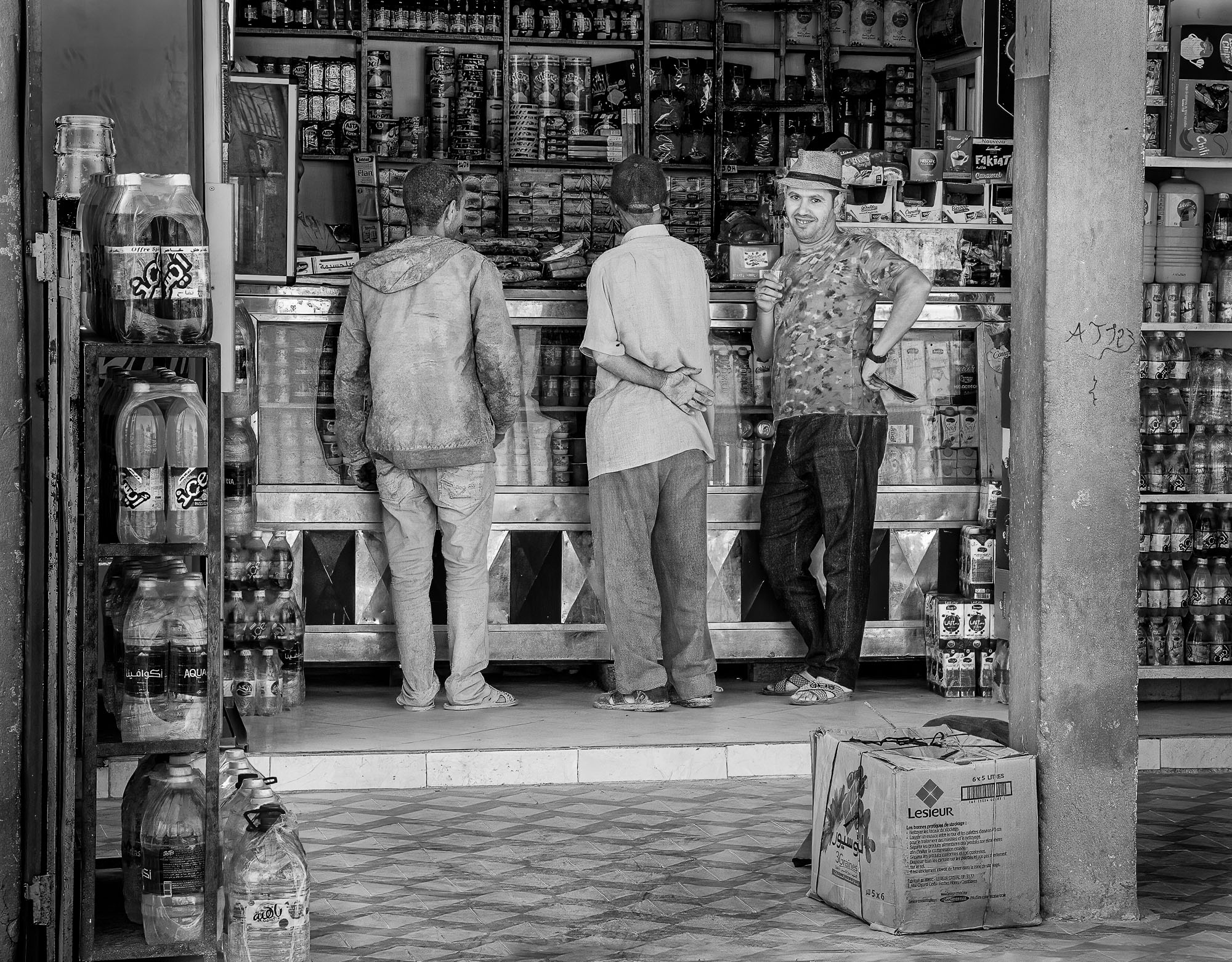
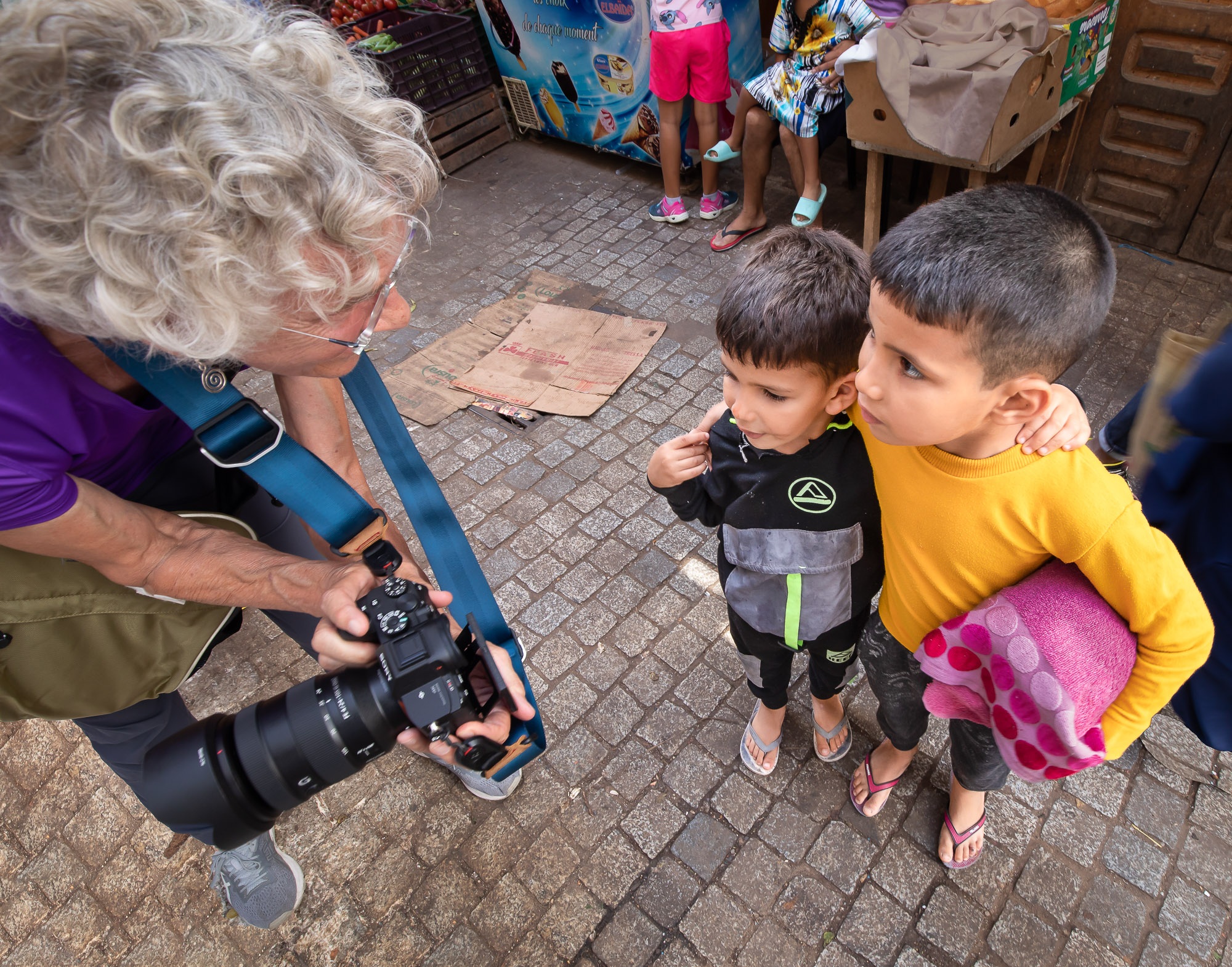
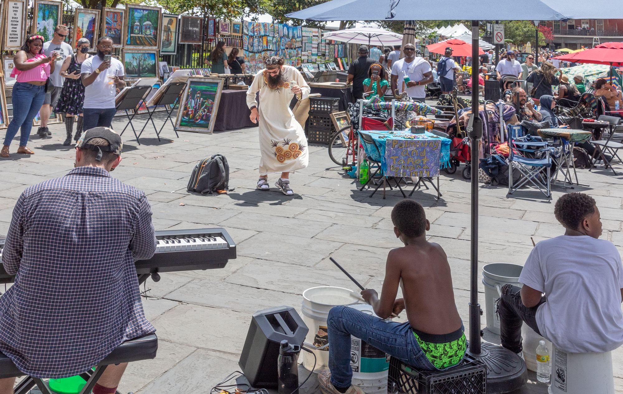
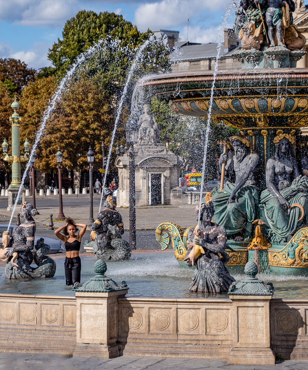
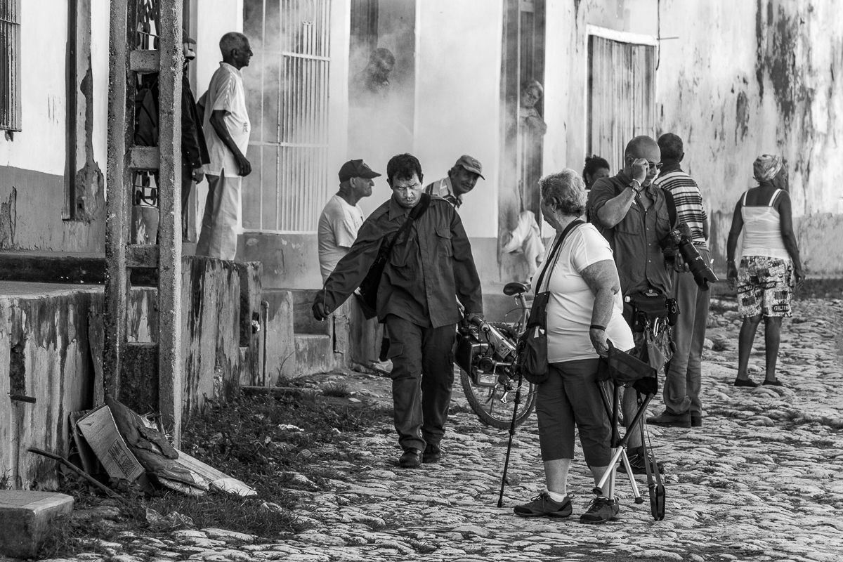
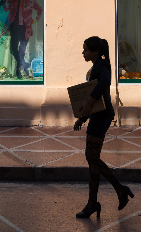
Interesting discussion regarding how much editing is appropriate. As mentioned, it is not photojournalism, so editing is allowed but it is a question of how much if any the photographer wishes to do. Personally I don't have a problem cropping the image or managing a distracting background but I still want to tell the story I saw when I created the image. In this image I like what Geoff did with the background but I prefer the un-cropped version. To my eye the tightly cropped version loses context and diminishes the story. |
Apr 8th |
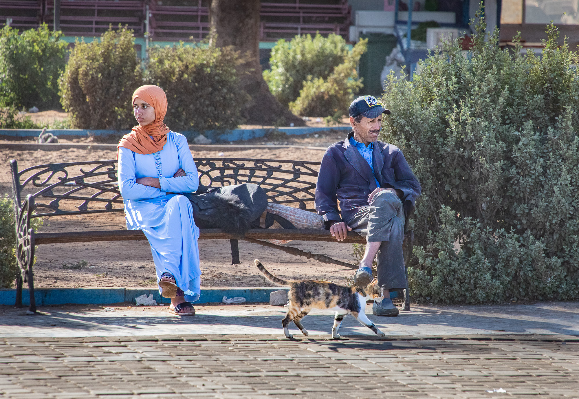
| 92 |
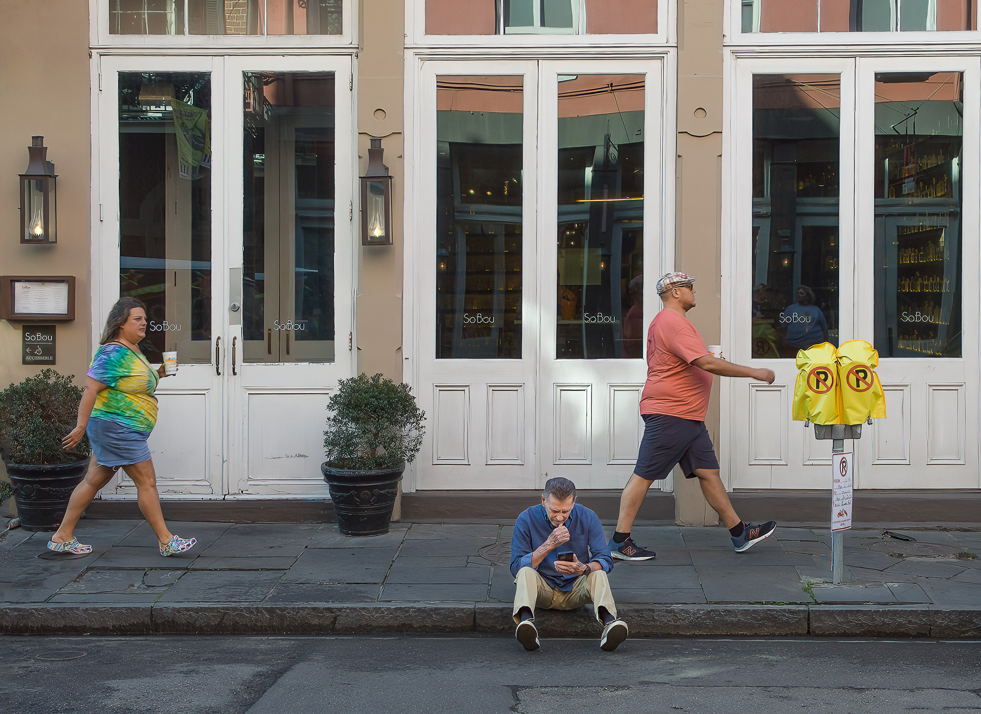
Apr 20 |
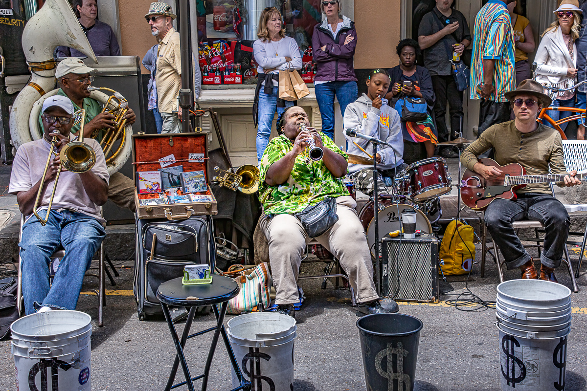
Comment |
I think that Geoff has made some very constructive comments. I think you did a good job capturing a difficult subject, what with all the distractions. I think that if the camera angle was higher you may have been able to exclude some of the extraneous images. To my eye the shadows and detail are captured well. |
Apr 8th |
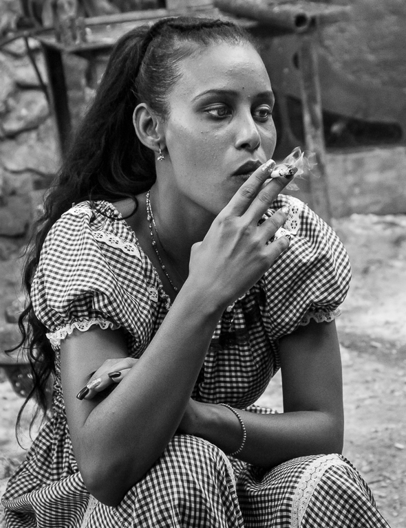
| 92 |
Apr 20 |
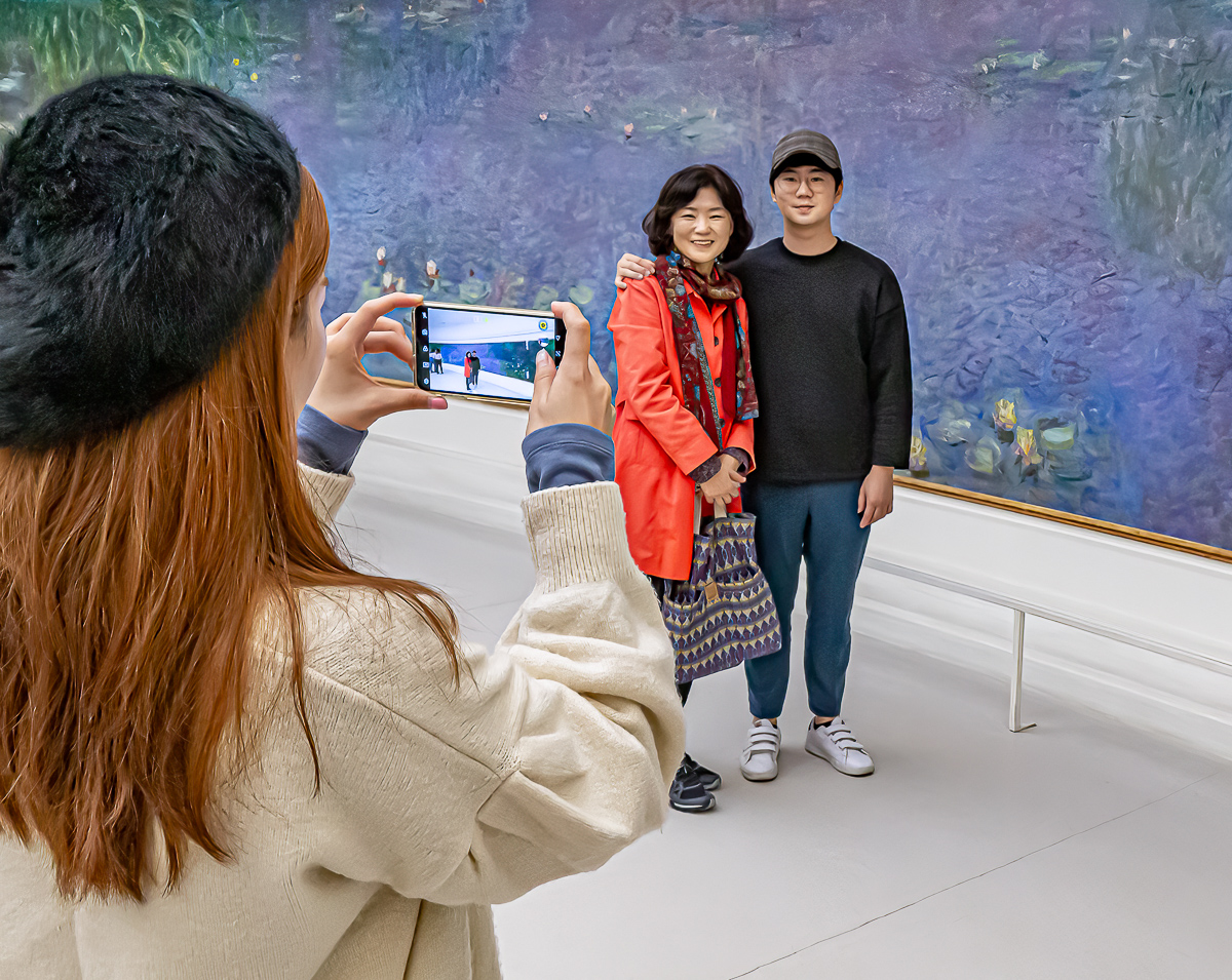
Reply |
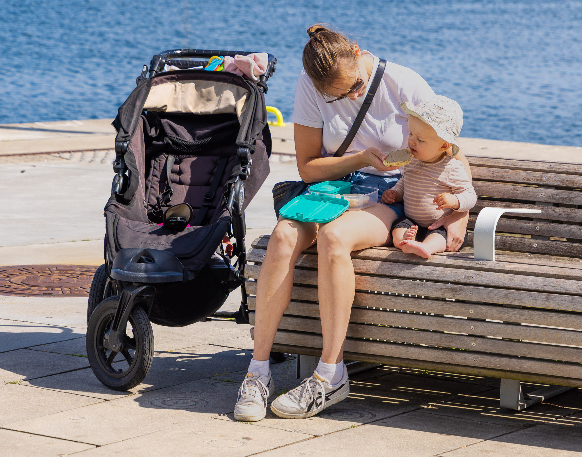
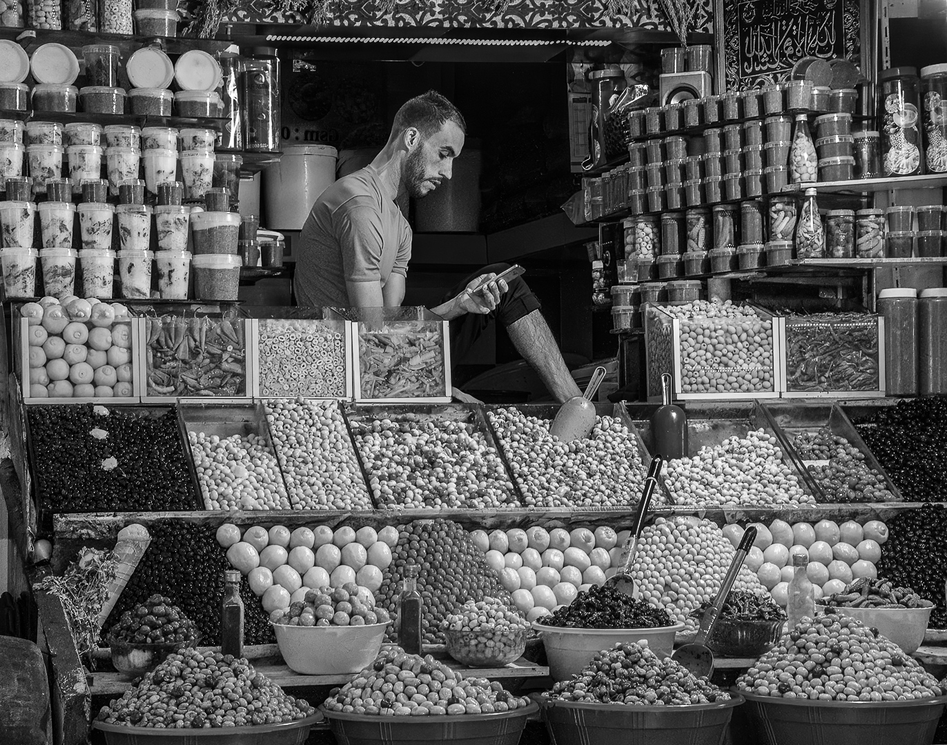
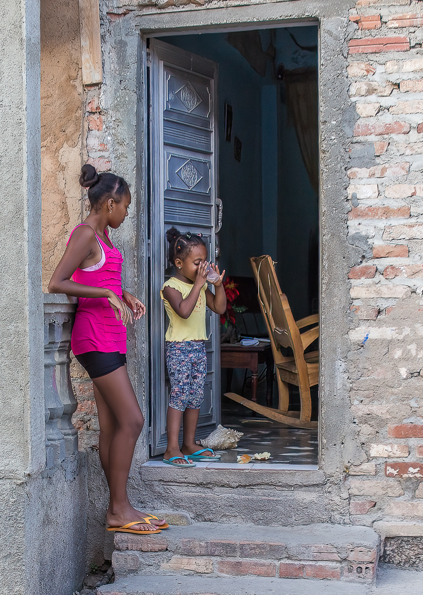
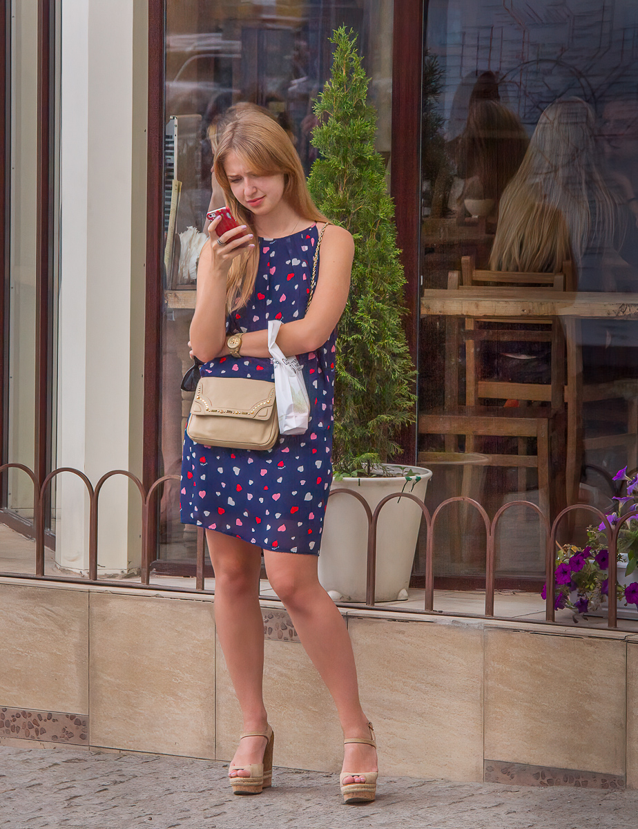
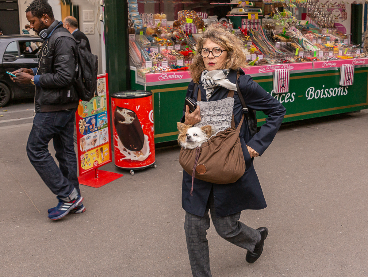
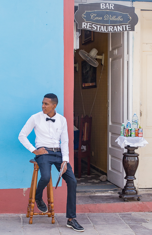
I like it Geoff. I think I lightened the legs so that the viewer could see the pattern on her stockings. Perhaps that pattern is not noticeable enough in my version. I like what you did with the shop window. |
Apr 8th |
4 comments - 2 replies for Group 92
|
11 comments - 10 replies Total
|