|
| Group |
Round |
C/R |
Comment |
Date |
Image |
| 24 |
Apr 20 |
Reply |
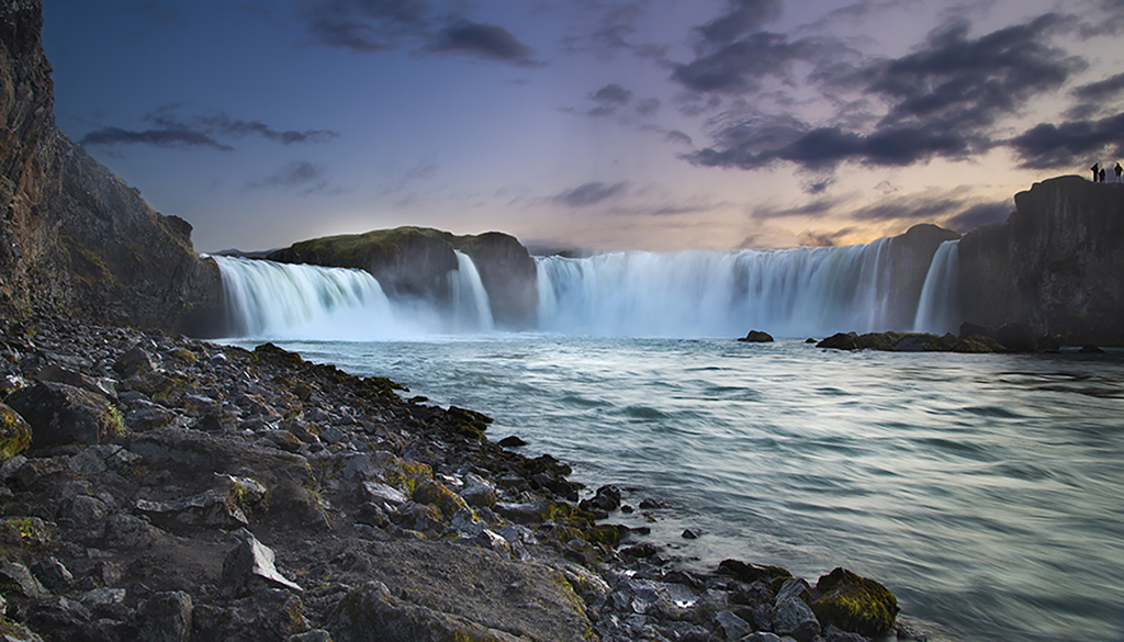
My suggestion is to dehaze the background (i.e. the mountains and clouds) only. The rest of the photo is fine.
This is only my imagination - don't know whether it will work. |
Apr 14th |
| 24 |
Apr 20 |
Comment |
Very nice landscape photo. Your use of the luminosity mask to bring out the lighter green tips of the brush in the foreground has worked well enhancing the depth of field. Perhaps it may be a good idea to dehaze the background a bit to take the eye more towards the barn. |
Apr 13th |
| 24 |
Apr 20 |
Comment |
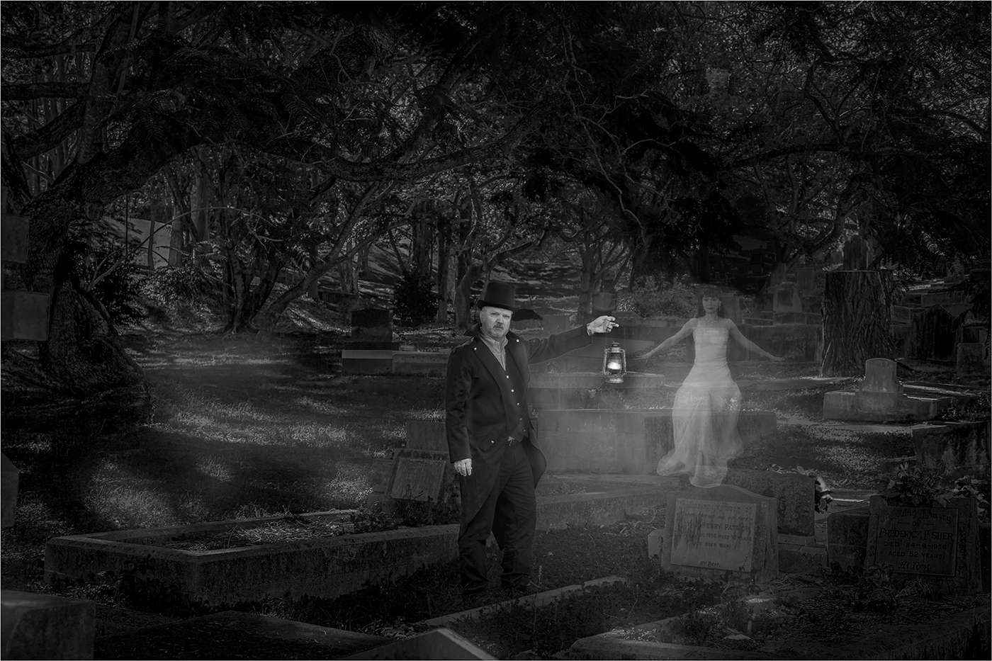
Donna has improved the original by way of removing busy tree branches. But there was a black patch on the left corner, which was a bit of distraction. Jim has vastly improved the photo by further reducing busy tree branches and removing that black patch. |
Apr 13th |
| 24 |
Apr 20 |
Comment |
I like the original. The photo is a good attempt to show the harshness of the 'bush', the dry and vastly unpopulated area of Australia. The original gives a good depth to the surrounding and differentiates the sheep well from the surroundings. The edited photo by Sue blends the sheep with the surrounding more and reduces the depth of surroundings. The sheep in Jim's photo stands out more from the surroundings. |
Apr 13th |
| 24 |
Apr 20 |
Comment |
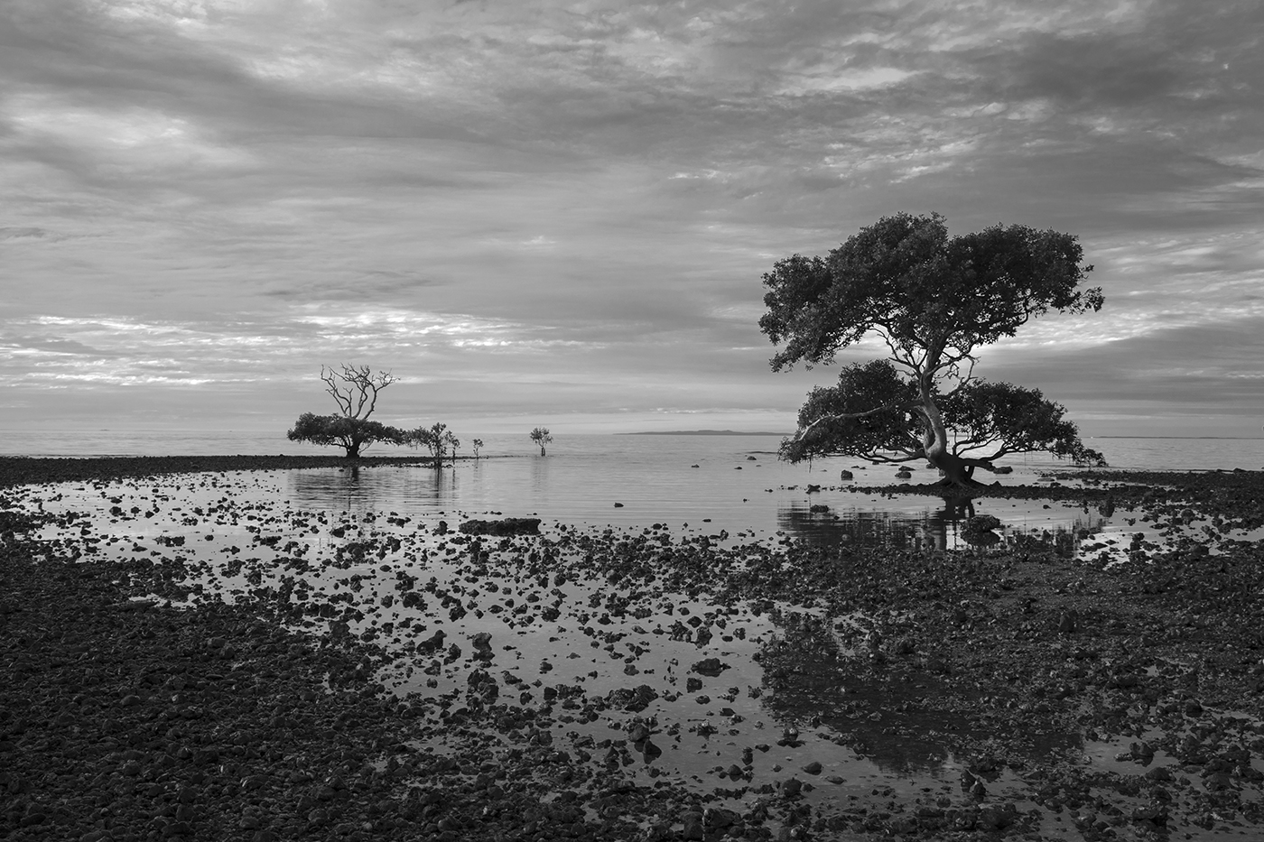
I definitely prefer the monochrome version. It gives an historical appearance to the photo. The range of tonality is amazing.
Good work Jim! |
Apr 13th |
4 comments - 1 reply for Group 24
|
4 comments - 1 reply Total
|