|
| Group |
Round |
C/R |
Comment |
Date |
Image |
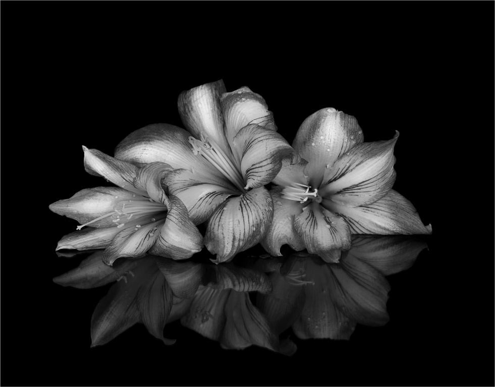
| 24 |
Sep 19 |
Comment |
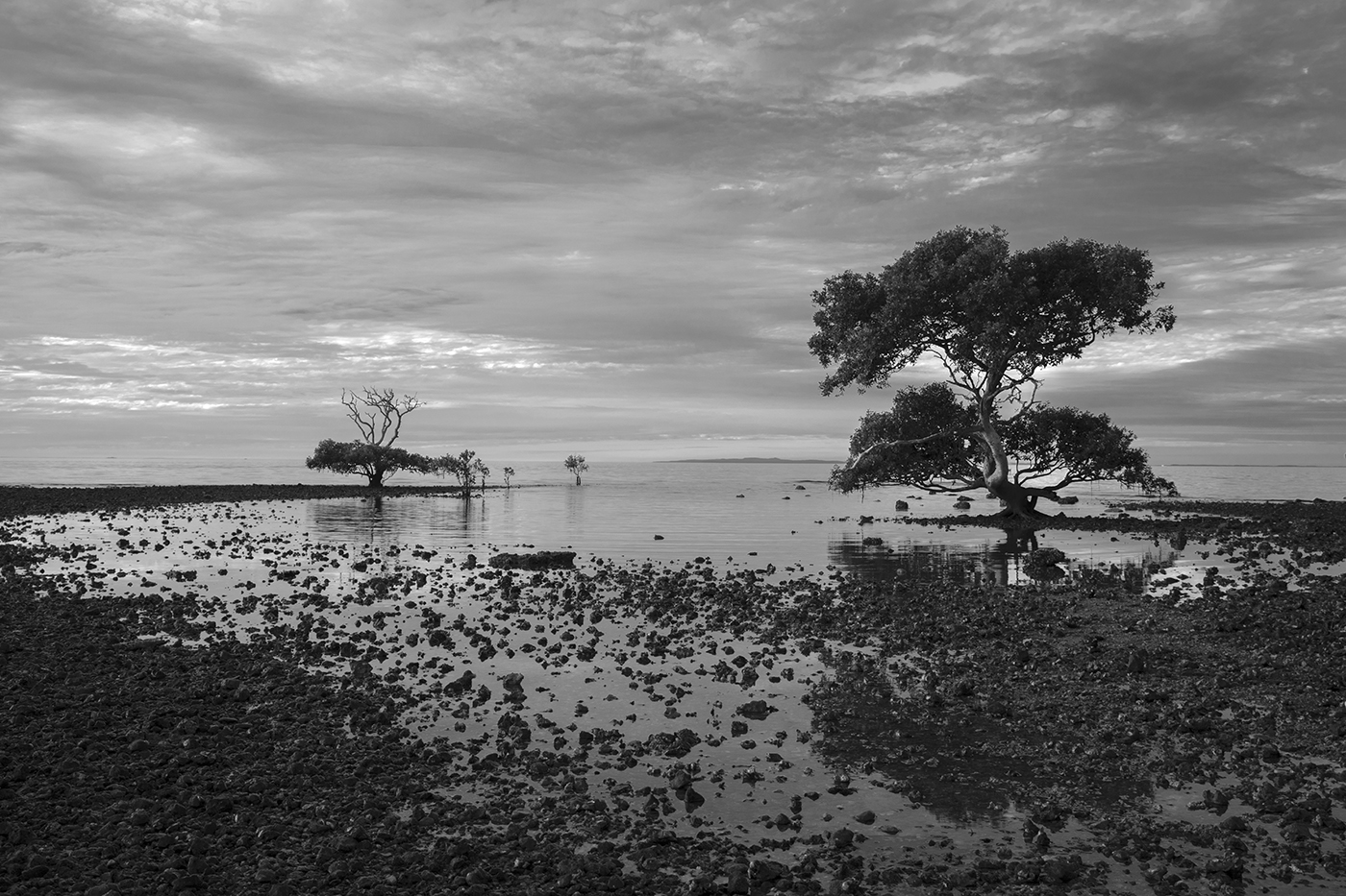
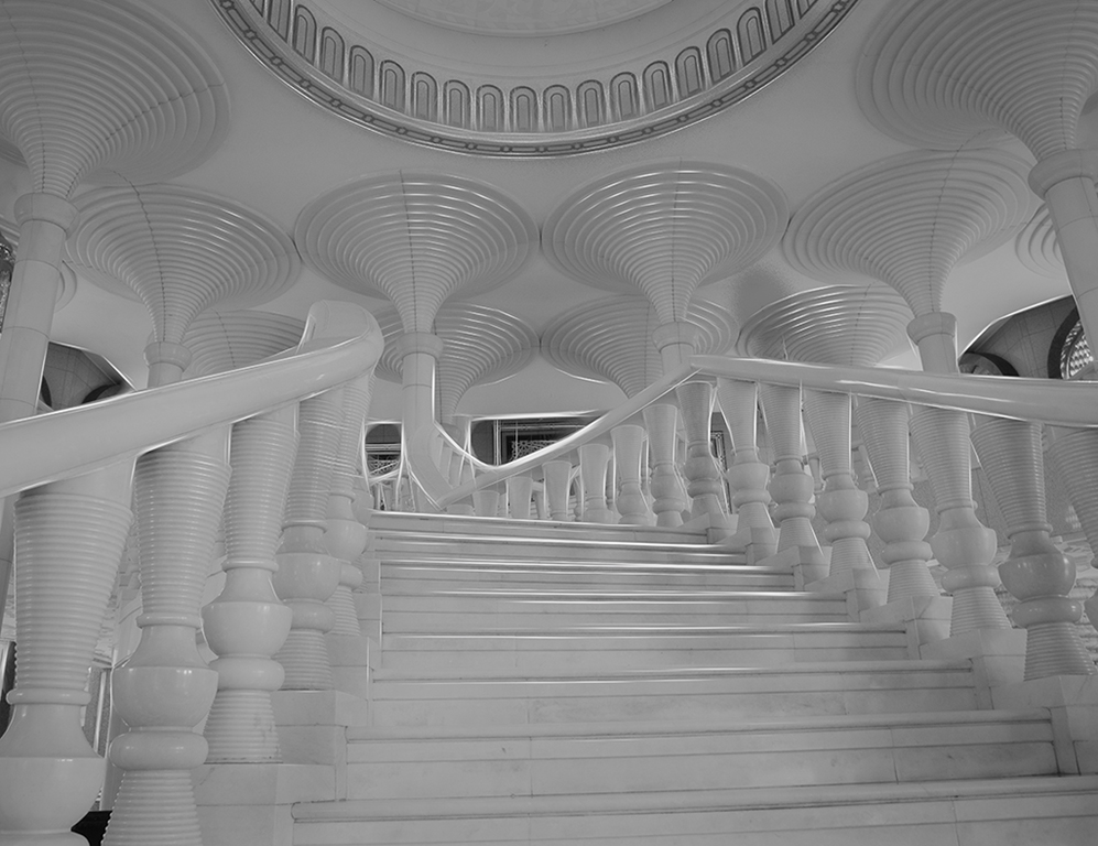
A nice black & white photo with good details.
I prefer not so much variations at the intersections between panels, which make my eye bit tired. |
Sep 27th |
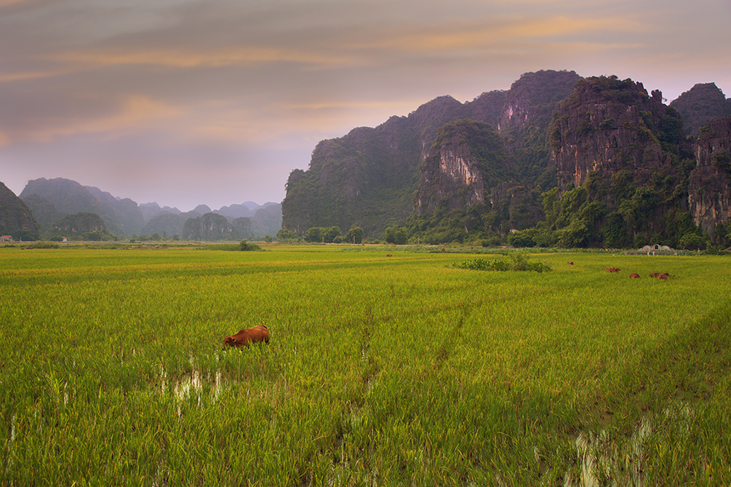
| 24 |
Sep 19 |
Comment |
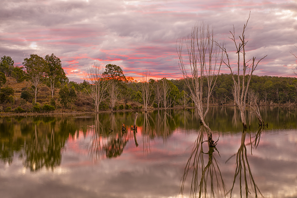
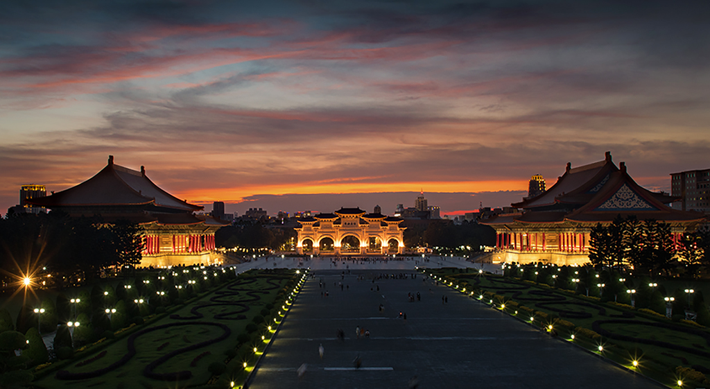
Beautiful landscape with stunning colors. Great photo.
The only problem, in my opinion, is that the road takes the eye away from the photo. The image would have been much stronger had the eye stayed within the frame of the photo until disappearing into the horizon. |
Sep 27th |
| 24 |
Sep 19 |
Comment |
Good image of the Cathedral showing details.
I agree that the lens distortion is a problem. If the photo would have been taken around sunset, the sky would have been more attractive. |
Sep 27th |
| 24 |
Sep 19 |
Comment |
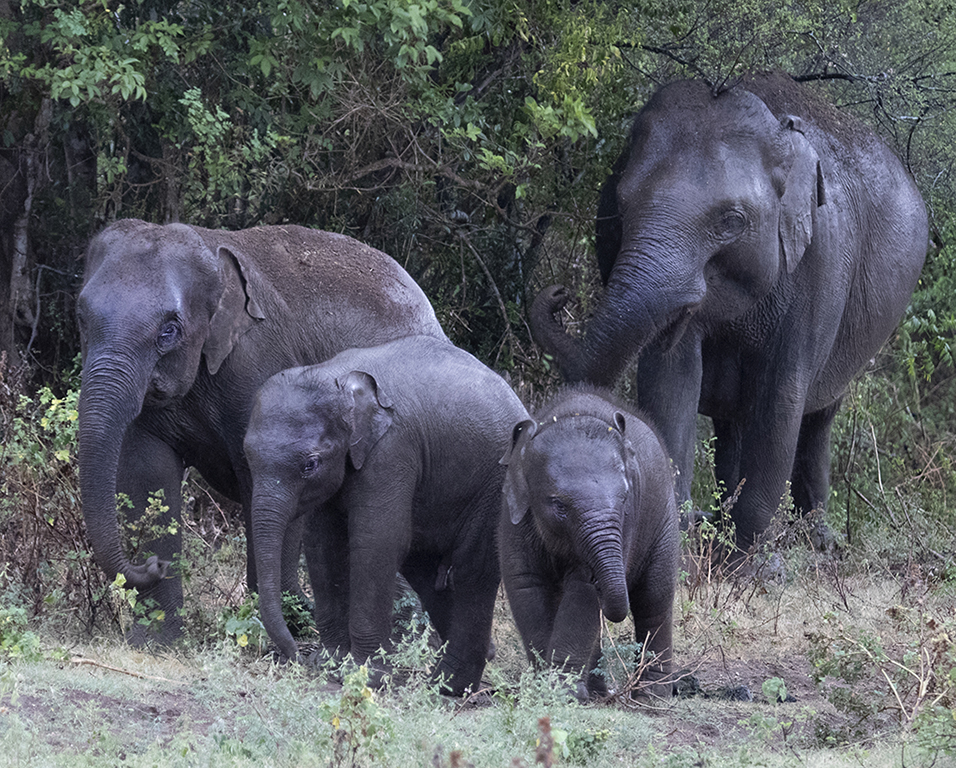
A good photo, well focused, good details of animals and surrounding. The animals lying in a circle also adds value.
It would have been much stronger, in my opinion, if you would have waited until most of them look at the direction of the camera. There is not much direction to follow in this photo. The eye goes all over. |
Sep 27th |
| 24 |
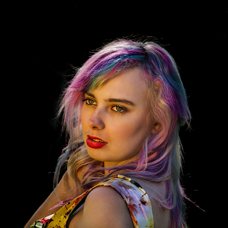
Sep 19 |
Comment |
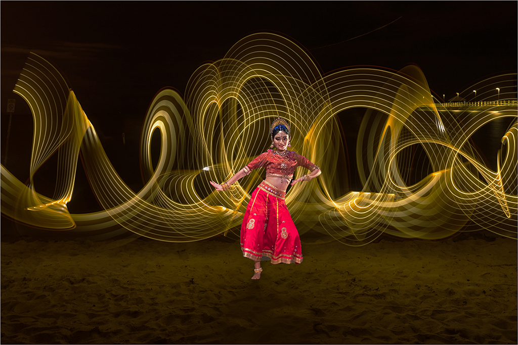
I have seen a lot of her photos as we both are from the same club. She is a superb photographer!
I love this photo. The subtle pleasing colors make the photo beautiful, together with its simplicity. One might argue that the negative space on the top does not contribute to the photo, but I think it adds value. I don't have any ideas for improvement. |
Sep 27th |
| 24 |
Sep 19 |
Comment |
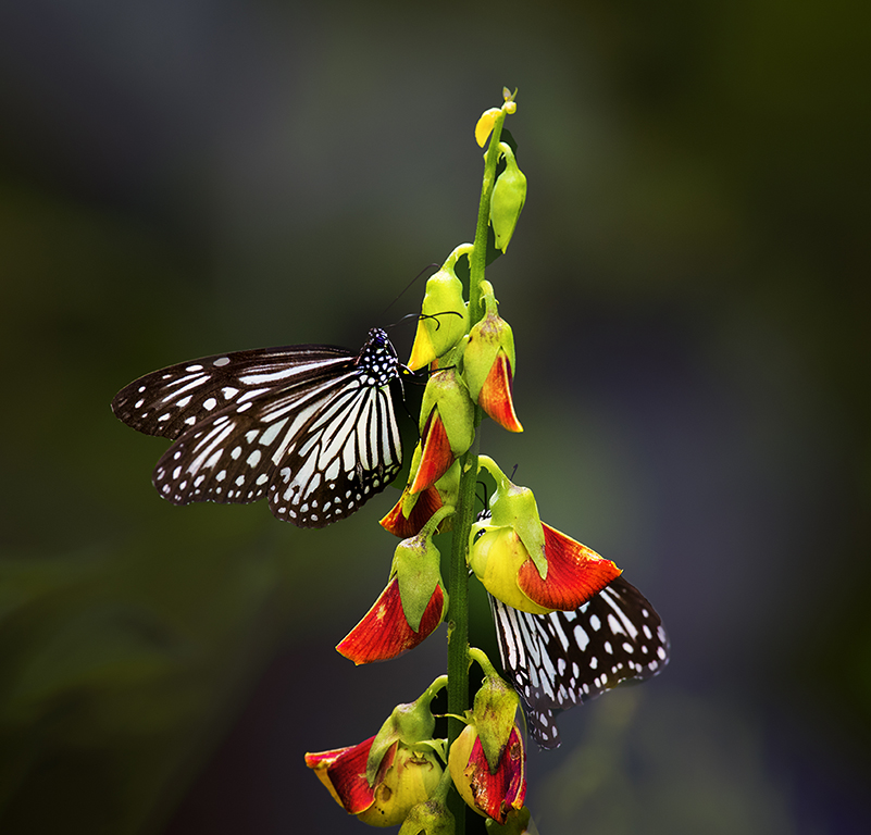
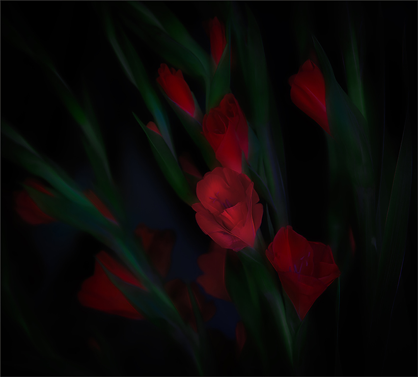
Beautiful photo. Red color of the flower draws attention and provides a good contrast to the background. Details of leaves and water drops add beauty to the photo.
The flower petals are opened towards the top left. Therefore, it would have been good, in my opinion, if more space is shown in top left area, which would have made a much stronger image. |
Sep 27th |
6 comments - 0 replies for Group 24
|
6 comments - 0 replies Total
|