|
| Group |
Round |
C/R |
Comment |
Date |
Image |
| 82 |
Nov 18 |
Comment |
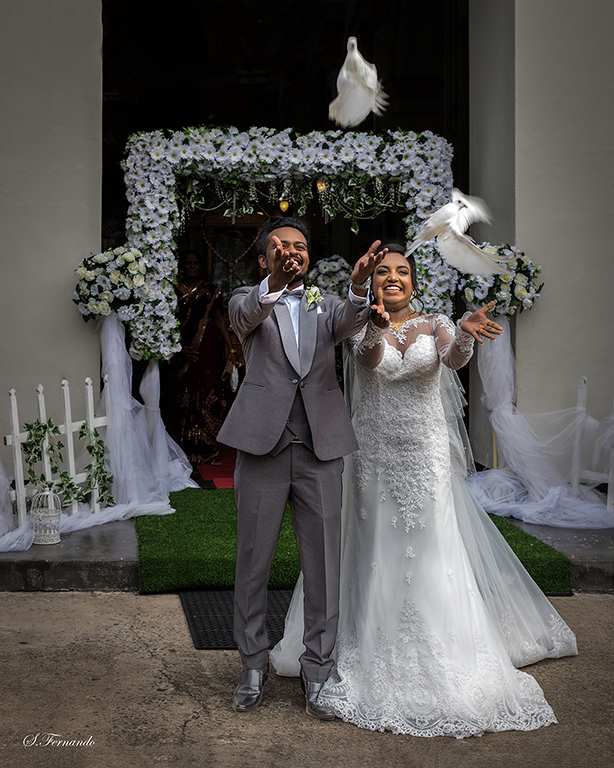
You have captured the neutral expression (or negative feelings!) of a child. If you want to use this photo for a competition, I think it is better to edit her face a little so that it will pop up. |
Nov 15th |
| 82 |
Nov 18 |
Comment |
Thanks Dave |
Nov 11th |
| 82 |
Nov 18 |
Reply |
My other problem is cropping at the bottom may bring the horizon close to the center, losing the rule of third position. |
Nov 8th |
| 82 |
Nov 18 |
Reply |
Thanks Kumaraswamy
I will do some cropping and see. |
Nov 8th |
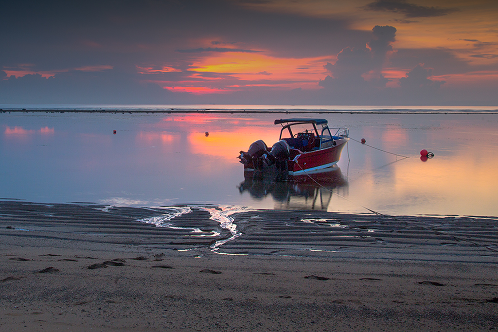
| 82 |
Nov 18 |
Reply |
Thanks Graham
I tried it, but I thought the whole image was darker. I will try again leaving only the boat darker this time. |
Nov 8th |
| 82 |
Nov 18 |
Reply |
Thanks Vera |
Nov 6th |
| 82 |
Nov 18 |
Comment |
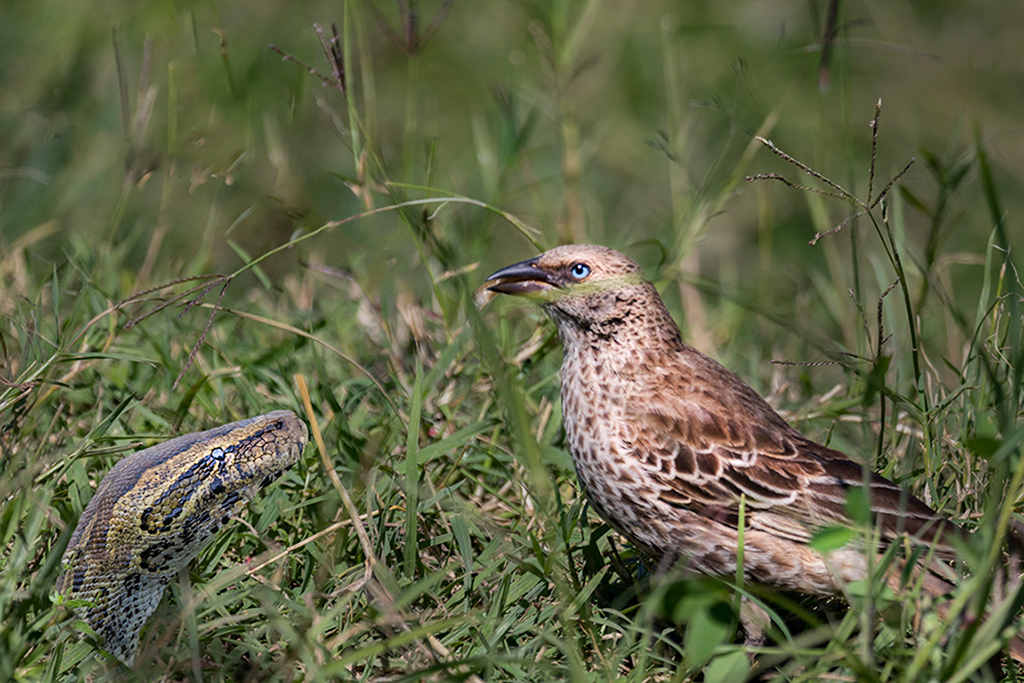
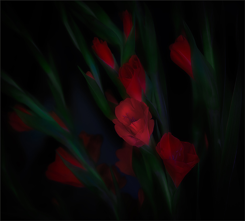
Hi Vera
Beautiful main subjects, the girl and the snake. Sun rays add to the beauty of the photo.
The slight distraction is the background vegetation, which looks like bit over saturated and blurred.
The part of sun rays falling on to the snake and the girl could be enhanced with little burning and dodging.
|
Nov 6th |
| 82 |
Nov 18 |
Comment |
I like the photo, especially its pleasing colours.
Good idea to consider reducing the brightness of the sky as it looks bit overpowering for me. |
Nov 5th |
| 82 |
Nov 18 |
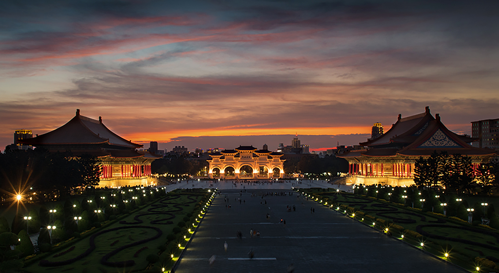
Comment |
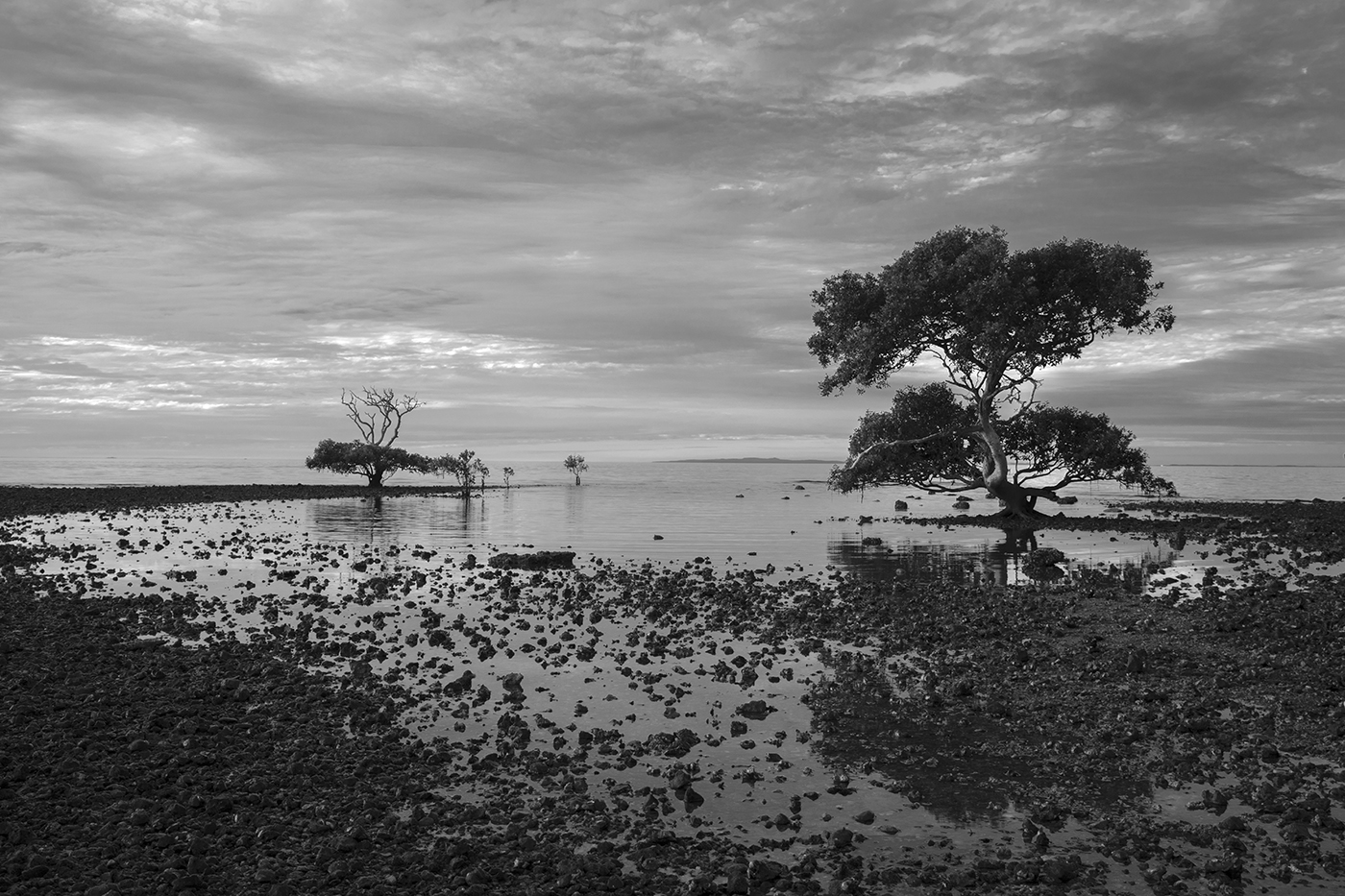
Good angle showing the architectural beauty of the building. Attractive sky with clouds.
It looks like the columns are not vertical. This can be easily adjusted in Lr.
Hardly visible slight vignette may also be good to focus attention to the structure.
|
Nov 5th |
| 82 |
Nov 18 |
Reply |
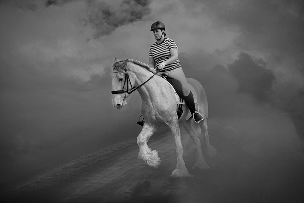
Good image showing the countryside.
I think Graham has improved the photo quite a lot. I can see a bush near the top towards the right side, which is not in Lou's original photo.
I like to see a little bit more of the man's face if possible, perhaps using dodging. Also burning and dodging may be used to enhance the appearance of the horse and people to make the photo more 3D. |
Nov 4th |
| 82 |
Nov 18 |
Comment |
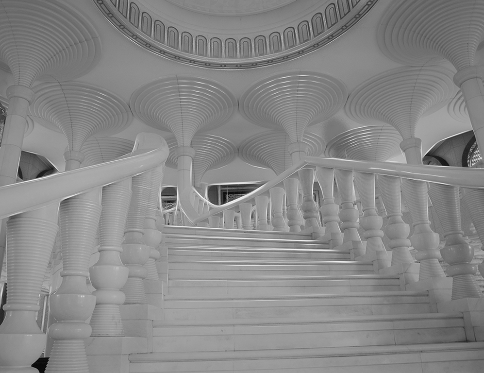
Hi Graham
I like the symmetry and different lines converging at the center. Different shades add to the beautify of the photo.
When looking at this photo, my eye immediately goes to lower left side, which is brighter. For me, the focal point is the darkest section in the middle.
In my case, I would reduce the brightness of the lower left section.
My monitor has the facility to look at photos turning them to black and white. For me, this photo is much better in black & white.
Sam Fernando |
Nov 4th |
6 comments - 5 replies for Group 82
|
6 comments - 5 replies Total
|