|
| Group |
Round |
C/R |
Comment |
Date |
Image |
| 5 |
May 19 |
Comment |
This is another well-constructed and attractive image, Nick. I do have a couple of concerns though as there is haloing around the edges of your granddaughter and her back doesn't meet the pumpkin on the left-hand side. I feel too that the image could do with some shadows to make it more three dimensional. Having said all that, I do agree with Pete that it displays your wonderful imagination yet again. |
May 15th |
| 5 |
May 19 |
Reply |
It's very kind of you to say that, Gary. Thank you very much... |
May 6th |
| 5 |
May 19 |
Comment |
Thanks so much for your very kind comments. I've made a number of PowerPoint presentations showing the layer by layer development of a number of my images for talks I give occasionally. I've been planning, for some time, to turn these into voice over screen videos to post on my website. You've encouraged me to do this now and I'll start with this one. When it's up , I'll let you know. |
May 6th |
| 5 |
May 19 |
Comment |
I like this very much Richard. Particularly, the patterns and dynamism created by the swirls. The simple colour palette finishes it off and makes for a very appealing image. |
May 6th |
| 5 |
May 19 |
Comment |
I love this image, Oliver (or should I call you Pete from now on??). It's very well composed and captures the joy of the little girl beautifully. I wouldn't change a thing. |
May 6th |
| 5 |
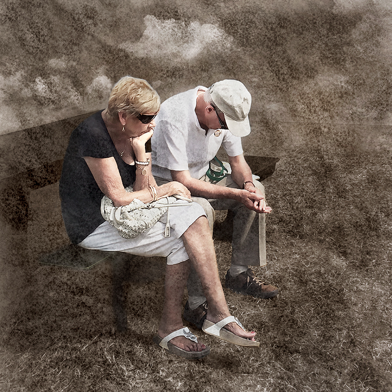
May 19 |
Comment |
You've stopped the action really well, Phil but I have to agree with the others that the background makes the image very confusing. I once interviewed Bob Martin, who is a brilliant sports photographer and the Chief photographer for the London Olympics, One thing he emphasised was the importance of a good background in sports photography saying that no matter how good the action is, a poor background leads to an unsatisfactory image. His way of working is to look at each venue carefully to find a good backgrounds then chose an appropriate one and wait for the action to happen. Have a look at his web site at
http://www.bobmartin.com/ - I hope you find it inspiring
|
May 6th |
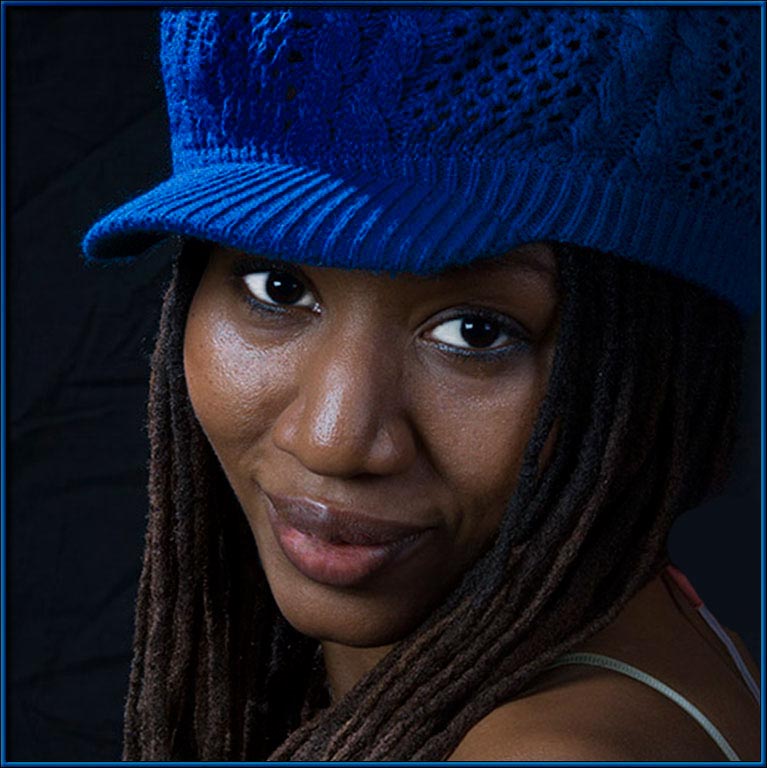
| 5 |
May 19 |
Comment |
Lovely composition, Barbara. I like, particularly, the diagonal created by the eyes. I agree with the others, though, that her eyes are a tiny bit too white and I also find her hat a bit distracting. I took the liberty of modifying the image using Viveza to darken the eyes and the hat and I hope you find this useful. |
May 6th |
 |
6 comments - 1 reply for Group 5
|
6 comments - 1 reply Total
|