|
| Group |
Round |
C/R |
Comment |
Date |
Image |
| 5 |
Mar 18 |
Comment |
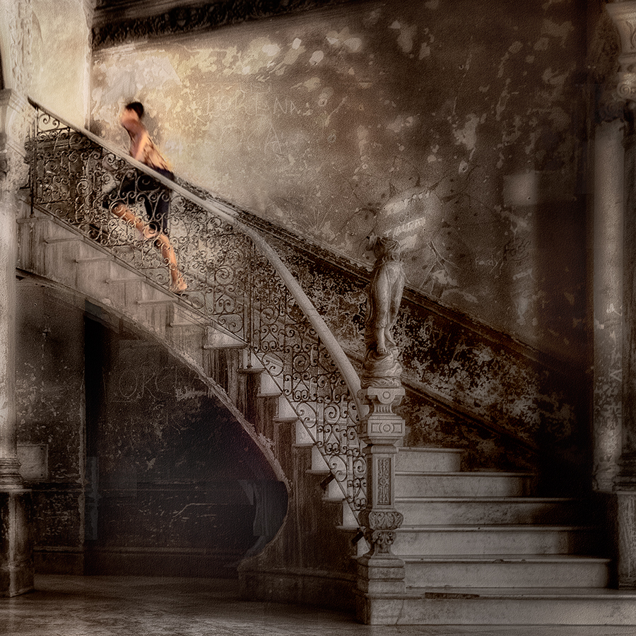
I like this very much, Richard. It's a good composition and it made me smile. The background it very effective but I do agree with the others about the front wheel and foot. |
Mar 8th |
| 5 |
Mar 18 |
Comment |
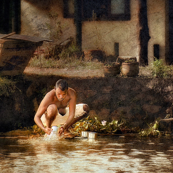
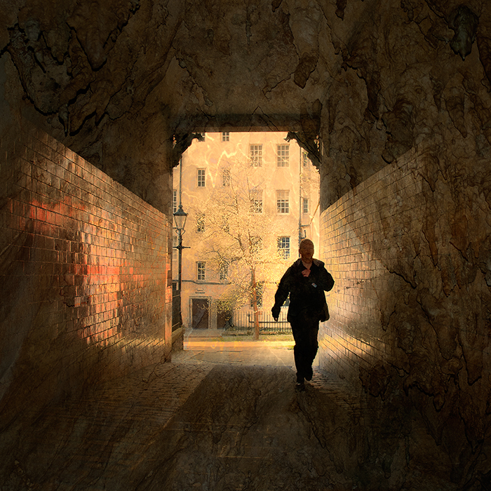
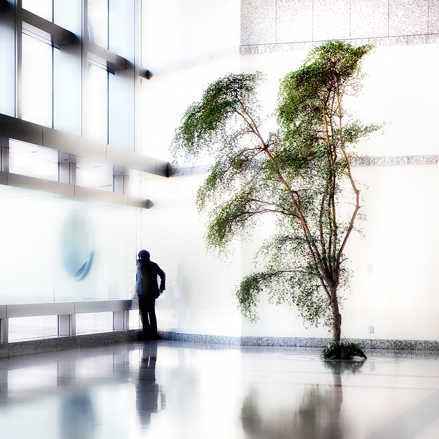
This is another very interesting image from you, Nick. I love the colour palette and the way it ties the whole image together. There is clear haloing around the house and the light house, though. It would make the image even better if you cloned that out. |
Mar 8th |
| 5 |
Mar 18 |
Comment |
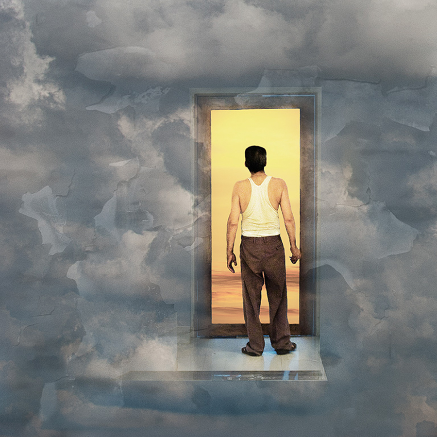
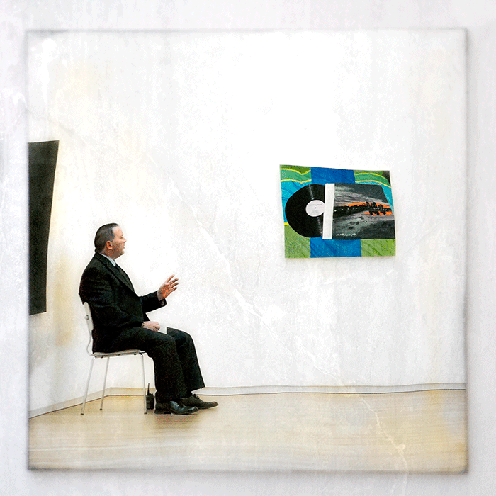
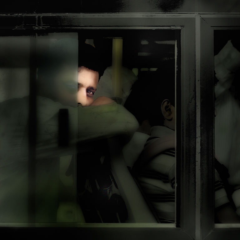
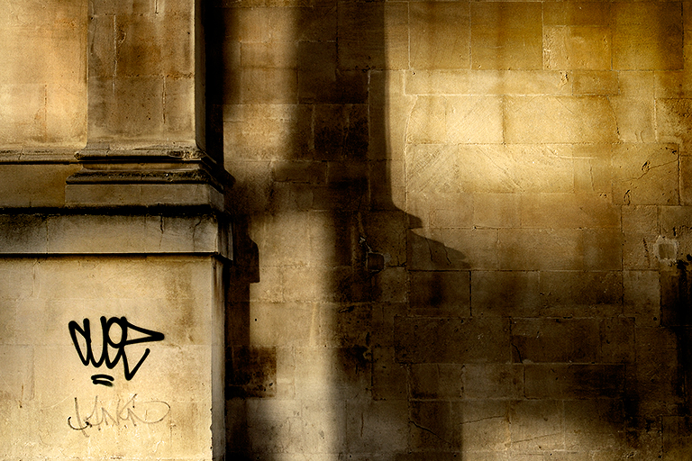
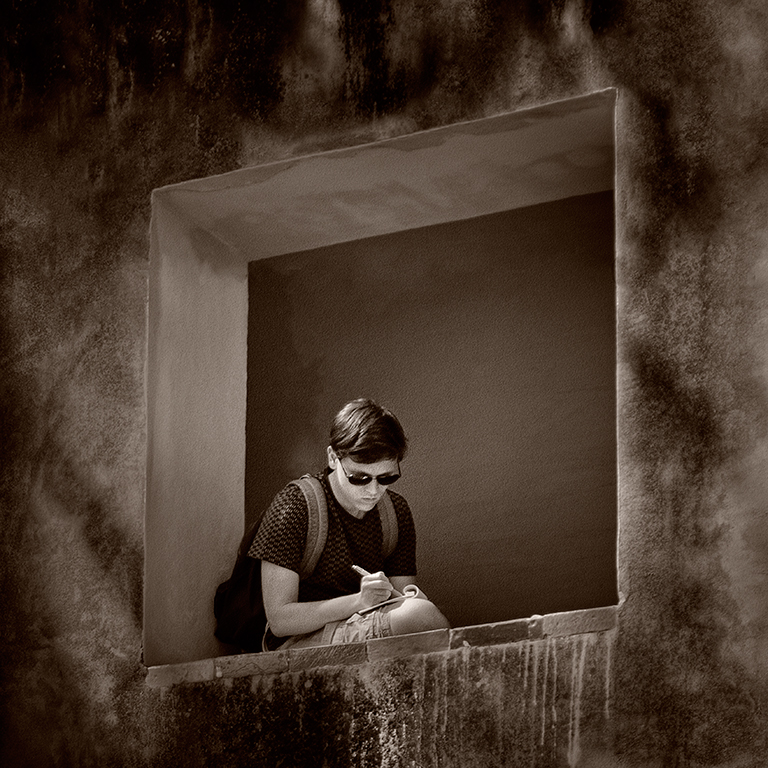
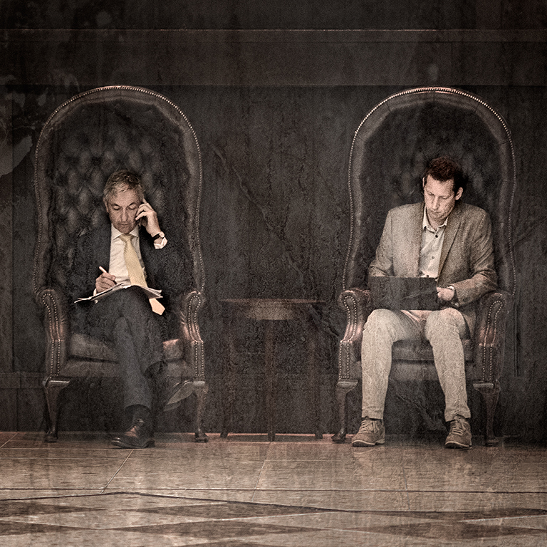
I like the patterns and the colour palette in this John, and the way that the hands of the clock are out of focus, I think it would be even better if you introduced a bit of dark red into the extreme top right-hand corner so that the rectangular frame was preserved rather than being cut off. It would be too if you could clone out the black box in the bottom right, although I do realise that it would be a lot of work to do this. |
Mar 8th |
| 5 |
Mar 18 |
Comment |
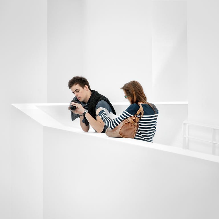
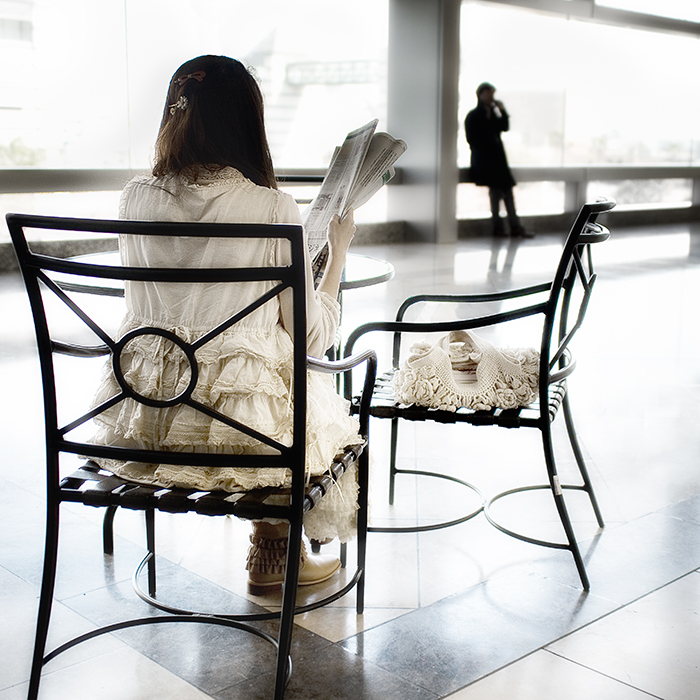
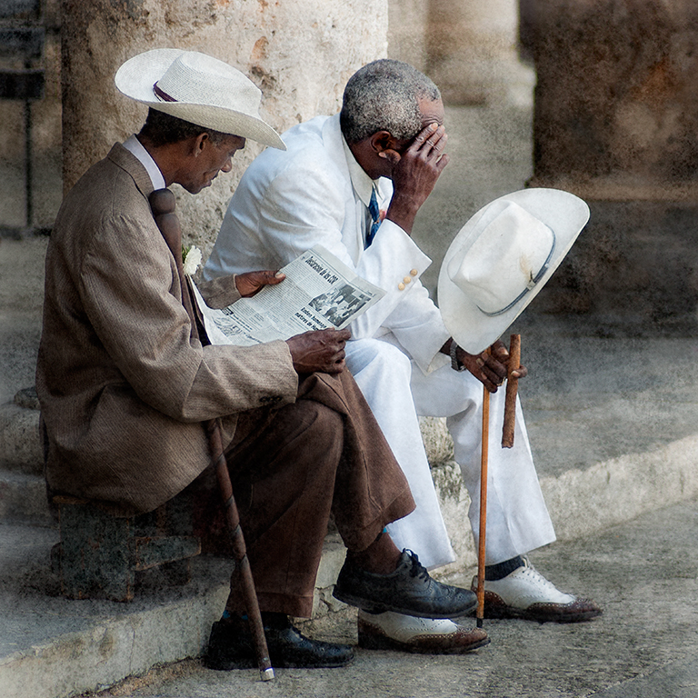
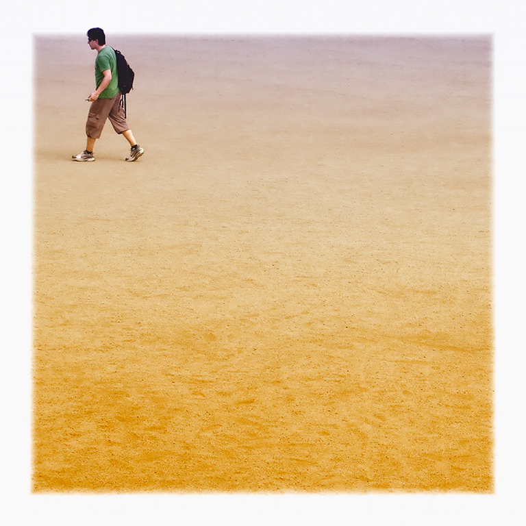
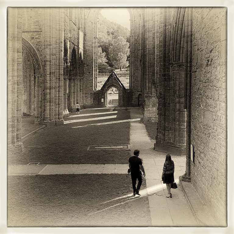
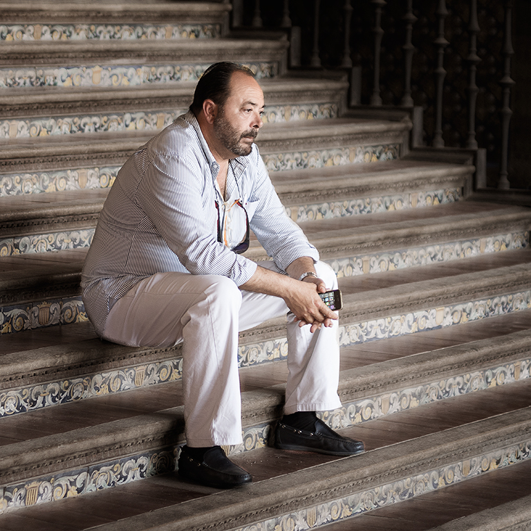
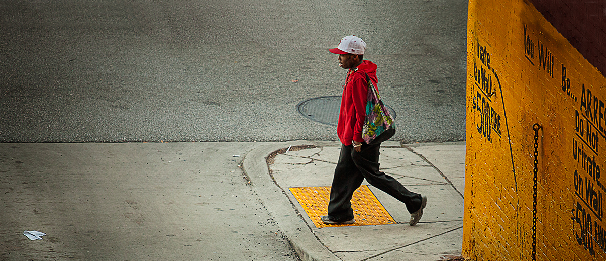
This is a good street shot, Oliver. I like the red and yellow/ Orange too. I do find that the man is rather squashed against the top of the frame and that there is a lot of negative space at the bottom of the image which isn't really doing anything. I've taken the liberty of doing a little work on it, namely extending the canvas at the top and adding to the top of the image by (rather roughly) cloning some of the lower bits and extending the wall upwards. I've also used Nik Darken / Lighten Centre to change lighting a little. I think that the piece of paper in the road is crucial to the success of this image as it takes the eye to the bottom left hand side of the image yet stops you wandering off. So, I've left this in. I hope you like it. |
Mar 8th |
 |
| 5 |
Mar 18 |
Comment |
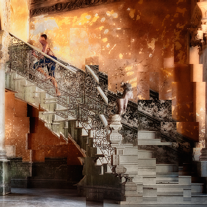
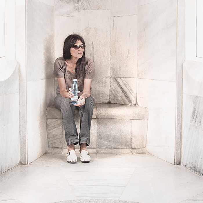
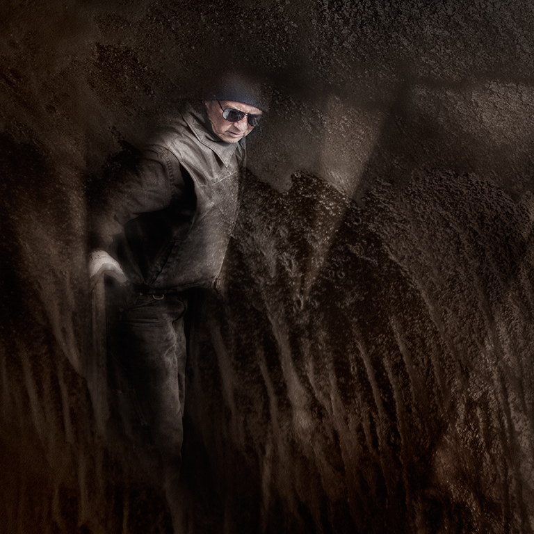
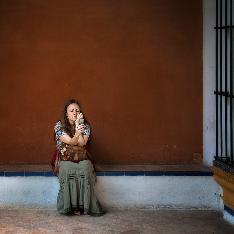
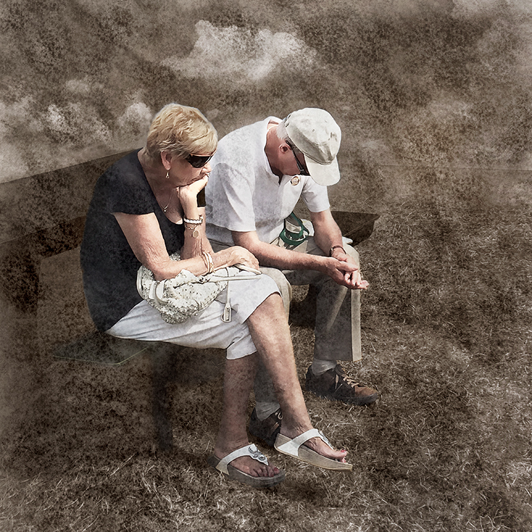
I like the composition of this, Barbara, but I find the orange far too dominant as it keeps pulling my attention away from the rest of the image. I tried toning it down, but I didn't find that it made much difference. I thought, though, that that it would work better as a monochrome image as this would make me concentrate on the shapes and patterns rather than having the distraction of the colour. My attempt is below and I hope you like it. |
Mar 8th |
 |
5 comments - 0 replies for Group 5
|
5 comments - 0 replies Total
|