|
| Group |
Round |
C/R |
Comment |
Date |
Image |
| 5 |
Feb 18 |
Comment |
Thanks for your comments. I'm not sure why it doesn't look sharp on your monitor though, Barbara as the print is very sharp and has a lot of fine details in it. It certainly works in B&W Oliver and I could easily have gone down that route so thanks for the suggestion. I'll give some thought as to which I prefer. |
Feb 17th |
| 5 |
Feb 18 |
Comment |
Another of your well executed, amusing images, Nick. They always brighten my day when I see them. I agree both with the suggestions made by Oliver and Barbara. |
Feb 17th |
| 5 |
Feb 18 |
Comment |
This is a very attractive image John. I love all the shapes and the way that they interact. The only issue I see with it is that the red of the vase has no detail at all and this is very distracting. Red is such a difficult colour to get detail in. If there could have been some of the texture which is in the reflection of the vase in vase itself, it would have made it into an even better image. |
Feb 17th |
| 5 |
Feb 18 |
Comment |
This is a lovely image, Oliver. You done a great job on the lighting which is now excellent. I really like it and I think that it would do well in international exhibitions. |
Feb 17th |
| 5 |
Feb 18 |
Comment |
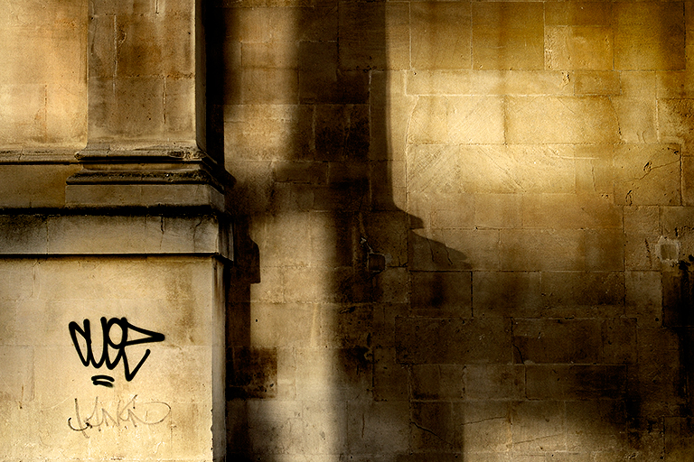
I Like this very much, Barbara. The shadow makes it into a very interesting image. I felt too that the leaf was too bright and distracting and I tried darkening the whole image with a Brightness / Contrast layer the bringing back the brightness on the image except for the leaf. Somehow it lost the impact. So, on balance I prefer it just as it is. |
Feb 17th |
5 comments - 0 replies for Group 5
|
5 comments - 0 replies Total
|