|
| Group |
Round |
C/R |
Comment |
Date |
Image |
| 5 |
Nov 17 |
Comment |
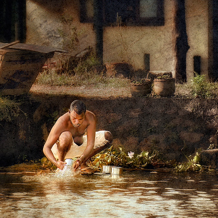
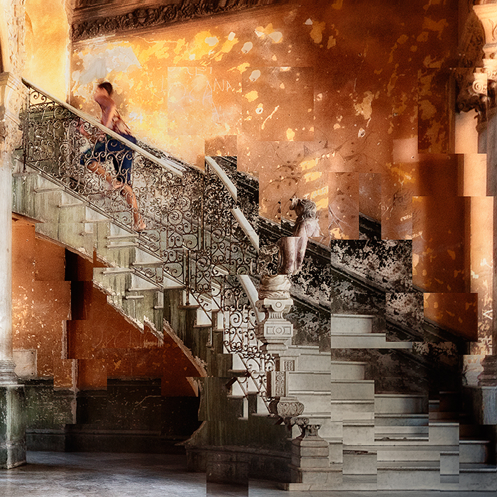
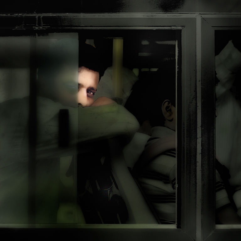
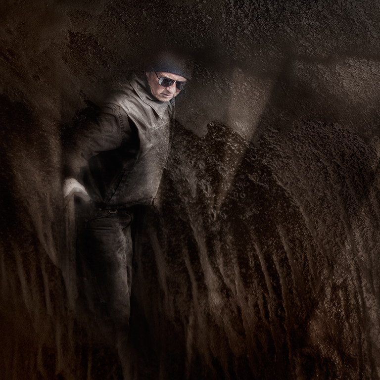
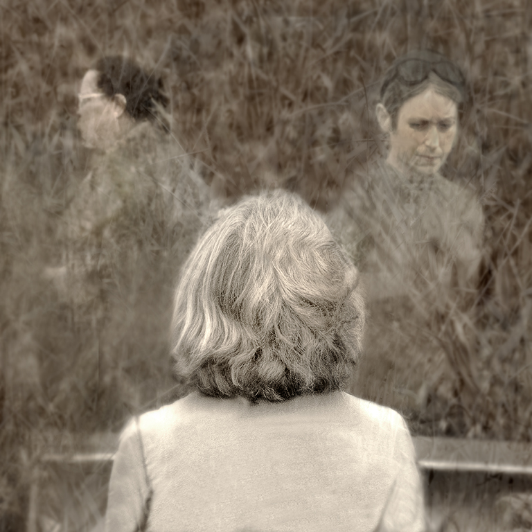
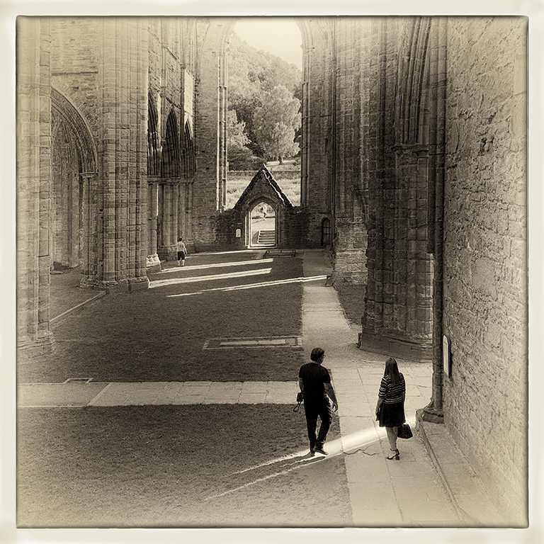
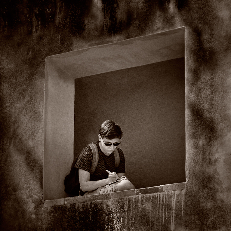
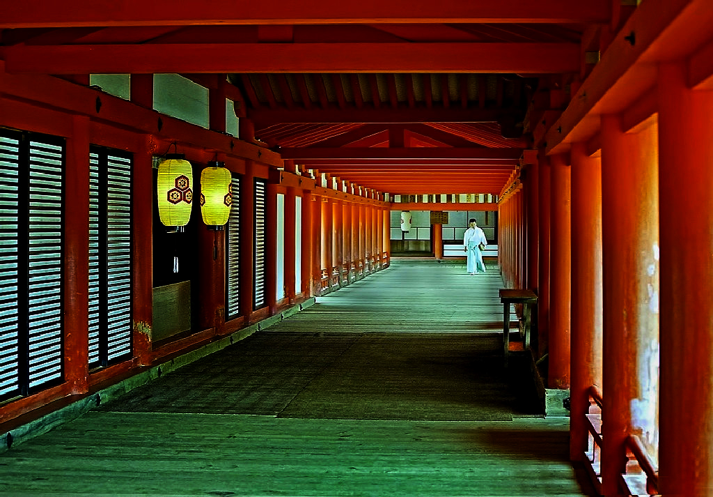
I like your use of the leading lines and the placement of the figure in this image very much, Richard, and you have produced a very attractive image. I wondered if it might be improved even more if you darkened the edges to emphasise the figure more and I took the liberty of trying the NIK Darken / Lighten Centre filter with a bit of additional vignetting on the lower edges of the image. My version is attached for your consideration. I hope you like it. |
Nov 25th |
 |
| 5 |
Nov 17 |
Comment |
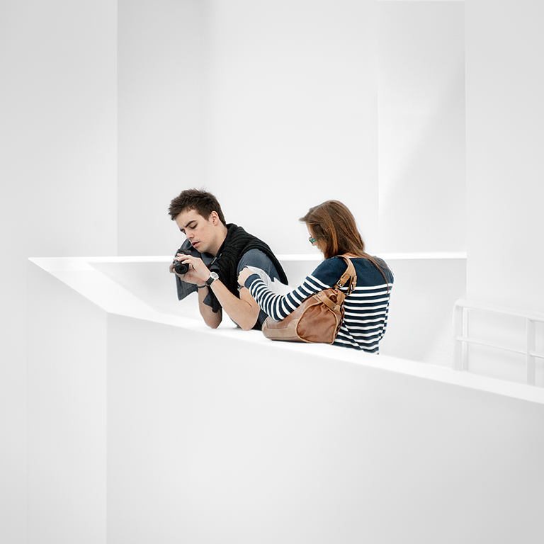
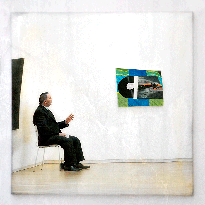
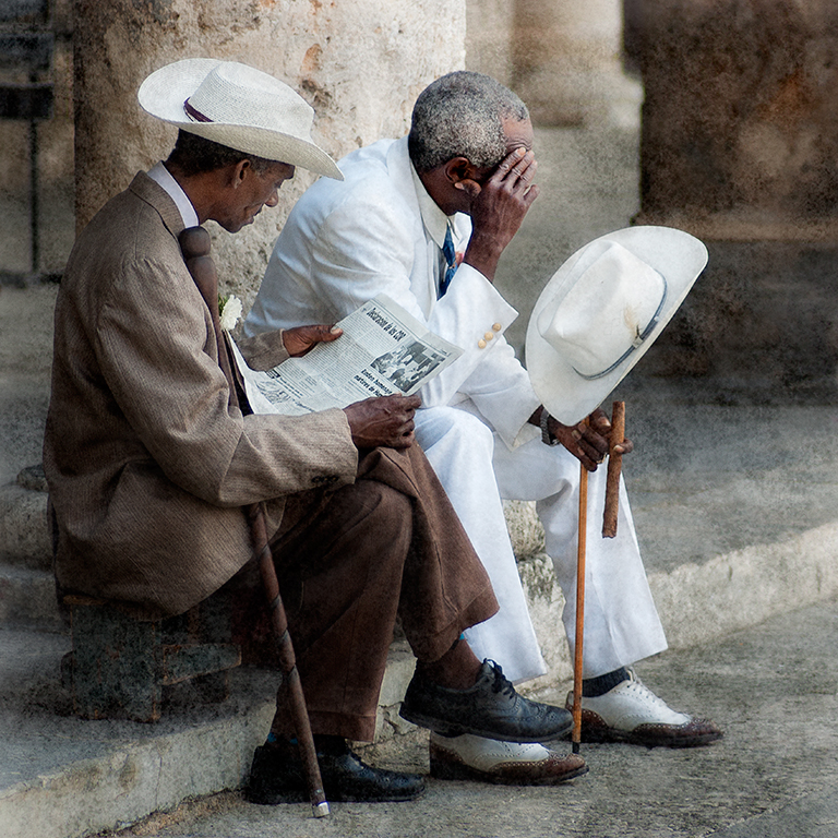
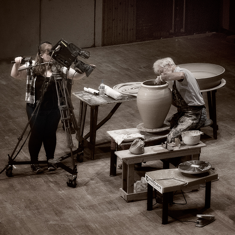
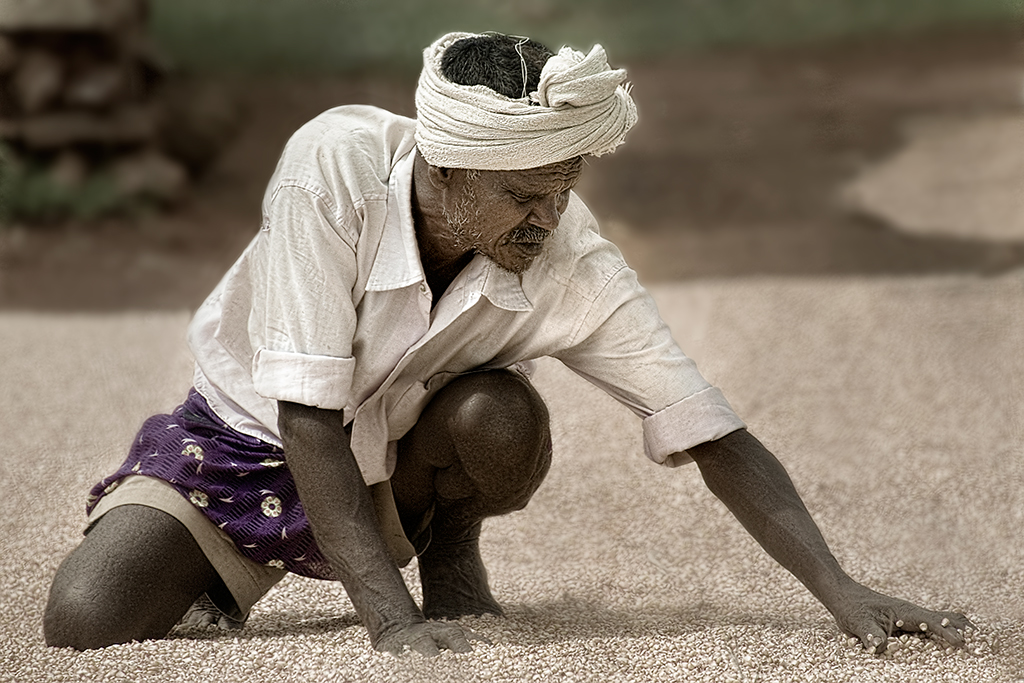
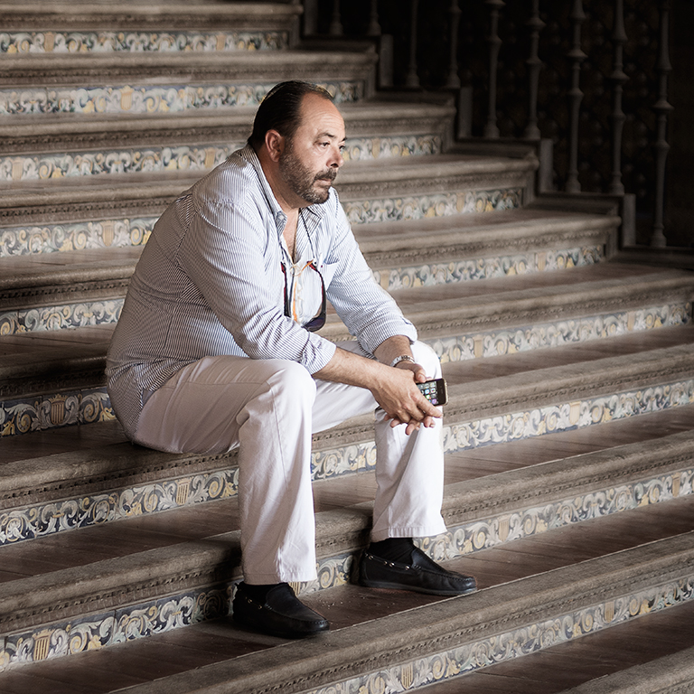
Another very pleasing and professionally put together image, Nick. I like the colour palette very much |
Nov 25th |
| 5 |
Nov 17 |
Reply |
Sorry, Oliver - no idea why I called you Phil :-( |
Nov 25th |
| 5 |
Nov 17 |
Comment |
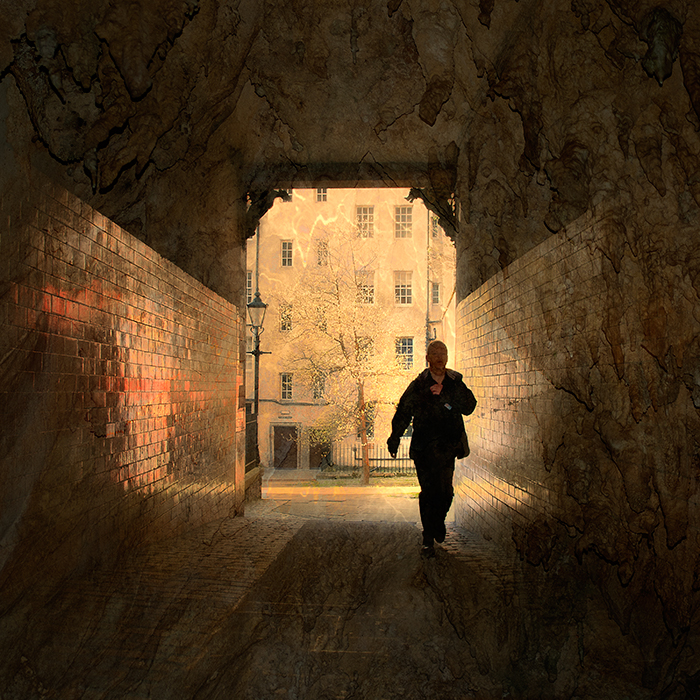
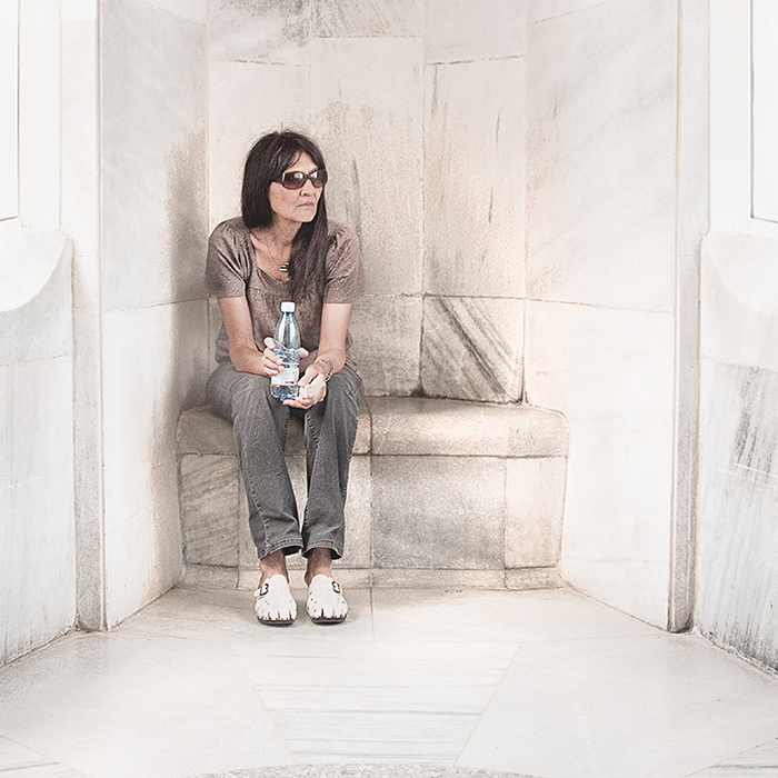
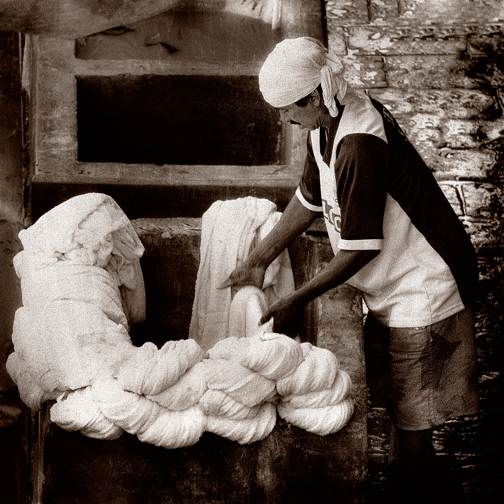
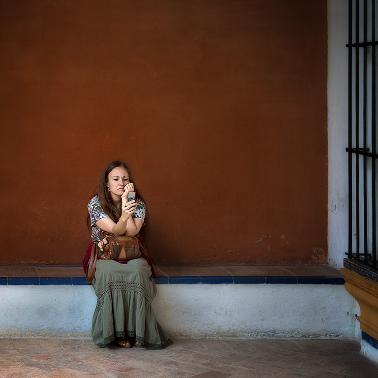
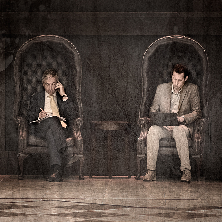
I agree with Barbara. You did an amazing job in rescuing the details, Phil and the additional modifications suggested above make it into a really interesting image. |
Nov 22nd |
| 5 |
Nov 17 |
Comment |
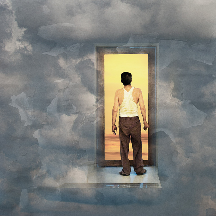
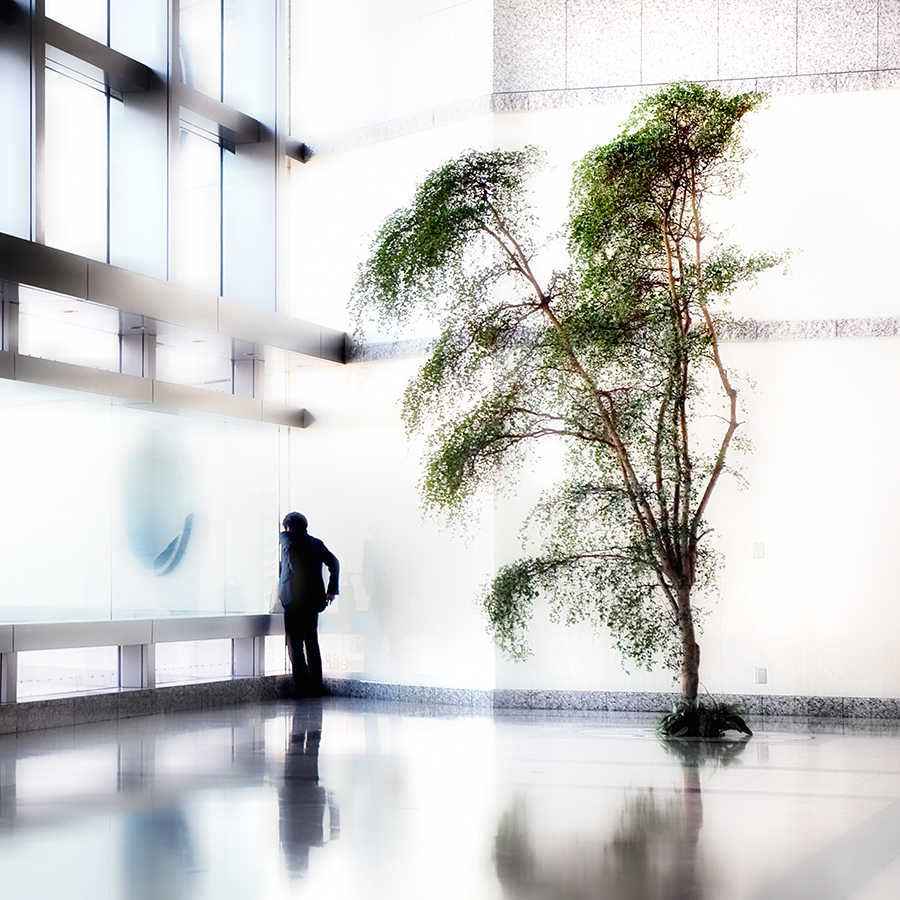
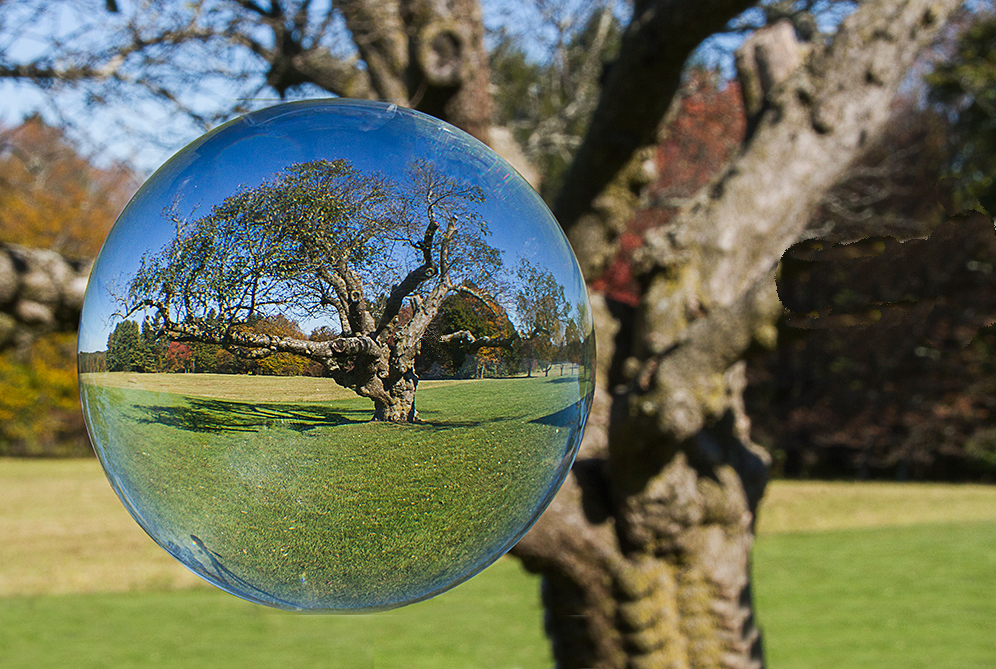
I really like the concept of this, Phil. I'm not sure about the notice particularly the out of focus one which I find rather distracting. I feel, too, that the sphere would be better if it were floating rather than being right up against the bottom edge. I've had a go at doing this - see image below. I hope it's useful. |
Nov 22nd |
 |
| 5 |
Nov 17 |
Comment |
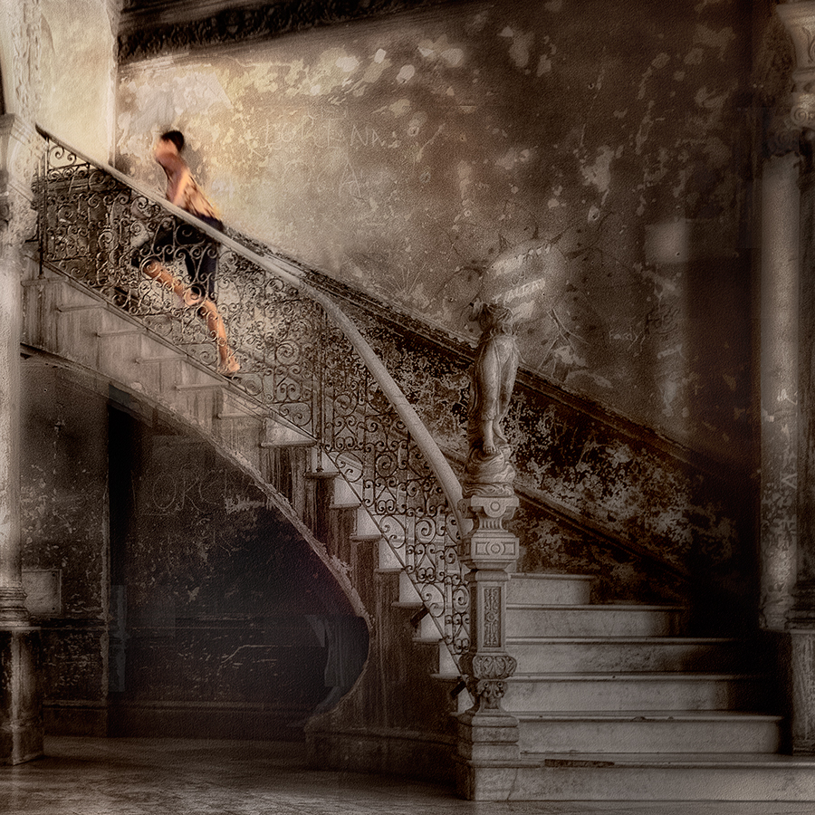
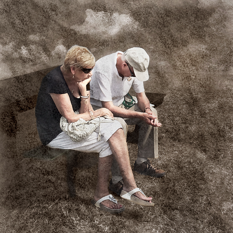
It's a great idea to remove the cluttered background which is very distracting, Barbara. I agree with you that the edges need cleaning up. As to the wispy hair, It is a time consuming job but not too difficult if you increase the size so you can see the individual pixels, use a layer mask on the layer you used for the new background, remove the new background around the hairs then and paint it back in leaving only the hair wisps visible. |
Nov 22nd |
5 comments - 1 reply for Group 5
|
5 comments - 1 reply Total
|