|
| Group |
Round |
C/R |
Comment |
Date |
Image |
| 5 |
Oct 17 |
Reply |
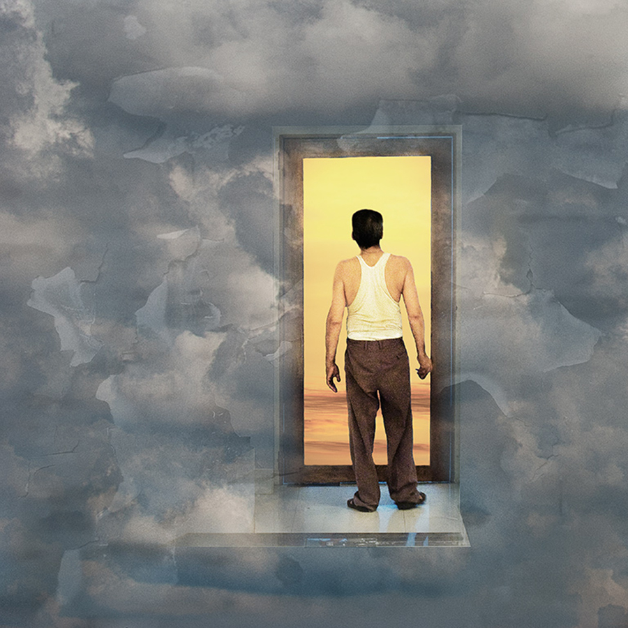
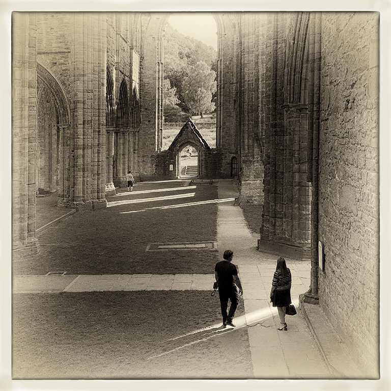
Thanks Oliver. I did try taking out the camera and strap his is holding but I felt that the composition lost something without it. Thanks for the suggestion though. It's great to have such feedback. |
Oct 24th |
| 5 |
Oct 17 |
Reply |
Thanks Richard. Your suggestions are helpful. I've modified the image accordingly and it does improve it.
When I get the time, I plan to start making some tutorials for my website and for a photography education project my daughter and I are working on.
|
Oct 24th |
| 5 |
Oct 17 |
Reply |
Thanks Barbara, I'll keep an eye on Group 51 to see what they get up to... |
Oct 24th |
| 5 |
Oct 17 |
Comment |
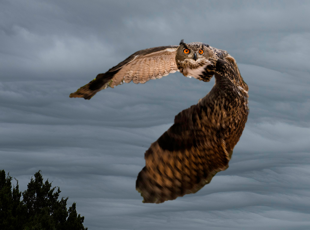
This is a very striking image, Richard. As it stands though the owl looks as if it has been cut out and imposed on the background. I took the liberty of taking it into Photoshop and running around the edges of the owl with the 'blur' tool to soften the edges. For me, this makes it a lot more realistic - see below. |
Oct 24th |
 |
| 5 |
Oct 17 |
Comment |
Yet another of your very professionally produced composites, Nick. It made me smile - a great start to a dull and autumnal Tuesday morning here in the UK. |
Oct 24th |
| 5 |
Oct 17 |
Comment |
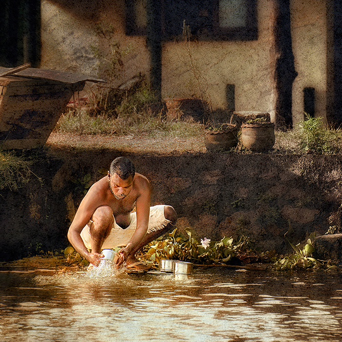
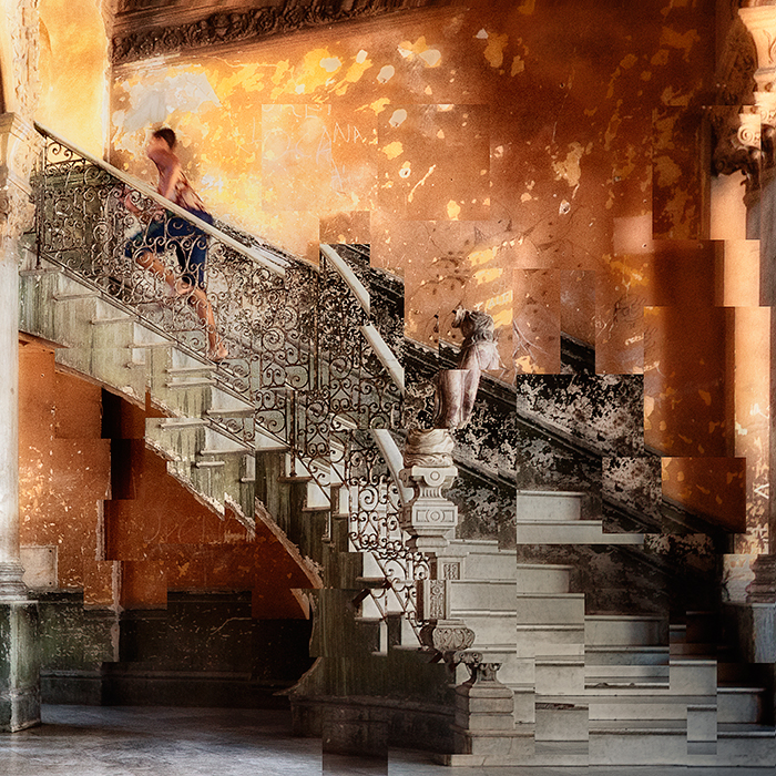
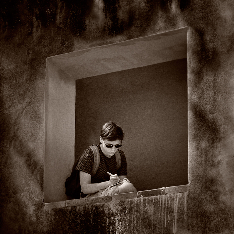
Potentially, I think this is an interesting image, John, but, as you presented it, the house and stairs get rather lost in the complex background. I think Oliver's monochrome image sorts out this problem, though. I can't make my mind up as to which of Oliver's versions I prefer. On balance though I feel the monochrome one is better. In this case the colour detracts slightly from the strong patterns in the image. |
Oct 24th |
| 5 |
Oct 17 |
Reply |
If it doesn't speak to you then you should abandon it. Having said that I think it would make a very popular greetings card and it's a significantly better image than most you see on greetings cards. Perhaps you should put it in the 'collection of possible greetings cards images' draw and see if any more turn up in your work. |
Oct 24th |
| 5 |
Oct 17 |
Comment |
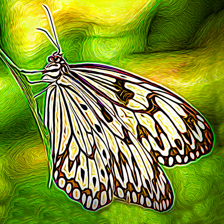
The filter has produced an attractive stylised image, Oliver, but it does still look like a photograph of a butterfly on a leaf which has been manipulated with a filter, as there is a lot of negative space which detracts from the main subject. I thought that if you homed in on the butterfly to remove all this then it might look more like a Van Gough Painting rather than a photograph. My attempt at this is below. |
Oct 22nd |
 |
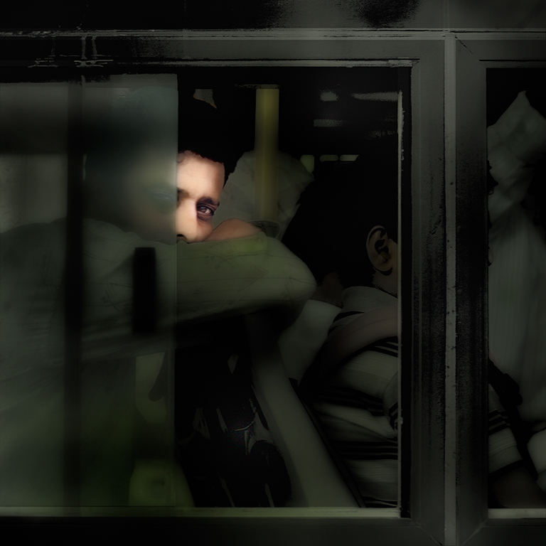
| 5 |
Oct 17 |
Comment |
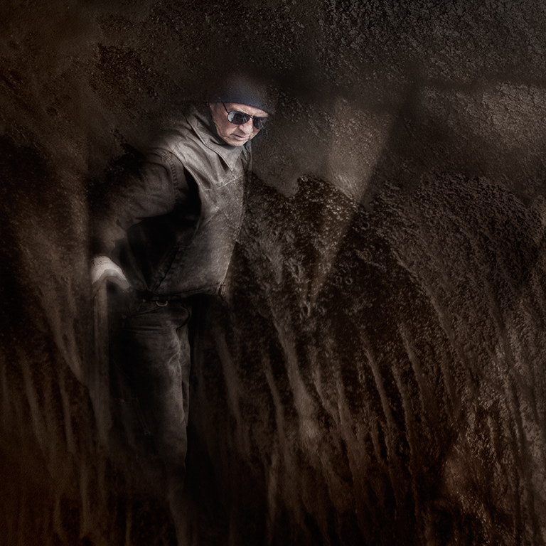
This has real presence and great impact, Phil. I like it very much. I reminded me instantly of the cover of the 'With the Beatles' Album from 1963. See:
https://en.wikipedia.org/wiki/With_the_Beatles#/media/File:Withthebeatlescover.jpg
You could add a little more detail to the right hand side of your face but it might take away the sense of mystery if it were overdone.
|
Oct 22nd |
| 5 |
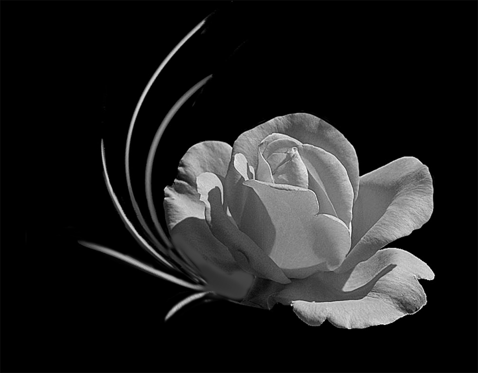
Oct 17 |
Comment |
We all seem to be thinking along the same lines with this, Barbara. It's a lovely image but the out of focus petals and the dark area are problems. There have been lots of suggestions to sort this and, for what it's worth, my version is below: |
Oct 22nd |
 |
| 5 |
Oct 17 |
Comment |
Here's the DNG RAW file which is saved at the same time in 645 Pro as the B&W square file |
Oct 8th |
 |
7 comments - 4 replies for Group 5
|
7 comments - 4 replies Total
|