|
| Group |
Round |
C/R |
Comment |
Date |
Image |
| 5 |
Sep 17 |
Comment |
Thanks for all your comments. It's always great to get the views of others on images and I do find them very useful and helpful. |
Sep 24th |
| 5 |
Sep 17 |
Reply |
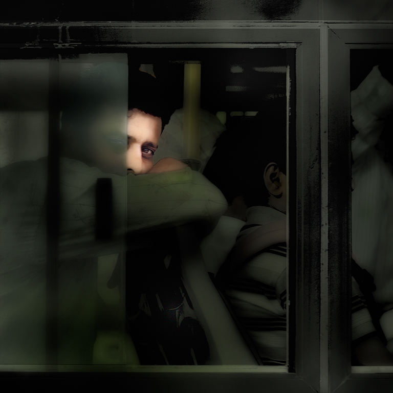
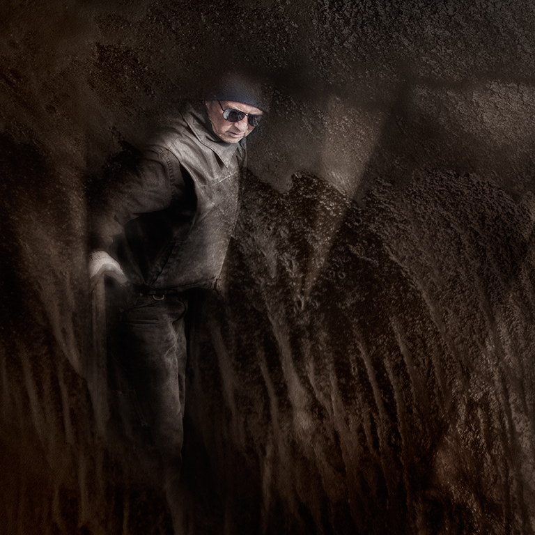
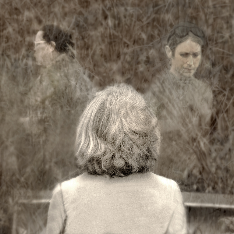
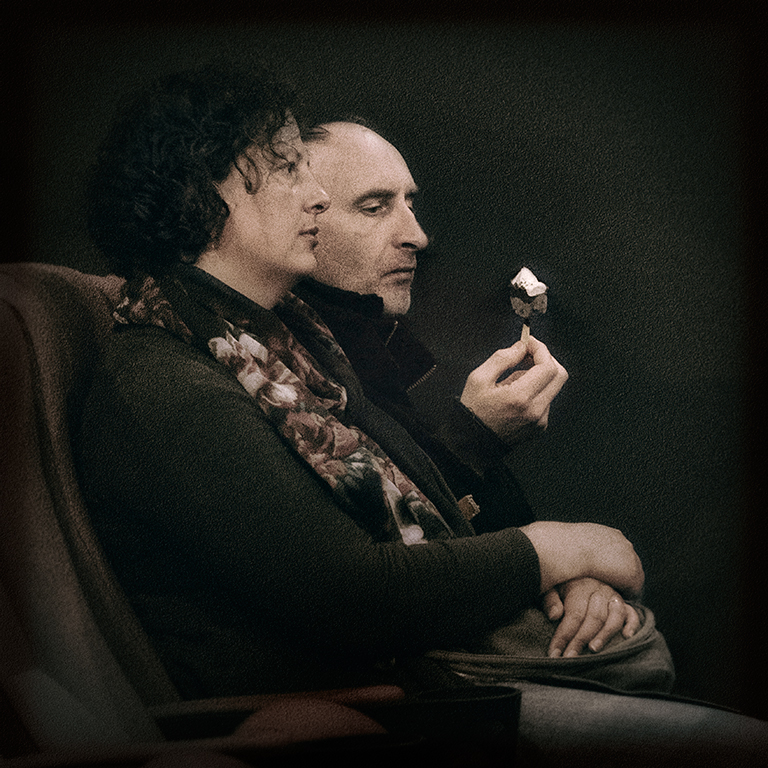
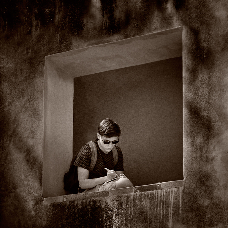
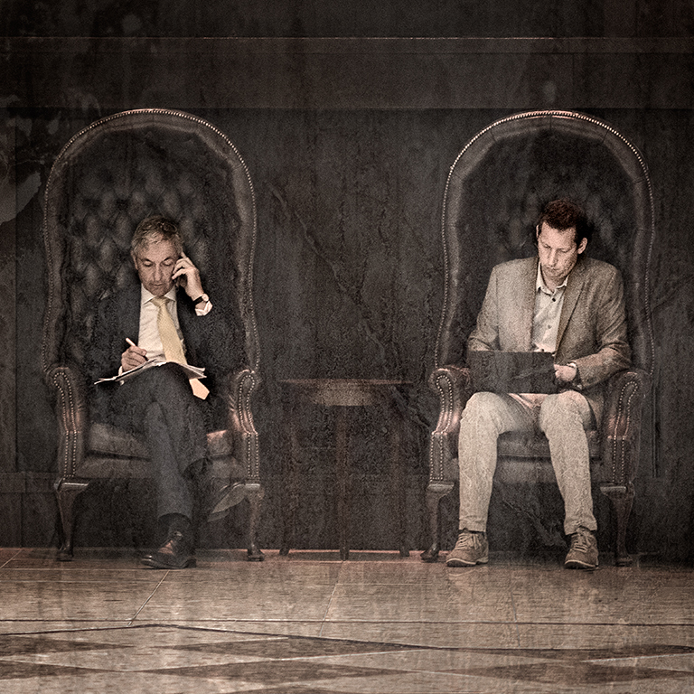
Thanks Oliver. This main issue in working on this image was in trying to get a good separation of the faces and the work have done in darkening down the man's face where the overlap is certainly helps. |
Sep 24th |
| 5 |
Sep 17 |
Comment |
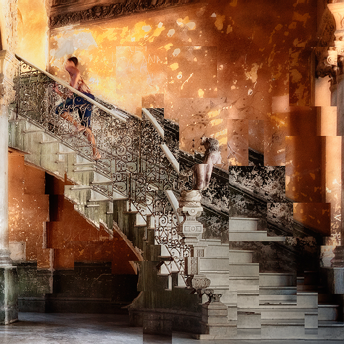
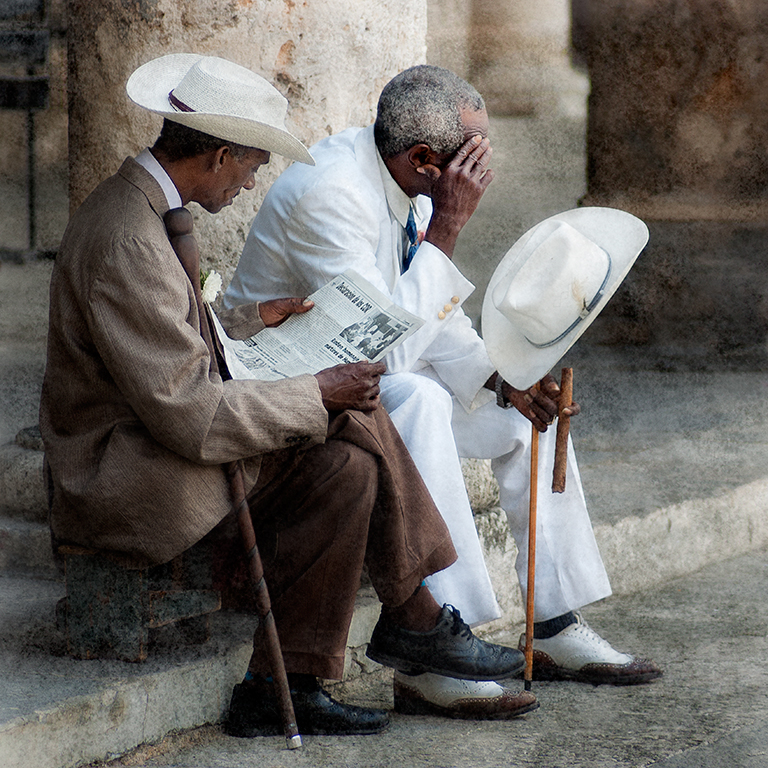
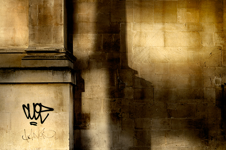
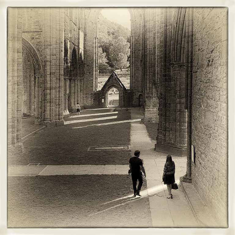
I like the overall composition and toning of this, Richard, with makes it an interesting image. Like John, I think there is too much foreground which draws attention away from the bridge and the people. The number of people on the bridge is also a bit distracting and there is no main focal point to look at. If it were mine I'd clone many of them out to leave just the people you want me to look at and which you feel make for a good composition. |
Sep 24th |
| 5 |
Sep 17 |
Comment |
This is a nice idea put together well to produce an attractive, well balanced, image, Nick. The girl looks rather flat and un-natural though which, for me at least, detracts from the image a bit. |
Sep 24th |
| 5 |
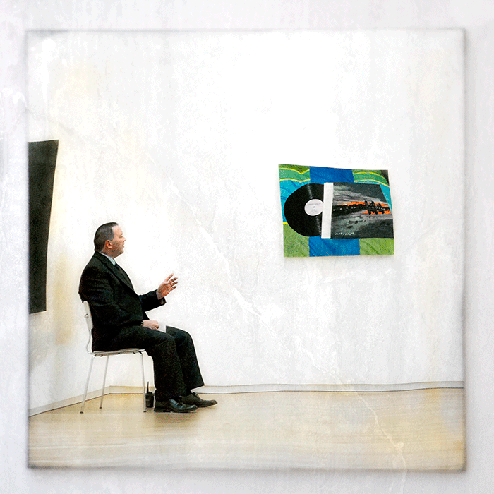
Sep 17 |
Comment |
This is a good shot, John, which tells a story. You've cropped it well to remove the distractions and to emphasise your subject, and the conversion to monochrome has given it an edgy feel. I think you could improve it further by toning down the blown highlights on her face and painting a little detail into them as well as removing the dark patch above the cup which is not present in the original.
|
Sep 24th |
| 5 |
Sep 17 |
Comment |
I love the idea of making the butterfly menacing, which you've achieved extremely well, Oliver. I've entered the discussion far too late though to make any further meaningful contribution.
I like the composition of the later image you posted with the two flowers and I feel that it has the makings of a great image. I'm sure it's worth going back to see if you can capture a similar one which, technically, is up to the standard you want.
|
Sep 24th |
| 5 |
Sep 17 |
Comment |
This is a great image, Phil, which captures her very well indeed. The expression on her face is great. It's well composed with a shallow depth of field which isolates her from the background. The colours all work well together, particularly the green of the lawn and the green apple in her hand. I like the image as it is because it sets her in the environment but I like Oliver's crop and changes too. |
Sep 21st |
| 5 |
Sep 17 |
Comment |
I'm sorry for not posting comments earlier. It's been a particularly busy time for me.
Although I like the diagonal leading to the Lace Maker in the original image, Barbara, I agree that it was a very good idea to replace it and the wall works very well. The edges where you've made the replacement, though, are a bit untidy in places and so she does look slightly as though she is pasted onto the background.
It's great to see so much comment on this and suggestions for changes and, coming very late into the discussion, I don't really have anything to add.
|
Sep 21st |
7 comments - 1 reply for Group 5
|
7 comments - 1 reply Total
|