|
| Group |
Round |
C/R |
Comment |
Date |
Image |
| 5 |
May 17 |
Reply |
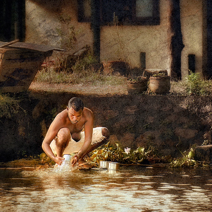
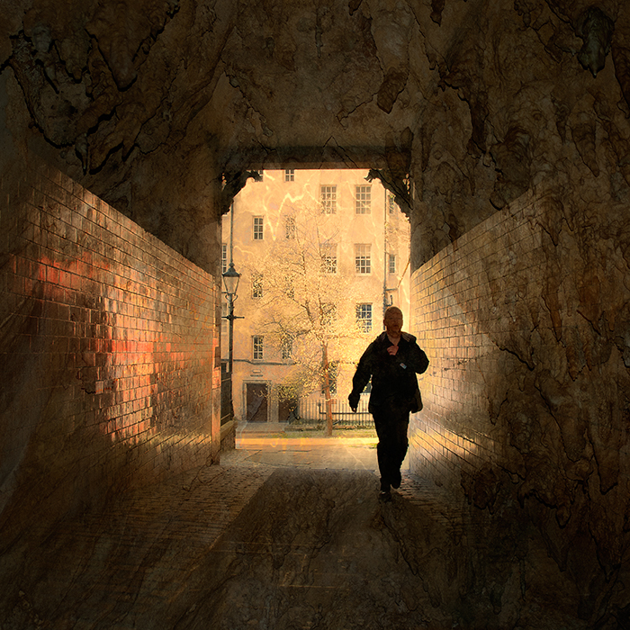
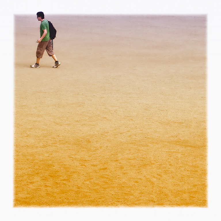
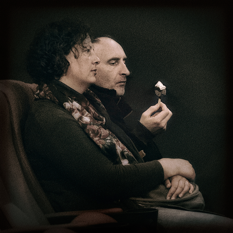
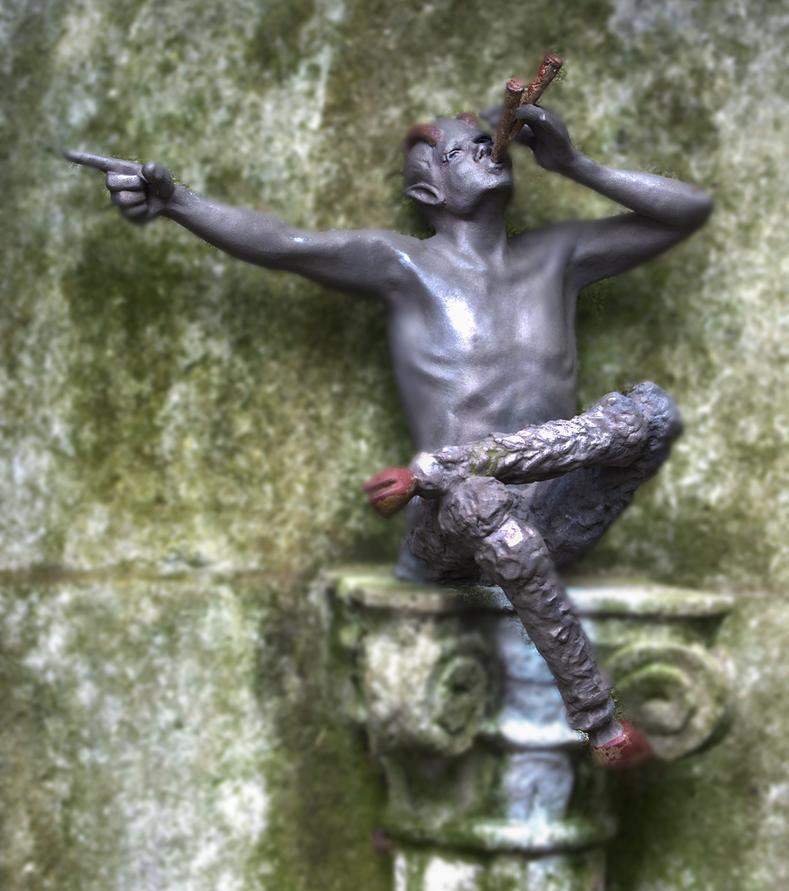
On the contrary, Oliver, I think it is an asset to the image not to know what the figure is pointing at. For me, ideally, images should raise questions which are unanswered and lead to the viewer getting involved in making up their own stories about what the image means… |
May 20th |
| 5 |
May 17 |
Comment |
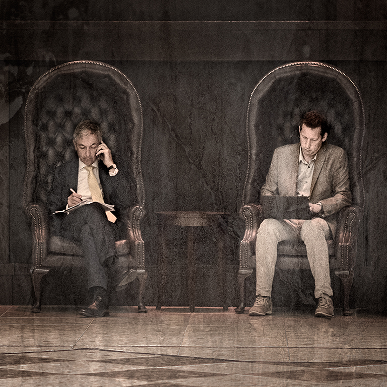
It's a great capture, Richard. I agree with the comments of the others, though. I’d love to see the repost if you are able to get it to a stage where you are satisfied the results. |
May 20th |
| 5 |
May 17 |
Comment |
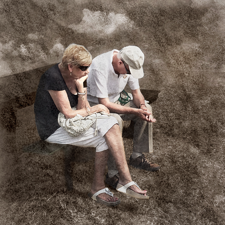
This is fascinating. Thanks so much for sharing it with us, Nick.
|
May 20th |
| 5 |
May 17 |
Comment |
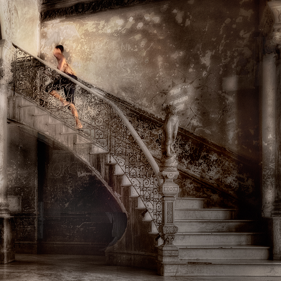
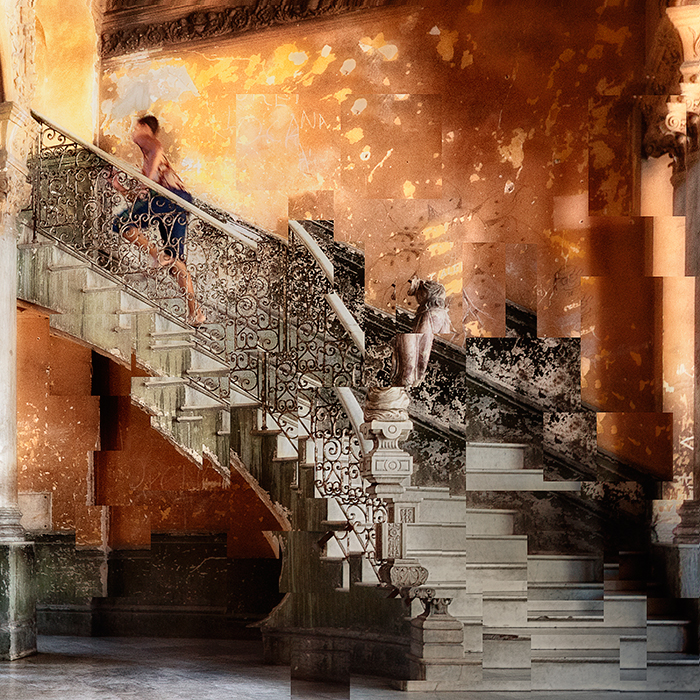
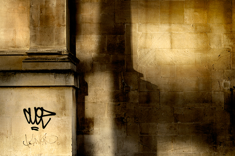
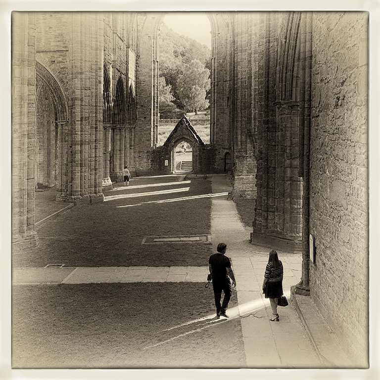
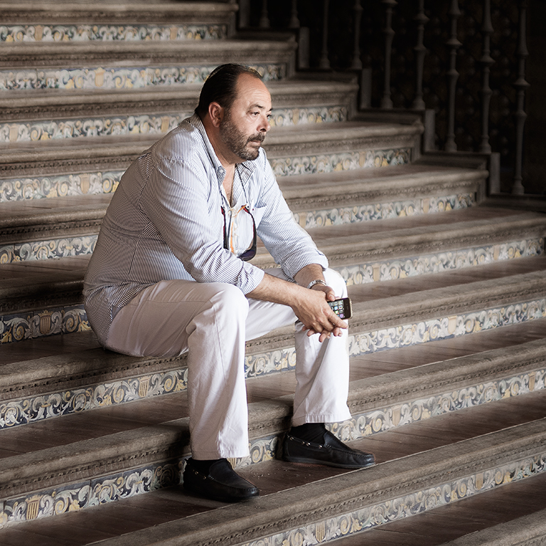
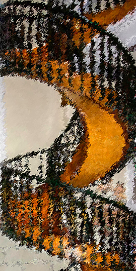
Potentially, this is a very interesting shot, John, but the original is rather cluttered and I’m not sure what you want me to look at. The converging verticals, as you recognise, are also a problem. I like Oliver’s modification to make the image about the stairs. You could go even further and crop it really tightly on the stairs to emphasise the patterns. I did this and added ‘Sprayed Strokes' from the Photoshop filter gallery which is below. Not at all what you were trying to capture, I suspect, but you might find it interesting as a way of using an image to create something entirely different. |
May 20th |
 |
| 5 |
May 17 |
Comment |
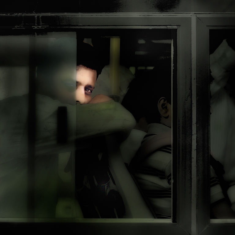
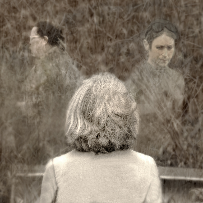
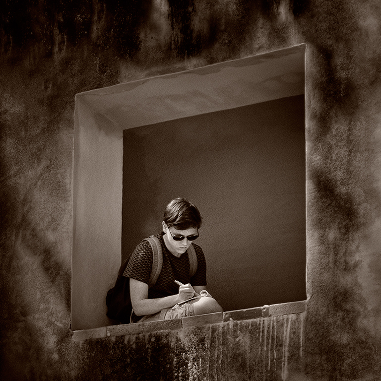
Welcome to the group, Oliver,
This is an interesting shot which raises the question of what the figure is pointing at. I prefer your original one to the modified one as I think that the figure gets more lost in the background in the latter. If it were mine, I’d crop it more tightly as I think a lot of the negative space at the bottom of the image is unnecessary. I’d try also to separate the figure from the background more. Initially by using a shallower depth of field but it can be done retrospectively in Photoshop. I’ve taken the liberty of modifying your image to do this by using Gaussian blur with a layer mask to remove the effect from the figure and Glamour Glow, using the same layer mask and selective sharping of the face using the high pass filter. It’s done rather crudely with some artefacts still showing but I hope you find this useful.
|
May 20th |
 |
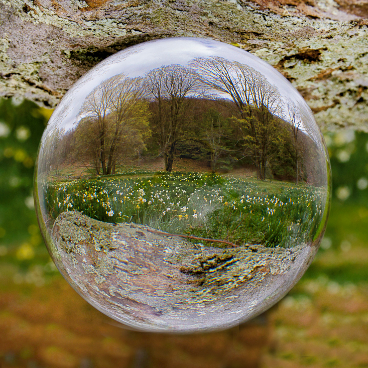
| 5 |
May 17 |
Comment |
Welcome to the group, Phil,
This is a great idea for creating an interesting image. I agree with Barbara that you shouldn’t worry about having a symmetrical layout of the image with the ball in the centre. I think you could develop this more by doing this and I’ve taken the liberty of doing some work on it to produce an alternative presentation which I hope you find interesting.
|
May 19th |
 |
| 5 |
May 17 |
Comment |
My first impression was just how red this is, Barbara, especially with the red border. The more I look at it though, the more I like it for that. The removal of the white part of the petals and the green is a good move as it simplifies the image and makes it stronger. As a study of a flower, I can see it attracting a lot of criticism but as a study of shapes and dramatic colour, it works. I love the title. |
May 16th |
6 comments - 1 reply for Group 5
|
6 comments - 1 reply Total
|