|
| Group |
Round |
C/R |
Comment |
Date |
Image |
| 5 |
Apr 17 |
Reply |
That definitely works much better, Joyce, especially in telling me what you want it to be about. I like your reinterpretation as an image and the tiny chair does make it in that it is a point to stop and look at and wonder about before exploring more. An interesting difference between painting and photography is that, in painting, the artist starts with a blank canvas and decides what they want to add to make the picture. In photography we subtract things from a scene, by deciding what to include when we chose the framing. Your two images are a classic example of how you can change the meaning totally by your choices of what to include and what to exclude when you frame an image. |
Apr 24th |
| 5 |
Apr 17 |
Reply |
Thanks Joyce. Please see my comment to Barbara, above, for an interpretation of what I was trying to do with the image. |
Apr 24th |
| 5 |
Apr 17 |
Reply |
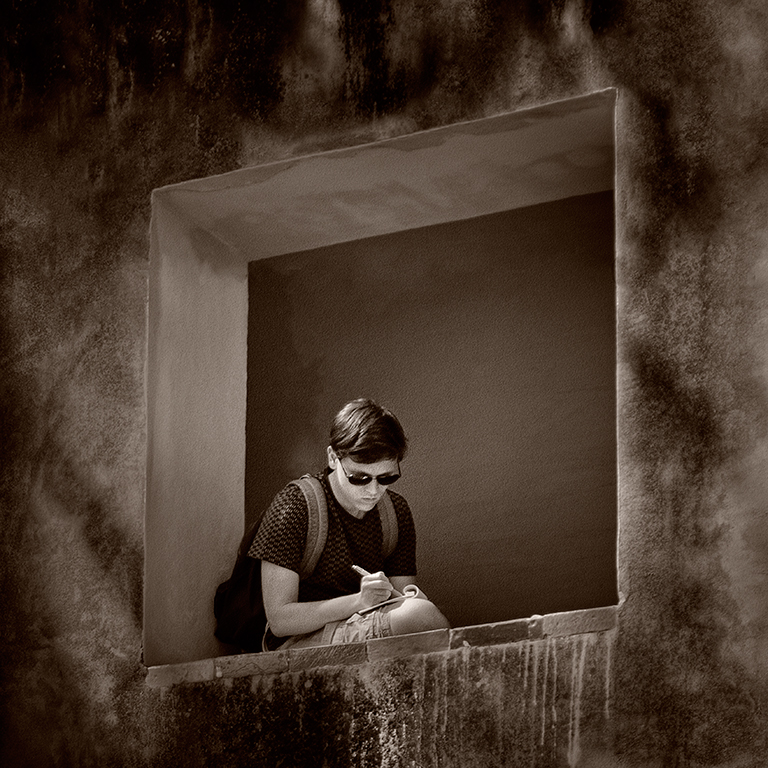
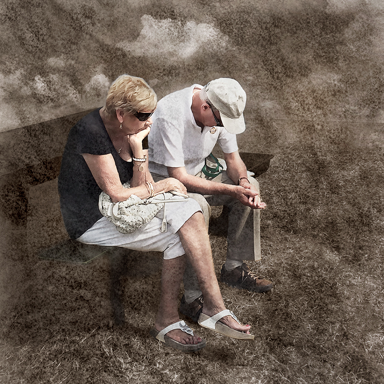
Thanks Barbara. I thought that the grill was important both as a graphic element which balanced the image but also because the whole scene suggested to me a prison which she was unable to escape from and the grill added to that interpretation. |
Apr 24th |
| 5 |
Apr 17 |
Reply |
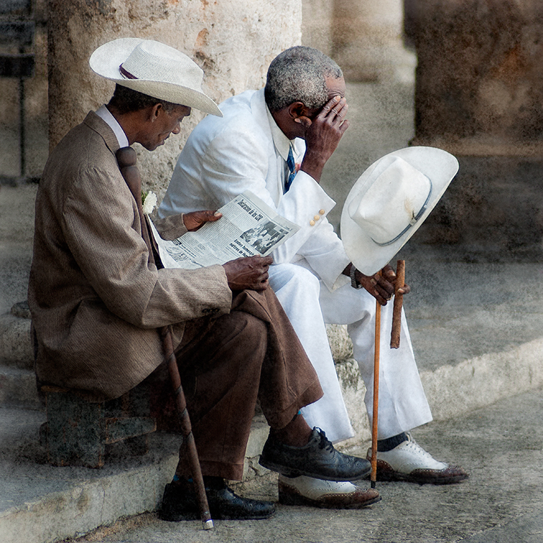
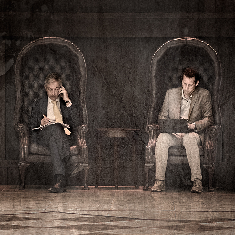
You’re right, Barbara, the window is far too dominating and has little detail at all. I tried to darken it but it just looked murky. If you had a raw file you might have been able to recover some detail. I used Viveza to darken Bobby and adjusted where the darkening was applied by controlling the size of the circle of the control point and using additional control points, which I didn’t adjust, to stop the darkening effect there. An alternative, as you suggest, would have been to darken Bobby and use a layer mask to remove the effect from the bits I didn’t want to be darkened. You could do this using Viveza or the Photoshop Brightness / Contrast Filter. |
Apr 24th |
| 5 |
Apr 17 |
Comment |
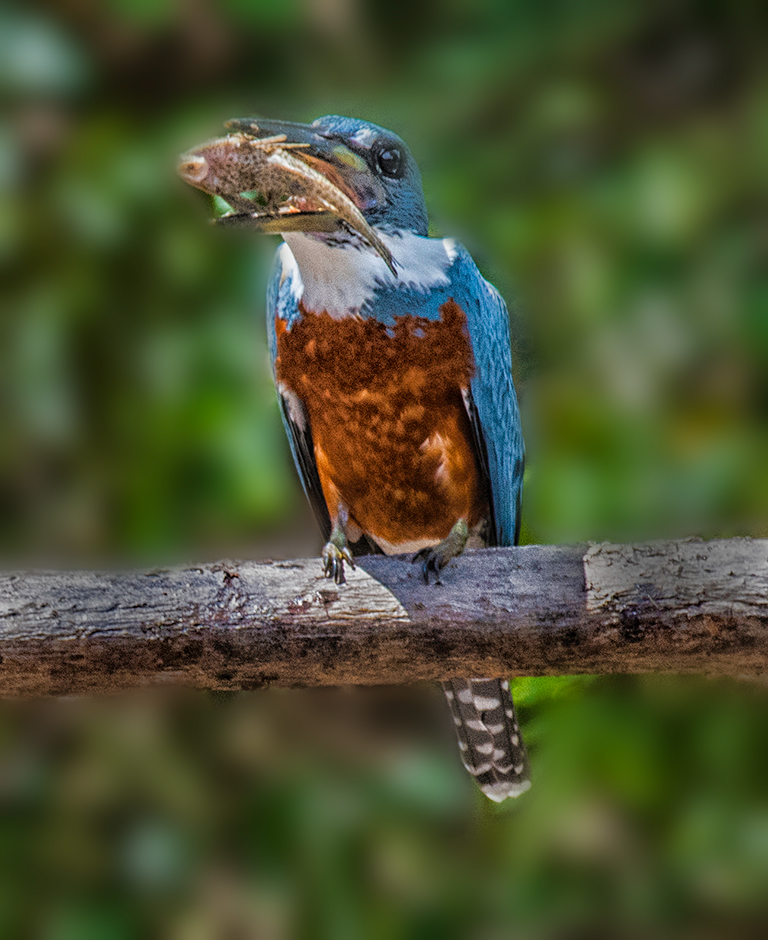
This is a very good capture, Richard and it has enlarged well. I do find the background a bit distracting since it clashes with the mottled brown in the King Fisher, making the image a bit confusing. I think it would have been improved if you had used a wider aperture to blur the background more. I've made a rather crude attempt to simulate this using a Gaussian blur layer with a layer mask to remove the effect from the King Fisher, which I hope shows you what I mean.
|
Apr 23rd |
 |
| 5 |
Apr 17 |
Comment |
Fascinating, Nick. When I saw the thumbnail, I thought it would be one of your creations but when I realised it was a real nature capture, I was amazed. The timing is perfect and the tonal quality is excellent. Brilliant… |
Apr 23rd |
| 5 |
Apr 17 |
Comment |
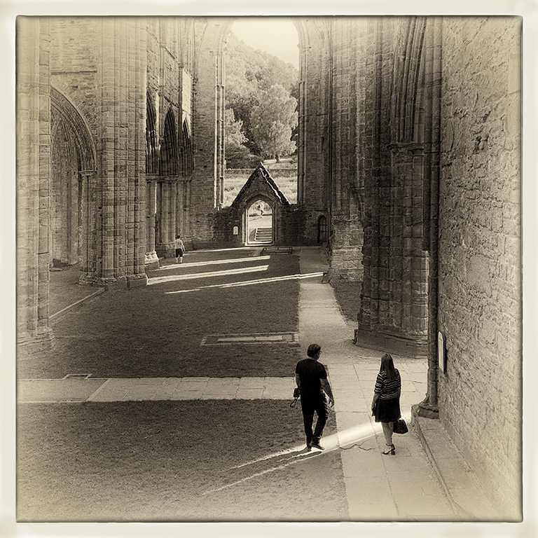
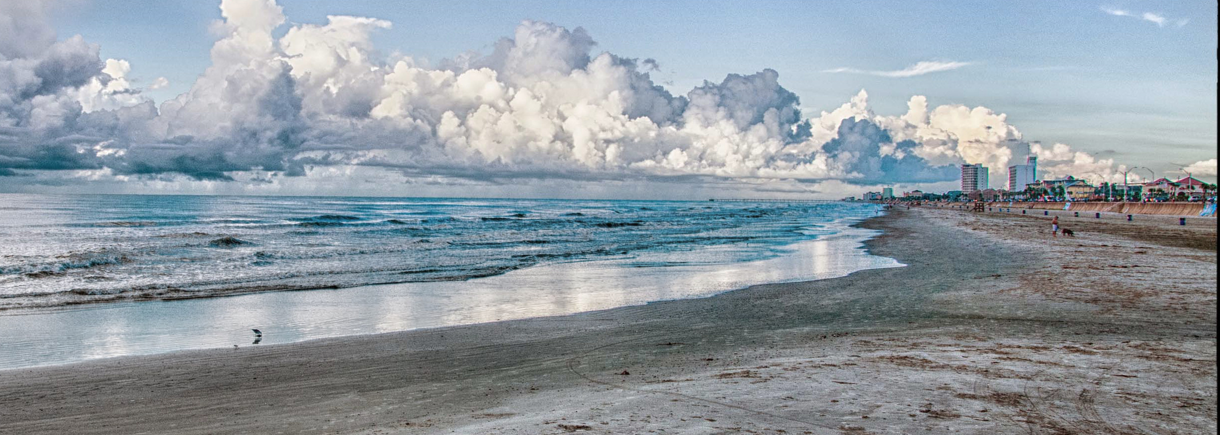
I agree with Barbara about the Sky, Joyce. All the lead lines point towards the City being the main point of interest but the sky is so dominant that it’s not clear if it is the sky or the city which you want me to look at. The heavy white border also dominates the image and, for my taste, the image is rather too saturated. I’ve taken the liberty of cropping it to a more letter box format which homes in more on the city and, I hope, makes it all be bit clearer. I also wouldn't worry about getting things on the thirds. I know it is a ‘rule’ but it often produces less interesting images. Why not just crop it the way you like it to look and stick with that. OK so some club judges might not like it but so what. If you think it’s good, that is all that matters. |
Apr 23rd |
 |
| 5 |
Apr 17 |
Comment |
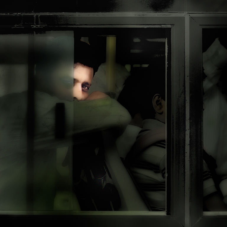
It’s a lovely picture, Barbara but, as you say, the light from the window is very harsh and distracting. I think the crop you have done is too tight though since it cuts out a lot of the secondary interest. I’ve taken the liberty of suggesting another crop �“ see image below. I’ve also done some work in Photoshop to darken down Bobby a bit to make him more the centre of attention. I hope you think it is an attractive alternative. |
Apr 23rd |
 |
4 comments - 4 replies for Group 5
|
4 comments - 4 replies Total
|