|
| Group |
Round |
C/R |
Comment |
Date |
Image |
| 5 |
Feb 17 |
Comment |
I agree with the others, it’s a very dramatic image, made more so by using monochrome. You’ve done a great job removing the distractions. Well done, Richard. |
Feb 23rd |
| 5 |
Feb 17 |
Comment |
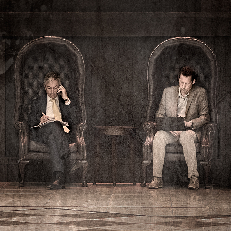
I agree with the comments made by others, Nick, and I also find the area round the steering wheel a bit confusing. Shouldn’t for example the black horizontal bars be black throughout rather than brown when the run across your wife's face? Overall, I like the image but I think it would be helpful to do a bit more work on it as suggested. |
Feb 23rd |
| 5 |
Feb 17 |
Comment |
I like the composition and colour palette of this John, and you have made a great improvement by cloning out the green in the bottom right hand corner. The final image is very attractive indeed. I hope it does well in the Art Show. |
Feb 23rd |
| 5 |
Feb 17 |
Comment |
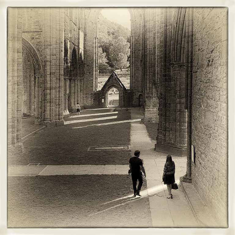
I agree with Barbara, Ken. When I saw the original, I thought the waves were interesting and I wondered why you cropped the lighthouse so tightly. I also prefer Barbara's’ second, flipped image. It’s interesting how flipping an image can sometimes make it much more appealing. As we normally look at text and images from left to right, the first image is more comfortable but flipping it gives it a tension which makes it more interesting, with the wave blocking your eye and preventing it from drifting out of the image and pushing it back to the main subject. |
Feb 23rd |
| 5 |
Feb 17 |
Comment |
Your work on this has improved the original image greatly, Joyce, especially in the details on the potentially blown highlights in the sun area. I’m not sure about the grass in the bottom left hand corner as I find it a bit distracting. I’ve had a go at cloning that out and also I’ve used the Darken/ Lighten Centre NIK filter to shift the lighting a bit to the bottom left hand corner to balance it a bit more. I’ve attached the modified version for your consideration.
I agree with the comments about breaking the ‘rule of thirds' and, by implication, any other ‘rule’ of photography if the result works for you. The ‘rules’ are there for guidance and following them slavishly often leads to comfortable but predictable images. Be adventurous with your composition and forget the judges.
|
Feb 21st |
 |
| 5 |
Feb 17 |
Reply |
Thanks Barbara,
I didn't choose an ISO of 1250 specifically. I normally shoot on auto ISO using aperture priority with a minimum shutter speed of 250sec and let the camera choose the ISO to get the exposure correct. There's a detailed explanation of how I set my camera up in my posting of September 2015 which is in the list in the 'Select another Round' menu. |
Feb 21st |
| 5 |
Feb 17 |
Reply |
Thanks Nick. The way you use frames enhances your images but I tend not to put a frame on the image itself. Instead, I mount my images using a soft white matte board with a 0.5cm gap around the image to show the white of the paper. For me, this produces a simple and elegant frame to the image itself. |
Feb 20th |
| 5 |
Feb 17 |
Reply |
Thanks Joyce. I was aware that the blotches on the top left hand corner stood out a bit and I darkened them down. Although they look OK in the print, they do still stand out a bit too much in the image for screen and are a distraction. I'll work on it a bit more to minimise their effect. |
Feb 20th |
| 5 |
Feb 17 |
Reply |
Thanks John, I really appreciate your kind remarks.
|
Feb 20th |
| 5 |
Feb 17 |
Comment |
I like this very much indeed, Barbara. It’s nicely set up and you have enhanced it greatly by changing the background and cropping the leaf to produce a very good composition. |
Feb 20th |
6 comments - 4 replies for Group 5
|
6 comments - 4 replies Total
|