|
| Group |
Round |
C/R |
Comment |
Date |
Image |
| 5 |
Jan 17 |
Reply |
Thanks so much, Joyce. I always try to create images which make people think about them and create their own stories so I'm really pleased that you reacted the way you have. |
Jan 13th |
| 5 |
Jan 17 |
Comment |
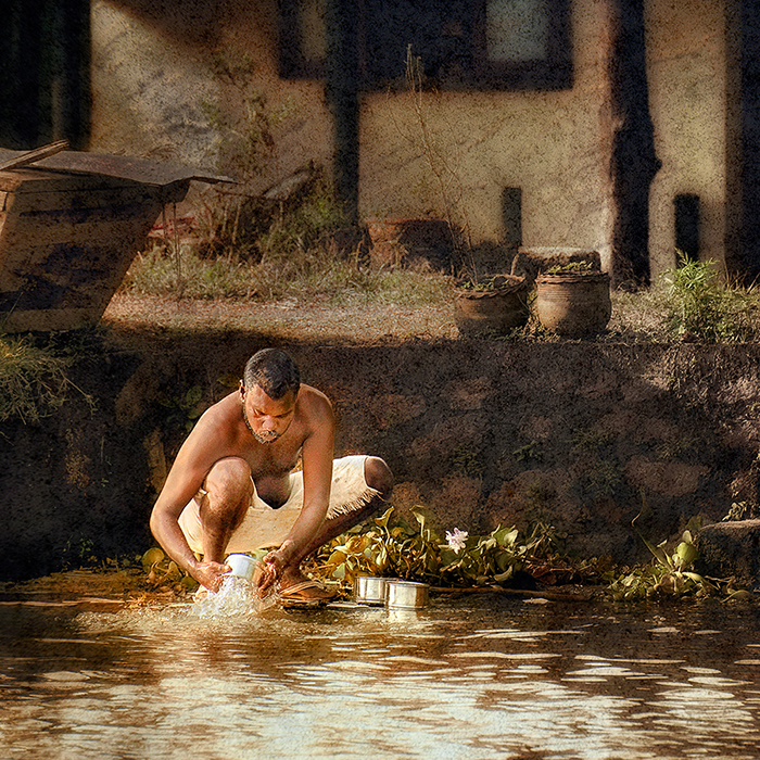
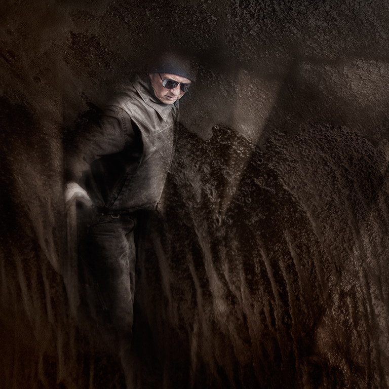
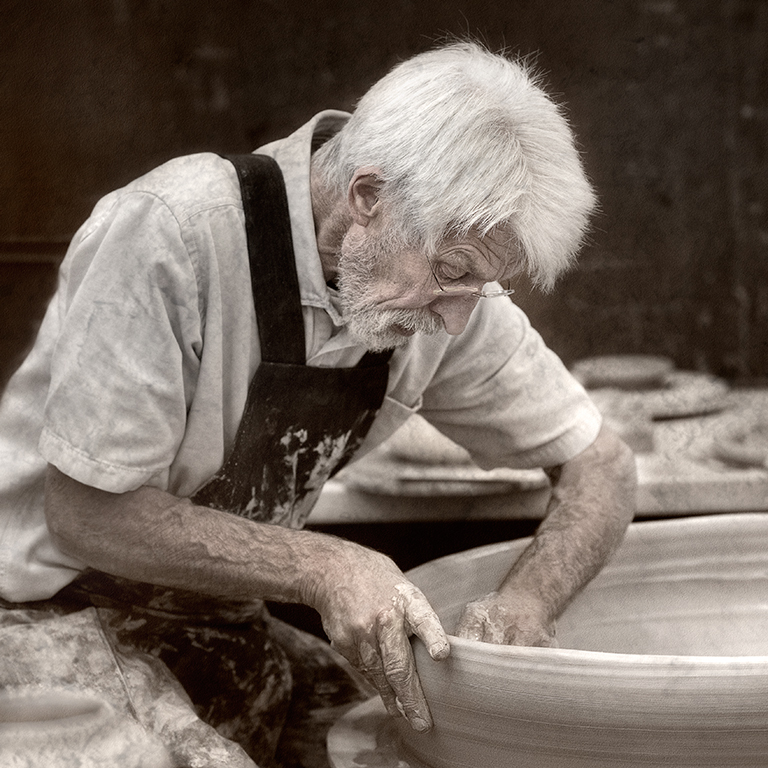
I like this very much, Ken and I feel that the drama is just right. Rather than throwing off the visual balance, I feel that the whites of the clay pans add greatly to the image as they provide a point of focus for the eye to rest on. Without them my eye would keep wandering about the image wondering what it was exactly that you want me to look at. |
Jan 11th |
| 5 |
Jan 17 |
Comment |
This is well generated as ever Nick. I like the models legs are slightly greyer because they are inside the glass. Her right hand though is similar although it appears to be outside the glass because of the break in gap in the rim. Also, the glass isn’t quite vertical and I feel it might be slight better if the model and glass were placed slightly more the left. |
Jan 11th |
| 5 |
Jan 17 |
Comment |
I think that the blue and green in this image go together very well, John, and the effect created by the beads is interesting. I think though that it would be even better if the stem of the glass was vertical and if the straw on the right hand side and the pendants were not cut off. |
Jan 11th |
| 5 |
Jan 17 |
Reply |
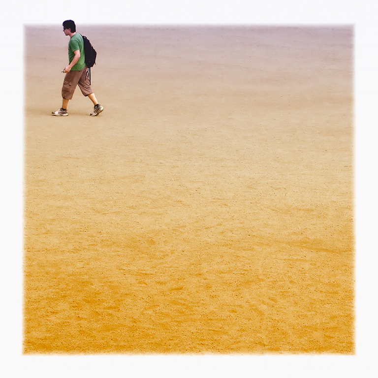
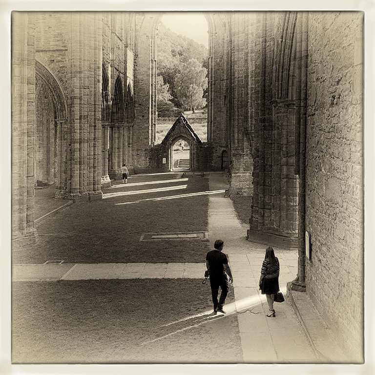
Thanks Ken and welcome to the group. I’ll try out the idea of a vignette around the people to see if it helps. |
Jan 11th |
| 5 |
Jan 17 |
Reply |
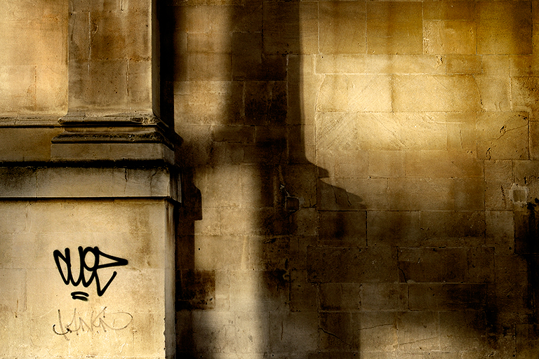
Thanks for your very interesting and helpful comments, Barbara. I’ll certainly try them out to see if I feel they improve the image. As to the visible lines, I did remove them during my work on it but brought it back a bit to try to prevent the feeling of a continuous background but I’ll try to think of a different way of doing it. |
Jan 11th |
| 5 |
Jan 17 |
Comment |
I like both the images very much, Barbara. Particularly, because they are not symmetrical and each has a different and interesting colour palette. Perhaps the more pleasing is the second one because the darker palette gives it a mystery. I can see both of these being used to make decorative plates. |
Jan 11th |
4 comments - 3 replies for Group 5
|
4 comments - 3 replies Total
|