|
| Group |
Round |
C/R |
Comment |
Date |
Image |
| 8 |
Nov 18 |
Comment |
This has a quality of a 'old master' oil painting. Excellent post-processing work.
With wonderfully rich colours and careful composition, I think it's great! |
Nov 7th |
1 comment - 0 replies for Group 8
|
| 82 |
Nov 18 |
Comment |
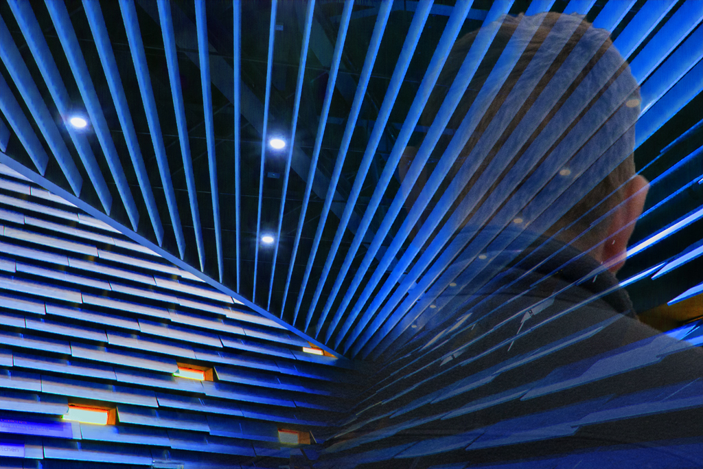
Tried to decrease the intensity of the windows.
But then became a bit experimental and added a 'see-through' figure. |
Nov 17th |
 |
| 82 |
Nov 18 |
Comment |
Thanks for your well observed image. The girl had obviously spotted your camera! |
Nov 14th |
| 82 |
Nov 18 |
Comment |
|
Nov 10th |
| 82 |
Nov 18 |
Reply |
Thanks Mark for your comment.
I darkened the whole are from the original but I could select the windows alone and darken them further.
Again thanks |
Nov 10th |
| 82 |
Nov 18 |
Comment |
Tried the suggestions above and then rendered it with a blue tint - I have probably overdone it! |
Nov 9th |
 |
| 82 |
Nov 18 |
Reply |
Many thanks Tom for your explanation of your method.
I will try and replicate it when I also include Sam's ideas |
Nov 8th |
| 82 |
Nov 18 |
Comment |
Very much like your picture, Holly. I rather like the sky - but if you live in gray-sky Scotland you just love skies with character!
Had you looked at it in monochrome as an experiment? |
Nov 7th |
| 82 |
Nov 18 |
Comment |
Thanks for this superb image.
The thunder cloud on the horizon brings interest to the sky.
Would it work if the boat was more of a silhouette? - Not sure! |
Nov 7th |
| 82 |
Nov 18 |
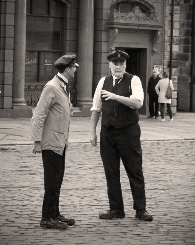
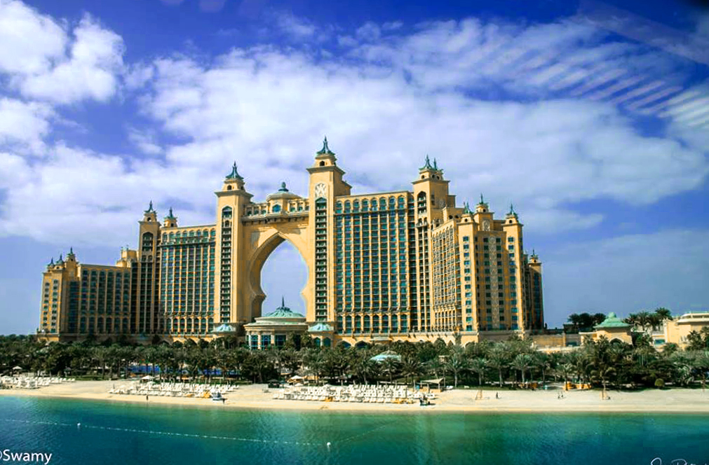
Comment |
Thanks for this excellent image - it looks a most impressive building. I saw it on TV during a cycle race last winter as wells as the approach roads.
I wonder if the colour or hue balance could be altered a tad. I have had a try with Photoshop Elements - please let me know what you think.
|
Nov 6th |
 |
| 82 |
Nov 18 |
Comment |
Hi Vera
This a fascinating image; could you share something of how you came to take it?
|
Nov 6th |
| 82 |
Nov 18 |
Comment |
Yes Sam you are right. When I took the picture I did not notice there are two yellow signs down in that corner. I'll try a vignette with some darkening in that area.
I have been meaning to reprocess this image as a B&W pix and also have a go at that.
Thanks for your comments and will let you see the results of above. |
Nov 5th |
| 82 |
Nov 18 |
Reply |
Tom - that is great improvement and just the effect was wanting to achieve.
Could you share your method with us? That's to say, did you select each of the dark areas of the roof seperately or is there an easier way? |
Nov 3rd |
| 82 |
Nov 18 |
Comment |
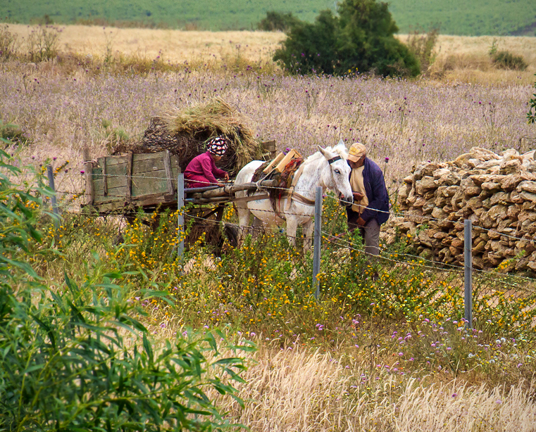
This is a really good image documenting the culture of the country you were travelling through. Moreover, you did very well to take it while 'underway'. Most of my out of car window shots are dreadful.
I have followed Tom's advice using Photoshop Elements. My only main difference from Tom's excellent image above, was to use the blur tool to de-focus the near bush and the far away field in the background. I also also added a vignette; my favourite adjustment.
Anyway, I offer it for your and groups opinion. |
Nov 3rd |
 |
| 82 |
Nov 18 |
Reply |
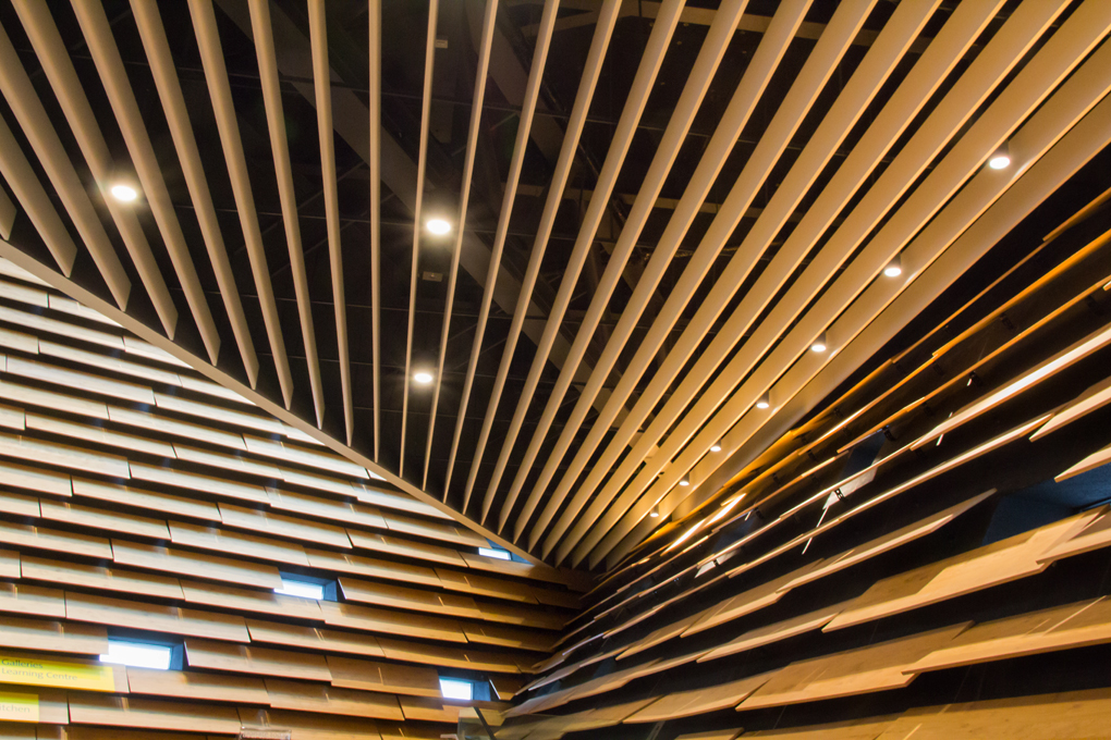
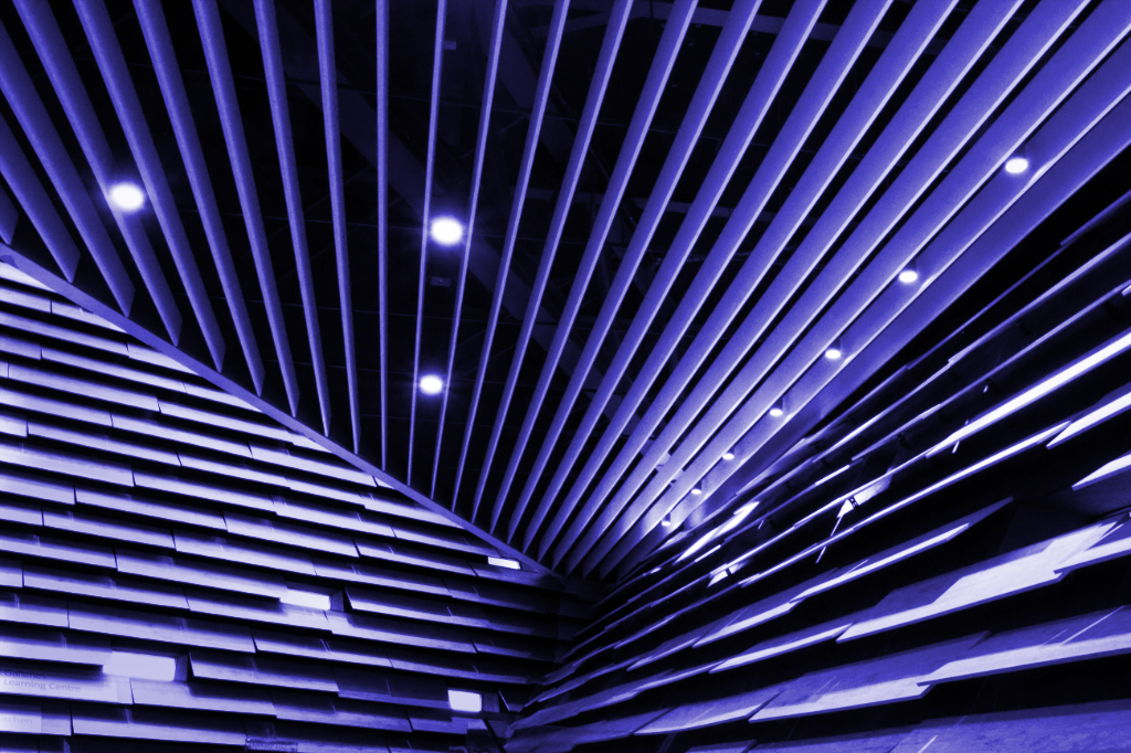
Hi Vera,
Many thanks for your kind comments. This image was taken with my Canon 60D using the Tamron 18-200mm zoom at 22mm. The exposure was 0.4 sec at f16 and ISO 1600; lens stabilisation would have been on. The museum was very busy but I managed to brace my arms against a hand rail.
Needless to say, this was one of of the many I took that day of a strikingly modern building. Being local to it, doubtless I will be posting more V&A images in the future.
Thanks for the suggestion of making the image more abstract. The brown colour scheme is not very eye catching. Also there is a beam behind the main roof spars that crosses the image and that is distracting. So that too could be 'toned down'. Will have a try!
Once again thanks for taking time to comment on my pix -Graham |
Nov 2nd |
10 comments - 4 replies for Group 82
|
11 comments - 4 replies Total
|