|
| Group |
Round |
C/R |
Comment |
Date |
Image |
| 6 |
Nov 19 |
Reply |
Thank you so much Salvador. Well, it's a team of 5-6 of us go in search of subjects (for safety reasons) and sometimes I get lucky to spot and sometimes others :-) |
Nov 26th |
| 6 |
Nov 19 |
Reply |
Thanks Tom |
Nov 22nd |
| 6 |
Nov 19 |
Reply |
Thanks Sandra. I used the brush tool and reduced the exposure in those unwanted areas |
Nov 16th |
| 6 |
Nov 19 |
Reply |
Thanks for stopping by Mark. Appreciate you feedback and liking. |
Nov 13th |
| 6 |
Nov 19 |
Comment |
Thank you so much Stuart and Dick for the suggestion. Here is the edited version. Please let me know if it makes sense now. |
Nov 10th |
 |
| 6 |
Nov 19 |
Reply |
Oh my God! Understand. Got that! |
Nov 10th |
| 6 |
Nov 19 |
Reply |
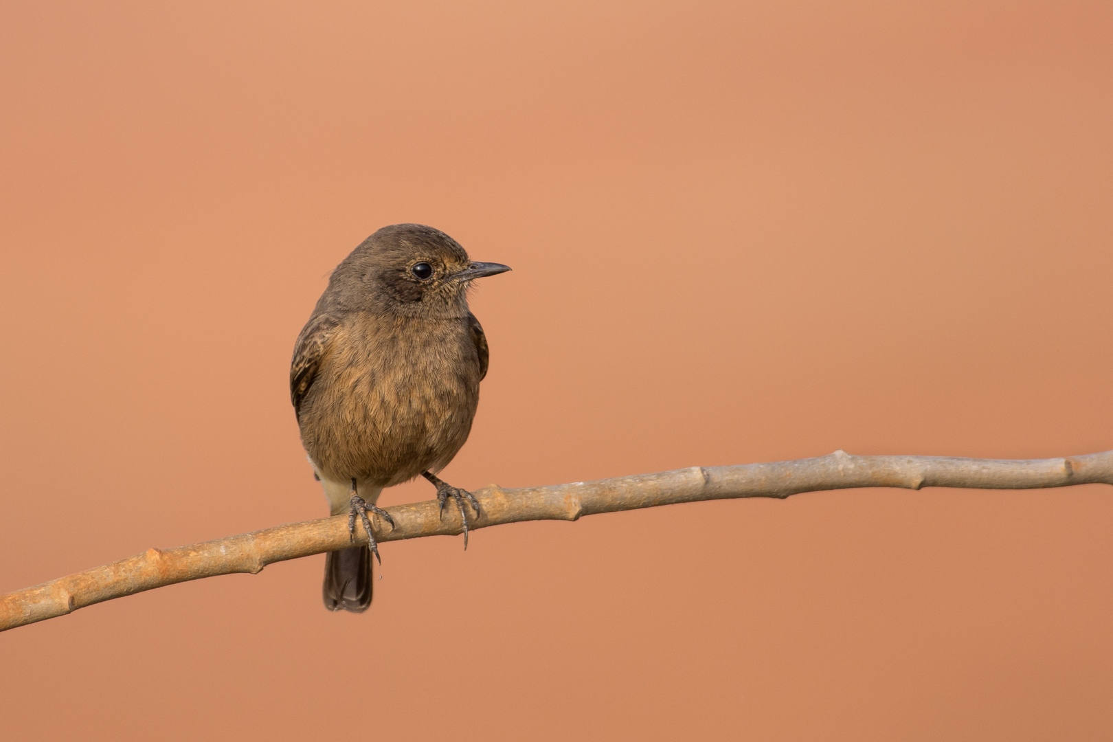
Is it on a wall it ground? I assumed it is on the floor unlike always. If wall, please read me comment as side pose instead of ground level shot Sandra. |
Nov 9th |
| 6 |
Nov 19 |
Comment |
A beautiful and unusual color contrast of the flower Tom. I like the orientation that Janet has made to show proper leading lines as we tend to read left to right by default. I agree with Stuart on cropping / positioning of the center. To me, it looks the image is incomplete with the current crop. I am thinking if you show a little wider shot to include center of the flower might help. |
Nov 9th |
| 6 |
Nov 19 |
Comment |
A good output for a product photography. Red being an arresting color, as Janet mentioned, viewer's attention is drawn to it mostly imo. I think, may be showing a little more of the motherboard might help to understand the role of this capacitor and also enriches the brand image of Jamicon. Just a thought, although some may not appreciate due to too many components then |
Nov 9th |
| 6 |
Nov 19 |
Comment |
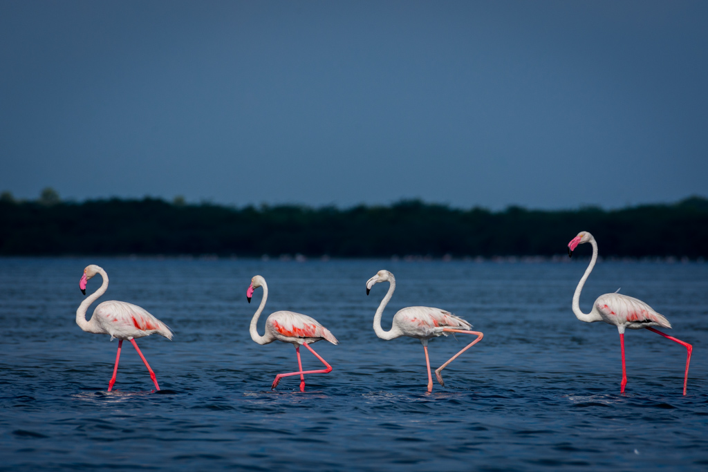
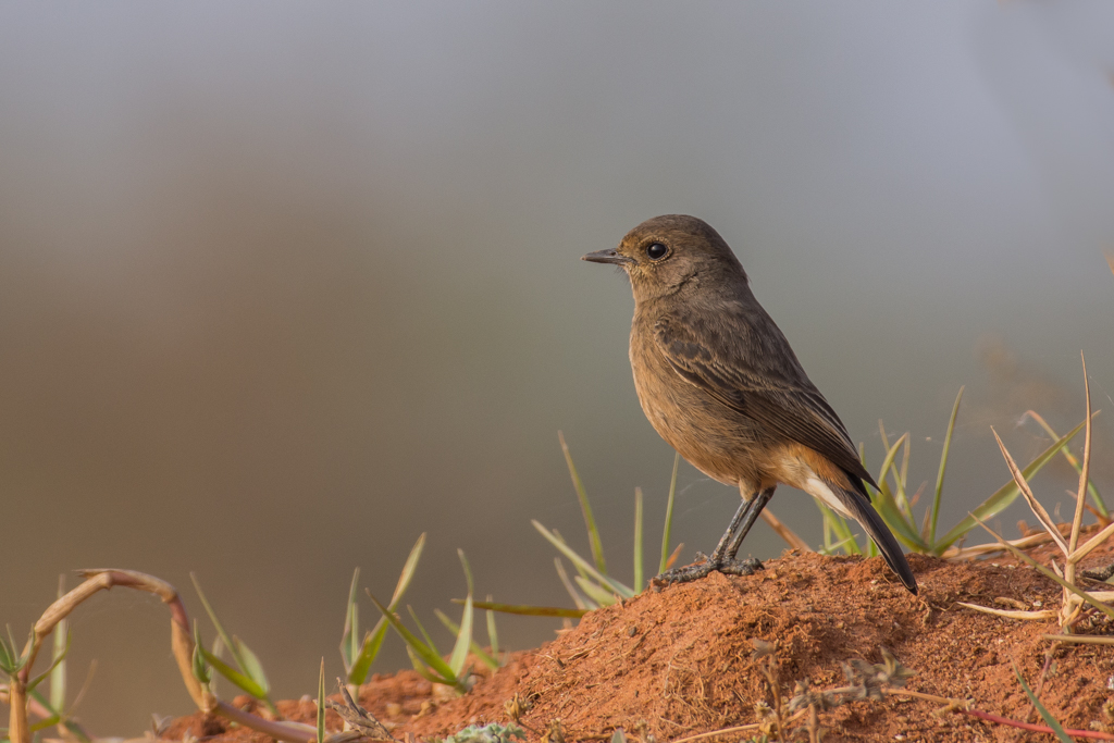
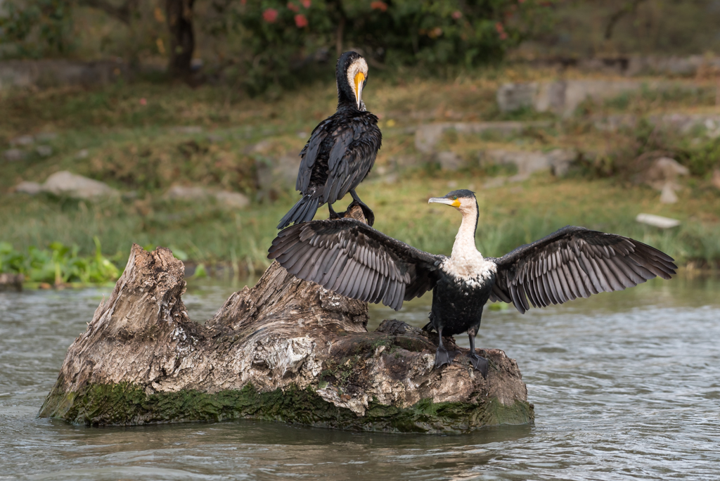
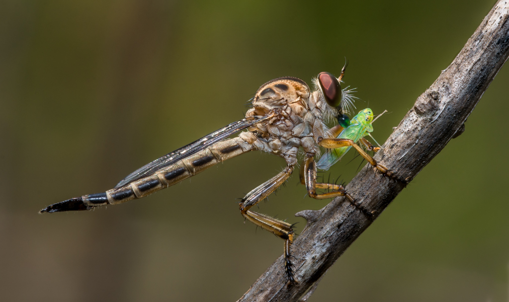
Nice capture Sandra. I feel it's too tight crop. Breathing space in front of the head and tail might enhance the image.
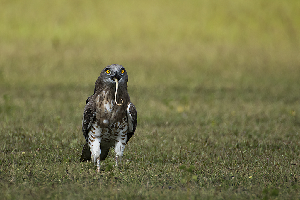
Did you try the ground level shot as well? That would have been more interesting angle to see if you have one |
Nov 9th |
| 6 |
Nov 19 |
Comment |
Simple yet clean image to appreciate Janet. Like the monochrome tone used. Wondering why yellow over white though... |
Nov 9th |
| 6 |
Nov 19 |
Comment |
Elegant image! Beautiful color contrast Dick. Which s/w do you use to stitch the stacking images? PS? |
Nov 9th |
| 6 |
Nov 19 |
Reply |
Thank you so much Janet |
Nov 9th |
6 comments - 7 replies for Group 6
|
| 67 |
Nov 19 |
Reply |
Thank you Wayne. Appreciate your feedback. |
Nov 25th |
| 67 |
Nov 19 |
Reply |
Helpful tips Larry. Thank you. |
Nov 22nd |
| 67 |
Nov 19 |
Reply |
Appreciate the detailed note Richard. The flipped image looks slightly better than my version. Wondering if it is due to my eye ball rolling left-to-right by default. I didn't realize to flip it before presenting my version. Good one! |
Nov 22nd |
| 67 |
Nov 19 |
Reply |
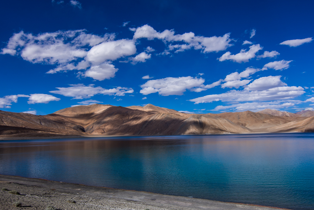
Thank you so much for the pano version Larry. Looks good. Out of curiosity, is this version acceptable if I want to retain a bit of shoreline? |
Nov 22nd |
 |
| 67 |
Nov 19 |
Reply |
Thanks Michael |
Nov 22nd |
| 67 |
Nov 19 |
Reply |
Wow! Super eye for detail. Though it is not bothering much, it is better to keep the unwanted out anyway... |
Nov 11th |
| 67 |
Nov 19 |
Reply |
Wow! Super eye for detail. Though it is not bothering much, it is better to keep the unwanted out anyway... |
Nov 10th |
| 67 |
Nov 19 |
Reply |
I rather prefer to love with this and retain the admin as-is. :-) |
Nov 10th |
| 67 |
Nov 19 |
Reply |
Thanks Rich. Wait for your detailed comment. Enjoy your vacation! |
Nov 10th |
| 67 |
Nov 19 |
Reply |
Thanks Todd. We drove up till there and stayed in the camp overnight and almost froze to death 🙂
I wish to visit CSprings someday. Have heard great things about it. |
Nov 10th |
| 67 |
Nov 19 |
Comment |
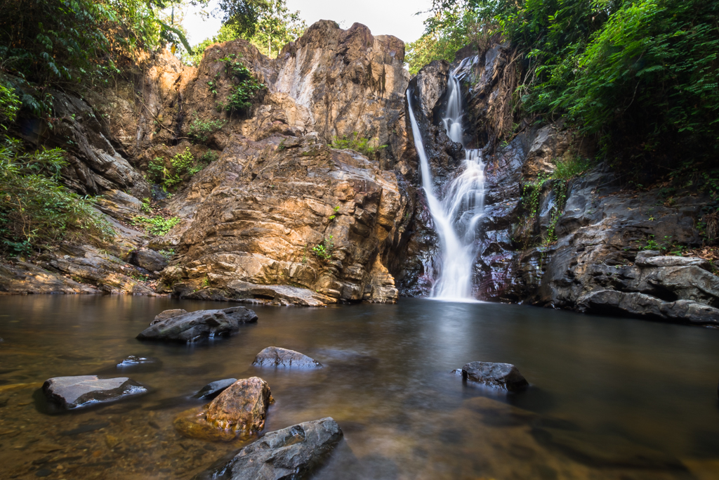
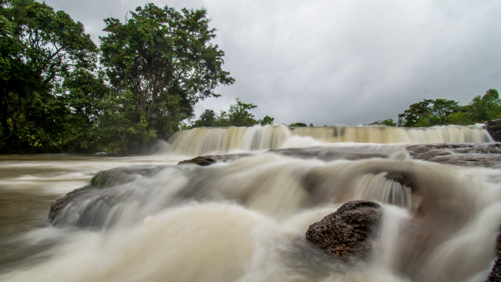
Hi Mark, I see the 2nd image posted is far better than the 1st image. It is a great image with moody colors. The circular shape leading all the way to vetical shape with various objects and colors is simply superb. I loved the play of light on left huge rock next to the falls. This image reminds me of the PS3 game Unchartered which has similar lighting effects and surroundings.
I envy your privilege of seeing and experiencing those fall colors... :-) |
Nov 10th |
| 67 |
Nov 19 |
Comment |
Hi Richard, lovely image overall. I could imagine your plight of remembering the childhood. It must have brought back sweet memories for you.
Is it just me feeling the image is but more softer than it's supposed to be on the trees and leaves? Although I appreciate the painterly effect. |
Nov 9th |
| 67 |
Nov 19 |
Comment |
It speaks a lot when a master creates another masterpiece and seeks suggestion to improve Larry.
On the first look, I felt the log was distracting but after reading your explanation, we can understand the while scene. I think the cropping is just right and the tree on the right doesn't get noticed unless directed to it. Worst case, I go with Mark's suggestion. Regarding image bring in the darker side, I think it sets the right mood to the frame.
To nitpick, I would probably would move to the right and try to get the full view of the falls while making the log merge with the falls to make it a V shape view.
I wonder what would have been the reaction of that professional who suggested not to click the falls in that lighting. :-) I'm sure she would have either regretted or planned to come again during that condition. |
Nov 9th |
| 67 |
Nov 19 |
Comment |
Great capture of the stormy weather Wayne. I think b/w is apt to show the climatic conditions and the rugged stance of the mountains & lonely tree. However, I would be curious to see the color version too just to see the greens.
Imo, the tree can come a bit more to the left for 2 reasons: 1. Can fit into the rule of thirds better 2. Giving breathing space towards right as the tree is leaning that side.
I agree with a little bit of dehazing (only on the mountains in the extreme left and not completely like in Michael's edit). Michael's edit enhances the feel of the clouds definitely. However, the highlights around the tree makes me think the editing is incomplete for some reason.
Overall, I liked the image showing the weather conditions. Lastly, I wouldn't have even noticed that man under the tree had you not mentioned assuming it to be a small bush/shrub :-) |
Nov 9th |
| 67 |
Nov 19 |
Comment |
Amazing frame and no wonder why is it your favorite image.
I have nothing much to say except appreciate this image as-is.
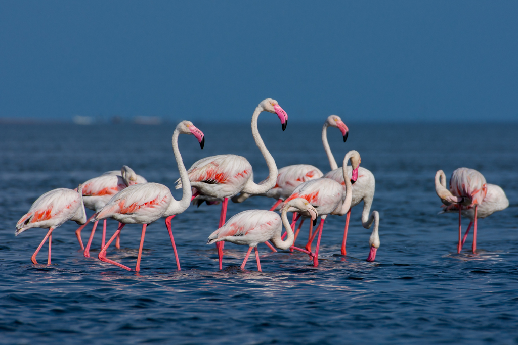
Though not in your control, I wish there was a bit of Royal Blue sky beyond those trees in bg to improve the vibrance a bit. |
Nov 9th |
| 67 |
Nov 19 |
Comment |
Definitely a worthy image for a desktop wallpaper Todd. I noticed only you have a different image this month than rest of us showing landscape images hence, you caught my attention to write a comment for your image first :-)
I see it is good thinking of isolating this flower and the trial to include the sky. However, I am confused is it the sky or a green bg in that nice soft bokeh. Whatever it is, it is adding right to the pic and enabling the subject to stand out. I think there is scope to reduce the highlights of the BG leaf a bit more. Else, it's a wonderful image giving great feel of the environment |
Nov 9th |
6 comments - 10 replies for Group 67
|
12 comments - 17 replies Total
|