|
| Group |
Round |
C/R |
Comment |
Date |
Image |
| 41 |
Mar 21 |
Comment |
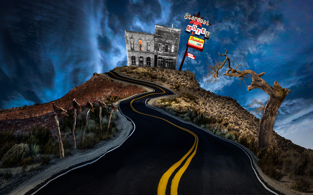
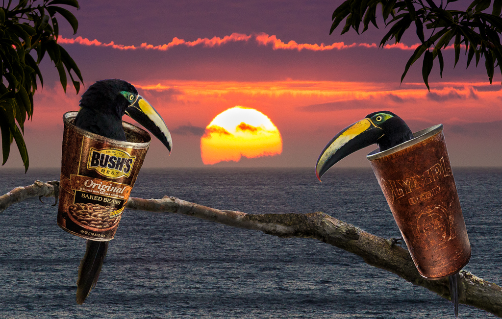
Brad, great concept! Your conceptual ideas are always interesting. I agree with Kathy in that I would like to see more cohesiveness in the image. I think perhaps a square format might contain the story a little better. |
Mar 30th |
| 41 |
Mar 21 |
Comment |
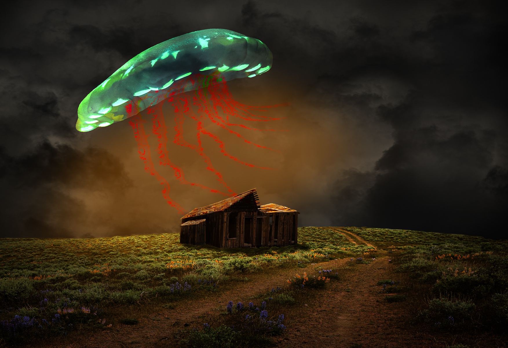
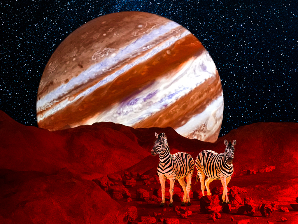
Welcome Tom, I hope you enjoy the group! I like what you've done with the sphere by enhancing it with the red original. It is indeed mesmerizing. I do like your second revision and the addition of the starburst. |
Mar 29th |
| 41 |
Mar 21 |
Comment |
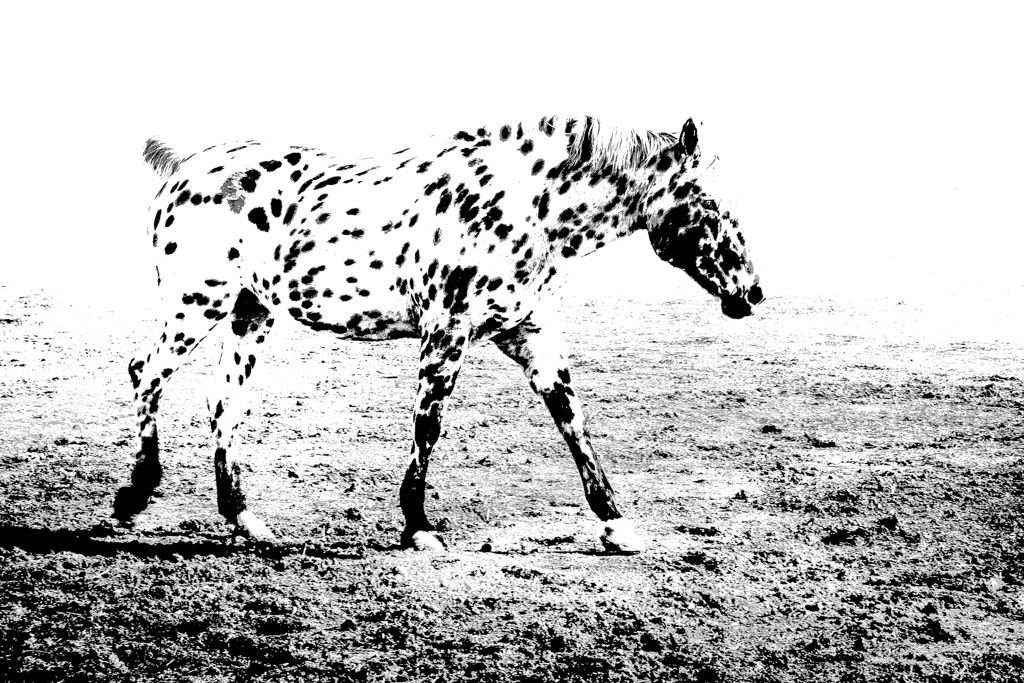
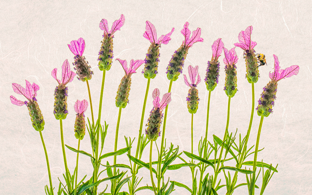
I think you've done a fine job with this Henry. I think the cropping simplifies and composition so the viewer can enjoy the bold color and graphic design. While I like Kathy's suggestion to tone down the seedpods, I think they might be too light in your second version. I might bring the darkest one back in a little or try Tom's suggestion. |
Mar 29th |
| 41 |
Mar 21 |
Comment |
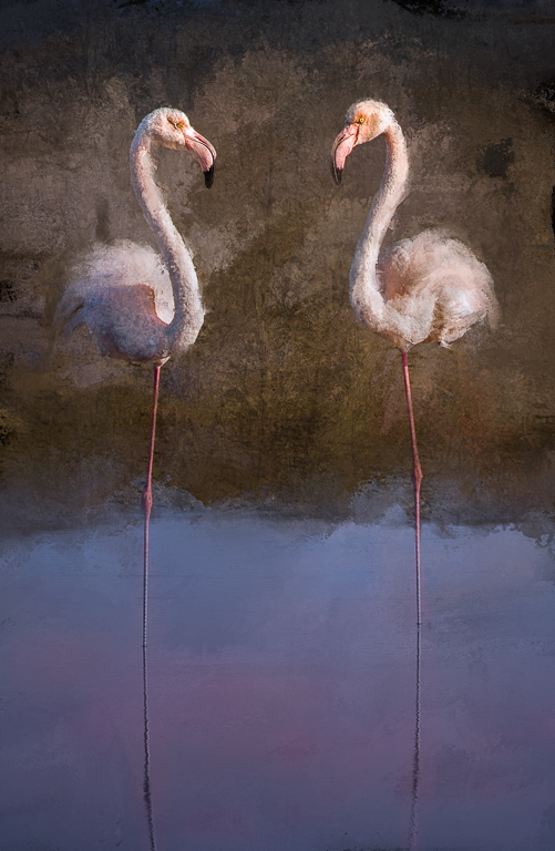
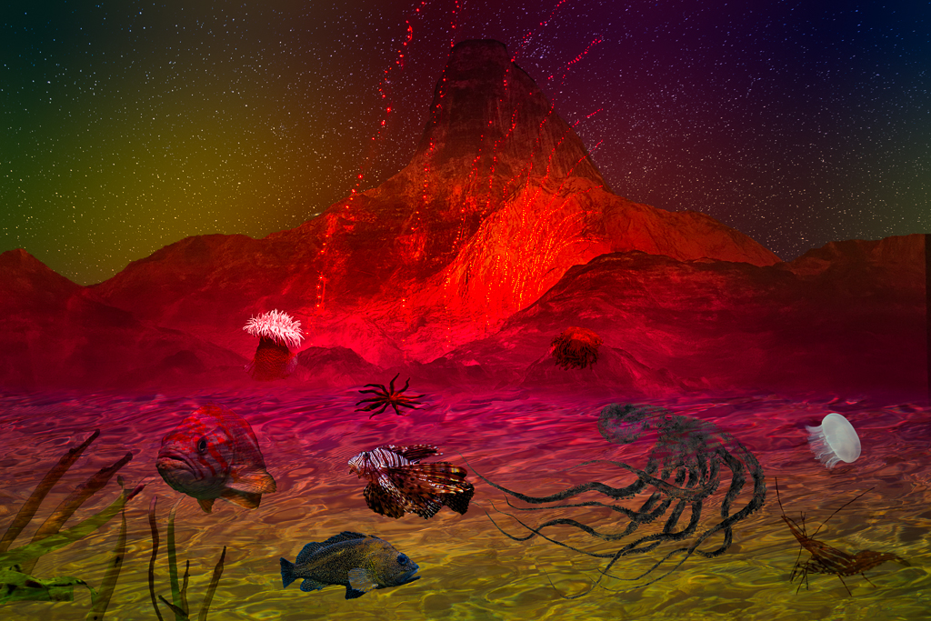
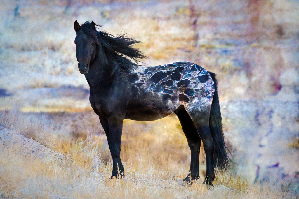
Hi Maryellen,
The Topaz filter really popped the colors in the image and created a soft contrast of blues, browns and grays. I see diagonal lines that work well together to give the image it's energy. For me, all lines lead to the center of the image (and my imagination sees a little mouse there). |
Mar 29th |
| 41 |
Mar 21 |
Comment |
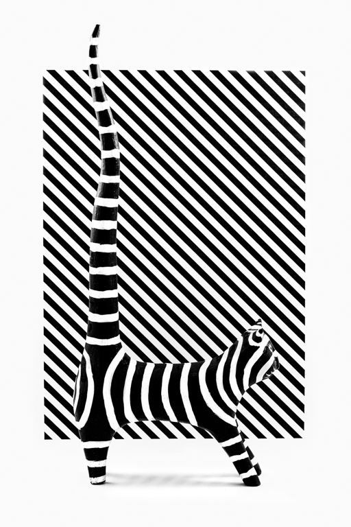
Wow Kathy, all I can say about this is that it is AWESOME! A winner by all accounts! |
Mar 3rd |
5 comments - 0 replies for Group 41
|
5 comments - 0 replies Total
|