|
| Group |
Round |
C/R |
Comment |
Date |
Image |
| 41 |
Dec 18 |
Comment |
I love the creativity, it reminds me of a reflection of eyes looking through a pair of binoculars. The colors, textures and shapes work really well together. I do wish there was a little more three dimensional look in the eyes, just my personal preference. |
Dec 20th |
| 41 |
Dec 18 |
Comment |
Hi Sue, perfect for the Holidays! Did you make Xmas cards from this? Coco is a natural. I really like your setup and background.
I think the idea of Coco decorating the tree is perhaps a bit hard to convey since she has paws and not hands, and I thought why not have her to do what a dog does? So my take on this would be to have Coco decorating the tree with an ornament in her mouth.
Happy Holidays! |
Dec 18th |
 |
| 41 |
Dec 18 |
Comment |
Hi Henry, your composition is lovely and the choice of colors is perfect. I tend to agree with Lisa though that the rough texture is not something I find personally appealing for a subject such as an orchid. My feeling is that the image is more about the texture than the orchid. I do like the Topaz van Gogh rendering. |
Dec 18th |
| 41 |
Dec 18 |
Reply |
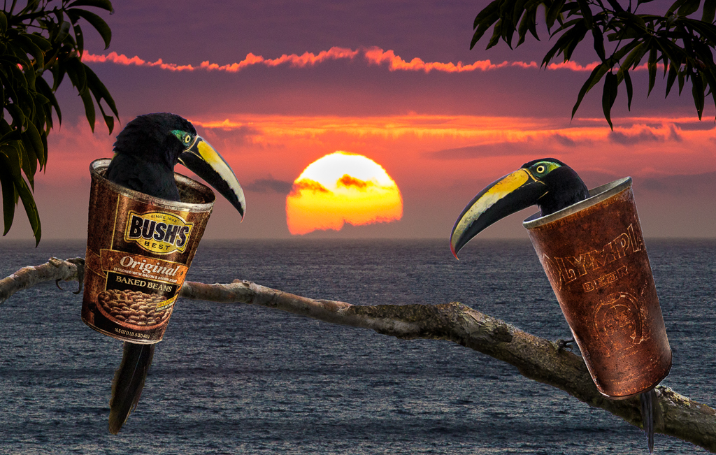
Thanks Lisa, your idea for turning the image upside down is a good one. And you are right about the fringing. I checked out Matt's tutorial and will definitely try it next time. That's why I joined the group, to learn more stuff! I do like your take on the image without the sun, but in pondering I think I still prefer it with the sun. Maybe because the two cans now seem too far away from each other. I like both renderings.
Hmmm... |
Dec 18th |
| 41 |
Dec 18 |
Reply |
Thanks Kathy! I'm glad you liked the idea of Two Cans. My only thought about your VF is that for me, the highlights become too grayed out. But the darker tones do create a different mood. |
Dec 18th |
| 41 |
Dec 18 |
Comment |
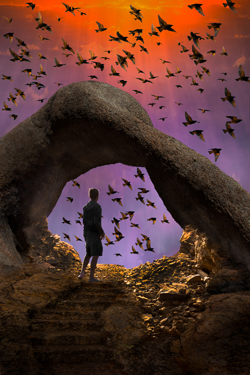
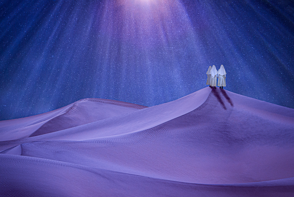
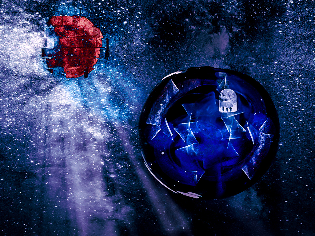
Hi Kathy, this is a great concept and the composition is well placed. I don't mind that the blue and red "elements" are misshapen, in fact that is one of the things I think adds interest.
The story or feeling about the image eludes me however, I think in part because the figures are so small and become almost insignificant. The brightness of the "moon" exploding (?) draws my eye away from the figures.
I tried to enlarge the figures in a VF, but the shape didn't work well, so I tried adding and deepening some color in LR to the overall image to enhance the outer space feeling. See what you think. |
Dec 16th |
 |
| 41 |
Dec 18 |
Comment |
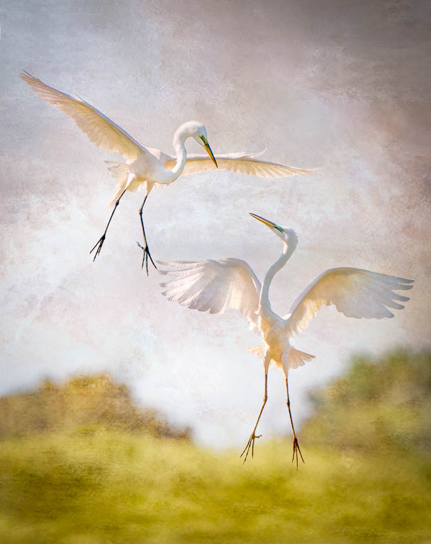
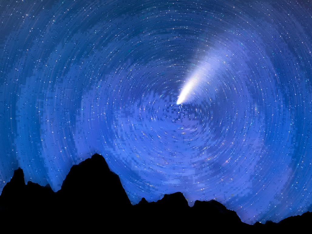
Sometimes less is more and in this case, it works beautifully. The simplicity of the image is the story. Loving the reflected light on the beach as well as the subtle movement of the lower figure. I'm not a big fan of star trails because they usually dominate an image, but you have blended them so well that without them the image would be much less dynamic. Beautiful. |
Dec 15th |
5 comments - 2 replies for Group 41
|
5 comments - 2 replies Total
|